Peekaboo! Stanford White and the Mystery Lantern for Madison Square Presbyterian Church
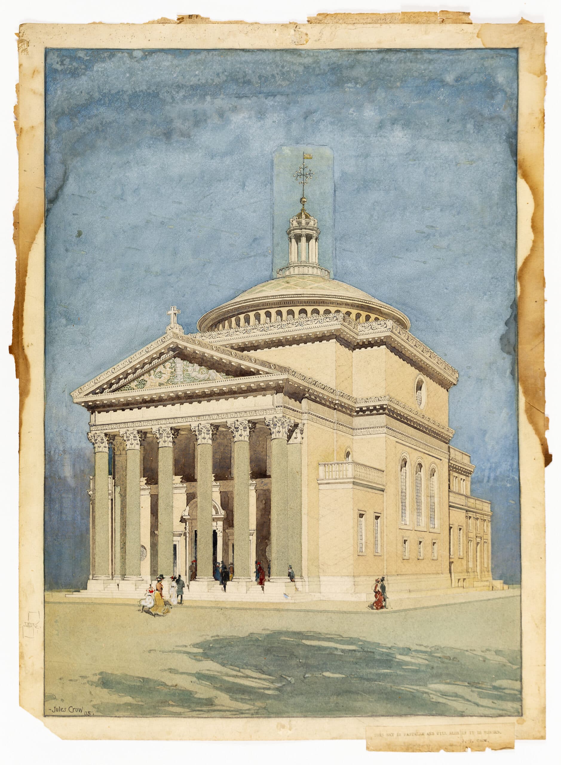
Up until the turn of the twentieth century architectural renderings tended to be created for clients early in the design process to give them an idea of how a proposed building would look. At that point however they began to be used more widely for publicity purposes as well, thanks to advances in halftone photomechanical printing that allowed drawings to be reproduced in colour and in large quantities. While looking through the September 1905 issue of the Century Magazine, I happened across one such early example: a full-page copy of a perspective drawing recently acquired by Drawing Matter of the Madison Square Presbyterian Church in New York City that was previously thought to have been created for the client by the office of the architect, Stanford White of McKim, Mead & White. Its reproduction in the magazine suggests a different or at least second purpose and offers new clues about the pasted-on lantern and finial.
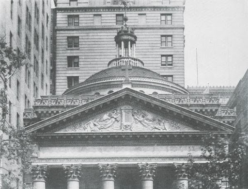
McKim, Mead & White, the firm behind such famous Gilded Age landmarks as Penn Station in New York and the Boston Public Library, invested heavily in public relations. This watercolour rendering was, however, a level up, even for them. They typically circulated black and white photographs of finished projects. But, as the magazine’s critic Christian Brinton explained in accompanying text, construction on the Madison Square Presbyterian Church hadn’t yet wrapped up at the time of publication. He notes as well that existing and future towers surrounding the site, on the north corner of East 24th Street and Madison Avenue, was the impetus for many of White’s design choices in the building, including the classical rather than gothic style traditionally used for ecclesiastical architecture as well as the unusually colourful palette and rich decorative programme. The net result being an especially striking exterior, even by the standards of McKim, Mead & White, and thus presumably a project the firm was interested in publicising early and in colour.
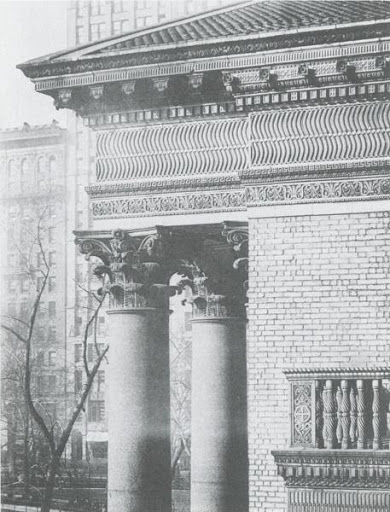
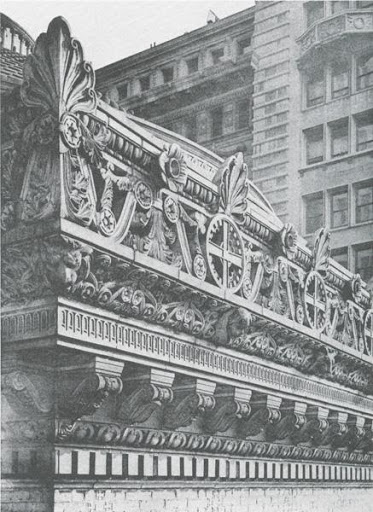
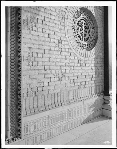
The illustrator of the rendering, Jules T. Crow (the firm’s go-to guy) all but omitted the building’s context except for a shadow of windows on the lower left-hand side. Still, he conveyed many of the design details that had been devised in response to the surroundings: the pale green-granite columns rising from their white marble base, elaborate strigalation in the frieze, and perhaps the most saturated cornice in the history of architecture.
But as architect and historian Sam White has pointed out to me, Crow did not depict the full effect of the diapering on the finished dome, nor did he do justice to the texture of the facades. Perhaps because these things hadn’t yet been finalised at the time or they weren’t worth depicting at the small scale of the drawing.
Nonetheless, his drawing and its photomechanical copy accomplished a great deal, giving a much fuller idea of the building than any black and white photograph. So much so in fact that in the magazine version it’s just about possible to trace the outlines of the paste-on lantern and finial.
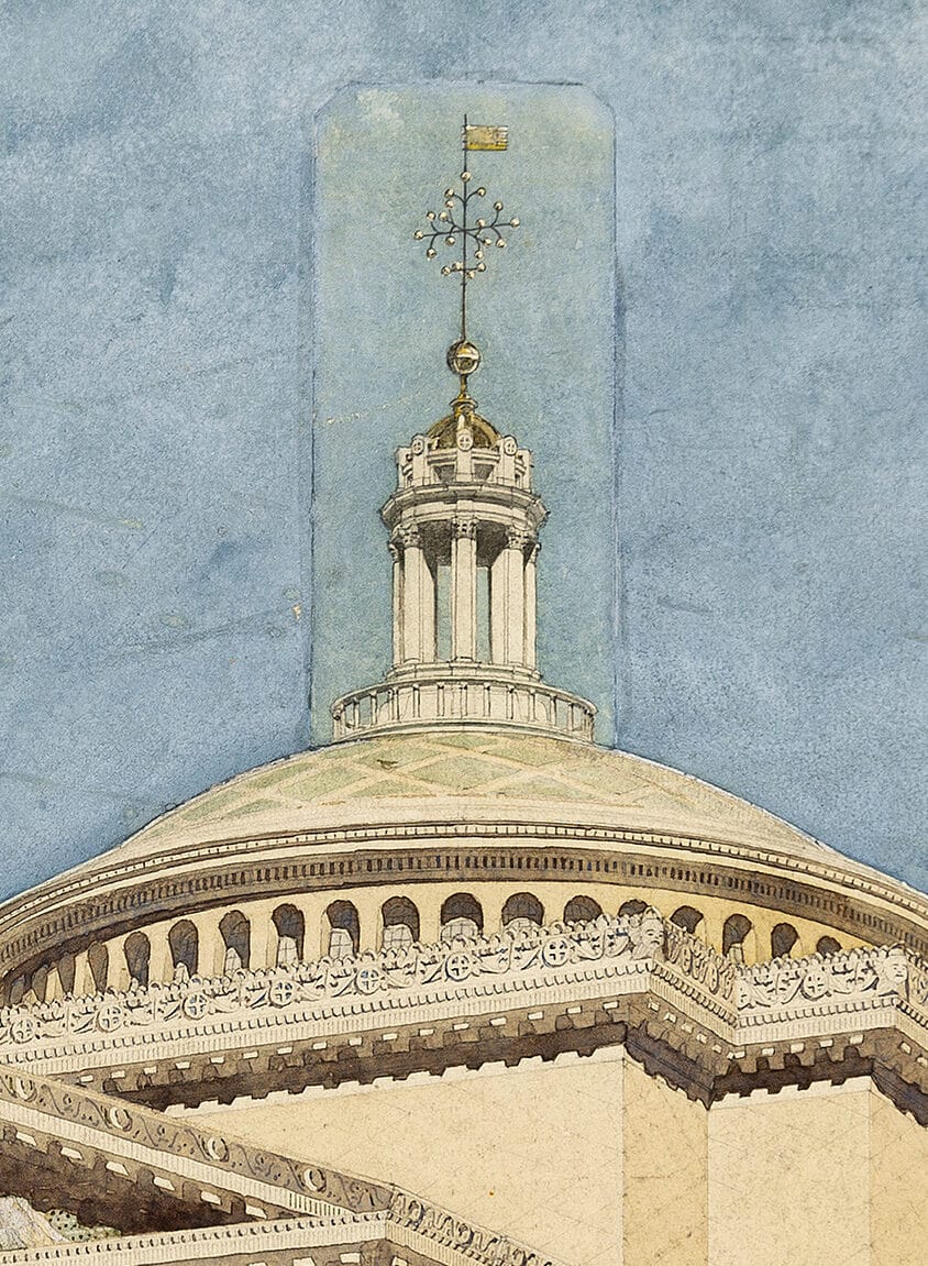
Which begs the question, what’s behind this little piece of paper? Hard to say without lifting it (not recommended!) or consulting the project files in McKim, Mead & White’s records at New-York Historical Society (something for after the pandemic). Still, we can make a guess or two! The most tempting is to imagine it somehow relates to the controversy surrounding the rooftop feature of another Stanford White building, Madison Square Garden, which like the church had also faced Madison Square (both buildings were demolished early in the twentieth century). The Garden, a vast entertainment centre completed in 1891 with several theatres and restaurants (including the one where White was famously murdered in 1906 by the husband of Evelyn Nesbit, a former mistress), was originally topped by a weathervane of the goddess Diana sculpted by Augustus Saint-Gaudens.
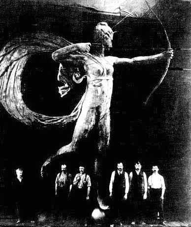
In addition to setting off great public controversy about nudity in art, real versus ideal, at 18 feet (5.5 meters) and 1,800 pounds (820 kilograms) the Diana sculpture was overwhelmingly large. So large in fact that White paid to have it replaced with a smaller version. Had he considered perching the original Diana on the dome of Madison Square Presbyterian Church? Unlikely of course. Or had Crow drawn it in as a practical office joke? Probably not. But the difficulties of the Garden’s rooftop feature may well have sensitised White and Crow to issues like appropriateness of scale and subject that could have led them, in combination with the challenges of the church’s towering neighbours, to make some last minute alterations to the lantern and finial in the rendering.
In response
Email from Neil Jackson to Horatio Joyce and Niall Hobhouse, 5 June 2021
Dear Horatio
I was interested to read your article on the Madison Square church in this morning’s mailing from Drawing Matter. You might think me quick off the mark, in which case you are right! But with the amount of e-mails that come in, I think that if one does not deal with them immediately, then they never get dealt with.
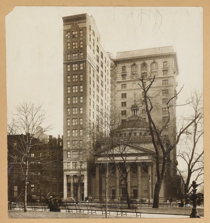
It is a very fine drawing by Jules Crow and it is intriguing to know what might be behind that pasted-on slip of paper. One way to find out would be to X-ray it, but I don’t know what Niall Hobhouse (copied in) would think of that. However, as you point out, the drawing gives no idea of context which, as the photo of the Pullman building shows, was very odd. I suppose it looked less odd when the surrounding buildings were completed, although it lasted only thirteen years before it was demolished to make way for another sktscraper.
I am not convinced by Christian Brinton’s argument, as you recount it, that White’s choice of the classical rather than the gothic style, traditionally used for churches, was to tie in with the surrounding buildings, built or projected. Comparing the diminutive distyle-in-antis portico of the Pullman building with the much larger hexastyle portico of the church would hardly suggest harmony. But, more than that, I think that he is wrong in assuming that the classical style is not for churches. Leland Roth discusses the choice of style on p.276 of his book on McK, M & W (1984) and cites White’s own observation that C18 American churches had been classical.
But I wonder if White was looking further afield. He often travelled to Europe and might well have known of the 1902 competition for the Liverpool Anglican Cathedral. After all, his ship from New York would have docked at Liverpool, then the second city of the Empire (some say). One entry, by the young Charles Reilly who was to become such a force in bring American Renaissance architecture to Britain, was in the classical style (see attachment). It was highly commended by judges (Norman Shaw and George Frederick Bodley) and subsequently exhibited at the Royal Academy in London in 1903 and the St Louis Exposition in 1904. Although it leans more towards Wren’s St Paul’s than, say, the Pantheon, which might be detected in the Madison Square church, it nevertheless broke the mould of building exclusively gothic churches (or, indeed, cathedrals). Reilly’s design, too, is surmounted by a lantern and, if not a finnial, a cross. Maybe a sighting of this design encouraged White to add the top-piece to the church. Another thought is that perhaps the lantern and finnial was added to distinguish the church from those other porticoed and domical designs by the firm which were intended for commercial purposes, such as the contemporaneous Bank of Montreal in Quebec (1902-05).
If I might make one correction to your otherwise enlightening article, Saint-Gauden’s statue of Diana did not, as you say, weight 820 grams. That is slighly less than a bag of flour. I think you meant 820 kilograms, which is about ten times my weight and a thousand times 820 grams!
Keep up the good work!
Best wishes
Neil
* * *
Email from Horatio Joyce to Neil Jackson and Niall Hobhouse, 5 June 2021
Dear Neil and Niall,
You are quick off the mark – and I love it! The DM email blasts are not to be missed, it’s a serious pleasure to be featured this week.
First, thank you for your correction re the statue’s weight. Embarrassing but sort of fun. I’ll see about getting that fixed!
As for the classical points, I see now how my account of C Brinton’s commentary is misleading. What he actually says is that the classical style is much better suited to this church because of how pathetic a gothic spire would look against the enormous neighbouring towers! It’s an excellent point. But is itself misleading and was almost certainly fed to him by McKim, Mead & White in one of the press releases they were in the habit of producing. As I think you’re getting at, MM&W’s commitment to classism ran much deeper than this. In fact, Charles McKim was causing a good bit of controversy around this time lobbying for the National Cathedral in Washington DC to be done in the classical style. (It was ultimately done in the Gothic R, mostly to the designs of English architect Henry Vaughan). Which makes the CH Reilly Liverpool comparison all the more fascinating – thank you for sending the image.
I hope you’ll both take a look at my forthcoming special journal issue on the American Renaissance for ‘Architectural History’ – where in my own introduction I offer some new perspectives on the Anglo-American and Reilly-MM&W discourse over classicism.
Once again, lovely and so helpful to have your response Neil. Hope you’re doing well on this glorious Saturday afternoon.
Best wishes to you both.
Horatio
