The Office Copier and Baptism by Colour: Working for Rossi in the 1990s
Aldo made this drawing when the Bonnefanten Museum in Maastricht was already realised. I would say that it is typical for the kind of drawing he would make when he was bored, done with the first pencil and sheet of paper to hand.
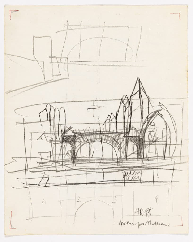
It is a drawing that already evokes the past in the sense that it does not contain the action of the project research. It is in some way self-celebrating: the new dome is added to Rossi’s historical panorama of the city, in which only the significant or salient buildings are drawn. It suggests that from now on his work is a part of history. This belongs more to the category of domestic, convivial designs. It is almost a still life, not of a painter, but of an architect.
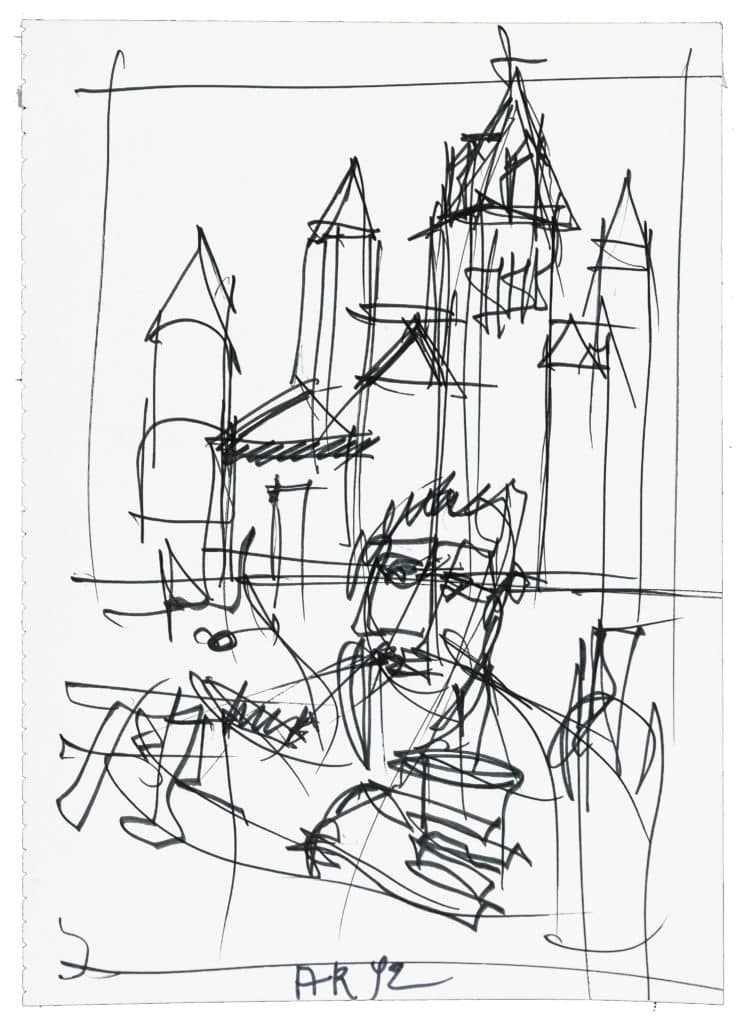
The Bonnefanten Museum was defined in all its architecture in 1990, and construction took place from 1992–94. This drawing, unlike the previous one, was made at the beginning of construction and presumably in Maastricht. In this self-portrait it is as if Aldo is saying, ‘Here I am, I am the protagonist who will make this pharaonic work!’
But it is not a narcissistic drawing, because in reality he was uncertain whether the site, his choices of materials, the construction details and the totality of the work would be realised as he had envisioned. It is a bit like taking a photograph of an actor while they perform on the set. They are committed to giving their best, and yet they cannot be certain that the film will be beautiful and go down in the history of cinema. And so, unlike the previous drawing, this one is particularly dynamic.
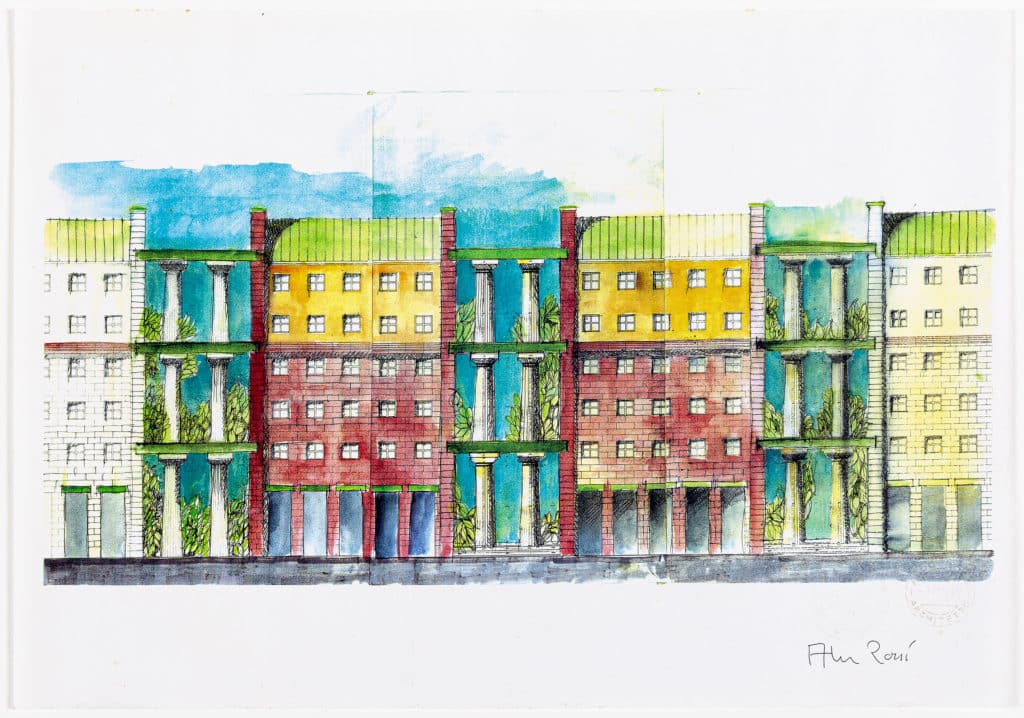
In the early 1990s there were good black and white photocopiers, meaning the copies were beautiful and precise – and above all, the lines remained perfectly crisp. It was expensive to have a photocopier where the optical component was not disrupted. This was important because a good copier allowed us to photocopy part of the elevation however many times, cut and sew the same part of the elevation and then make a single long, repetitive elevation that was perfectly aligned, as if it had been designed all at once.
A parallel to this is a musical one. For example, the technology back then made it possible to record a drum pattern, repeat it four times and insert a crash at the beginning of every four bars. Suddenly there was a background rhythm on which to set a melody. Let’s say that on the drawing, the original elevation was assembled as the bass. Aldo then added the colours – the melody. This design is a photocopy of the original, but the peculiarity is that it was photocopied at a time when only the Canon colour copier existed, which had the defect of eating 4mm of frame around the original sheet – but in return, the colours were livelier and much more beautiful than the original. From there, hence the spasmodic use of the Canon by the studio.
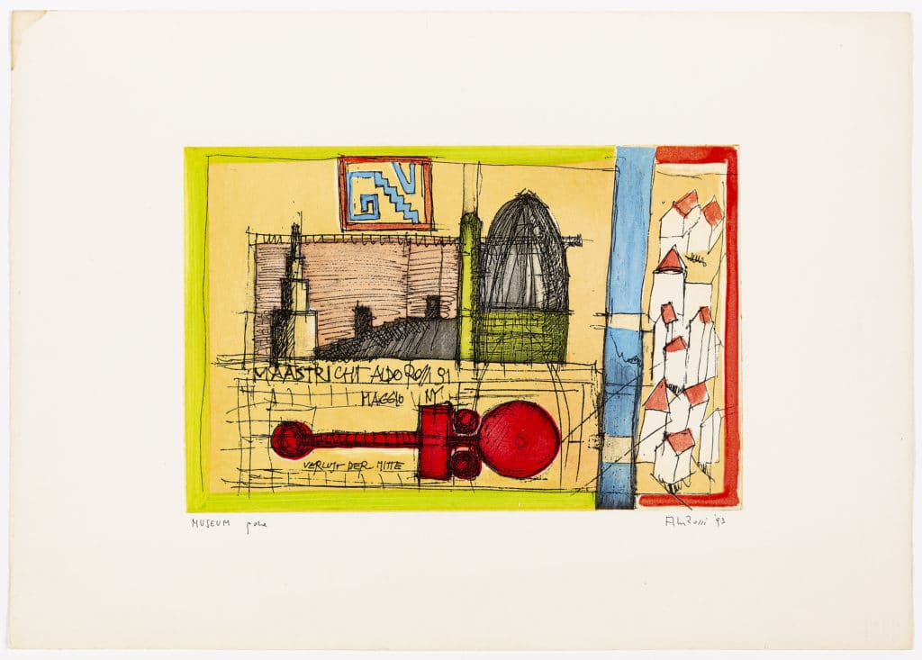
Aldo really liked antique architecture prints, and he liked to enter the history of architecture through these drawings. While designers of the past would have depicted the architecture of others, Aldo’s prints depicted his own architecture. All designs for prints, etchings or posters were produced to mark occasions. In the Germanic tradition, a coin or a commemorative object is printed on completion of a building’s roof as a sign that the construction is in its final stages. This print was produced towards the end of the Maastricht museum‘s construction. Perhaps also, by tradition, it was a good omen.
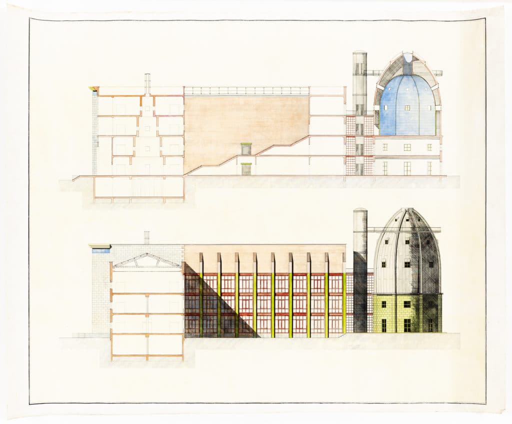
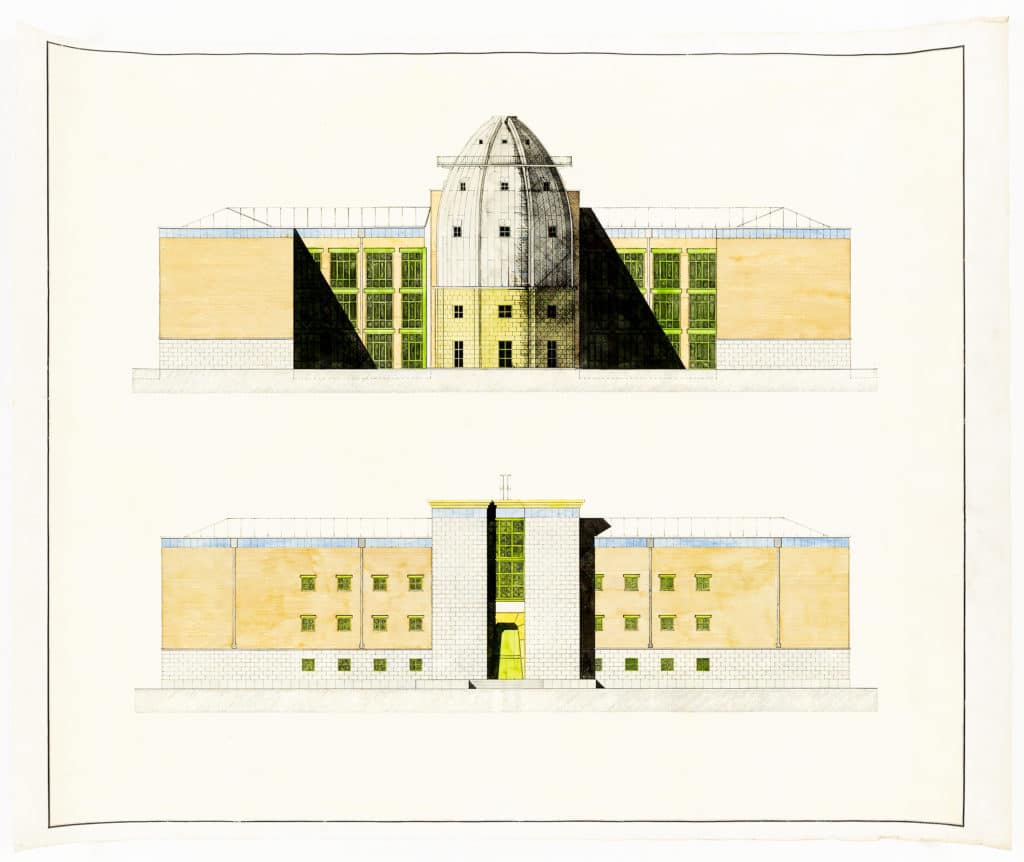
For Aldo this pair of drawings should never have survived the bin. They are colour proofs of the same drawings found in the various books. The definitive originals, with the right colours, are in the Bonnefanten Museum. The interesting thing about these is the production process. They are rigorously designed, technical drawings, produced not on the classic drawing boards but on American tables on which a long parallel line (as long as the table) runs from top to bottom. The vertical parts were drawn by the team using Indian felt-tip pens on glossy paper. When the drawing was finished, it was printed on Canson watercolour paper in the copy shop – to whom we were directly supplying rolls of the paper!
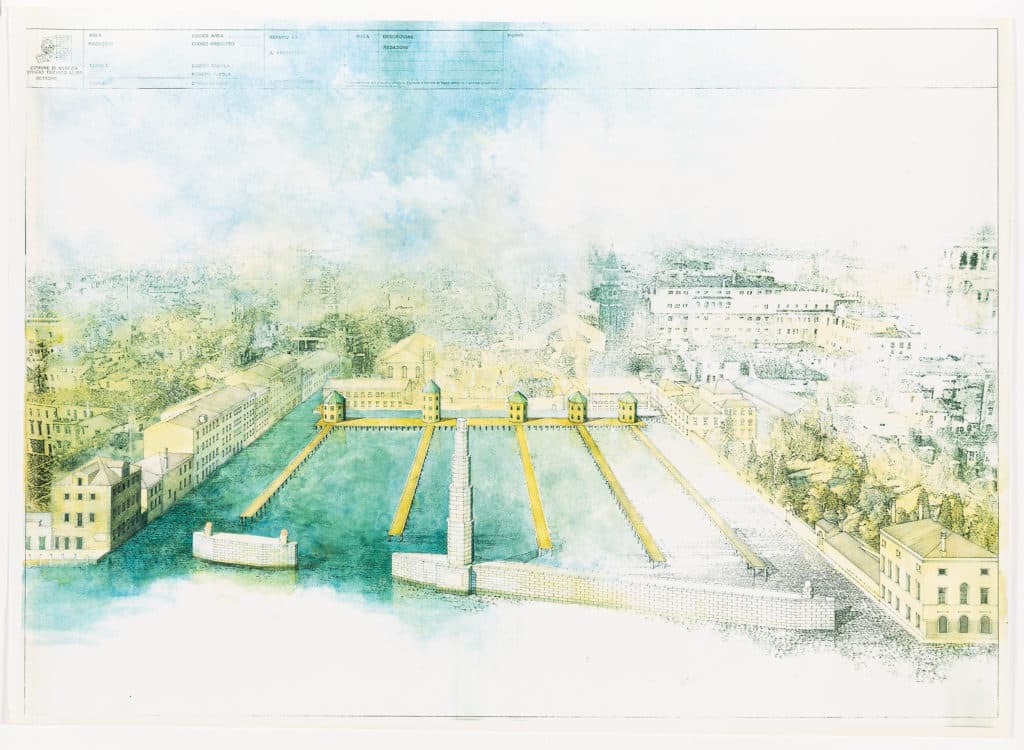
The technique used above is the same as the two previous technical drawings of the Bonnefanten Museum. The base is a black-and-white perspective drawn with line and square on glossy paper. A heliocopy was then made on Canson paper. Then photos of perspectives or ancient views of the surrounding city panorama were photocopied on transparent paper. This material was photocopied again, on its negative side, onto plain paper. Thus the symmetrical (not the real) part of the urban landscape appeared on plain paper. This paper was juxtaposed against the Canson paper drawing. The back was rubbed with a rag soaked with trichlorethylene, which released a print on the drawing. Everything was then filled in with watercolour.
What you see is a large colour photocopy of the original design with the colour Canon copier of the time. These copies were expensive to make, and we were therefore limited to a maximum of two or three.
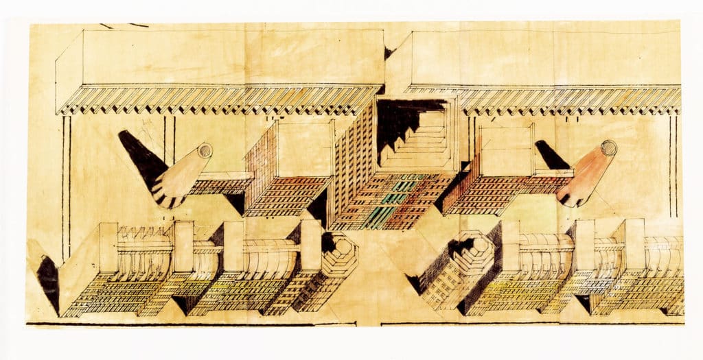
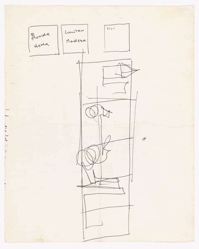
This was one of the earlier ideas for the Walt Disney Company project in Orlando, whose actual realisation is much more comic. Aldo drew an axonometric in black and white, which was then printed on thick paper, coloured and soaked in linseed oil (by one of the carpenters) and left to dry for a few days, suggesting an aged design.

The technique of this drawing is the same as that of the Darsena in Venice. It is again a Canon photocopy, but because the drawing was too long for the Canon machine, it is mounted in two pieces. The perspectives were designed by Marc Kocher (the best designers came from Zurich). Marc had just over two weeks to produce the drawing, and he spent the first ten days watching the drawing board, flipping through photos and drawings about the city of Maastricht and planting nails here and there on the inclined table to guess the vanishing points. We teased him every day and asked what he was doing. In reality the most difficult thing was defining the two correct vanishing points on the right and on the left that would highlight the project’s grandeur. This also had to be compatible with the images he had found to print them with trichlorethylene in a manner consistent with perspective. Aldo laughed and didn’t worry because he was always certain of his work. A few days before delivery, Marc meticulously coloured all day and night. Aldo then baptised everything with some smoked watercolour and we all thought, ‘Hell, he’s getting his drawing dirty!’
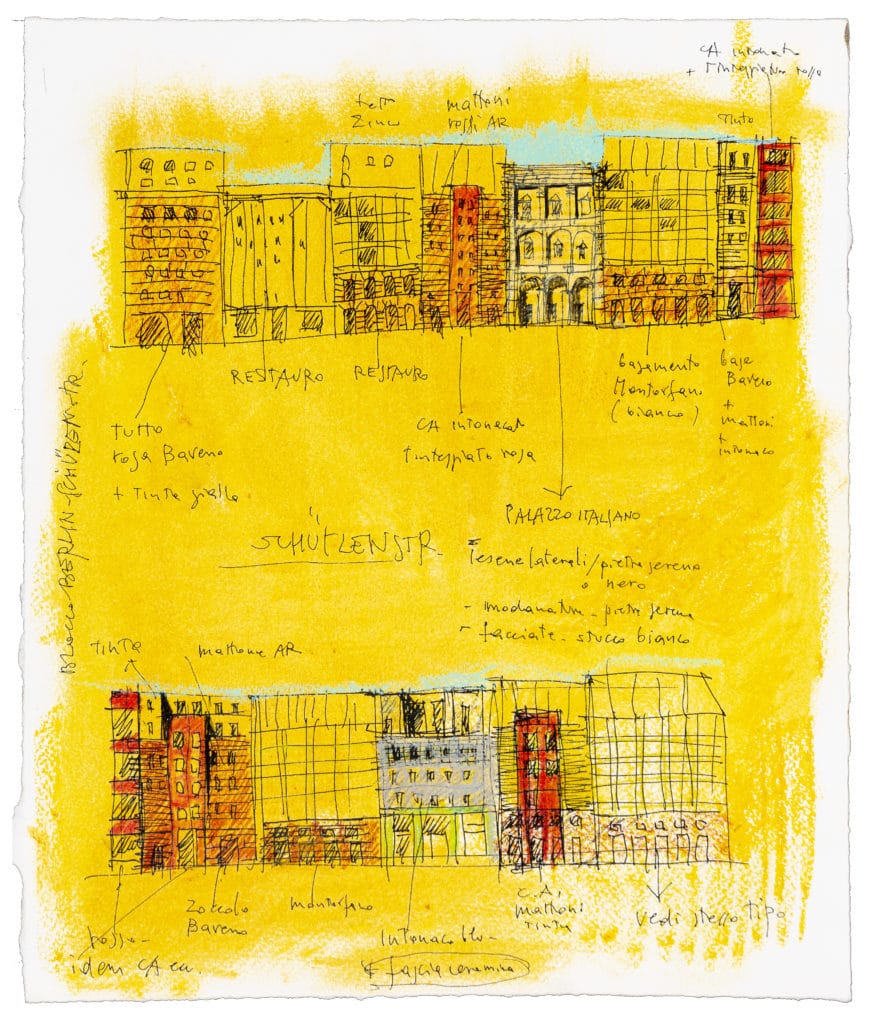
Aldo’s character was so incisive, and the whole studio team was so young that he could have been our father. Historical collaborators such as Massimo Scheurer therefore grew under his influence in their way of drawing, photocopying, retouching. This is a classic Aldo Rossi not designed by Aldo Rossi.
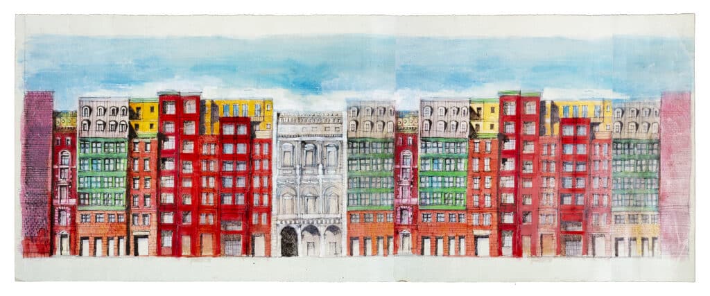
This stuff hung for months in the office. A colour photocopy of a drawing by Aldo was juxtaposed on Canson paper. Let’s say it was part of the constructive disorder of the current project.

Aldo would leave instructions for how to paint technical drawings. These look like basic colours, but in reality they are classics of his own making. I don’t remember if he was leaving for a business trip when he made this, but I seem to think he had done his work and was ready for a drink. It is as if he said: ‘Now it’s up to you workers! I’ve done my part of the job.’
