Aldo Rossi
In the spring of 1979 John Hejduk invited Aldo Rossi to teach at Cooper Union. I’m not certain when he met Rossi, but Rossi was crucial, I would say, to John’s last major shift in his work. He saw something in Rossi’s analogical project that would allow him to transition from his purist work, which he was doing in relation to Bob Slutzky and others, to his metaphysical late projects. That is my intuition as to why he wanted Rossi. He invited him originally to teach the thesis group, but John was unhappy with their work so he shifted Rossi to the third-year studio, where I happened to be. So it was really a chance thing. It was Rossi’s second trip to America at that time, and travel abroad was still a big deal. To be international was more significant for architects then than it is today. I think Rossi was also trying to find an analogous architecture in America, to extend his own project. So he assigned us Thomas Jefferson’s Academical Village because it was fundamentally a European Enlightenment vision about an architecture that would form the new American; more an idea than a thing. We were to do a new version or interpretation of the Academical Village on any site we wanted.
My first talk with Rossi, however, was not about architecture. He came by and saw two models on my desk, a Battle of Britain tableau with a German Heinkel being closely pursued by a Spitfire. I’d done model-making since I was four. Anyway, I and my friend John Nambu were always building models, and had the two highly detailed – I mean really very carefully detailed – models on the desk.
Rossi came by and was immediately attracted to the scene and the detail: the German aircraft kits had complete markings including swastikas, and the paintwork on the Heinkel entailed precisely applied splinter camouflage in 1940 RLM colours. It was all really precise realism, which was part of the discussion I had with Rossi. First he admired the two aircraft – he loved the duck egg underside of the Spitfire – and then started talking about his favourite Italian bomber from the period, which was the Savoia Marchetti. He said it was unlikely they ever operated over the British Isles but that they did account for a lot of British shipping in the Mediterranean. The plane was nicknamed ‘the hunchback’.
Hejduk came by and had more of an aesthetic reaction to the whole thing. Overall, he admired the form and camouflage patterns on both planes, the colours and so forth. Rossi and I then got into a discussion of realism and atmospheric perspective: since model planes are miniatures you could never use the actual colours. To make them look real you needed to add atmosphere, which meant lightening the colour, thereby making them look like scaled things seen from a distance – not toys. It was an issue of realism, which was a part of his ideological position.
And then Slutzky came by, didn’t look at the Spitfire, looked only at the Heinkel and, while he was impressed with it, indicated that it was also a clear sign of where the school was going: there was a common misperception that associated Rossi’s work with fascism. I am not entirely convinced Slutzky actually held this view or if his quip simply reflected his anger and dismay that his and Hejduk’s projects were diverging, and that Rossi was somehow implicated.
So the Battle of Britain tableau was a flashpoint. My later conversations with Rossi shifted to the question of how to find a model in America. I found an indirect route to the model question in relation to the Academical Village through painting. We were talking about Edward Hopper (this is discussed in the Scientific Autobiography): I was interested in Hopper, had done copies of his paintings in high school. He grew up in Nyack, across the river from where I grew up, and his work resonated with me. There was something about the everyday subject matter, but there was also something really interesting in that the major oils – this is something I did discuss with Rossi – were never, or very rarely, of actual places. The watercolours were, but the major oils were composites and distillations of a lot of different locations, so they appear to be everywhere and nowhere. There is a strange quality to them; everybody is convinced they know, for example, where Nighthawks was, but in fact it’s nowhere. It is similar to the film Eraserhead. Everybody is convinced that they know where it is – Baltimore, Detroit, Cincinnati – but it was filmed, confected, in Los Angeles, which is the opposite of what one would expect. It was a really distilled realism in Hopper – a realism of no-place, an unreal realism. Detail was strategically removed. It wasn’t really classical, but at the same time, it was not really avant-garde. Rossi was always very ambivalent about the avant-garde himself. Hopper resonated with a modern sensibility while being a realist – resonated even with the abstract painters: the only realist that Rothko tolerated was Hopper, because of the compositional and painterly structure of his canvases. Ultimately Hopper’s genius lay in the fact that once you saw one of his paintings the whole world started to look like a Hopper painting. This of course was not lost on Rossi. And really this discussion about Hopper, and the work I did afterward, was derived from that.
My third-year project was well received, so Rossi invited me and Frank Gerard, who was also in the class, to intern over the summer. It was a very small office – a total of only six or seven people – in a bourgeois apartment in Milan. It was actually not even an office, but more a case of desks set up in a domestic space – Via Maddalena Uno. He sat in the living room and worked on a big wooden board on trestles. He had a manual American typewriter, either an Underwood or a Remington – not an Olivetti, which was important to his position vis-a-vis design in Milan: it was a room with nothing to suggest high design.
He would spend the morning writing – he had a very structured day – and then look at projects in the afternoon, and then spend one day a week drawing on his own, maybe on the weekend. He would do two things: either hand drawing, or he would have film positives of drafted drawings that he would run through the blueprint machine and on which he would then use oil pastels and something called triolina – a solvent that would melt the pastel to produce more painterly effects and tints. He would apply this solvent with a rag, so he could either build up the surfaces manually and keep the strokes, or dissolve the strokes with the rag and produce washes. His drawings, then, fell into two rough categories: completely free-hand drawings and illuminated blueprints.
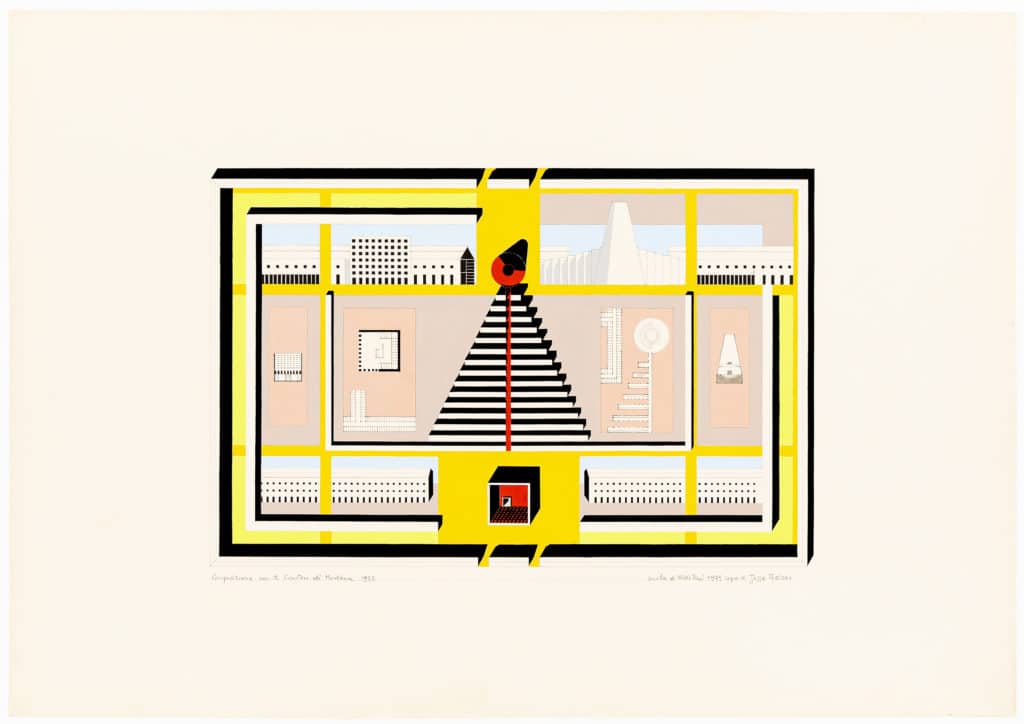
He wanted me because he liked the drawings I did at Cooper, and he had an idea: the drawings I would do that summer would be the beginning of a whole new portfolio. (I was supposed to keep doing them even when I got back to the States, and I never did. I only did a few.) It was not about the design of the Modena Cemetery. That had been done in 1972. This was about Rossi creating a school – in two senses: connecting to the old school’s painting, but also helping to move his architecture out of the Italian scene. It was part, I think, of his ambition to internationalise his project. It also connected to the Academical Village idea. It was part of the analogical architecture project, I think – or this is what I am projecting onto it.
He gave me one of the large film positives of Modena that he used to run blueprints from. In retrospect, it’s actually really sad what I did: to transfer the drawing I put the film directly on the Arches paper, then used a pin to produce points, and then connected the points in pencil. There was nothing created by me. It was a transfer of an existing drawing and using the film was a practical expedient. The blueprints were large, but he wanted everything I did to be on rag paper so the film positive scaled it down to fit the dimensions of the paper. I basically ruined the film: I was taking pins and pushing them through it. It was a brutal and direct transfer of the drawing and it made the film useless to run future blueprints from. I still feel guilty about it. I was 21 years old and otherwise a very dutiful student. I was carefully looking at the other iterations of the Modena Cemetery and I was going to base the colouration on what I saw in those previous iterations, of which there were many. But he had something really specific in mind about what the colours would be.
He took me to the art supply store and he was pulling gouache tubes out and I was completely shocked because they didn’t match the other drawings of Modena in terms of colouration or palette. It was a strange combination of colours that I was convinced wouldn’t work. It was a mixture of beiges and tans in the background. This was a drawing for America, that is how I saw it. This was a way of being specific yet general enough to transcend site or place, sort of like the Hopper. Then he would have a strange abstraction of what he saw as local colour, a weird mixture. He had what seemed to be combinations from Good Housekeeping or Ladies Home Journal, or like in the Birdcage restaurant at Lord and Taylor. I mean, you would see this palette in what were then called ‘restaurants for ladies’, which, ironically, were an attempt by American designers to be European in a tasteful way – or what they thought was European.
He had his signature red, which was basically unchanged, then cadmium and then black. And then he pulled out – this was really the surprising part – these intense day-glo yellow-greens, which were more like the blacklight posters that my sister had up on her wall from the 60s. Or Peter Max, or Pop. So it was this incredible, counterintuitive palette that he wanted for the drawing. I was totally flabbergasted – but I went along, of course. I was convinced it wasn’t going to work, but it did. It worked really, really well.
I did the pencil transfer and then he would come by every day and we would do tests – fare una testa, fare una testa – so it was constant. Colour location wasn’t completely preordained. We would do tests on samples to locate the colours and where they should be. All the colours were to be applied straight from the tube. No mixing. Totally flat graphics like silkscreen. It was important to him, obviously: it took a long time to do drawings, so he invested a lot of effort into every one, taking me to the store and also monitoring the progress. And when he finally signed it, it was: ‘School of Aldo Rossi, drawn by Jesse Reiser’.
It relates to classicism. It had a universality, or was attempting a kind of universality, which would be the counter to that of the modern movement. It was a cosmopolitan project different from that of modernism or the International Style of Johnson and Hitchcock – he was always ambivalent about both. But he had to somehow move his model from Italy and he did this with colour. There is an ideality to the drawing, but then it’s localised in terms of colour. Rossi, like one of his favourite writers, Borges, always went back to language, even in relation to colour. Recalling Borges’ essay ‘The Argentine Writer and Tradition’, there is a famous argument which goes something like this: No camels are mentioned in the Koran, which is proof of its authenticity – the camel being too ubiquitous to mention. Only a regionalist, one who consciously resorts to local colour, would commit that error. Rossi’s fictive palette swerves around that problem, being contradictory, everywhere and nowhere, authentically inauthentic – essentially American. He didn’t think I was an American because I was a Jewish New Yorker. The real Americans were Texans. I was too tragic and cosmopolitan in background. When he went to Texas: ‘These are real Americans’. The colour choices were totally improbable – how could you get all those colours to work? – and there was no precedent for it in the office.
