The Over Under: Drawing as process
The Over Under series is a look at drawing as process, but in this instance, not the process of designing a building or object, but rather an amplification and deepening of the reality we encounter. Reality here begins with a place but has since transformed into working and imagining through the drawings themselves, the origins of which are a poignant but distant memory by now. My interest in the depths and interplay of its composition and meaning continue to enchant. Presented here are four iterations: the original graphite on Bristol, an ink on Denril paper overlay, a combined graphite and ink composition with digital manipulations and finally a more recent pen sketch contemplating the advance and display of nature. This sequence is not a means to an end but rather a means to further provoke imagination and ideas through drawing.
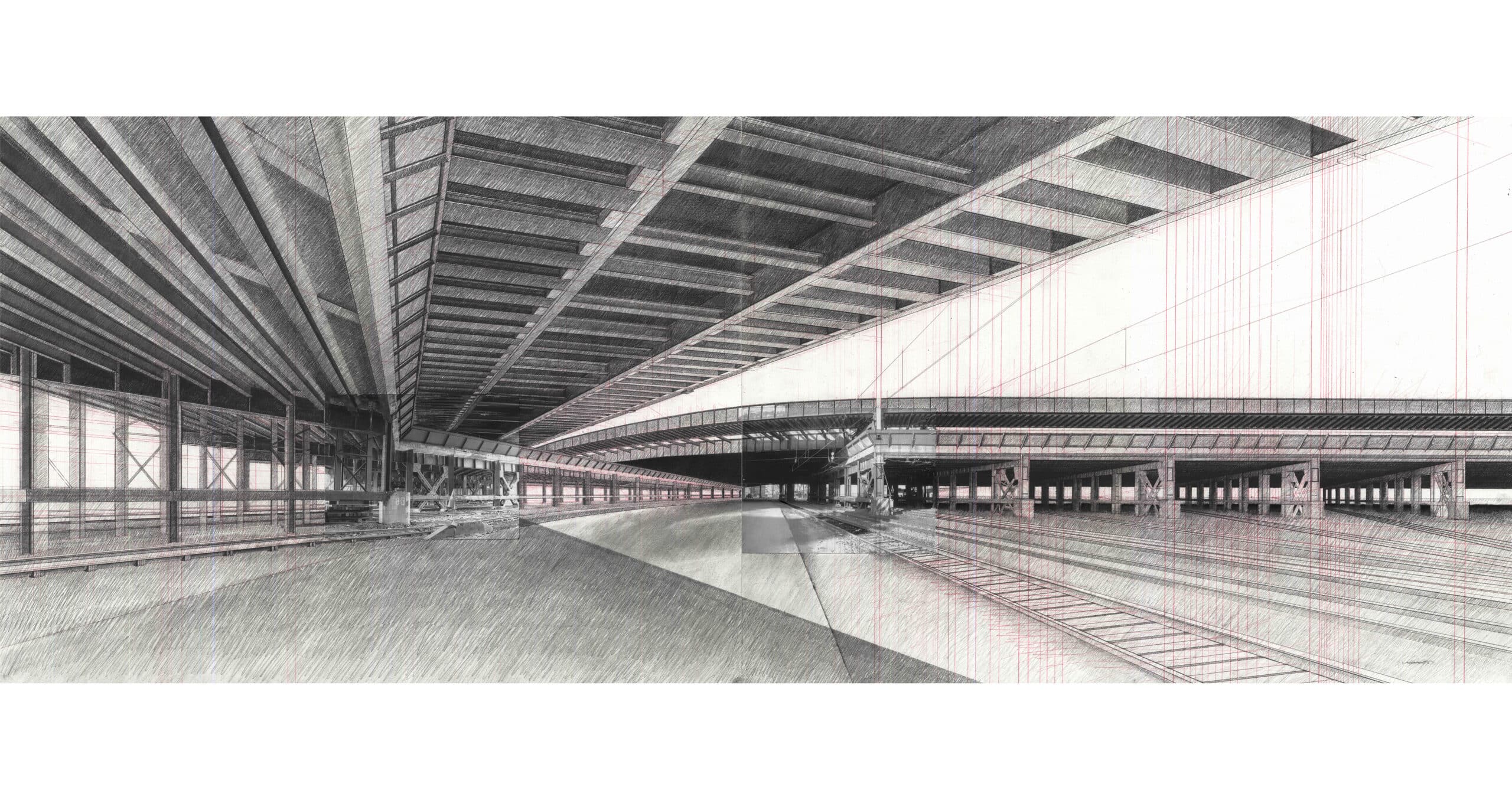
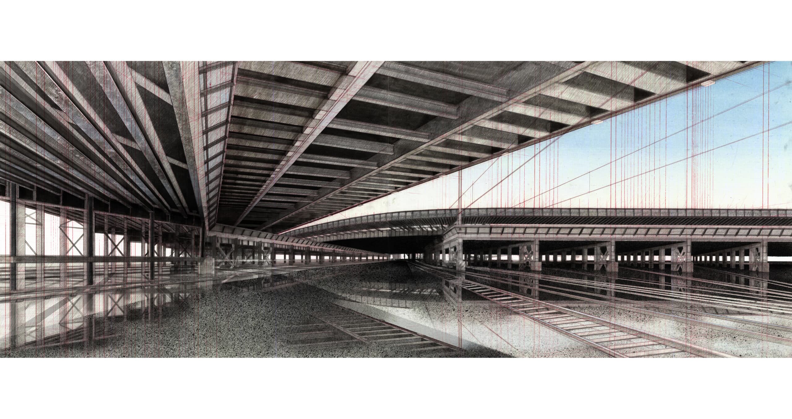
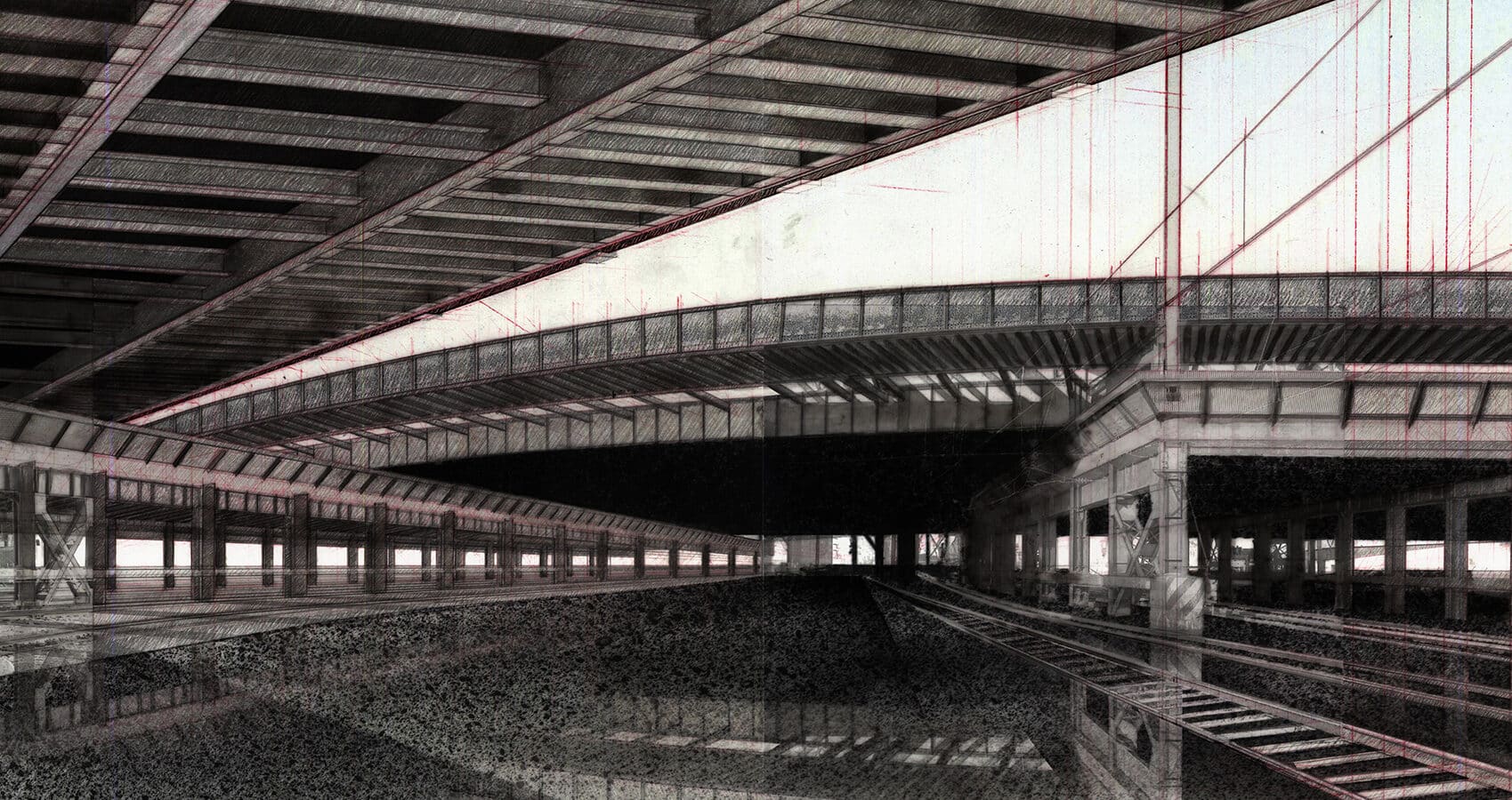
The Over Under series derives its name primarily from the overlapping elements at its focal point. One linear element of rail infrastructure makes an abrupt turn and tucks under a curvilinear bridge as it accelerates towards the horizon. The ‘Over’ element completes its slow bending turn and reveals a nested sequence of bays beneath. Three of the four bays follow the same perspectival relationship at which point the fourth pivots slightly inward, an anomaly of experimentation for better or worse. The name is also a nod to the iterative process of under-lay and working over the top of previous drawings, both physically and digitally. Beyond the affiliations to compositional form and method, the sequence lends me its name at times as a quasi-philosophical outlook at the cyclical nature of things. What is over could very well be under and what lies below has not necessarily surrendered.
The first three in this series of four drawings were completed as part of a famed drawing course at the University of Pennsylvania taught by the Architect Marion Weiss. The experience began as a photography exercise at 30th Street Station in Philadelphia, Pennsylvania. I recall with clarity a cold and damp January day, an alertness to all my senses as I watchfully walked the under croft and extremities of the rail yard. The crushing gravel underfoot, the wet cold, the oscillation between still silence and the weight and grind of trains across the steel rails. This parallel dimension stood in stark contrast to the thriving transport hub and platforms above with constant movement, chatter and colour. My reflections of this day arise the same cautious sensation that came with avoiding eye-contact as I discretely carried a camera, photographing unremarkable corners and junctures of transport infrastructure in a post 9-11 America. With these photographs I had hoped to find the seeds of growth for the work to come, a synthesis that would generate an entirely new composition, a step beyond this place I had just been.
The photographs were trialled in pairs in a search for possible formations, a desired chemistry of connection, juxtaposition and extension. Quick gestures were created to test their compatibility on two adjoined pieces of Strathmore 500 Series Bristol. Lines were extended and rhythms deployed using a Prismacolor Carmine Red Pencil, the linework and colour of which finds its way through all iterations of the sequence. The red linework requires a closer look and at a casual glance almost appears as a soft uniform background colour. It has practical and artistic qualities, distinctive in its aesthetic and essential to the process and its memory.
Drawing represents who we are in the sense that it captures the movements of our body. With calm comes a steady hand. Fatigue or anxiety bring disturbance revealed in jogs interrupting the flow of an otherwise continuous line. Following the course set out in Crimson Red, the primary formation of the sequence was conceived in graphite of varying line weights. Depth and shadow are derived through a hatching technique that was used with confidence after endless hours of practice, as an athlete might warm up with drills before a match.
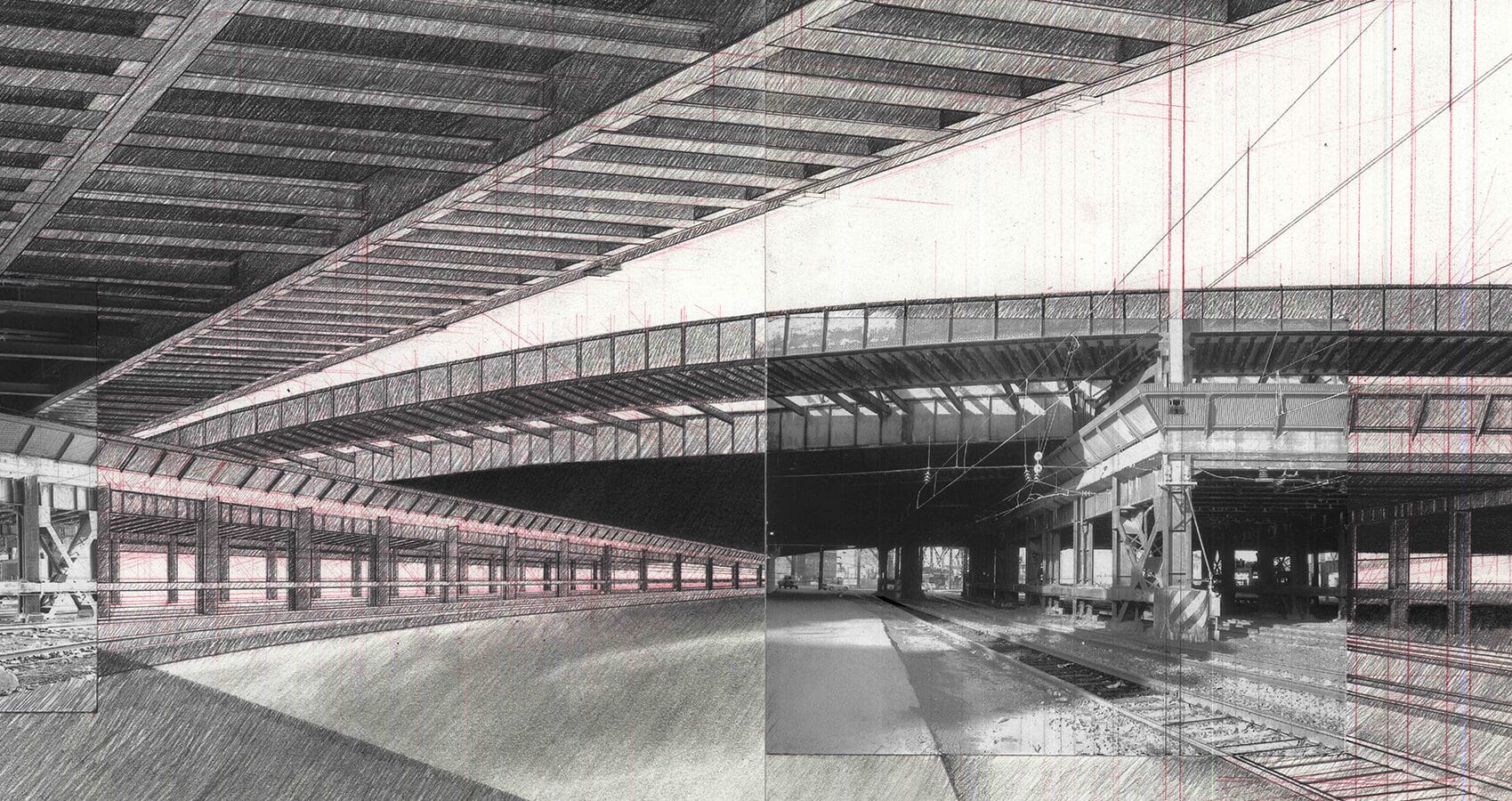
With the pencil works sufficiently advanced, the drawing was reconstituted using Higgins Waterproof Black India ink on Denril paper placed over the top of the previous illustration. The only lines drawn at this stage where those of the recurring Carmine Red and light graphite to capture the essence of the composition. Ink was worked through brush strokes across the upper regions of the drawing. The ground plane and areas in need of the deepest black were cautiously marked out with masking tape and saturated until black or speckled with a brush to achieve splatter patterns of varying intensity, delivering a new found texture to the sequence, an intimation of that cold gravel underfoot. Ink as a liquid medium is loose and free, yet permanent. Mistakes become absorbed into its history. Boundaries are permitted to blur so long as the composition is in harmony. At this stage, the story of the sequence grabs a new thread, a thread of softened imprecision, texture and depth of black, an evolution of process with echoes of a place, yet entirely redefined.
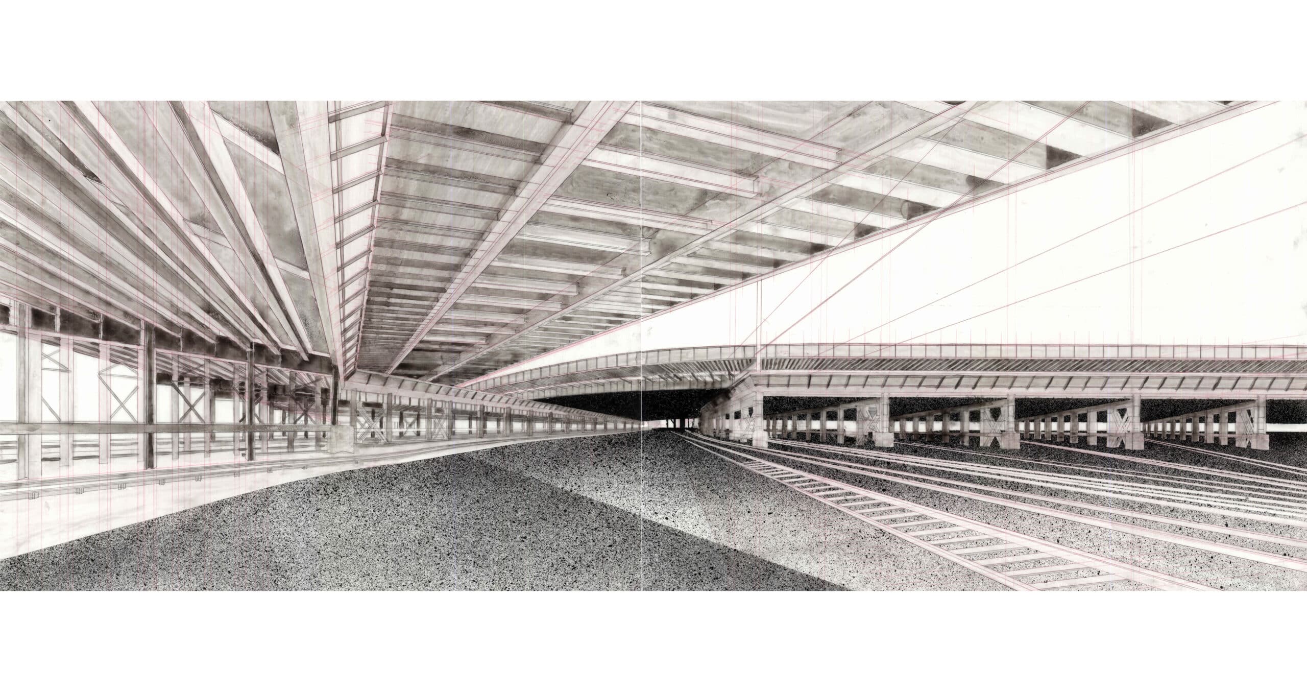
I recall with excitement, the experience of digitally overlaying high resolution scans of the ink and graphite depictions, and that instant feeling of fulfilment at the depth and richness generated by these two different representations simply placed one on top of the other in a digital environment. As analogue tools of process often teach us, sometimes the simplest moves have the greatest impact. Such is true with digital techniques. Digital tools allow us to quickly expand on analogue creations, achieve further depth, contrast and embellishment. Watercolour swatches of oranges, yellows and blues were trialled as background and the ground plane was manipulated to introduce reflection and a sense of wetness. The digital environment also allowed for a change in scale and experience. A high-resolution print nine feet in length was displayed in a gallery and at proximity, you could almost feel within it, amongst the imperfections, rhythms and atmosphere.
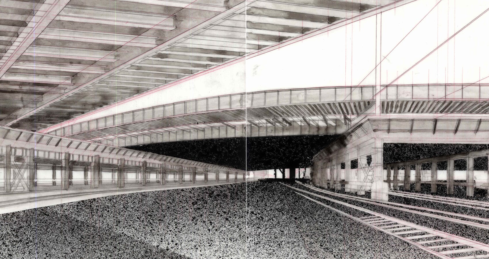
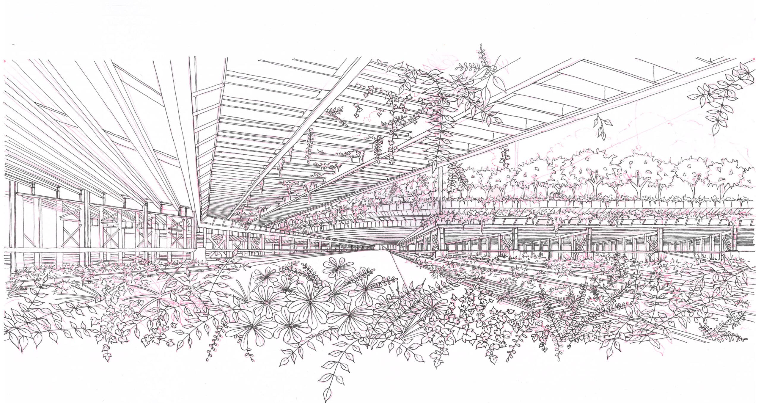
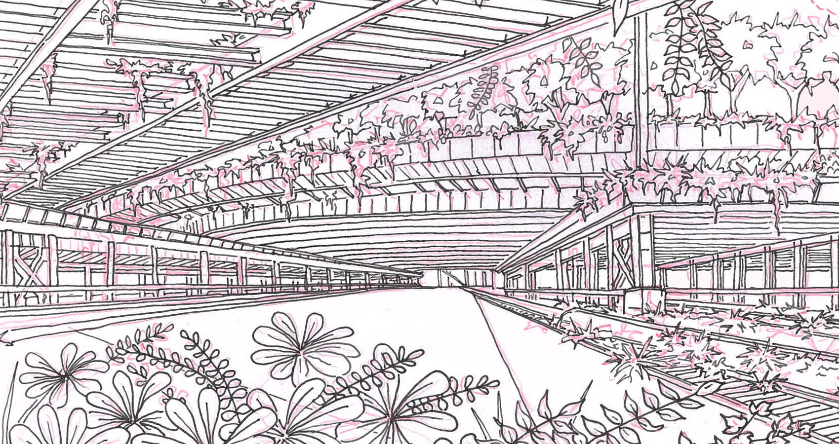
Working back from the increasingly large scale of the sequence and the necessity of tools such as straight edges, masking and photoshop, the latest and most recent contemplation in the series is a pen sketch. This version of the work contemplates something unforeseen in previous variations, the growth and dominance of nature in the places we let rest. A further overlay on the exacting rhythms and linearity but in this experience, verdant life thrives and cascades off ledges and drops through a re-imagined trellis of steel rail infrastructure moving up and beyond the frame.
Emanating from an experience of place, walking, seeing and feeling, these drawings have evolved into an ongoing conversation. Drawing, after all, is one of the most basic tools we use to communicate, and what a privilege it is to be able to see, gesture and inform. As I walked those interstices of transport all those years ago, in that subsidiary environment between arrivals, departures and the journey itself, below the presence of humanity and behind the scenes, I could not have imagined that one day what lay centre stage could all come to a burdened halt. Yet paradoxically when humanity ceases, nature surges and flourishes. What then would any such place look and feel like in escape of our presence? Drawings can take us part of the way. Imagining through this sequential process has been but one method of telling a story and making sense of the things that might not have seemed sensical, now with more clues than ever from reality to inform the way ahead.
Peter William Rae is an Architect currently based in Madrid, Spain.
This text was entered into the 2020 Drawing Matter Writing Prize. Click here to read the winning texts and more writing that was particularly enjoyed by the prize judges.
