Stan Allen’s Situated Objects (2020): Review & Excerpt
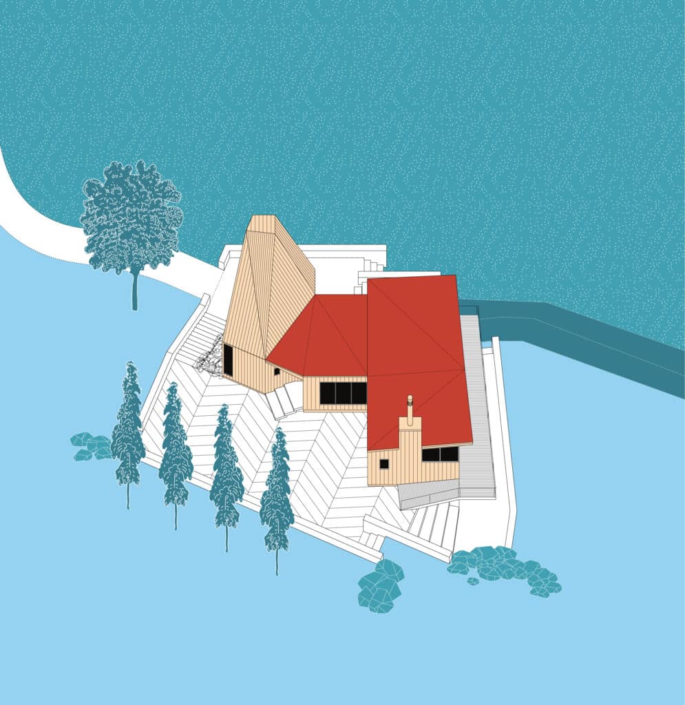
Review
Three times a week a package arrives in Somerset with another Practice Monograph, and the generous proposal that we might want to add it to the library at Drawing Matter. This is clearly an old story – somewhere we have a copy of one of John Soane’s endless books about his own house; on the flyleaf a later bookseller has written in pencil: Very Rare: not inscribed by Author.
We have often been tempted to put out a call to the architectural community, for ideas about how to transform all these architectural books, better left unpublished, into the fabric of an actual building. The topping-off of this grand new building would have coincided with the announcement of a new award to the best recently-published book by an architect about their own work – both for it’s contribution to architectural knowledge and to the narrow genre of the monograph.
This year, the clear winner would have been Stan Allen’s Situated Objects. It is far less thankless to list what he gets right, than what the others get wrong elsewhere.
The rules are simple, if not always easy to follow. Pick your publishers because you admire their imprint and respect their editorial advice. Concentrate, if you can, on a body of your work which sustains a coherent narrative. Work with a single photographer chosen for familiarity with context, and get her or him to photograph all the buildings afresh; black and white is fine, if not preferrable – and as long as the buildings can tolerate it. Hold your designers close, telling them they may take as long as they need – but that the book must look as though they did it all in an afternoon. Write the Introduction yourself, and choose your other contributors for their critical stance not for their loyalty. If possible, find writers who are outside the narrower discipline, or can come new to your work; they will surprise your readers if they are surprised themselves, and everything is more interesting if seen first in vision that is, somehow, peripheral. Be clear that the book is about defining your own approach, and contribution, to architecture; do this without risking large claims about scope and ambition – careful self-reflection is an alien concept to many architects.
All this, Allen, with his collaborators, manage without once looking back. Where he excels is in being clear that the book is also for reading. So, press forward only when you are clear that you have something to say, which might challenge others in – or around – the profession to think differently about what they do. Again, do this without trying to change the world, but as a simple account of how exactly you have learnt to approach any new project, and always with the sense that your text remains a personal enquiry, shared here with some diffidence.
Of course, the hardest truth is that Allen also has something serious and thoughtful to tell us. His architecture is wrought, in the best sense, out of constraints that are self-imposed, through long reflection on history, context or materials. He is never better than when writing about the limitations of architectural aspiration, about the narrowness of a brief and the duty to site, or about the fascination of standard materials and construction techniques.
Or, indeed, about the elusive frontier between drawings and buildings.
Allen’s essay on the meaning and force of the axonometric is dressed like an afterthought within his monograph, but it succeeds as a quiet manifesto for the work of an architect who, more even than his recent buildings, is himself convincingly situated – and not only in the Hudson River Valley, but at John Hejduk’s Cooper Union, or at Princeton where he was Dean until 2012, or in the work of the other cerebral masters he admires. A sense of personal identity is a condition of making good architecture; what emerges in his thoughtful text is a belief that it is always the product of ideas that have first to be inherited, and then transformed. And it is not just by building; drawing and writing each offer a medium in which this can happen, and the good architect must move freely between all three.
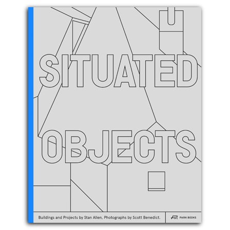
Situated Objects is published by Park Books, and is available here. It includes photographs by Scott Benedict, and essays by Jesús Vassallo and Helen Thomas.
Niall Hobhouse is Director of Drawing Matter.
Excerpt: Explaining by Drawing: In Axonometric
“The plan determines everything; it is the decisive moment.”
Le Corbusier, Toward an Architecture (1923)
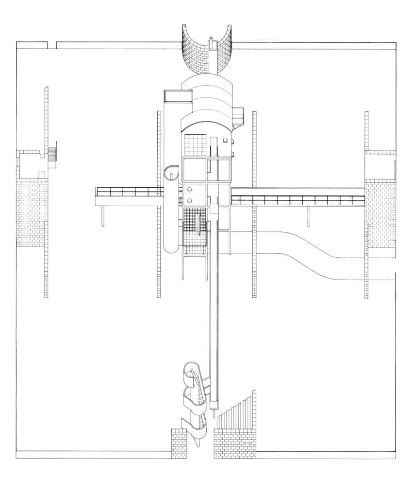
There are many forms of axonometric, but the simplest to construct is a vertical projection from a rotated plan. This means that the plan geometries are preserved, while the elevations are skewed, maintaining dimensional consistency on an angled plane. The building is presented as an object, floating in abstract, measurable space. The viewer and vanishing point are both located at an infinite distance. But axonometrics have a pictorial quality, too, approximating the appearance of the building and faithfully describing the internal relationships of the parts. The axonometric is a utilitarian drawing, explaining form and assembly, clearly and concisely.
In a 90-degree (or zero-degree) axonometric, the plan is square to the plane of projection. If the power of the axonometric is to combine in one drawing the measurability of orthographic projection with the pictorial character of perspective, the 90-degree axonometric complicates and challenges the descriptive character of the axonometric. It produces an oddly flattened figure on the page, sometimes difficult to read. For me, these projections have a slightly awkward, even naive quality, something almost childlike, or coming from somewhere other than the Western canon of visual representation.
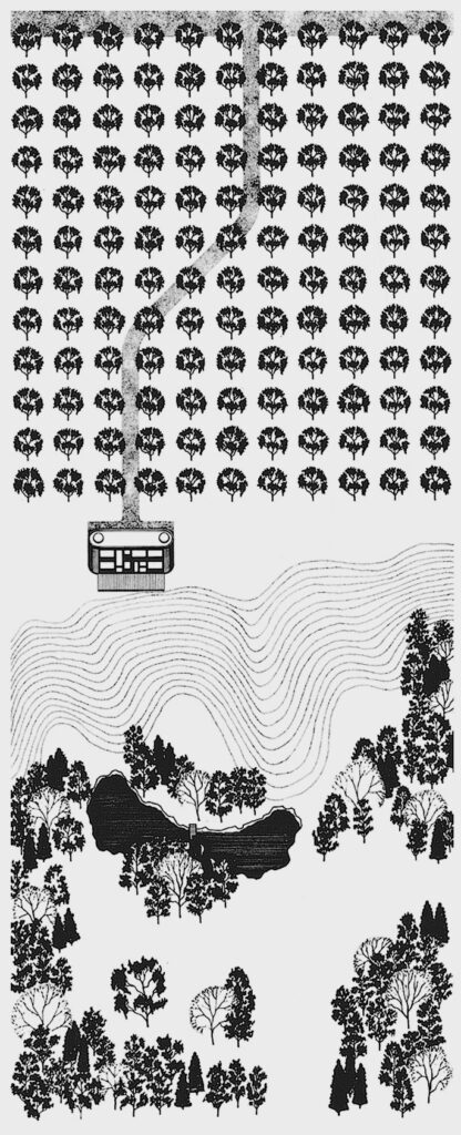
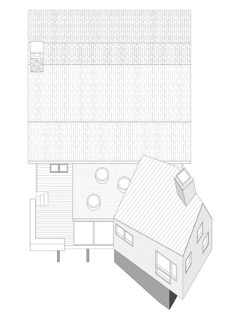
This drawing form, which was originated by John Hejduk in the early 1960s, has a strong affiliation with painting. In his diamond projects, Hejduk transposed the painterly problem of the edge of the canvas to the architectural question of the envelope. In the 90-degree axonometric, both plan and front elevation are undistorted, and the sides have collapsed to nothing. The drawing sits frontally, square to the page, forcing a reading of surface and depth, push and pull, onto the architectural object. By the late 1970s, the 90-degree axonometric had become an available technique, no longer necessarily tied to Hejduk’s formal language or its associations with purist painting. Stanley Tigerman, James Stirling, Toyo Ito, and Arata Isozaki all used the 90-degree axonometric to different ends. [1] Hejduk may have originated the form, but it now belongs to the shared culture of the discipline.
I studied with Hejduk at Cooper Union in Manhattan, but as a student I avoided the 90-degree axonometric. With time and distance Hejduk’s work has become more important to me, and I have returned to the 90-degree axonometric. For small-scale projects, this drawing type underlines the building’s object-like character while still gesturing to site and context. For me, it is an indirect form of representation, less transparent to the artifact represented. It calls attention to the drawing as artifice.
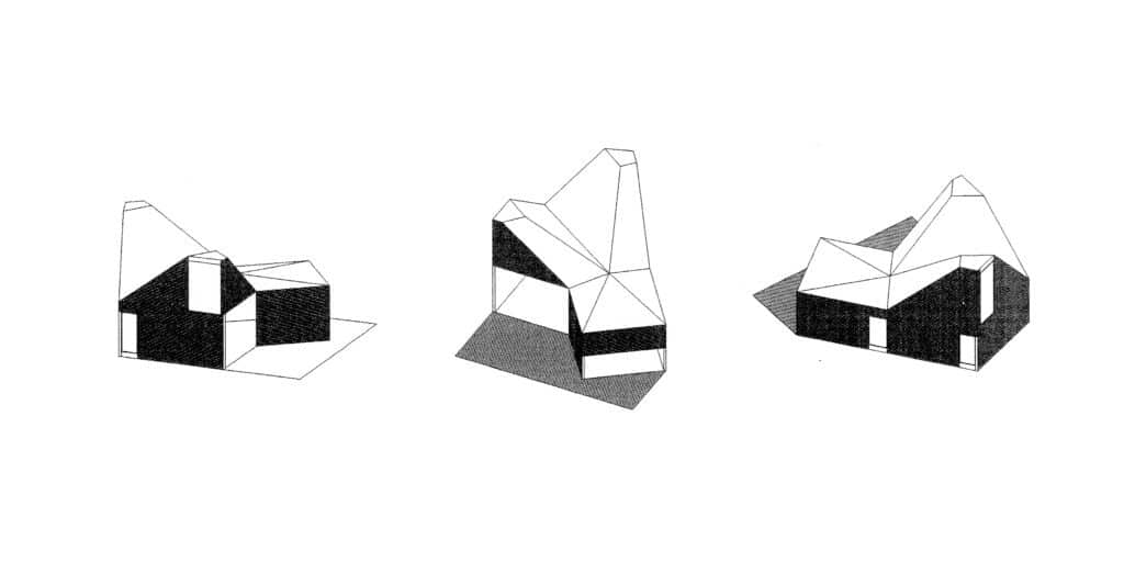
These new axonometrics are made on the computer, which raises another series of questions. The computer automates operations once done by hand. In most cases, these new axonometrics are not projected from plans; instead, they are oblique orthographic views of a three-dimensional computer model. Strictly speaking, then, although they look like axonometrics, these quick studies are not true axonometrics. Because the angled edges are foreshortened differently, the dimensional consistency is not preserved. For more developed drawings there is a simple work-around that yields a proper axonometric. It involves a ‘make 2-D’ top view of a 3-D model that has been rotated and sheared at 45-degrees. But it is also worth emphasizing that, for me at least, this yields a fairly crude underlay, which has to be extensively reworked in 2-D, utilizing all of the techniques of projection and geometric construction once done by hand, now faster and more precise in the computer.
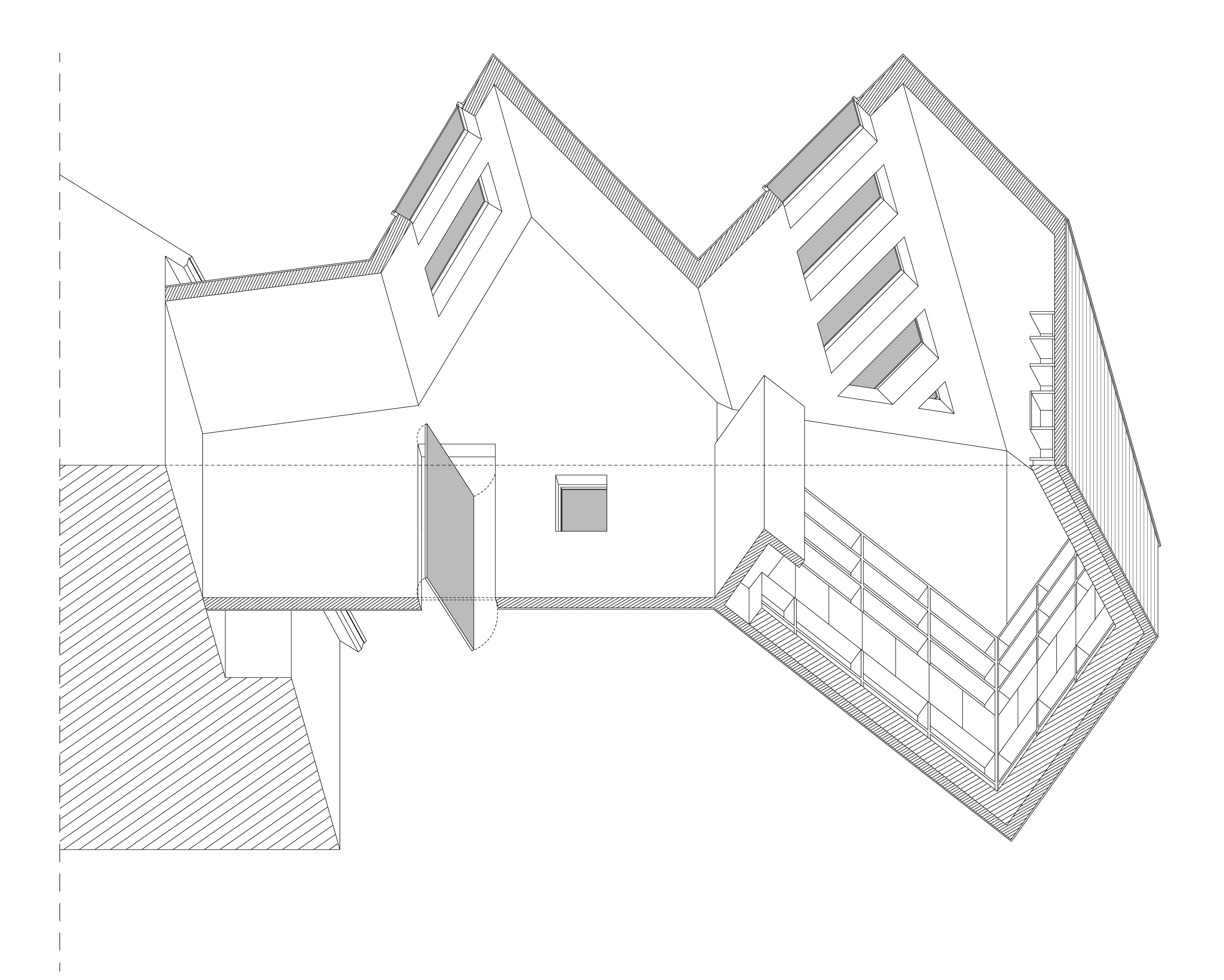
The axonometric is an analytical drawing, and lends itself to sectioned, or exploded, views. Originating in military and engineering practice, axonometric drawing was a useful tool to explain the construction and assembly of complex objects and machines. This is true in architecture, too, although it appeared later, with Auguste Choisy at the end of the nineteenth century. Choisy cut buildings in plan and section, and adopted the worm’s-eye view to explain the pathways of structural forces. The worm’s-eye in particular accentuates the relationship between plan and structure. By definition, a worm’s-eye must be cut at plan level, and the logic of the structure as it develops upward is clearly explained. These are highly abstract drawings with no reference at all to context or the ground.
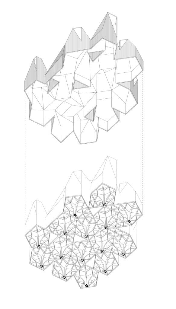
What the worm’s-eye viewpoint does better than almost any other form of representation is to describe the spatial logic of a three-dimensional enclosure. The 90-degree axonometric is about the building as object; the worm’s-eye is about interior space. Plan anticipates movement, structure, and spatial organization, and section maps out profile and scale, but it is fundamentally the domain of the ceiling – domes, vaults, and skylights – that conditions our perception of space. The first thing anyone does on entering an expansive space is to look up. The worm’s-eye allows the architect to study and describe the enclosing effect of the architecture overhead, which is why Choisy employed the worm’s-eye view to explain vaulted construction.
The axonometric is, preeminently, an architect’s drawing: technical and precise. It is objective in both senses of the word: detached, tangible, and impartial, and tending to render the architecture as an object. The drawings made for this book develop out of axonometric studies completed over the course of the design work, but at a certain point, particularly when the buildings are complete, they acquire a logic of their own: as a powerful explanatory tool, and as independent artifacts.
Notes
- A drawing done in 1925 by the Swedish architect Sigurd Lewerentz complicates this chronology. His view of the Resurrection Chapel at the Woodland Cemetery in Stockholm combines plan and elevation to highlight the role of the portico in terminating the long wooded allée of the cemetery. Although celebrated for his improvisational details, Lewerentz was an extraordinary draftsman, and this is very sophisticated drawing. Rather than see it as anticipating the 90-degree projections of the later twentieth century, I would see it in the context of naive depictions of towns and settlements common in the nineteenth century. The longitudinal roof of the church, for example, is not projected, and the pavilion overlooking the sunken garden is oriented in the opposite direction. This does not diminish Lewerentz’s invention, but rather underscores his originality in adapting a vernacular form, and his commitment to describing the relationship between building and landscape.

– Stan Allen and José Oubrerie