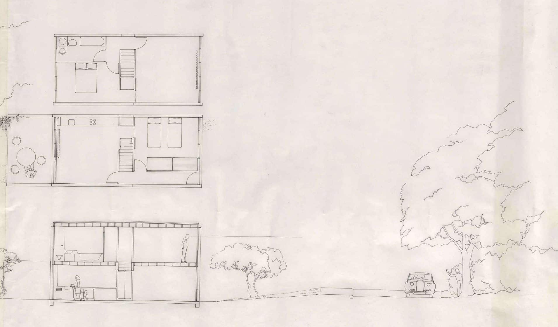
Netherfield Scroll One
– Chris Cross, Jeremy Dixon and Edward Jones
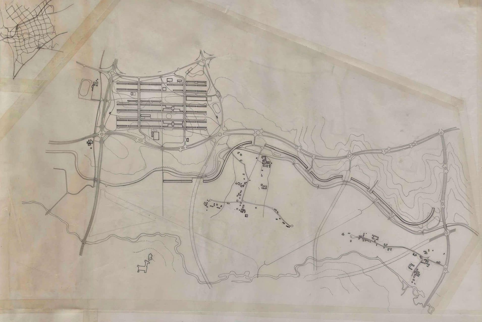
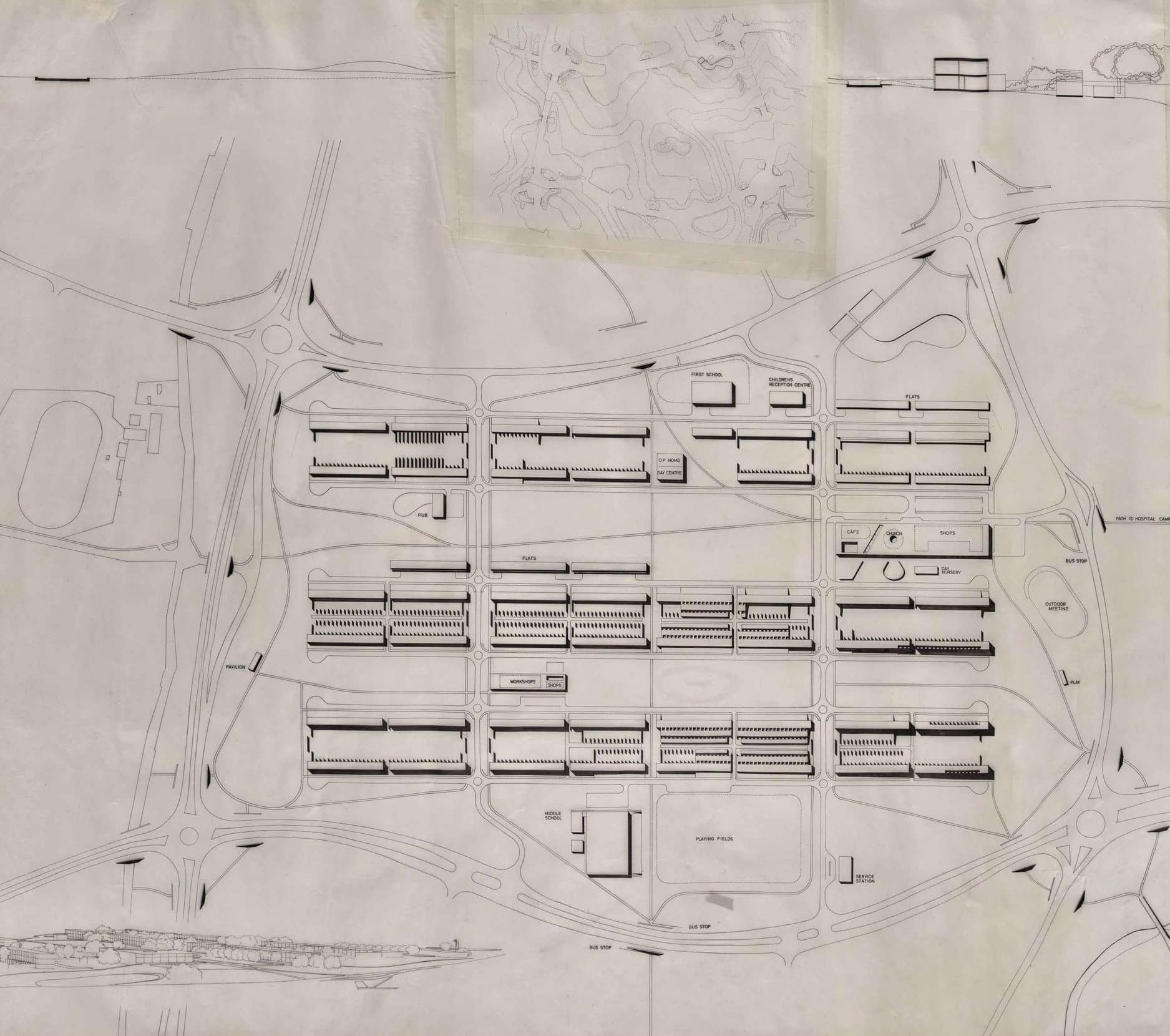
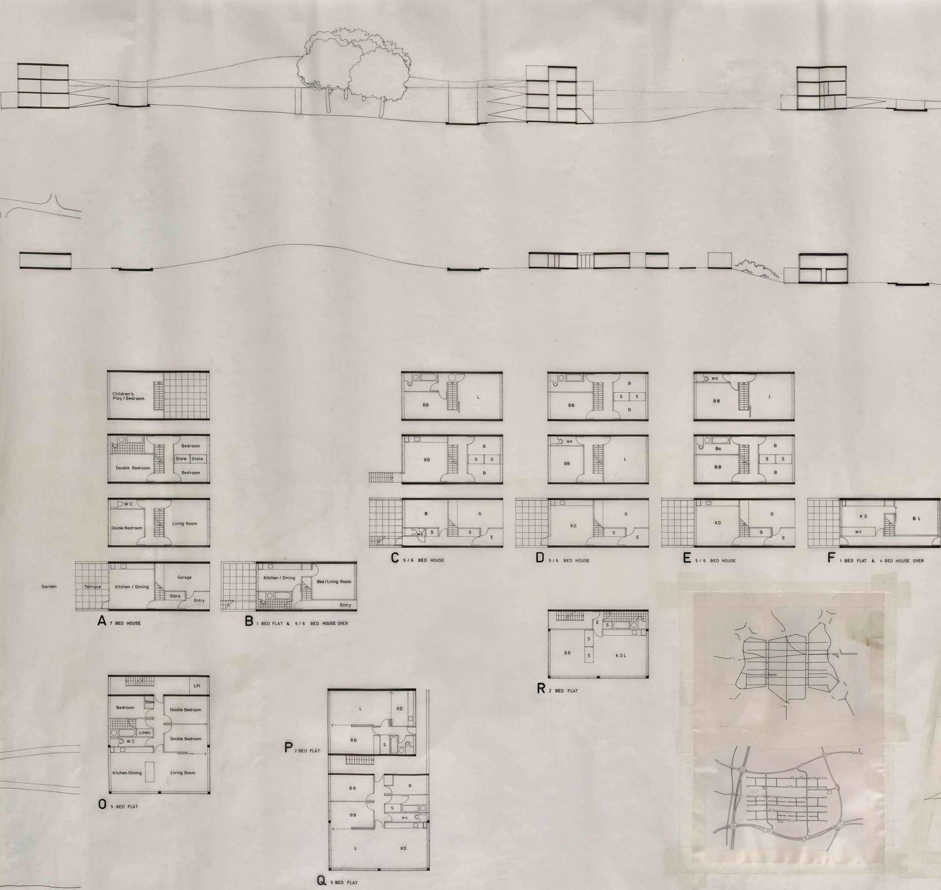
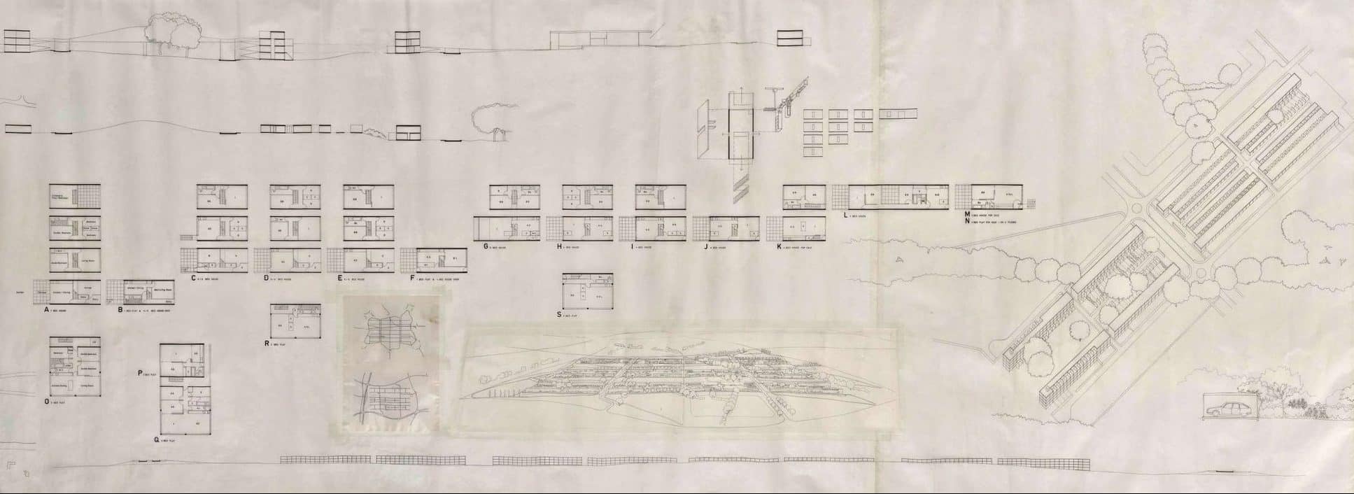
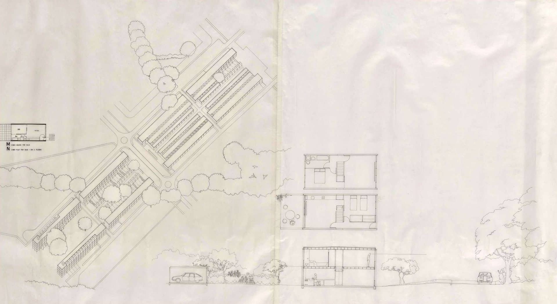
The following two-part conversation surrounds the acquisition of the Netherfield Scroll – a 20-foot-long drawing created c. 1971 by Chris Cross, Jeremy Dixon, Michael Gold and Edward Jones, otherwise known as the ‘Grunt Group’, for the commission of a low-density housing estate in Milton Keynes. The conversation with Jeremy Dixon on 23 April has been transcribed from a conversation on the day the Scroll was presented to Drawing Matter; the other excerpts are taken from an email exchange in the months before the acquisition. The conversation is divided into two parts: the first by Cross, Dixon and Jones focuses on the drawing and context; and the second, by Gold, reflects on more generally on drawing practices at the time.

Jeremy Dixon, 23 April
It is very good to be here and to see that the Netherfield drawing is being valued and looked after. It is all the more puzzling that a project like this, the product of white-hot inventiveness and confidence, should have declined in use, eventually to become what is known as a ‘sink estate’. I would like to try an explanation.
Looking more generally at social housing projects created within the post-war vision for a new social ideal – schools, hospitals, housing, etc. – the grand social vision gave ‘permission’ to architects to express the spirit of the moment with monumental designs, particularly housing. The majority of these schemes have proved not to be good places to live in. A monument doesn’t necessarily make good housing.
I think that something similar informs the background to Netherfield. The ambitious social programme of Milton Keynes provided a similar inspiration for grand solutions, again giving ‘permission’ to design at a monumental scale.
I still think Netherfield is a beautiful overall concept. Seen as sculpture in the landscape, the regular grid lying across the undulating landscape, the free pattern of paths, the interaction with existing woodland and hedges, all evident in the drawing, make for a very elegant minimal composition. The final act of overall control was to impose a horizontal plane on all the roofs, thus defining the distribution of dwelling types in a minimalist, mechanical manner.
It is so interesting that Milton Keynes itself has chosen to celebrate Netherfield, in spite of it failing as housing, on the basis that it was an interesting early experiment, worth looking at again. I have always believed that had it been built as middle-class housing in, say, Switzerland, it would have been a great success. The current state of affairs is partly due to being badly built and maintained; however, I do feel that there is an underlying mismatch here between the creation of a grand, controlling vision and the requirements that involve making a satisfactory place to live in.
I think, in a way, the drawing becomes more important than the built project. It stands for what might have been and that’s perhaps the most significant legacy.

Chris Cross, 21 March
A few months after starting at Milton Keynes, with much motorway travel but still living in London, we suggested to Derek Walker that our time would be better used if we agreed programme deadlines, came to pre-arranged meetings and got on with the scheme in London. This lasted for a few months and covered the period of developing the main design proposals. The AA had a studio space in Percy Street, a few doors away from the flat where Elspeth and I lived, and we cheekily set up a working space there behind a screen with drawing boards on a big worktop. Having worked individually and in pairs on many public projects and competitions, we liked straightforward grid planning. We heard that Derek Walker had invited us to Milton Keynes having seen our Runcorn Housing Competition entries. We had a shared graphic style – carefully set up clutch pencil drafts traced off on to tracing paper with Rapidograph pens. We used 0.18 and 0.2 nibs, sometimes even going to 0.3 to draw something solid.
The long drawing is made up of a series of separate sheets of 40” wide tracing paper in different lengths. This allowed us all to contribute. To make a joint, we would overlay two sheets, fix them to a board separately, and then cut both sheets together so that they would fit together exactly. The joint was then firmly taped on the back. After getting the five main sheets together, other drawings were added as insets. The final drawing is made up of eleven pieces of tracing paper. When the drawing was printed, with the right printer adjustments, the joining tape disappeared. All this would be easily handled now by computer. Our low key drawing style also anticipated computer graphics.
The long drawing overall plan does not show the planting ideas that were developed. These are shown with other developments on the later drawing included with the roll.
Working on a horizontal drawing board on white paper under an angle-poise lamp limited visual colour range but was good for concentration; it is how I still make drawings. When Ed and I were working with Alan Colquhoun and John Miller in Sackville Street, I can remember on a few occasions, at the end of a winter day’s drawing, walking across Soho and dropping into the basement snooker club off Old Compton Street. The green tables and coloured balls thrilled my tired eyes.
Edward Jones, 07 Feb
I have already mentioned that we were invited to come as a group to Milton Keynes by Derek Walker, then city Architect. Derek enthusiastically supported the emergence of our design and particularly in the form of the long drawing. When we showed less enthusiasm to travel each day up and down the M1 motorway and under threat of dismissal by the chief executive Fred Lloyd Roche, Derek negotiated a deal on our behalf. The deal involved the generous support of another champion, Alvin Boyarsky, then Chairman of the Architectural Association. Alvin provided space for us in the basement of the AA annex on Percy Street. Here as Jeremy has already noted there were the dimensions to compose and layout the long drawing. As to Alvin’s opinion about the end product there might be some debate about, but as AA graduates and unit masters his patronage was much appreciated. It was therefore fitting that the ‘scroll ‘ should return to the AA some 46 years later by way of an exhibition in the Front Members Room over looking Bedford Square.
Jeremy Dixon, 05 Feb
You asked about the drawing technique involved and again, each of us will have our own memories.
Firstly, I ask myself why did we undertake it as a single long drawing? At the time, we were very preoccupied with doing projects that occupied the whole dimension of a site, in other words, a proposition should be of a scale and length unique to that particular site. This led to the length of the terraces and the absolute relationship to the site boundary. I think this preoccupation with overall extent is what informed the decision to undertake a single, long drawing. It was also attractive that it was a single comprehensive representation rather than a set of separate drawings. It was a challenge – what is now easy on the computer, the joining together of various bits into a single image, was of course much more difficult at that time. The drawing implement was a pen, the Rapidograph, which provided a reliable fine ink line. We were helped by being able to work in a basement studio in Percy Street that belonged to the AA so that we could join together tables to produce a working surface long enough for the whole drawing. The various parts of the drawing were done by each of us often working at the same time. I remember always valuing a special graphic skill from Chris Cross. Tone was added using letratone. We also knew from experience that the printing machines of that period used a continuous process that could accommodate a drawing of unlimited length.
We showed the end result printed on shiny dieline paper, with a certain pride of the moment, to Alvin Boyarsky and others in the Members Room at the AA. A fair amount of cold water was poured on the endeavour at that point. Alvin didn’t really like it and I seem to remember other critics also being rather negative. Of course, that would have been as much about the scheme as the drawing. Nice to see it back at the AA and revalued.

Edward Jones, 05 Feb
As we had previously worked either independently or in pairs (Cross/Dixon and Gold/Jones) Derek Walker’s invitation presented an unexpected opportunity for us not only to work together but also to possibly collaborate on the same drawing.
The combination of various scales and images brought together on a single page, as frequently observed in Le Corbusier’s Œuvre Complet, had always been held in high esteem by us – a site plan, view from terrace with a bowl of flowers in the foreground and the building section – combined in a coup d’oeil to represent the spirit and character of the project.
Quite apart from representing the idea of the long terraces of Netherfield, we had a quiet ambition to produce the longest single page to collage together the various aspects of the project – ‘uncompromising in layout, tender in detail’ as Bob Maxwell commented in hindsight on Chris Cross’s AA thesis of 1964.
No doubt the great Beaux Arts tableaux of the Prix de Rome were also giant collective enterprises, but the size of the Netherfield scroll in present times (not so present!) possibly makes it unique.
