André Arbus: Details Matter

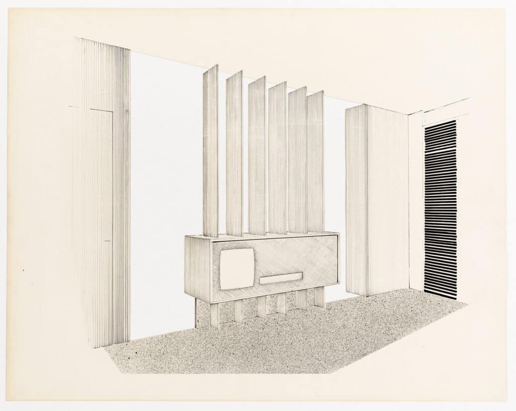
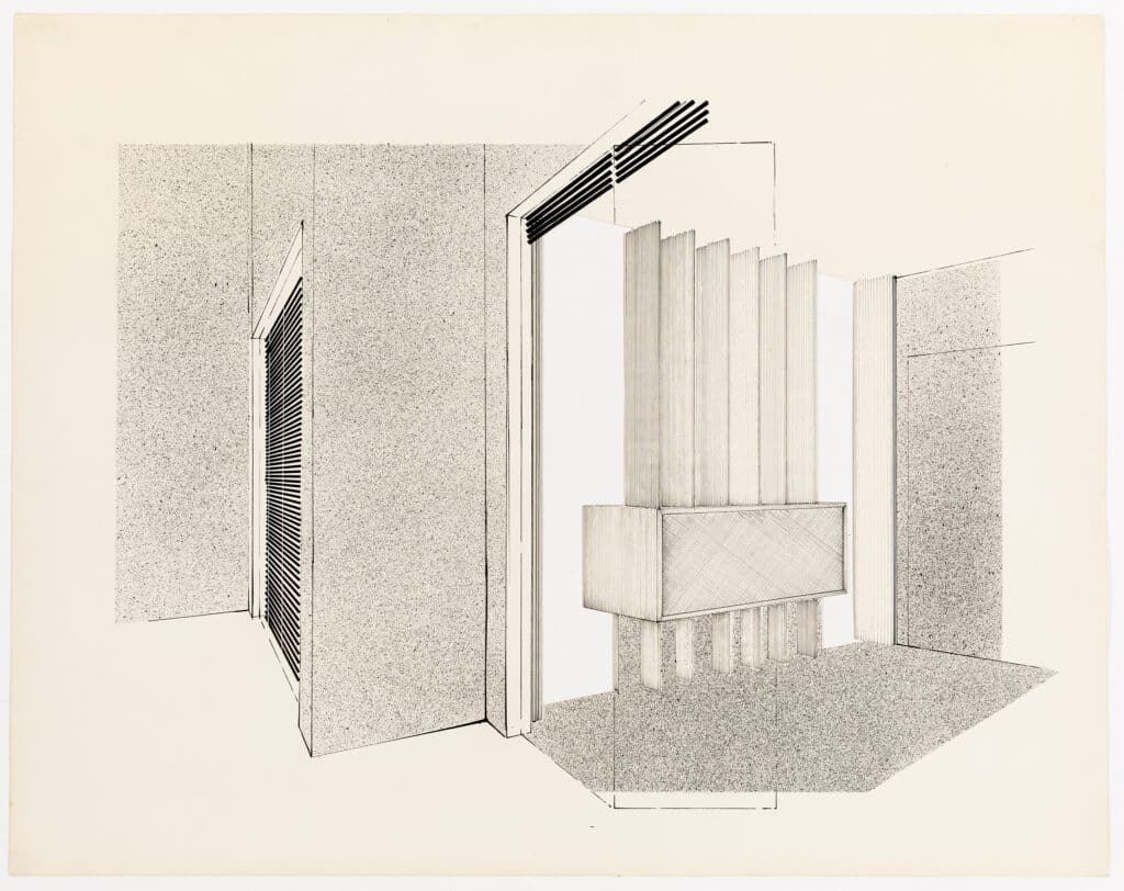
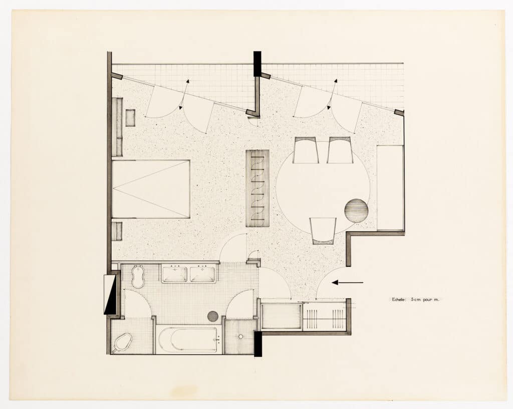
These presentation drawings – polished, finished, complete – were drawn by André Arbus in the 1950s. They are of a compact, open-plan apartment. Although they are not design drawings, they reveal a lot about the process of design. They communicate thought and care and suggest many drawings have come before them. They are the culmination of a thorough process. The structure is what reads heaviest in the plan, but it is also a furniture plan, a flooring layout, and a joinery drawing.
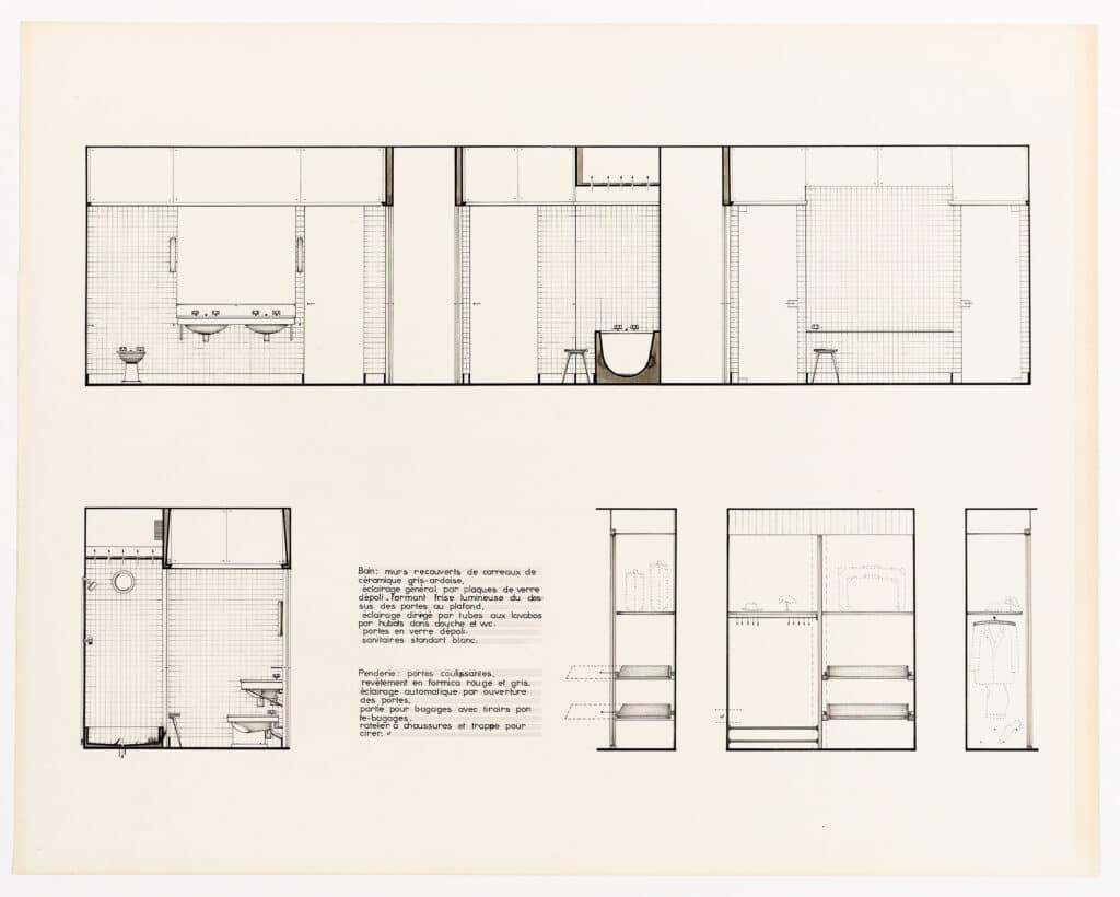
The drawings are skilled and refined; and the palette is limited to black, white and cream. They float somewhat, with limited context, and are carefully composed on the page. The surfaces are each given different textures. The cream background has been cut out of the interior elevations to show that the bedroom and living area open onto each other. The walls and arrows are the strongest elements in the plan. In the section, elements that are cut through and the edges of skirting tiles draw the most attention. The drawings are detailed in some ways and abstract in others. While doors and windows are indicated in minimal detail (in the plan, the door swings are single lines), the joinery items are solid and thicker. Similarly, the external glazing is made up of three lines with no detail of the frames. The focus is instead on the joinery and the sanitary fittings, the interior. Views from the exterior tell us very little about the external environment and seem only to exist in order to study the interior.


By looking at these drawings, we can see where the design was focused. At the centre of the plan is a multi-functional piece of furniture with panels that swivel to open the space up during the day, and close at night, in combination with folding doors on either side. This is shown in more detail in the two interior elevations. We can imagine that one of the earliest elements in Arbus’s design was this central division between the living area and the bedroom. There is something fascinating about the details of the wardrobe, with clothes, shoes, and suitcases clearly shown, and their storage carefully considered. As a designer, you do not draw this level of detail without first taking into account how people live their lives. Particularly in such a small space, people’s daily habits are an integral consideration in the design. The layout of the bathroom reveals a similar level of consideration. Interestingly, there are two doors to the bathroom very close to one other, which suggests a concern for maintaining the separation between the communal space of the living area and the private space of the bedroom. In the plan, we can see that each fitting has been carefully located; in the elevation, the tiles are laid out and the location of the extractor is indicated above the bath and shower. There’s even a stool.

It is difficult to separate the drawings both from what they represent and what they reveal about the person that made them. In a 2012 New York Times article titled ‘Architecture and the Lost Art of Drawing’, Michael Graves wrote that he was ‘fascinated not just by what architects choose to draw but also by what they choose not to draw.’ Ultimately, drawings are a representation, a selection. There is a choice in what you highlight and what recedes into the background, or what isn’t even included. Initially, I am struck by the level of detail in these drawings. Then I notice that the detail is focused on particular parts, while other areas are lacking in the detail you might expect at such a scale. I then realise I have no idea where the kitchen might be. The only assumption I can make is that it’s on the far right in the plan, a space entirely devoid of detail. Meanwhile, I know exactly where a hat might go in the wardrobe. This leads me to research Arbus. I learn that his father and grandfather were cabinet makers and that he spent the first years of his career designing furniture. The clues to this are in Arbus’s drawings. He is drawing what he knows. The joinery, the most detailed items, reveal where his interests lie.
As Henry David Thoreau said, ‘It’s not what you look at that matters, it’s what you see.’ We all have different ways of seeing the world, and our attention will be drawn to different things. This is evident in our observations and in how we design. While studying architecture, a group of us spent a couple of days in a small Irish seaside town practicing our photography. The photographs were varied, with almost no repetition of images. When we pinned our contact sheets up in the studio we could mostly tell who had photographed them. Mine were of details, texture, layers, weathering. Even a photograph isn’t objective. What we are drawn to is part of who we are, partly innate, partly learned. Arbus was drawn to the details of things, and I am drawn to these images for the same reason.
Drawing gives you a new way of looking at the world. Part of the effort is in seeing things as they really are and recording them as such. It is in relying on the right side of your brain, the visual and intuitive side, and not letting the left side interrupt to tell you what it ‘knows’ about what you’re drawing. You will notice things you have never noticed before when you go to draw something. Similarly, when the process of drawing is applied to design it leads to a new understanding. Drawing is a means of thinking through something before it is made or built. Looking at drawings of a building and drawing the building do not produce the same understanding. When Arbus worked on the design for this apartment, I’m sure he came to understand every corner of it. Drawing these kinds of details leads to an understanding of the existing space, and of the space as it will be. The drawings suggest an apartment that is well-considered, a reflection of its design and designer.
Anna Healy is an architect working in west Cork, Ireland.
This text was entered into the 2020 Drawing Matter Writing Prize. Click here to read the winning texts and more writing that was particularly enjoyed by the prize judges.
