Bramante: Five Dots
The remote past is distant and faded. Original objects and documents that might be used to study it are scarce. They are often uncooperative and most of the time they don’t tell the truth, because they have been reframed by history’s ‘victors’ over the centuries. We must always bear in mind that we don’t study historical objects and documents in search of solutions for the present, but rather to show how far away the present is from the past. The practice of a historian is thus the constant measurement of a distance. History doesn’t tell us what we are, but rather something of what we are not. It tells us in what way a given experience of space may correspond to a given experience of the world, to given social practices and to a crucial, albeit implicit, given metaphysics. What history does do is to cast light on the modes and deep structures shaping the life of individuals and societies in the past. In this way we can understand, almost as a recoil, that our experience of the world is not the experience of the world but one experience of it. It is the result of interweavings, thoughts, intuitions and prejudices and it is the task of critical thinking (and arguably also critical architecture) to explore them. Architectural historians investigate the relations between spaces, buildings, urban geometries and real social practices and, therefore, the forms of life of which those spaces, those buildings and those geometries are the sedimentation.
Like many historians in his generation, throughout his life Manfredo Tafuri (1935–1994) reflected on the Modern, on the concept of architecture as an emancipation and transformation of the world. In a good deal of 20th-century architectural thinking, the Modern age was seen as having begun with the Industrial Revolution, or at most with the Enlightenment. Tafuri’s interest in the Renaissance, on the other hand, also stemmed from his conviction that it was the beginning of the Modern age. He saw in the Renaissance the advent and rise of subjectivity. It was the age of the project, of the organised space designed from the point of view of the individual actor. I would like, therefore, to dedicate this article to Manfredo Tafuri, 40 years on from the publication of La sfera e il labirinto (Turin 1980; trans. as The Sphere and the Labyrinth: Avant-gardes and Architecture from Piranesi to the 1970s, Massachusetts 1987), which marked his new stage of studies focused on the Renaissance (and the start of the 15-year period when I got to know him and became a scholar working at his side).
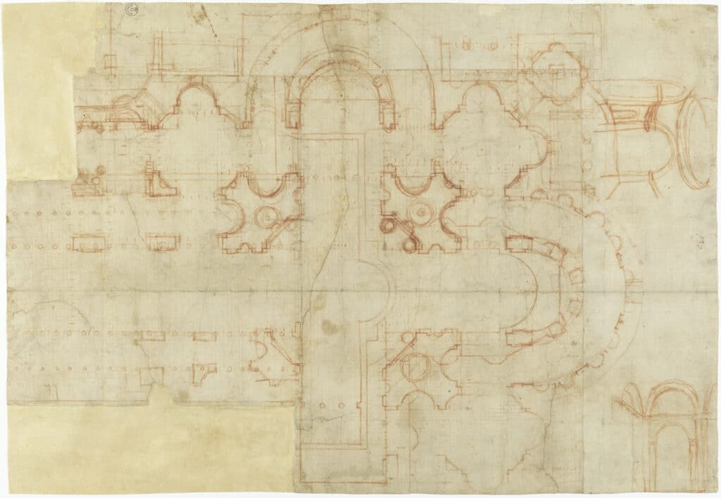
Sometimes, by a stroke of luck, ‘talking objects’ are thrown up on the beach of the present, survivors from the great shipwrecks of the remote past. In this case the object is a sheet of paper (690 x 472 mm), known as Uffizi A20. It is important because Donato Bramante drew on it for several months in 1506. We know that Bramante made countless drawings for his project for St Peter’s Basilica in Rome. Almost all of them are lost, but this one has survived, which is particularly fortunate, because he noted down new ideas on this sheet, various inventions that gradually emerged during months of designing. Sometimes after an idea took shape, Bramante developed it further on other sheets, but then he always returned to this sheet. It was his logbook on a very special journey.
The problem with ‘talking objects’ is that often, if we left it to them, they would remain mute. It is therefore up to us to try to give them a voice. In this case I tried to deconstruct the drawing, using Photoshop to go down through the successive layers and back in time to follow Bramante while he was designing.
He starts by drawing with the ruler (or, I believe, by having someone else draw) an orthogonal grid of squares with 3.7 mm sides. The grid has very thin lines, made with a pen and pale sepia ink. The length of 60 squares of the grid is 223.4 mm, i.e. the equivalent of one Roman palmo, which in fact used to be divided in 60 minuti (minutes). Bramante thus initially created a ‘minute paper’ (like millimetre graph paper), and then later made every square the equivalent of 5 palmi.
Designing on graph paper was nothing new (in his Treatise on Architecture, Filarete recommended using it to design the cathedral for the ideal city of Sforzinda). What is truly innovative is that Bramante uses an absolutely new medium for architects: red chalk, also called sanguine, a red earth pigment and variant of the haematite used by the ancient Egyptians and Romans in wall paintings. All known drawings by architects from the Middle Ages up to Bramante’s day – from the Palazzo Sansedoni in Siena (1340) to Alberti’s Baths in the mid-15th century – were made with quill and ink. Graphite was discovered only in the second half of the 16th century and it was the virtuoso Borromini who introduced it to architectural design. Until Bramante, architecture was drawn in pen and ink. He learned about the potential of red chalk from Leonardo da Vinci, who used it to achieve more gradual transitions between shadows. Bramante thus enjoyed the unprecedented freedom of being able to make a continuous mark; there was no need for an interruption, as when a pen had to be dipped in ink. We will shortly see why this fluidity was so important for him.
The first thing Bramante drew on the grid was a survey of the plan of the existing five-nave basilica, built in the early decades of the fourth century by Emperor Constantine and Pope Sylvester I over the tomb of St Peter. He also drew a survey of the plan of the great choir that the architect Bernardo Rossellino had built a couple of metres above ground between 1452 and 1455 for Pope Nicholas V, in the first failed attempt to enlarge the basilica.
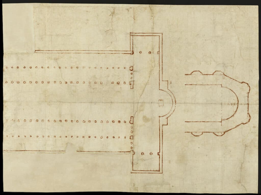
A now barely visible sketch drawn on the verso of our sheet reveals Bramante’s intention: he wanted to cover the new church with a large dome. In this first phase, he didn’t plan to demolish the naves of the Constantinian basilica, but only the transept. In fact, he thought of simply extending the massive walls of Rossellino’s choir by designing a new transept around the one to be demolished. The new dome could then go over the centre. But he ran into two problems: first, half of the dome would still have to be supported by the old columns of the Constantinian basilica, which were not strong enough; secondly, the dome could only be 27 metres wide at most, compared to the 45 metres of Brunelleschi’s Santa Maria del Fiore and the Pantheon.
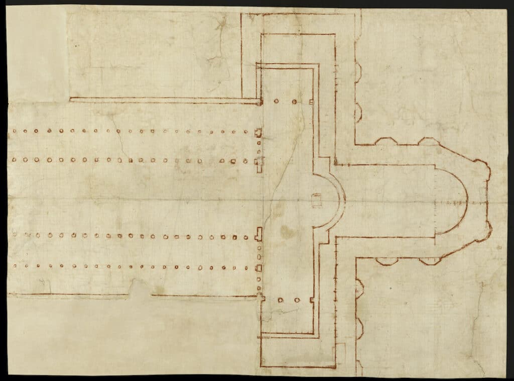
At this point Bramante drew five red-chalk marks, almost just dots, where the right nave ended: each mark was made every two squares of the grid, which means that they progressively enlarged the radius of the dome by 10, 20, 30 and 40 palmi, taking the overall diameter up to 45 metres. The enormous new dome now needed a pillar capable of bearing its thrust. Bramante drew it, while also imagining smaller domes on the sides, according to the Byzantine quincunx scheme. He then worked on other versions of the pillar in later variants, which can be read here clockwise a–d.
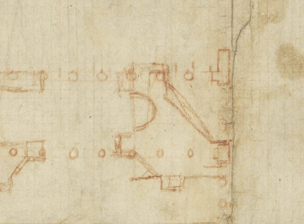
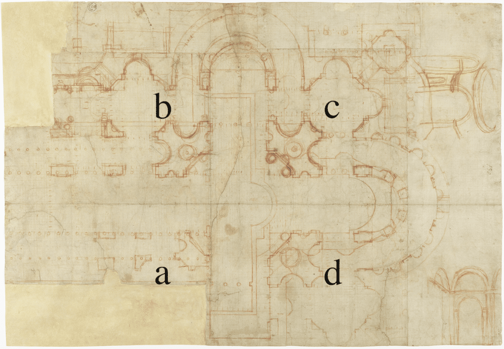
Why is all this so important? Because it shows how Bramante arrived at the diagonal cut of the pillars. This solution is not only better suited to supporting the thrust of the dome but also gives fluidity and dynamism to the spaces of the church. Moreover, by cutting the pillar diagonally, Bramante introduces a crucial element of subjectivity, of free will: how far to cut it, and in what way, is not a question of predetermined geometric shapes, but of static requirements and, most importantly, the architect’s expressive needs. Brunelleschi’s basilica is conceived as a sum of predefined cubic modules, linked to each other by simple geometric relationships in both plan and elevation. Perspective is the method he employed to control this mathematical and harmonious space of elementary solids.
But Bramante conceives a new modality of relationship between spaces and structures, between voids and solids, and he focuses more on the voids than the solids.
The shape of the pillar is determined not by abstract mathematics, but by the shape of the space he wanted to create: the pillar is the residue left after designing the void, and that is why it is shaped in ways never seen before in geometry. To construct it, Bramante returned to the ancient Roman technique of building using a sort of ancestor of concrete, pozzolana, cast as a fluid into moulds. To draw the pillar, Bramante needed a grid with a very small mesh that designed a continuous topography, over which the line drawn by the red chalk could move fluidly, with a continuous but measurable gesture at all times.
The sheet of paper is no longer the place where a preconceived mental idea comes out of the architect’s head and becomes graphic. It is a whole territory, where various possibilities can be explored. The building produced by this process is no longer a mental image, but a visual experience. As James Ackerman wrote, ‘In the interior of St Peter’s, the purely sensual delights of vision inspire the design. The philosophical impulse of 15th-century architecture had become sensual.’
And we can trace all this back to little more than five dots on one of Bramante’s few surviving drawings.
