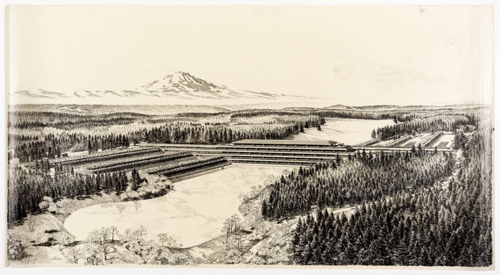
This remarkable drawing is a rendering by Carlos Diniz of the headquarters for the timber company Weyerhaeuser in Washington State from 1969, which he drew for the architects Skidmore, Owings & Merrill. The completed building is stunning, of course: the concept of office design known as bürolandschaft, extended out into the wild forests of the Pacific Northwest. But what I love is Diniz’s illustration itself. Hidden in the apparent accuracy of his infinitesimally thin ink lines is a whole rhetorical world in which seduction and intellectual proposition are almost impossible to separate.
Here Diniz is making a statement about a fresh design logic of the new western frontier: an inversion of the 1950s in Manhattan whereby height and size were a sign of corporate prowess. The western states though, high on the utopianism of the 1960s, saw themselves as closer to nature. In the drawing, Diniz ascribes the vertical prowess to natural components, compositionally to Mount Rainier in the distance, but also in detail to the serried ranks of fir trees, rendered at the furthest remove simply as vertical lines of ink. Diniz gives equal weight to the lines denoting building and vegetation, making them seem a part of the same order, yet he uses the horizontal slice through the landscape, exaggerated by the heavy lines of the deeply recessed windows, to assert the power of the building over nature. The building is like the blade of a buzzsaw through wood.
The glimpses I get of Diniz the man I find charming too. Of Brazilian extraction, he was raised in Beverley Hills by his mother, and schooled at the Art Centre in Pasadena. He went pretty much straight into rendering, opening a studio he called Carlos Diniz Associates Visual Communications in 1957 to provide everything that an architect or developer might need: drawings, presentations and brochures. In the days before computer technology, his hand-drawn visions of unconstructed environments were sought by SOM, Frank Gehry and even the Walt Disney Company, which knew a thing or two about drawing.
Diniz, too, is strangely pertinent. He worked a great deal with forgotten legend Edward Charles Bassett – an obsession for another time – de facto head of SOM’s San Francisco office in the 1960s and 70s, who produced many of the stunning creative company and university campuses in the west of the USA at the time. Diniz’s drawings are seductive certainly, but they seduce with ideas as much as with his very obvious technical skills.
Carlos Diniz: Weyerhaeuser Project
– Tim Abrahams
This remarkable drawing is a rendering by Carlos Diniz of the headquarters for the timber company Weyerhaeuser in Washington State from 1969, which he drew for the architects Skidmore, Owings & Merrill. The completed building is stunning, of course: the concept of office design known as bürolandschaft, extended out into the wild forests of the Pacific Northwest. But what I love is Diniz’s illustration itself. Hidden in the apparent accuracy of his infinitesimally thin ink lines is a whole rhetorical world in which seduction and intellectual proposition are almost impossible to separate.
Here Diniz is making a statement about a fresh design logic of the new western frontier: an inversion of the 1950s in Manhattan whereby height and size were a sign of corporate prowess. The western states though, high on the utopianism of the 1960s, saw themselves as closer to nature. In the drawing, Diniz ascribes the vertical prowess to natural components, compositionally to Mount Rainier in the distance, but also in detail to the serried ranks of fir trees, rendered at the furthest remove simply as vertical lines of ink. Diniz gives equal weight to the lines denoting building and vegetation, making them seem a part of the same order, yet he uses the horizontal slice through the landscape, exaggerated by the heavy lines of the deeply recessed windows, to assert the power of the building over nature. The building is like the blade of a buzzsaw through wood.
The glimpses I get of Diniz the man I find charming too. Of Brazilian extraction, he was raised in Beverley Hills by his mother, and schooled at the Art Centre in Pasadena. He went pretty much straight into rendering, opening a studio he called Carlos Diniz Associates Visual Communications in 1957 to provide everything that an architect or developer might need: drawings, presentations and brochures. In the days before computer technology, his hand-drawn visions of unconstructed environments were sought by SOM, Frank Gehry and even the Walt Disney Company, which knew a thing or two about drawing.
Diniz, too, is strangely pertinent. He worked a great deal with forgotten legend Edward Charles Bassett – an obsession for another time – de facto head of SOM’s San Francisco office in the 1960s and 70s, who produced many of the stunning creative company and university campuses in the west of the USA at the time. Diniz’s drawings are seductive certainly, but they seduce with ideas as much as with his very obvious technical skills.
Related...
Better with Sun from West: US Embassy Moscow, The Commons
– Tim Abrahams
Carlos Diniz: United States Embassy, Moscow
Becoming One with the Landscape (1969)
– Carlos Diniz
Category
drawing histories commentaries, rants & reflections Drawing Matter archive: research & collecting
Period
c20th
Architect
Carlos Diniz
Medium
drawing
Tags
topographic/cartographic presentation commerce landscape DMC