What is compelling about the sketches of Mies van der Rohe is their reliance on a pictorial composition that actively distorts perspectival conventions. This type of distortion is evident consistently across his more finished presentations drawings as well as his sketches. In using perspective as his main visualising tool Mies stands against the exploration of the axonometric evident in architecture during the period of the 1920s and 30s.
The conventions of perspective drawing, prescribed through their use of either single or double/multiple vanishing points, assume a specific distance given to the viewing subject. A 60˚ cone of vision within which the view is conceived defines the location of this viewer. This cone of vision reinforces the singularity of the scene in relation to the geometries of vision and the static nature of the view. Since Renaissance times, while perspective techniques have continuously been used, this inflexible geometric structure has been judged inadequate to the narrating of specific ideas about architecture’s spatiality. Architects have introduced distortions in order to make their ideas more explicit.
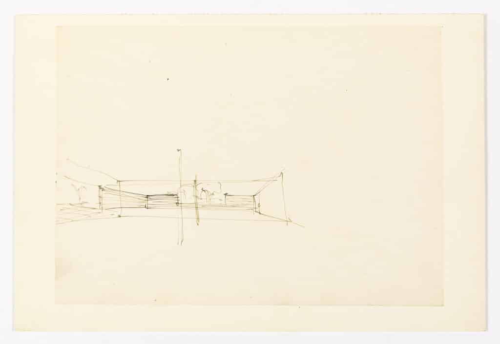
Mies’s sketch of the Hofhauser of 1935 is based on one such distortion. Here a centrally focused and single point symmetrical perspective – on the right half of the image – is extended beyond the constraints of the cone of vision to incorporate the continuance of the scene to the left. This extension of the visual field is a device that destabilises the attention of the viewer of the image. It is not clear where he/she should gaze. The construction of the drawing demands that the viewers looking at the image recognise that the viewer internal to the geometry of the image is caught in the act of turning his head in order to document what they see! Through this possibility of movement in the internal viewer the image introduces a panoramic effect. The impact of the columns within the extremity of the initial perspective construction emphasises this effect of movement.
Dan Hoffman and Beatriz Colomina recognise that what is also created by this extension of the visual field in Mies’s drawings is an emphasis on the horizontal and, more specifically the horizon – set beyond the confines of the space and dramatically reinforced here in this image by the inclusion of a distant tree. [1] To focus on the distant view, beyond the walls of the courtyard, destabilises the architectural elements of the foreground, the brick detailed walls and fine metal columns of the Miesian repertoire, that now float within a visual field. These elements reinforce the abstract clarity of the horizon by remaining un-grounded. Mies’s use of perspective in such a distinctive manner is as if his drawings remain in dialogue with others amongst his milieu. They each take a stance positioning their spatial speculation against other drawing conventions preferred by the modernist avant garde such as the axonometric. Preferring the perspective Mies maintained his interest in architecture’s need to recognise the coexistence of abstract and embodied space. The view in his drawings is never stabilised by perspective’s geometry but instead emphasises the prescribed possibilities of meandering performativity of architectural space.
Notes
D. Mertins, The Presence of Mies (New York: Princeton Architectural Press, 1994), 99–100, 217.
Mies: The Double or Panoramic Structure of the Perspective
– Desley Luscombe
What is compelling about the sketches of Mies van der Rohe is their reliance on a pictorial composition that actively distorts perspectival conventions. This type of distortion is evident consistently across his more finished presentations drawings as well as his sketches. In using perspective as his main visualising tool Mies stands against the exploration of the axonometric evident in architecture during the period of the 1920s and 30s.
The conventions of perspective drawing, prescribed through their use of either single or double/multiple vanishing points, assume a specific distance given to the viewing subject. A 60˚ cone of vision within which the view is conceived defines the location of this viewer. This cone of vision reinforces the singularity of the scene in relation to the geometries of vision and the static nature of the view. Since Renaissance times, while perspective techniques have continuously been used, this inflexible geometric structure has been judged inadequate to the narrating of specific ideas about architecture’s spatiality. Architects have introduced distortions in order to make their ideas more explicit.
Mies’s sketch of the Hofhauser of 1935 is based on one such distortion. Here a centrally focused and single point symmetrical perspective – on the right half of the image – is extended beyond the constraints of the cone of vision to incorporate the continuance of the scene to the left. This extension of the visual field is a device that destabilises the attention of the viewer of the image. It is not clear where he/she should gaze. The construction of the drawing demands that the viewers looking at the image recognise that the viewer internal to the geometry of the image is caught in the act of turning his head in order to document what they see! Through this possibility of movement in the internal viewer the image introduces a panoramic effect. The impact of the columns within the extremity of the initial perspective construction emphasises this effect of movement.
Dan Hoffman and Beatriz Colomina recognise that what is also created by this extension of the visual field in Mies’s drawings is an emphasis on the horizontal and, more specifically the horizon – set beyond the confines of the space and dramatically reinforced here in this image by the inclusion of a distant tree. [1] To focus on the distant view, beyond the walls of the courtyard, destabilises the architectural elements of the foreground, the brick detailed walls and fine metal columns of the Miesian repertoire, that now float within a visual field. These elements reinforce the abstract clarity of the horizon by remaining un-grounded. Mies’s use of perspective in such a distinctive manner is as if his drawings remain in dialogue with others amongst his milieu. They each take a stance positioning their spatial speculation against other drawing conventions preferred by the modernist avant garde such as the axonometric. Preferring the perspective Mies maintained his interest in architecture’s need to recognise the coexistence of abstract and embodied space. The view in his drawings is never stabilised by perspective’s geometry but instead emphasises the prescribed possibilities of meandering performativity of architectural space.
Notes
Related...
Mies van der Rohe: Neue Stadt
– Markus Lähteenmäki
Peter Blake & Adolfo Natalini: From Mies to Mickey Mouse
– Peter Blake
Mies: The Horizon
– Robin Evans
Category
design methodologies drawing histories drawing techniques & materials commentaries, rants & reflections Drawing Matter archive: research & collecting
Period
c20th
Architect
Ludwig Mies van der Rohe
Medium
drawing
Tags
sketch projection (axonometric isometric) domestic DMC