Sir William Chambers: Somerset House
Approximately 700 drawings of Sir William Chambers’ eighteenth-century design for Somerset House reside at Sir John Soane’s Museum. Yet, to start, it was not at all certain that Chambers would get the commission. At that point in his career he was Comptroller of the Works under King George III, a position that entitled him to oversee rather than to do. But when the appointed architect, William Robinson – someone so unremarkable that Edmund Burke, speaking in the House of Commons, called for magnificence in the project – conveniently died in 1775, the commission went to Chambers.
The site, which stretched from the Strand to what would later become the Embankment, brought with it a rich political and strategic history: located between the courts of Westminster and the commerce of the City of London, the first Somerset House, built by Edward Seymour, Duke of Somerset, had become a hub for aristocratic social and cultural life. The brief for the new Somerset House outlined a more public institution; and the extent of Chambers’ drawings reflect the challenge posed by the project. Unlike Paris, which boasted individual grand projets like Antoine’s La Monnaie (Paris Mint) and Gabriel’s Ecole Militaire and Place Louis XV, which Chambers had just visited, Somerset House was proposed as a single building housing all governmental offices. These included the Navy Office, alongside the tax and lottery offices, the Duchy of Lancaster, among other offices or Duchies and three learned societies: the Royal Academy, the Royal Society and the Society of Antiquarians. Chambers’ ambition was twofold: to work within the reigning style of neo-Palladianism in England, and to create a building that reflected the munificence and grandeur of the monarchy.
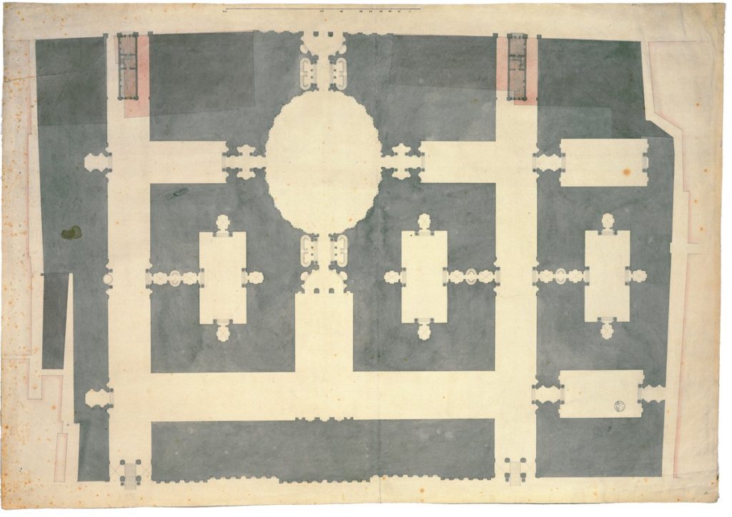
Chambers initially came up with over five schemes. The earliest plan was symmetrical and included an oval centre around which flanking lanes were mirrored, with a movement of detail that showed the influence of the Baroque, to which Chambers was exposed when in Italy from 1750-55. The scheme was ambitious in that it sought to overtake the pre-existing buildings on the frontage to the Strand, in this drawing, indicated in pink wash.
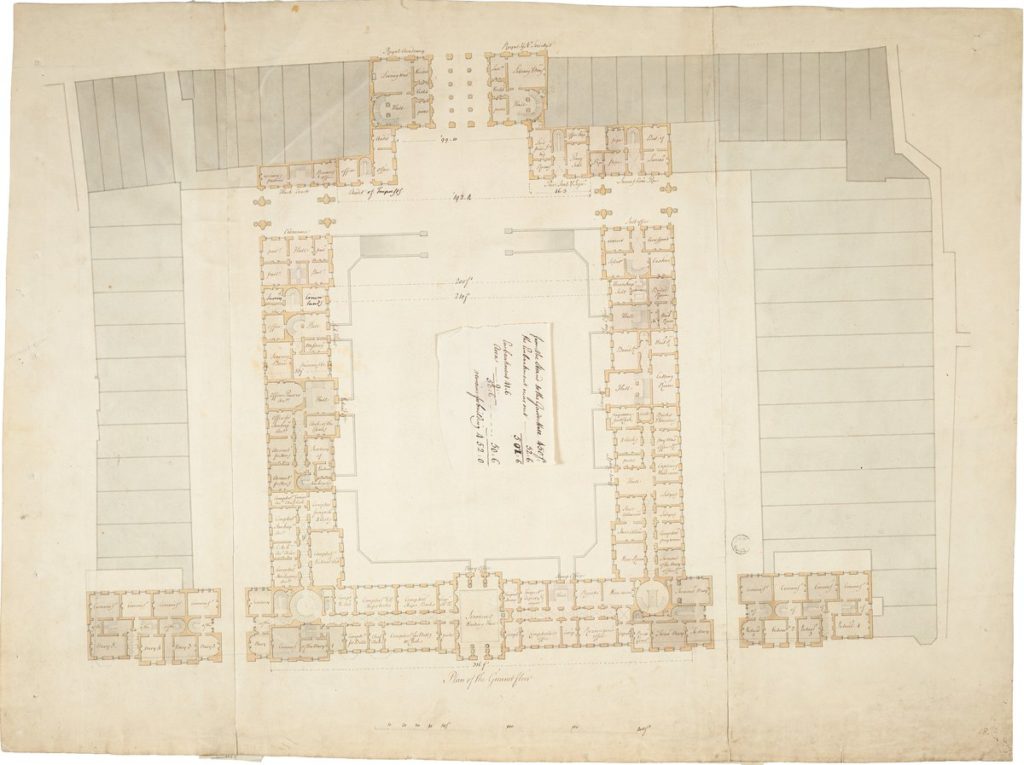
Later schemes were soberer, limiting the Strand frontage to 143 feet, as in the earlier Somerset House, and working within what appeared to be a neo-classical plan: a square courtyard, enclosed by two lateral wings, and a wing flanking the river. Pre-existing lanes were preserved, running east to west across the top of the site and north to south along each side. Colour coding, which came into use in the eighteenth century both for materiality and programme, appears in the near final plan to indicate all clients involved.

The royal societies were allocated to the Strand block, with the Royal Academy to the west and the remaining two societies to the east, and each of which contained a grand semi-circular stair; the offices to the rear comprised the Naval Office, which occupied the most space in the west and south-west wings.
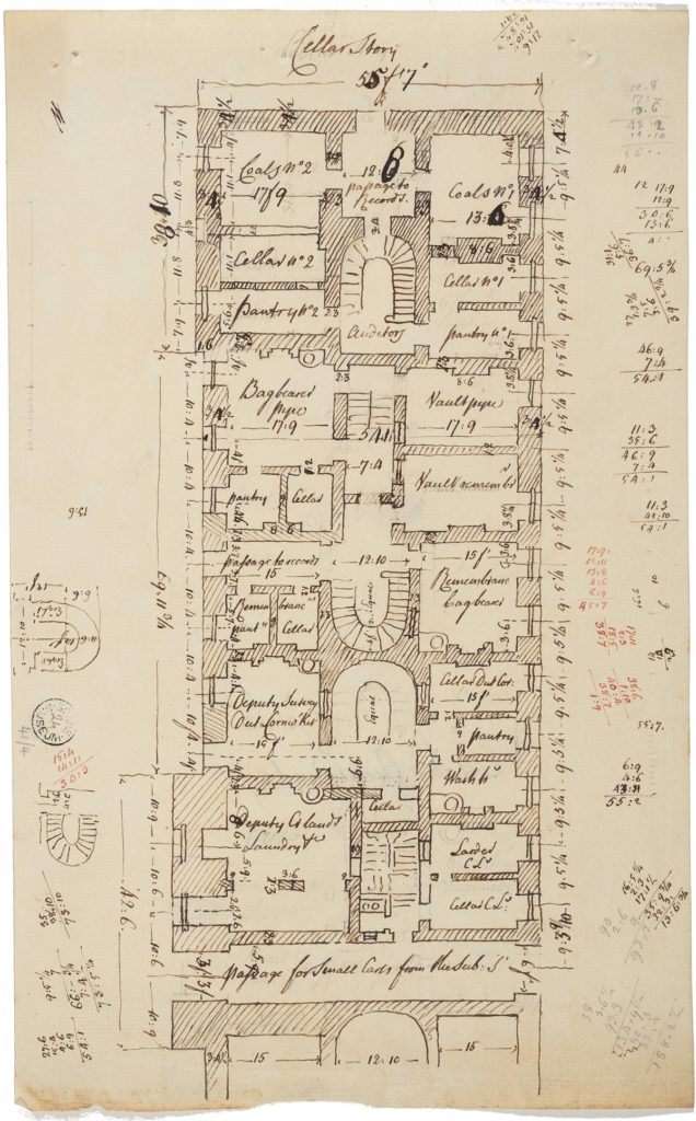
But perhaps more important was the contrast between an exterior that appeared to have a regular order and pacing, and an interior that seemed, in first draft, rambling if not a bit chaotic – for Chambers had to respond to what became an intense competition for the best and most space among the offices. Drawings in this sense acted as a form of contract. In the Soane collection one can trace the process from the earliest ledgers of space allocations to the first sketches in Chambers’ own hand – generally drawn and noted in sepia ink – showing the intensity, complexity and irregularity of the dimensions in the allocation of space; to those hard-lined in black ink by an assistant in the office, with Chambers’ accompanying notes, again in sepia ink; to those which, being finalised in presentation-style drawings, now replete with a coloured wash, were signed and sealed to indicate an agreement on the allocation and design of the space.
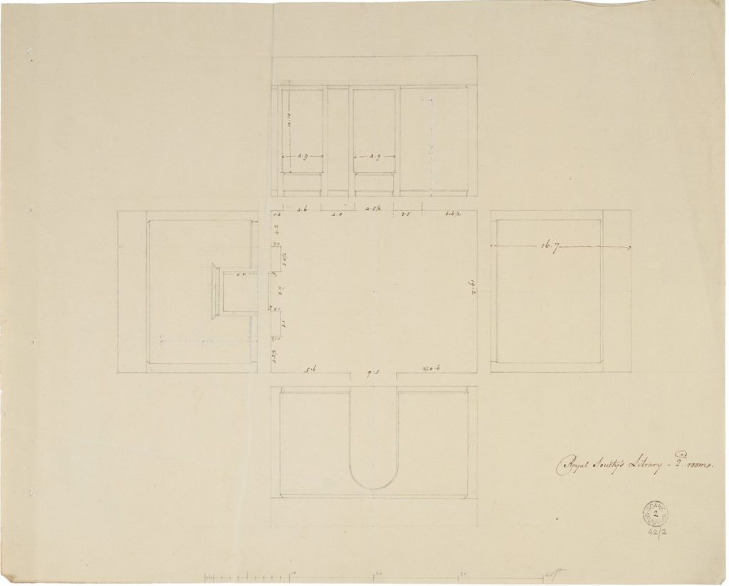

In some cases, the plans worked vertically though the floors, and were shown in miniature on one sheet, perhaps in an effort to save on the expense of paper. Others, primitive at first, reflected an invention in drawing, an exploded plan – in which each side elevation was extruded – to develop an overall scheme.
Given that much of the project stressed space planning, it was, according to Sir John Soane, in the stair and ornamentation that Chambers’ ingenuity lay: in the semicircular and circular stairs for the Royal Academy and Naval Offices. An early drawings in Chambers’ hand, with sepia ink notations and a grey wash, highlight an immediacy of thought and convey the underpinnings of Chambers’ theoretical and practical position. His theoretical Treatise on Civil Architecture was published in 1759 and subsequently put into practice in Somerset House between 1776 to 1801.
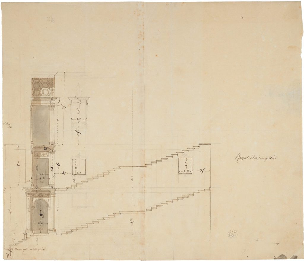
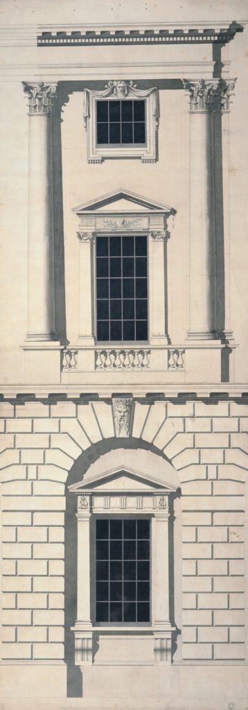
This preliminary drawing depicts the steep rise of the Royal Academy stairs, alongside the respective landing and designated doorways. Chambers’ use of the orders entails a vertical hierarchy rising from Doric through the Ionic to the Corinthian. Such a hierarchy maintains an allegiance to Scamozzi rather than Palladio (who designated the Composite as the highest order). Nonetheless, in theory and in practice Chambers upheld that orders and their ornamentation ‘are the basis upon which the whole decorative part of the art is chiefly built and toward which the attention of the artist should be directed’. As shown in Chambers’ detailing of the floors and exterior elevation, the orders, which account now for the cohesiveness of the whole, ‘originate most of the forms used in decoration, [and] regulate most of the proportions … to them, multiplied and arranged in a thousand different ways, architecture is indebted for its most splendid productions’.
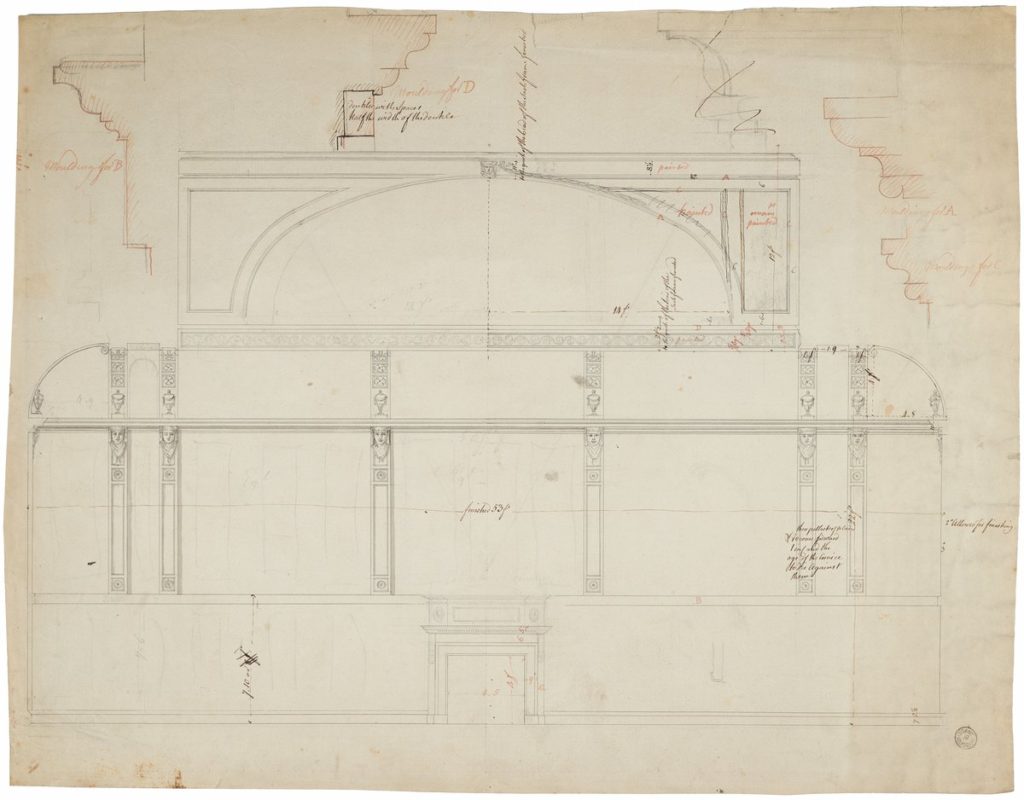
Chambers’ notations demonstrate an attention to measurement and proportion. Ceiling heights, for example, are determined by the orders: on the lower level, and corresponding to what he terms the ‘Herculean’ and ‘strong and masculine’ sense of the Doric, are the lowest ceilings, which should be, according to Vitruvius, eight diameters in height, while on the upper floor rises the great exhibition hall, corresponding to the thin elegance expressed in the proportions of the Corinthian column, to be, like the Composite, ten diameters.
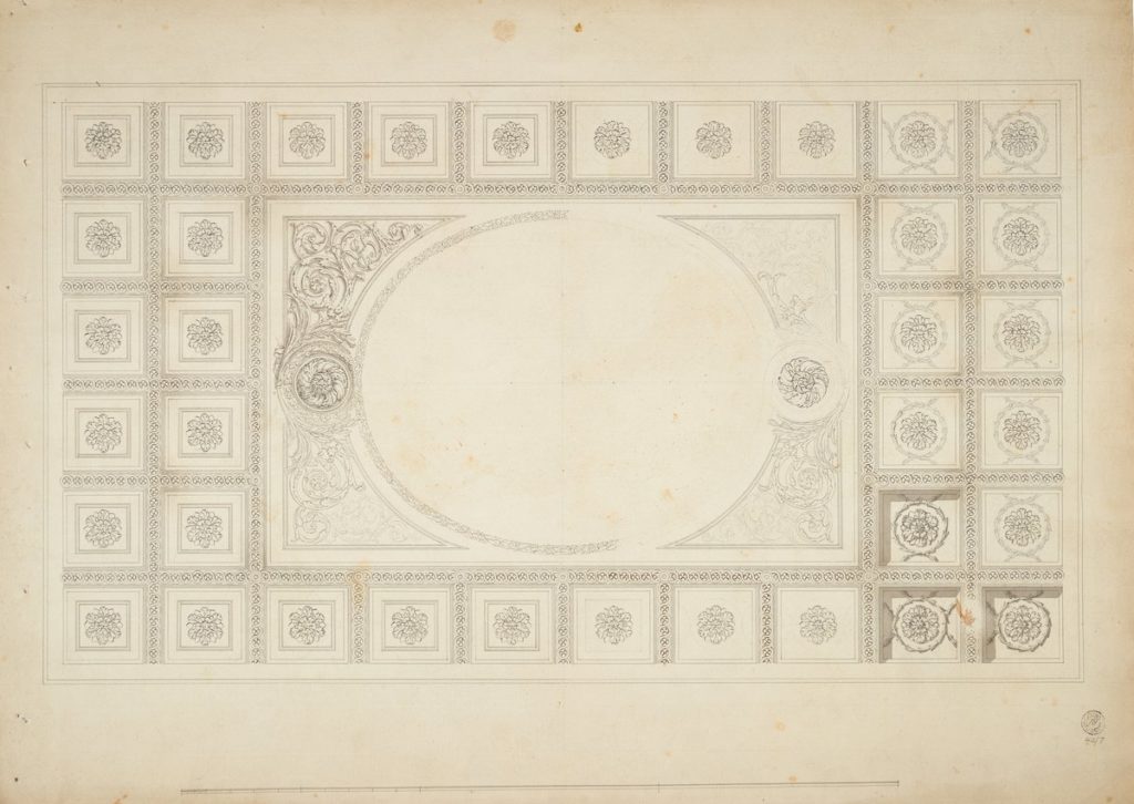
Contrary to his competitor Robert Adam, Chambers’ detailing is modelled: bold and restrained, geometric in the coffering of the ceiling, and lightly developed to convey a strong three-dimensionality. In the section for the staircase, Chambers uses a traditional grey wash to pull one’s eye to the left of the page, highlighting the landings instead of the rise of the stair. The detailing distracts from the somewhat awkward proportions of the stair itself, which, due to space restrictions, rises in a semicircular rather than fully circular niche. The informality and immediacy of the sketch seem at odds with the formality of the environment – and the rise was such an issue that Rowlandson drew a parody of the patrons precariously descending its steep incline.
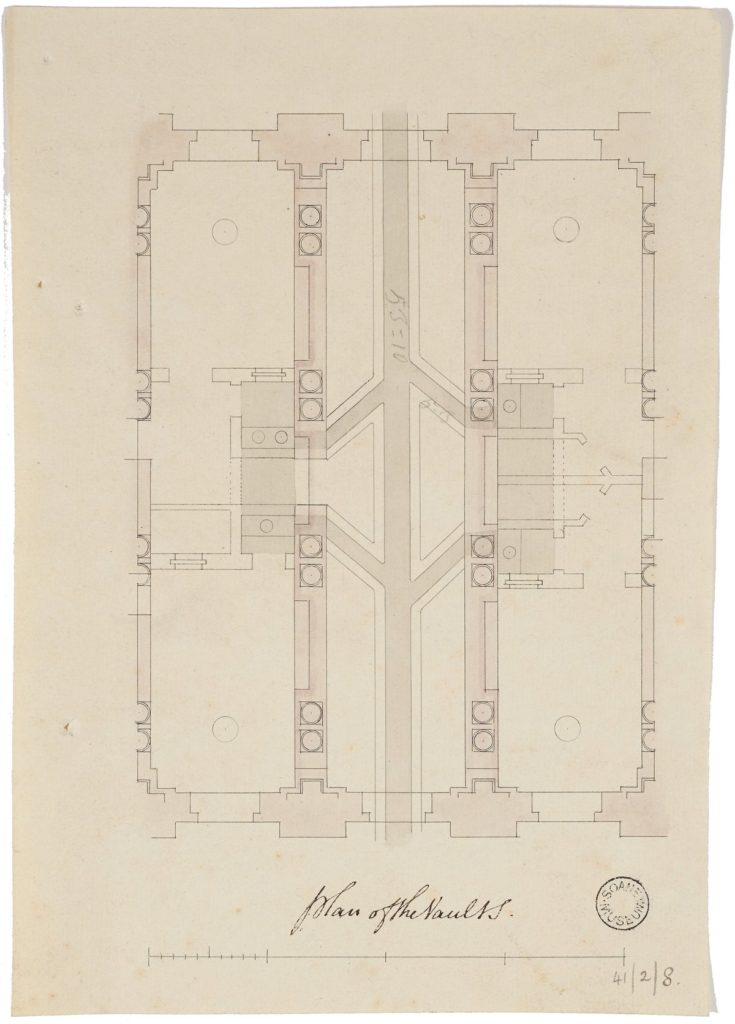

On the ground floor, the Doric order ties interior to exterior, to echo one of Chambers’ most famous interventions, the design of the three-lane vestibule at the entry from the Strand. The drawing, in Chambers’ hand, was modelled after Sangallo’s Palazzo Farnese in Rome. However, his design for the pairing of the columns in the vestibule breaks from Roman convention, and that of Palladio, referring instead to Lemercier’s design for the west wing of the Louvre. Both the vestibule and the Strand façade represented a strong yet elegant restraint, a regularity and a coherence that achieved the necessary grandeur.
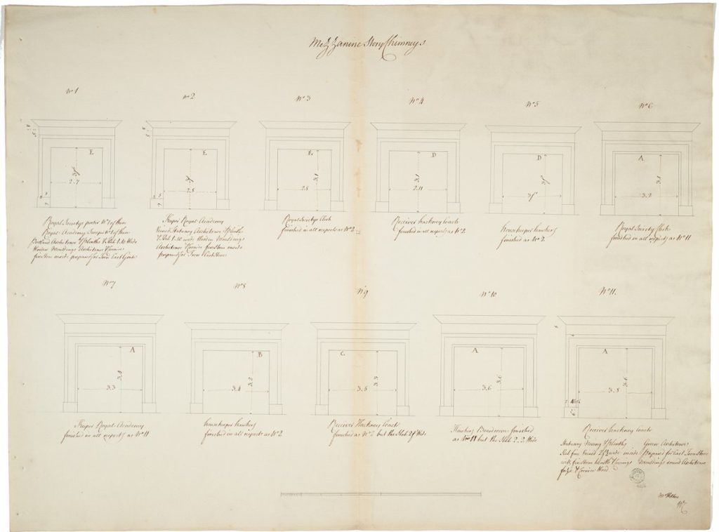
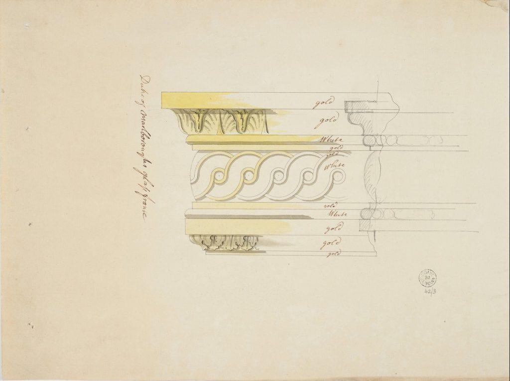
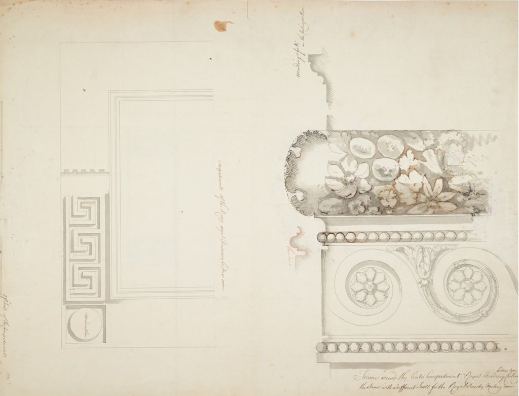
From the orders came decoration. Chambers’ attention ranges from plans to ornamentation, from mouldings and cornices to the fireplaces and chimneys, in which the dimensions and ornamentation reflected social standing. Those for the Royal Academy were, for example, more grand than those for the Royal Society). The cost of paper was another incentive. He often combined drawing types, like the elevation which leads to section for a frame, partially covered with yellow wash, a colour coding to designate the materiality of the gilding. Such an emphasis revealed the ingenuity and range of the architect, working from the scale of the site down to the detail of the frame, in a project, which lasting more than twenty years, would be his last.
