The Hidden Horizontal. Cornices in Art and Architecture: Exhibition Review

Architecture is never an easy topic for exhibitions, because the level of knowledge and pre-existing interest of the public is difficult to gauge. A show devoted specifically to a single architectural detail, seen across a historic panorama, is even more challenging. But this is the ambition of ‘The Hidden Horizontal: Cornices in Art and Architecture’ currently on view at the Graphische Sammlung of ETH Zurich and curated by Maarten Delbeke and Linda Schädler. Including over 150 drawings, prints, books, and assorted objects including furniture, decorative arts, videos, photographs and historical models, displayed in one large room and two hallways, it aims to demonstrate the historical vicissitudes of the cornice across time. A defining element of Greek and Roman architecture, for the modernists it became the reviled symbol of all that was old, only to be revived, with irony, by the postmodernists. But rather than take the conventional approach of a journey across time, the exhibition moves the visitor through a series of loosely interconnected themes, each highlighting different aspects of this element’s history.
Among the seventeen themes defined in the accompanying essay, several emerge with particular clarity. ‘The Metamorphism of the Cornice’ pertains to what is generally understood as the anthropomorphic impulse in architecture. It is a theme that may be particularly well suited to capture the imagination of the casual visitor, because while the association between human and architectural forms dates back at least to ancient Greek caryatids, it remains at once intuitive and surprising. Where do architectural forms come from, anyway, and why couldn’t it be from our own faces and bodies?
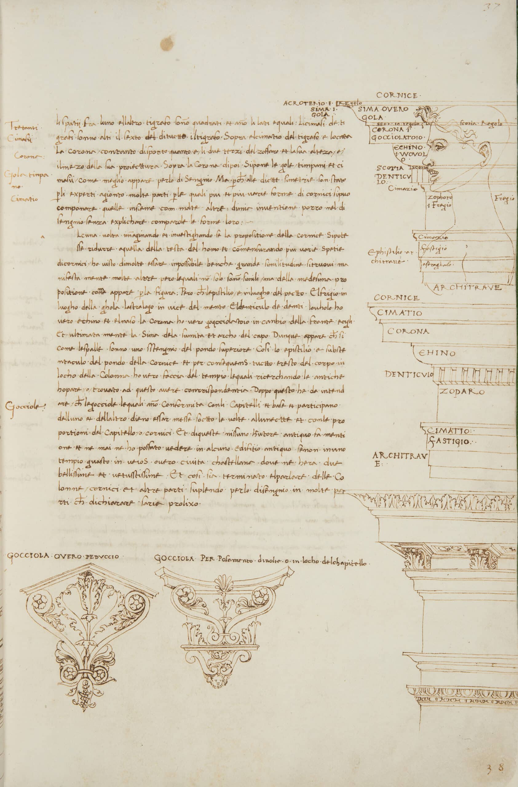
An important manuscript included in the show, Francesco di Giorgio Martini’s Trattato di architettura from the Biblioteca Nazionale in Florence, illustrates one of the interpretive challenges of the Renaissance: how to square the physical remains of ancient Rome with the writings of Vitruvius. Francesco wanted to understand both the origins of forms and their meaning. In a way that would prove enormously influential through the multiple copies produced, Francesco projected an anthropomorphic logic onto details, as in his drawing mapping a man’s profile against the profile of a cornice. Michelangelo took up this prompt in his characteristically looser way, as did Jacques-François Blondel, whose plates illustrating the Tuscan order as filtered through human profiles are also included.
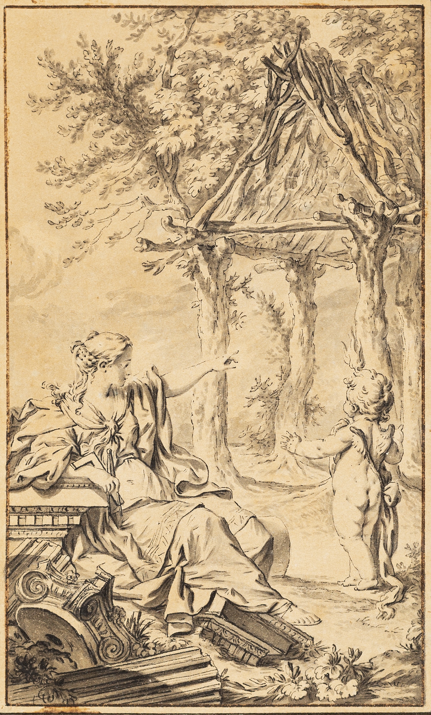
Also related to the theme of anthropomorphism is that of ‘Origin Myths.’ In this category, the exhibit includes a drawing of a plate so familiar it is surprising to see in the flesh in the form of the preparatory drawing by Charles Dominque Joseph Eisen, from the Drawing Matter Collection. The foreground is scattered with broken cornices, capitals and a fluted column shaft, predicting the ruin of architecture even as it narrates its beginnings.
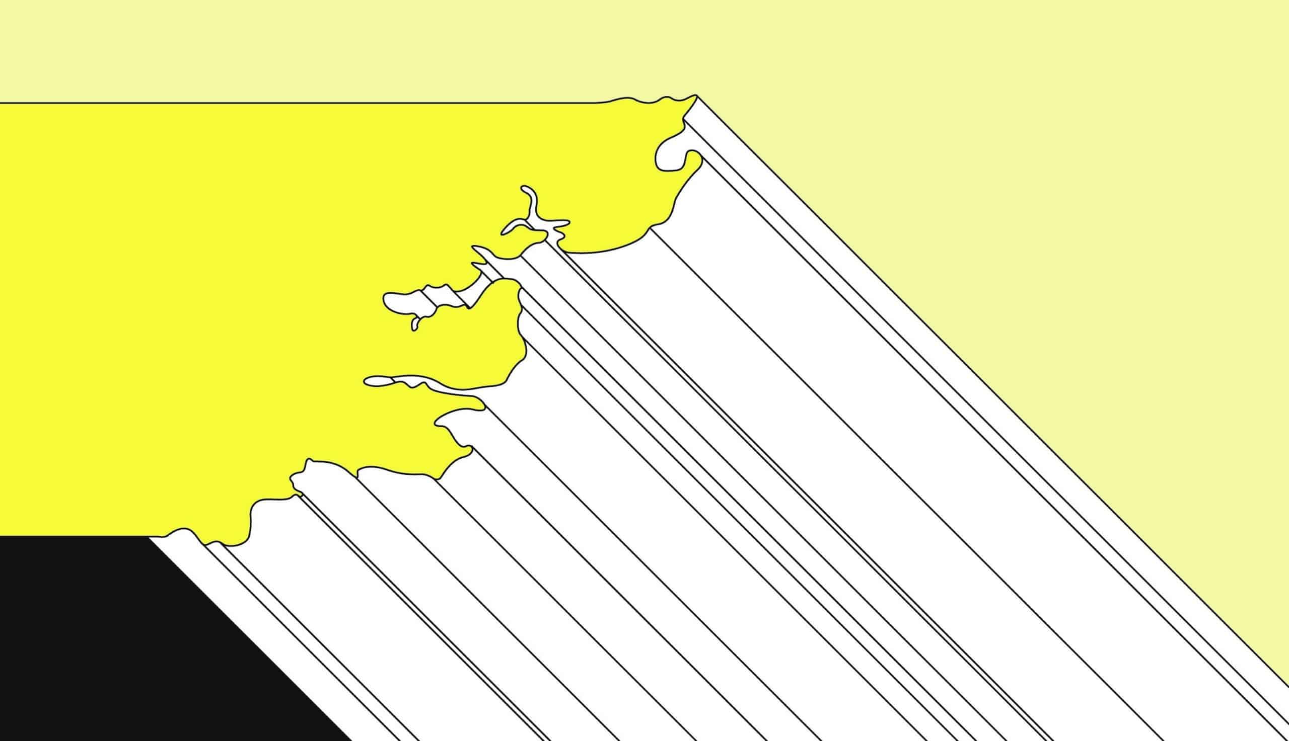
Another noteworthy theme is ‘The Cornice as a Sign,’ corresponding to the postmodernists’ return to the form in defiance of the modernist suppression. Charles Holland and Elly Ward of Ordinary Architecture produced the striking axonometric cad drawing in shades of yellow, black and white. Called Essex Coast Cornice in reference to the origin of its profile, it employs the coastline of England as its inspiration in lieu of the human profile. It was also produced as a three-dimensional model, and is included in the exhibition as well, alongside more traditional cornice pieces.
One theme that might have merited further exploration, if the show were larger, is that of the urban ramifications of the cornice, considered under the theme ‘The Cornice in the Urban Perspective.’ The show juxtaposes sixteenth century street views of Northern printmakers Joannes van Doetecum the Elder and Lucas van Doetecum after Hans Vredeman de Vries, Giovanni Battista Piranesi, and Utagawa Hiroshige, but in a sense these representations of street-scapes only tell a small part of the story. How far a cornice was allowed to extend into the street was also legislated in Renaissance Florence, for example, and these issues (of overhang, set back and shading) are still central matters for urban planners.
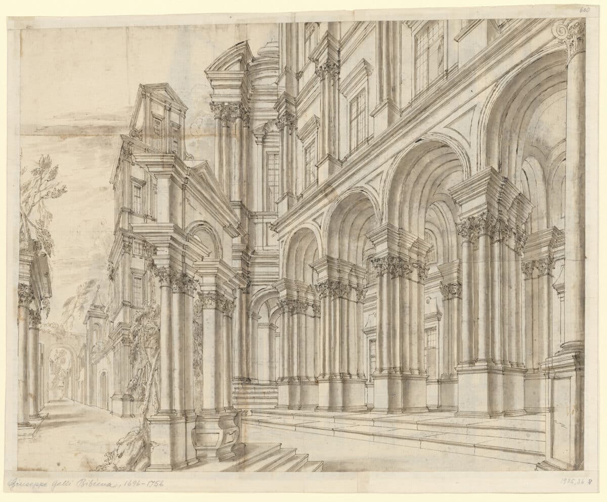
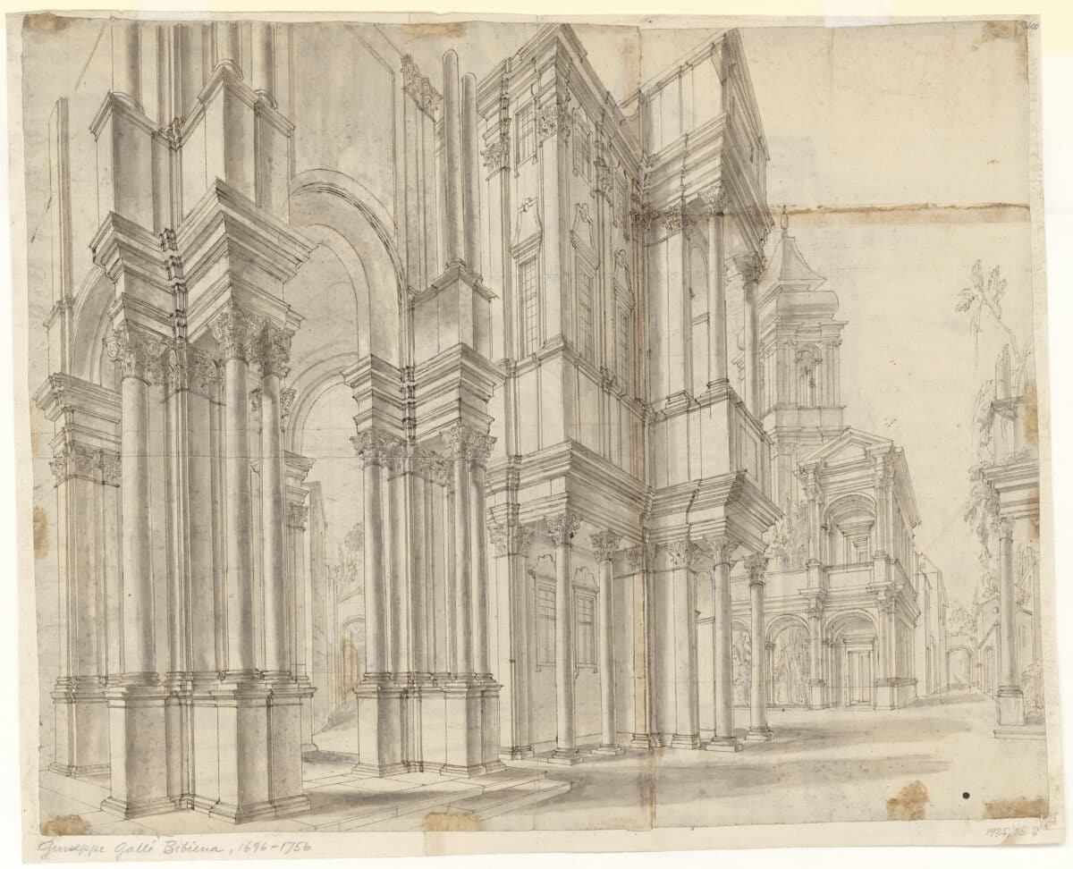
The most spectacular single work in the exhibition, to my eye, appears in the section devoted to ‘The Cornice as Stage.’ This is the double-sided drawing by Giuseppe Galli Bibiena. Illustrating a set design from an oblique angle in an off-centre composition, it shows how architecture could be harnessed for dramatic ends.
Implicitly, the exhibition’s particular way of tracing an element across time works to undermine the sense of a definitive break with the past that the modernists sought to instil. After all, the exhibit suggests, even for figures such as Le Corbusier who ultimately rejected the cornice (following a brief, partial embrace), it was nonetheless an object of focus and interest. This is an interesting and productive assertion, and might have been even more explicit.
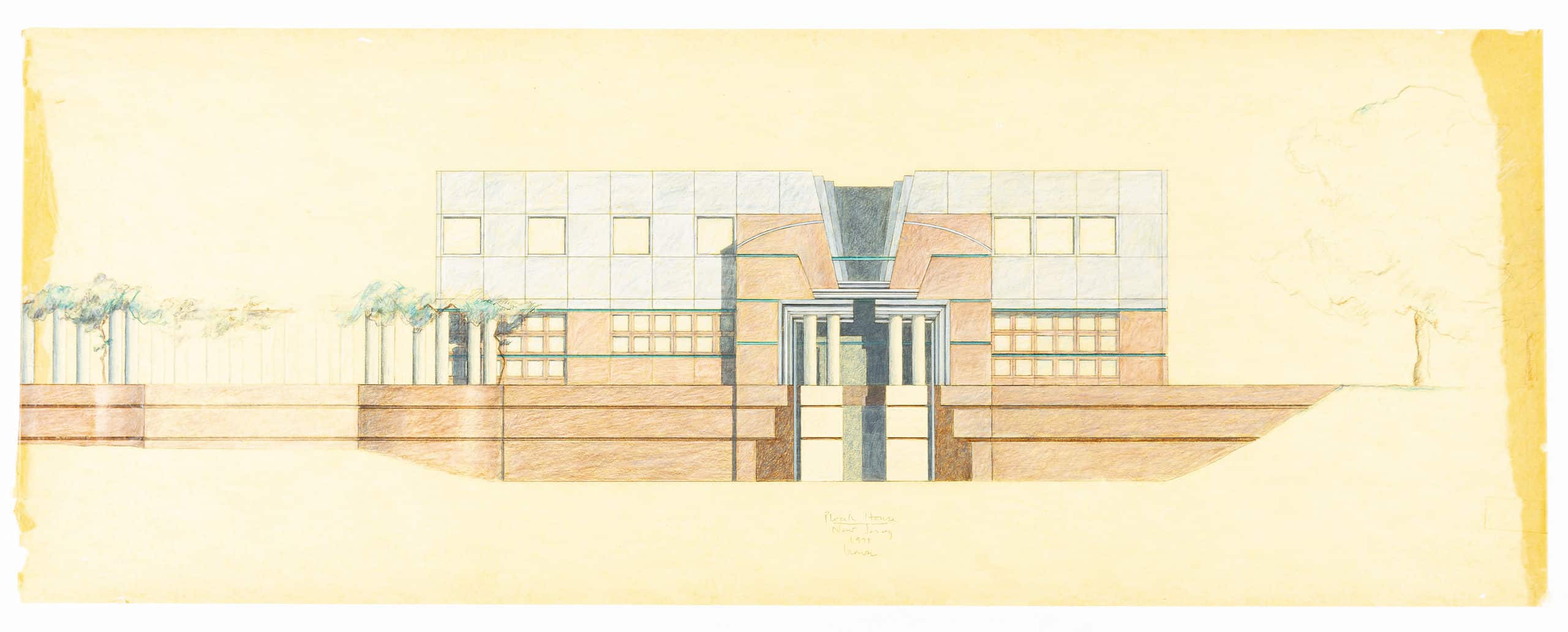
In negation and suppression, the modernists still affirmed the importance of details. Postmodern architects such as Michael Graves (whose work is included in the show) seized on this modernist suppression, using the cornice as a symbol of their return to history and embrace of all that had been forbidden.
Another, more explicit, point the show makes is how the overwhelming focus in the literature of architecture on columns and capitals has led to the neglect of other key components.
It is minor quibble in the context of an impressive exhibition, but the labels merited greater care, especially with regard to works on paper. There are inconsistencies in identifying the state of prints, the materials employed in the drawings and so forth. For a collection focused on graphic materials, one might hope for more attention to these details.
In many regards, the exhibition triumphs over the hurdles intrinsic to its subject, including breathtaking works that offer their own pleasures even to viewers who may understand little of the specific content, and conveying a sense of the changing historical fortunes of the cornice in classical, Renaissance and modern times. But some of the subtler themes set forth in the short, accompanying catalogue may well elude the non-expert visitor. Additional wall text might have helped (the only text was in the object labels), but there is also the question of how much information can be conveyed in a relatively small amount of space. Fortunately, the exhibition is only one of the venues for Delbeke’s exploration of the theme, which will also become the subject of an edited volume of gta Papers and was the focus of a 2019 seminar in which students worked with traditional artisans as well as digital modelling tools to carve and cast a cornice.
What is achieved by taking a selective vertical slice through history, rather than the more typical horizontal and contextual picture of a particular moment in time? Primarily, the exhibition provides a sense of the continuity of ideas and forms even across seemingly vast divides of time and space. The modernist view, that the past is fundamentally unlike the present, and mostly irrelevant, has for the most part prevailed. Few schools of architecture include historians who work on periods prior to the twentieth century. One exhibition will certainly not change that, but it at least advances the view that if we are not talking about exactly the same thing as Vitruvius and his interpreters, we are at least in conversation with them across time.
One overarching question the exhibition raises is to what extent any architecture should be seen in terms of its details. The exhibition brought to mind John Onians’ 1990 book, Bearers of Meaning, The Classical Orders in Antiquity, the Middle Ages, and the Renaissance as well as the more recent scholarship of Mark Wilson Jones, concerning the meanings, origins, and reception of classical details. Is architecture a building a kit of parts, or are the parts incidental? Delbeke and Schädler give us a history of architecture in fragments; they leave it to us to pick up the pieces.
‘The Hidden Horizontal: Cornices in Art and Architecture’ is curated by Maarten Delbeke and Linda Schädler, assisted by David Bühler, Anneke Abhelakh, and Emma Letizia Jones. It is on view at Graphische Sammlung of ETH Zurich until 14 November 2021 – more information here.
Cammy Brothers is an art historian specialising in Italian Renaissance and Mediterranean art and architecture. She is an Associate Professor at Northeastern University, a Guest Professor at ETH Zurich, and a regular contributor to The Wall Street Journal.
