Álvaro Siza: Fast and Slow Lines
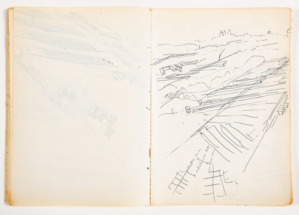
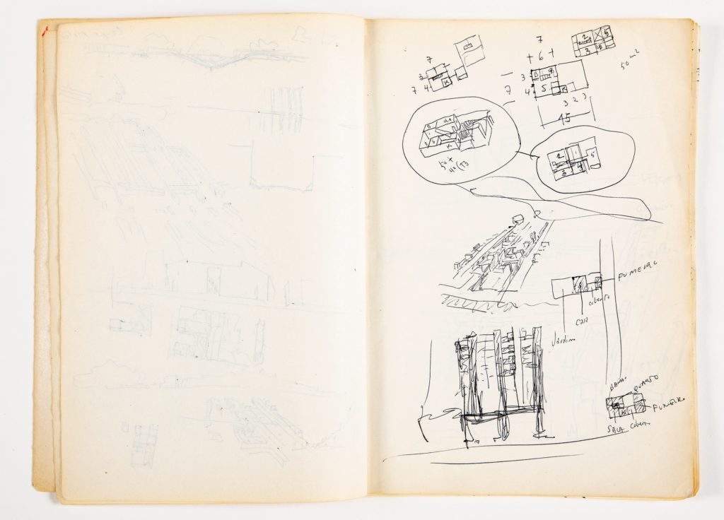
Álvaro Siza began working on the ‘Quinta da Malagueira’ project in 1977. In his sketchbooks, he would doodle iterations of the proposal over and over, together with other observational scenes, figures, calculations, and schedules.
The sketches have various line qualities. Some are steadier, thicker in the middle, and thinner at the end, probably from holding the pen near the tip and moving it in a hurry. Some are looser, wobbly, heavy at the end, probably developed slowly, holding the pen away from the paper.


If we compare the speed of lines with the content of sketches, we can see a pattern: the faster steadier lines seem to be associated with an idea in mind, and the slower lines with observation and processing.
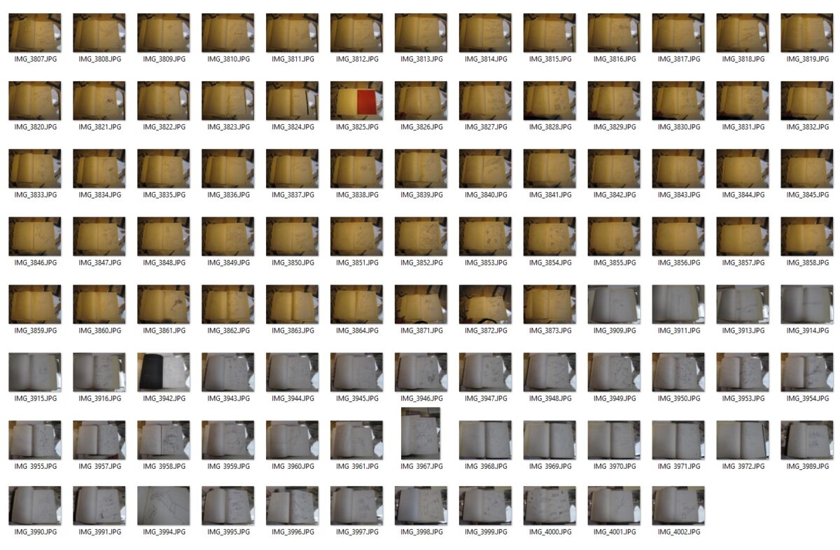
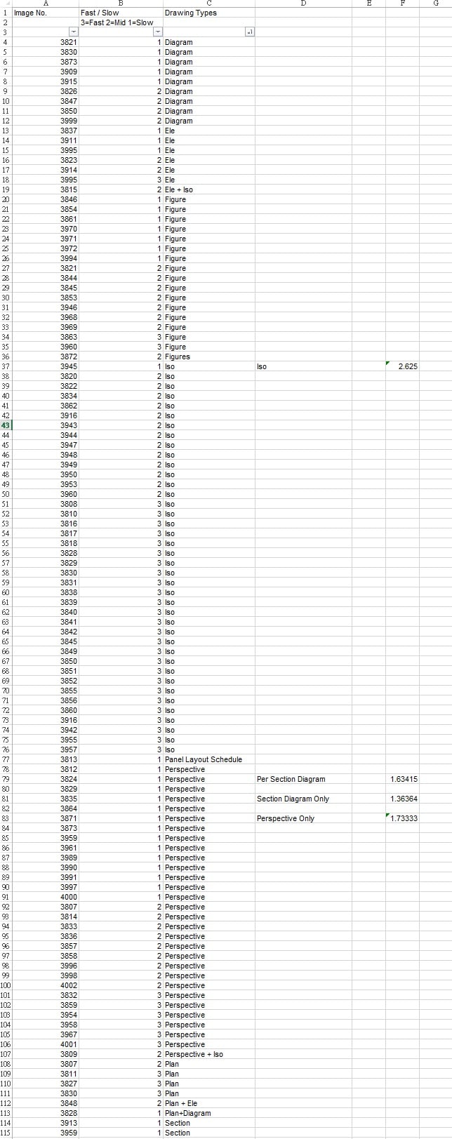
To examine this hypothesis, we carried out a small statistical experiment. We sampled about a hundred pages from Siza’s sketchbooks. We tabled the sketches by manually tagging their content and line speed: 3 stands for faster lines, 2 for medium speed, and 1 for slower lines. The preliminary results show that, among the sampled pages, isometrics were drawn quickly with an average line speed of about 2.63; perspectives were drawn at 1.73, and calculated diagrams and sections were drawn slowly at 1.36.

How should we understand the relationship between line quality and content within Siza’s sketchbooks? Would it be: the purpose of isometrics was to test preconceived ideas; therefore, they were drawn fast before they faded away as if the speed of the line was racing against the speed of the mind? Perhaps, calculated diagrams and perspectives were uncertain and explorative; time was required to process self-dialogues, and to maintain necessary psychological distance, therefore slowing down the lines?
To investigate this further we need an algorithm that analyses the pen traces. The algorithm would be calibrated by comparing video footage of Siza sketching alongside his sketchbooks.
Do all architects draw with a similar fast/slow pattern? Or do some architects draw another way around? In the age of digital drawing and modelling, line weight becomes perfect; hesitation and rush are invisible unless we record computer idle time. Do variations in drawing speed and thinking speed suggest the different ways an architect may construct a space? As quoted by Tim Ingold, Paul Klee would describe two line types: one that develops freely in its own time; another in a hurry to get from one location to another. [1] Analysing this may provide the answer to Siza’s remark on the importance of the link between the hand and the mind. [2]
Notes
- Tim Ingold, Up, ‘Across and Along’, in N. v. Akkelies (Ed.), Space Syntax 5th International Symposium, (Amsterdam: Techne Press, 2005), pp. 45-54.
- Álvaro Siza, ‘Drawn Closer’, in D. Luscombe, H. Thomas & N. Hobhouse (Eds.), Architecture through Drawing, (London: Lund Humphries, 2019), pp. 178-191.
