Zaha Hadid
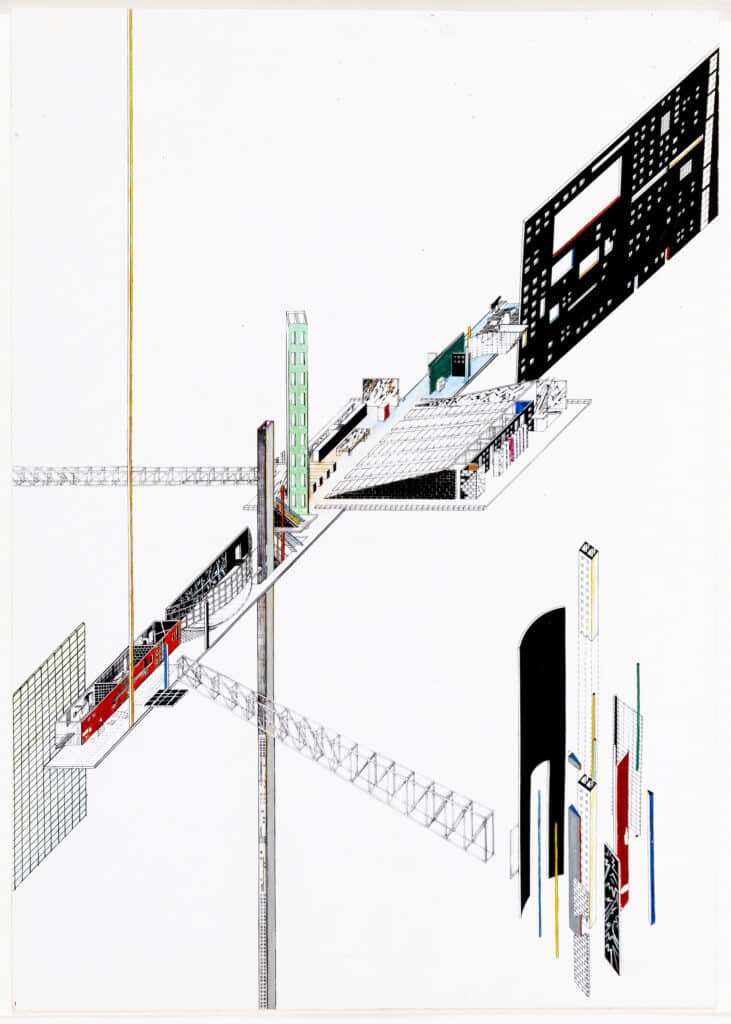
When, in January 1983, Peter Cook reviewed a recently held exhibition for Zaha Hadid’s 59 Eaton Place, he spoke of the resonance between the individual and their education in developing an architectural identity. [1] He pondered on the development of Hadid over that period,
What if fate had led her to study in Stuttgart, or Belgrade or Pittsburgh? What if she had reached her peak as a student under Leo Krier (an earlier teacher) rather than with Rem Koolhaas and Elia Zenghelis? What if the prospect of converting a real and ordinary Victorian Belgravia apartment had flummoxed her? There are, for instance, plenty of people around the AA who make the right sounds and pencil the right lines but live amongst very predictable objects and build the most ordinary conversations. In other words, both Cedric and Zaha have had several opportunities to be more ordinary than they are. [2]
Accompanying the text of the review, were images of paintings and drawings for the Eaton Place scheme and one in context of the gallery interior. What is interesting from Cook’s comment is not only the content of the review, but its timing with regard to the two exhibitions included. [3] Combining comments on Hadid’s work with those of Cedric Price’s exhibition in New York from 1980, the review published in AA Files was under the general title, ‘AA Exhibitions.’ [4] Without saying where they had been located Cook bought these exhibitions to the attention of his British audience at a time when exhibitions of architectural drawings were rare. The contextual image of the exhibition that Cook had included in Hadid’s section of the review was from Zaha Hadid: Planetary Architecture held in Van Rooy Gallery, Amsterdam from November 1981 until January 1982. [5] As noted in the review these two architect’s works were shown together at London’s Architectural Association from 8-26 June 1982, but the inference of Cook’s review is that it is the individuals, Hadid and Price, who were collectively understood for their ‘AA’ roots, and for the AA’s developed sense of the importance as international recognition reinforced the radical nature of Alvin Boyarsky’s leadership. [6]
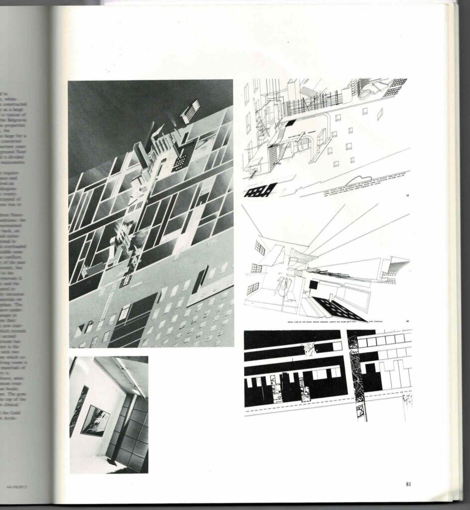
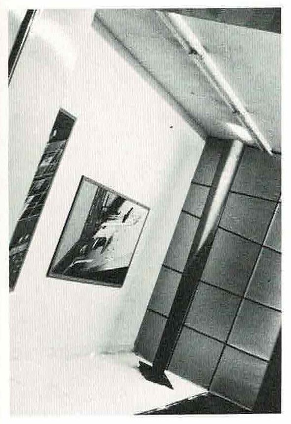
When this context is understood, it is the work shown internationally and bought ‘home’ that becomes Cook’s focus in the review. Hadid’s specifically, reflected a way of drawing and painting each of her architectural project in a manner expressing the power of her experimentation and radicalisation against architecture’s norms. It was an experimentation that crossed the divide between spatial practices found in architecture with those in painting.
While, when turning his attention to Hadid’s ‘59 Eaton Place’, Cook implied that her architectural drawings and paintings held an expressiveness responding to the dominance of the ‘line’ in new ambiguities of architectural space, these remain claims that are not explained. His was not a penetrating interpretation but emerged with a certain emotive strength. Cook’s comments are very specific and approach the images for their impact on what he understood as resilient traditional forms of architecture like the London terrace. He asserted with passion,
Her insertion explodes out of the carcass of the terrace: as if to say, ‘The terrace is great . . . it can take this – WHAM! – and this – BAM! – and that – ZAP! . . . . That’s why the old London terrace is great.’ Not some mealy-mouthed rubbish about Victorian sensitivity. [7]
For Cook, viewers would respond to Hadid’s images in the same way that their somatic memory might return the excitement of ‘WHAM’, ‘BAM’ and ‘ZAP’, terms coined from comic superheroes and Pop Art paintings. However, for our contemporary audience this review reminds us that in architectural drawing power to develop meaning emerges in part from viewer response inevitably combined with pictorial effects of size, scale, compositional intricacy, painterly technique, attitudes to conventions and representation, as well as the technical precision that is required for the documentation of architecture. Cook sees things that others do not. These attributes emerging from viewer insights, in one sense tied implicitly with an object under scrutiny, combine to embed each viewer’s performative engagement and apprehension of the architecture presented. However, Cook also reminds us of another attribute in this engagement, one that takes on an architectural spatiality. Hadid’s exhibitions of the 1980s focused on developing the setting of the gallery as much as her images. In Cook’s review it is difficult to tell whether he has included images from Van Rooy or whether the setting for the paintings was painstakingly repeated at the AA!
Cook extended his critique to this gallery setting without opening the issues that Hadid was attempting to recognise in the importance of setting to an understanding of her work as architecture. In his response Cook is damning,
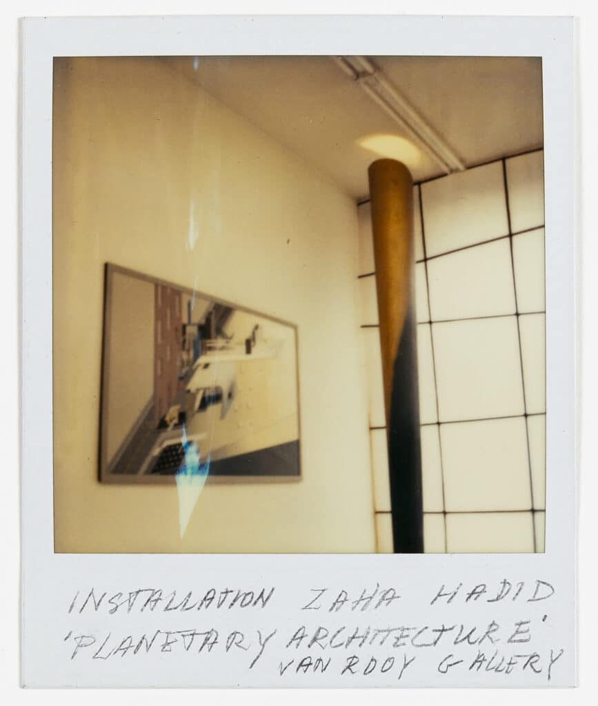
And Zaha presents us with objects of very dubious taste: her column in the exhibition . . . is gold and tapered and revolving, a real bit of Middle Eastern kitsch, or alternatively a dialogue across forty years with Hans Arp. [8]
What must be asked is whether the setting of the exhibition, constructed in haste to Hadid’s direction can be so easily dismissed. [9] To raise such questions points to the importance of the Van Rooy Gallery for so many young architects from this period, its flexibility and support for new spatial ideas about exhibiting architectural drawings, paintings and models. This was a place where experimentation went beyond the hanging of images. Van Rooy was interested also to experiment with how drawings and paintings were apprehended within the space of the gallery itself. It was this gallery, situated in the museum district surrounding the Stedelijk Museum in Amsterdam that became one of only a few internationally dedicated to showing original architectural drawings and paintings in an environment where architectural concepts could be apprehended. Here Luce Van Rooy was willing to respond to the new conditions of exhibiting architectural drawings and models so that the meaning of the architecture might be enriched beyond the display of its representation.
Hadid’s exhibition Planetary Architecture was her first solo exhibition, and the ninth exhibition held at the Van Rooy Gallery. As hinted in Cook’s review, this exhibition was a place where Hadid had tested many ideas about the intent of an exhibition for architectural projects. The exhibition itself became a mirror of the new spatial potential of architecture. The catalogue was published as Pamphlet Architecture 8, Zaha M. Hadid: Planetary Architecture, Projects 77-81, in 1981. [10] The only difference between the Van Rooy Gallery catalogue from that of the Pamphlet Architecture edition seems to be the title of the exhibition. It is the distinctiveness understood between print media and exhibition venue that became the site of ‘work’ in this exhibition that had an impact on architectural thought. The catalogue was compiled from cards, in the manner of a series of postcards, their black linearity and detail produced stark contrast to the paintings and environment of the gallery. The catalogue, the paintings and the gallery context combine therefore for affect that figures architecture.
One of the ideas tested by Hadid in the Van Rooy exhibition was the notion of attracting the attention of the viewer and engaging with the idiosyncrasies of their movement and the inquiry of their gaze. The implications here are first understood by her manipulation of the environment of the gallery. As a question, how viewers might engage with architectural spatiality dominated Hadid’s early architectural schemes. As an idea it would also dominate her early exhibitions. The use of a gold column, one that Cook drew attention to as Middle Eastern kitsch in his review, was a device that was also seen in OMA’s, Netherlands Dance Theatre conceived in 1980. Here, the column acts to draw attention to the rear of a spatially limited reception hall. In the Netherlands Dance Theatre, Koolhaas covers this large structural column with gold leaf, and its bright but warm illumination draws people toward its surface. It is not clear if the idea originated with Hadid or Koolhaas. In Hadid’s use of the column it again brings the sumptuous qualities of a luminated gold column to draw attention of the viewer well into the gallery space, or to the spaces that might otherwise be passed-by in eagerness to see the paintings.
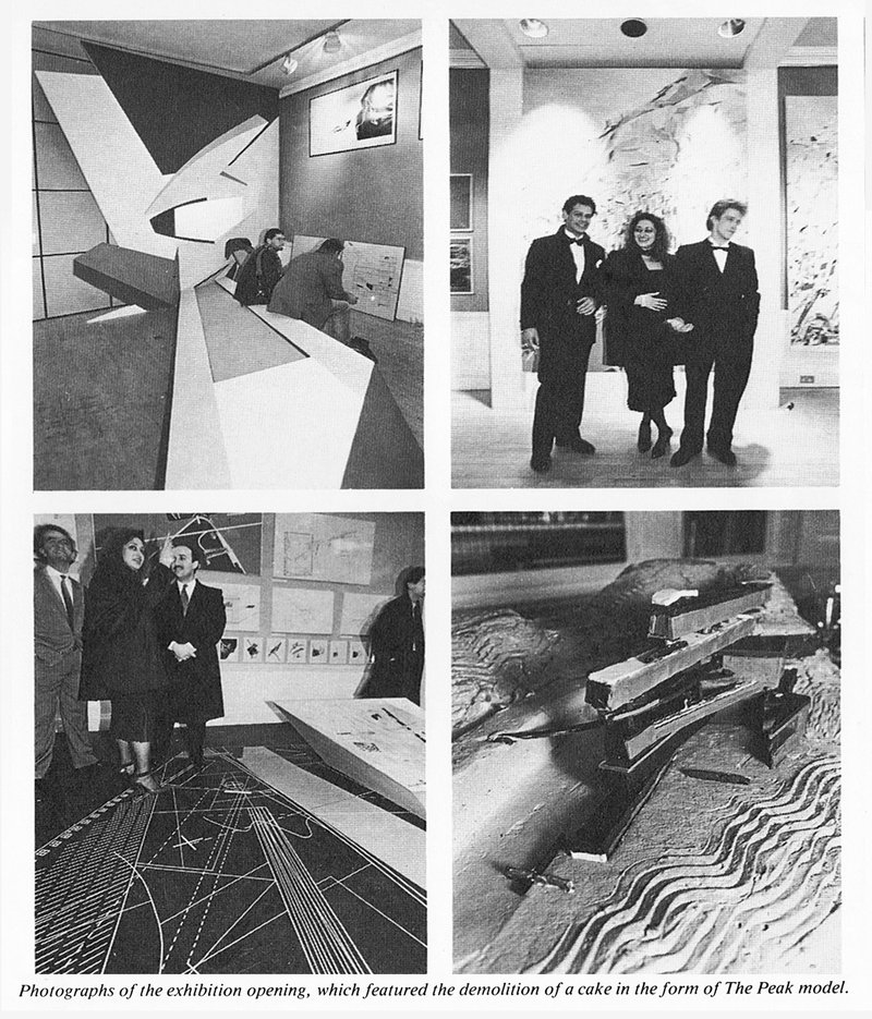
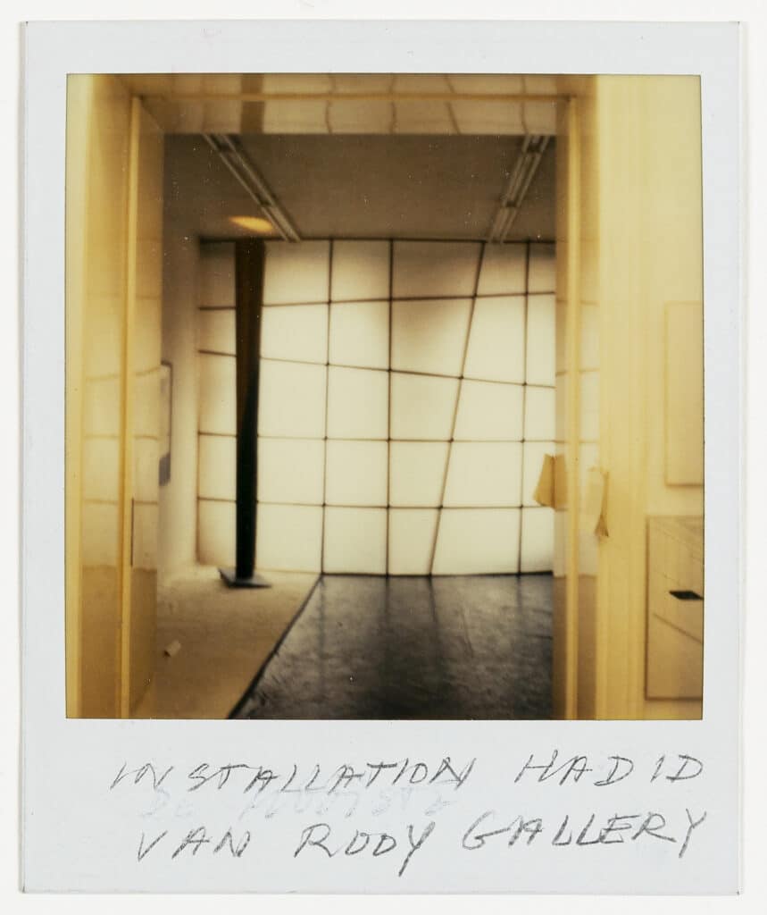
It was in this first solo exhibition that Hadid also developed the environment of the Gallery to create such affect. Hadid had designed the setting for her work at Gallerie Van Rooy to include a gold rotating column and gridded wall lights that had be made with support from her assistants Bijan Ganjei and Gus Hutcheson. Luce Van Rooy recalls the impact of the exhibition reinforcing the idea that the space needed to lead the viewer. Van Rooy remembers,
By now the architectural installation had become a real ‘must’. Zaha drew a great zigzag on the gallery floor with on the left a white sandy path, in the middle soft board covered with black agricultural plastic sheeting and on the right of the zigzag again pure white shell sand plus a postmodern double front-frame, made out of chalk paper and divided in crooked squares. [11]
This experimentation with installation strengthened other visual sign-posts availed through the paintings themselves reinforcing certain directionality, spatiality and temporal engagement. Hadid’s understanding of how paintings might operate in the large space of a gallery worked to combine small detailed technical drawings with large and more expressive/impressive paintings. In this sense the size and complexity of images becomes an important offset to the gallery’s spatial redefinition.
Prior to this exhibition, Hadid had been involved the OMA exhibition Sparkling Metropolis at the Solomon Guggenheim Museum, New York in 1978. Here, three large paintings re-conceived from her final student work, ‘Museum of the Nineteenth Century’, completed in 1977 where shown alongside OMA’s paintings by Madelon Vriesendorp and Zoe Zenghelis as well as Rem Koolhaas and Elia Zenghelis. [12] In the context of this exhibition what is interesting was the size of Hadid’s paintings alongside those of OMA. While only three paintings were included, they were significantly larger than others exhibited by OMA. Size is not always obvious when we see images reconceptualised in print media, but their impact was certainly understood in the gallery in the context of smaller OMA paintings. As Hadid was to grow in understanding of the impact of spatial media over print media the complexity of scale, size and intricacy of linework took on specific performative attributes for viewer engagement.
When Hadid mounted the exhibition at the Van Rooy Gallery she had re-created a number of images from her early projects in the form of paintings. Which ones would be included at large scale and which at small scale began to define a practice that would unfold in coming years. According to Luce Van Rooy the large painting ‘Horizontal Tektonik’ was not included in this exhibition confirming that its large version was not completed until it was included in Planetary Architecture Two shown at the Architectural Association in 1983. [13] However, the ‘Malevich Hotel’ series and small painting ‘Malevich Tektonik’ (1270 x 889 mm) were included and shown in the Van Rooy catalogue, as were Hadid’s drawings and large paintings for ‘Museum of the Nineteenth Century’ and the ‘Irish Prime Minister’s Residence’. [14]
At smaller scale were painted prints of the drawings Hadid created for OMA’s, ‘Extension of the Dutch Parliament’ scheme. For their scheme Elia Zenghelis, Rem Koolhaas and Zaha Hadid had each designed individual components responding to aspects of the brief that were later combined to form the final complex. In Koolhaas’ terms, by undertaking this process there would be no deferral caused by overarching rationalist attitudes, nor would there be the demands of a contextualism that could return architectural innovation to pastiche. [15] OMA’s method derived from what Koolhaas referred to as emerging from the Surrealist concept of ‘Le Cadavre Exquis’ whereby, individuals were given only a few points of contact-continuity between theirs and other parts of the project. In this setting, Zaha Hadid had designed The Ambulatory and its Connections within the OMA competition entry.
Even representations of the scheme were driven by the individuals showing their distinctive approaches. Hadid’s design was represented through painted isometric drawings attributed to her hand, while Elia Zenghelis had collaborated with his wife Zoe Zenghelis for coloration in the same manner that Rem Koolhaas had with his wife Madelon Vriesendorp. [16] A study for Hadid’s image, now purchased by Drawing Matters Trust, displays the exploratory nature of the painted image in Hadid’s practice. The semi-gloss print forming the basis of this painting is small only measuring 210 x 290 mm. These were often done to explore the colour range required by final larger productions of the image. In applying colours using acrylic paint on this print Hadid reinforced the intricacy and the linearity of architectural drawing conventions. To this she added colour to selected shapes and variated hues to others using techniques that draw attention to the individuality of each component and the abstract qualities of the painting’s composition. While this technique is reminiscent of her large paintings both have attributes that transform viewer engagement as they can be apprehended from differing distances. This is exaggerated in the large paintings as there is a compositional effect that forms a singular although complex narrative for the image. They work at distance and close proximity.
As seen in remaining photographs of the show, the large paintings of ‘59 Eaton Place’ were a highlight of this exhibition. Included were the Aerial Perspective of Master Bedroom and Library, 1120 x 2013 mm, the Three Towers: The Flamboyant, the Suprematist, The Clinical, 1060 x 1890 mm, and Plot of Internal Elements, 1580 x 970 mm. These large paintings and those of other schemes, were combined with small intricate drawings and sketches showing orthographic details and axonometric drawings. It was these images that were repeated in black and white regularity in the catalogue. This pattern of combining the attributes of differing techniques and conventions across the exhibition display, required viewer engagement at distance as well as close investigative inquiry. It is a temporal and spatial engagement that is countered by the catalogue where there is an expectation for close and intense focus, the turning of pages and development of meaning as sequences of drawings are compared. What is highlighted in this layering of engagements is an expectation of the scope of the exhibition through media, it is one ranging from an engagement with architecture to the abstract appeal of large painting/small painting comparisons and on to print media’s differing spatiality.
Such kinaesthetic engagement with the different scales and scope of each image and the settings of those images in the gallery is productive in the mind of the viewer reinforcing understandings of the active essence of the architecture portrayed. Architectural concepts, no longer available to the viewer as simple representations of whole objects or environments, are reproduced as a mirror of Hadid’s architectural intent. The effect of conceptual fragmentation and partial disclosure of what might occur in realised building remain distinct. Not reducible to a rational point of knowing, this type of engagement between viewer and painting produces a sense of understanding beyond the objectivity implied by empiricism. It removes the necessary role expected of architectural delineation: that centrally located in a process of realising a building. Instead, the complexity of the exhibition and its images remains emotively charged, selective and productive acting across multiple forms of media. In this model of visualising, the architectural object and its context take on the nomadic sensibilities of phenomenological understanding. They as well appear and disappear from understanding. In their engagement the viewer is distanced from any empirical understanding of the project as whole or as built form. Instead viewers will engage at a more fundamental level with architectural concepts and ideas about the relationality of architecture to the human subject.
Working across print, drawing, painting and gallery settings for an understanding of architectural experimentation, each viewer is able to contemplate the actions of one depiction of the work on the other without loss of their independent importance. Viewers are left to rethink the implications of other images and representational types on the apprehension of what they individually judge is significant. This extended relationality, reinforced throughout the exhibition environment, informs each viewer’s discernment of architectural experimentation and its implications for producing new spatial understandings. This is the point when the subject content of the image, ‘Architecture,’ becomes most compelling. It is the point where the subjectivity of each viewer takes on a productive role for developing new architectural propositions. In this, the painting is not the only source of knowledge. There is an interaction across media and environments. Here, architecture, and the constraints determining architecture’s representation, are tied within a complex of interdependencies. Within this construct, viewers are themselves changed by what they see, with previous ideas confirmed or redirected within individual kinaesthetic, ocular, haptic and intellectual engagements.
In Response
Michael Wolfson: The photos and description of the installation at the LUCE gallery reminds me of what Zaha wanted at the AA exhibition. The two guys in dinner jackets on either side of Zaha are Alastair Standing – the other ex-student who was working with me over that first summer when we did The Peak – and ME.
From the Archive
A Christmas gift from Luce van Rooy, to the Drawing Matter archive – the six polaroids of the Planetary One installation.
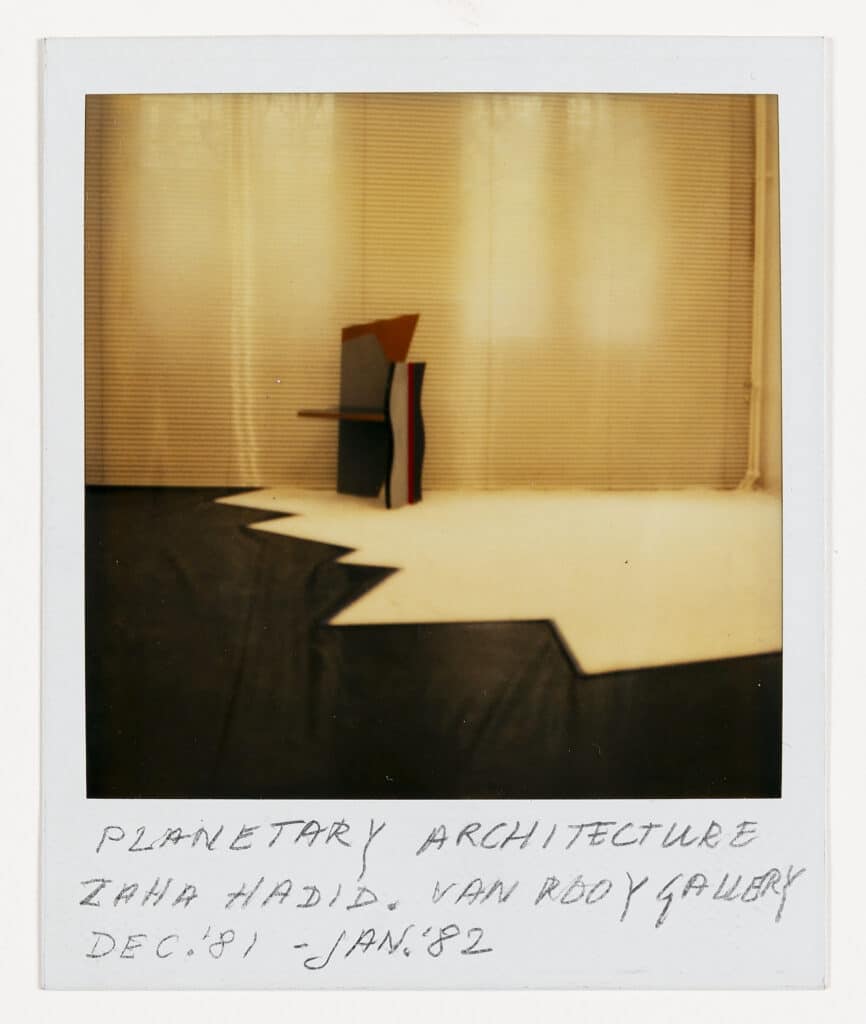
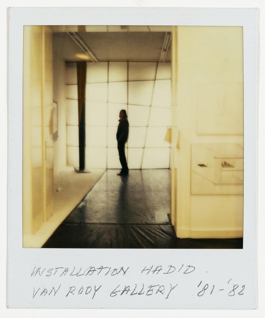
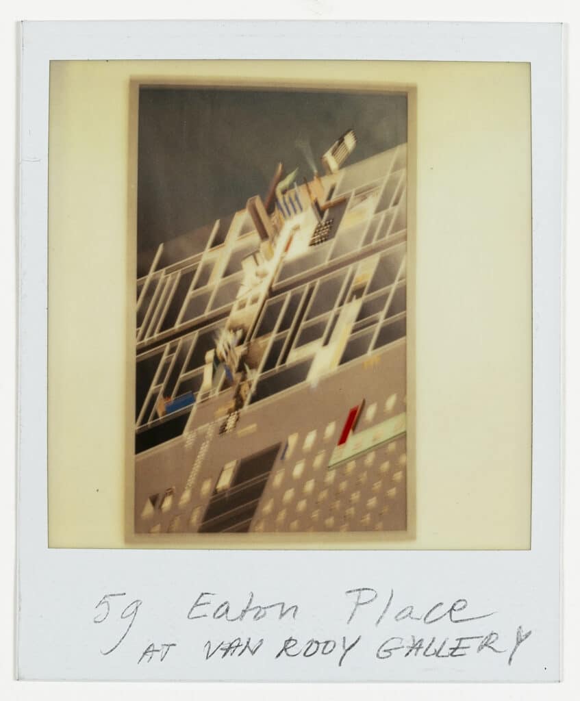
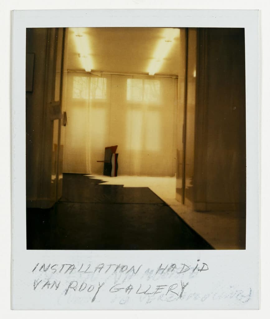
Notes
- P. Cook, ‘Reviews of AA Exhibitions: Larger than Life Cedric Price: The Home / Zaha Hadid: 59 Eaton Place,’ AA Files, 3 (Jan 1983), p. 78.
- P. Cook, Ibid.
- The timing of Cook’s review may have been in response to Hadid’s scheme being awarded the ‘Gold Medal for the AD British Architecture Award’, in 1982.
- Cedric Price had recently shown the works included in the review as part of Architecture II: Houses for Sale, at the Leo Castelli Gallery, New York in 1980. This show travelled to Los Angeles but apparently not to London. See images in J. Kauffman, Drawing on Architecture, The Object of Lines, 1970-1990, Cambridge, Mass., MIT, 2018, p. 185.
- Hadid’s work, and the small in situ image included in the review were from her Zaha Hadid: Planetary Architecture I at the Gallery van Rooy in Amsterdam in 1981–82. See images in J. Kauffman, Drawing on Architecture, The Object of Lines, 1970–1990, Cambridge, Mass., MIT, 2018, p. 261.
- See I. Marjanovic, ‘Lines and Words on Display: Alvin Boyarsky as a collector, curator and publisher’, ARQ 14, 2 (2010), pp. 164–174, and I. Marjanovic and J. Howard, Drawing Ambience: Alvin Boyarsky and the Architectural Association, St. Louis, Mildred Lane Kemper Art Museum and Museum of Art, Rhode Island School of Design, 2014.
- P. Cook, ibid, p. 80.
- P. Cook, ibid, p. 80.
- As remembered by Van Rooy in conversation with Tina di Carlo.
- Tina di Carlo in conversation with Luce Van Rooy.
- Tina di Carlo in conversation with Luce Van Rooy.
- The images included, ‘Axonometric in Context’, 1977 (1977-78), acrylic, ink on paper, 165.1 (170) x 68.3 (66) no. 1549.78; ‘Collection of the Facilities of the Hotel’ (axonometic) 1977–78, Acrylic on paper, 80.6 x 113.6, no. 1557.78; ‘Project’ (section), 1977-78, acrylic, pencil, ink on paper, 74.3 (75) x 182.2 (186), 1556.78. The numbers included refer to the Guggenheim Checklist A0023B709909_OMA.
- There are distinct differences between the 1976-dated painting of ‘Horizontal Tektonik’, held in the image bank of ZHA, the later version first seen in Planetary Architecture Two catalogue, and the even later produced large paintings. Whichof the early small images was included in the show at the van Rooy Gallery is not known; but it may have been the original, small version that is now lost. In her Tate talk of 2014, Hadid explains that this original version was damaged and later copied at the same size: https://www.tate.org.uk/context-comment/video/zaha-hadid-and-suprematism. The second, small version is now held in San Francisco Museum of Modern Art, titled ‘Malevich Tektonik, London, 1976’ (dated in their catalogue as 1977 even though the painting is physically signed and dated 1976) https://www.sfmoma.org/artwork/98.151. It is the image of this painting that is held in the ZHA image bank. A later large painted version of ‘Horizontal Tektonik’, measuring 2444 x 1770 mm, displays differences including grey shading of the upper shoreline of the Thames and modifications to details of the lower left plan shapes. Both these characteristics are consistent with the image in the catalogue for Planetary Architecture Two. See Z. Hadid and A, Boyarsky, Zaha Hadid: Planetary Architecture Two, London, Architectural Association, 1983. From this I assume that the large painting ‘Horizontal Tektonik’ – the one now most commonly displayed in exhibitions – was probably completed for either Planetary Architecture Two or the exhibition of the following year in Italy curated by Marco de Michelis in 1984. This is documented in his catalogue later reprinted as La ricostruzione della città. Berlino – Iba 1987. XVII Triennale di Milano, eds M. De Michelis and N. De Michelis, Milano, Electa Editrice Milano, 1985. The third form of the image is larger and was created as a painting for the Solomon Guggenheim retrospective of the work of Zaha Hadid held in 2006. She explains in her Tate talk that this image is unique because it was created to manage the sloping rake of the spiral ramp exhibition format of the Guggenheim Museum.
- See H. Olbrist, ed., Zaha Hadid, Early Paintings and Drawings, London, Serpentine Galleries, 2016.
- See Rem Koolhaas, Architectural Design Profiles, 5 (1977), p. 48.
- The scheme was published first in International Architect, 1, 3 (1980), 47-60, where individual acknowledgements are made.
