Karl Friedrich Schinkel

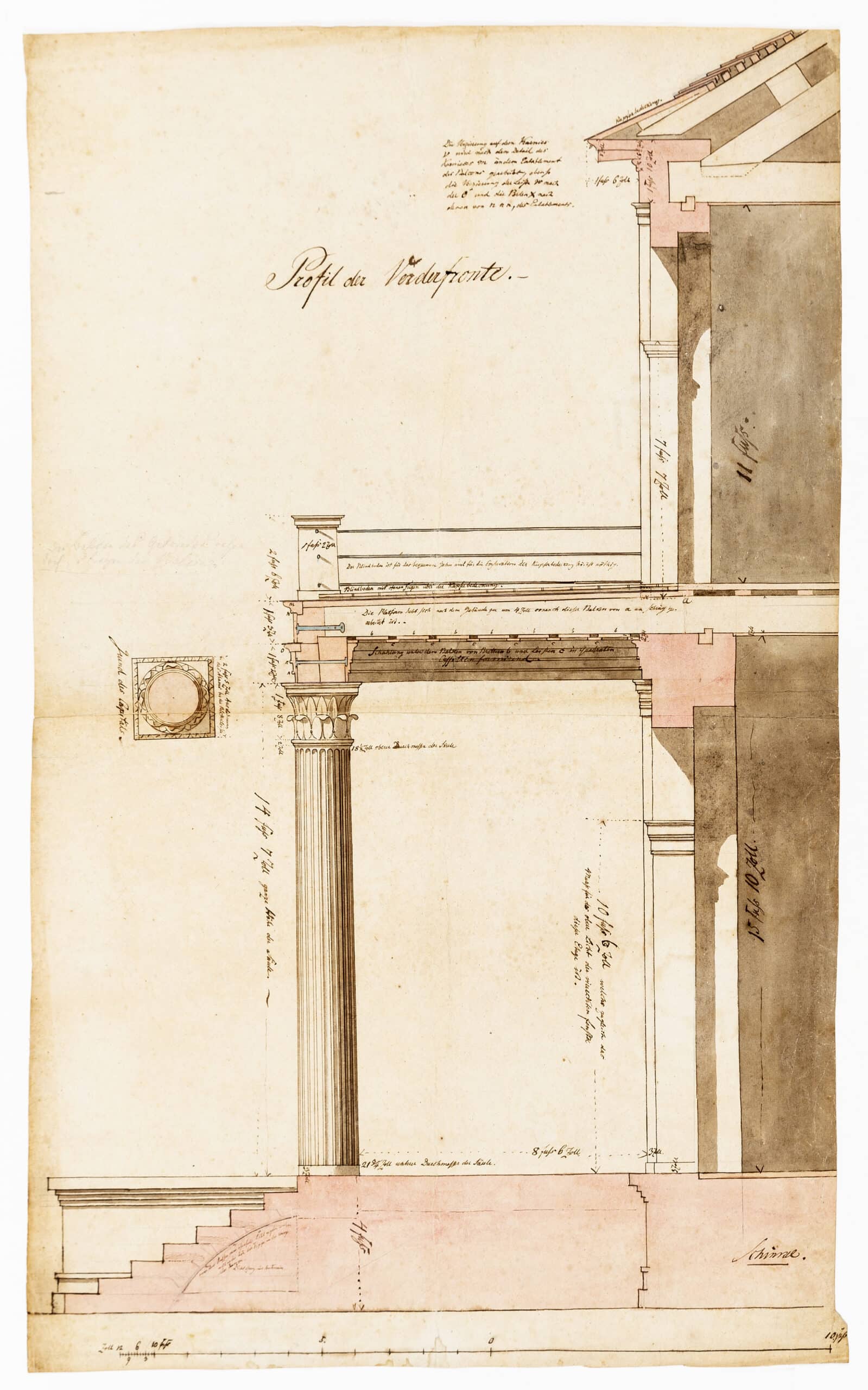
In his designs for the Tilebein House, Schinkel makes considerable use of different colours corresponding to the nature of the materials depicted. To indicate iron he uses a darkish blue, for wood mostly yellow and, of course, when he wants to show cut masonry (he is building in brick), he shows it in red, orange or pink. So at first glance it seems that Schinkel uses colour as a painter would do, in an imitative way, following a long tradition, in the German-speaking world, of using imitative colours in architectural drawings. This is notable for the seventeenth century, when most of Europe, under the influence of Italian architectural draughtsmanship, was monochrome. If one looks closely, however, there is a distinction to be made between two types of colouring in this drawing that marks it clearly as the work of an architect and not a painter. Schinkel’s contemporaries would have understood immediately that the pink that he uses to indicate cut masonry belonged to another order of signification than the rest of the colours spread on that sheet. It was not a colour of imitation, but clearly a conventional sign, a feature born in France under the reign of Louis XIV.
This convention appears indeed in a systematic way in France around 1680 in the drawings of Sébastien le Prestre de Vauban (1633–1707), a military engineer who reformed the entire corps of French fortifications under the Sun King. Vauban strongly favoured drawing over text as a means of communication between engineers, Versailles and the network of forts and ports that he devised to defend the kingdom along the frontiers. Everything, every construction had to be submitted to military engineers in Paris and then sent to the periphery as models, and in order to avoid any kind of ambiguity in the nature of materials to be employed, Vauban established in a written Instruction, sent all over the kingdom, a series of graphic conventions mostly based on colour coding. Of these colours, pink served to denote cut masonry in an unambiguous way in section drawings. Vauban borrowed this colour from the Dutch engineers with whom he worked and against whom he fought during the multiple wars on the Northern frontier. But where the Dutch, like the Germans, use pink to reproduce the appearance of the material, Vauban severs any mimetic link between the hue in the drawing and the material’s actual colour: pink wash now denotes any type of cut masonry – not only brick, but also ashlar, rubble stone or even rammed earth or timber frame. Architects soon afterwards began to adopt the colour codes devised by Vauban under the influence of the first treatises of architectural draughtsmanship, all published by military engineers – beginning with the French, in the first decades of the eighteenth century, who then spread them to the rest of Europe.
So the colours used by Schinkel in this drawing stem from two traditions: a mimetic one, strong in the German and Dutch world, and a conventional one, borrowed from the French. It demonstrates how nineteenth-century architectural draughtsmanship relies on the synthesis of national traditions operating in the time of cosmopolitan Enlightenment.
