OMA: Big Competitions—Reorienting the Modern Project
This is the fourth post, in a series of six, titled OMA CONVERSATIONS. The series is the result of a collaboration between Drawing Matter and architect Richard Hall who, over the past two years, has conducted twenty-three in-depth conversations with key collaborators working with OMA during its formative years. Drawing Matter has long had an interest in the work of OMA in this period, in particular the role of Rem Koolhaas in establishing the model of a horizontal organizational structure and the purpose, and techniques, of drawing in its distinctive repertoire.
BIG COMPETITIONS—REORIENTING THE MODERN PROJECT draws from conversations with Xaveer de Geyter, Mike Guyer, Luc Reuse, George Heintz and Marion Goerdt all working the on early large scale competition projects.
Upcoming posts in the series include focused conversations with external collaborators (‘Satellites’)—who worked across the different OMA locations followed by a concluding conversation with Rem Koolhaas on the challanges in becoming an Office. Find more about the project, including a list of the upcoming posts, here.
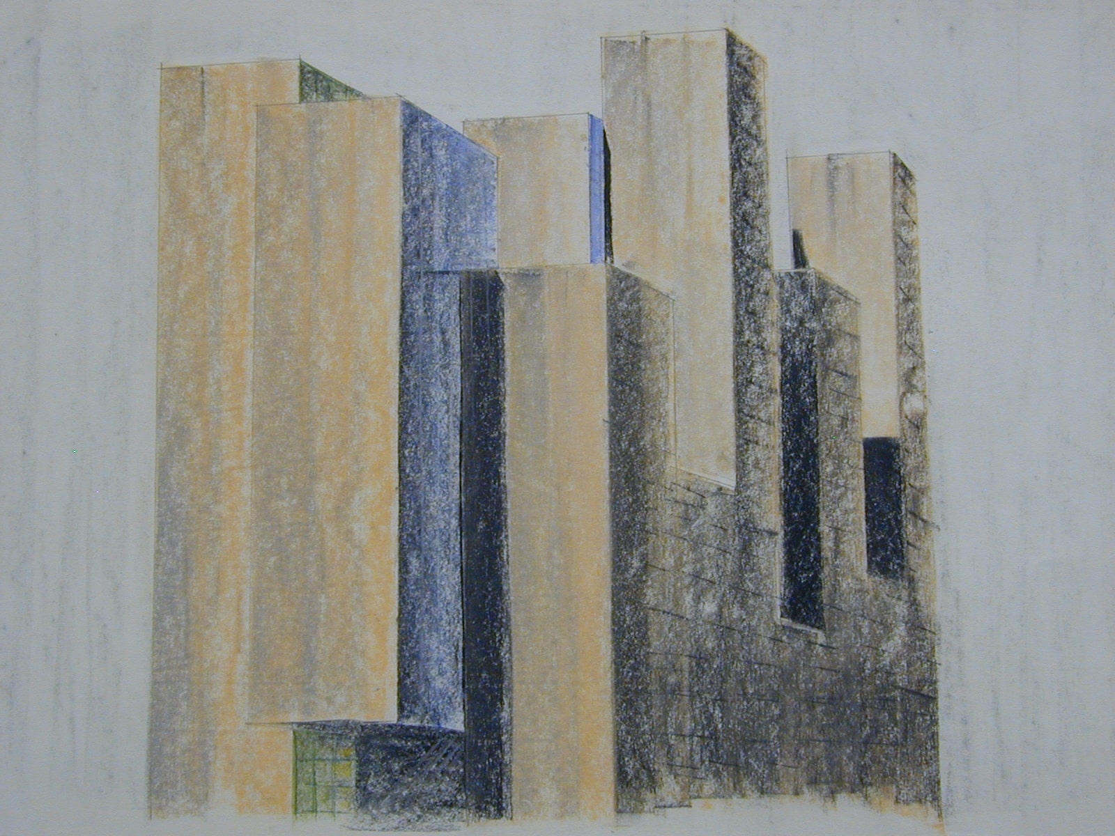
During the mid- to late-1980s, OMA participated in a sequence of important competitions, culminating in a combined effort on Frankfurt Flughafen, Zeebrugge Ferry Terminal, Zentrum für Kunst und Medien (ZKM) in Karlsruhe and the Très Grande Bibliothèque in Paris—all undertaken in the summer of 1989.
The competitions entered in this phase (including slightly earlier examples such as Ville Nouvelle Melun-Sénart and The Hague City Hall) led to the development of new concepts and approaches, surpassing OMA’s previous dependency on the repertoire of 20th-century Modernism. Through this series of experiments, OMA effectively extended the Modern Project, orienting it towards the issues at stake and untapped possibilities at the turn of the 21st Century.
This was a metamorphic phase of OMA, through which the office’s project transcends its heredity, establishing itself as a legitimate contributor to the ongoing processes of Modernity.
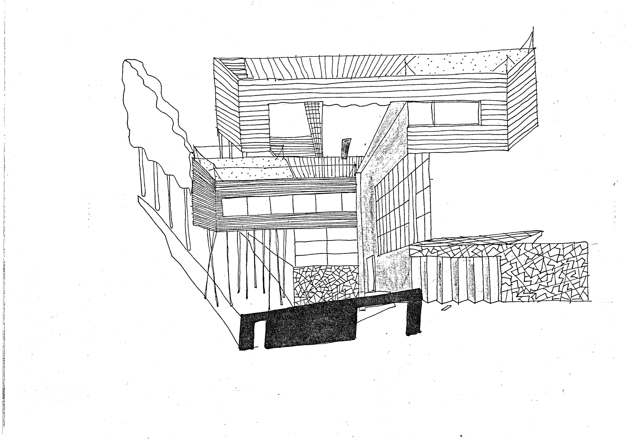
‘This is a sketch, obviously, and there is a poster that was derived from this for the first exhibition that OMA did in Antwerp, at De Singel.
Basically, it’s not an invention at all. It’s a regular perspective drawing that is inverted, simply meaning that what is in front is small and what is in the back is big. It is a very ancient technique that was used in China. The reason I used this was that there is a very specific spatial configuration of the house and the materials. This sketch was made before it became clear how everything would fit together—and we couldn’t show it in a normal perspective. That’s basically why this was inverted: in order to understand for ourselves where the concrete would stop, where the corrugated aluminium would start, where the openings are, and so on. In fact, compared to a traditional perspective, one sees more of the facades together. But as you can see, this has nothing to do with the collage for the Architecture Institute. So, my message would be that original ways of representing projects were often derived from practical issues, like shortage of time or, in this case, not knowing how to make different materials fit together.’
‘On the one hand, it was a very open structure, certainly at the beginning. Everybody brings in what they have in them. I think Rem was absolutely functioning as a catalyst, and very clearly the central person. But it was a system that was very open to ideas from others—which did not necessarily lead to a project that was authored by a specific person—but that basically led to new things as different ideas were confronted. I think if we inherited anything in our own office, it is this way of working. It is often explained as: if the cleaner has a better idea than the architects, then that’s what we will do. So that is an attitude that remained in our office.
But on the other hand, it’s very clear that this period towards ‘89—or let’s say this development from being a rather modernist architecture office and then ‘89 being a culmination point—resulted in the office being able to go one step further than the modernist attitude, I would say. Because the context at that moment was already—since quite some time—postmodern. But I think that what OMA did in that period had simply nothing to do with postmodernism or anything. It was rethinking more extreme forms of architecture on a programmatic basis. I think a big value of that is that we were not at all concerned about style.’
— Xaveer de Geyter Transcript click here.
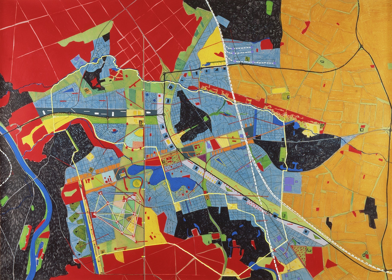
‘There are the two main panels of Melun-Sénart: the black and white line drawing with ‘Les Vides’, the forest textures, the building typologies, the usage diagrams and the firm logos. And there is a drawing in very strong colours—printed black-and-white in S,M,L,XL. In my memory, it is a beautiful drawing in oil pastel, that we did after several try-outs in one night—the three of us working on the same drawing. It was a conclusion for the line drawing and the sequence of the abstract diagrams in black-and-white.’
‘This strong will to shift boundaries led to the myth of the star architect. Rem, as a very charismatic person, initiated the trend but was also the first who criticised it. But I think the search for ways to work together in pursuit of the best possible outcome under a high time pressure was very important. Although we were very different personalities, we all were young, hungry, curious and open for experiments. We exchanged drawings and diagrams and were writing texts in very close dialogue—and building models together. Only the results counted, we didn’t care about authorship.’
‘The installation for the 1986 Triennale shows an interesting mix of media that resulted from this process. As a response to the hype of postmodernism and the rebuilding of the Barcelona pavilion, Rem was really keen to invent a narrative of what happened with the original pavilion—this icon of Modernism. The fictional story goes like this: it got dismantled and transported back to Germany, was forgotten in the war time, being reused in East Berlin, then rediscovered and brought back to the West. We found the fragments and finally reassembled them in Milano. Strangely enough we only got a curved space in the fascist Triennale building, and as a consequence our Barcelona pavilion had to bended. The narrative was transmitted in a film shown in the pavilion with leftovers of the journey, collages and drawings. It was—intellectually—a really sharp concept but had some shortcomings in the realisation.’
— Mike Guyer Transcript click here.

‘Although I didn’t work on the competition project itself. I was asked to make some drawings at the end. The main idea for these drawings was to capture what I would see if I moved my head like this [moves head in up-and-down motion]. It’s a wide angle, but it’s not constructed. I visited Frans Parthesius—who was making the model—to understand the interior, and that was the inspiration. So, there’s no perspective construction: everything could fly. I made sketches from which you could understand the building as a whole: one drawing that captured what you would see as you moved around. When you construct a perspective, you have to choose a viewpoint, but this is more intuitive and allows you to see as much as possible.’
‘Personally, I learnt that the way to do a competition is to analyse the program and start from the client’s question. I didn’t learn that in school, I learnt that at OMA. I think that’s a good attitude, because an architect is not an artist. Ours is another kind of work. We do work for people or for the city. They have to use it. You have to make sure that it works. That’s your life. That’s your responsibility. I remember fifteen years ago; we had never built a school in my own practice. Suddenly, we had the question for a competition. As an architect, you don’t know everything. You have to listen to the people who wrote the brief. I think that when you do that at the start, the client is pleased that you respect their view. So, the main thing I learned at OMA is that you begin by talking and listening and seeing.’
— Luc Reuse Transcript click here.
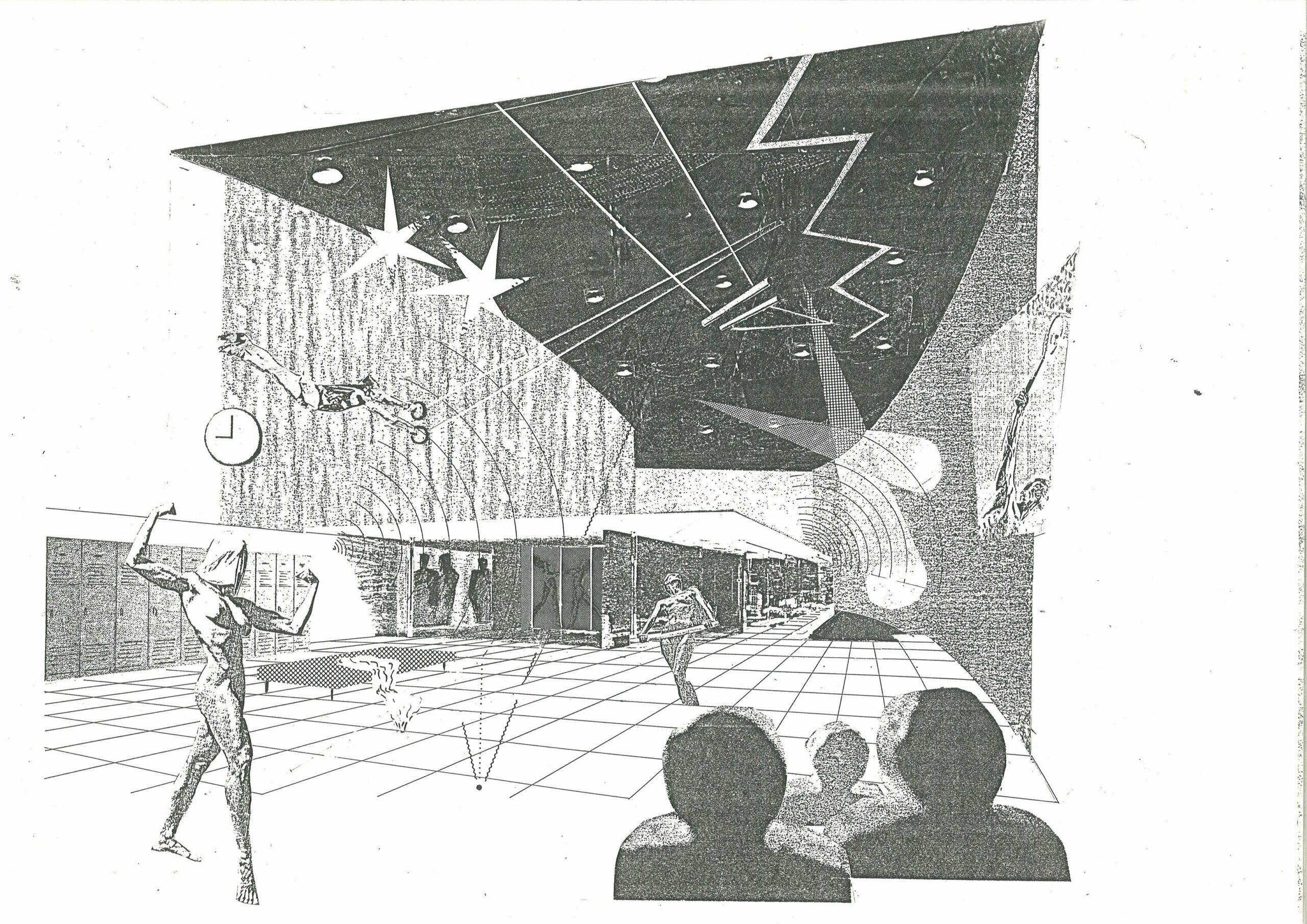
‘It was the beginning of computers. Actually, it was quite funny because we did most of them in ink, but there was this illusion that we were working with computers. It was handmade, but very fast. When we really started with the computer, first it was external—and we used it for the models especially. We did a lot of computer-looking drawings, but it was really the start of this technology. The programmess were very primitive. So, we used it for certain expressions, but it was very schematic. Schematic images to help us rationalise our thoughts and reassure the client and so on. It was about presenting ‘professional data’, like we do today, but then it was done with a Xerox machine and glue! But it was really professional at that time. It was possible to make this illusion because all the programs that you have now on your computer, they didn’t exist. Drawing with no colours and ornament (‘a crime’) became computer illusion.’
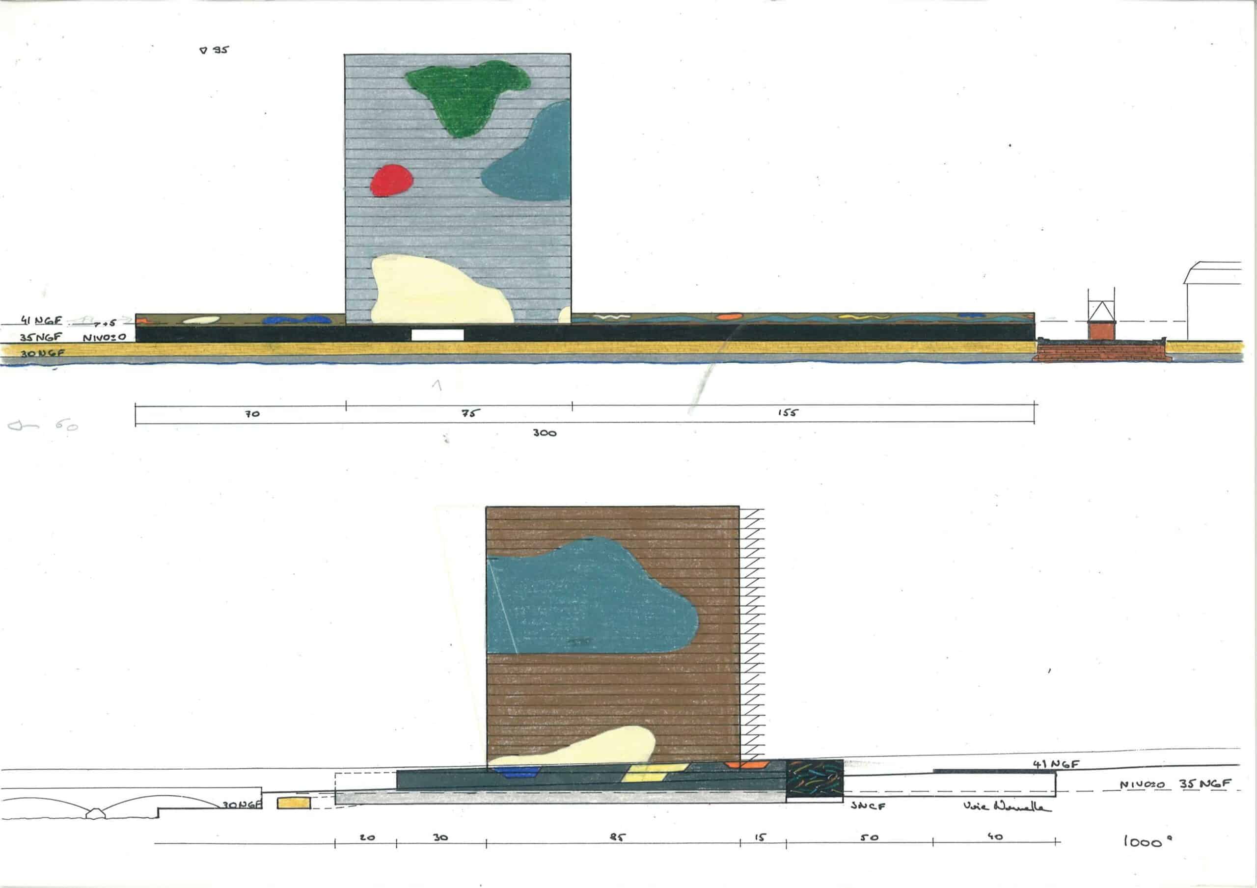
‘Of course, I like very much the drawing that Rem selected for S,M,L,XL about Très Grande Bibliotèque. This is a real key. If you look at the book, it’s the only drawing in all the book—of more than 1000 illustrations—where you have the name of the author (p.644). Even San Rocco magazine, chose it when they had the ‘Rabelaisian’ table at the Venice Biennale. They chose this drawing for the 100 pieces of architecture of the century. There was this—I am ashamed to say—between a Mies van der Rohe and an Oscar Niemeyer project. In between, there was my drawing and Rem’s comment, ‘altruist machine’, that he did as a beautiful dedication for me. I’m very proud of this.’
‘I think the first decade of OMA, brought in a complete revolution, simply by saying that the modern movement was not finished or frozen. The attitudes, the expressions, the techniques are still effective. They just have to be improved and combined differently. It’s an open encyclopaedia to pose questions, not answers. Finally, if you consider the 2014 Venice Biennale of Rem. What is he saying? Ceilings, stairs, doors, roofs, floors, etc. Elements of Architecture; Architectonics. You combine them and you have infinite architectural possibilities. Whatever the style, the price, the place etc. It’s a lesson in freedom. I think this is the most important thing I learned there at that time. Feeling like you are standing, free and outside the Doxa!’
— Georges Heintz Transcript click here.
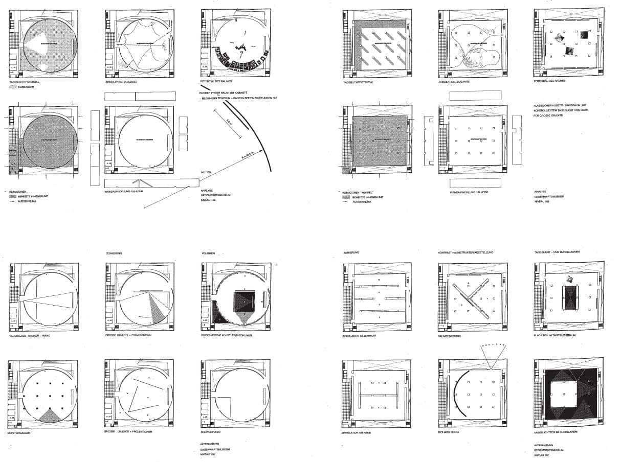
‘I was basically involved in the upper museum floors [ZKM], and Christian Basset was working on the big performance space on the entrance floor. There were floors with structural elements and other floors where there was no structure in the space itself. The floor plans on the second sheet were all about potential exhibition arrangements, relative to the structural elements on the four museum floors. They show different scenarios: playing with the size of exhibits; objects vs. projections; options for division into several different spaces; creating surprising options for movement in space. They study how to use the curved wall and the circular space: what dimension of artwork you could hang on the wall there, things like this, on the four different museum floors.’
‘But at OMA, an important thing for me was to try out things where you would say, ‘But that’s not possible’, in the first moment, and then to think, ‘But how could it work?’. To leave conventions or traditions to one side and to really look for an individual approach on a topic or a site. I think that remains very important to this day. I wouldn’t have wanted to miss my time at OMA. Absolutely not. It was also the time when OMA won big competitions and there were a lot of new architectural approaches being developed to different topics. For the sea terminal in Zeebrugge or the library in Paris, they really created new kinds of spaces—never seen before. Like really inventing something new. That was very exciting.
Of course, when I came to the office it was the moment that those big competitions were already done. Then, OMA was really trying to make this huge step into building the projects. Not only developing a design, but also to get them built. I think that was quite a hard step, and quite a hard experience when it was clear that the ZKM wouldn’t be built. I can’t imagine what the atmosphere was like at OMA at that moment. When that was decided—in 1992—I was already in Cologne. But that must be terrible.’
— Marion Goerdt Transcript click here.
