A Taste for Architectural Drawings
Olfactory Analysis in Identification
The smelling and tasting of historical architectural drawings have been overlooked by scholars as valuable research tools, particularly in matters of dating and authorship. In this short discussion—a foretaste of a future volume, or two, that I intend to write on the subject—I demonstrate that drawings made by architects, including the master masons of the medieval period, emit clues transmitted to the senses that may be detected and interpreted with considerable precision through knowledge of aroma and flavour.
The olfactory analysis of architectural drawings may be compared to other fields that rely on sensory identification. In oenology, the science of wine, connoisseurs can identify the geographical district, maker, grape and vintage simply by inhaling the bouquet and sipping the liquid. For many everyday people who have a good nose, a small amount of training can develop a sharp sensory awareness. My friend Luis, when younger, worked in perfumeries, so now when we are together at gatherings he is always identifying the scents and colognes, some very rare, that people around us are wearing; and as Luis enjoys fine cuisine, when we have been walking down the street, he has declared with great accuracy a smell wafting on the air: ‘Boeuf bourguignon, much garlic, few champignons’.
I first raised the subject of flavour and olfaction in 2014 in my article Tasting Architectural Drawings, written when researching and mounting an exhibition at the Royal Academy of Arts on the drawings of the architect Richard Norman Shaw. There I explained how architectural drawings excite all of our five senses—sight, sound, smell, taste and touch—and demonstrated this using Shaw’s drawings as an example. I concluded by stating that Shaw’s drawings taste like chicken. This was, of course, a simplistic conclusion because the essay was written for a general audience rather than as the rigorous analysis demanded by the academic and scientific communities. I also alluded to the fact that this had been my only tasting of an architectural drawing, not wanting to lose my curatorial position, when in truth, for over forty years, I have sniffed and licked many thousands of drawings by countless architects from across the centuries, leading to a specialised understanding of their identification.
The Shaw drawings do indeed taste like free-range chicken (battery chickens being unknown in the late nineteenth century), with hints of smoke, saltiness and orange-rind astringency, followed by a long aftertaste. These are the pronounced flavours and olfactory modalities specific to Shaw’s drawings, and by combining these with other subtle elements, it becomes possible to identify a work in Shaw’s own hand. Inks and washes, for example, are mixed in a personal manner, giving distinctive scents and flavours. Once these sensory signatures are properly analysed and catalogued, the attribution of drawings becomes not merely possible but almost unavoidable.
A drawing is composed of medium and support, the most common support being paper. Once the taste data is acquired, it is fairly easy to date paper with a quick flick of the tongue across its surface because paper of every year has its own distinct characteristics, just as wine does. My method proceeds by first using sheets that are dated by their watermark, digesting the pronounced taste of the vintage of the tree cull and paper processing—a blend of woody pulp and flavourful gelatine bindings such as potato or corn starches—and then applying these specifics to unwatermarked sheets to establish the year of their making. It is a great pleasure to taste high-quality papers, especially those made by Whatman, which can savour of a fine dish of pommes duchesse.
Medieval architectural drawings were made on parchment created from prepared skins of sheep or cows, and these obviously have the whiff of abattoirs and tanneries. By studying the unique and individual processes of a percamenarius (parchment-maker), animal dermatology and dated records on parchment in archives, it is possible to not only date a drawing but also identify its creator since master masons usually used the same craftspeople. The finest and most expensive parchment was vellum (from the same origin as veal), made from the skins of young calves. Even after paper was introduced into Europe, architectural drawings for nobility and royalty continued to be made on vellum, which has rendered it straightforward in being able to sniff out and distinguish unsigned and undated drawings by, for example, William Vertue, Royal Master Mason to King Henry VIII, who used premium vellum made from the foetuses of aborted calves, with their most delectable and mouth-watering taste.
Pinpointing individual architects, however, relies most heavily upon their use of medium. Although this can be detected through techniques such as X-ray fluorescence spectroscopy and optical microscopy, there is nothing more sensitive than the stimulus of human receptors. The pigments of ink and paint contain organic components derived from plants, lichens, insects or molluscs, as well as inorganic ones such as metals, minerals and earths. With such a wide array of elements available, the taste buds can enjoy quite a feast.
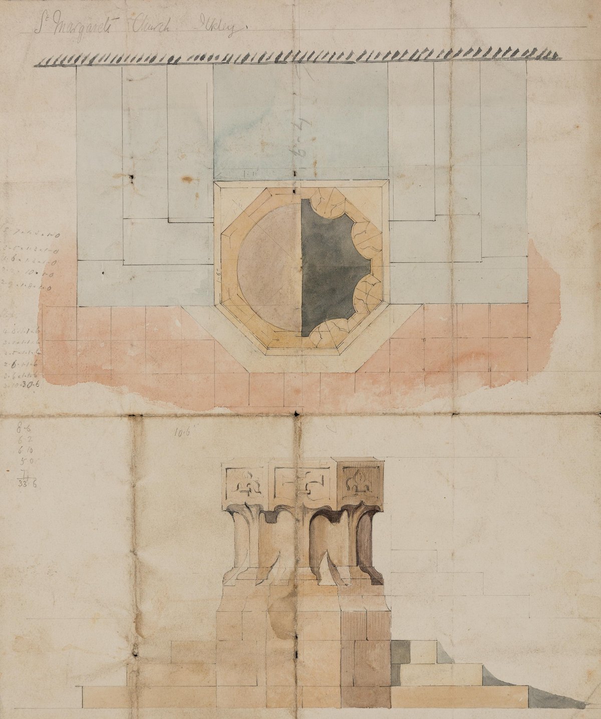
Richard Norman Shaw (1831–1912), font, St Margaret’s Church, Ilkley, c. 1878. Pencil, pen and ink, and colour wash on paper, 340 × 400 mm. DMC 2875.4
Returning to Norman Shaw, the ink he habitually used is not difficult to identify because it is an unusual squid ink, its briny taste is specific only to cephalopods living off the North Sea coast near Skegness. Similarly, his yellows are lead-tin (not poisonous in small quantities, and with the puckering orange rind astringency already mentioned), mined near the Welsh town of Pant. I can reveal too that for red tints Norman Shaw occasionally used human blood, probably his own, which contains iron oxide and thus produces a saline metallic tang unmistakable on the tongue. This leads me to the conclusion that Shaw suffered from a tendency toward self-harm or had access to a hitherto unknown publication on pigments and binders.
More recently, I have applied similar techniques to distinguish drawings by William Talman from those by his son John, whose styles can sometimes be indistinguishable. I have discovered that William’s drawings possess a distinctive taste of burnt beef, with overtones of cabbage and vinegar, whereas John’s drawings taste markedly fresher with non-animal tasting products. When I asked one of my young vegetarian colleagues, whom I have been training, to savour a John Talman drawing of a design for a Trianon at Hampton Court, she was pleasantly surprised, pronouncing it a blend of gooseberry, elderflower and ginger cordial. However, when she sampled a drawing of Whitehall Palace attributed to John, she gagged … conclusively establishing it as a meat-flavoured work by William. Thus, we have been able to authenticate two closely related drawings of approximately the same date as the work of father and son architects through taste alone.
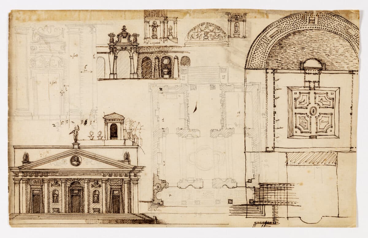
John Talman (1677–1726). Design for a Trianon, Hampton Court, Surrey, 1709. Brown ink and pencil, 195 × 316 mm. DMC 1248.1r.
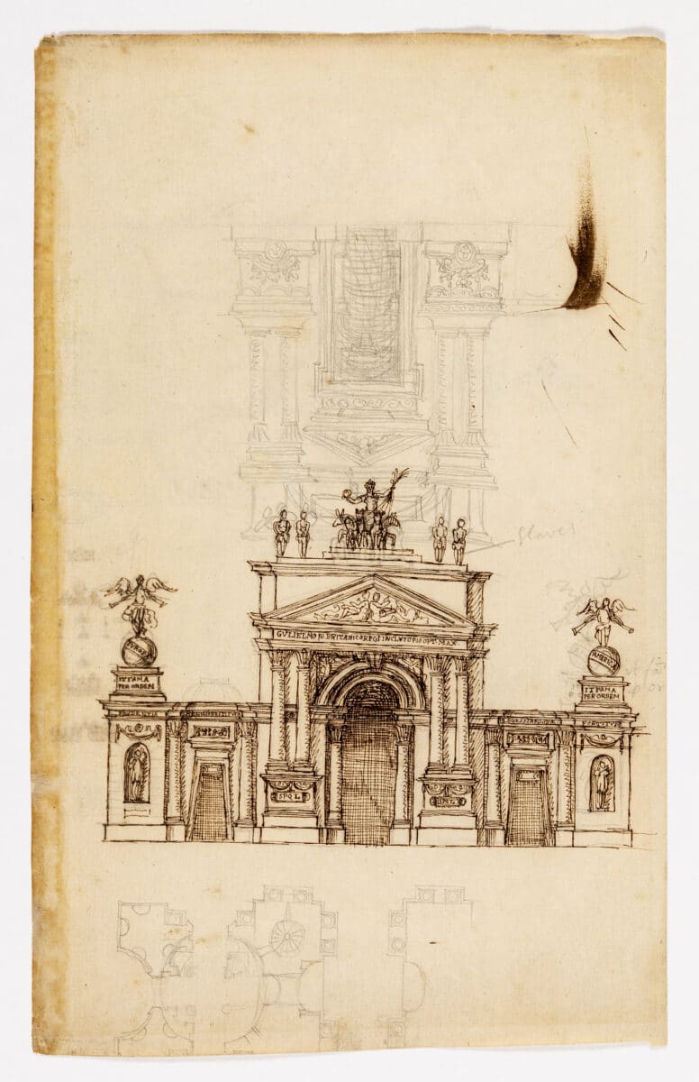
William Talman (1650–1719). Design for Whitehall Palace, London, 1709. Brown ink and pencil, 316 × 198 mm. DMC 1248.2r.
Alongside smell and taste, I am also exploring touch and sound, tactile and aural qualities emitted by drawings. Every sheet of paper feels different to the touch, especially after it has been used by the draughtsperson who imparts a unique impregnated finish to the surface through sweat, hand grease, nose drippings and other bodily functions (which, of course, also enhance the olfactory stimulus). Likewise, every sheet produces a distinct sound when rustled. As an example, a Whatman Double Elephant size non-pressed, manufactured between 1818 and 1825, when shaken, produces the harrowing sound of the death rattle of an elderly Essex man from the Chigwell area.
This research will, I believe, ultimately demonstrate that the long tradition of studying architectural drawings solely through using the sense of sight is both highly overrated and in urgent need of revision.
*
Neil Bingham is the founder of the Society of Sensory Historical Information Techniques (SSHIT), a group dedicated to the research of carnal perception and tasty architectural drawings.

– Andreas von Foerster