Analoge Architektur: Fire Station Project
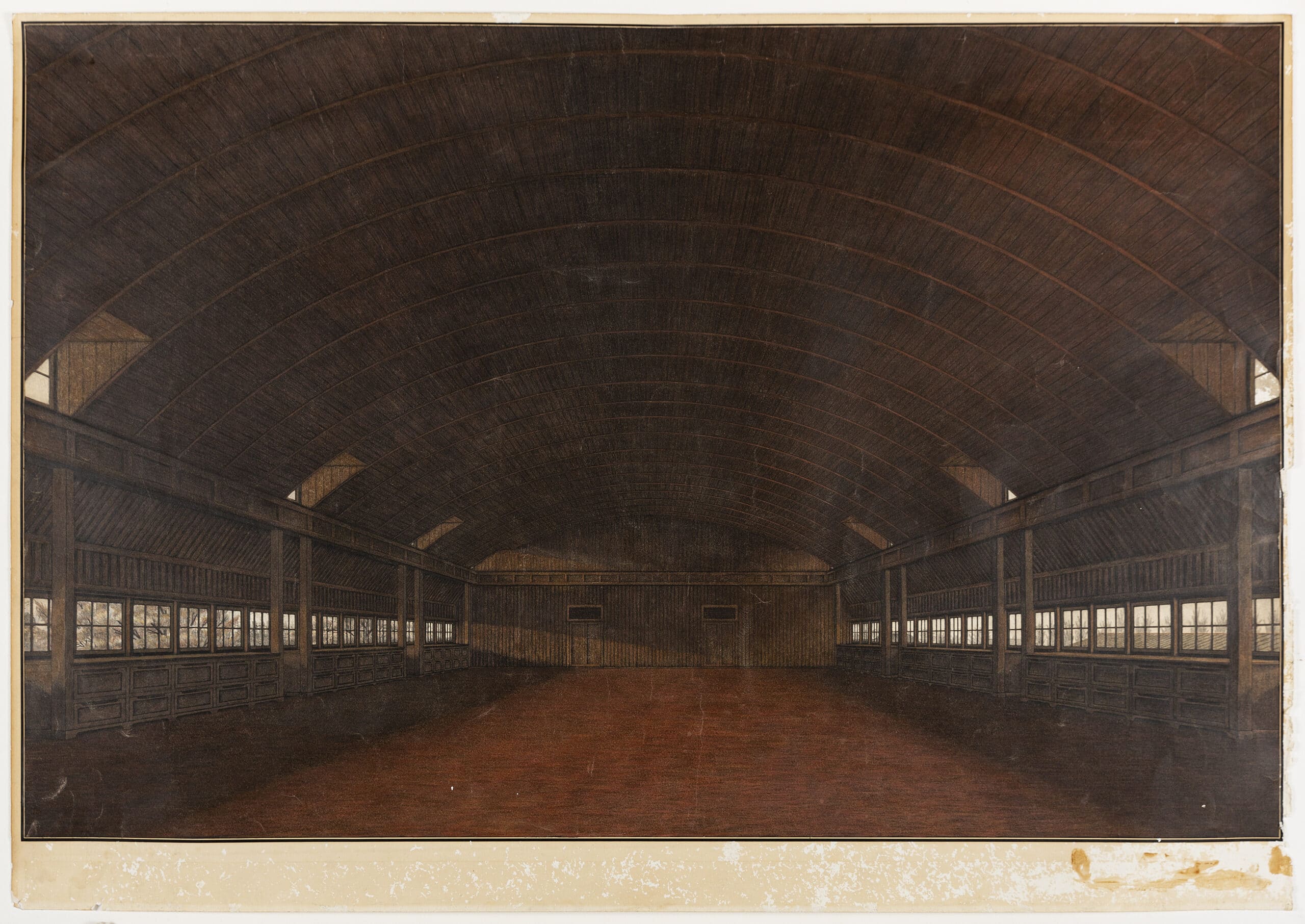
This drawing of the roof level of a fire station, designed as a student work in 1986, was for the ‘Analoge Architektur’ exhibition at the Architektur Forum Zurich. [1] While the drawing is the work of an individual, it was inconceivable without the competitive and collegial development of a drawing method by the members of the student design atelier of Prof. Fabio Reinhart at ETH Zurich. From 1984 onwards, the depiction of architecture moved from lightly coloured technical perspectives on A3 paper with clear, visible lines, to more painterly pictures on A0. For us, this new type of representation was the result of a new perception and conception of our designed spaces. Light, surface, and material became more important; geometry made no sense without these qualities.
To make a drawing like this, we first drew a pencil perspective. Many smaller, sketched perspectives of the space preceded the final large oeuvre. The sheer size of the final drawing, however, forced us to think about details unprocessed in the smaller versions. This work on tracing paper took about 32 hours over two days. We drew, bent over two tables, to ensure that the vanishing points were as far away from each other as possible. Using rulers joined together with adhesive tape, this perspective was copied onto a transparent sheet suitable for an ink drawing. Then came plan printing. A reactive, viscous mass is applied to a flat table, and a paper copy of the ink drawing is placed on it and pressed down briefly with rollers. The mass is activated at the points of the strokes, so the colour adheres to the paper. Once the drawing was dry, it could be processed further. The line drawing now served as a template for the actual work on the coloured picture. In contrast to the first representations, the strokes were all drawn as thinly as possible. Ideally, they should not be visible later.

The edge of the drawing was covered with tape, a studio convention. In the end, this would be the only place with unprocessed paper, a passe-partout, so to speak. The choice of paper was very important: Schöller Hammer 260gr. was used most of the time. The surface was absorbent enough for gilding with greasy Jackson oil pastels but flat and hard enough for work with colour pens, pencils, erasers, eraser stencils, even Japanese knives, and razor blades.
After priming the surface with oil pastels, paint was roughly applied with coloured pencils and rubbed into evenly spread surfaces. Richer colours were created by using different colours simultaneously, before and also after rubbing. This second priming was partial, depending on the colour field. Now, with water-soluble colour pencils (like Caran d’Ache Prismalo and Faber-Castell Polychromos), colour could be applied and removed in any number of layers. The colour, which represents the materiality represented by it, its surface, and the light in the space were further designed and specified. The exact edges were created by taping off or using eraser stencils as boundaries of the surface, then drawing or erasing, or scratching along a ruler. But more important was the discovery and treatment of the surface, its colour gradients, and its light, which only became visible through the large dimensions of the drawing. We used classical painting as a reference, and Edward Hopper. I often turned to Max Liebermann, Playing Girl (1898). The light became more dominant than the surface colour of objects in the room. It increasingly determined more. Physical phenomena in space shaped the light’s representation. Already in the line drawing, a correction of perspective had been made in order to achieve a more realistic representation against mathematical rules of representation. That colour and light also had to be the subject of conscious, non-naturalistic design in order to be more realistic and expressive was not surprising, but only became compelling through the drawing.
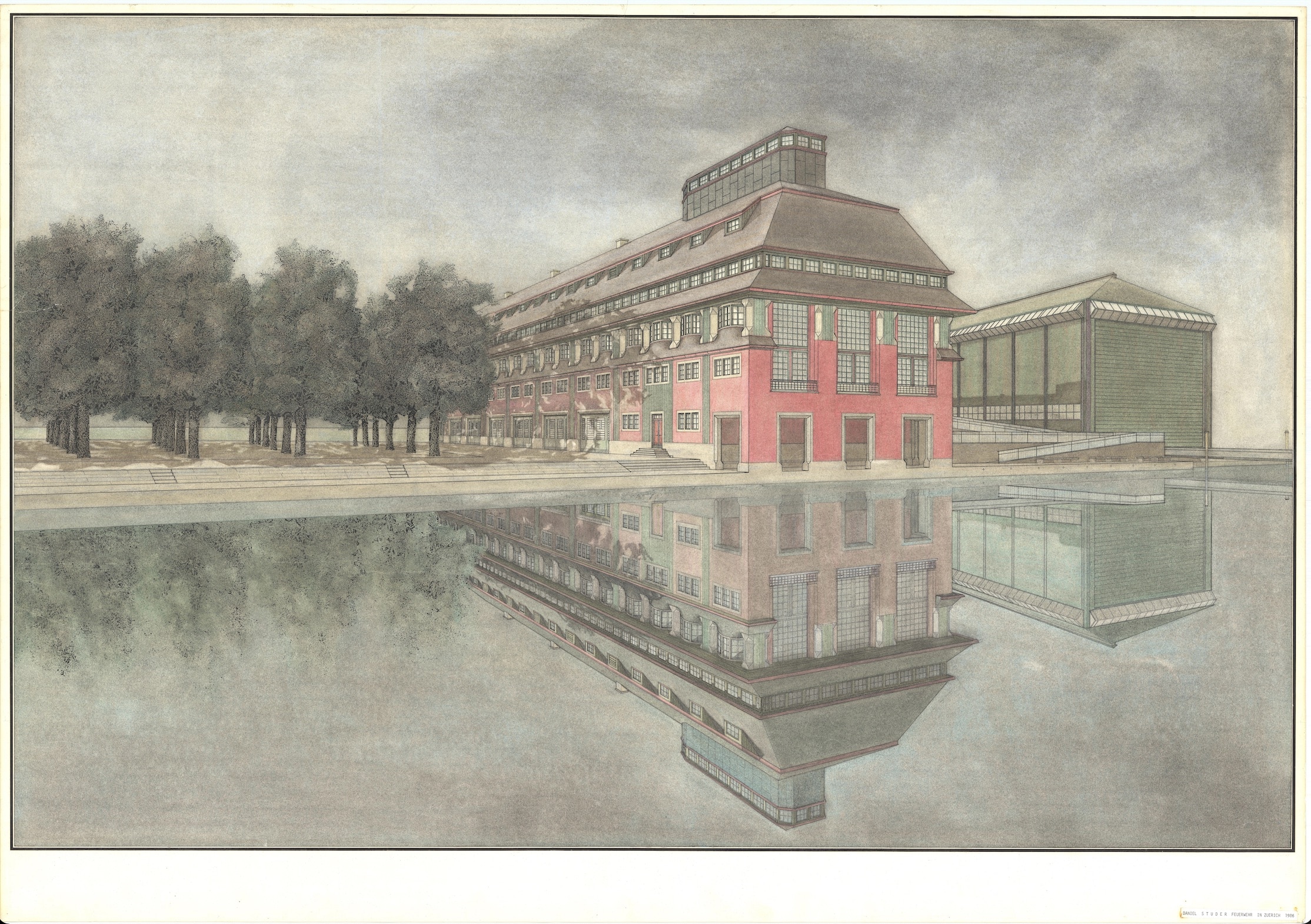
Analoge Architektur was an attempt to expand the repertoire of architecture without protective, distancing postmodern diversions. Its history was last described in an important work by Eva Willenegger and Lukas Imhof. [2] The freedom to work with all means, even with those that many architects had abandoned, such as ornament, pitched roofs, or historical styles, was understood as a provocation. The seemingly precise presentation of designs served to develop and test these freedoms. The consistent format and technique made the representations and their contents comparable and encouraged development.
Today, more accurate representations can be rendered with computer programs. And they do not exclude an equally intensive preoccupation with the relationship between representation and the object represented. However, the physical immersion in the image and its manipulation by hand are omitted. To build is a physical process, and it is sensual.

Notes
- Miroslav Sik, Analoge Architektur for the Analoge Architektur exhibition at the Architektur Forum Zurich in 1987, (Verlag Boga: Zurich, 1987).
- Miroslav Šik and Eva Willenegger, with texts by Miroslav Šik, Lukas Imhof, Alberto Dell’Antonio, Andreas Hagmann, and Christoph Mathys, Analoge, Altneue Architektur, (Quart Verlag GmbH: Lucerne, 2018).
