Cosmos Street Revisited
This response relates to a text by Oscar Binder and Nicholas Podlanha published by Drawing Matter in July 2021, which described and reconstructed (badly) a lost project by the deceased architect James Clark. In fact I am James Clark (decidedly not dead) and the project parodied in this less than successful chuzpe is my 1989 Cosmos Street design, published as AA Mega XII. (A set of Cosmos originals are now in the Drawing Matter collection).
As the Austrian authors stated ‘redrawing shortcuts in depth understanding’, and further that ‘…every drawing has its own claim on the truth’. Claiming this claim, I am here giving a ‘directors cut’ of the real Cosmos Street Drawings.
The first question is why 30-year-old drawings might still resonate today. This project belongs to what I have elsewhere termed ‘The Indian Summer of Hand Drawing’, i.e. on the cusp of the digital turn. The credo of Drawing Matter is that such crafted works emanate an aura, an embodiment of discursive architectural thought.
Cosmos Street is in Tokyo – why Japan? Mark Dorrian in ‘Peter Wilson in the Empire of Signs’ (The Journal of Architecture) writes:
‘geometric, rigorously drawn, and yet always signed somewhere with an asymmetrical fold or knot.’ While this could be a concise description of Peter Wilsons work, it is actually Roland Barthes writing in his book Empire of Signs about what he describes as the Japanese ecstasy of packaging’.
The Cosmos Street façade certainly wraps, packaging folded at the corners.
Chronologically the unbuilt Cosmos project occurred between my 1988 win in the Japan Architect (Shinkenchiku) ‘Comfort in the Metropolis Competition’, a conceptual piece permeated by Toyo Ito, who described it as ‘…a respectful, fearful, optimistic shadow’ of his own ‘Tower of the Winds’, and the 1993 much-published BOLLES+WILSON Suzuki House in Tokyo.
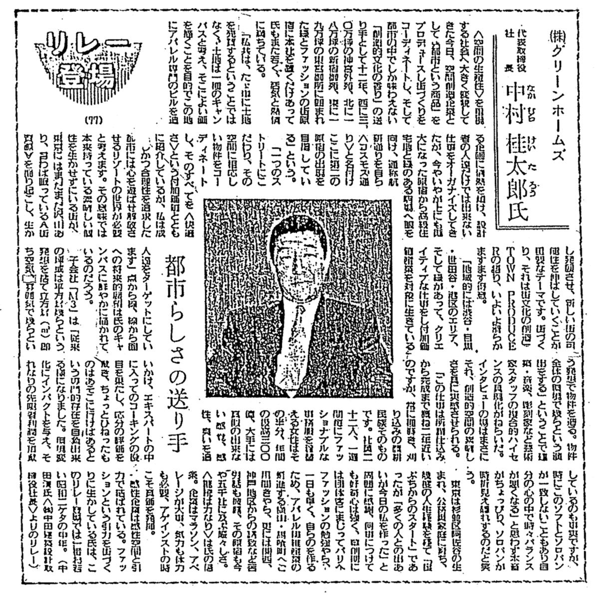
We had expected the Cosmos project to be built (our Tokyo hand-holders Kengo Kuma Spatial Design Studio were waiting on the starting blocks). The client, Mr Keitaro Nakamura, owned a number of sites on Cosmos Street (which he hoped to rename Architects Street) and planned to up-the-value of between sites with a scattering of signature buildings. Only the first by Shin Takamatsu was built – it was also Shin who had sent me to the office of the client where 10 pretty Japanese girls in pink uniforms bowed deeply, in unison, to the arriving architect.
Mr N. then showed a video about what a great guy he was, and when asked what function our building should have, answered: ‘it’s up to you’.
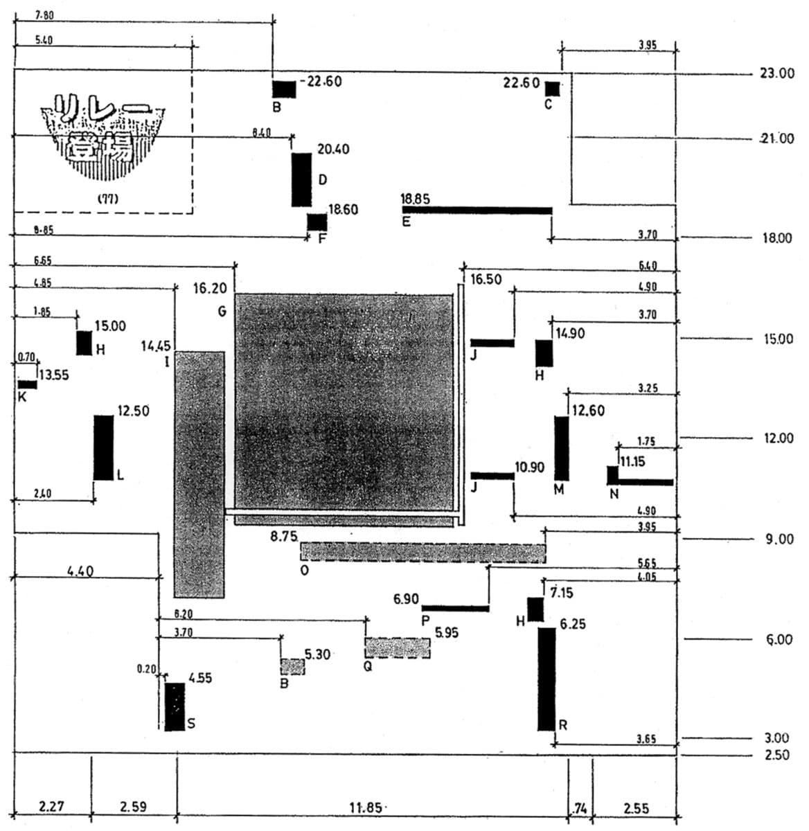
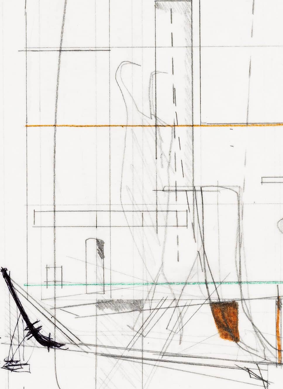
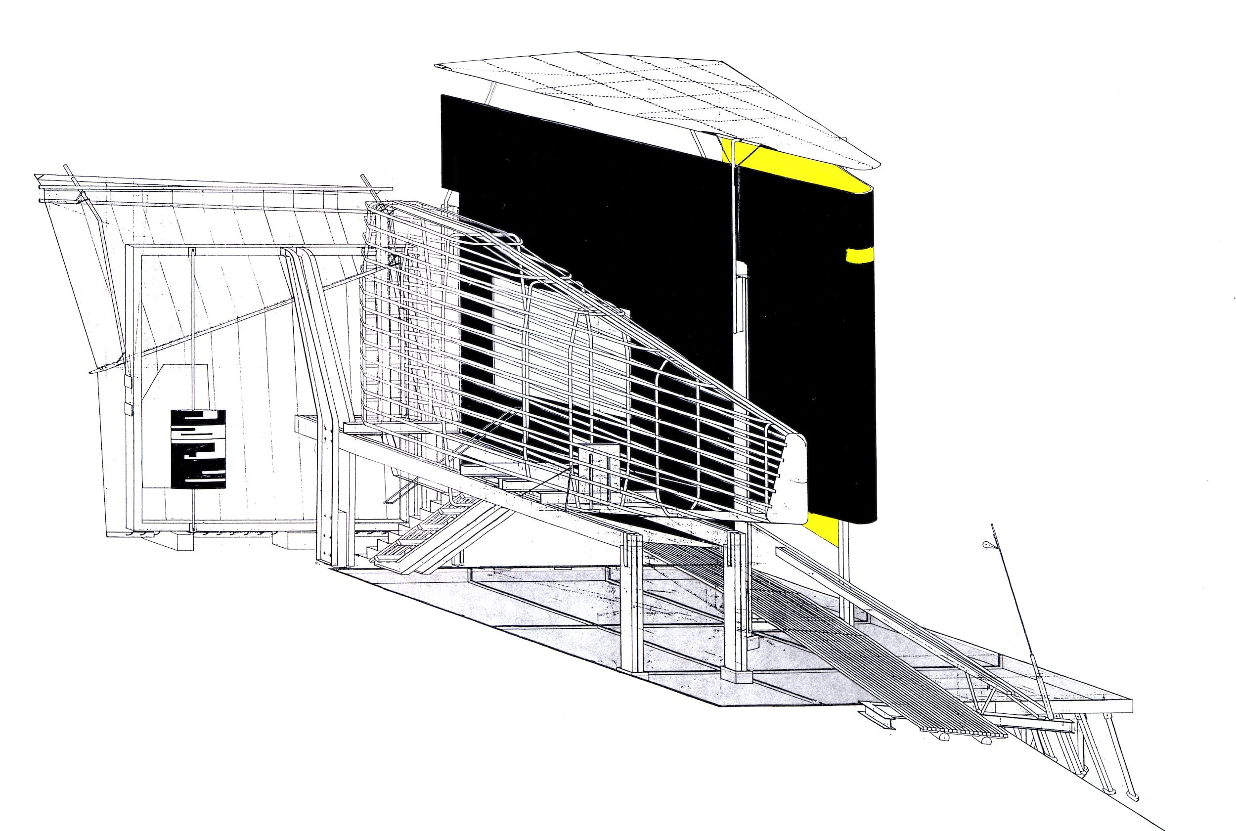
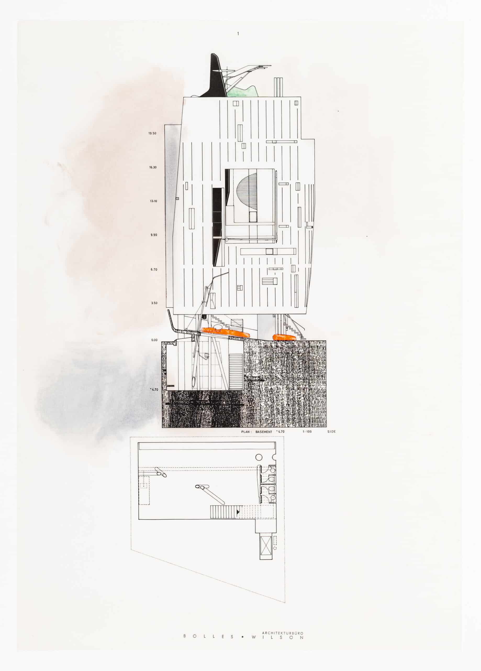
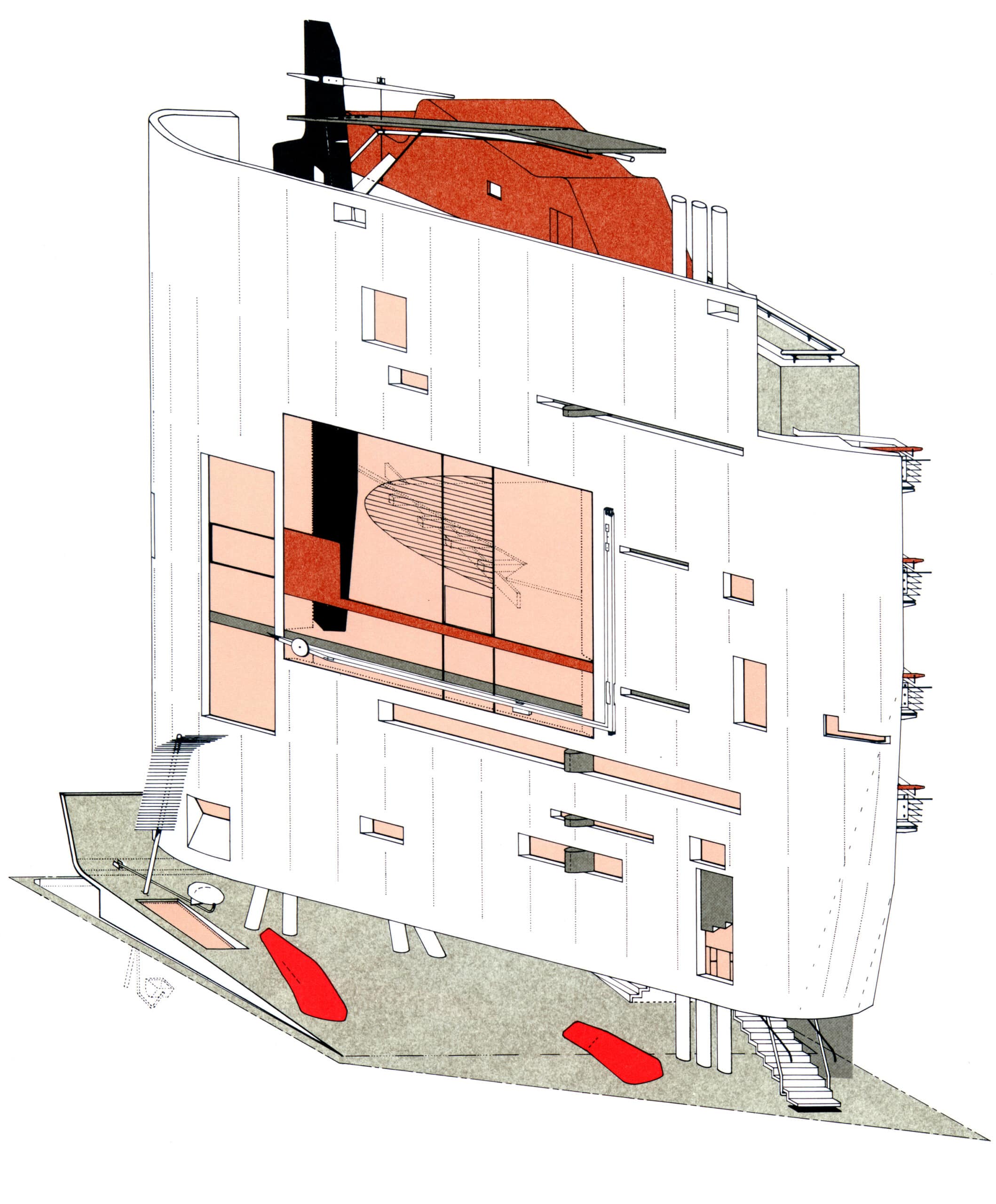
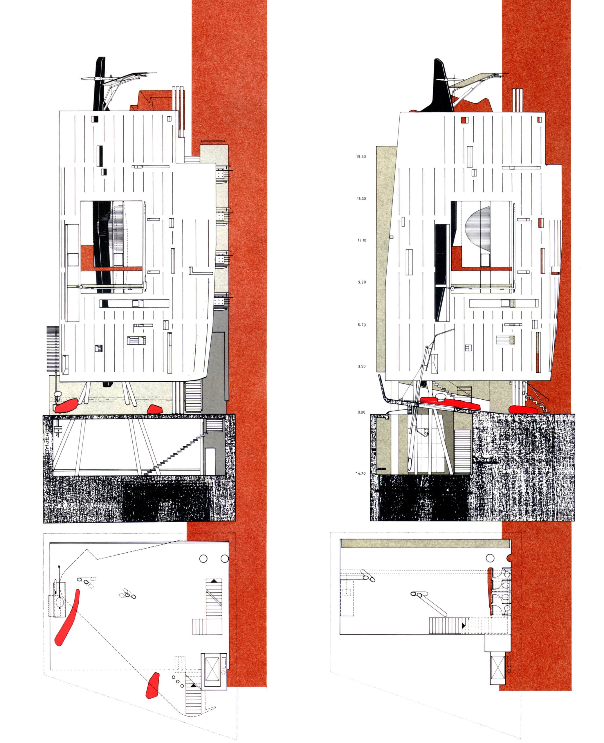
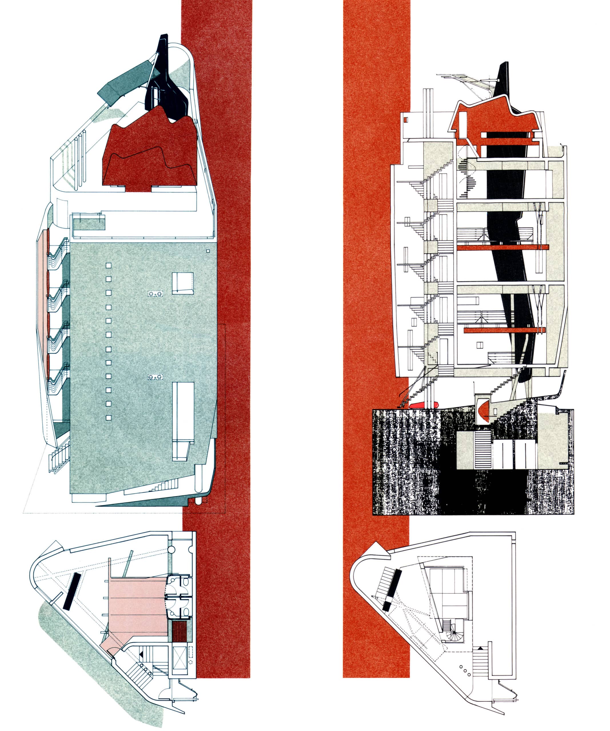
The Cosmos Building was functionless, no clues for an architect conditioned to activate programme as generator of form. We had not only to construct a visual narrative but also a use narrative (this was boom-time Tokyo, all properties had value). The only clue he gave us was a newspaper clipping, square in format, with Mr N. squarely at the centre. We took it back to London and measured it, not the Japanese text, which we in any case could not read, but the voids between text that we quickly and literally began to see as punctures, as window. The article thus generated a tolerable façade. This façade (the wrapping street front) focussed first, as it does in the initial two of the final six-page presentation sequence of plans and elevations.
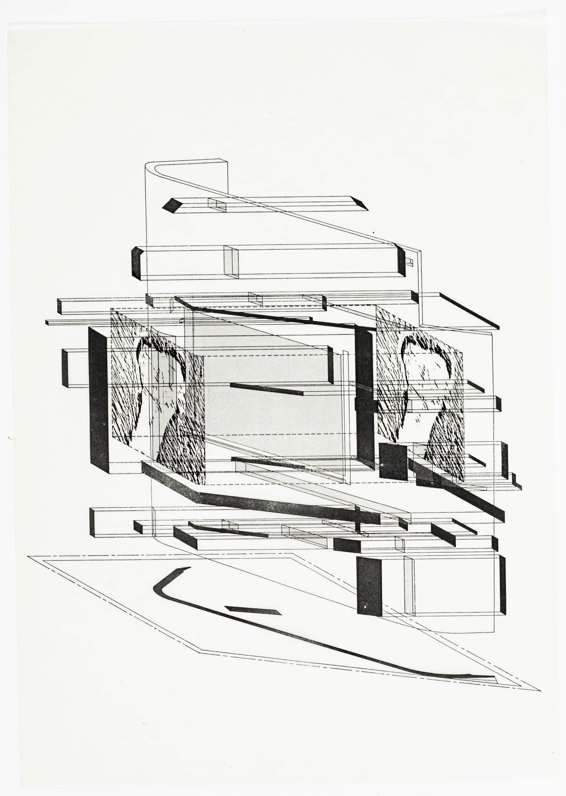
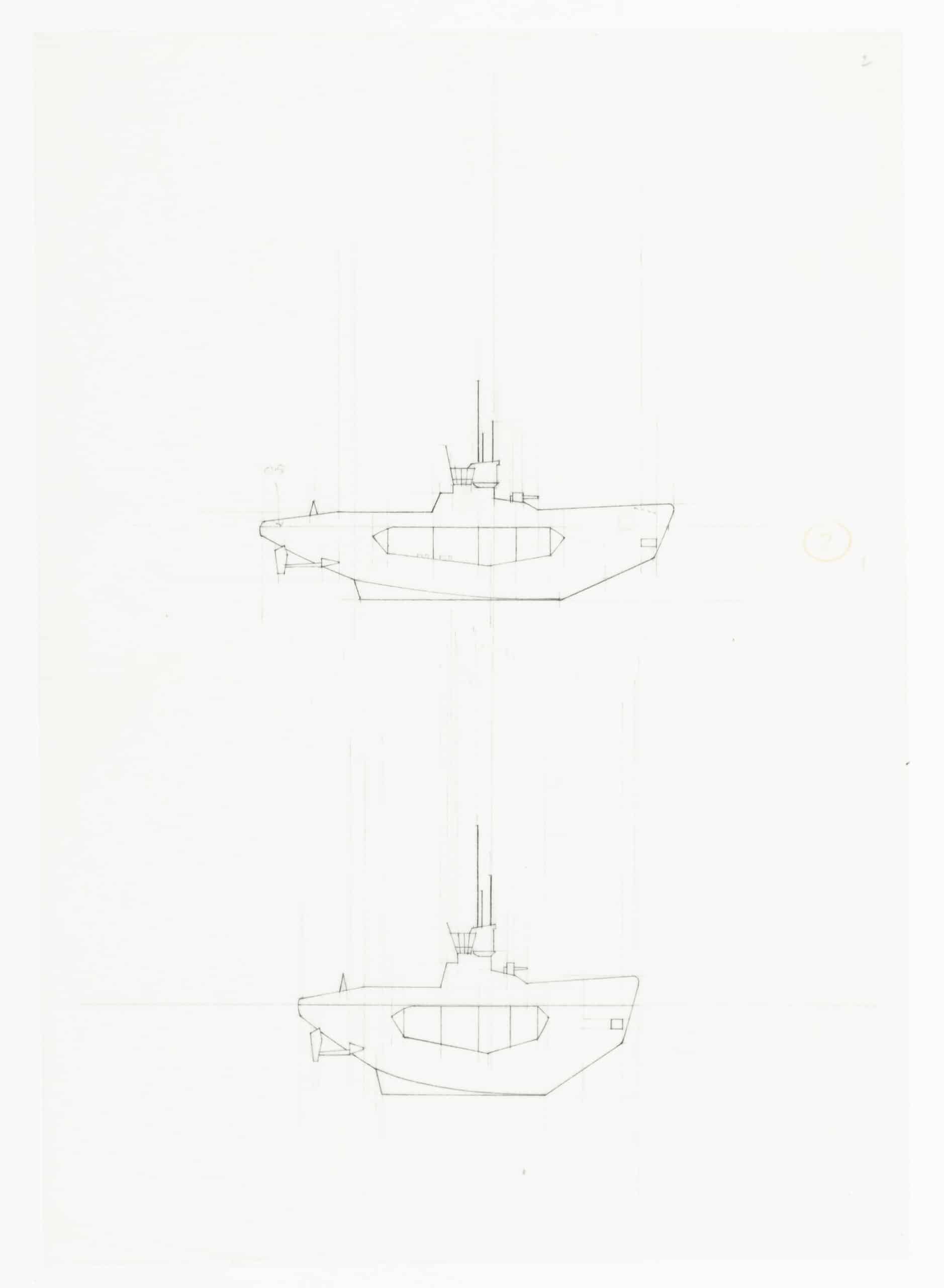
A black structural ninja lurks in the interior – a relative of our Shinkenchiku Ninja (a black glove, Faraday screening the rain of satellite projected information), also of the digital Ninja that a year or two later glanced the façade of our Suzuki House. In Cosmos Street the black Ninja was structural, with splayed bracing legs, the system of an elastic earthquake resistant Japanese temple.
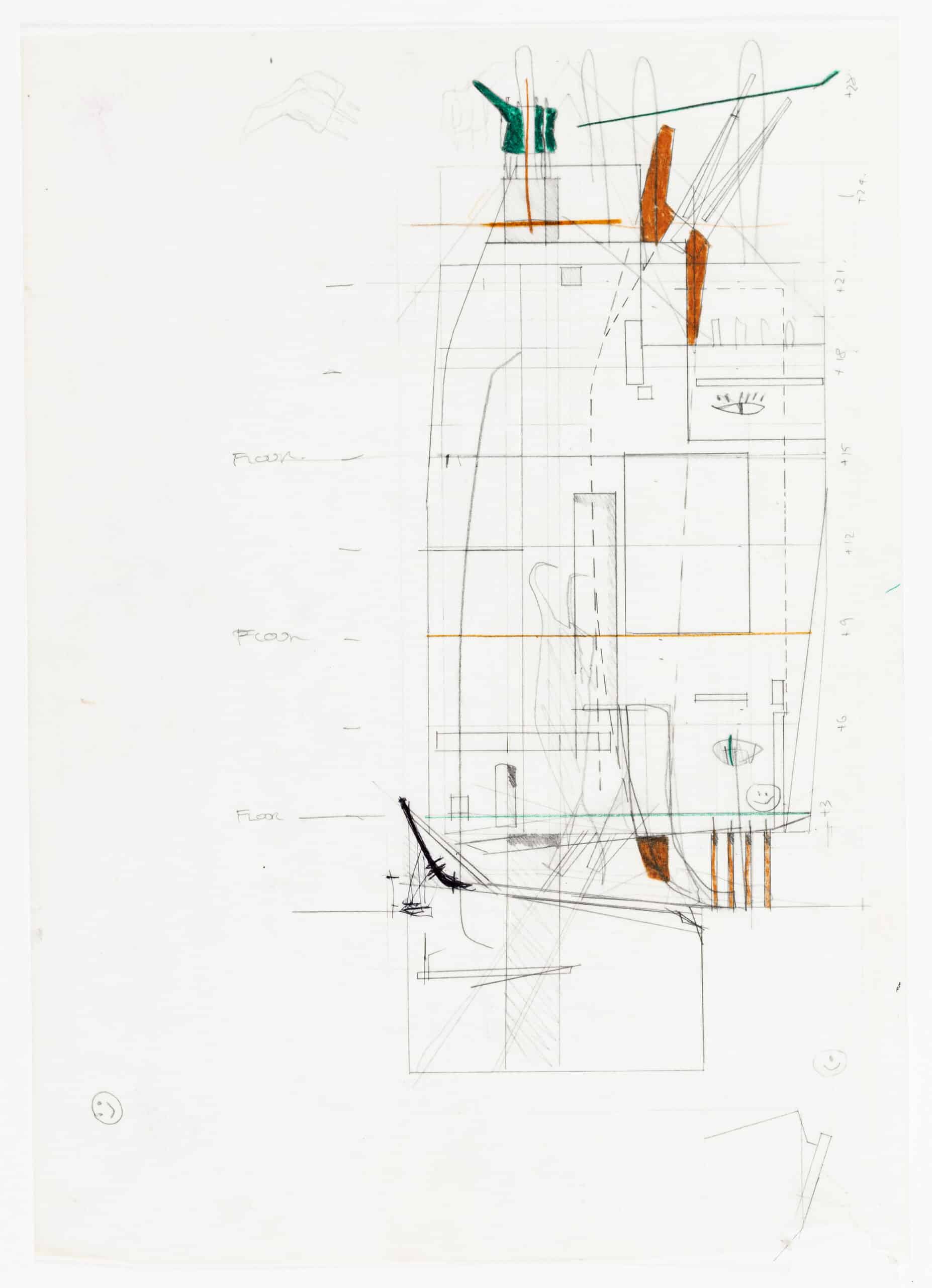
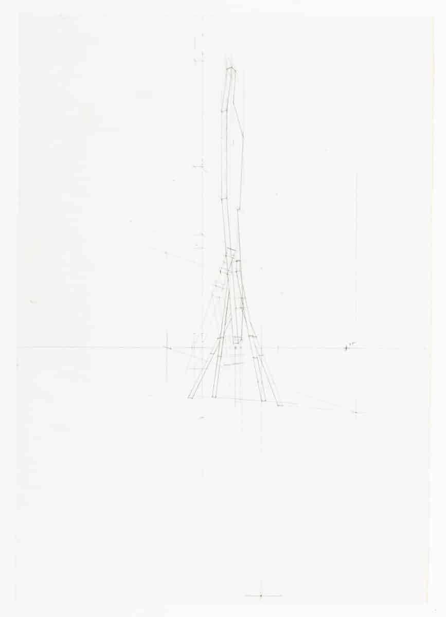
A workup sketch (above) shows the Shinkenchiku Ninja lightly sketched in the Cosmos interior, it later grew to take up its structural responsibilities. Shortly after, the elastic (in both meaning and form) black Ninja again materialised as our 1990 Osaka Folly (the Folly design sketches appear on the pages following Cosmos Street in the AA Mega book Western Objects Eastern Fields).
The black form of the Ninja was in origin a submarine – compressed by extreme pressure in the horizontal dimension until it popped into Ninja format (a phase transition to glove, structure or metallic Folly skin). I had heard about this submarine mutation procedure, somewhat laborious in the days of hand-drawing but executed diligently in our office by Toshiaki Hisatomi, as an exercise set by John Hejduk for his Cooper Union students. When John saw my act of homage he immediately crossed me off his list of credible people – submarines were his personal metaphor. My ‘blacklisting was in fact a compliment’, Liz Diller informed me at the time, everyone interesting was on Hejduk’s blacklist – Tschumi, Eisenman, etc. One wonders what the sensitive Hejduk would have made of the posthumous construction of his ‘Wall House’ in Groningen. The abstraction of Hejduk drawings depend on a strictly orthogonal up/down view point (both sides of the wall seen at the same time), the wandering photographer can now only deliver Hejduk’s precise post-Corbusian geometries perspectivaly, as candy-coloured bon-bons (see the internet).
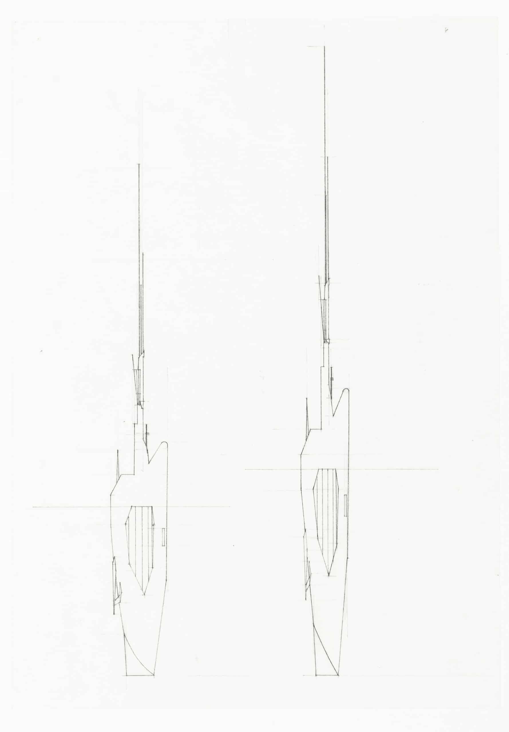
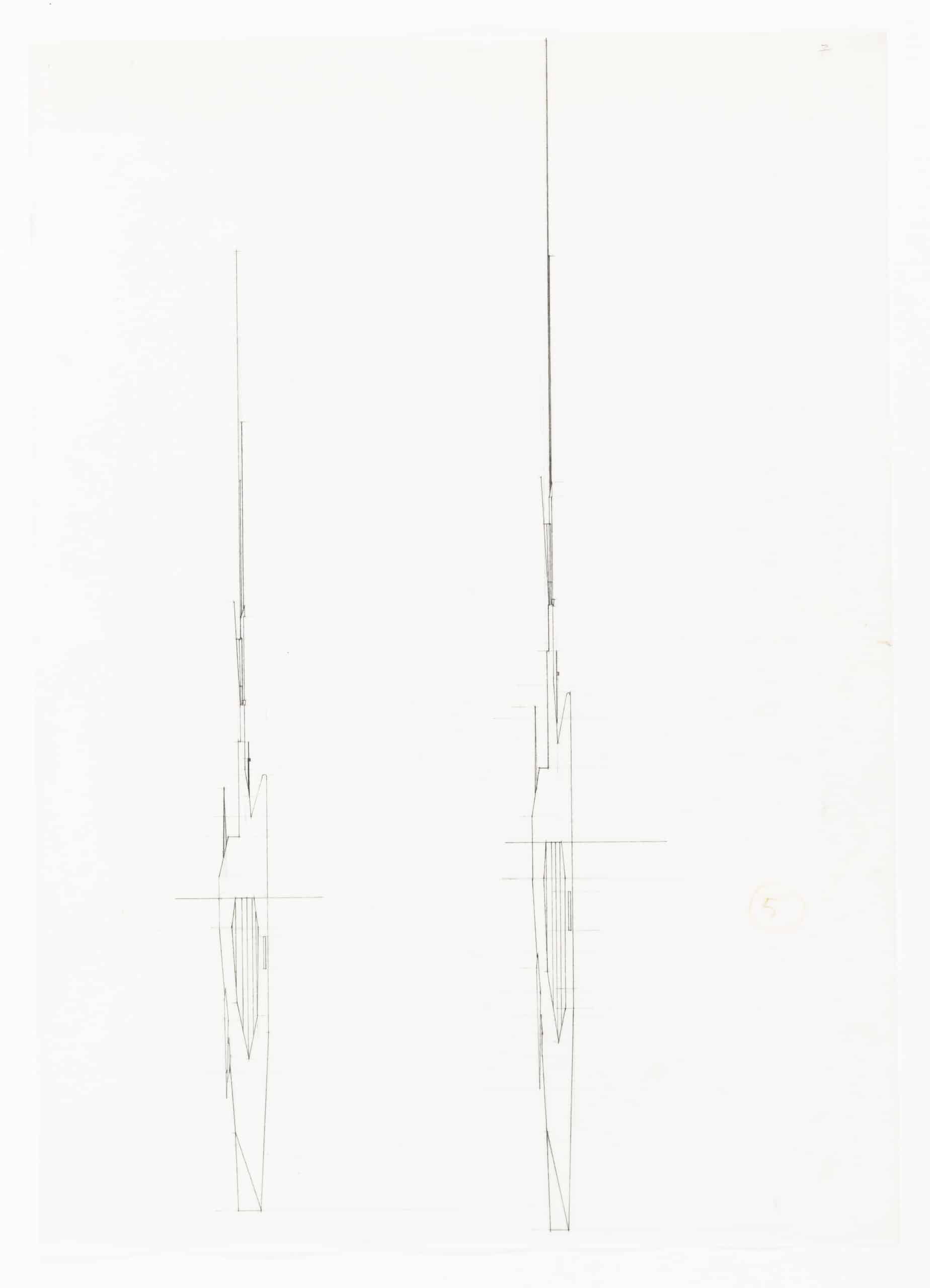
Back in Cosmos Street, the ground plane required an upward folding to mask the site behind and the roof a wavy pavilion to compete with the water tanks of Tokyo’s skyline.
The final Cosmos pages are precise line drawings, coloured with a technique I had invented for my AA thesis project – shoe polish – preferably ‘Kiwi Dark Tan’ for that sensuous red-brown strip that ties together each composite Cosmos page. My 1980s AA Diploma Unit was characterised by this technique of colouring. Binder and Podlanha also describe their fictitious Clark drawing as being coloured with Shoe Cream (German for shoe polish).
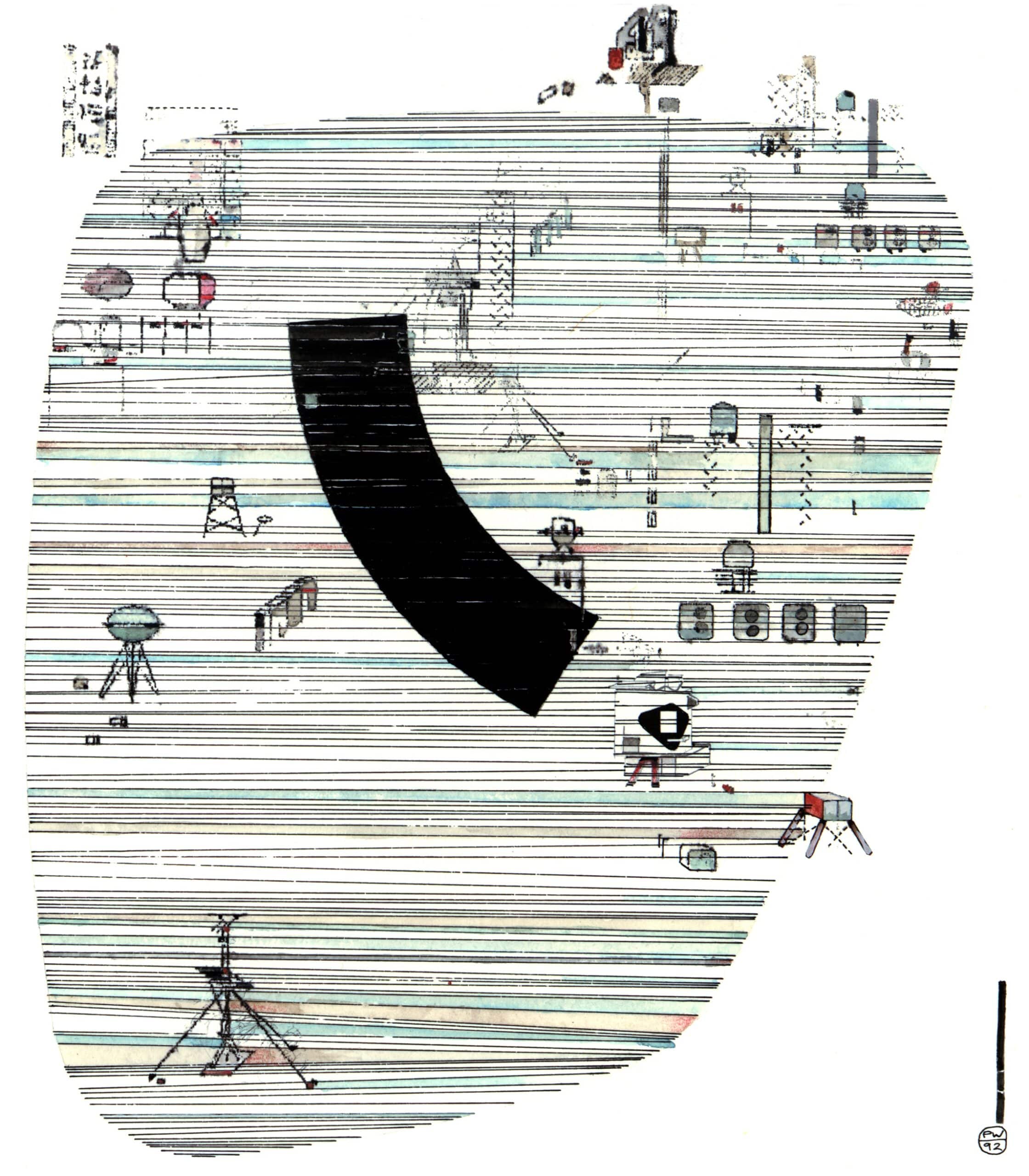
Often, in retrospect, process drawings reveal more about design procedures than final highly polished presentation pages. This is the case with the submarine derived Ninja or even with the tentative drifting of pink and grey shoe polished clouds towards the wrapping Cosmos façade (below). In the end cloud and smoke techniques were rejected in favour of a rectangular and marshalling vertical stripe of Dark Tan.
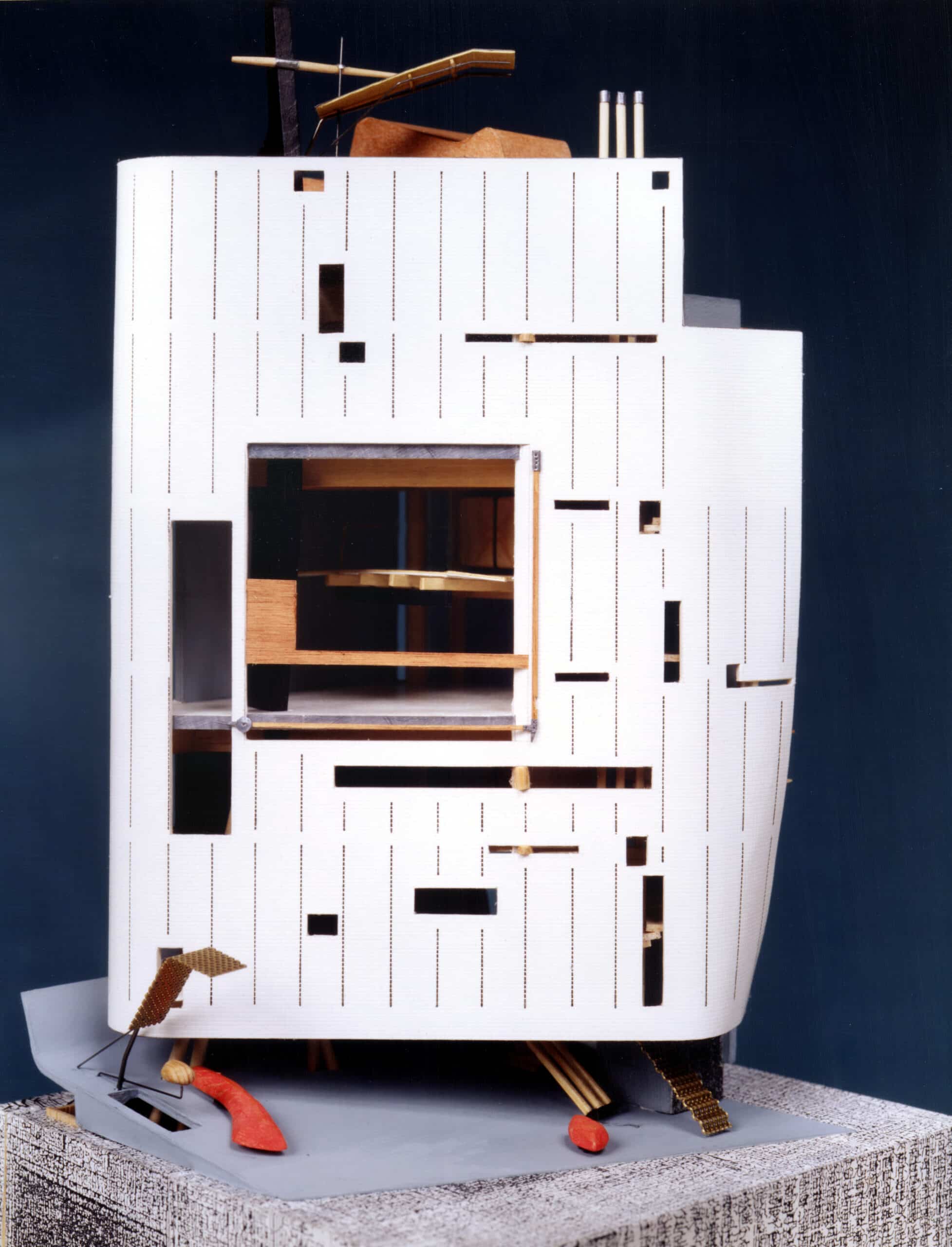
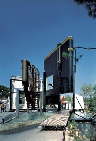
The Cosmos Street drawings were produced in our London office by Joey Shimoda, Thomas Dekker and Ekaterina Panagiotou, remote controlled by fax, I was at that time already transposed to Münster where BOLLES+WILSON were beavering away detailing our Münster Library. The model, which ultimately made its way to Mr N’s Tokyo office, was artfully made by Takuro Hoshino.
Why was Cosmos street not built? It was a media victim. Not long after the drawings were presented in Tokyo we received a fax from Mr Nakamura saying that he had seen a video about Prince Charles and Leon Krier (establishment vs. modernism) and could we change our design to Prince Charles Classical Style. ‘No way’, we faxed back, ‘but we could make it Royal Blue’. The blue would have been a translucent blue glass-brick façade (a last-ditch blue model was knocked-up). We had at the time used blue glass-brick in a Kindergarten – the blue underwater-light was meant to give the little ones encouragement in the toilet.
In retrospect our move to mainland Europe may have broken the spell of these exciting years of Japanese engagement. The Japanese seemed to only be aware of one M-city in Germany (Munich), and Münster was decidedly off their map. Returning to Tokyo some years later (as participants in a new German Embassy competition) the economic boom bubble had burst, things were less frenetic, a new generation of minimalists was on the ascendancy – we at that moment recommended to El Croquis (who were one of the first to publish Cosmos Street) that they also consider a monograph on Kazuyo Sejima.
Postscript
I recently received a mail from my one-time teacher Leon Krier, to say that he approved of the BOLLES+WILSON National Library in Luxembourg (2020), his hometown.
