Landing Square Scenarios: The Wilhelmina Pier & Luxor Theatre
Radical Scenarios for Rotterdam
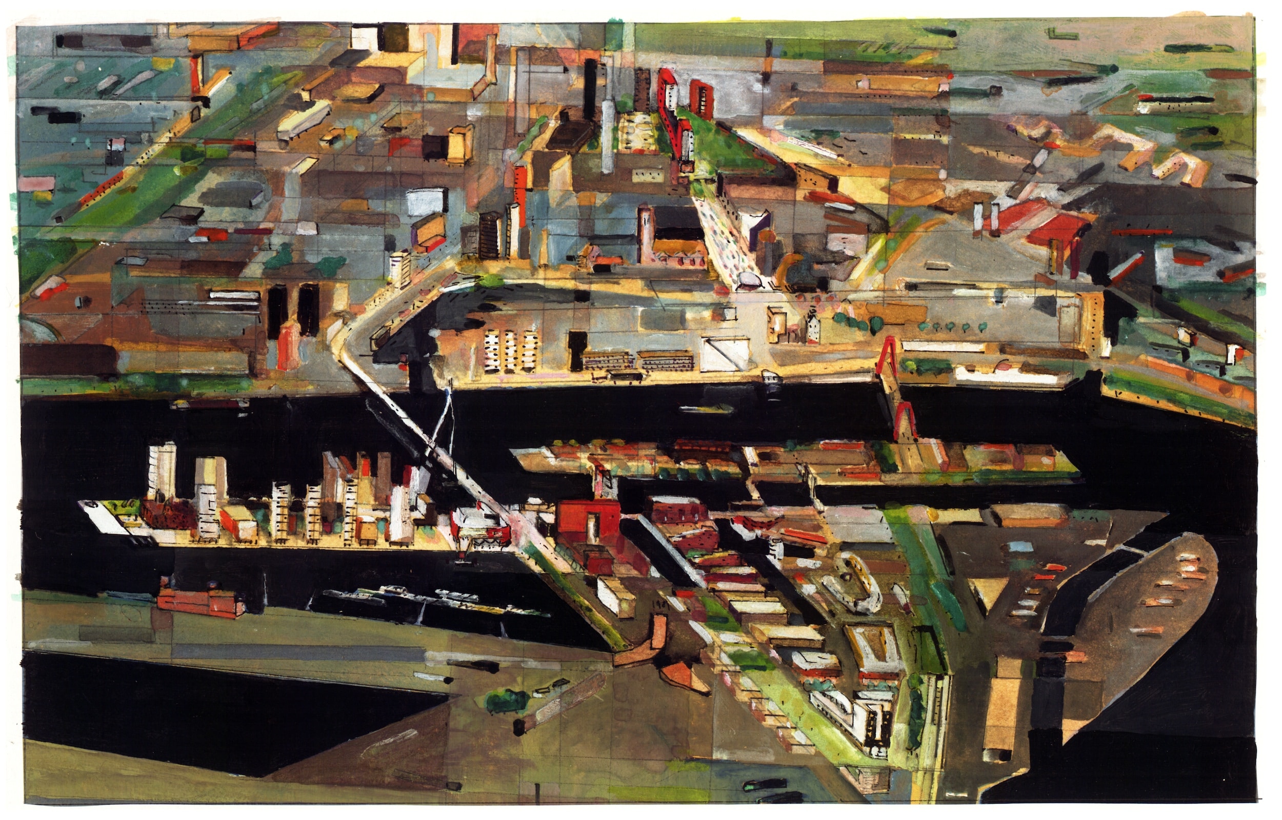
For a while in the 1990s, Berlin and Rotterdam were seen as embodiments of opposing strategies in city making. Postwar Berlin was the laboratory for the ‘Reconstruction of the European City’—blocks with 22m facades—while Rotterdam, largely destroyed by German bombing during WW2, became a zone of experiment, regularly reinventing itself with new and radical scenarios. BOLLES +WILSON, then recently relocated to Münster, a few hours’ drive from Rotterdam, oscillated between these two poles. A painted portrait of Rotterdam (with the Wilhelmina Pier on the left) locates our contributions to the city’s story.
Drawn Scenarios: Phase Change
We describe the Landing Square Scenarios, a set of planning scripts that has recently arrived in the Drawing Matter Collection, as the last hand-drawn drawings produced by the office of BOLLES+WILSON. This does not mean that we then threw away our pens and pencils and dived into the digital quagmire. The phase change was incremental; the number of monitors in the office only gradually increased to replace drawing boards. Project conception remained hand drawn, but technical and presentation plans at this moment gained the added exactitude that the digital offers. The question—still lingering—is whether a haptic or poetic proximity to a fundamental architectural potency slipped through our fingers the moment they grasped a mouse.
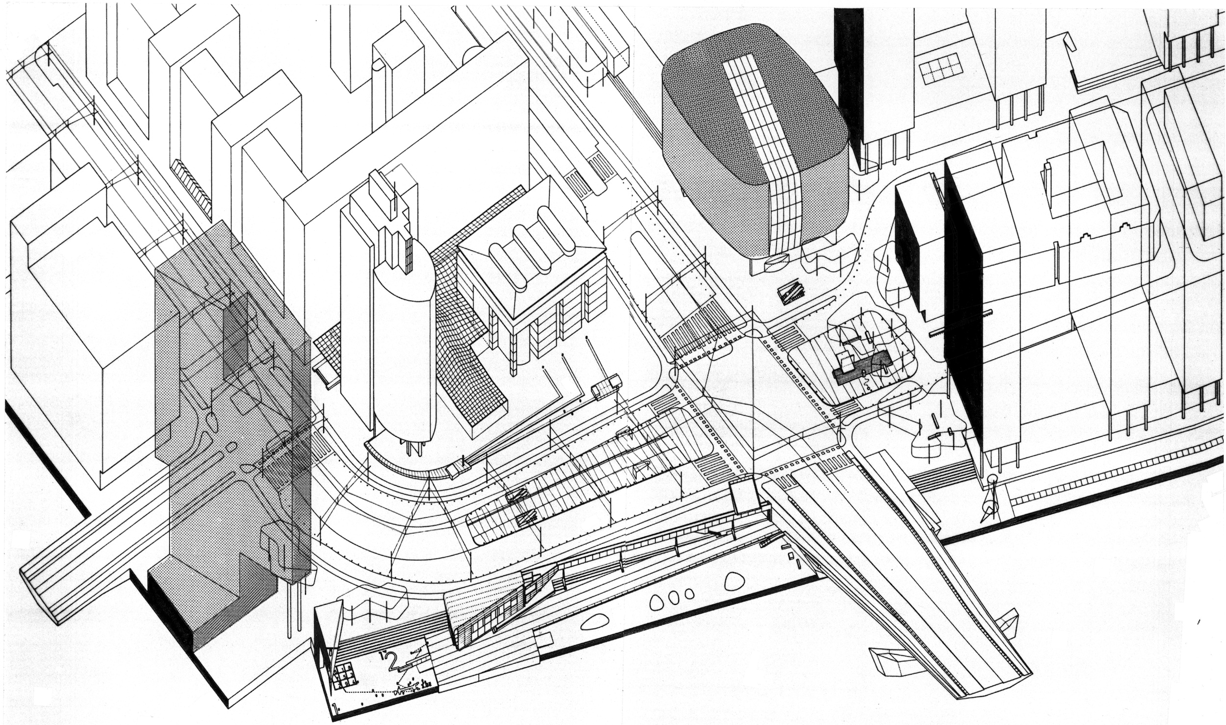
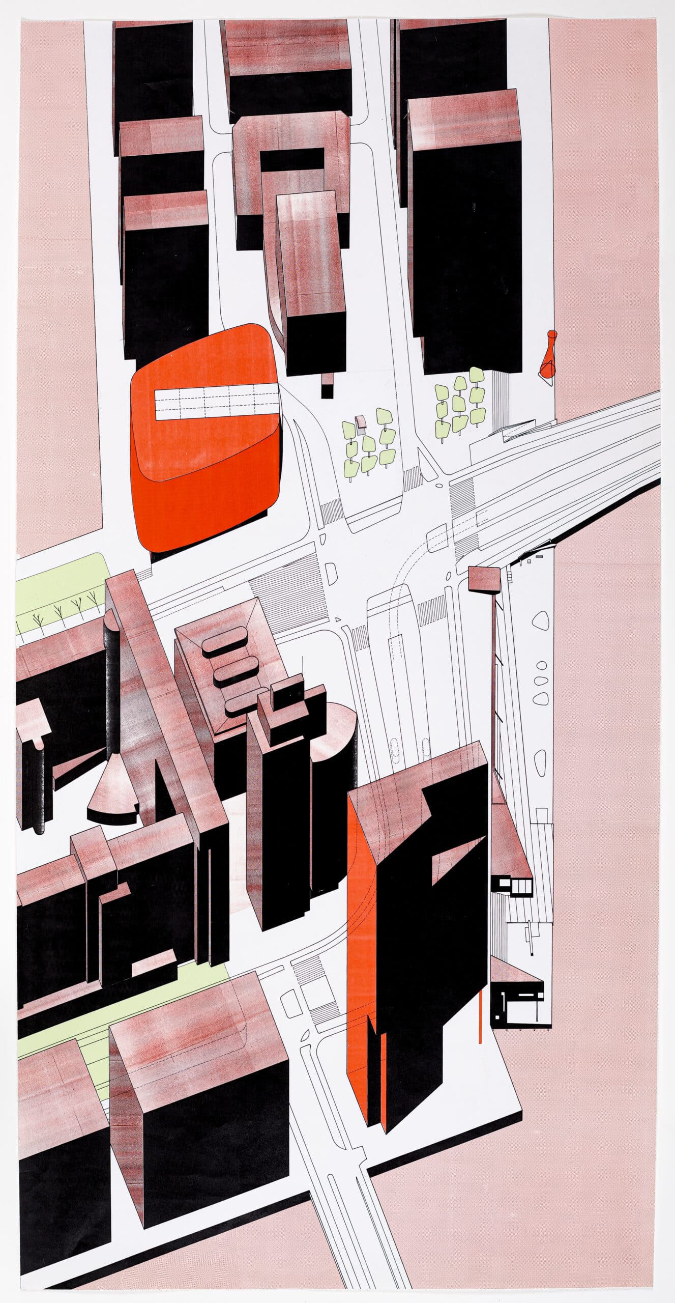
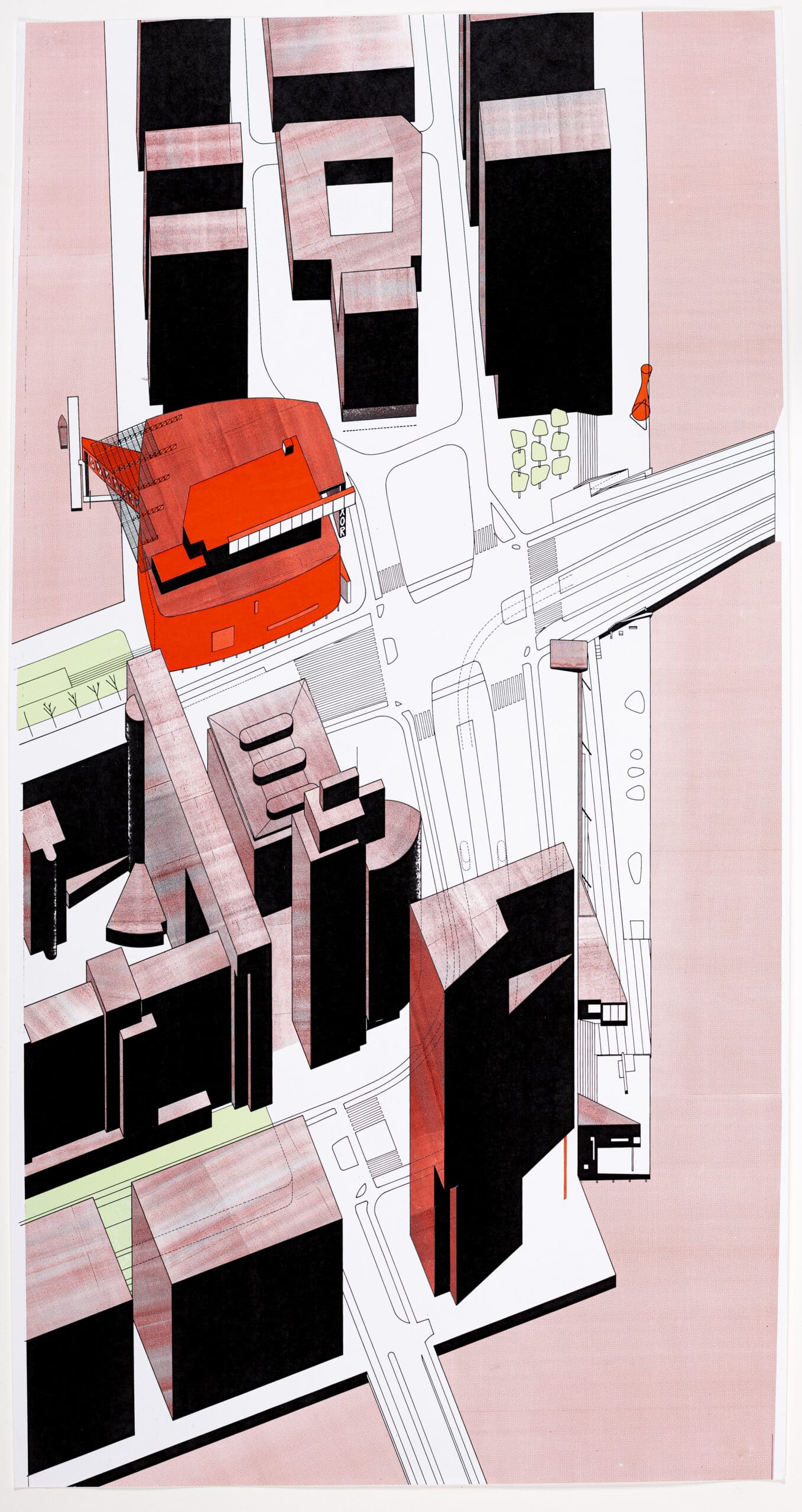
We had for some time been faking it, pretending that we were ahead of the game by passing hand-drawn images through the fax machine to translate them to a digital dot-matrix—this for a while fooled the Japanese into believing that we were digitally-savvy. And even the cloudy metallic textures of the Rotterdam Landing Square drawings were the result of explorative collaborations with technical tools. They were chance overlays of red and black photocopied textures printed on foil to be applied to the linework of the axonometric drawings. This, in the early 1990s, was cutting-edge technology.
Audience
The large-scale format of the Landing Square Scenario drawings was chosen because they were to be pinned on a wall and discussed by the Quality Team—a limited audience—which comprised a group of pan-Europe experts put together by Riek Bakker, then the visionary head of Rotterdam Planning. The Quality Team included Juan Busquets (soon to be Harvard Planning Professor), Hans Kolhoff (a major player in Post-wall Berlin) as well as selected local planners. This steering team was a tool for fast-tracked planning. Based on images (drawn scenarios) Rotterdam prioritised the visual. In retrospect, this radical compacting of planning procedures is to be commended, it avoids all the pseudo-legal report writing that bogs down planning in the UK (best-practice requirements legally obliging even mediocre architects to deliver great works—bumf).
The Landing Square Scenarios were commissioned by the DS+V, the Rotterdam planning department responsible for the then new development of the Wilhelmina Pier—docklands recently connected to downtown Rotterdam by Ben van Berkel’s Erasmus bridge, which slips in at the lower edge of our drawings. Our Landing Quay with its voyeuristic Bridge Watchers’ House had been part of the same construction contract as Ben’s signature bridge. Planning authorities in the Netherlands were at the time in the habit of commissioning young (often untried) architects to produce radical urban scenarios to be the basis for discussion and, if accepted, to be cemented as masterplans, templates for future urban development.
BOLLES+WILSON’s first involvement with Rotterdam was as one of a number of teams suggesting how the urban matrix could be sewn back together after the major infrastructural surgery of a new Railway Tunnel below the Maas River. We had dropped large vector buildings on now empty bridge approaches and a scattering of figure-like architectural characters on the river’s edge. These evolved into the commission for a Bridge Watchers’ House and the Landing Quay.
Existing front/Projective hinterland
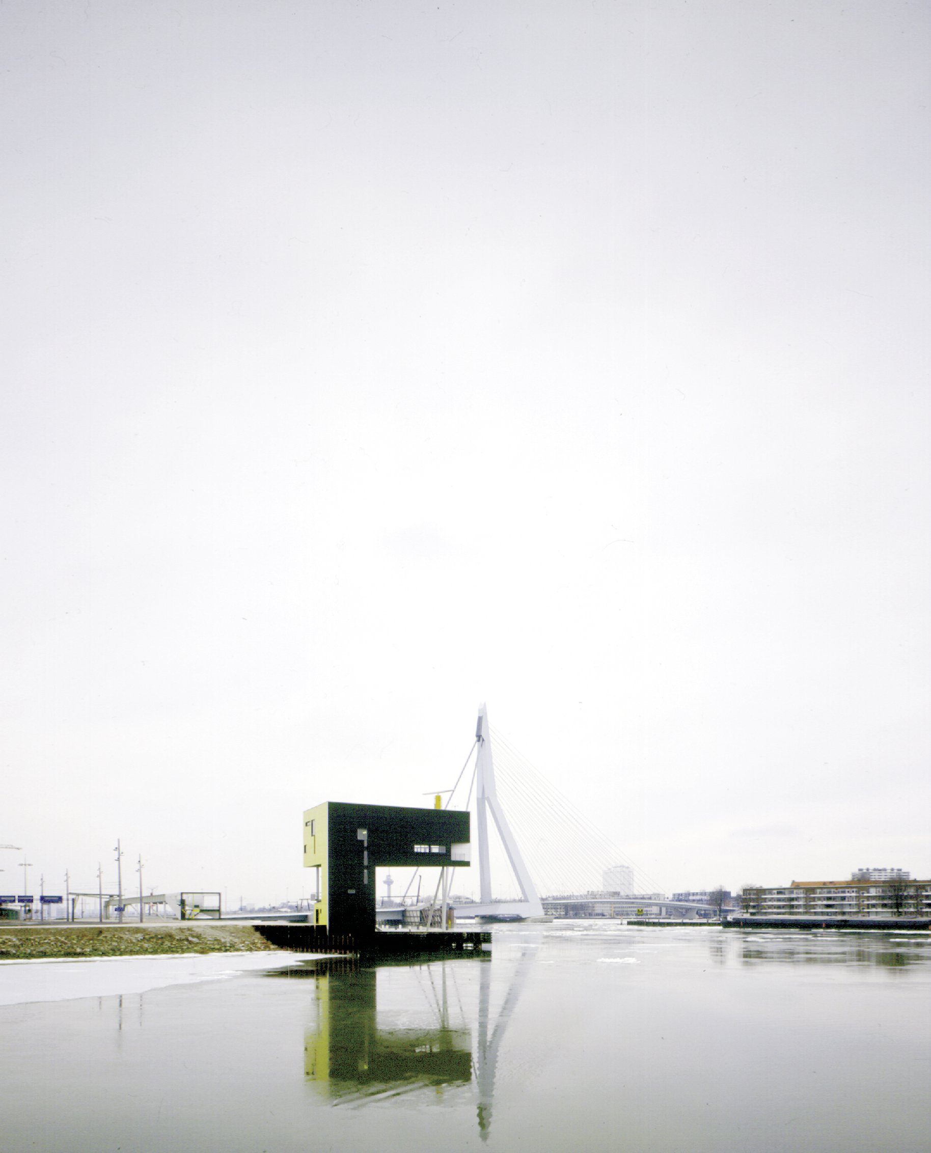
What do the Bridge Watchers do? They watch bridges. Principally the Erasmus Bridge but also ten or so other bridges over the river Maas. They are water traffic policemen, marshalling the floating trajectories of Europe’s largest port, opening and closing bridges for barges, cruise ships, floating cranes, etc.
Conceptually, we locate the 1996 Bridge Watchers’ House in our then emerging taxonomy of architectural characters: the 1976 Waterhouse, the Osaka Folly for a 1990 exhibition of Gardens and Greenery, and the 1993 Suzuki House in Tokyo.
Having choreographed the water’s edge, we were the obvious candidates to conceptualise this already-built ensemble, extending it back into the docklands’ terra-incognito intended to become a future urban matrix. The quay components in the Landing Square Scenarios were thus drawn as documentation of existing objects and the rest was graphic speculation.
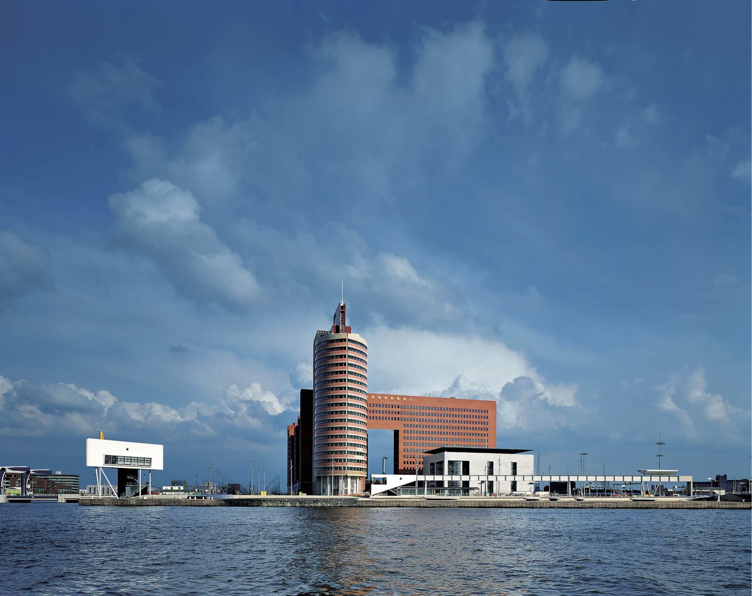
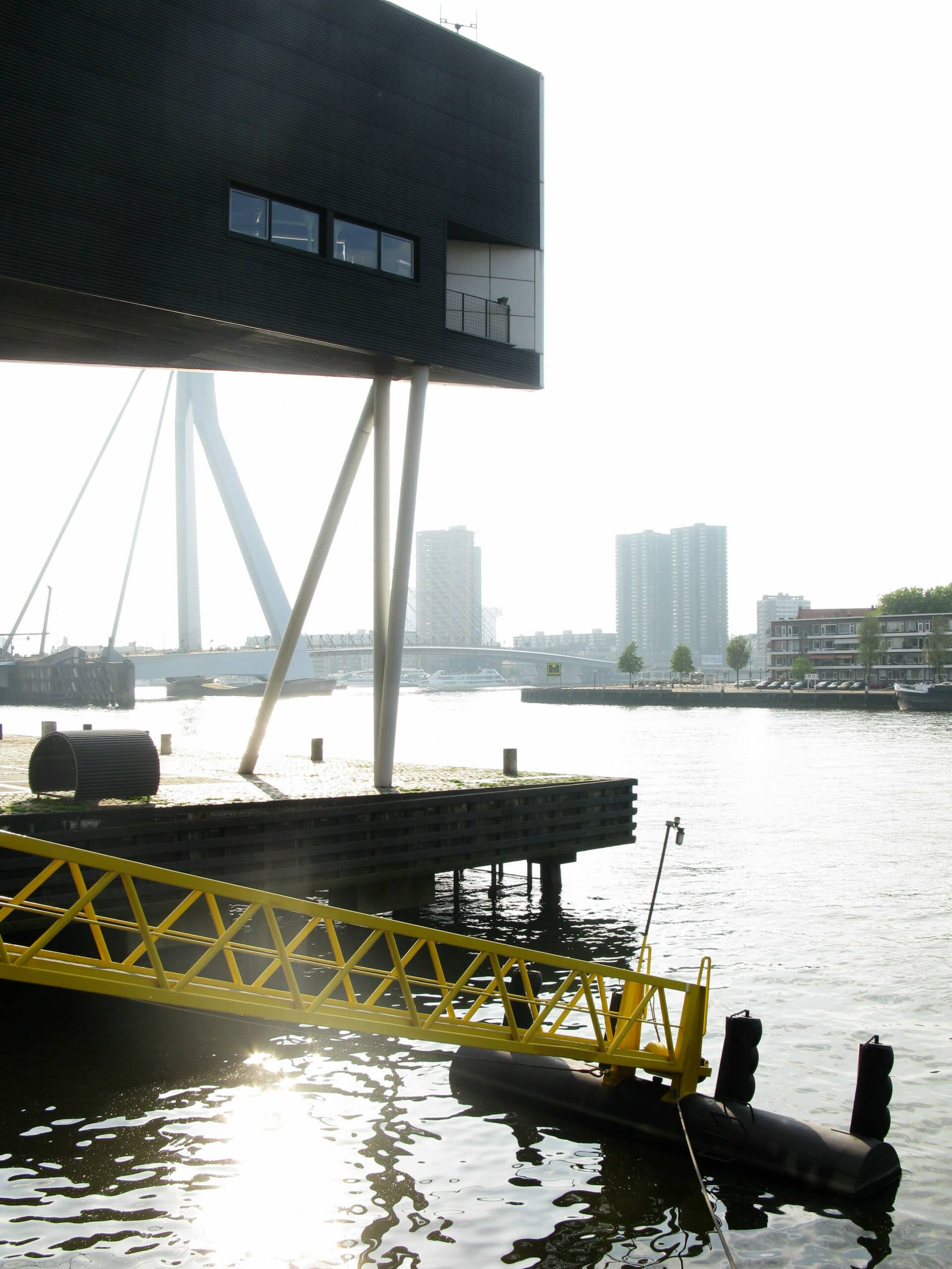
Bridge Watchers had to be at a height of 12 metres—ostensibly to look passing ship captains in the eye, although they sit with their back to the panoramic view watching on the radar screen—and thus the house is elevated on spindly legs. These in turn can only land at specific points, as the quay is a table standing on piles in the river. The bookend relationship of the Bridge Watchers’ House to the quay is best seen in the up-axonometric with the quay running vertically. Initially it was a lonely chap, our drawings predicted a big-brother tower edging up behind it, which is now built, thankfully with a facade that darkens towards the base providing a contrasting backdrop for the white (Villa Savoy on steroids) facade.
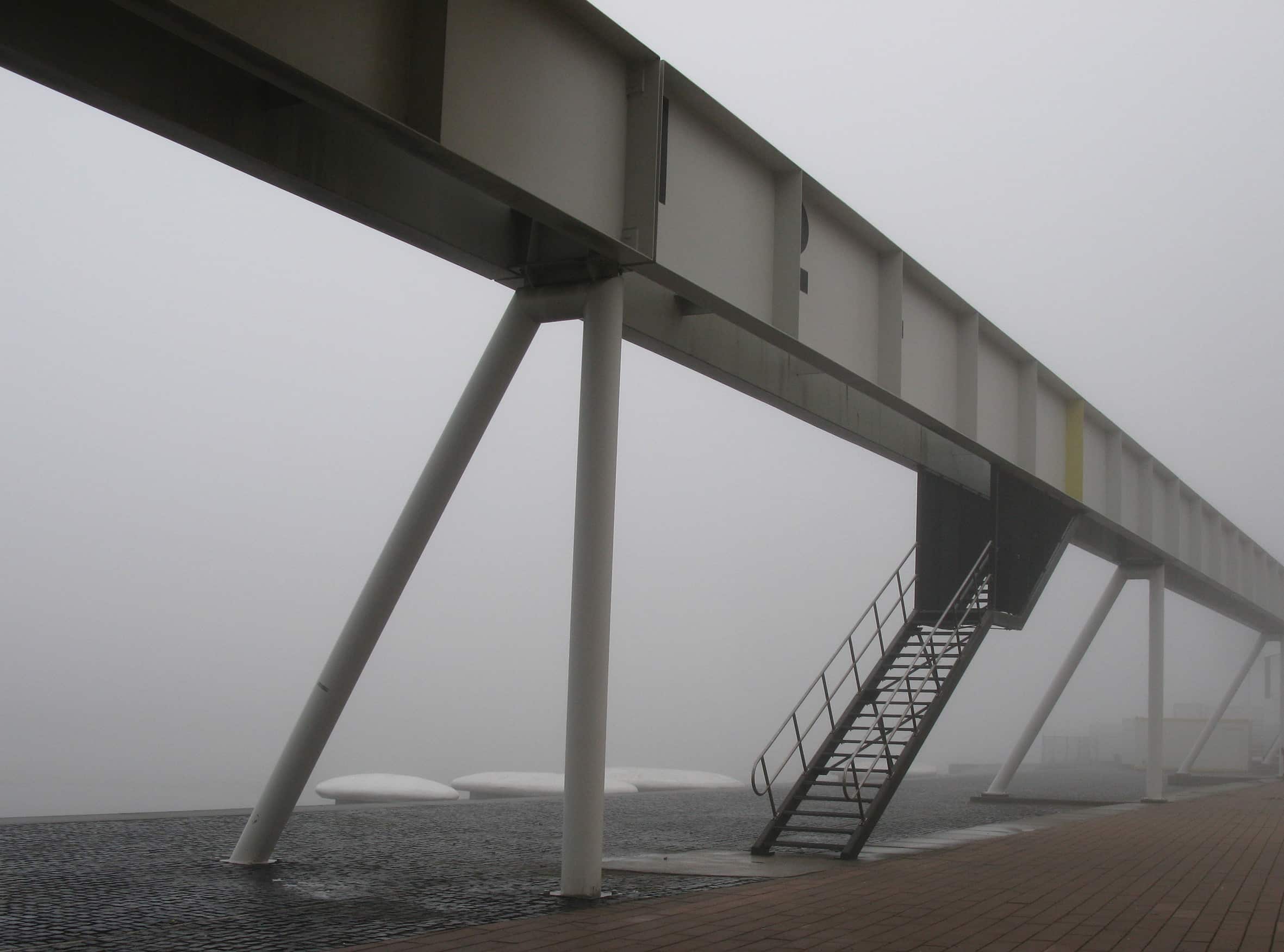
On the quay are what we called ‘Electronic Rocks’, splats of urban furniture to be claimed (and graffitied) by groups of kids or, as we regularly saw, bridal couples photographed atop the rocks with a Rotterdam panorama as background. If the ‘Rocks’ evoke illegally dumped cargo, then the Colonnade/Bridge behind looks like an abandoned piece of harbour equipment, now a good vantage to view the passing Rotterdam marathon.
For the Landing Square, a principal question to be resolved was that of traffic planning. Here we brought streets from all four directions (including a tram line from the south) together in a Landing Square—pedestrian and bicycle crossings inscribed on the ground as red-carpet zebras.
More important was the morphological resolution of surrounding buildings into a coherent urban ensemble. To be choreographed were existing Law Courts and Government Offices immediately behind the quay as well as towers to the right on the Wilhelmina Pier (top of the up-axonometric).
Various morphological scenarios were rehearsed in plan as well as block form axonometric. These were given material substance with the red/black textured foil (cutting this foil to size on the final page was a risky business with the scalpel often slicing through the cartridge paper as well).
Bloop
It soon became obvious that the future towers and government offices collide at an awkward angle and could not simply be morphed together. A free-standing hinge element was needed directly on the visual axis of the Erasmus bridge. Here we projected into our Landing Square Scenario drawings a nebulous red blob, a continuous wrapped facade that belonged neither to the block family on the left nor those on the right.
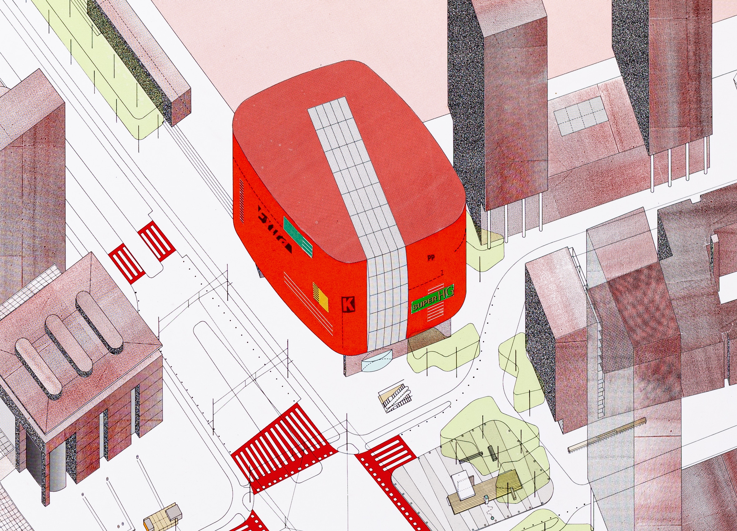
The Dutch, at that time unfamiliar with the word Blob, referred to it as the Bloop. The Bloop addressed all sides equally: the bridge axis, the adjacent Wilhelmina Pier, and the Rijn Harbour behind. The much overused phrase ‘Urban Icon’ springs to mind for this prominent location. Once our scenario became an official planning template, the City of Rotterdam made the brave decision to fill the Bloop with a public function: a theatre. This was to activate the south, the working-class harbour zone—Kop van Zuid.
Bloop-Luxor
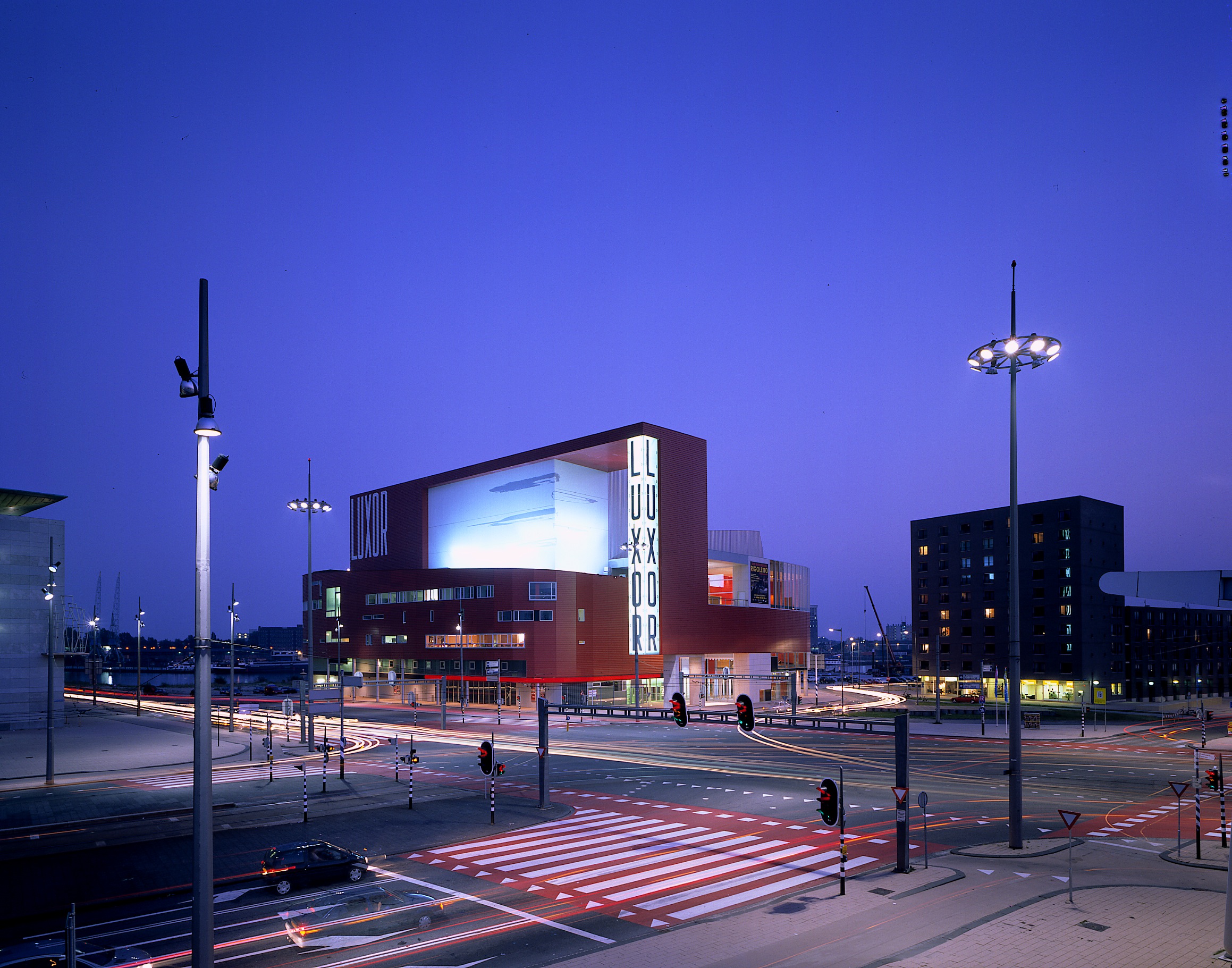
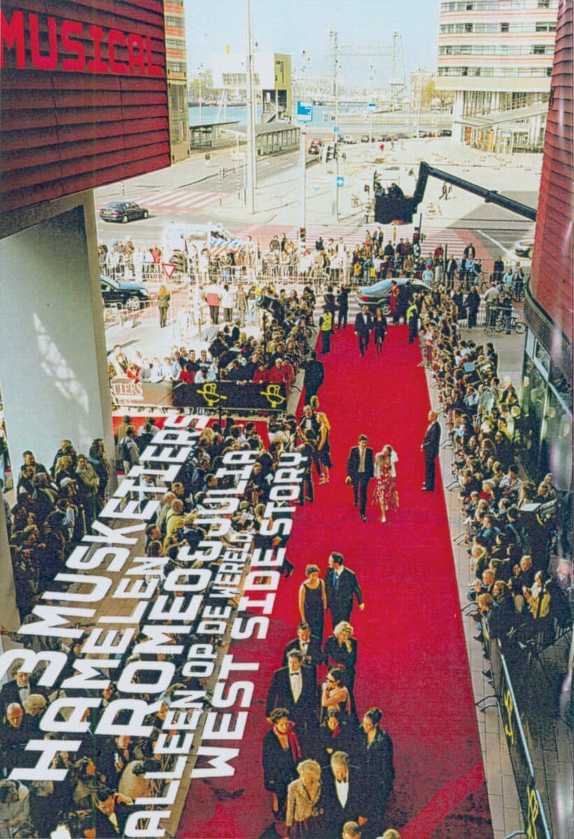
The competition for the Luxor Theatre was a few years after our Landing Square layout had become the official masterplan. It was limited to six invited architects, four Dutch and two international. When BOLLES +WILSON won, the local press grumbled that ‘it’s just a piece of German Functionalism’, which is true: it is now known as the best functioning theatre in the Netherlands. The challenge of the competition was to fit a programme for an audience of 1,500 onto this tight site with no back-of-house for delivery. The stage was required at first-floor level, leaving ground level for generous foyers and public quays. The Luxor is for traveling variety shows and stand-up comedians, i.e. multiple changeovers each week. Herman Herzberger’s entry solved the logistic problem with a lift to raise delivery trucks to stage level, but the cost of a permanent safety officer made this too expensive. Rem Koolhaas expanded the site placing the theatre in the Rijn Harbour behind, he assumed he could do this, it being his city. We at BOLLES +WILSON as authors of the red straitjacket Bloop saw it as our obligation to solve the problem inside the building, taking the turning circle of a juggernaut as our basic curve. Thus, a boxed-in ramp charges through the foyer, then cantilevers out over the Rijn Harbour for trucks to back neatly in beside the stage. A later updated version of the up-axonometric shows the final Luxor form with a projecting truck finger on the south side.
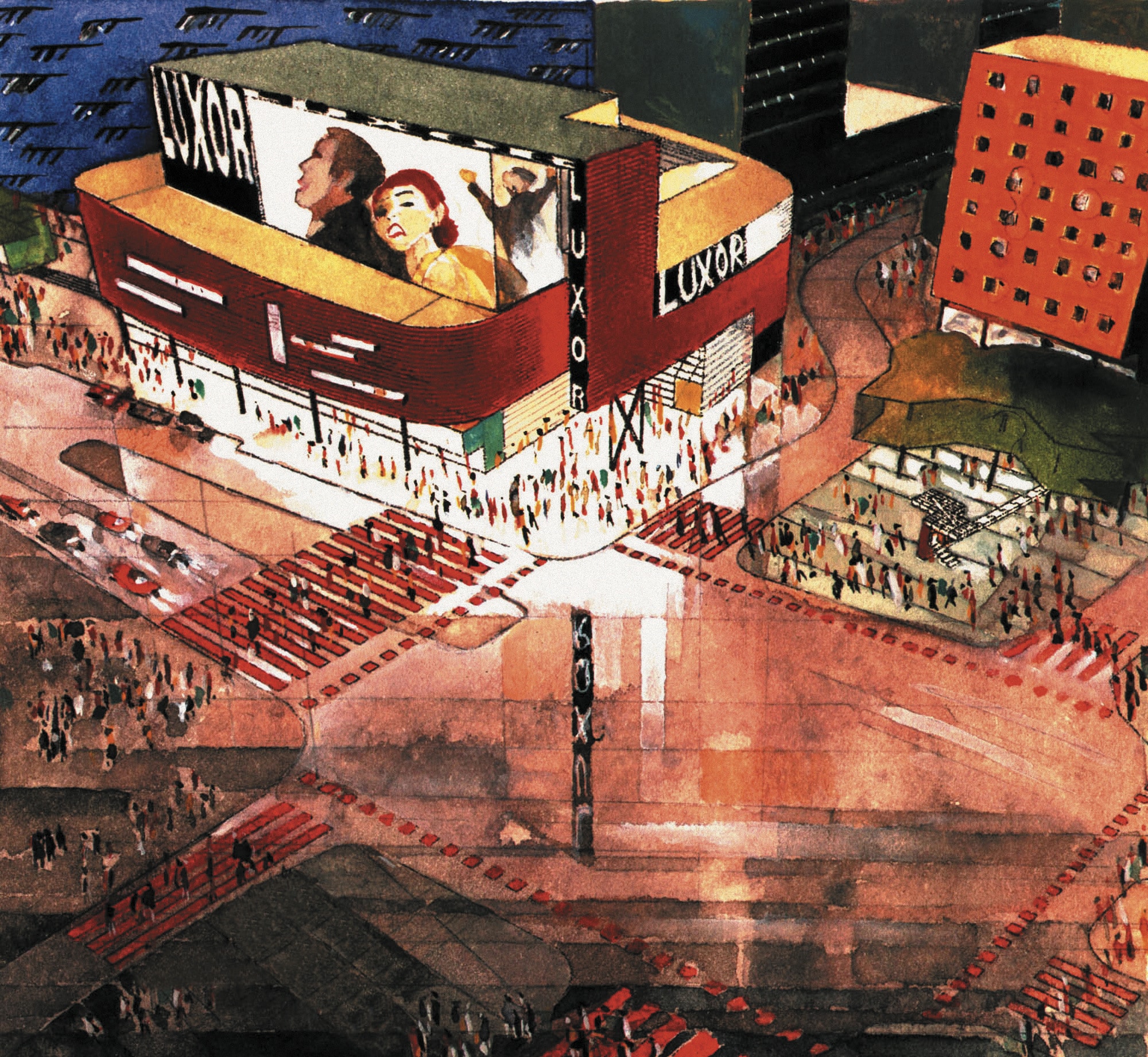
Following the Luxor competition, I sketched the theatre on opening night, mise-en-scène atmospheric drawing in contrast to the geometric exactitude of the Landing Square Scenarios, but accurately predicting the atmosphere of the actual opening in 2001. Unfortunately, the opening night sketch image did not make it to the Drawing Matter Collection, it was lost in a sketchbook mislaid at Frankfurt airport—keep your eyes open.
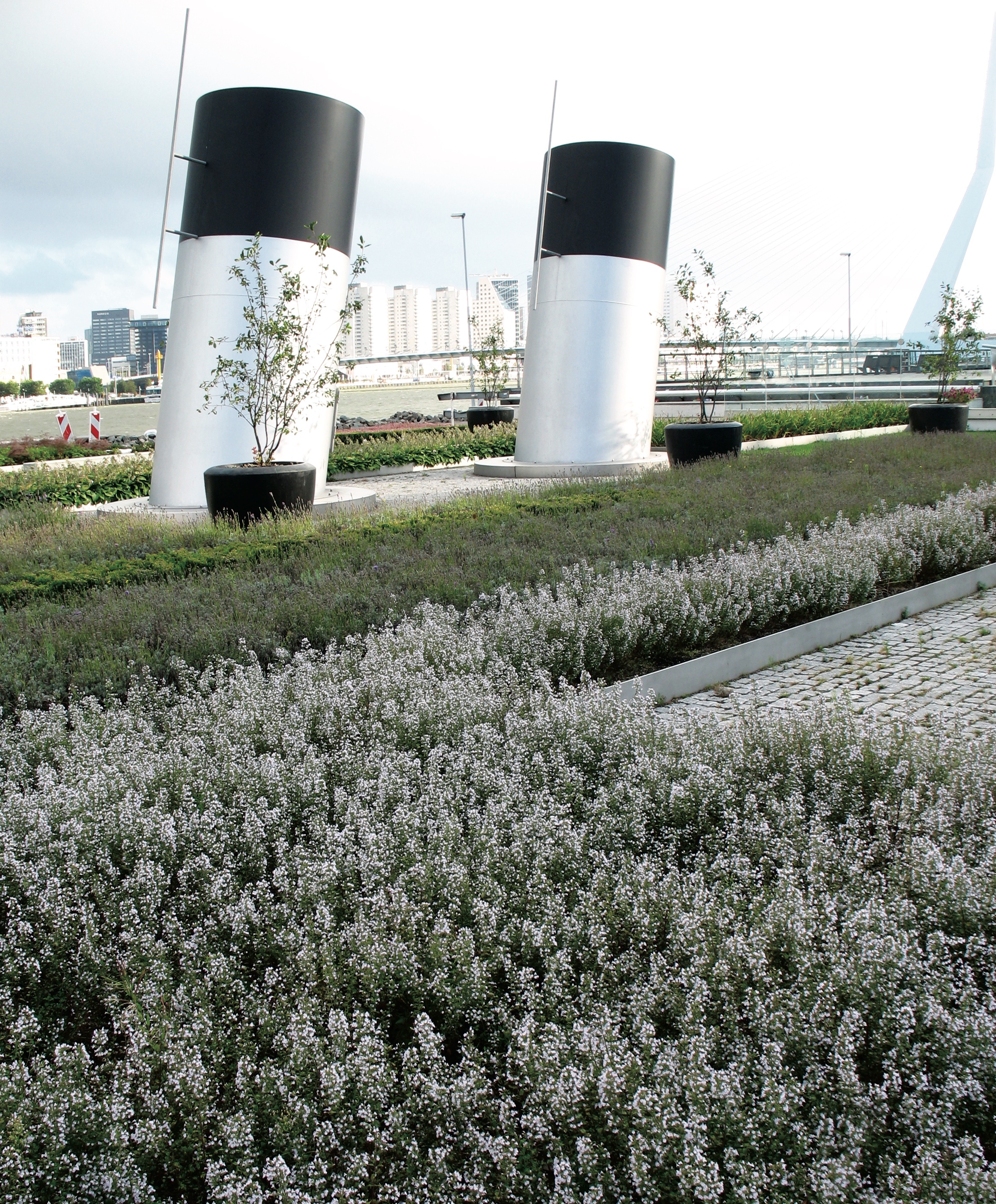
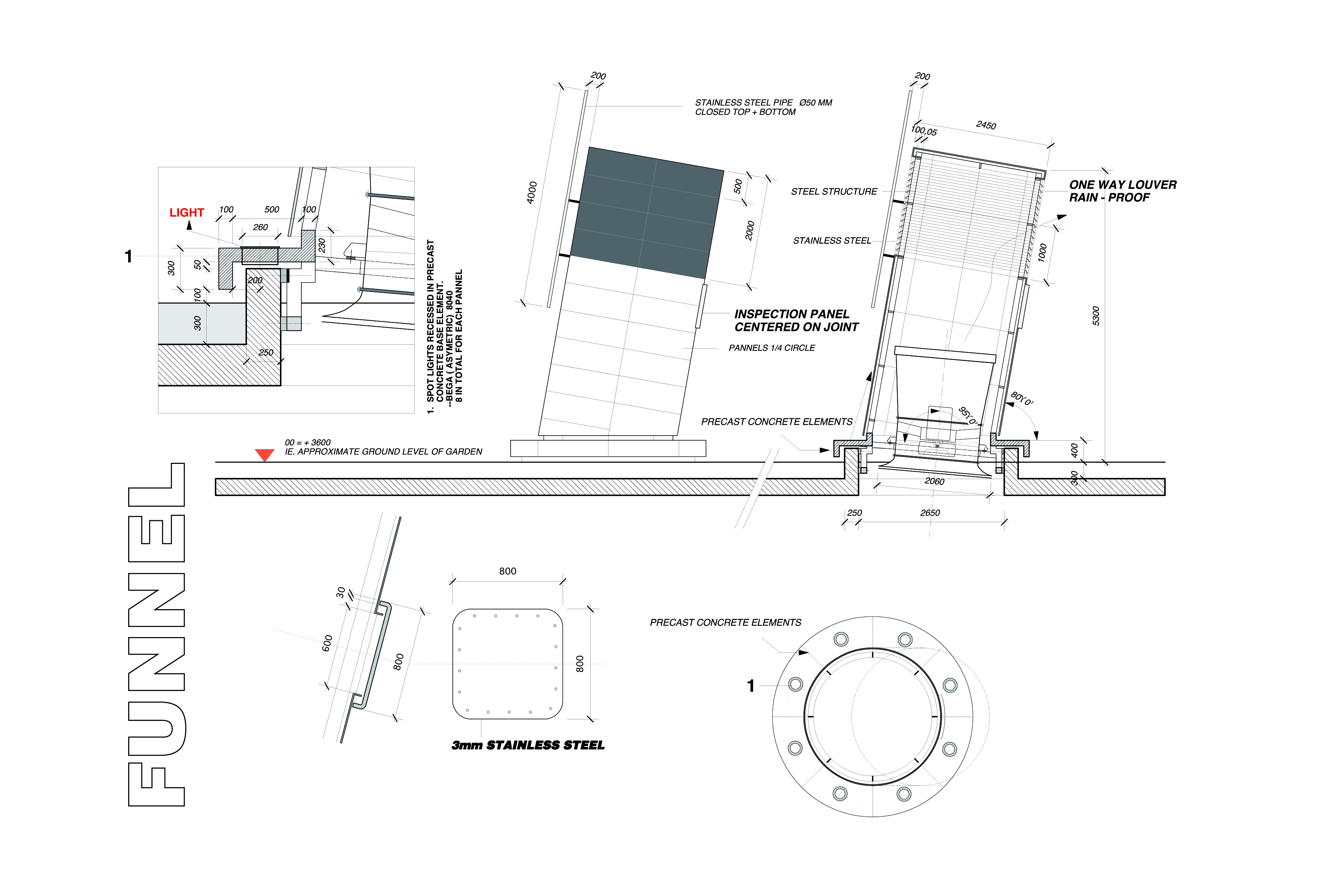
Some of the Landing Square drawings took in the whole length of the Wilhelmina pier from Renzo Piano’s propped tower in front of the Luxor to Foster’s World Port Centre at the western end. There, above the Foster carpark, BOLLES+WILSON were again entrusted with quay landscaping the gardens and event fields of the Hotel New York, but that is another story, except for our ventilation funnels which the Foster office refused to include in their drawings—we spoke at the time the Foster Titanic effect.
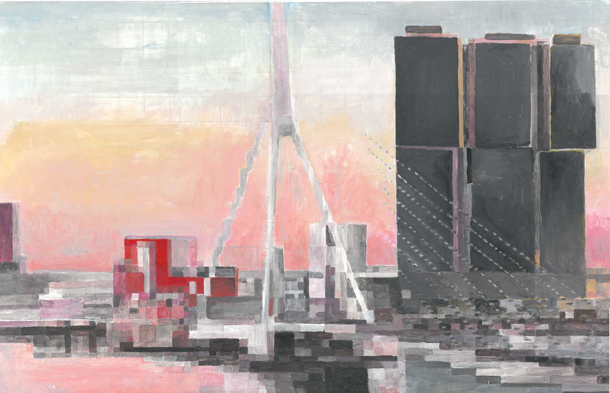
Quite clearly Rotterdam, with its close-packed towers on the Wilhelmina Pier, is projecting itself as a Low Country Manhattan. The delirium of this ambition has also infected the metaphor’s author. Rem Koolhaas’s three mega Rotterdam towers now-out tower their neighbours and further diminish the scale of the Luxor, which was always meant to be a ground-hugging cultural magnet wedged between towers (MVRDV are currently building a zany tower right next door to the Luxor). Perhaps this overshadowing is Rem’s revenge for us winning the Luxor competition. My recent painting, which hopefully will one day find its way to Drawing Matter, is titled `Poor Little Luxor’.
This is a long story to tell—in conclusion I remain an advocate not of the grand narrative of macho towers but still of the minor narratives of practical and poetic opportunities (urban anchors). The Bridge Watchers’ House’s small but enigmatic silhouette still holds its own on foggy Rotterdam mornings.
Find more drawings for the Landing Square Scenarios on www.drawingmattercollections.com.
