Madelon Vriesendorp and Rem Koolhaas at Van Rooy Gallery, 1980
– Editors
On 1 October 1980, at the height of postmodernism, Luce van Rooy opened her gallery in Amsterdam, around the corner from the Stedelijk Museum. [1] In a recent interview van Rooy reflects on the history of the gallery: the idea — what she calls a gallery for ‘architecture and related forms of visual art’ — arose at the end of the 1970s. For her, it was very much influenced by the New York Five — Peter Eisenman, John Hejduk, Richard Meier, Charles Gwathmey and Michael Graves — in which the architectural drawing was being perceived as visual art. According to her account, ‘a new market for collectors developed where drawings were offered as autonomous, aesthetic works of art. One spoke in terms of paper architecture or special mades’.
She observed numerous venues in which drawings of this kind were being shown: the Max Protetch Gallery and the Drawings Center in New York; Antonia Jannone in Milan; and Aedes with Helga Retzer and Kristen Feireiss in Berlin. As van Rooy recalls, Max Protetch was already showing ‘the New York Five, sketches of Frank Lloyd Wright, Alice Aycock and artist-architects such as Siah Armajani, Gordon Matta-Clark, Dennis Oppenheim and Richard Artschwager; Antonia Jannone was showing Aldo Rossi, Giorgo Grassi, John Baldessari and Superstudio; and Aedes started with Josef Paul Kleihues and O. M. Ungers.’
But as Van Rooy tells it, ‘it all came along because I met Rem Koolhaas. I can’t make more of it,’ she says. ‘He stimulated me. I met him in New York, it was then nearly in his interim of the IAUS and he was making an exhibition of the works of Wallace Harrison […] It came down that he was really interested in starting a gallery. I was already starting to plan a gallery, but for drawings, and then he said, “Why don’t you try to do architectural drawings.”’ According to van Rooy, Koolhaas encouraged her to create an ‘ “international platform” where continuous action, attraction and “international cross-pollination” could take place’.
When she returned to Holland, she did her homework and then started, choosing drawings because of their limits, because, as she says, ‘in their texture, in their outcome, they were accessible’.
And according to her, Koolhaas emphasised the ‘idea of the abstract drawing’. There was no computer and they — Rem, Peter Wilson, Mike Gold — were all working furiously to make beautiful drawings. Because the gallery was founded around the corner for the Stedlijk Museum, the location boosted the interest in architecture and its affiliation with fine art. This was compounded by the fact that the Stedlijk was also beginning to show architecture at that time.
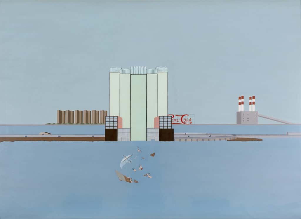
Van Rooy’s first exhibition began with the motto: ‘architecture is the most anonymous and abstract, the most universal of all arts’, a statement from the New York architect Lebbeus Woods. The exhibition included designs and drawings from Peter Cook, Zaha Hadid, Rem Koolhaas/Madelon Vreisendorp, and Judith Turner, among others. Welfare Palace Hotel, Sunken Medusa Raft (1975–76), recently acquired by Drawing Matter through van Rooy, also featured. One of the earliest works by OMA, it was shown in the Sparkling Metropolis exhibition at the Guggenheim Museum in 1978 and later at the Stedelijk in 1980. Luce reflected on the work during a recent visit:
This I think this was one of the earliest from 1976. It was by Rem Koolhaas and Madelon Vreisendorp together with Elia and Zoe Zenghelis, and most of it was painted by Madelon. This was a sort of design, because it looks at bit like the towers there in the drawing by Rem. There were meant to be six towers for immigrants to start their existence in the New World, Manhattan. In the back, you see what were dull towers, later part of Williamsburg. There is also a Pepsi-Cola sign in Queens and in front a raft, which is the Medusa raft — a reference to Gericault’s early-nineteenth-century painting. People want to go to the New World but don’t actually get there — it is comparable to what we have now, those that embark on a boat to seek a new future, a new life. The raft here is already destroyed and the swimming survivors eat each other — also a reference to the cannibalism in the tale of Gericault’s Raft of Medusa. One can see half-bodies, perhaps one person that arrives, but the others are given up to death. Of course, also in the New World is the electric power plant.
During the second show, van Rooy again showed work by OMA, while the Stedelijk showed their projects from the 1970s. For the third exhibition, Van Rooy departed from OMA’s abstract works, exhibiting instead the ‘figurative symbolism’ of Michael Gold’s Crossed Swords drawings. This set of ten drawings was significant: exhibited first in the 1980 Venice Biennale, they were the first works that van Rooy sold, and constituted one of the most successful shows. They were sold to Lodewijk Houthakker, ‘one of the few and maybe the only professional private collectors … in Amsterdam,’ according to van Rooy. In general, however, van Rooy did not sell. ‘I did not have to make a living out of it personally,’ she has said, ‘but the gallery had to earn enough to keep going, to sustain itself. […] The money that came out of the gallery, I put back into it.’
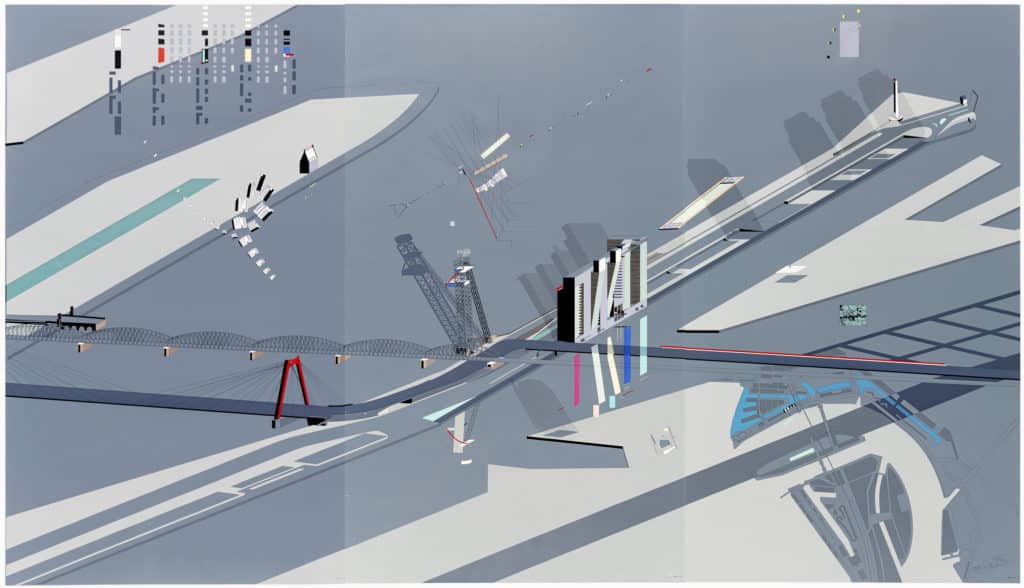
Van Rooy continued with exhibitions on Giorgio Grassi, Peter Wilson and Julia Bolles, Jo Coenen, and Zaha Hadid — with whom she produced Planetary Architecture One. OMA featured again in her eleventh show, specifically their Boompjes Tower Slab (1982), a silkscreen triptych printed by master silkscreener Bernard Ruygrok. The Boompjes Tower — which means ‘little trees’, describing the street — was shown, as is well known, in the 1988 Deconstructivist Architecture exhibition at the Museum of Modern Art, and an edition is also in MoMA’s collection. A rare drawing attributed to Rem Koolhaas, given to van Rooy in 1988, seems a precursor to the print. Van Rooy reflected on the silkscreen during the same visit:
The triptych, a signed silkscreen, was produced in 1982. The project was a commission by the city of Rotterdam for part of the town in which there was a lot of bombing. For OMA, it was a chance to make something new, and it was really Rem’s idea. He was always toying with these towers, that they were not straight; at that time, it was a little bit crazy. For every commission, he tried to have this kind of building. Of course, people didn’t want it, they thought it was dangerous to live like this.
The silkscreen is a masterpiece by Bernard Ruygrok, the master printer in Amsterdam. It is nearly impossible to make the edges align so precisely; and if you look closely all align — the swimming pool, the bridge, the tower of Tatlin. The design is also interesting because it is before the computer, the advent of CAD CAM. So this was all handmade. This is the scheme for the four towers, with a swimming pool, the old bridge, and, in the upper right, a sort of shadow from a full moon. There is also a swimmer. The same swimming pool is in the other two works — Welfare Palace Hotel and Medusa Raft, from 1978. Below, on the lower right, is a plan in which you see the building on the site. On the upper left, there is a detail and the signing of OMA, which is mirrored, and so it seems as if the initiation of AMO. On the upper left one also see the first skyscraper in Rotterdam, the White House.
The silkscreen, which allowed them to achieve such fine detail, was really a tour de force. Ruygrok had never done such thing, and at that size. Of course, Rem wanted it in one panel, but Ruygrok insisted it be three.
The silkscreen became exemplary of van Rooy’s approach to selling drawings and developing the market. The idea began in her seventh exhibition centring on her grandfather, Hendrik Petrus Berlage, in which she showed works on loan from the Dutch Foundation for a Museum for Architecture. Because she could not sell the originals, she had silkscreens made by Ruygrok. According to Van Rooy: ‘The gallery published three silkscreens: two interiors from the hunting lodge Sint Hubertus (1916) in colour and one of Berlage’s entry for the competition of a design for the Lenin mausoleum (1924) in black and white. Van Rooy found that ‘[t]he architectural drawing is a more than suitable item for graphic reproduction. In this way the often fairly expensive or unavailable originals become accessible for a broader public. Together with the fine, precise and perfect realization of the silk-screens, this first offer was a great success.’ It was a process she then repeated and by her twelfth exhibition on Tadao Ando silkscreens, she had become ‘convinced that investing in high quality graphic reproduction was a safe and relevant thing to do.’
Van Rooy’s eleventh exhibition on OMA was the last at her South Amsterdam location, after which the gallery moved to the Centre.
LUCE VAN ROOY GALLERY, EXHIBITIONS 1–11
1. Designs, drawings and photographs from a.o. Jo Coenen, Peter Cook, Zaha Hadid, Rem
Koolhaas/Madelon Vriesendorp, Judith Turner [photographs], Peter Wilson, Carel Weeber, Hans Tupker [Chicago Tribune Tower] and Benthem/Crouwel
2. Rem Koolhaas/OMA Exodus
3. Michael Gold: Gateway to Mecca
4. Giorgio Grassi
5. Peter Wilson and Julia Bolles: From Column to Door
6. Paul Tames van den Berg: Sets in search of Meaning
7. Hendrik Petrus Berlage (1856-1934) and the introduction of the silkscreen
8. Joe Coenen
9. Zaha Hadid: Planetary Architecture 1
10. Alfred Eikelenboom
11. OMA: Amsterdam, Rotterdam, Den Haag
The paper is excerpted from an informal talk given at roundtable for a postmodernism interest group, during the European Architecture History Network conference in Tallin, Estonia, on 13 June 2018. The session entitled ‘Drawing Architecture: 1968–1988’ was chaired by Veronique Patteeuw and Lea-Catherine Szacka.
Notes
- For an extended discussion of the van Rooy Gallery, see also Jordan Kaufmann, Drawing on Architecture, The Object of Lines, 1970-1990, Cambridge, Mass., MIT, 2018, pp. 256–63. For a full list of the gallery’s exhibitions, see pp. 271–72.

– Peter Wilson