Peter Wilson in the Empire of Signs
‘Geometric, rigorously drawn, and yet always signed somewhere with an asymmetrical fold or knot.’[1] While this could be a concise description of Peter Wilson’s work, it is in fact Roland Barthes writing in his book Empire of Signs (1970) about what he described as the Japanese ‘ecstasy of the package’.[2] Barthes was struck by the precision and profusion of the wrappings of Japanese goods, which were developed to the extent that they themselves became objects that surpassed what they contained, their pleasures coming to far exceed those conferred by the relatively trivial gifts secreted in their interiors. For Barthes, Japanese packaging materialised an art of the signifier, one whose elaboration served to delay, postpone, and even void the content—that is, the gift the wrapping signified. It is, Barthes wrote, ‘in the envelope that the labor of the confection (of the making) seems to be invested, but thereby the object loses its existence, becomes a mirage […] the package is not empty, but emptied’.[3] And, although he did not make this explicit, when he described the Japanese package as ‘a thought’, he seemed to tacitly link it with the ideogram—a spatial, figurative cipher in which an idea takes form.[4]
In this article, I want to reflect upon two well-known projects developed by Peter Wilson for the 1978 and 1988 Shinkenchiku Residential Design Competitions. One of the things that makes these projects, designed a decade apart, interesting to think about in relation to one another is that they responded to the same brief—or at least the same brief but with a difference. While it was Peter Cook who had first proposed that the competition be for a ‘Comfortable House in the Metropolis’, the idea was taken up and reused ten years later by Toyo Ito, who gave it a new inflection by emphasising the physical ephemerality of the metropolis in an era of pervasive informational technologies. In making this comparison, I aim—by looking at Peter Wilson’s works and words—to be able to say something about transformations in his designs across this period. But I also hope that this will let me make some kind of argument about the way the projects are drawn, for this is inseparable from the ways that they were conceptualised and imagined. To look ahead, I will argue that the change that takes place between these two projects can be read as an attempt to escape metaphor and to move toward something akin to an art of the signifier of the kind that Barthes has already given us a foretaste of—something less self-consciously representational and descriptive, and more graphic and indicative. In short, the work becomes increasingly ideogrammic, and this is reflected in the drawings that Wilson makes. While the city of the 1978 project is thought of in terms of permanence and material mass, the heavily worked drawings also speak of the weight and profundity of metaphorical meaning. By contrast, ten years later, we have a project that has more to do with lightness, discontinuity, and the graphic qualities of profile and contour. Moreover, the 1988 work appears—in one way at least—to be newly exempted from meaning and perhaps even montage-like, of which more later.
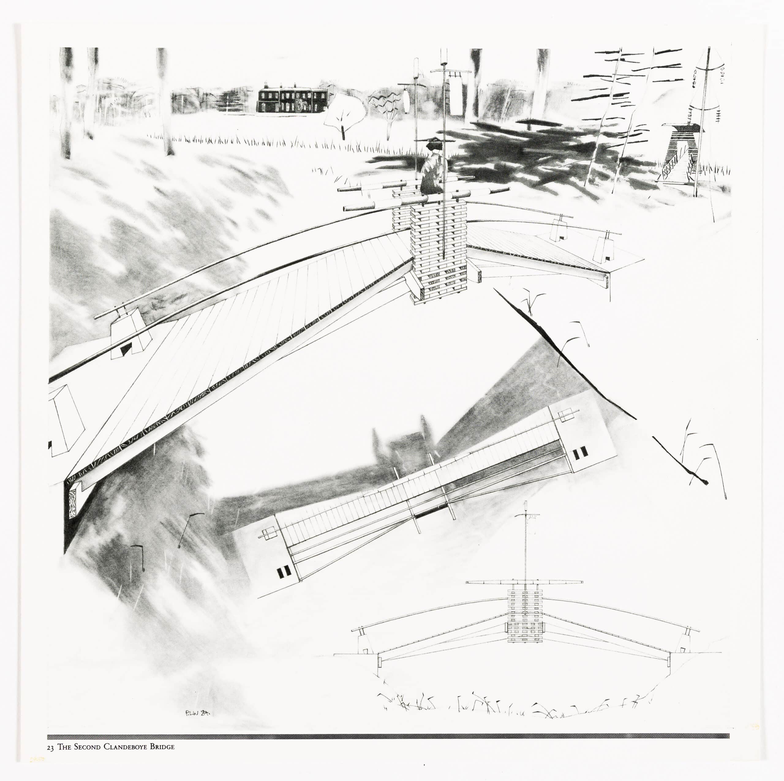
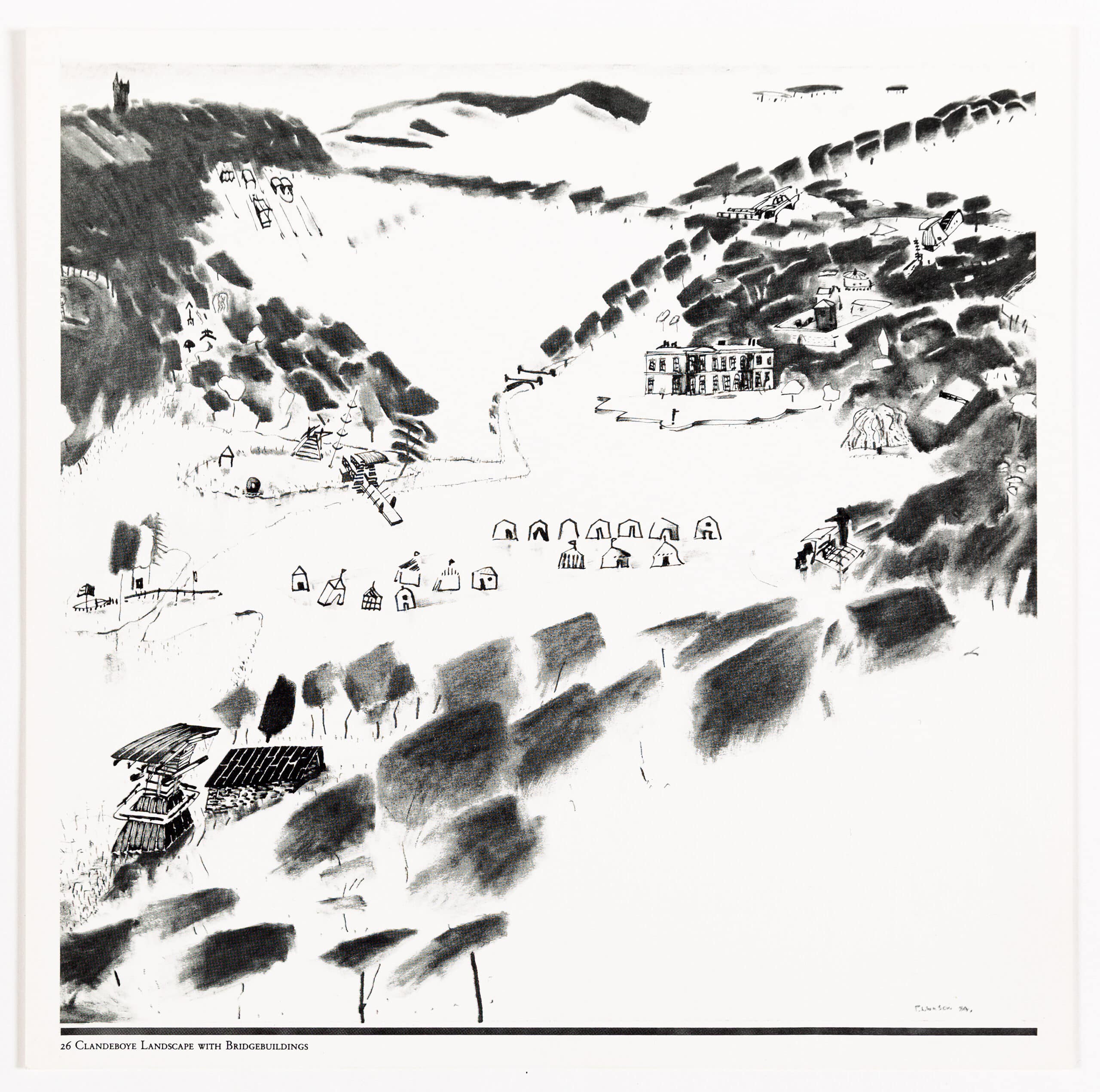
I propose to read this shift by way of Barthes’s Empire of Signs, the book—with which we began—comprised of his reflections on visiting Japan. We will recall that in this work Barthes made no claim upon some objective ‘reality’ of Japanese culture—instead, it is a journal of the affect of the experience of Japan upon him, the way it marked or, as he wrote, ‘starred’ him (the term carries implications of the flash of a camera, but also a blissful wounding).[5] It was an experience in which, he wrote, ‘a certain disturbance of the person occurs, a subversion of earlier readings, a shock of meaning lacerated’.[6] While I am cautious of making too much of the Japanese context of the late 1980s projects of Architekturbüro Bolles Wilson—as the practice of Peter Wilson and Julia Bolles was then known—I am also wary of making too little of it. Perhaps the affect of Japan was to some extent always there anyway, as Wilson himself has said in one of his published interviews with Alvin Boyarsky:[7] see, for example, the drawings of the projects for the Clandeboye estate in County Down, Northern Ireland (1984), with the kimono-clad Marchioness of Dufferin and Ava lingering on the bridge (Fig. 1); or the landscape in which mist merges with the paper support of the drawing and induces a kind of mobility and uncertainty into the spatial relations between the elements (maybe we can see this drawing as a kind of middle term between the two modes, a decade apart, of the Shinkenchiku competition drawings) (Fig. 2). Perhaps, in the same way that Barthes felt that ‘Japan has afforded him a situation of writing’, it afforded Wilson a situation of designing—especially so in the wake of the 1987 Architectural Association Summer School in Tokyo, which involved both Peter Wilson and Nigel Coates, as well as Toyo Ito.[8] In any case, what I will try to do is to hold Architekturbüro Bolles Wilson’s Japanese projects and Barthes’s text in a paratactical relation, reading them alongside one another and exploring ways in which they might ‘interlace’—the term that Barthes uses to describe the relationship between text and image in his book.[9]
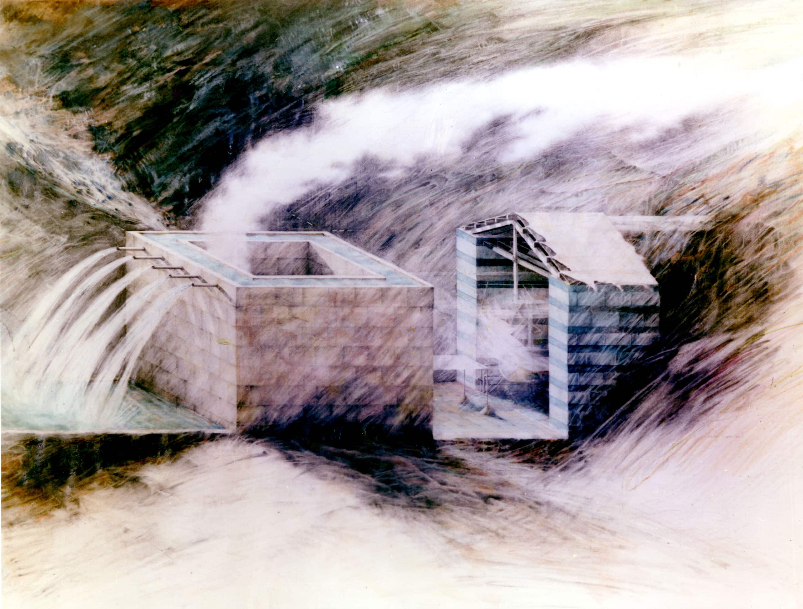
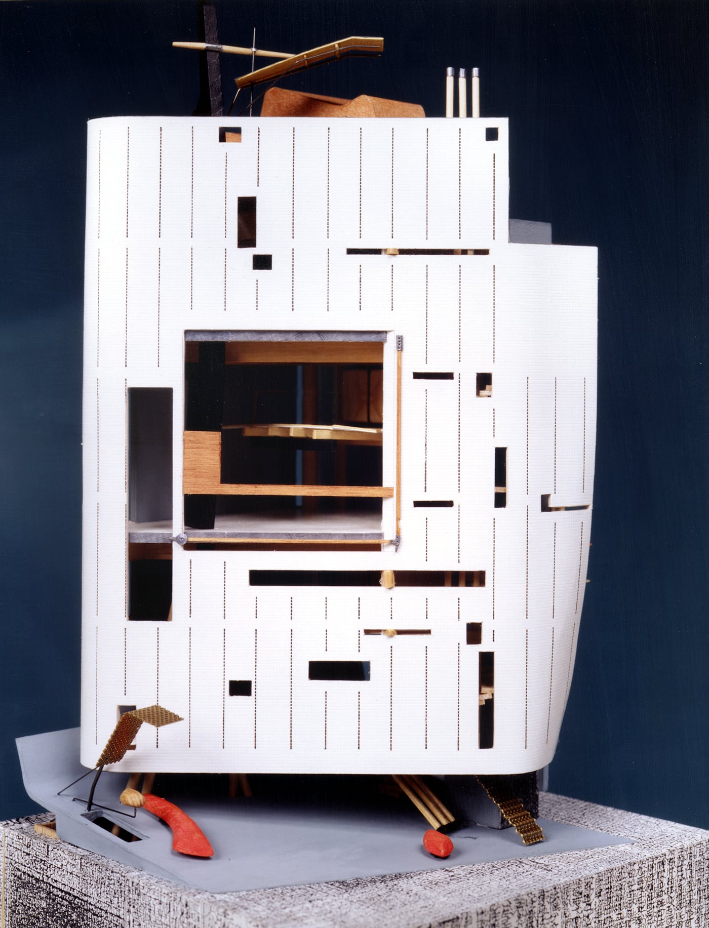
A persistent preoccupation with water and related hydraulic technologies, bridges, boats, and submarines, has flowed through Peter Wilson’s work. The forms that this has taken are closely entwined with the shift that I have just indicated. It begins with the elemental, with Bachelardian water, the stuff of Water and Dreams (1942)—profound, fecund, and transformative.[10] This is water that is to do with, by turns, ritual, vitality, purification, renewal, and oblivion. It is deeply mythologically invested and is itself almost the very substance of the metaphorical in the multiplicity of transformations it enacts and stimulates. It is the regenerative water in which Sigfried Giedion placed hope in Mechanization Takes Command (1948) and also the non-technologised liquid that Ivan Illich would write of in his Bachelardian reflections on the cultural history of water, H2O and the Waters of Forgetfulness (1986).[11] This is the water that percolates through Wilson’s early Water House design of 1976 (Fig. 3). A kind of hydraulic villa, it is massive and grounded, both of which are part and parcel of the particular kind of metaphorical mode, or metaphorical mood, of the project. It emits vapour, but this does not dissolve or complicate the ground of the project as it would in the later Clandeboye drawings.
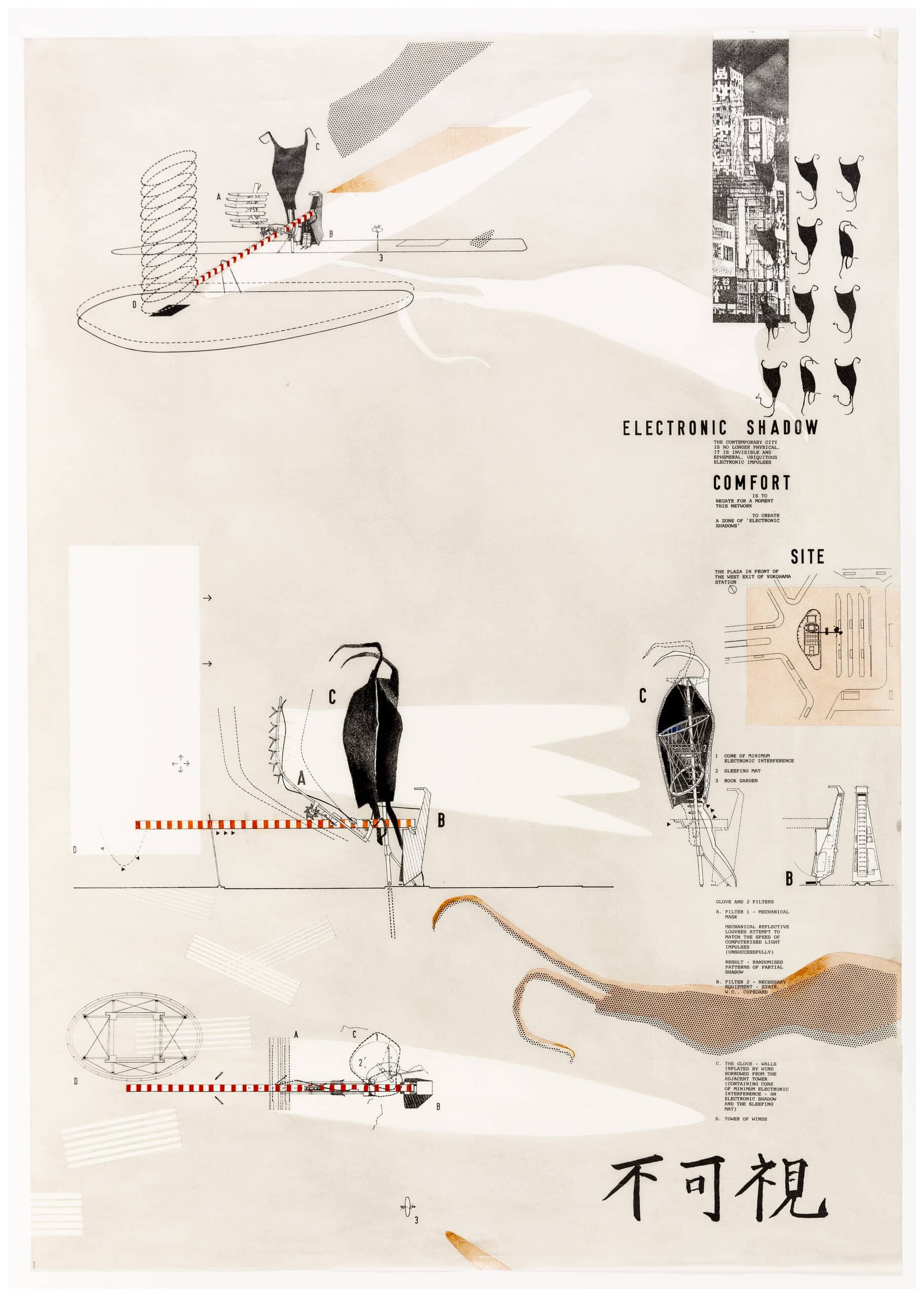
As we move across the projects from this period, the preoccupation with the watery shifts. It moves away from a Bachelardian-elemental character, valued for its presumed profundity of meaning and rich metaphorical relations, to something that is more like a condition of pure fluidity—perhaps, in the end, less watery than aerial, and even electromagnetic (Toyo Ito would describe the black, dancing form in the second Shinkenchiku project as ‘riding the waves on a sea of electronics’).[12] And this in turn seems related to a new condition of emptiness in the designs—perhaps this is first articulated in the voided centre of the Villa Auto projects (1978–1980)—and of the architecture as a wrapping, a surface, or a screen that occludes some kind of protected interior. This movement is partly a result of cultural-theoretical considerations and partly a result of the encounter with new conditions of commissioning, such as that of the Cosmos Street building in Japan (1989), a project without the ‘content’ of a brief.[13] Interestingly, like Barthes’s Japanese packages, this becomes architecturally elaborated through its wrapping, and it seems not coincidental that it was a sheet of paper—a newspaper—that came to motivate the project (Fig. 4). When in Japan, Barthes experienced the murmuration of its unknown language as a liberating release from meaning. Rather than alienation, it produced exactly the opposite effect—that is, an escape for the alienations inflicted by the language of home, with the ravages of its hierarchies and exclusions (of class, taste, knowledge, expertise, etc.). In Japan, Barthes wrote, ‘I live in the interstice, delivered from fulfilled meaning’.[14] It seems to me that this is exactly what the Cosmos project does, and in a double sense—first of all, in its independence from the meaning conferred by a brief; and second, in its exemption from the semantic content of the newspaper article and its poetic play upon the unmarked interstitial spaces or voids upon the page (Figs 5 and 6).
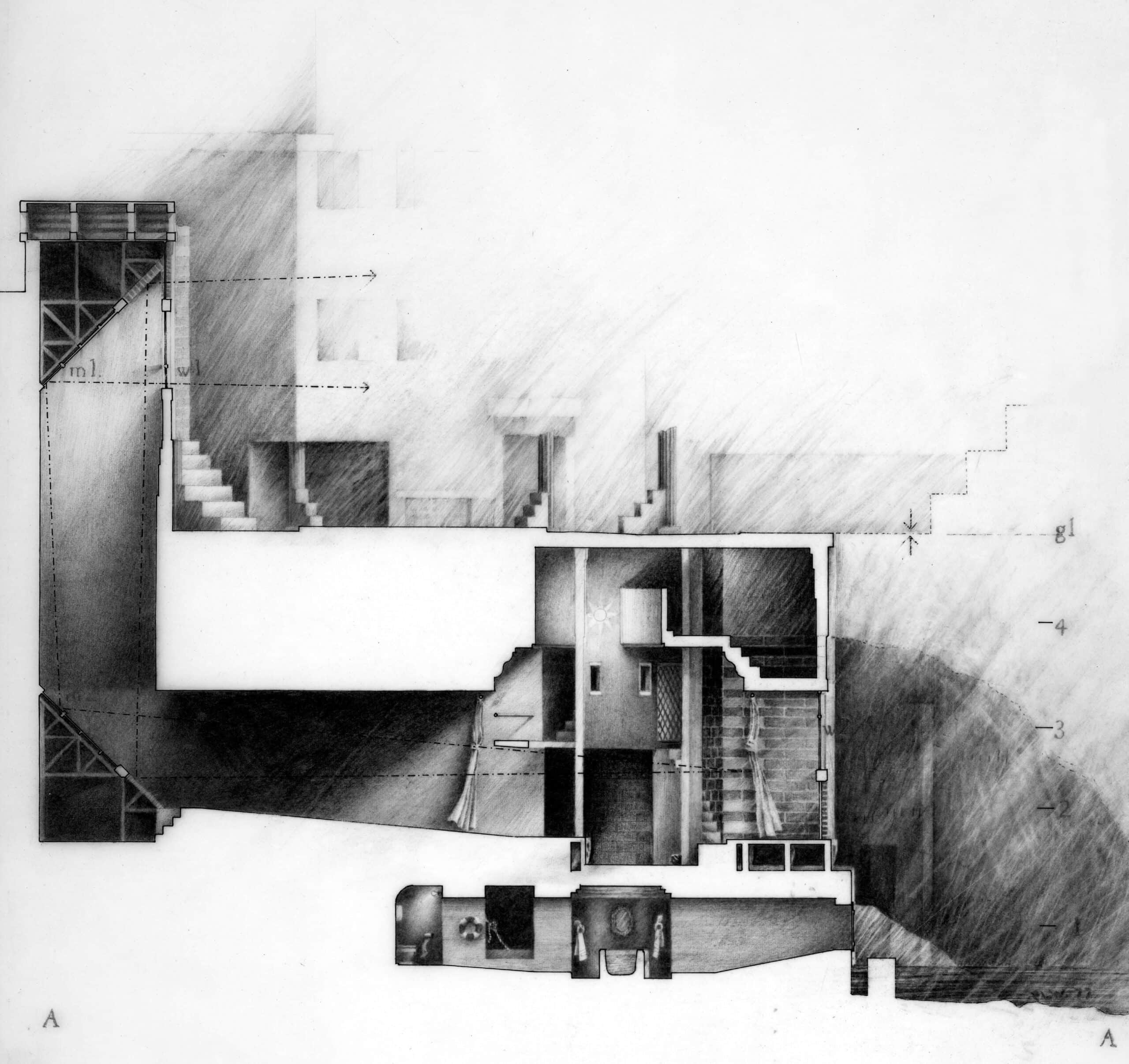
Let us return to what metropolitan comfort looked like in 1978 and consider the way it was drawn (Fig. 7). This is the kind of image that makes us think how, at its root, drawing is about the transfer of material from one place to another and its redistribution on a surface—which, in this case, is almost entirely marked and leaden. It is also the kind of drawing that tends to be characterised as atmospheric. I suspect that whenever architects use the term in this way, they are usually referring to something rather specific. All drawings might be said to induce atmospheres in the sense of affects or moods, but it tends to be only certain kinds of these that are described as ‘atmospheric’—typically ones that render the space as a sort of fluid material medium, perhaps vaporous, striated with light and shade, a miasmatic continuum that holds together all the elements of the architecture and out of whose depths they emerge. When Illich writes that ‘there is a stable, dense, slow, and fertile watery stuff that obscurely vegetates within us’, whose—here he quotes Bachelard—‘black flowers bloom in matter’s darkness’, he might have had in mind a drawing like this.[15] In Wilson’s section, it is almost as if the density of matter normally held within the poché has been released and has spilled out into the air. Through the later 1970s and onwards, this kind of drawing will set a template for what metaphoric thinking comes to look like in architecture. Occulted by shadows, enigmatic, profound—a whole school at Cambridge comes to be built on it. It is a way of drawing that is deeply imbued with, and is symbolic of, the labour of its own production—making a drawing like this comes to be part an act of meditation, part spiritual exercise, and part mortification of the flesh.[16] This is a tendency that reaches its most fully developed form not in a drawing but in Daniel Libeskind having his students fabricate his wonderfully complex medieval reading machine by candlelight using hand tools. Wilson has commented that: ‘Around 1980 I made a conscious decision to be less laboured over my drawings, to do things quicker’.[17]
When Wilson comes to talk about the shipshape in his 1984 AA publication Bridgebuildings + The Shipshape, he describes the ship as a ‘profound and fundamental architectural metaphor’ and his use of the multivalent shipshape form as part of a project to ‘remythologise both architecture and everyday events’.[18] In the same section, he gives a definition of the shipshape that has always struck me as both interesting and curious. While we might rightly expect the shipshape to be described through talk of boats, the way they float and their movement through water, Wilson instead tells us a story about two architects standing in opposite corners of a square. They are holding strings and each of these is attached, at its other end, to one of the unoccupied corners. Keeping their cord taut, each architect walks to the corner where the other has been. The space between the two arcs formed by the movement of the ends of the strings is the shipshape. Now, I wonder what the telling of a story like this does that the more expected description does not? Several things, I think, including one which I will save for later. First of all, it locates drawing as fundamental to building, building being literally built off drawing. It seems like a story of setting out—which is also I suppose a kind of launching—that is, of drawing upon a site with instruments at a scale of 1:1. Then, by picturing the figures of the two architects alongside the geometric form to which their movements are tethered, it gives us an image of the co-presence of figuration and abstraction that is so important to Wilson’s work in this period, and that he articulates through the idea of frame and adjacency. The shipshape form, which is produced out of the interaction of the story’s protagonists with the square, seems itself to mediate between them, oscillating between frame and figure. Perhaps not coincidentally, the shipshape at which we arrive is something like, albeit not exactly, the vesica piscis (these are surely architect-geometers), a term that holds together something of the geometric-abstract with the (abject-) figurative by denoting a specific geometrical form while meaning literally ‘the bladder of a fish’.
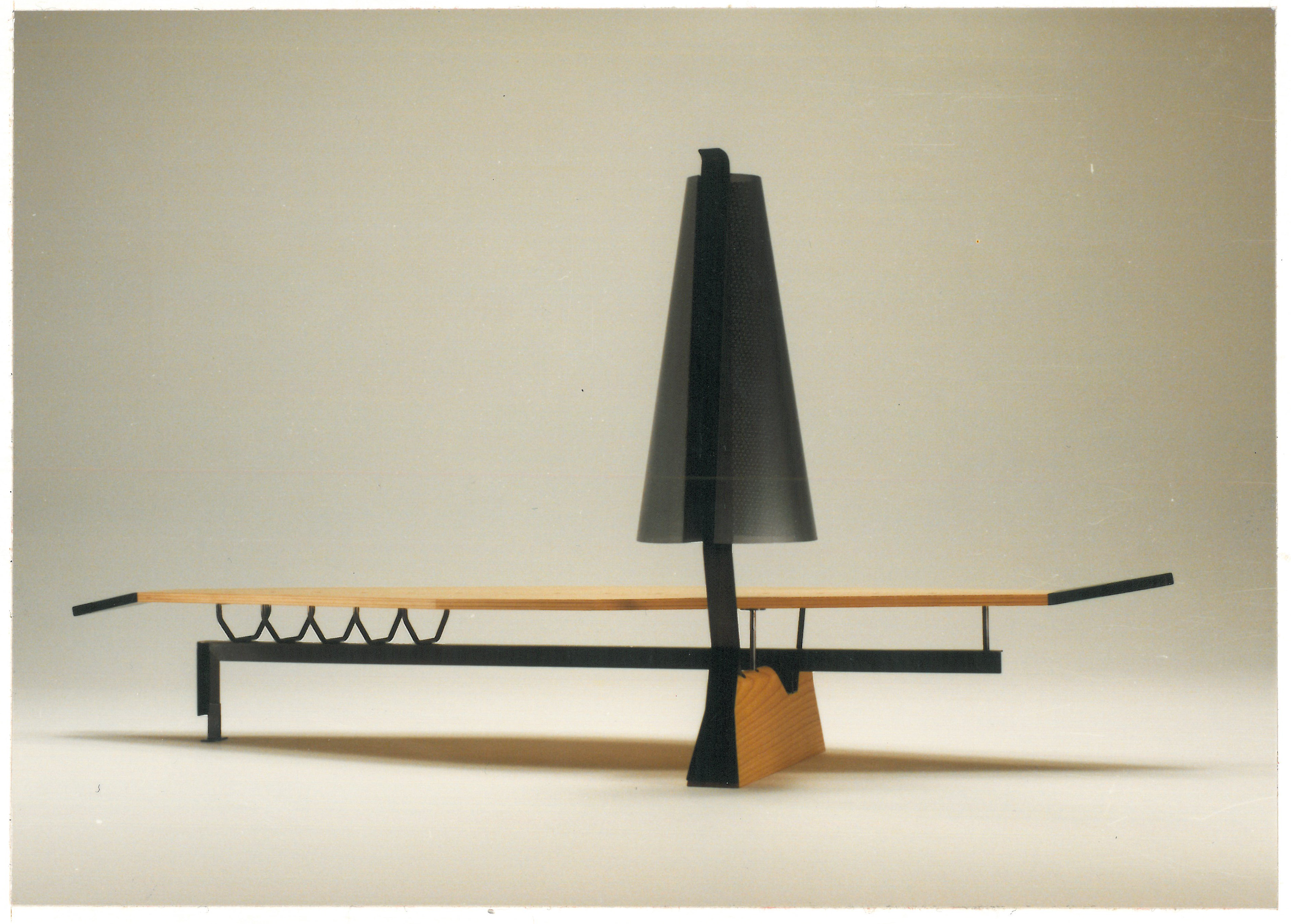
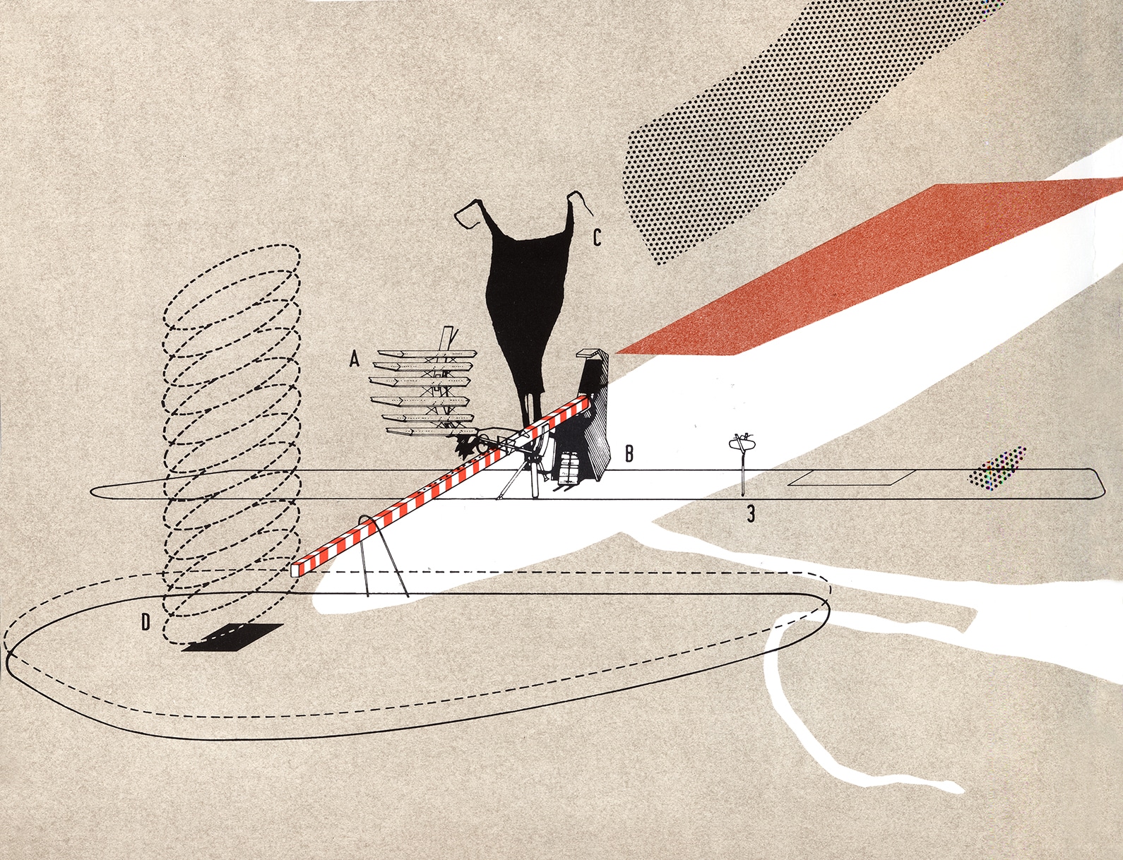
Wilson’s thinking on frame and adjacency is very resonant with the way Barthes writes about the feeling of the miniature engendered by Japanese things. In Japan, we constantly have the impression of the diminutive, Barthes writes, not because things are small, but ‘because every object, every gesture, even the most free, the most mobile, seems framed. The miniature does not derive from the dimension but from a kind of precision which the thing observes in delimiting itself, stopping, finishing’.[19] Doesn’t this formulation—‘a kind of precision that the thing observes in delimiting itself, stopping, finishing’—accurately describe one of the key qualities we find in Wilson’s work? The figurative elements that assemble in relation to frames never appear as fragments—they are never partial objects, but are always strikingly conclusive and concluded. Even in a case such as the 1991 Bolles + Wilson Kronprinzenbrücke competition for Berlin, where we find the recognisable form of an aircraft tail fin, we don’t experience it as a fragment of a larger whole, but rather as something that has gained a strange independence and autonomy without losing its reference (Fig. 8). While it seems almost banal to say it, although I think it is rather a complex issue, this effect of conclusion and delimitation has much to do with Wilson’s compositional facility with the use of intense and differential colours and of tapering forms—forms that both the shipshape and the bridge provide models for in various ways: they draw themselves to a close, and their termination is often emphasised by some shift, twist, or knot, as in the Punch Sofa of 1987 (Fig. 9). This is an effect that is heightened by the graphic isolation of objects upon flat fields of colour, an approach that runs through the presentation of the projects in the book Western Objects Eastern Fields, published on the occasion of an exhibition at the Architectural Association in October 1989. It is suggestive to return from an image such as Wilson’s famous 1986 screenprint of the Paradise Bridge, Amsterdam (Fig. 10) to Barthes, who is by now describing the presentation of Japanese food as a palette of colours and objects that the diner composes through selection (it’s important for Barthes that anything like a menu, which provides a sequence of ingestion—an architectural programme for the food—is suspended). He writes:
‘The dinner tray seems a picture of the most delicate order: it is a frame containing, against a dark background, various objects (bowls, boxes, saucers, chopsticks, tiny plates of food, a little gray ginger, a few shreds of orange vegetable, a background of brown sauce).’[20]
Here it is a matter, as he later writes, of ‘linear contour’, ‘elastic firmness’, and brightness of colour, a visual rawness composed through the spacing and discontinuity of objects within a frame that they always in some way exceed.[21]
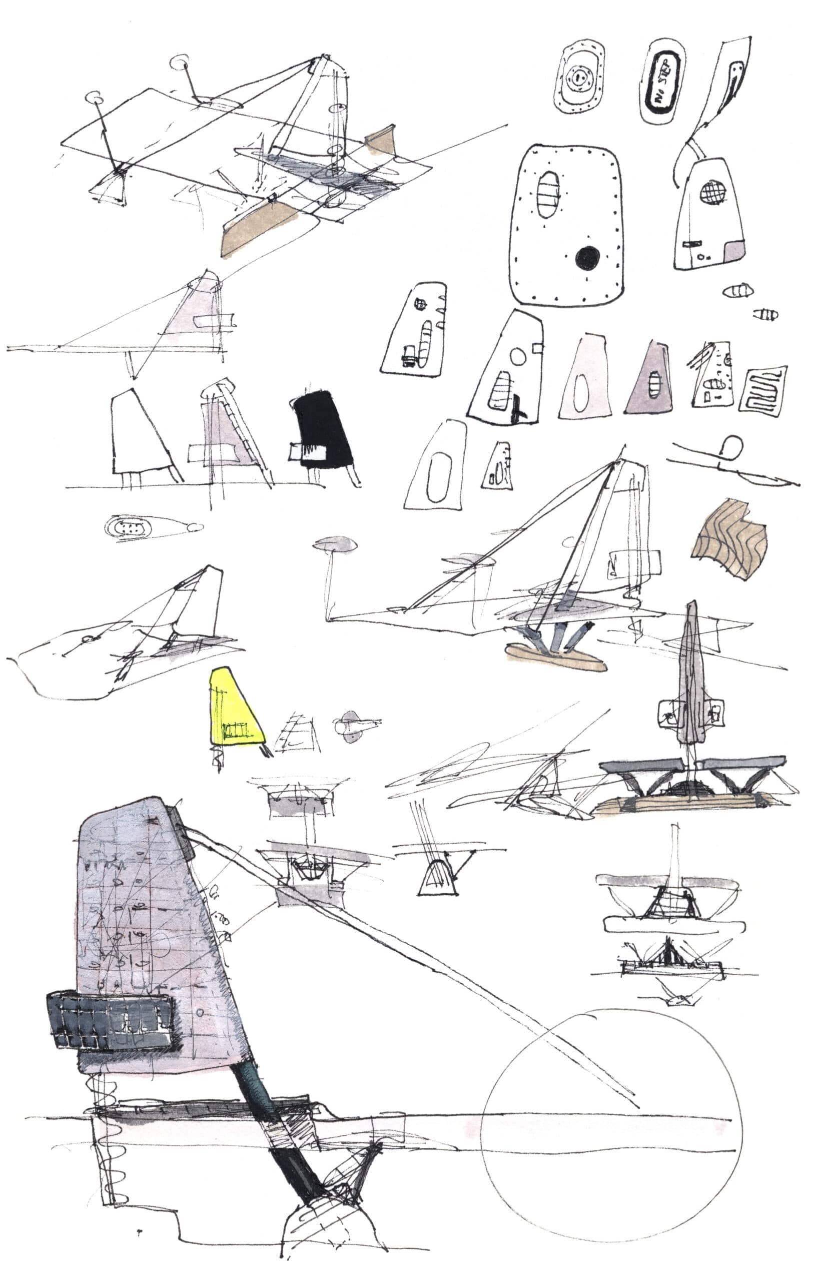
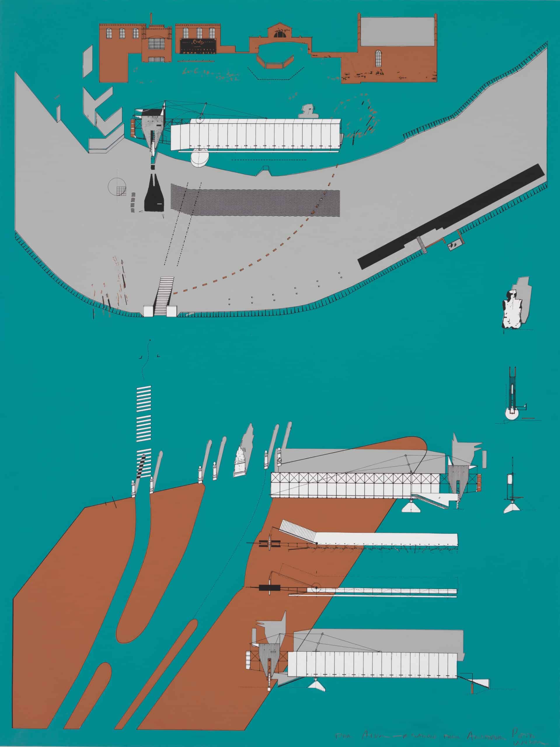
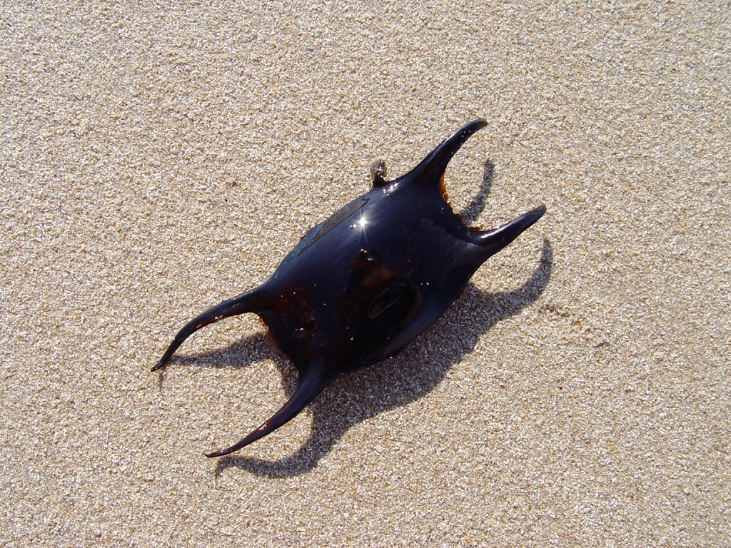
But there is still another way of reading Wilson’s story of the two architects and their crossing threads, and that is as an allegory of the danger of architects becoming entangled in, or tripped up by, their own metaphors. Now, it is precisely to escape this, I argue, that the motif of the submarine is introduced. When, sometime in the mid-1980s, the shipshape dives to become the submarine, it does so in order to escape the metaphoric flotsam and jetsam that is bobbing around it. Its descent downwards is not into some profound realm of fundamental meanings—it is the opposite gesture to that of Salvador Dalí when he appeared, in his 1936 lecture at the New Burlington Galleries in London, dressed in a diving suit as an emissary from the depths of the sub-conscious. In the course of his talk, Dalí was nearly suffocated and his helmet had to be prised off, thereby giving us a worked example of an artist being asphyxiated by his own metaphors. He came close to becoming, in Peter Sloterdijk’s words, the Modernist ‘martyr of symbolic dives’.[22] In the case of Wilson, what deserves to be stressed is that when the shipshape goes underwater, it undergoes a kind of state change, transforming from a metaphor to an ideogram. In the work to date, the shipshape had been valued for the way relations clustered around it—it was less an idea itself than a formal motif around which a profusion of associations could be gathered. The point of the submarine—which works as an ideogram of the idea of an isolated, voided interior, screened by an enveloping surface—is to strip all these associations away and evaporate the metaphoric richness of water that the projects had hitherto entertained. This is very clear if we compare the projects for the Opéra de la Bastille (1983) and the Kassel Documenta Exhibition Hall, six years later. The first is a shipshape with an attendant flotilla that sails upon an urban sea, playing upon an array of mythical and Modernist tropes (Fig. 11); in the second, the submarine forms are, in comparison, obdurate, resistant, and arrested—perhaps the most we could say is that they are ‘beached’. This sense of the drying up of metaphoric movement seems to underlie Wilson’s description of submarines as ‘autonomous super-present objects’—these are not things that are shading into other things but that instead aim to stop metaphor in its tracks, and the idea or effect of ‘super-presence’ is surely closely tied to this.[23] Moreover, from this perspective it is clear that the black ‘glove’ of the 1988 Shinkenchiku competition is a soft submarine immersed in a ‘sea of electronics’ (Fig. 12).[24] It is not that it is without possible relations—obviously one can always claim something is ‘like’ something else. Instead, it is that the project now works to screen out these relations rather than to declare or intensify them. Thus, as far as I am aware, Wilson has never said on record what the found object that lies behind the shadow is. Toyo Ito thought it was ‘like a jellyfish’, but it is much more akin to the egg-sac of a fish—that of a skate, a ‘mermaid’s purse’ as they are colloquially called—another aquatic encapsulating form (Fig. 13). Certainly, this would resonate with the womb-like interiority of the comfortable house (present too in the earlier project), although this was now held in tension with the deathly, threatening aspects of the shadow form with its ninja nomenclature and predatory protuberances. And so, we move from the fish-bladder of the metaphoric shipshape to the egg-sac of the ideogrammic submarine.

There were various literary, graphic, and cinematic experimentations with ideograms in the twentieth century. These include Ezra Pound’s ideogrammic poetry, influenced by the essay of the American sinologist Ernest Fenollosa, ‘The Chinese Written Character as a Medium for Poetry’, which Pound edited and published in 1918 after Fenollosa’s death a decade before. Notable too is the work of the Belgian-born poet, painter and writer Henri Michaux, who explored the zone between drawing and writing in a series of ideogrammic studies. His experiences travelling in East Asia between 1930 and 1931 were a revelation to him—there he found, as he wrote:
‘the poetry of incompleteness preferred to the rendered report, to the copy. Markings (traits) thrown, fluttering, as if seized by the moment of a sudden inspiration and not traced prosaically, laboriously, exhaustively as officials do, this is what spoke to me, captured me, transported me.’[26]
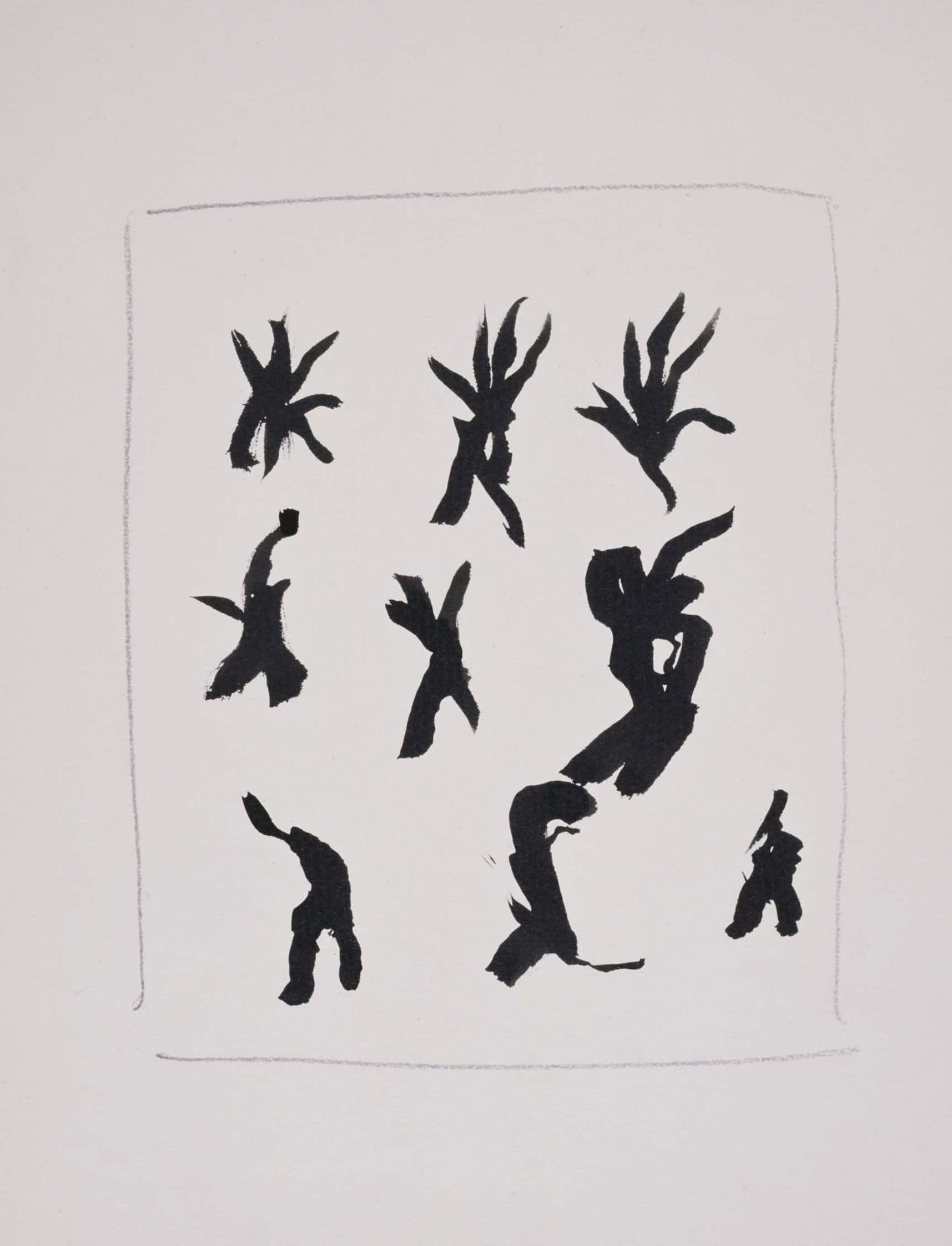
He discovered, as one scholar has put it, ‘a tradition of painting, writing and theater that was at once concrete and abstract, material and immaterial, stable and fluid—a tradition, in short, grounded not in mimesis […] but rather in the art of signification’.[27] It is suggestive to set some of Wilson’s sketches of the fluttering shadow of the 1988 Shinkenchiku project alongside Michaux’s studies at the time of his 1951 book of poetry and drawings, Mouvements; for this conveys and clarifies for us the graphic, inscriptive character of the shadow, as if its transformations are a kind of calligraphy in motion that is always oscillating between figure and script (Figs 14 and 15).[28]
One of the most interesting and perhaps unexpected reflections on the ideogram took place in the Soviet filmmaker Sergei Eisenstein’s text ‘Beyond the Shot’, first written as a postscript to a 1929 book on Japanese cinema and translated for Film Form as ‘The Cinematographic Principle and the Ideogram’. Dismissing Japanese filmmaking outright, Eisenstein chose not to write about it at all, instead turning his attention more broadly to Japanese culture, for he claimed this both anticipated and was saturated with the fundamental condition of the cinematographic—which is, he insisted, montage. Ideograms were the prime example of this—and in particular combinatory ideograms produced by the coming together of two existing formations in order to release a concept that is, Eisenstein wrote, not a ‘sum but rather a product’. ‘[T]his is montage!’, he exclaims, ‘a cinema that seeks the maximum laconicism in the visual exposition of abstract concepts’.[29] Moreover, this is, we are told, what haiku poems do, for these are ideograms ‘transposed into phrases’.[30] Whereas for Fenollosa the construction of combinatory ideograms was founded in an immanent relation between their elements, for Eisenstein the underlying principle was instead conflict between the parts, out of whose clash the concept emerges. At the same time, this was achieved through figuration—indeed in a ‘profusion of figurative effect’—leading Eisenstein to characterise his ideogrammic method—in other words, montage—as born out of ‘a cross between the figurative mode and the denotative purpose’.[31]
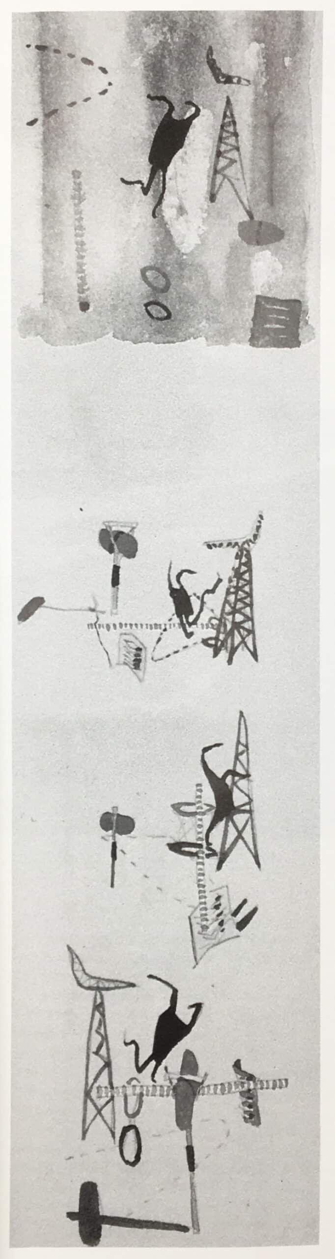
Now, from this perspective, we might say that Wilson’s later Shinkenchiku project develops through something like this ideogrammic method. That is to say, it locates itself close to Toyo Ito’s ventilation tower in Yokohama in order to engage it in a conflictual relation, similar to Eisenstein’s compound ideograms, and this seems inseparable from the laconic graphic quality of the drawing (see the handling of the Ito tower, for example), the spacing of its elements, and its discontinuities (Fig. 16). But the point here becomes not so much to construct a new concept as to intensify the existing concept that lies at the root of the submarine-as-ideogram. It is this condition of conflict that animates and, in a sense, even produces the conditions of this comfortable house. The tower is rigid and emissive, the comfortable house mobile and absorptive. Thought of as a moving shadow, the latter dances in the air vortex pushed out from the transportation centre below, but it also must be defended by other architectural elements against the pulses of light that race up Ito’s tower. As a soft submarine, the black ‘glove’, although it contains indicators of occupation, is fundamentally conceived as a voided interior, an electromagnetic shadow, one emptied of any kind of electromagnetic signal. To return to Barthes’s ruminations on the Japanese package, this glove seems to rather precisely give us a version of what he calls Japanese ‘instruments of transport’[32]: packages, pouches, sacks of (Barthes again) ‘hallucinatory outline’.[33] In relation to this, he frames a triple demand that ‘is imposed on all fabricated objects: that they be [like the glove] precise, mobile and empty’.[34] It is an injunction to which Wilson’s project scrupulously adheres.
Notwithstanding Barthes’s profound appreciation of Eisenstein, I think he would disagree with him about the haiku and its giving rise to concepts. For Barthes, it was quite the opposite—the haiku’s importance was that it dried up language, that no exegesis was possible, and that there was nothing to say except what the verse already said. The haiku cannot be developed and interpretation cannot take hold. It is worth quoting Barthes at length here:
‘The denial of ‘development’ is radical here, for it is not a question of halting language on a heavy, full, profound, mystical silence [ … ] what is posited must develop neither in discourse nor in the end of discourse [ … ] all one can do with it is to scrutinize it.’[35]
The haiku is ‘a praxis destined to [ … ] jam that kind of radiophony continually sending in us, even in our sleep [ … ] to empty out, to stupefy, to dry up’.[36] And so, it turns out to be exactly an electromagnetic shadow.
Perhaps then this is ultimately how we should see the difference between the two Shinkenchinku projects and the way they are drawn—as a shift from an art that is mimetic and metaphoric to an art of the signifier. Where the first is heavy, replete with meaning and expectant of interpretation, the second is light and concise as a haiku that we can only scrutinise, because everything else has been screened out and nothing is left to be said. And in this way the submarine-as-ideogram comes into focus as the emblem of the whole project, and of not only the black form.
Notes
- Roland Barthes, Empire of Signs, trans. by Richard Howard (New York, NY: Hill and Wang, 1982), 45.
- Ibid., 46.
- Ibid.
- Ibid., 45.
- ‘The author has never in any sense photographed Japan. Rather, he has done the opposite: Japan has starred him with any number of “flashes”.’ Ibid., 4.
- Ibid.
- Peter Wilson and Alvin Boyarsky, ‘Far Eastern Conversation’, in Peter Wilson, Mega XII, Western Objects Eastern Fields: Recent Projects by the Architekturbüro Bolles Wilson (London: Architectural Association, 1989), 5–17 (5).
- Barthes, Empire of Signs, 4.
- ‘The text does not “gloss” the images, which do not “illustrate” the text. For me, each has been no more than the onset of a kind of visual uncertainty.’ Ibid., facing, x.
- Gaston Bachelard, Water and Dreams: An Essay on the Imagination of Matter, trans. by Edith R. Farrell (Dallas, TX: Pegasus Foundation; Dallas Institute of Humanities and Culture, 1983).
- Sigfried Giedion, ‘The Mechanization of the Bath’, in Mechanization Takes Command (New York, NY: Oxford University Press, 1948), 628–712; Ivan Illich, H2O and the Waters of Forgetfulness (London: Marion Boyars, 1986).
- Wilson, Mega XII, Western Objects Eastern Fields, 41.
- Wilson linked the absent centre in the Villa Auto to the contemporary cultural condition of ‘discoherence’—‘the juxtaposition of things, the overlaying of experience without that binding of a continuous logic’. See ‘Alvin Boyarsky Interviews Peter Wilson’, in Peter Wilson, Bridgebuildings + The Shipshape (London: Architectural Association, 1984), 7–13 (8); ‘Cosmos Street, Commercial Building for M3 Co. Ltd.’, in Wilson, Mega XII, Western Objects Eastern Fields, 43–59.
- Barthes, Empire of Signs, 9.
- Illich, H2O and the Waters of Forgetfulness, 7; Bachelard, Water and Dreams, 2.
- Compare the exchange between Alvin Boyarsky and Peter Wilson on the Water House: AB—‘And the graphics were, of course, very atmospheric’. PW—‘That was almost the way into working this way. It would take a very long time, and those hours spent drawing and thinking was how one developed that way of working’. See ‘Alvin Boyarsky Interviews Peter Wilson’, 10.
- Ibid., 9.
- ‘Typology of Shipshapes’, in Wilson, Bridgebuildings + The Shipshape, 4.
- Barthes, Empire of Signs, 44.
- Ibid., 11.
- Ibid., 19–20.
- Peter Sloterdijk, Terror from the Air, trans. by Amy Patton and Steve Corcoran (Los Angeles, CA: Semiotext[e], 2009), 78.
- Wilson, Mega XII, Western Objects Eastern Fields, 25.
- The phrase is Toyo Ito’s. Ibid., 41.
- Ibid.
- Henri Michaux, Emergences-Résurgences: Les sentiers de la création (Genève: Skira, 1972), 16 (my translation). See also, Richard Sieburth, Signs in Action: Pound/Michaux (New York, NY: Red Dust, 1987), 10–11.
- Sieburth, 11 (emphasis in the original).
- Henri Michaux, Mouvements: Soixante-quatre dessins, Un poème, Une postface (Paris: Gallimard, 1951).
- Sergei Eisenstein,‘Beyond the Shot’, in Selected Works, Vol. I, Writings, 1922–34, ed. and trans. by Richard Taylor (London; Bloomington, IN: British Film Institute; Indiana University Press, 1988), 138–50 (139).
- Ibid., 140.
- Ibid., 141. Eisenstein uses the term ‘hieroglyphic method’.
- Barthes, Empire of Signs, 46.
- Ibid., 47.
- Ibid.
- Ibid., 74.
- Ibid.
Mark Dorrian is Editor-in-Chief of Drawing Matter Journal, holds the Forbes Chair in Architecture at the University of Edinburgh, and is Co-Director of the practice Metis. His work spans topics in architecture and urbanism, art history and theory, and media studies. Dorrian’s books include Writing On The Image: Architecture, the City and the Politics of Representation (2015), and the co-edited volume Seeing From Above: The Aerial View in Visual Culture (2013).
This article first appeared in The Journal of Architecture, 26:5, Architectural Lineaments: Adventures Through the Work of Peter Wilson, ed. Mark Dorrian (2021): 688–709.
Find more drawings of Peter Wilson’s Japanese projects at www.drawingmattercollections.com.