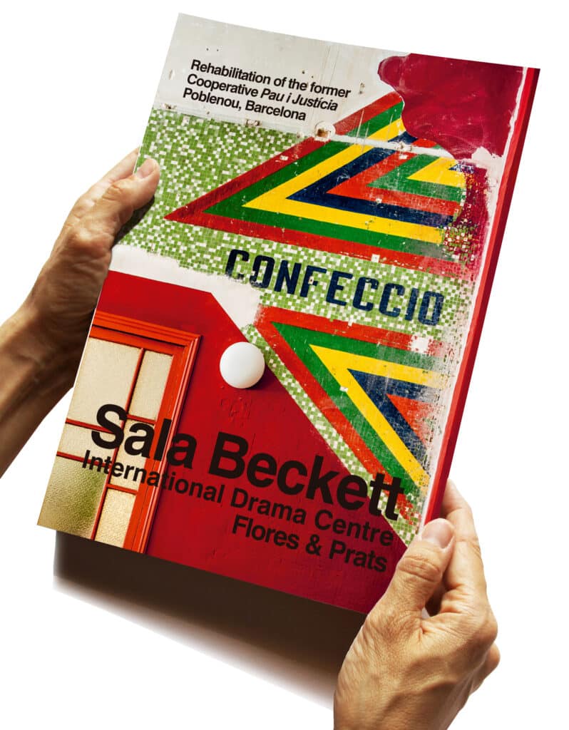
Making a book about making a building creates a special narrative challenge in the constant battle between reality and myth that vibrates through non-fiction publications and the ways in which we as readers engage with and interpret them. This is complicated even more when making a book about a building you have designed yourself, but Ricardo Flores and Eva Prats face the challenge head on by somehow imitating the intensity and unpredictability of their years spent with the project of designing and constructing the Sala Beckett in its new location but old building in the Poblenou district of Barcelona. The result is a rich and informative story, clearly not a manual but inevitably it will somehow succumb.
The visual density and complexity of the book is managed through simple strategies – a chronological approach, for example, and the repetition of key voices – most notably that of the client Toni Casares, playwright and director of Sala Beckett. Following the story unfolds a working process, and gives insight into their use of hand drawing, that is evident also in their teaching and what is revealed about their architectural practice. What emerges especially for me, however, is an enigmatic sense of the building as an actor, with a palpable and unpredictable presence. When handed over, it was an abandoned body ravaged, harried and reassembled to play a role. Its parts were dismantled, and self-conscious processes were used to separate them from their original meanings, to seem decorative but to say something else. The process of the Inventory is an obvious strategy, but also the invitations to outsiders to engage in their own ways – an interview-documentary, stop-motion films, unfolding models – all of which are explained and illustrated in the book. The conceptual gap between the ruins and the new reality is recorded in plain sight – the beautiful photographs that unfold an unashamed chronology attest to it too, from black and white archival images, photographs of the ruin, the selective clearing of it, construction and the crucial ‘first occupancy’, to images of the completed interiors and finally the representation of the process, called Liquid Light, at the Venice Biennale in 2018.
The book has not been produced by one of the usual publishers chosen by Europeans – Park Books or one of the more academic presses, for example, but by Miquel Adrià of Arquine, the Mexican journal and publishing house, much of whose output is difficult to find in European bookshops. Having worked with Adrià on their earlier monograph Thought By Hand, The architecture of Flores & Prats, 2014, this seems natural choice, but still intriguing. Could it be due to the ‘network of close personal friends’ that Ellis Woodman refers to in his essay on ‘Constructed Realities’ at the end of the book, when he talks about Soraya Smithson, daughter of Peter and Alison, and her engagement with the project, or perhaps and also an intent to create another distance from which to critically reflect on the cultural and architectural production of European civilization.
Helen Thomas is Reviews Editor at Drawing Matter.
Excerpts
Inventory Feb 2011 – July 2011
Adapting the former cooperative building to the technical requirements of contemporary theater work involved a series of actions that might well have completely effaced the charm of the fragile structure we inherited, destroying its delicate decoration or breaking up the enormous spaces that were a large part of its richness. The design competition left it to each team to decide whether to preserve the building or to tear it down, but we liked everything we saw in it and wanted to make it a participant in the new project.
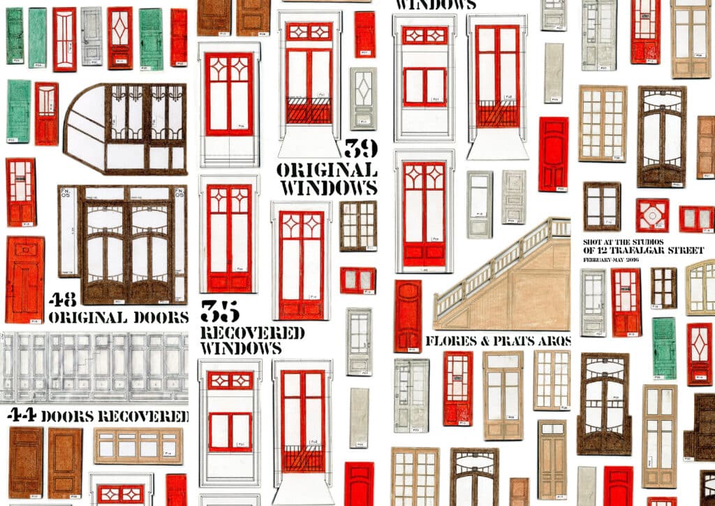
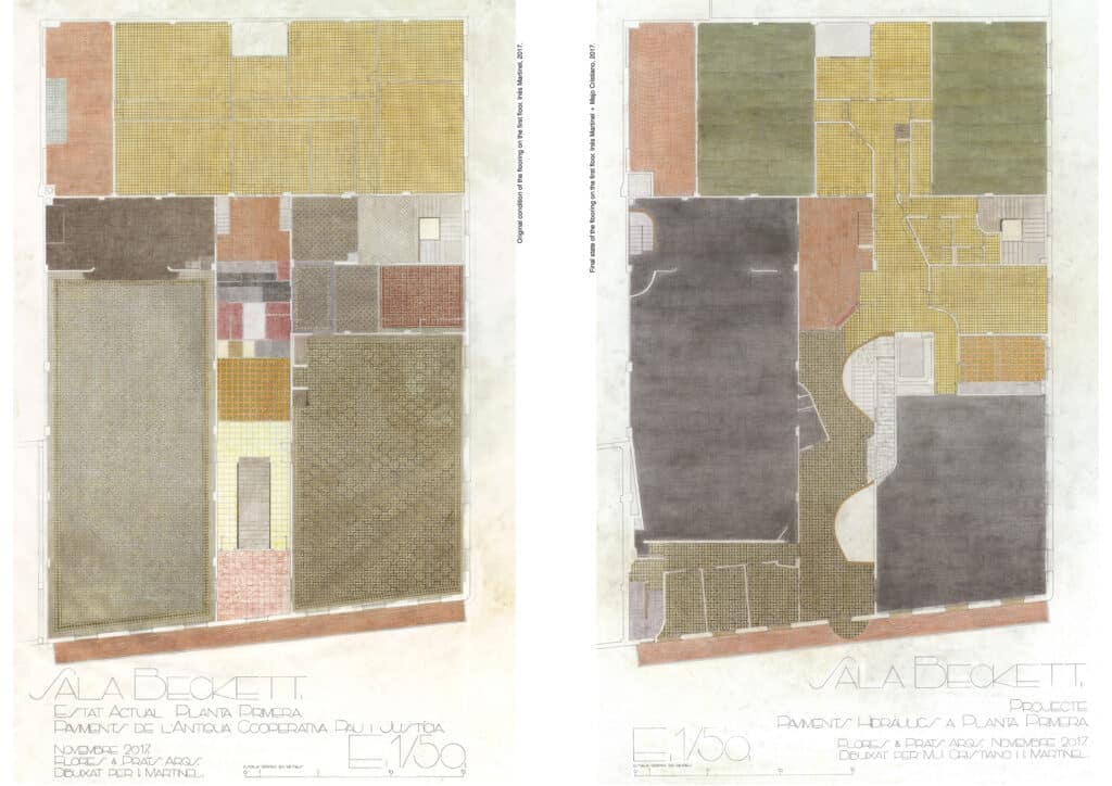
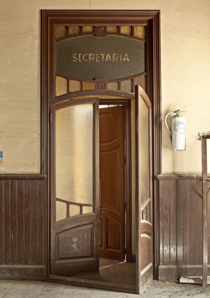
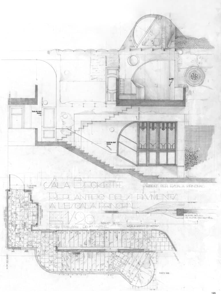
We wanted to keep and reuse all the elements we could turn to account from the abandoned building: mosaic tiles, doors, windows, wainscoting, lamps, ceiling roses … In order to identify them all, and to know exactly what we had, we spent three months or so in the abandoned building, gathering information, taking measurements, and drawing everything that was still there in great detail: every melding, flashing, and mullion, every design on the tiles, it all interested us alike. We still didn’t know exactly how we would end up using these elements, but we had the intuition that everything inside the building should stay there, even if it were to be moved to a different location, in an attempt to lend continuity to its history, through these objects charged with a past. In this way, they might reactivate the place by their presence, bringing along the time already accumulated and adding it to the memories the new occupants would eventually generate.
We decided that each element should be put to the same use it had had in the former cooperative building: the doors would remain doors, the mosaic tiles would remain tiles, the rosettes would continue to serve as decorative elements … There would be no reinterpretation of their function. We were also aware that we were manipulating material that was very common in the city of Barcelona, and that even today, when an apartment or an entire building is renovated, this kind of woodwork and flooring often ends up in the dumpsters installed temporarily in front of construction sites. It is surprising, but still today these elements continue to be invisible. The inventory would be a way of making the contractor understand their importance in the future project.
When the renovation work began, all the elements we had drawn in the inventory were carefully removed and stored away. The fragile building resisted the work of renovation, and when all these elements returned, the culture they carried within them also returned: carpenters who knew how to draw and not only to work with wood, carpenters who understood geometry; very pretty colored tiles, with designs conceived for rooms with borders on the flooring, with cornices at the juncture of wall and ceiling… All these decorative elements had been used for generations, and here, in a building so sparsely decorated, they assumed special importance.
Drawing on a 1 :1 Scale
During the final design stage, the director of the Sala Beckett was concerned that some of the elements of the lobby and the bar were too close together: the counter too close to the façade, the stairway too close to the bench…
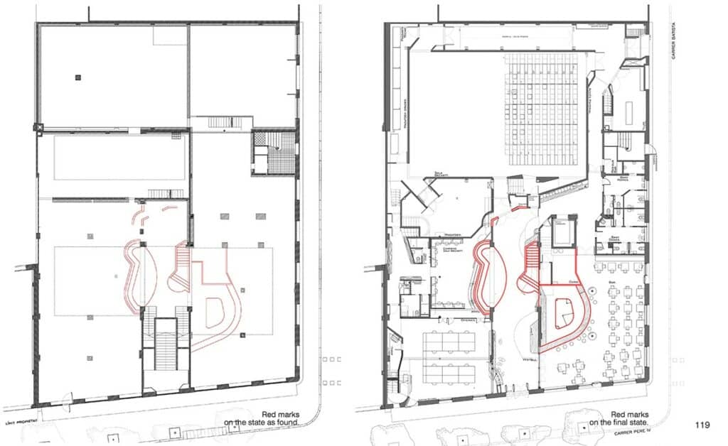
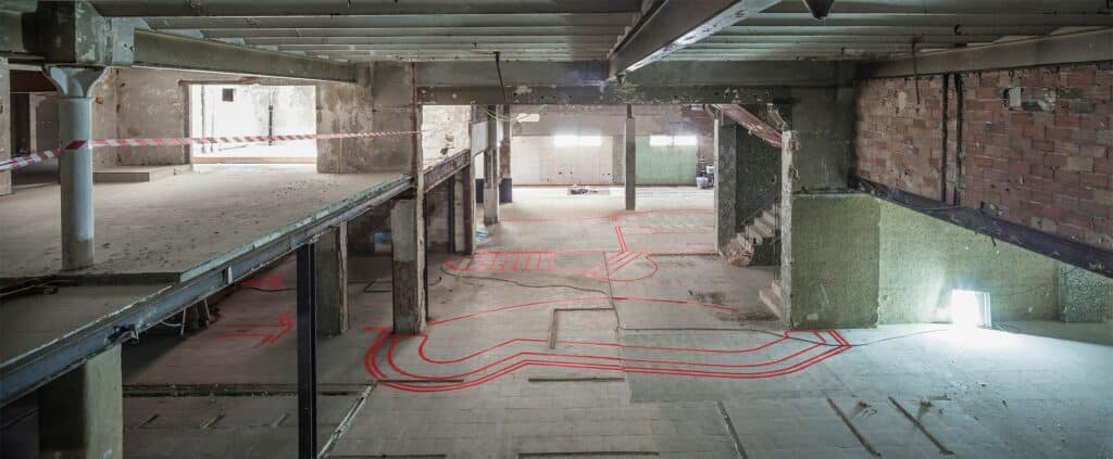
The ground floor had been stripped of the remains of the gymnasium, and we had access to the building. We decided to draw the outline of the bar, the stairway, and the long bench with red tape directly on site, so that we could have a more direct experience of the dimensions. It helped us better to understand the scale of these elements in relation to the building as a whole, and also to test the distances that worked best between them.
A few weeks after drawing with red tape, work began in earnest.
Temporal Centrifuge
The overlaying of times and periods in the building as we found it made it difficult to distinguish what period each element belonged to, which was part of its charm: it allowed everyone who saw it to reconstruct, in a personal and partial way, the history of what the place had been. This condition of being open to different interpretations allowed us to approach its different histories without distancing ourselves, without separating ourselves mentally or physically from what was in front of us, but instead moving backwards or forwards in time, in order to be able to connect with that moment that most interested us about the former cooperative, in order to build our own version of its history, which was to be that of the new Sala Beckett. In this way, the new actions performed on the building join previous ones at the same level of importance, in a continuous timeline, without hierarchies, so that it is impossible to know what came first and what came later. The building presents itself as a temporal centrifuge that allows everyone who visits it to participate in this reality, where one’s own memories feel an affinity with what is there. Now, everyone who looks at these walls remembers some concrete moment in his or her past, activating the space in a unique way as memory rises up to participate in a new reality. The building contains everything at once: the time of the former cooperative, the time of abandonment, and the time of the new Sala Beckett.
Containers
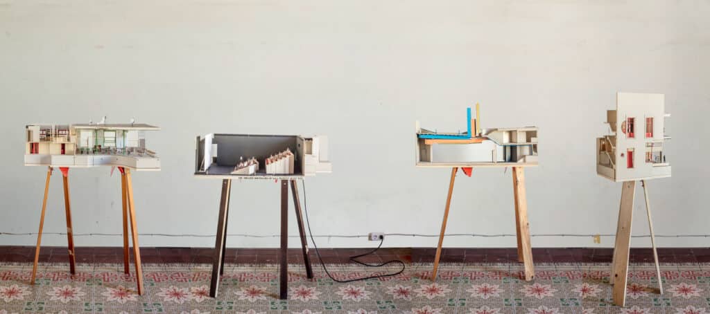
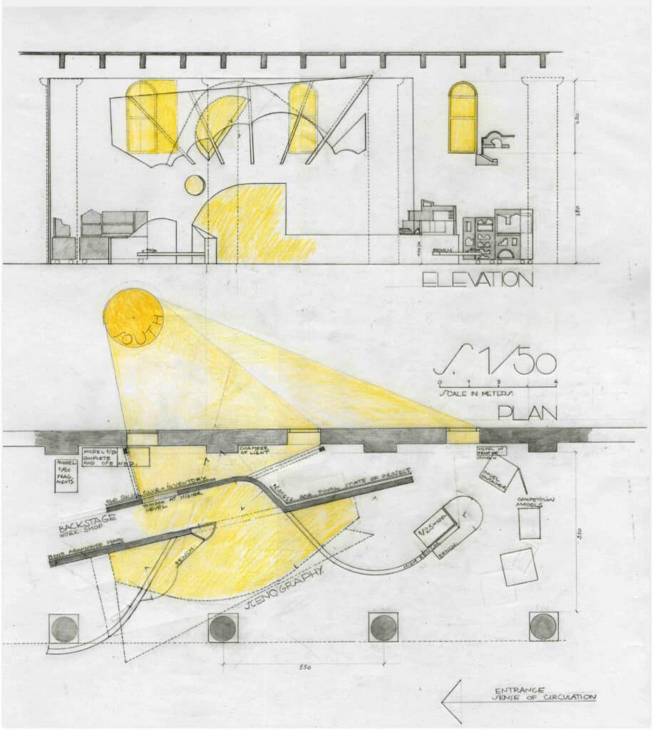
The models must be very precise since they serve to verify proportions, and therefore it takes a long time to make them and it is difficult to get rid of them when the project is finished. So, they stay around us, on the shelves or hanging on the studio walls, as company.
But when we have time, we collect those of a specific project and build a container made to measure for them. On the one hand, it is a way to keep them safe from dust and damage, but also because by ordering them we can reflect on the project process again.
So, the first thing that must be done to design the container is to collect together from the shelves and walls all the models, fragments, templates, drawings, sketches, reference books, paper patterns… These documents, of very different origins and formats that represent the project evolution are then placed on a large table, spacious enough to contain all at once, giving us the full spectrum of materials to store.
The next thing to do is to decide how to place the various models and fragments inside the container. This can be done chronologically, and for this it is key to have them dated at the time of their production, which now allows us to follow the evolution over the months or years that the whole process took. Another way to organize the models inside the container is by ordering the pieces by affinities or families, since some models and fragments are better seen together to explain more fully a subject or interest that has been tested, and not necessarily in chronological order.
When deciding how to hold together the pieces, one also has to decide on the shape or silhouette of the container. This can be defined by the dimension of the various pieces that will be kept inside and the manner in which they will be collated. Implicit in this decision is the way in which the container will finally look when it is opened, so that it helps us to remember the ideas that have led from one model to another, the jumps in the process of evolution of the project, the variations of a solution, and where the doubts and discussions about the project provoked different options.
Therefore, these are not just boxes but ‘containers’ that keep thoughts and all knowledge of the project within, things we must not forget. When it is opened and activated for an explanation or an exhibition, the sequence in which the different documents appear accompanies the narration, as a visual aid. Since these containers have wheels, they can move around the studio and make themselves disappear as soon as they get in our way…
Flores & Prats Sala Beckett International Drama Centre (2020): REVIEW & EXCERPTS
– Helen Thomas
Review
Making a book about making a building creates a special narrative challenge in the constant battle between reality and myth that vibrates through non-fiction publications and the ways in which we as readers engage with and interpret them. This is complicated even more when making a book about a building you have designed yourself, but Ricardo Flores and Eva Prats face the challenge head on by somehow imitating the intensity and unpredictability of their years spent with the project of designing and constructing the Sala Beckett in its new location but old building in the Poblenou district of Barcelona. The result is a rich and informative story, clearly not a manual but inevitably it will somehow succumb.
The visual density and complexity of the book is managed through simple strategies – a chronological approach, for example, and the repetition of key voices – most notably that of the client Toni Casares, playwright and director of Sala Beckett. Following the story unfolds a working process, and gives insight into their use of hand drawing, that is evident also in their teaching and what is revealed about their architectural practice. What emerges especially for me, however, is an enigmatic sense of the building as an actor, with a palpable and unpredictable presence. When handed over, it was an abandoned body ravaged, harried and reassembled to play a role. Its parts were dismantled, and self-conscious processes were used to separate them from their original meanings, to seem decorative but to say something else. The process of the Inventory is an obvious strategy, but also the invitations to outsiders to engage in their own ways – an interview-documentary, stop-motion films, unfolding models – all of which are explained and illustrated in the book. The conceptual gap between the ruins and the new reality is recorded in plain sight – the beautiful photographs that unfold an unashamed chronology attest to it too, from black and white archival images, photographs of the ruin, the selective clearing of it, construction and the crucial ‘first occupancy’, to images of the completed interiors and finally the representation of the process, called Liquid Light, at the Venice Biennale in 2018.
The book has not been produced by one of the usual publishers chosen by Europeans – Park Books or one of the more academic presses, for example, but by Miquel Adrià of Arquine, the Mexican journal and publishing house, much of whose output is difficult to find in European bookshops. Having worked with Adrià on their earlier monograph Thought By Hand, The architecture of Flores & Prats, 2014, this seems natural choice, but still intriguing. Could it be due to the ‘network of close personal friends’ that Ellis Woodman refers to in his essay on ‘Constructed Realities’ at the end of the book, when he talks about Soraya Smithson, daughter of Peter and Alison, and her engagement with the project, or perhaps and also an intent to create another distance from which to critically reflect on the cultural and architectural production of European civilization.
Helen Thomas is Reviews Editor at Drawing Matter.
Excerpts
Inventory Feb 2011 – July 2011
Adapting the former cooperative building to the technical requirements of contemporary theater work involved a series of actions that might well have completely effaced the charm of the fragile structure we inherited, destroying its delicate decoration or breaking up the enormous spaces that were a large part of its richness. The design competition left it to each team to decide whether to preserve the building or to tear it down, but we liked everything we saw in it and wanted to make it a participant in the new project.
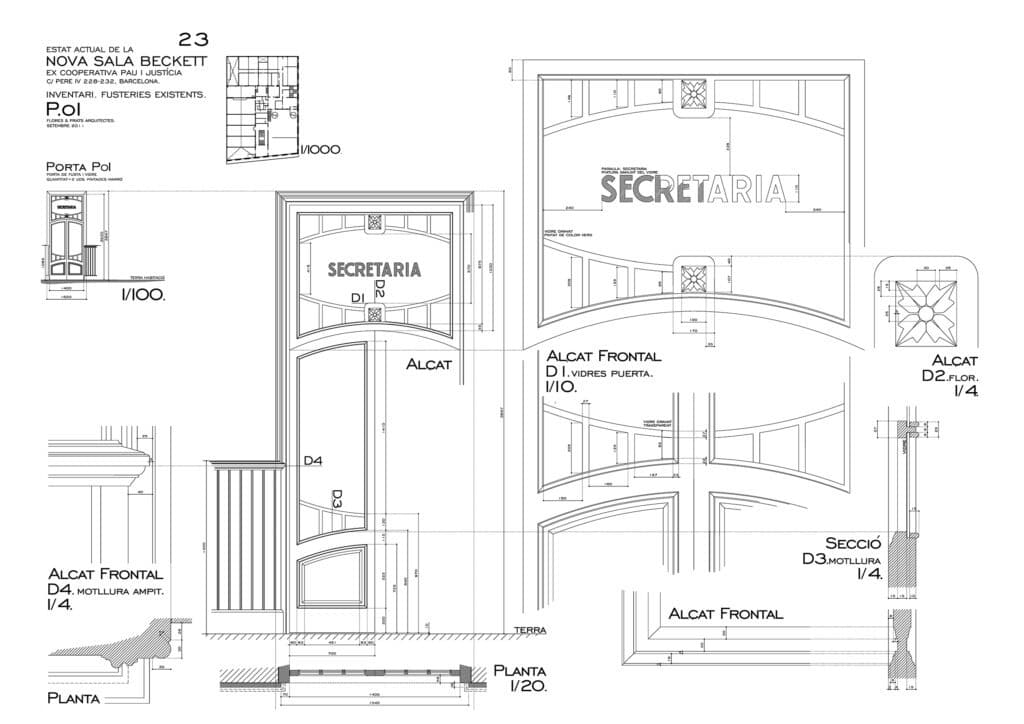
We wanted to keep and reuse all the elements we could turn to account from the abandoned building: mosaic tiles, doors, windows, wainscoting, lamps, ceiling roses … In order to identify them all, and to know exactly what we had, we spent three months or so in the abandoned building, gathering information, taking measurements, and drawing everything that was still there in great detail: every melding, flashing, and mullion, every design on the tiles, it all interested us alike. We still didn’t know exactly how we would end up using these elements, but we had the intuition that everything inside the building should stay there, even if it were to be moved to a different location, in an attempt to lend continuity to its history, through these objects charged with a past. In this way, they might reactivate the place by their presence, bringing along the time already accumulated and adding it to the memories the new occupants would eventually generate.
We decided that each element should be put to the same use it had had in the former cooperative building: the doors would remain doors, the mosaic tiles would remain tiles, the rosettes would continue to serve as decorative elements … There would be no reinterpretation of their function. We were also aware that we were manipulating material that was very common in the city of Barcelona, and that even today, when an apartment or an entire building is renovated, this kind of woodwork and flooring often ends up in the dumpsters installed temporarily in front of construction sites. It is surprising, but still today these elements continue to be invisible. The inventory would be a way of making the contractor understand their importance in the future project.
When the renovation work began, all the elements we had drawn in the inventory were carefully removed and stored away. The fragile building resisted the work of renovation, and when all these elements returned, the culture they carried within them also returned: carpenters who knew how to draw and not only to work with wood, carpenters who understood geometry; very pretty colored tiles, with designs conceived for rooms with borders on the flooring, with cornices at the juncture of wall and ceiling… All these decorative elements had been used for generations, and here, in a building so sparsely decorated, they assumed special importance.
Drawing on a 1 :1 Scale
During the final design stage, the director of the Sala Beckett was concerned that some of the elements of the lobby and the bar were too close together: the counter too close to the façade, the stairway too close to the bench…
The ground floor had been stripped of the remains of the gymnasium, and we had access to the building. We decided to draw the outline of the bar, the stairway, and the long bench with red tape directly on site, so that we could have a more direct experience of the dimensions. It helped us better to understand the scale of these elements in relation to the building as a whole, and also to test the distances that worked best between them.
A few weeks after drawing with red tape, work began in earnest.
Temporal Centrifuge
The overlaying of times and periods in the building as we found it made it difficult to distinguish what period each element belonged to, which was part of its charm: it allowed everyone who saw it to reconstruct, in a personal and partial way, the history of what the place had been. This condition of being open to different interpretations allowed us to approach its different histories without distancing ourselves, without separating ourselves mentally or physically from what was in front of us, but instead moving backwards or forwards in time, in order to be able to connect with that moment that most interested us about the former cooperative, in order to build our own version of its history, which was to be that of the new Sala Beckett. In this way, the new actions performed on the building join previous ones at the same level of importance, in a continuous timeline, without hierarchies, so that it is impossible to know what came first and what came later. The building presents itself as a temporal centrifuge that allows everyone who visits it to participate in this reality, where one’s own memories feel an affinity with what is there. Now, everyone who looks at these walls remembers some concrete moment in his or her past, activating the space in a unique way as memory rises up to participate in a new reality. The building contains everything at once: the time of the former cooperative, the time of abandonment, and the time of the new Sala Beckett.
Containers
The models must be very precise since they serve to verify proportions, and therefore it takes a long time to make them and it is difficult to get rid of them when the project is finished. So, they stay around us, on the shelves or hanging on the studio walls, as company.
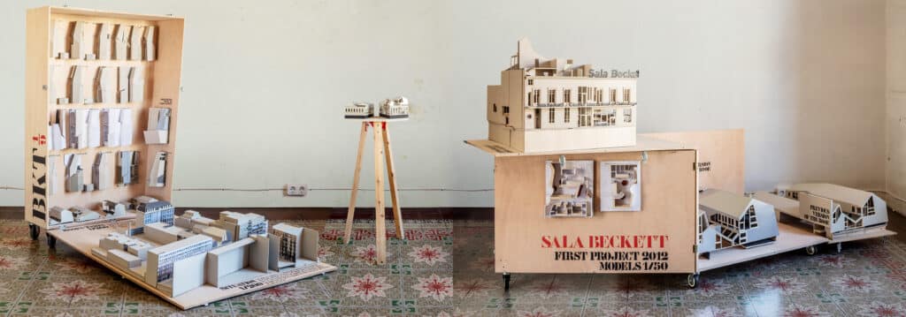
But when we have time, we collect those of a specific project and build a container made to measure for them. On the one hand, it is a way to keep them safe from dust and damage, but also because by ordering them we can reflect on the project process again.
So, the first thing that must be done to design the container is to collect together from the shelves and walls all the models, fragments, templates, drawings, sketches, reference books, paper patterns… These documents, of very different origins and formats that represent the project evolution are then placed on a large table, spacious enough to contain all at once, giving us the full spectrum of materials to store.
The next thing to do is to decide how to place the various models and fragments inside the container. This can be done chronologically, and for this it is key to have them dated at the time of their production, which now allows us to follow the evolution over the months or years that the whole process took. Another way to organize the models inside the container is by ordering the pieces by affinities or families, since some models and fragments are better seen together to explain more fully a subject or interest that has been tested, and not necessarily in chronological order.
When deciding how to hold together the pieces, one also has to decide on the shape or silhouette of the container. This can be defined by the dimension of the various pieces that will be kept inside and the manner in which they will be collated. Implicit in this decision is the way in which the container will finally look when it is opened, so that it helps us to remember the ideas that have led from one model to another, the jumps in the process of evolution of the project, the variations of a solution, and where the doubts and discussions about the project provoked different options.
Therefore, these are not just boxes but ‘containers’ that keep thoughts and all knowledge of the project within, things we must not forget. When it is opened and activated for an explanation or an exhibition, the sequence in which the different documents appear accompanies the narration, as a visual aid. Since these containers have wheels, they can move around the studio and make themselves disappear as soon as they get in our way…
Related...
Writing Prize 2020: To Measure a Croissant
– Emily Priest
Alternative Histories: Flores i Prats Architects on Alberto Ponis
Pan Scroll Zoom 2: Flores & Prats
– Ricardo Flores, Fabrizio Gallanti and Eva Prats
Category
design methodologies drawing techniques & materials on their own work commentaries, rants & reflections reviews
Period
c21st
Architect
Flores i Prats Architects
Medium
drawing model photograph print
Tags
topographic/cartographic record theatre