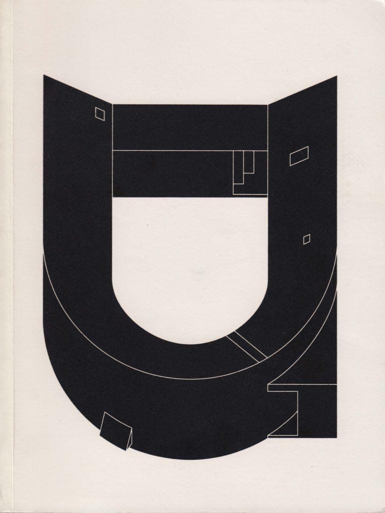
This beautiful and black glossy image lies on top of the contrasting ground of a thick, white and matt-surfaced magazine binding. The substance of the drawing is not composed of lines but rather made of solid fields that recoil from each other, very neatly, to leave spaces. These slivers where the white ground has seeped in are the drawing’s lines; they are delineated by absence and the surface tension of the varnished ink that its shininess highlights. The image is alone on the page, almost filling it, but a comfortable margin is big enough to suggest a vast surrounding emptiness. There is no accompanying text – no name, no title and no caption, but to a certain kind of architect it is clear that the building that this figure represents is Toyo Ito’s U House, built in Tokyo next door to his own for his bereaved sister in 1976.
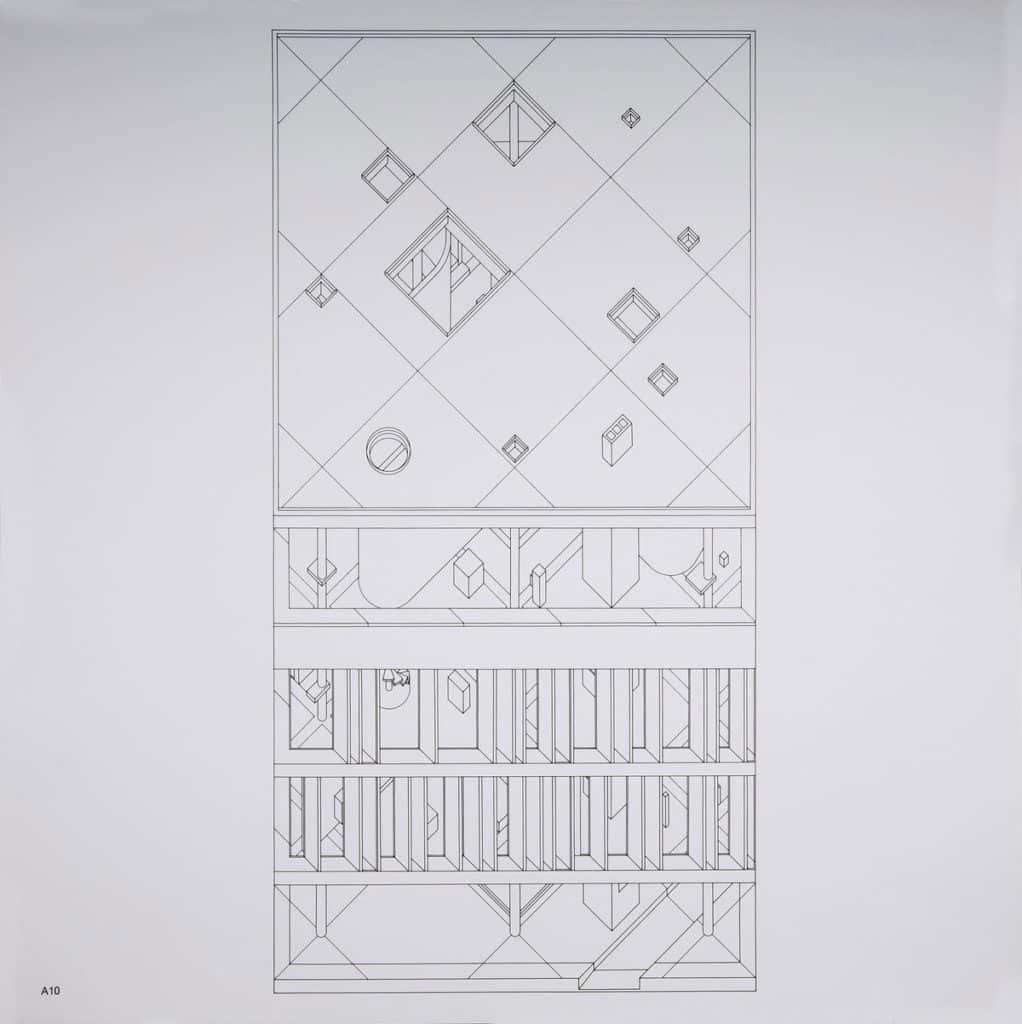
The projections of the drawings on the magazine’s front covers are always the same – they are neither true axonometrics nor oblique drawings. Only two planes are emphasised: the plan, set at right angles to the picture plane so that the principal or most interesting (single) elevation is projected up from the plan line with a 1:1:1 ratio. Only when the building is not square can other elevations come into play. Two well-known predecessors who produced exactly this kind of projection are John Hedjuk, and an example is his ‘Diamond House’, 1967, and Oswald Mathias Ungers, as in his ‘Student Residence, Enschede, Netherlands’, 1963. Michele Marchetti, who invented and constructed the special San Rocco drawings, cites Ungers and James Stirling as his personal precedents: ‘I was inspired by their drawings when I produced the first design for San Rocco. Stirling, especially could explain an entire project with a single drawing.’
The San Rocco editorial team propose architecture as a collective knowledge that architects collaborate to produce. The place where they meet, as people, is a space enacted through the production of architecture – as conversation, as drawn object and as constructed product. The idea of this space, or the surface of the field, is defined through the front cover drawings whose powerfully standardising technique made all instances of architecture – the monumental and the modest; the man-made but sometimes the naturally occurring; the built but sometimes the imaginary; the ancient, the historical and the recent all equivalent. Each drawing suggests itself as one instance within a vast catalogue. The editor, Matteo Ghidoni, describes architecture as ‘a knowledge to which we all can contribute, which is transmittable and shareable through all architecture built through time… we try to explore modes of collaboration that can develop through time, with architects in the past – a perspective that is not only historical but projected, or that happens simultaneously between two architects, in the present.’ In a way, the San Rocco field is composed of a politicised but exclusive iconography of architectural objects comparable to that of the Warburg Library, but selected with a suspicion of symbolic and conceptual narrative.
San Rocco
FRONT COVERS
– Helen Thomas
This beautiful and black glossy image lies on top of the contrasting ground of a thick, white and matt-surfaced magazine binding. The substance of the drawing is not composed of lines but rather made of solid fields that recoil from each other, very neatly, to leave spaces. These slivers where the white ground has seeped in are the drawing’s lines; they are delineated by absence and the surface tension of the varnished ink that its shininess highlights. The image is alone on the page, almost filling it, but a comfortable margin is big enough to suggest a vast surrounding emptiness. There is no accompanying text – no name, no title and no caption, but to a certain kind of architect it is clear that the building that this figure represents is Toyo Ito’s U House, built in Tokyo next door to his own for his bereaved sister in 1976.
The projections of the drawings on the magazine’s front covers are always the same – they are neither true axonometrics nor oblique drawings. Only two planes are emphasised: the plan, set at right angles to the picture plane so that the principal or most interesting (single) elevation is projected up from the plan line with a 1:1:1 ratio. Only when the building is not square can other elevations come into play. Two well-known predecessors who produced exactly this kind of projection are John Hedjuk, and an example is his ‘Diamond House’, 1967, and Oswald Mathias Ungers, as in his ‘Student Residence, Enschede, Netherlands’, 1963. Michele Marchetti, who invented and constructed the special San Rocco drawings, cites Ungers and James Stirling as his personal precedents: ‘I was inspired by their drawings when I produced the first design for San Rocco. Stirling, especially could explain an entire project with a single drawing.’
The San Rocco editorial team propose architecture as a collective knowledge that architects collaborate to produce. The place where they meet, as people, is a space enacted through the production of architecture – as conversation, as drawn object and as constructed product. The idea of this space, or the surface of the field, is defined through the front cover drawings whose powerfully standardising technique made all instances of architecture – the monumental and the modest; the man-made but sometimes the naturally occurring; the built but sometimes the imaginary; the ancient, the historical and the recent all equivalent. Each drawing suggests itself as one instance within a vast catalogue. The editor, Matteo Ghidoni, describes architecture as ‘a knowledge to which we all can contribute, which is transmittable and shareable through all architecture built through time… we try to explore modes of collaboration that can develop through time, with architects in the past – a perspective that is not only historical but projected, or that happens simultaneously between two architects, in the present.’ In a way, the San Rocco field is composed of a politicised but exclusive iconography of architectural objects comparable to that of the Warburg Library, but selected with a suspicion of symbolic and conceptual narrative.
Related...
John Hejduk’s Axonometric Degree Zero
– Stan Allen
Stone Adversaries – Ruskin’s Rocks, Hejduk’s Diamonds
– Anthony Auerbach
Toyo Ito & Associates, Architects
– Toyo Ito
Category
drawing histories drawing techniques & materials commentaries, rants & reflections Drawing Matter archive: research & collecting
Period
c20th c21st
Architect
John Hejduk Michele Marchetti
Medium
print
Tags
projection (axonometric isometric) publication theoretical & imaginary graphic design DMC