O’Donnell + Tuomey in Conversation
– Sheila O'Donnell and John Tuomey

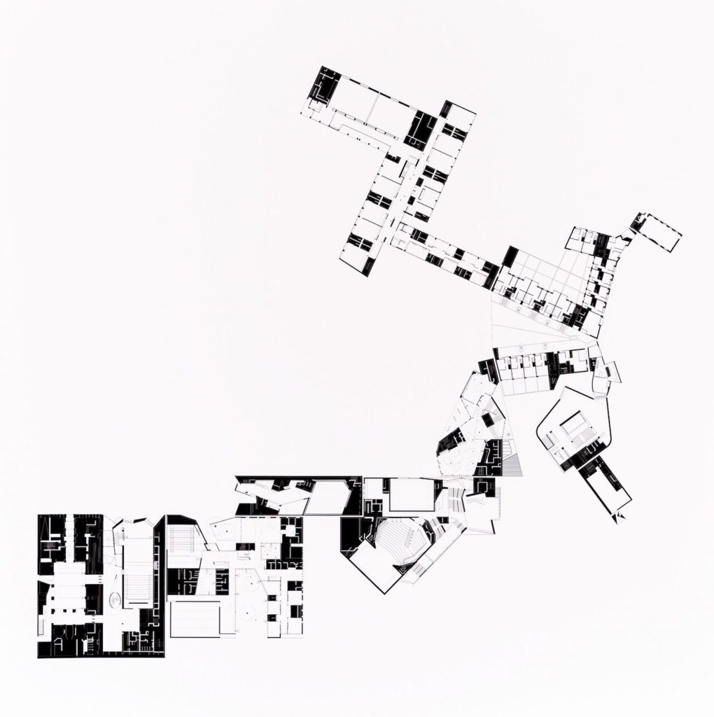
John Tuomey: Let me tell you the story of this drawing. We were at one of those despairing moments when we were putting together our book Space for Architecture and feeling that we had never achieved anything of any substance. We didn’t have a lot of work going at that particular moment, and it was coming up to Christmas. We always make an office Christmas card. There’s an architect called Brian Barber who’s worked closely with us on a number of special projects, and we asked Brian to print out all of our projects at the same scale. At the very least I thought seeing the projects at one scale would be a nice distraction, or that they could form a nice image to send to friends at Christmas.
So Brian printed everything, and I started cutting out the prints and arranging the plans by either their compatible dimensions or compatible functions. I was trying to make some sense of all the small works while also trying to use them together to create a little city that made sense too. I remember Peter Salter came to visit while I was sticking all of these plans on the wall of the office. He said, ‘Have you nothing more useful to do?’
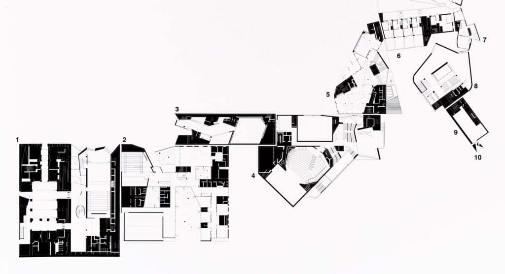
The drawing starts with our office, at 20A Camden Row. For us it made sense to place the Timberyard social housing scheme as the next drawing, since one is local to the other. One side of the Timberyard is a rational housing scheme with courtyards flipping side to side. So I placed our other most rational school project next to that wing of the Timberyard. Their dimensions are also common.
I then started working with the phase one plan for the Central European University in Budapest (1). One of its edges links beautifully into the Sean O’Casey Centre (2), which has such a tiny frontage effect that siting it next to the plan for the Irish Cultural Centre creates this extended entrance. And then because the Irish Cultural Centre (3) is a performing arts building, its backstage is bumped up against the backstage of the Lyric (4). The dimensions just worked. And then the café at the front of the Lyric spills over into the café bar of the London School of Economics (5), whose blind gable wall sits against the gable of the other wing of the Timberyard housing (6). And the other gable of the Timberyard looks onto the gable of the wall of a little house we did in Howth (7), which was designed to look out towards the sea. The Glucksman Gallery (8) was designed to look out towards the river, and so we arranged the pair to look in on each other. At the back of the Glucksman is the back of the Photographers’ Gallery in London (9), which has one window to look up Tavistock Street. We put our 2012 Venice vessel (10) here as a viewing device to look out.
But really what we were doing is just trying to make a big thing out of small things.

Sheila O’Donnell: I don’t think these projects are small, but John thinks they’re all very small. However I do think there is something really interesting about size and scale. For example, the Timberyard project is small but it also becomes part of a larger neighbourhood and history in its alignment with an existing lane that has been on the map since 1700.
Also, when you put things together, some elements seem much bigger than they actually are – like the Irish Language Centre. It’s hard to believe the little parallelogram is this glazed-roof courtyard. It feels like a big space when you’re in it and has a lot of impact. But in fact it’s the size of the classroom in a primary school, or not much different.
Redrawing these projects was also a way to move forward with our work. Years before, John and I both worked for Jim Stirling, and a big thing in the office was doing the after drawings. There was always fallow period after the rush of submitting for a competition. You would think about what you had made and try to put it back together. Maybe the after-drawings aren’t always exactly the same as the thing you submitted because the drawing is always developing.
JT: Seeing everything at the same scale helped us determine a consistent language and compatible way of drawing all the projects with the same emphasis – in this case, on public space, like a Nolli plan. It also helped us see things in the projects that we hadn’t seen before. The parts that are necessarily silent, which are the parts that appear in black, become the bonding agents between the buildings. In the end this drawing was called ‘Composite Functions’. It derives from the idea that in mathematics, one function is the steppingstone to the next one. And as they say X is the taxi driver between. So I was just interested in how the dimensions of things could become points of transfer between one project and the next. And in the end you realise that you’re only ever doing one project. But that’s also because the geometry of this work is in the hand of the person making it.
SO: When you’re designing buildings, measure is really important. And when we’re teaching, I always try to make students understand that the actual size of things and the relative scale of things within a building are really important. So doing something like this actually was a lesson for ourselves. You’re continuously studying the measure between the back and the front of house or between the size or the space between buildings.
If you know the measure, if you know the rules of scale, then you can start to really design, and bend things. This took a long time for us to learn. In our early years our work was orthogonal. We were having to understand how things went together in a classical way or a modern way, and as a result we were quite strict with ourselves before we could start bending things. We spent a lot of time looking at vernacular and classical buildings trying to make things related to those orders. But things changed when we got our first serious project, the Irish Film Centre. The existing building was actually nine buildings and they were all placed at funny angles to each other. John and I surveyed the site ourselves. Just experiencing that space which had so many odd geometries, and then having to add things to that existing building, influenced how we worked after that.
JT: We’ve always worked in conversation and we have similar minds. Sheila is quite strict, and I am quite dogmatic, perhaps? But the things we enjoy together have softened us a bit, and now we are simply interested in how space works. We have made many trips to Venice and Rome because we both just love that spatial journey from one point to the next.
SO: As you experience these buildings in different sequences, you develop a strong sense of moving between the poché, which in Rome is just the fabric, the normal parts of the city. The experience of knowing the plan and then experiencing the plan affects how you design.
The late Tim Robinson, who made maps of west Ireland, wrote: ‘While walking the land, I am the pen on the paper. While drawing the map, the pen is myself walking the land. The purpose of this identification was to short circuit the polarities of objectivity and subjectivity and let me keep faith with reality.’ I think that is what happens for us, but it wasn’t always the case.
JT: There is a unique freedom to making a map or a plan. You can turn it. You can read it up-side-down. Nothing has a right-side-up. Gravity exists in the section, but it doesn’t apply in a plan. Instead, it can be determined by your own experience of getting from one point to the next.
