Drawings’ Conclusions

The Campo Marzio project had its origins in a series of drawings done as far back as 1979, when I was a student at Cooper Union. I entered Cooper as a transfer student with a BA already in hand. I was originally placed in second year, but after a semester I went to John Hejduk and asked if I could jump ahead to third year. I had two reasons for this: first, that I felt I was more advanced than the second year students; and second, that Aldo Rossi was coming as a visiting professor in third year and I wanted to study with him. Hejduk allowed me to jump ahead but would not allow me into the Rossi studio (Jesse Reiser took that studio and was the star student).
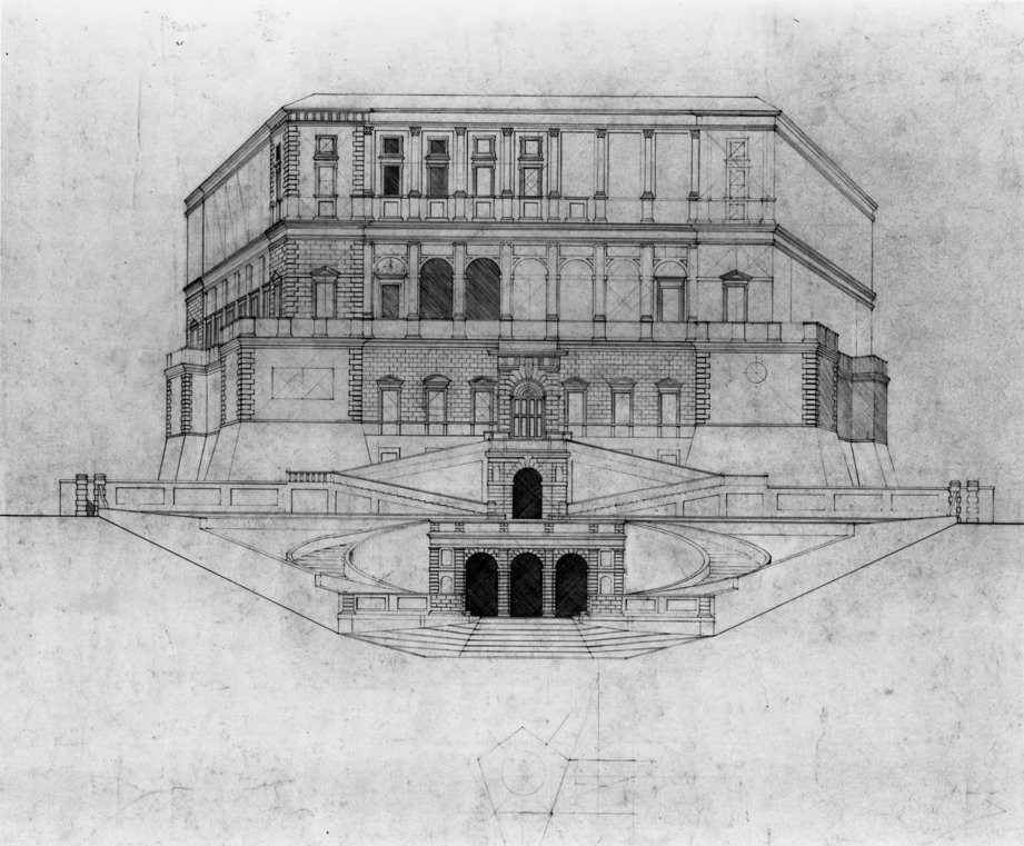
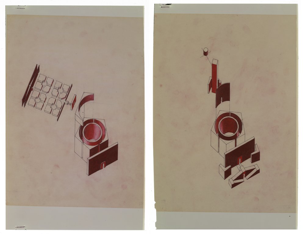
Instead, I worked with Richard Henderson in the formal analysis studio. Diana Agrest suggested I look at Palazzo Farnese Caprarola. Those drawings represented my first thoughts in a creative reinterpretation of classical plan notations, in this case breaking down the whole into parts. (And of course Caprarola is a pentagon in plan, an early hint of a future obsession.)
One of the interesting properties of the pentagon is that you can see three sides simultaneously, as you can never do with a square or rectangle in plan. One of the intentions in the hybrid elevation/perspective drawing was to show that there is a virtual cone of vision described by the extension of the sides of the pentagon. Inside that cone everything is flattened – the stairs and ramps in the centre. Outside of that the perspectival depth of the wings is emphasised by projection. The two diagrams show the central axis, which is formal and organisational versus the actual route to the garden. There is an implied symmetry, but the topography only allowed the construction of a single garden.


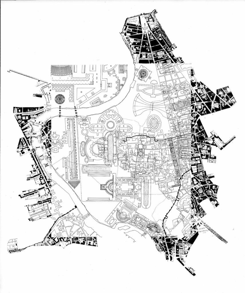
The Campo Marzio work itself was started in 1984, in response to a Shinkenchiku Competition (I think it got a second prize) and then continued as an independent project at Princeton when I was a graduate student (which is when the drawings in Drawings’ Conclusions were done). The context here is important: 1986/87, at Princeton under the lingering shadow of Graves, time spent in Moneo’s office in Spain, contrasted with the energy and speculations around Deconstructivism and the show at MoMA… all leading to the idea (from Tafuri) that Piranesi represented a radical critique from within of the rationality of classical architecture. Piranesi’s plan offered a series of notations that could be freely interpreted in a way that bridged classicism, late post-modernism and radical modernism. I would say that I embraced the fragmentation and discontinuity in the Campo Marzio plan, while looking less for violent collisions and more for strange figurations. The speculative design proposal was intended to bring the past into play by working directly over the drawings and notations of this canonical project. Instead of seeing history as a distant reference employed to legitimate new work, the project worked with a more instrumental idea of history: as material immediately available to the designer today. Drawing here serves to link remote history to the present.

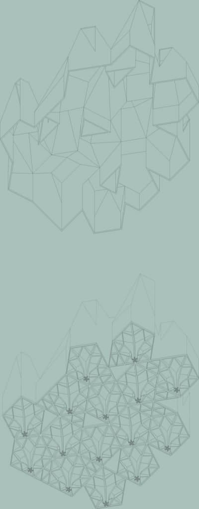
As for the more recent work – the Maribor axonometric – working on that project in 2010 provoked me to revisit the part-to-whole ideas of the Field Conditions piece, but now in the context of an institutional program that required a clear identity. Hence the shift toward the iconic roof form, and a way out of the mat-building typology. In particular, the worm’s eye axonometric shows the way in which the structural lattice forms a continuous whole based on the geometries of the discrete gallery modules floating above in the drawing.
The only thing I would add is that for me the opposition between ‘hand’ drawing and the computer is missing a key point – a large percentage of the graphic work produced by architects before the advent of the computer were not hand drawings at all, or at least not drawings invested in the trace of the hand. To be certain, with the ink on Mylar drawings of the period the idea was to erase any trace of the individuality of the hand, to make them as impersonal and machine-like as possible. This is why I see little difference in the way I work today, making line drawings on the computer. For me the computer is a powerful drawing machine, one which leaves intact all of the powerful instrumentality of drawing practice in architecture as it has developed over the past 500 years.
But there is another whole category of architectural drawing that consists of creative uses of analog forms of reproduction to create images – think of drawings and collages by Hans Hollien, Michael Webb, or the Smithsons, to name only a few. These are drawings intended for the printed page, anticipating their circulation as reproduced images. In my case, none of the originals in the show were actually intended for exhibition. Generally they were photographed, and the full-size negatives obtained from the photographs were run through the blueprint machine to obtain white lines on a blue background. It was those prints that were intended for exhibition or reproduction. The interest in viewing these originals is an interest in process, thinking and the architect’s methods, more than the hand or the craft of drawing.
