The third edition of the Venice Biennale in 1985, ‘Progetto Venezia’, directed by Aldo Rossi, had two major themes: the priority given to the moment of planning and the comparison with the Venetian landscape. For the 1985 exhibition, architects were invited to display their designs for the ‘requalification or the transformation of specific areas of the lagoon town and its mainland’. In Dario Passi’s schemes for the Accademia Bridge and the Ca’Venier Museum (Palazzo Guggenheim), the architect connects the two banks of the canal twice: first with the bridge, second by expanding the museum on the opposite side of the bank.
Il Museo
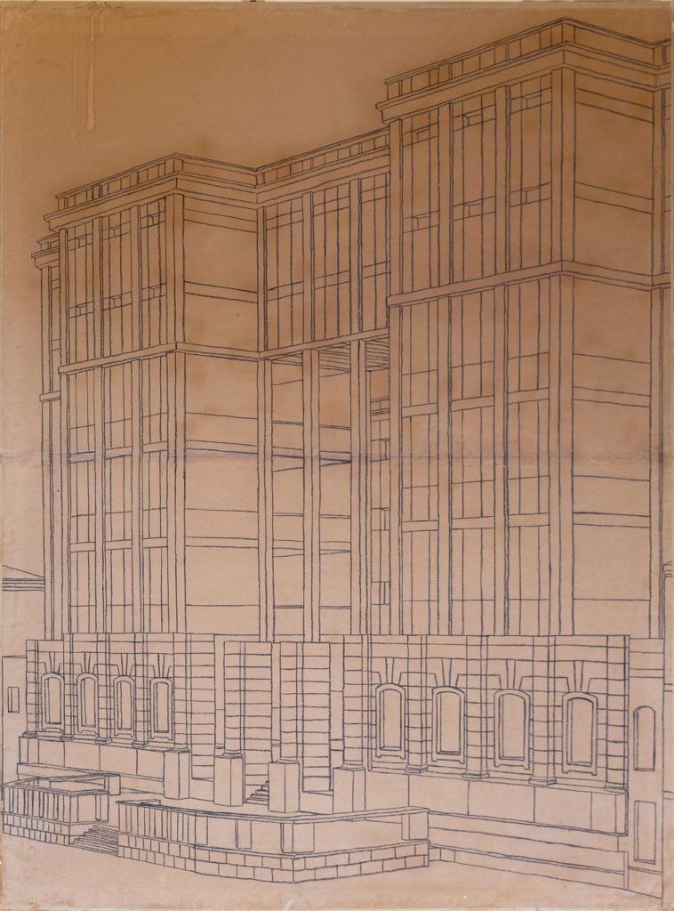
The museum relies on a strong idea of architecture that accentuates vertically, emphasised by the pilasters and overlapping fenestrations and onto which the internal spaces project themselves. This is akin to how Elizabethan architecture valued the language of new civil conditions, shifting interest to the evidence of the weight of construction.
The ensemble is ordered in between two towering buildings that overlook the canal, which are transversally connected by an open nave. The nave looks out onto the water through a large loggia which, up close, echoes the perforated central openings of Venetian palaces where single buildings lose their individuality.
The expansion of the museum, planned on the opposite bank, is in axis with the loggia open on the inner garden. From it one can see through the facade, the garden, the picture gallery and the long body which separates the new area from the museum at the back.
From a functional perspective, the expansion makes space for offices. On a visual level, the expansion architecturally reinforces the ideal connection of the two banks, positioning itself on the water with a short flight of stairs – as many small churches do along the smaller canals.
Il Ponte
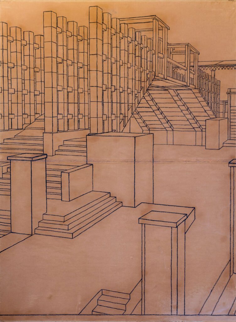
The new Ponte del Accademia is constructed from four large frames by which three routes are laid out, a central cordonata and two lateral paths – each with steps.
The static idea coincides with the formal idea. The edges of the bridge are defined by further columns, as if one is walking through an avenue of cypresses or among a canebrake. Through this protective screen, one glimpses the city’s panorama, mediated by stems rising up from the ground. At the summit is a sheltered area to rest and look out onto the water.
The sides of the bridge evoke a stack of construction material pierced by light and wind to show its orderly structure. Behind it are reinforcements built with four large pilasters. Beyond this, the extremities of the bridge are inset into buildings and spaces arranged to incorporate them into the urban fabric.
The piazza dell’ Accademia has been redesigned to front a tall, thin building measured on the facade of the old church. It is a civic building, designed to accommodate shops and workshops; the opposite side outlines a typical Venetian street, small and closed in on itself. A second, slightly oblique part of the building was conceived for rest and docking operations. At the centre, the building opens with two large atriums to allow access to the bridge.
On the other side, the end bridge meets with a typical arrangement in waterline civil works, formed by steps which reinforces the axis of movement through the design of the pavement and the edges of the piazza.
The search for detail in controlling the perspectival space of the Canal Grande goes hand in hand with the idea of considering the two adjacent themes of the Accademia and of Ca’Venier within one single project. Simply working within tradition, as it were in neoclassical architecture, not directed by any theme but instead focused on the city – on the ever-present desire to contribute, through architecture, to the future of Venice.
Lightly adapted by the Drawing Matter editors from a text by the architect supplied at the acquisition of the drawings. Passi’s proposal was designed in collaboration with Sabina Di Pasquale, Carlo Lococo, Giuseppe Muratore, Gianni Roscia.
Venice Biennale (1985)
Dario Passi's Proposal for the The Accademia Bridge and The Ca'Venier Museum
– Dario Passi
The third edition of the Venice Biennale in 1985, ‘Progetto Venezia’, directed by Aldo Rossi, had two major themes: the priority given to the moment of planning and the comparison with the Venetian landscape. For the 1985 exhibition, architects were invited to display their designs for the ‘requalification or the transformation of specific areas of the lagoon town and its mainland’. In Dario Passi’s schemes for the Accademia Bridge and the Ca’Venier Museum (Palazzo Guggenheim), the architect connects the two banks of the canal twice: first with the bridge, second by expanding the museum on the opposite side of the bank.
Il Museo
The museum relies on a strong idea of architecture that accentuates vertically, emphasised by the pilasters and overlapping fenestrations and onto which the internal spaces project themselves. This is akin to how Elizabethan architecture valued the language of new civil conditions, shifting interest to the evidence of the weight of construction.
The ensemble is ordered in between two towering buildings that overlook the canal, which are transversally connected by an open nave. The nave looks out onto the water through a large loggia which, up close, echoes the perforated central openings of Venetian palaces where single buildings lose their individuality.
The expansion of the museum, planned on the opposite bank, is in axis with the loggia open on the inner garden. From it one can see through the facade, the garden, the picture gallery and the long body which separates the new area from the museum at the back.
From a functional perspective, the expansion makes space for offices. On a visual level, the expansion architecturally reinforces the ideal connection of the two banks, positioning itself on the water with a short flight of stairs – as many small churches do along the smaller canals.
Il Ponte
The new Ponte del Accademia is constructed from four large frames by which three routes are laid out, a central cordonata and two lateral paths – each with steps.
The static idea coincides with the formal idea. The edges of the bridge are defined by further columns, as if one is walking through an avenue of cypresses or among a canebrake. Through this protective screen, one glimpses the city’s panorama, mediated by stems rising up from the ground. At the summit is a sheltered area to rest and look out onto the water.
The sides of the bridge evoke a stack of construction material pierced by light and wind to show its orderly structure. Behind it are reinforcements built with four large pilasters. Beyond this, the extremities of the bridge are inset into buildings and spaces arranged to incorporate them into the urban fabric.
The piazza dell’ Accademia has been redesigned to front a tall, thin building measured on the facade of the old church. It is a civic building, designed to accommodate shops and workshops; the opposite side outlines a typical Venetian street, small and closed in on itself. A second, slightly oblique part of the building was conceived for rest and docking operations. At the centre, the building opens with two large atriums to allow access to the bridge.
On the other side, the end bridge meets with a typical arrangement in waterline civil works, formed by steps which reinforces the axis of movement through the design of the pavement and the edges of the piazza.
The search for detail in controlling the perspectival space of the Canal Grande goes hand in hand with the idea of considering the two adjacent themes of the Accademia and of Ca’Venier within one single project. Simply working within tradition, as it were in neoclassical architecture, not directed by any theme but instead focused on the city – on the ever-present desire to contribute, through architecture, to the future of Venice.
Lightly adapted by the Drawing Matter editors from a text by the architect supplied at the acquisition of the drawings. Passi’s proposal was designed in collaboration with Sabina Di Pasquale, Carlo Lococo, Giuseppe Muratore, Gianni Roscia.
Related...
The facade is the window to the soul of architecture: Venice Architecture Biennale, 2018
– Adam Caruso and Helen Thomas
Architectural Ethnography: Japan Pavilion
– Helen Thomas
Freestanding: Sigurd Lewerentz
– Helen Thomas
Category
project & building histories on their own work commentaries, rants & reflections Drawing Matter archive: research & collecting
Architect
Dario Passi
Medium
drawing
Tags
DMC presentation theoretical & imaginary exhibition urban form public space