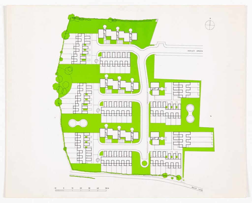
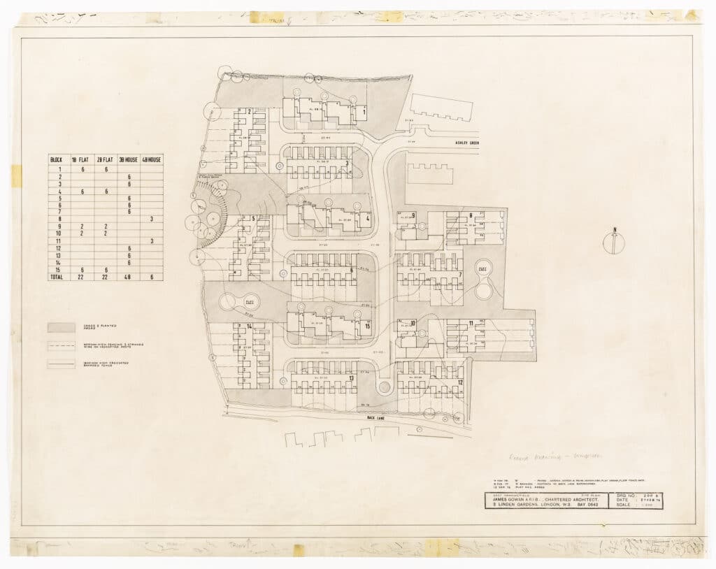
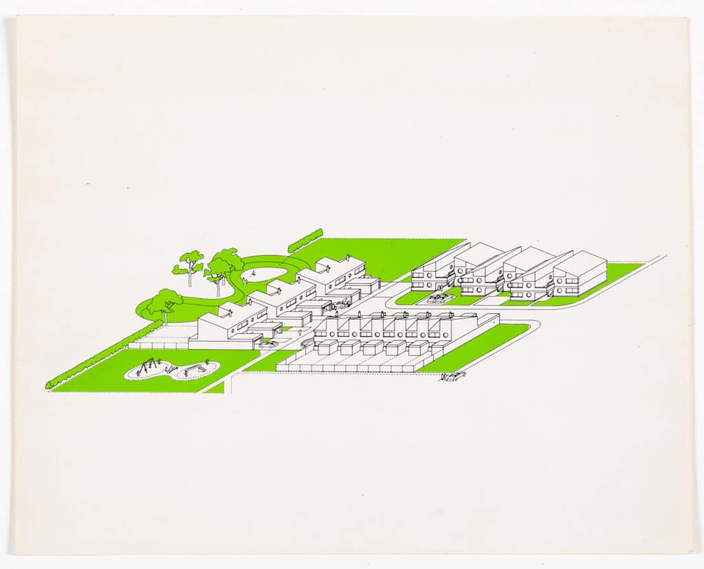
The Site Plan was one of the Planning drawings prepared for submission to Chelmsford District Council and Essex County Council. It is A1 size and drawn on Wiggins Teape 112 gram ‘Gateway’ tracing paper.
The East Hanningfield job was the first on which ‘A’ sized paper had been used in James’s office. Incidentally, it was also the first job that he had done using ‘metric’ dimensions.
James had been in the habit of cutting off a suitable length of tracing paper from a 30” wide roll of ‘Gateway’. This meant that there was no standardisation of drawing format, which led to chaos in the plan chest trying to find odd sized drawings. UDO the printers, who by this time had gone over to A-sized sheets for dyeline prints, had asked me to have a word with James to see if he could be persuaded. Eventually he was and the standard format adopted. He was taken by the proportion of the sheets, 1 : √2, but drew the line at having them pre-printed with the practice’s name, preferring his extremely well-used rubber stamp.
It is important to remember that, up until the almost universal use of Xerox machines for drawing reproduction and CAD, drawings were produced for ‘dyeline’ reproduction. James had developed a lean (pencil) style which had great clarity and produced prints that were very suitable for colouring. My drawing technique was very influenced by American ‘drafting’. Working drawings were always done in pencil and used standard hatching and lettering so much so that they all could have been drawn by the same person.
I remember visiting an exhibition of the work of the American architect Bruce Goff at the Bartlett. His work, I suppose, could be described as ‘organic’ because of its extraordinary complex non-linear forms. What astonished me was that his working drawings could have been any ordinary ‘dingbat’ scheme as Reyner Banham would have it. My own method used coloured pencils on the reverse of the tracing paper to produce various tones. And, as a cheaper alternative to Lettratone, I used shoe polish applied with a soft cloth also to the back of the drawing. Black polish produced a dark tone whilst dark, mid and light tan gave successively lighter tones.
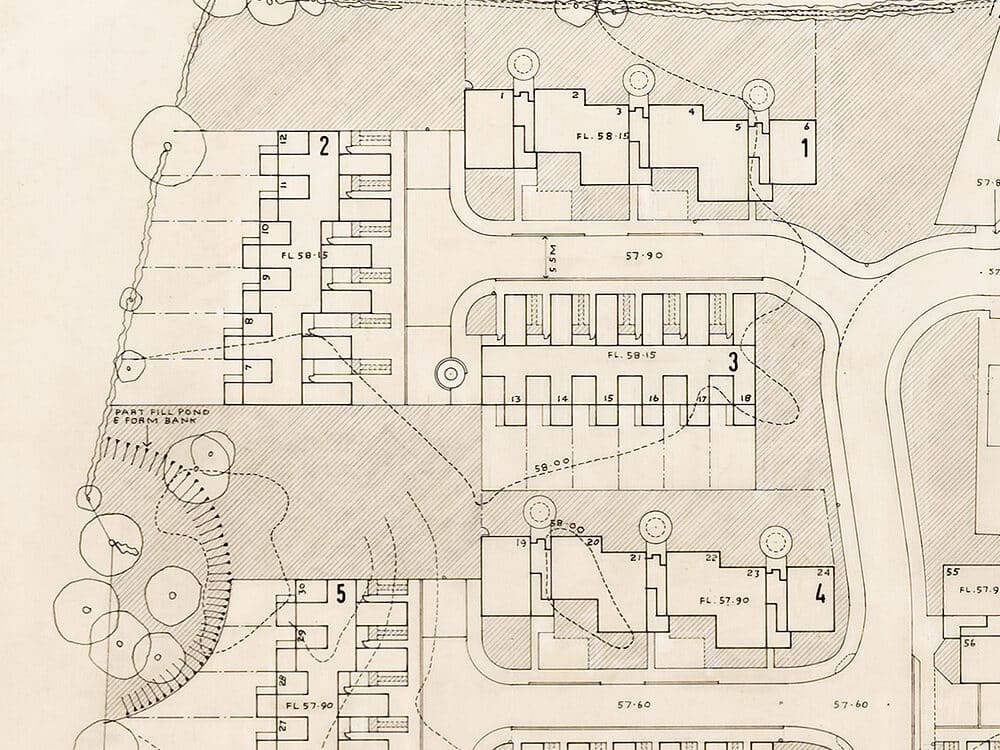
Because the Site Plan was a ‘presentation’ drawing it was drawn in ink, as were the other planning drawings. Usually drawings, especially working drawings, were produced in pencil. I favoured a Faber Castell clutch pencil with an HB lead while James was a diehard fan of the Schwan Stabilo or Faber Castell HB pencil, which he would ritually sharpen with a Stanley knife at the start of the day. At various times, I suggested he used mechanical pencil sharpeners, but he would have none of it. Many years later I gave him a very sophisticated Japanese electric sharpener. I doubt if he ever used it.
The Site Plan was produced by laying the drawing over a pencil version and then tracing over it with pen. As I recall the pencil underlay drawing was the third or fourth version, the layout having been through a number of iterations before being settled. I used various sizes of Rapidograph pens to produce the drawing and Standardgraph stencils for the titles, numbering etc. The grassed areas were hatched in pencil at 45 degrees on the back of the drawing. This was done by canting the drawing at 45 degrees to the drawing board and tracing over the 1/8th square graph paper that I used as a backing sheet.
James was not a fan of the Rapidograph. He was of the opinion that the line they produced was in like an elongated ‘dumbbell’ with a blob at either end of a straight line. He had a point, but, to most people, this was undetectable. His preferred pen was the ‘Pelikan Graphos’, a drawing device that I regarded as an instrument of torture. Graphos pens were essentially an updated version of the traditional ruling pen. The nibs were blade like and came in various sizes from 0.1mm to 1.2mm and so on. The handle held a reservoir of Indian ink and herein lay the problem. They constantly dried out and caused intense frustration and often the air to turn blue. If you weren’t careful the very thin nibs were able to cut through tracing paper like a craft knife. A good reason to use thick 112gram tracing paper.
Graphos pens that had been in action, together with James’s other drawing instruments, were ritually cleaned on a Friday afternoon, followed by a glass of single malt in the living room.
For the Planning application it was decided that the Site Plan should be coloured up. As the application required 12 copies plus one for the files, this was no mean undertaking. The dyeline prints were coloured using Derwent coloured pencils, grass green for the grass (there was a lot of grass), terracotta for the roofs, primrose yellow for the roads and so on. We set up a sort of production line to colour the drawings taking it in turns to apply each colour. James was very keen on hand colouring drawings and often spoke of its therapeutic qualities. Colouring the Site Plans probably took about two days to complete, pushing James’s therapeutic notion to its very limit.
The East Hanningfield job came at a very opportune time for the office, work was a bit thin on the ground. The first job I worked on, the innovative housing scheme for Pamela and Keith Gems at Bembridge on the Isle of Wight, had been turned down by the planners after a vociferous campaign by the local ‘Yachting’ community to which the local authority had caved in. I drew up the last phase of the Deptford warehousing job and then did on-site supervision of two jobs that James had inherited from Roman Halter’s practice, the Agar Grove Day Nursery and the Polygon housing development at Somers Town. Both for the London Borough of Camden.
The Polygon housing scheme had an interesting history. It was designed in Sydney Cook’s Camden Architects Department by Peter Tabori, and due to the pressures of work within the department, the scheme design was passed to Roman Halter Associates for completion. Originally designed in concrete in the same manner Highgate New Town, Halter changed the facing material to brick. Otherwise the scheme remained more or less the same, an ‘L’ shaped plan of stepped section terraces with lifts and stairs at the corner and car parking underneath. (see the excellent Cook’s Camden by Mark Swenarton).
Roman Halter became ill and retired from practice. James took on the job which, on the face of it wasn’t very attractive, ‘slugging it out with contractors’ as he put it. The ‘carrot’ was the prospect of designing a new Health Clinic to be sited on the remaining corner of the Polygon site. There is a version of the Clinic illustrated in the Academy Editions Monograph on James. The design has a straightforward rectangular plan with rooms disposed around the perimeter and trademark stair and lift towers signalling the entrance. There was also another earlier version of the project. The plan this time was a quadrant three stories high with floors stepping back to form terraces and again with the trademark lift and staircase signalling the entrance. I recall drawing an isometric of this version, but the project was never built.
One day in November 1973, I took a phone call from a man called Esmond Abraham. James was out somewhere so I took down some details. It turned out that Esmond Abraham was an architect and also Technical Director of Chelmsford District Council. He asked me two questions. Firstly, would Mr Gowan be interested in designing a housing scheme at a village called East Hanningfield in Essex? And secondly, does Mr Gowan work for scale fees? On the first, I said that I am sure he would and on the second, I said that I had no idea, but I would get Mr Gowan to call him.
Seemingly the job came out of the blue. Quite why James had been chosen was a bit of mystery until it was revealed that, Esmond Abraham had been a student at Leicester School of Architecture and was a great admirer of the Engineering Building and James’s Greenwich housing schemes.
The first site visit involved a trip up the A12 in James’s Alfa Romeo GT Junior and revealed a large grass field of about 6.5 acres which lay to the west of the village. The site sloped about 1.0 metre north to south and was surrounded by mature hedges on three sides and some fairly non-descript 1960s houses on the third, eastern side, Ashley Green. An outline planning consent had been given in January 1972 which called for ‘the layout to be by way of an estate road with access from the adjoining development to the east known as Ashley Green’. The consent also prescribed 15 dwellings to the acre to be not more than two stories high. This gave a total number of 96 dwellings which were to be a mixture of 1 and 2 bedroom Old Persons’ flats, 3 bedroom 5 person houses and 4 bedroom 7 person houses.
At about the same time as the Hanningfield job came into the office, Essex County Council had published its ‘Essex Design Guide’. Apparently aimed at Developers, I would describe it as a ‘Pattern Book for the Picturesque’. It advocated what James once called the ‘English Crumbly’ style, lots of tile hanging, timber cladding, pitched roofs (with pantiles), arbitrarily placed buildings and culs-de-sac as shared spaces.
Although our attention was drawn to this Guide, I think it would be true to say that nobody was very keen on it. There were two major stumbling blocks to its use. Firstly, the Highways Authority refused to ‘adopt’ shared space culs-de-sac because they were not, in their terms, roads. Secondly, the public utilities, water, electricity etc. would not share trenches. They wanted roads with footpaths. When the scheme was presented to Chelmsford District Councils Housing Committee, James was quizzed about the Design Guide and was able to respond that there were culs-de-sac (to highways standards), pitched roofs and pantiles.
The site layout came about quite quickly after a number of alternatives were tested. Broadly based on ‘Radburn’ principles of the separation of pedestrian and vehicular movement, there are 5 clusters of dwellings arranged around culs-de-sac, 3 large and 2 small. Terraced houses are orientated either east/west or north/south so that the majority of gardens are either south or west facing. The Old persons’ flats are predominantly oriented east/west so as to give a preferential position in each group of dwellings.
The funding for the project came from the Ministry of Housing and Local Government and was determined by their ‘Housing Cost Yardstick’. This was a complex document which determined the level of funding and considered factors like location, density, site area, housing mix and so on. It was arranged in a series of bands. The Hanningfield scheme was on the cusp of one of the bands and it became apparent that we needed to ‘nudge’ it into the next band in order to get more funding. A determining factor was the site area. The site plan I produced was based upon a measured survey and the local OS map. Somehow, we had to demonstrate that the site was bigger. My solution was to weigh the site plan. This involved cutting out the shape of the site, weighing it and comparing it with a piece of the paper (of known area) the site plan was printed on. James’s solution was to buy a gadget called a ‘planimeter’ (he loved gadgets). This device had a trammel arm with a pointer at one end and a graduated brass wheel at the other. The plan scale was set on the wheel and the pointer traced around the perimeter of the site and ‘hey presto’ after several goes, it would tell you the site area. We were able to move the project into the next band much to everybody’s relief.
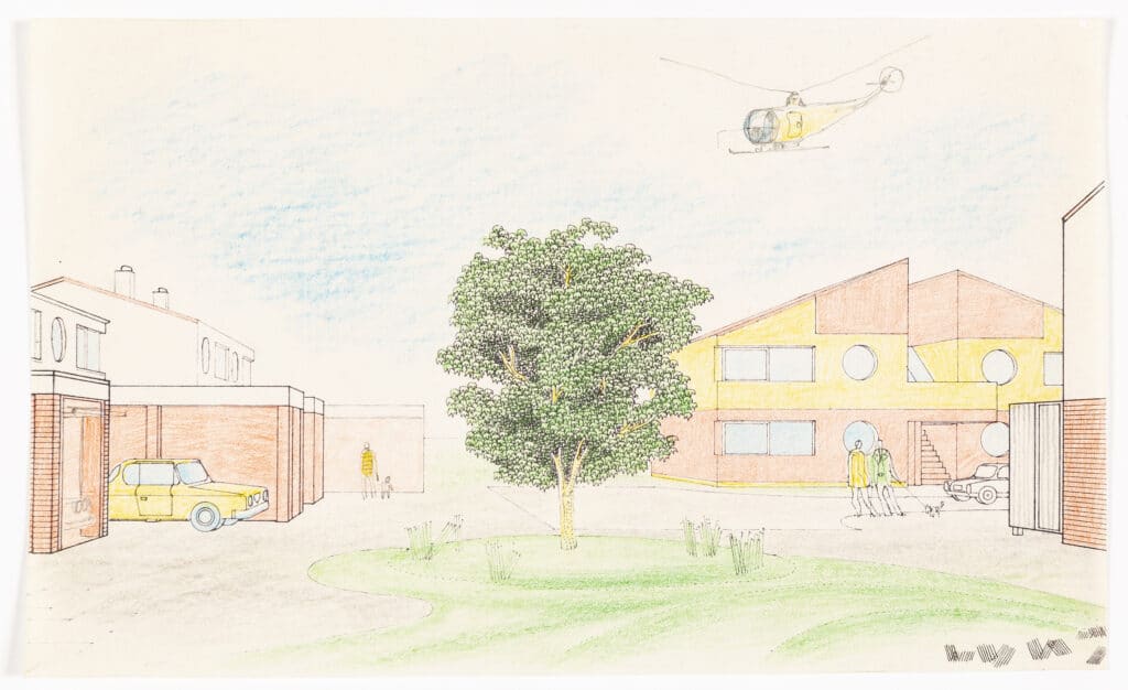
At about this time the Ministry of Housing also introduced what were known as Metric Housing shells. These were standard plans, to Parker Morris standards, for various types of dwelling that were based on a 300mm module. The Hanningfield scheme was, by this time, well advanced and so we managed to avoid this new constraint. However, there is an underlying module that determines the dimensions of houses and flats and that is the roofing. After some samples were delivered to the office and in the light of the Essex Design Guide it was decided that the roofing material should be Suffolk pantiles. I came into the office on the following Monday morning and at our usual start of the week meeting he announced that we have to change the plans! What he meant was that the plans were to be adjusted to fit the pantile ‘module’ so that there were no cut tiles. At that stage I had drawn all the plans and sections of the various house types to 1:20 scale. It was late in the day so a redraw was a daunting task. The drawings were changed and although it was a hell of a job to do, I think he was right. James did say to me later on that he would be surprised if anyone noticed that there were no cut tiles. ‘I would’ was my reply.
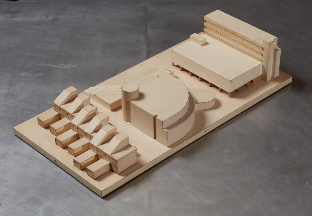
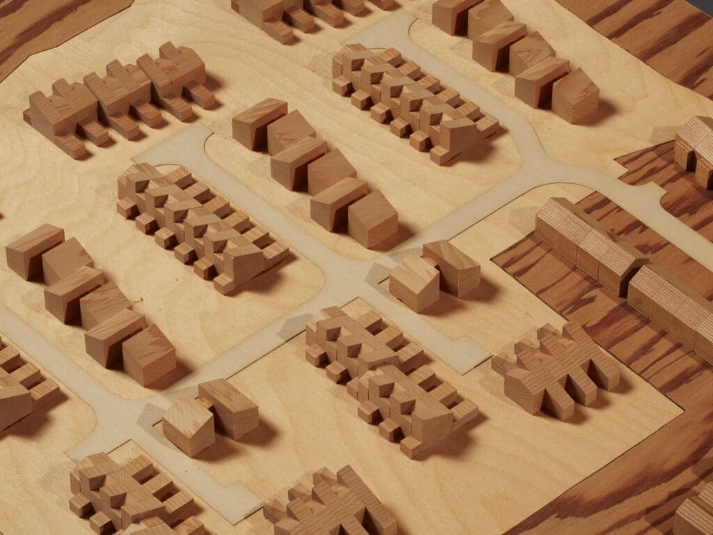
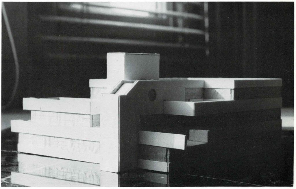
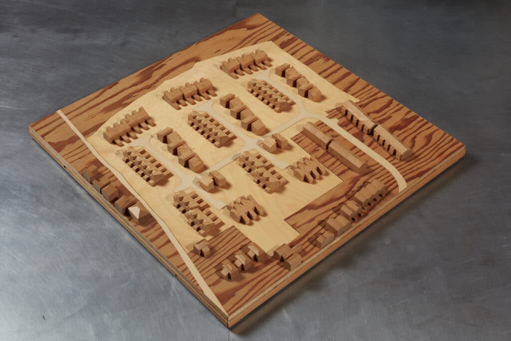
Before the planning application could be made the scheme had to be approved by the District Council’s Housing Committee. I managed to persuade James that we should produce a report for the presentation and a model of the scheme rather than pinning up drawings that nobody could see. The A4 sized (landscape) report was put together and contained photographs of the site, a description of the site and layout, the site plan and all dwelling types in plan, section and elevation. The 1:1250 scale model was made (on the quiet) by Arup Associates model making workshop with whom I had contacts.
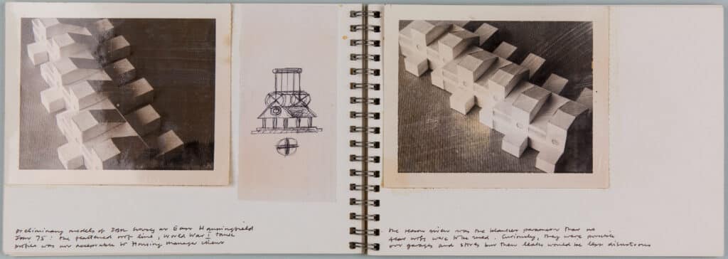
Before the Committee meeting James became anxious about the scheme’s circular bathroom windows. He felt the need to demonstrate, if there was objection, that they were perfectly normal and that there were lots of examples locally. Another trip up the by now very familiar A12, this time in my Alfa Guilia Super, produced a good selection of (mainly Georgian) circular windows which James photographed with his twin lens Rolleiflex camera. In the event the Committee meeting went very well with only one question about the circular windows which was to do with fixing curtains. The only ‘flak’ was from a crusty old Labour councillor who was worried about the cost of the model and the reports.
Planning consent was eventually given but approval from the Ministry of Housing was slow in coming. This meant that the next phase of the job, working drawings etc. could not be started. Because of this hiatus I went on to a three day week and started teaching one day a week at the Bartlett. By now my wife and I had bought a flat so the need for a regular income became important. I was offered a job by my old employer Arup Associates which I decided to take. There I worked on the new Cambridge Magistrates Court and the headquarters for Babergh District Council near Ipswich in Suffolk.
I spent a total of about 18 months working for James and before that I had been taught by him at the AA.
It was an important period in my life. Derek Sugden of Arup Associates nicknamed James ‘Plucky Jim’. He was and I very much admired him for it.
Working with Gowan: Housing at East Hanningfield
– Paul Notley
The Site Plan was one of the Planning drawings prepared for submission to Chelmsford District Council and Essex County Council. It is A1 size and drawn on Wiggins Teape 112 gram ‘Gateway’ tracing paper.
The East Hanningfield job was the first on which ‘A’ sized paper had been used in James’s office. Incidentally, it was also the first job that he had done using ‘metric’ dimensions.
James had been in the habit of cutting off a suitable length of tracing paper from a 30” wide roll of ‘Gateway’. This meant that there was no standardisation of drawing format, which led to chaos in the plan chest trying to find odd sized drawings. UDO the printers, who by this time had gone over to A-sized sheets for dyeline prints, had asked me to have a word with James to see if he could be persuaded. Eventually he was and the standard format adopted. He was taken by the proportion of the sheets, 1 : √2, but drew the line at having them pre-printed with the practice’s name, preferring his extremely well-used rubber stamp.
It is important to remember that, up until the almost universal use of Xerox machines for drawing reproduction and CAD, drawings were produced for ‘dyeline’ reproduction. James had developed a lean (pencil) style which had great clarity and produced prints that were very suitable for colouring. My drawing technique was very influenced by American ‘drafting’. Working drawings were always done in pencil and used standard hatching and lettering so much so that they all could have been drawn by the same person.
I remember visiting an exhibition of the work of the American architect Bruce Goff at the Bartlett. His work, I suppose, could be described as ‘organic’ because of its extraordinary complex non-linear forms. What astonished me was that his working drawings could have been any ordinary ‘dingbat’ scheme as Reyner Banham would have it. My own method used coloured pencils on the reverse of the tracing paper to produce various tones. And, as a cheaper alternative to Lettratone, I used shoe polish applied with a soft cloth also to the back of the drawing. Black polish produced a dark tone whilst dark, mid and light tan gave successively lighter tones.
Because the Site Plan was a ‘presentation’ drawing it was drawn in ink, as were the other planning drawings. Usually drawings, especially working drawings, were produced in pencil. I favoured a Faber Castell clutch pencil with an HB lead while James was a diehard fan of the Schwan Stabilo or Faber Castell HB pencil, which he would ritually sharpen with a Stanley knife at the start of the day. At various times, I suggested he used mechanical pencil sharpeners, but he would have none of it. Many years later I gave him a very sophisticated Japanese electric sharpener. I doubt if he ever used it.
The Site Plan was produced by laying the drawing over a pencil version and then tracing over it with pen. As I recall the pencil underlay drawing was the third or fourth version, the layout having been through a number of iterations before being settled. I used various sizes of Rapidograph pens to produce the drawing and Standardgraph stencils for the titles, numbering etc. The grassed areas were hatched in pencil at 45 degrees on the back of the drawing. This was done by canting the drawing at 45 degrees to the drawing board and tracing over the 1/8th square graph paper that I used as a backing sheet.
James was not a fan of the Rapidograph. He was of the opinion that the line they produced was in like an elongated ‘dumbbell’ with a blob at either end of a straight line. He had a point, but, to most people, this was undetectable. His preferred pen was the ‘Pelikan Graphos’, a drawing device that I regarded as an instrument of torture. Graphos pens were essentially an updated version of the traditional ruling pen. The nibs were blade like and came in various sizes from 0.1mm to 1.2mm and so on. The handle held a reservoir of Indian ink and herein lay the problem. They constantly dried out and caused intense frustration and often the air to turn blue. If you weren’t careful the very thin nibs were able to cut through tracing paper like a craft knife. A good reason to use thick 112gram tracing paper.
Graphos pens that had been in action, together with James’s other drawing instruments, were ritually cleaned on a Friday afternoon, followed by a glass of single malt in the living room.
For the Planning application it was decided that the Site Plan should be coloured up. As the application required 12 copies plus one for the files, this was no mean undertaking. The dyeline prints were coloured using Derwent coloured pencils, grass green for the grass (there was a lot of grass), terracotta for the roofs, primrose yellow for the roads and so on. We set up a sort of production line to colour the drawings taking it in turns to apply each colour. James was very keen on hand colouring drawings and often spoke of its therapeutic qualities. Colouring the Site Plans probably took about two days to complete, pushing James’s therapeutic notion to its very limit.
The East Hanningfield job came at a very opportune time for the office, work was a bit thin on the ground. The first job I worked on, the innovative housing scheme for Pamela and Keith Gems at Bembridge on the Isle of Wight, had been turned down by the planners after a vociferous campaign by the local ‘Yachting’ community to which the local authority had caved in. I drew up the last phase of the Deptford warehousing job and then did on-site supervision of two jobs that James had inherited from Roman Halter’s practice, the Agar Grove Day Nursery and the Polygon housing development at Somers Town. Both for the London Borough of Camden.
The Polygon housing scheme had an interesting history. It was designed in Sydney Cook’s Camden Architects Department by Peter Tabori, and due to the pressures of work within the department, the scheme design was passed to Roman Halter Associates for completion. Originally designed in concrete in the same manner Highgate New Town, Halter changed the facing material to brick. Otherwise the scheme remained more or less the same, an ‘L’ shaped plan of stepped section terraces with lifts and stairs at the corner and car parking underneath. (see the excellent Cook’s Camden by Mark Swenarton).
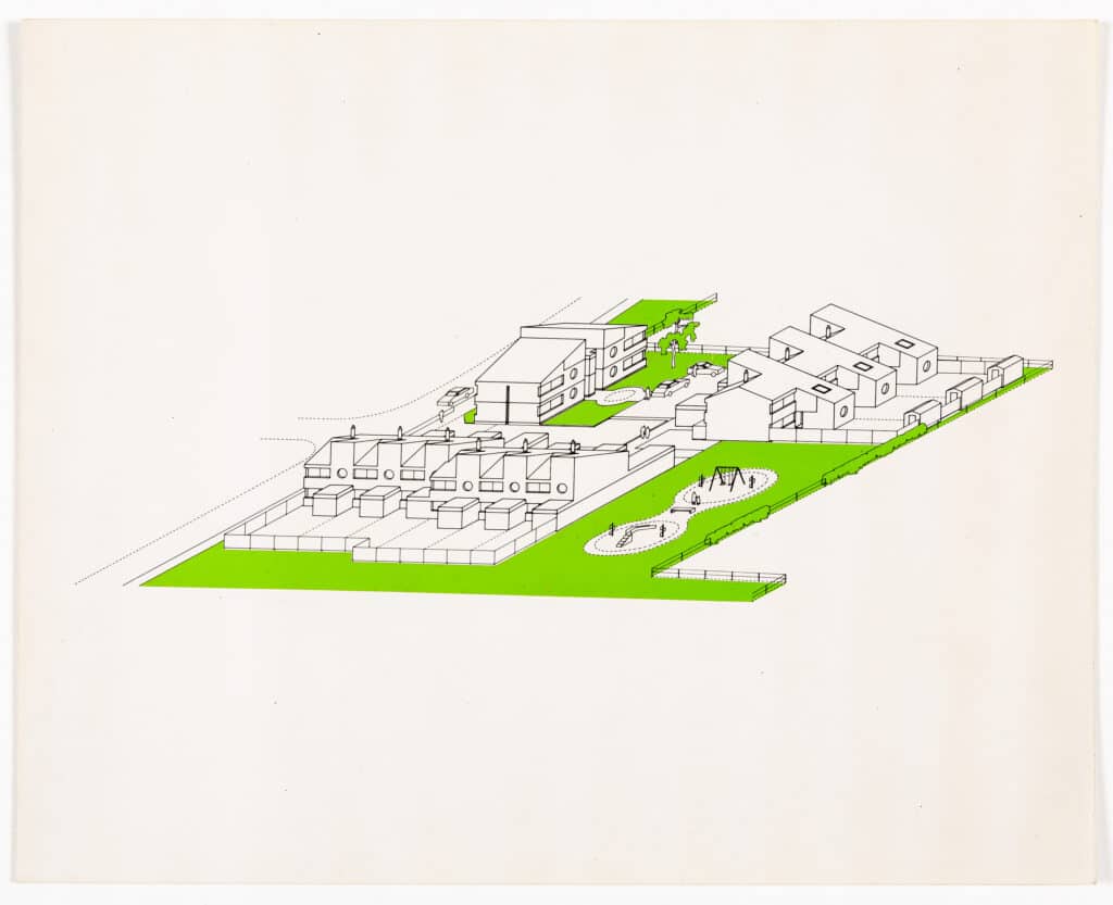
Roman Halter became ill and retired from practice. James took on the job which, on the face of it wasn’t very attractive, ‘slugging it out with contractors’ as he put it. The ‘carrot’ was the prospect of designing a new Health Clinic to be sited on the remaining corner of the Polygon site. There is a version of the Clinic illustrated in the Academy Editions Monograph on James. The design has a straightforward rectangular plan with rooms disposed around the perimeter and trademark stair and lift towers signalling the entrance. There was also another earlier version of the project. The plan this time was a quadrant three stories high with floors stepping back to form terraces and again with the trademark lift and staircase signalling the entrance. I recall drawing an isometric of this version, but the project was never built.
One day in November 1973, I took a phone call from a man called Esmond Abraham. James was out somewhere so I took down some details. It turned out that Esmond Abraham was an architect and also Technical Director of Chelmsford District Council. He asked me two questions. Firstly, would Mr Gowan be interested in designing a housing scheme at a village called East Hanningfield in Essex? And secondly, does Mr Gowan work for scale fees? On the first, I said that I am sure he would and on the second, I said that I had no idea, but I would get Mr Gowan to call him.
Seemingly the job came out of the blue. Quite why James had been chosen was a bit of mystery until it was revealed that, Esmond Abraham had been a student at Leicester School of Architecture and was a great admirer of the Engineering Building and James’s Greenwich housing schemes.
The first site visit involved a trip up the A12 in James’s Alfa Romeo GT Junior and revealed a large grass field of about 6.5 acres which lay to the west of the village. The site sloped about 1.0 metre north to south and was surrounded by mature hedges on three sides and some fairly non-descript 1960s houses on the third, eastern side, Ashley Green. An outline planning consent had been given in January 1972 which called for ‘the layout to be by way of an estate road with access from the adjoining development to the east known as Ashley Green’. The consent also prescribed 15 dwellings to the acre to be not more than two stories high. This gave a total number of 96 dwellings which were to be a mixture of 1 and 2 bedroom Old Persons’ flats, 3 bedroom 5 person houses and 4 bedroom 7 person houses.
At about the same time as the Hanningfield job came into the office, Essex County Council had published its ‘Essex Design Guide’. Apparently aimed at Developers, I would describe it as a ‘Pattern Book for the Picturesque’. It advocated what James once called the ‘English Crumbly’ style, lots of tile hanging, timber cladding, pitched roofs (with pantiles), arbitrarily placed buildings and culs-de-sac as shared spaces.
Although our attention was drawn to this Guide, I think it would be true to say that nobody was very keen on it. There were two major stumbling blocks to its use. Firstly, the Highways Authority refused to ‘adopt’ shared space culs-de-sac because they were not, in their terms, roads. Secondly, the public utilities, water, electricity etc. would not share trenches. They wanted roads with footpaths. When the scheme was presented to Chelmsford District Councils Housing Committee, James was quizzed about the Design Guide and was able to respond that there were culs-de-sac (to highways standards), pitched roofs and pantiles.
The site layout came about quite quickly after a number of alternatives were tested. Broadly based on ‘Radburn’ principles of the separation of pedestrian and vehicular movement, there are 5 clusters of dwellings arranged around culs-de-sac, 3 large and 2 small. Terraced houses are orientated either east/west or north/south so that the majority of gardens are either south or west facing. The Old persons’ flats are predominantly oriented east/west so as to give a preferential position in each group of dwellings.
The funding for the project came from the Ministry of Housing and Local Government and was determined by their ‘Housing Cost Yardstick’. This was a complex document which determined the level of funding and considered factors like location, density, site area, housing mix and so on. It was arranged in a series of bands. The Hanningfield scheme was on the cusp of one of the bands and it became apparent that we needed to ‘nudge’ it into the next band in order to get more funding. A determining factor was the site area. The site plan I produced was based upon a measured survey and the local OS map. Somehow, we had to demonstrate that the site was bigger. My solution was to weigh the site plan. This involved cutting out the shape of the site, weighing it and comparing it with a piece of the paper (of known area) the site plan was printed on. James’s solution was to buy a gadget called a ‘planimeter’ (he loved gadgets). This device had a trammel arm with a pointer at one end and a graduated brass wheel at the other. The plan scale was set on the wheel and the pointer traced around the perimeter of the site and ‘hey presto’ after several goes, it would tell you the site area. We were able to move the project into the next band much to everybody’s relief.
At about this time the Ministry of Housing also introduced what were known as Metric Housing shells. These were standard plans, to Parker Morris standards, for various types of dwelling that were based on a 300mm module. The Hanningfield scheme was, by this time, well advanced and so we managed to avoid this new constraint. However, there is an underlying module that determines the dimensions of houses and flats and that is the roofing. After some samples were delivered to the office and in the light of the Essex Design Guide it was decided that the roofing material should be Suffolk pantiles. I came into the office on the following Monday morning and at our usual start of the week meeting he announced that we have to change the plans! What he meant was that the plans were to be adjusted to fit the pantile ‘module’ so that there were no cut tiles. At that stage I had drawn all the plans and sections of the various house types to 1:20 scale. It was late in the day so a redraw was a daunting task. The drawings were changed and although it was a hell of a job to do, I think he was right. James did say to me later on that he would be surprised if anyone noticed that there were no cut tiles. ‘I would’ was my reply.
Before the planning application could be made the scheme had to be approved by the District Council’s Housing Committee. I managed to persuade James that we should produce a report for the presentation and a model of the scheme rather than pinning up drawings that nobody could see. The A4 sized (landscape) report was put together and contained photographs of the site, a description of the site and layout, the site plan and all dwelling types in plan, section and elevation. The 1:1250 scale model was made (on the quiet) by Arup Associates model making workshop with whom I had contacts.
Before the Committee meeting James became anxious about the scheme’s circular bathroom windows. He felt the need to demonstrate, if there was objection, that they were perfectly normal and that there were lots of examples locally. Another trip up the by now very familiar A12, this time in my Alfa Guilia Super, produced a good selection of (mainly Georgian) circular windows which James photographed with his twin lens Rolleiflex camera. In the event the Committee meeting went very well with only one question about the circular windows which was to do with fixing curtains. The only ‘flak’ was from a crusty old Labour councillor who was worried about the cost of the model and the reports.
Planning consent was eventually given but approval from the Ministry of Housing was slow in coming. This meant that the next phase of the job, working drawings etc. could not be started. Because of this hiatus I went on to a three day week and started teaching one day a week at the Bartlett. By now my wife and I had bought a flat so the need for a regular income became important. I was offered a job by my old employer Arup Associates which I decided to take. There I worked on the new Cambridge Magistrates Court and the headquarters for Babergh District Council near Ipswich in Suffolk.
I spent a total of about 18 months working for James and before that I had been taught by him at the AA.
It was an important period in my life. Derek Sugden of Arup Associates nicknamed James ‘Plucky Jim’. He was and I very much admired him for it.
Category
design methodologies drawing histories project & building histories drawing techniques & materials office cultures on their own work commentaries, rants & reflections Drawing Matter archive: research & collecting
Period
c20th
Architect
James Gowan
Medium
drawing model
Tags
DMC plan housing autographicals (editorial project)