Fuglsang Kunstmuseum: Facts and Interpretation in Staging a Museum
The following text was first published in OASE #111: Staging the Museum (2022). Drawing Matter would like to thank Tony Fretton and the issue’s editors Aslı Çiçek, Jantje Engels, and Maarten Liefooghe, for allowing us to reproduce the text. Purchase a copy of OASE #111 here.
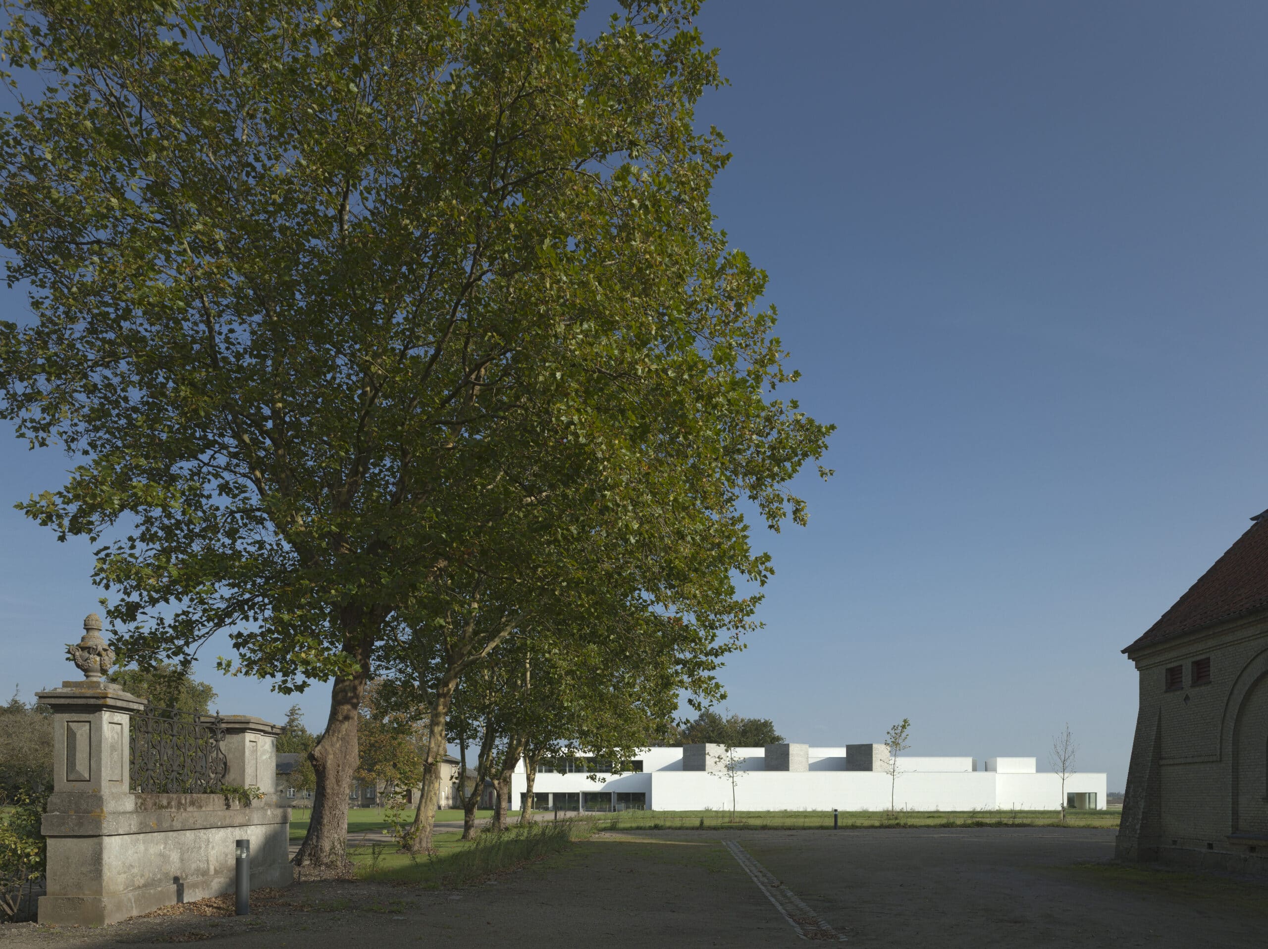
Fuglsang Kunstmuseum is located on the Danish island of Lolland in the Baltic sea. Its collection of paintings, drawings and sculptures by Danish artists from the 18th to the 21st century was originally housed in the Storstrøm Museum in the nearby town of Maribo. There only part of the works could be shown at one time, and it was decided to commission a new, much larger building through an international architectural competition, which would be dedicated entirely to the collection. Fuglsang as the chosen location was unconventional but courageous. A farming estate in the countryside, it is around two and a half hours south of Copenhagen and a taxi ride from the nearest town and railway station. Its qualities as a place however are compelling and they were formative on our winning scheme and in the creation by the museum leadership of a cultural destination that combines intellectual rigour, popular appeal and pure pleasure. There was also considerable synergy between the location and the collection, with its emphasis on local artists and motifs and works depicting Fuglsang itself. At another level, the museum has brought social and economic benefits to this economically disadvantaged region and its national standing is a source of local pride.
The competition brief for the museum was exemplary in its clarity of requirements, originality of museological ideas and its rigorous testing by a local architectural practice before being issued. An entrance foyer was required containing a café and museum shop with adjacent rooms for public art lessons and lectures. In unspecified locations, there were to be a library for visiting researchers, museum offices and areas for the museum’s back of house. Three types of exhibition area were projected, a single sub-divisible space for temporary exhibitions, another of similar size for the collection’s works of modernism and a suite of smaller rooms for historical paintings, works on paper and plaster casts. Within the sequence there were also to be small spaces, called ‘pockets’ in which one or two people could concentratedly view a single work. Choices of route through the galleries were to be provided, so that for example single visitors could avoid groups being led by a gallery guide. Most striking was the brief’s requirement for a sitting room within the gallery sequence where visitors could simply rest and look at the landscape.
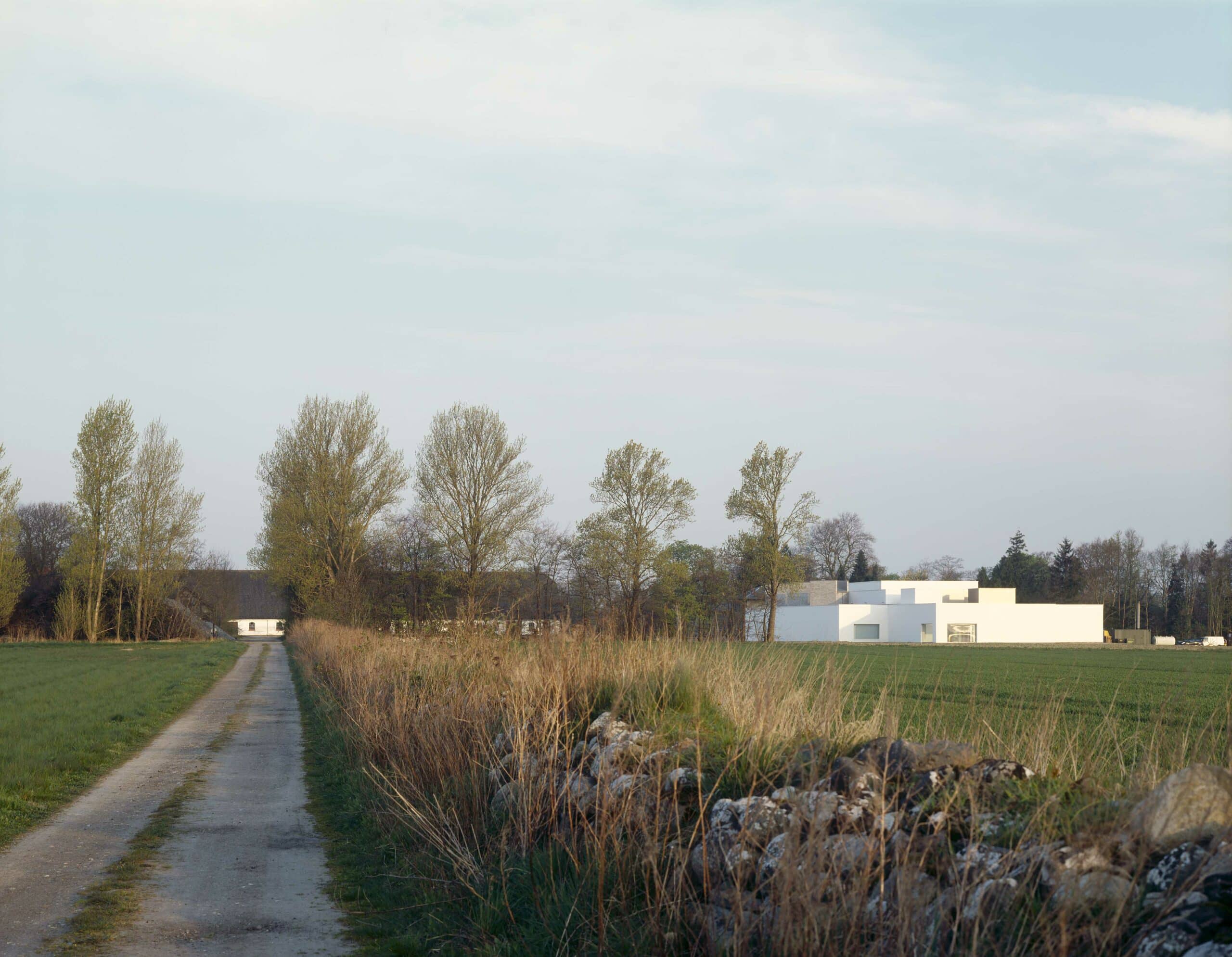
These very clear requirements were incorporated into the planning of our scheme. To them we added a long central gallery that is open at one end to the foyer and at the other to the sitting room, and arranged the galleries around it as a series of interconnected rooms. Back of house areas and the loading bay were situated out of sight at the rear of the building and museum offices and the research library on the first floor above the foyer where they have views over the estate and a private outdoor space.
The design of the building itself came by framing questions about the nature of the project and its relationship to the locale. How should a museum, a building of significance be placed in the location among existing buildings with very different styles and purposes, and how it could possess some of their familiarity while being itself? What could be the pleasure of visitors finding themselves at rest in nature after a long car journey to the museum? How could the museum be a place of social gathering that also showed the transcendent meanings of human contact and the natural world? How could the building intensify a setting that was already highly meaningful?
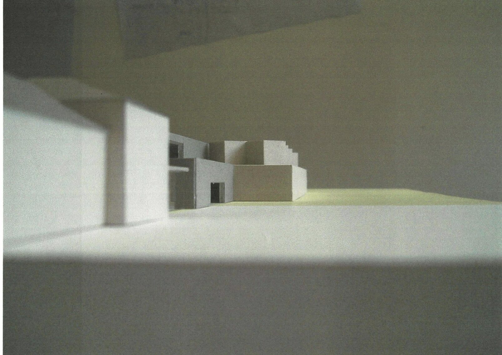
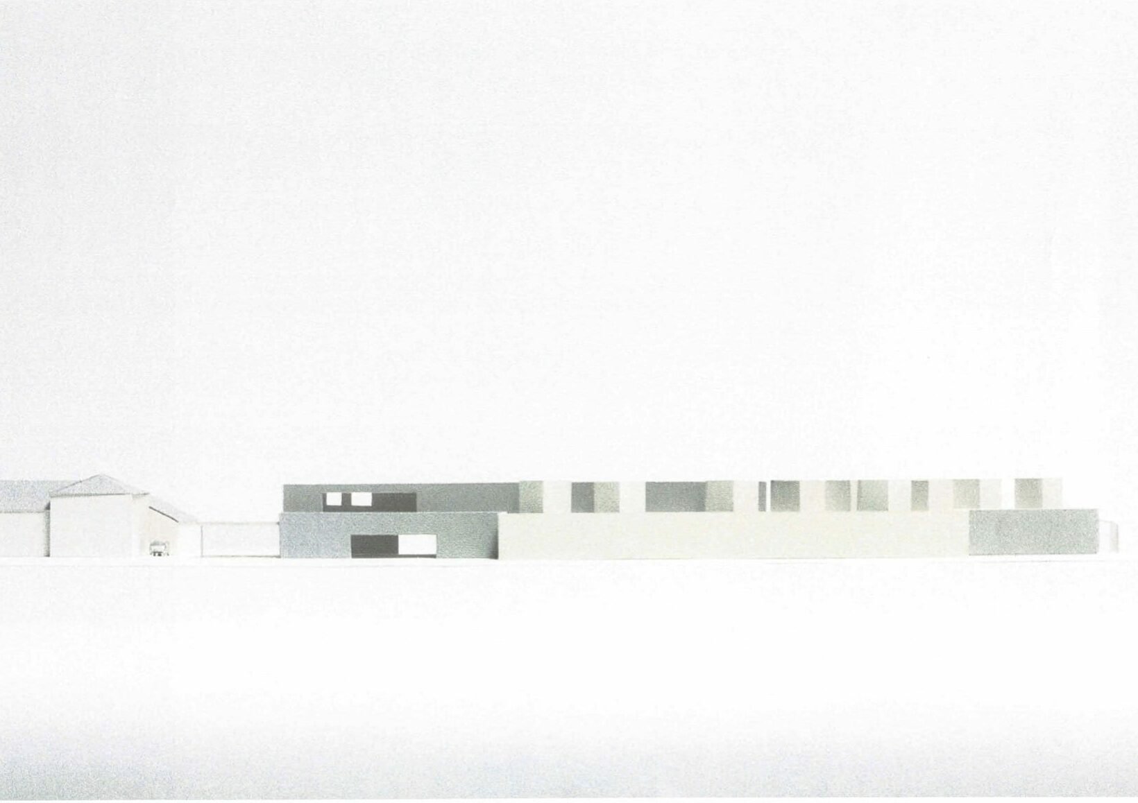
Unlike an urban museum reached through room-like spaces of a city, visiting Fuglsang Kunstmuseum entails a long journey through open countryside, arriving finally in a courtyard between a loose assembly of buildings. The principal of these is a Manor House, set at some distance from the south side of the courtyard behind a moat. Its red brick façade is arranged with three tall gables and the finest of its interiors have decorated ceilings and parquet floors that change slightly from room to room. Facing it across the courtyard is a land steward’s house on the north, built of simply ornamented pale yellow brick. Enclosing the west side is a barn in white painted brick with a tall slate roof. To the east the courtyard is completely open with magnificent views of the sky, agricultural fields and the distant sea. In our scheme, they are the first thing that visitors see as they enter from the highway before parking out of sight and continuing to the museum on foot. The museum is set to the side of the view in line with the land steward’s house and extends out into the fields where its form is seen against the sky, giving the museum its distinctive status.
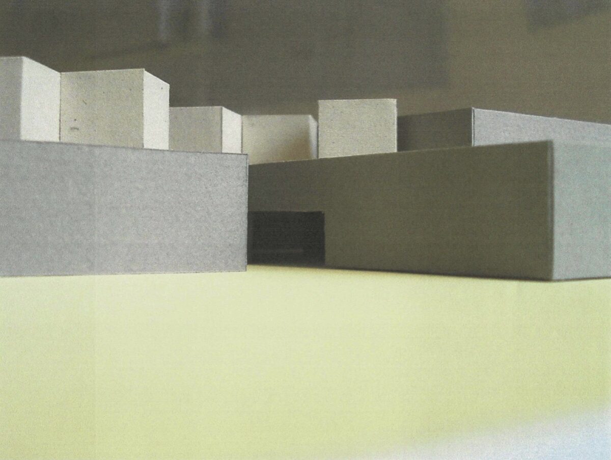
Like the barn, the museum building is abstract, and it is made of brick like the buildings around it and many classic works of Danish modernism. It is painted white like the barn and the grey brick of its roof lights matches the colour of the surrounding slate roofs. It is similar in height to the buildings around it and the façade that extends into the fields has the same length as the Manor House.
At the entrance to the museum the façade steps back, and the view of the fields is taken away and then recovered at points in the sequence of the interior public spaces and galleries. The café where visitors arrive looks out to the courtyard on one side and through the public art room to an orchard on the other. A line of sight extends from the cafe into the central gallery and through it to the sitting room and the landscape beyond.
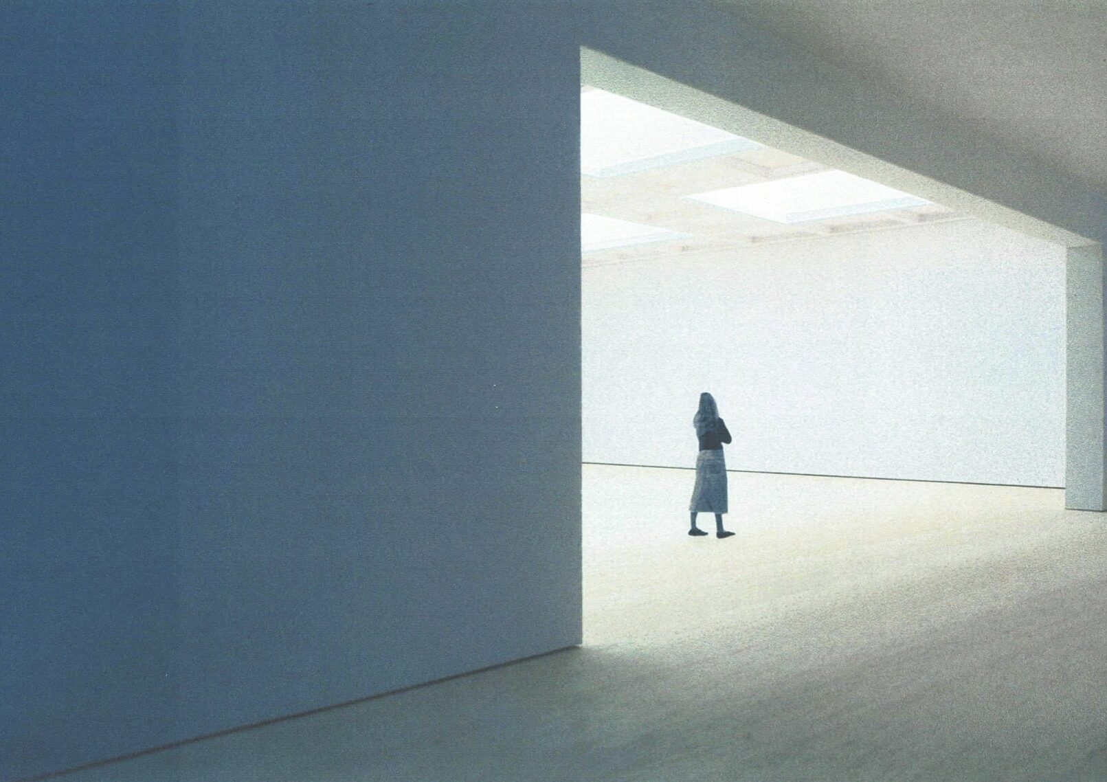
Social activity, artworks and the landscape coexist in the central gallery before visitors enter the enclosed and more reserved spaces of the galleries.
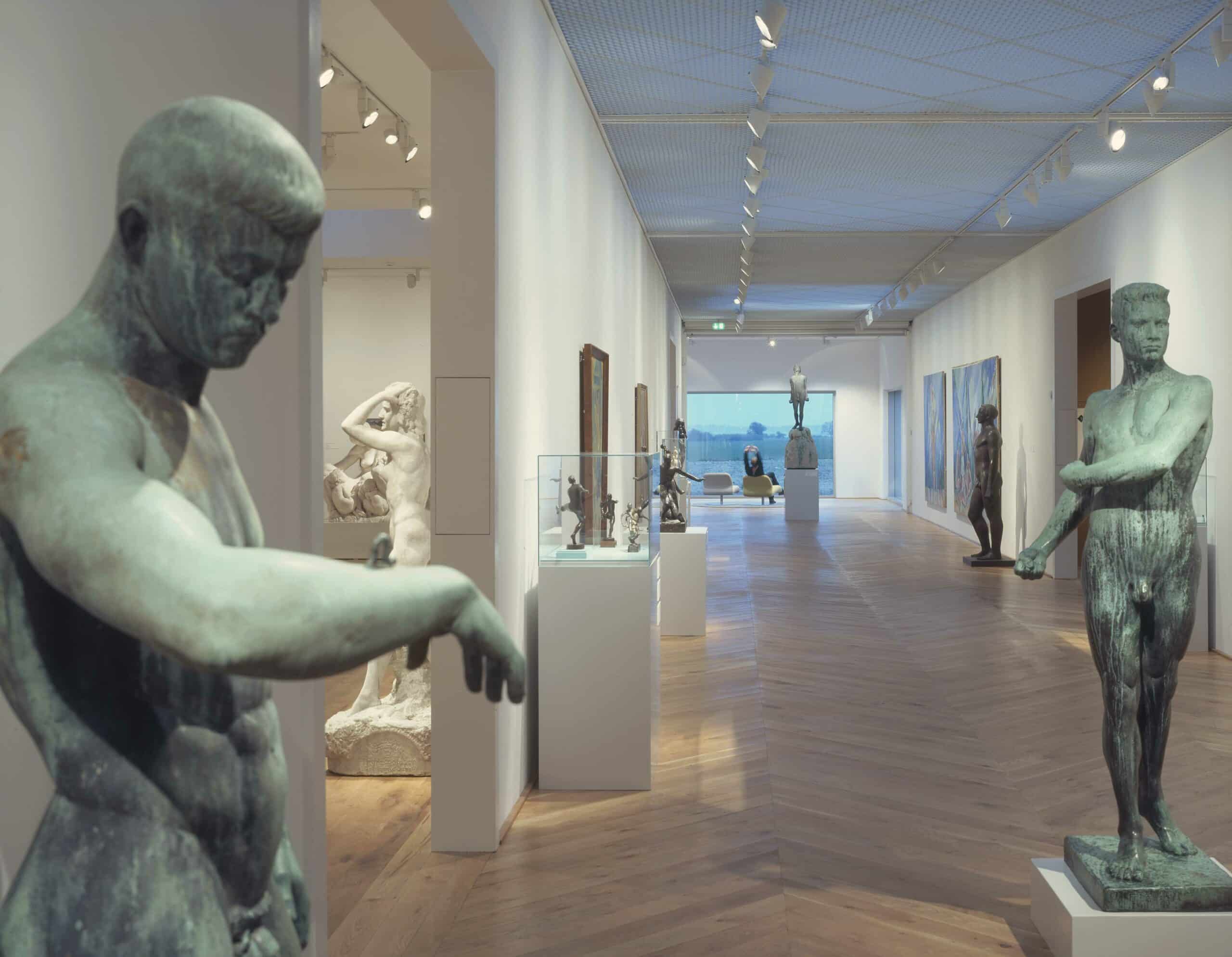
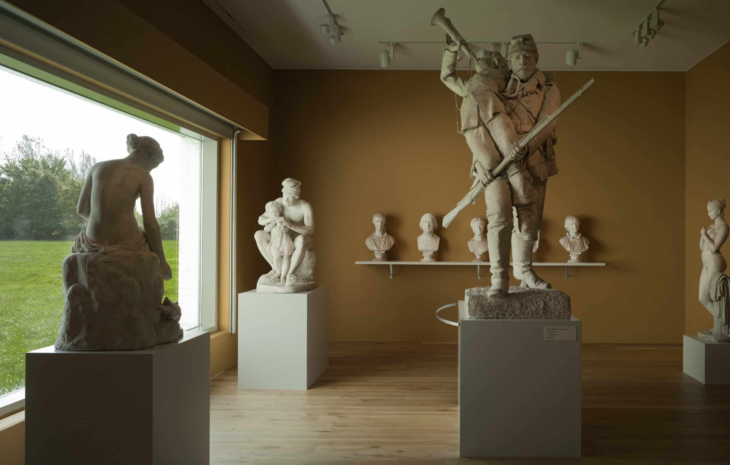
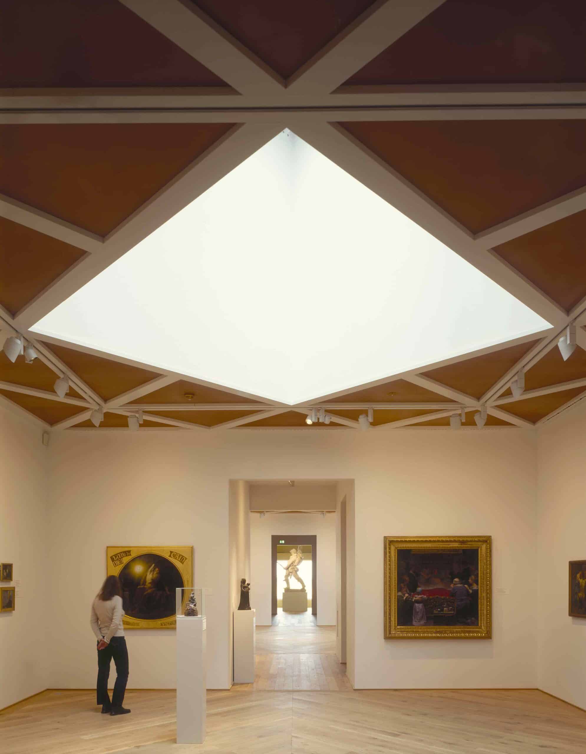
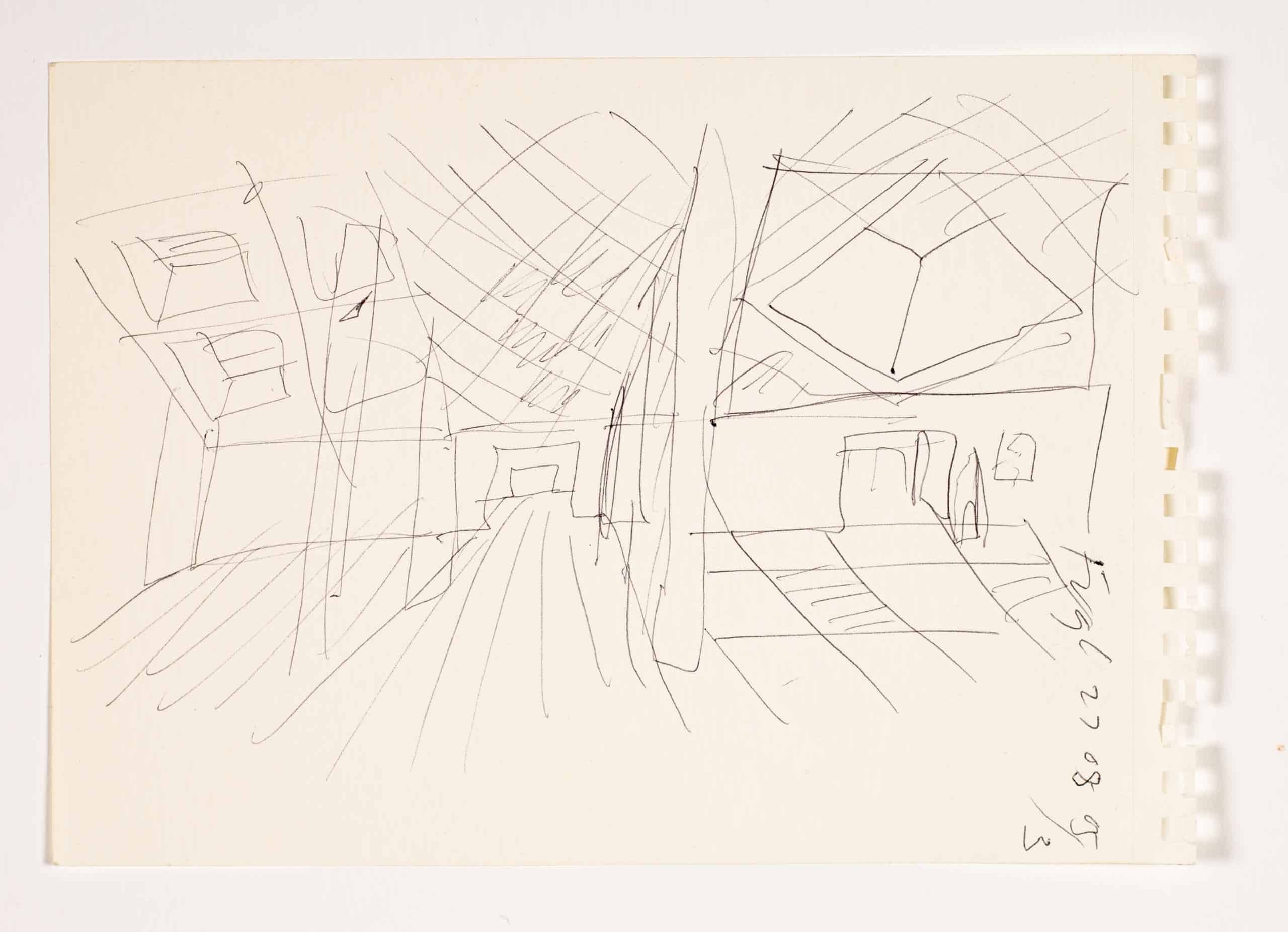
To the left of the central gallery is the temporary exhibition space, which is minimally detailed, abstract and reconfigurable. Daylight comes into this tall space through a ceiling of open metal grids. Further along on this side is a similarly scaled, plainly detailed space for the modernist collection, divided by removable partitions and with visible roof lights. Across the central gallery the spaces for historical paintings, works on paper and plaster casts are configured as a suite of decorated rooms arranged enfilade with pocket spaces concealed between them. In the first three rooms the diagonal roof lights seen above the façade provide changing daylight onto the floor while the paintings are artificially lit to conservation levels. The rooms that follow are also artificially lit for works on paper and they open to a gallery for plaster casts at the end of the sequence that is lit by a window looking out to the fields.
Although designed specifically for the collection the galleries are accepting of different configurations. The museum frequently rehangs the permanent collection and extends temporary exhibitions into its spaces and the central gallery, allowing significant travelling exhibitions to be accepted that attract a much wider audience. For curators and exhibiting artists the immediacy of the central gallery and its connectedness to nature and life events have proved very stimulating. Each group of galleries has a subtly distinct character that is related in style to the others. Wide oak flooring extends through the galleries and is arranged linearly in the temporary exhibition and modernist spaces and in changing chevron patterns, like large parquet in the central gallery and rooms for historical art. The metal ceiling grid of the temporary exhibition space is used again in the central gallery where it is rotated to form a diamond pattern that is repeated at a different scale in the decorated plaster ceilings of the rooms for historical art.
Our intentions were for changes of daylight, detail and form to act at the periphery of a viewer’s attention and provide stimulating backgrounds for art, and for the architecture of the building and its interiors to have an undefined familiarity and openness of meaning that let them be the imaginative property of curators, artists and visitors. At a broader scale the loss and recovery of the landscape, sky and sea brings underlying qualities of the locale into the quiet, top lit exhibition space, pointing to humankind interdependence with other life forms and the validity of the agricultural fields, made by centuries of labour, as a cultural artefact like the art in the museum.
I would like to thank Founding Director of Fuglsang Anne Højer Petersen for her role in the development of our architectural design and her invaluable contributions to this article.
