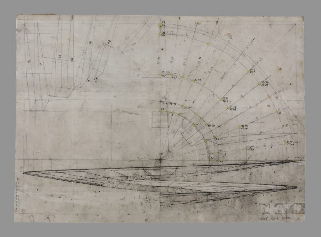
In his drawings for the Sin Centre, Michael Webb constantly returns to the parts of the project that are to do with movement – the undulant mechanical escalators and the complex vehicle system through which cars enter and flow through the building on ramps that loop around, cross over and intertwine with one another. The four drawings shown here are studies of these. The first two are beautiful elevational drawings that examine the morphology of the ramp arrangement. One delineates its geometry as it spirals through one and a quarter turns; the other, a montage, then pulls this apart to show how the elements of the continuous system interlock to choreograph the movement of cars. As the curves are banked, the top surface becomes visible in the drawing, a dark tone marked with the graphic punctuation of parking bays. Webb likened the ramps to aircraft wings, made of an aluminium frame construction, tapering to a thin edge, and deflecting under the force of the vehicles racing on top.
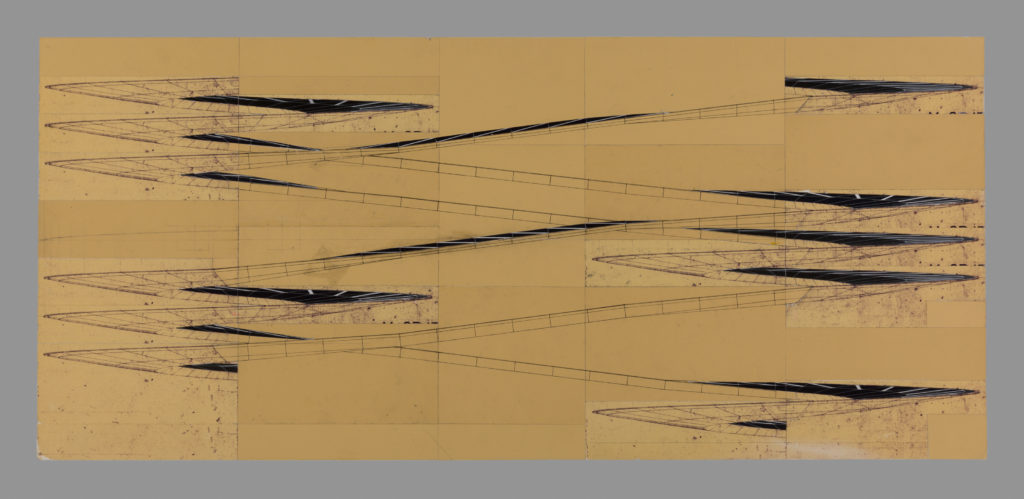
Despite the interest in movement, there is not the same kind of preoccupation with the mobility of architectural elements here as there is in the Fun Palace of Joan Littlewood and Cedric Price, to which the Sin Centre is often related. In the Sin Centre, movement instead is conceptualised in relation to a dynamic observer whose motion confers a violent animation upon the building. Webb imagined, he wrote, encountering the architecture at speed, ‘the sense of having the building spin around you as you negotiated corners; of entering it; of being absorbed by it’, and in a recent interview commented on his regret not to have drawn a section projected from the centre line of the ramp. To do this would be, in effect, to turn the car into a kind of drawing device, to translate the experiences of driving and drawing onto one another – for not only would space at the zones of the opened coils become compressed and intensified, as it is for the driver when the vehicle spins around, but the unfolding of the ramp would produce a redistribution of the parts of the building, causing them to appear multiple times within the drawing.
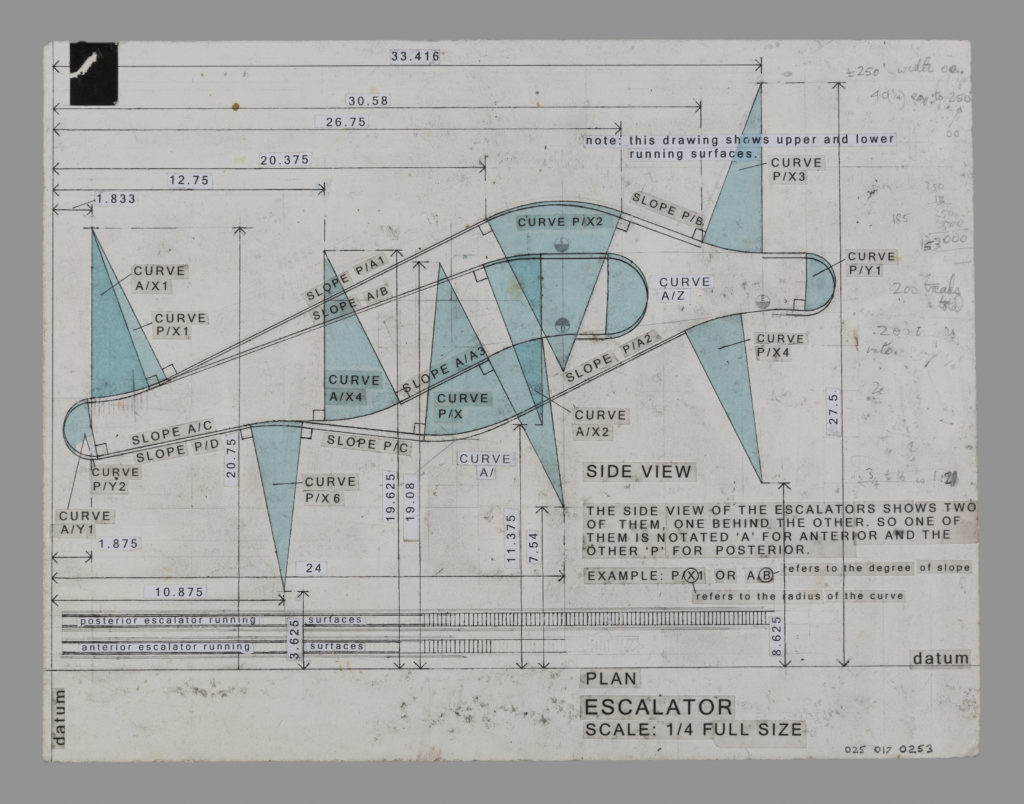
The other pair of studies show the escalator arrangement, in which two devices run parallel to one another, each taking their users on a sinuous fairground-like ride. Webb’s idea here is that the escalator treads become arranged as a fully accessible loop, rather like a horizontally orientated paternoster lift. To do this he has to think of a way of keeping the upper surface of the moving treads to the top after they loop around the terminal curves. As shown in the last drawing, he imagines this through the crossing over of the guide rails at the side, so that the treads turn 180° around a vertical axis. As we see in Webb’s sketch, it’s as if the rails on either side are trails left by the wingtips of an aeroplane that, turning through a vertical arc while climbing upwards, completes a half roll so that the cockpit comes out on top.
Michael Webb
– Mark Dorrian
In his drawings for the Sin Centre, Michael Webb constantly returns to the parts of the project that are to do with movement – the undulant mechanical escalators and the complex vehicle system through which cars enter and flow through the building on ramps that loop around, cross over and intertwine with one another. The four drawings shown here are studies of these. The first two are beautiful elevational drawings that examine the morphology of the ramp arrangement. One delineates its geometry as it spirals through one and a quarter turns; the other, a montage, then pulls this apart to show how the elements of the continuous system interlock to choreograph the movement of cars. As the curves are banked, the top surface becomes visible in the drawing, a dark tone marked with the graphic punctuation of parking bays. Webb likened the ramps to aircraft wings, made of an aluminium frame construction, tapering to a thin edge, and deflecting under the force of the vehicles racing on top.
Despite the interest in movement, there is not the same kind of preoccupation with the mobility of architectural elements here as there is in the Fun Palace of Joan Littlewood and Cedric Price, to which the Sin Centre is often related. In the Sin Centre, movement instead is conceptualised in relation to a dynamic observer whose motion confers a violent animation upon the building. Webb imagined, he wrote, encountering the architecture at speed, ‘the sense of having the building spin around you as you negotiated corners; of entering it; of being absorbed by it’, and in a recent interview commented on his regret not to have drawn a section projected from the centre line of the ramp. To do this would be, in effect, to turn the car into a kind of drawing device, to translate the experiences of driving and drawing onto one another – for not only would space at the zones of the opened coils become compressed and intensified, as it is for the driver when the vehicle spins around, but the unfolding of the ramp would produce a redistribution of the parts of the building, causing them to appear multiple times within the drawing.
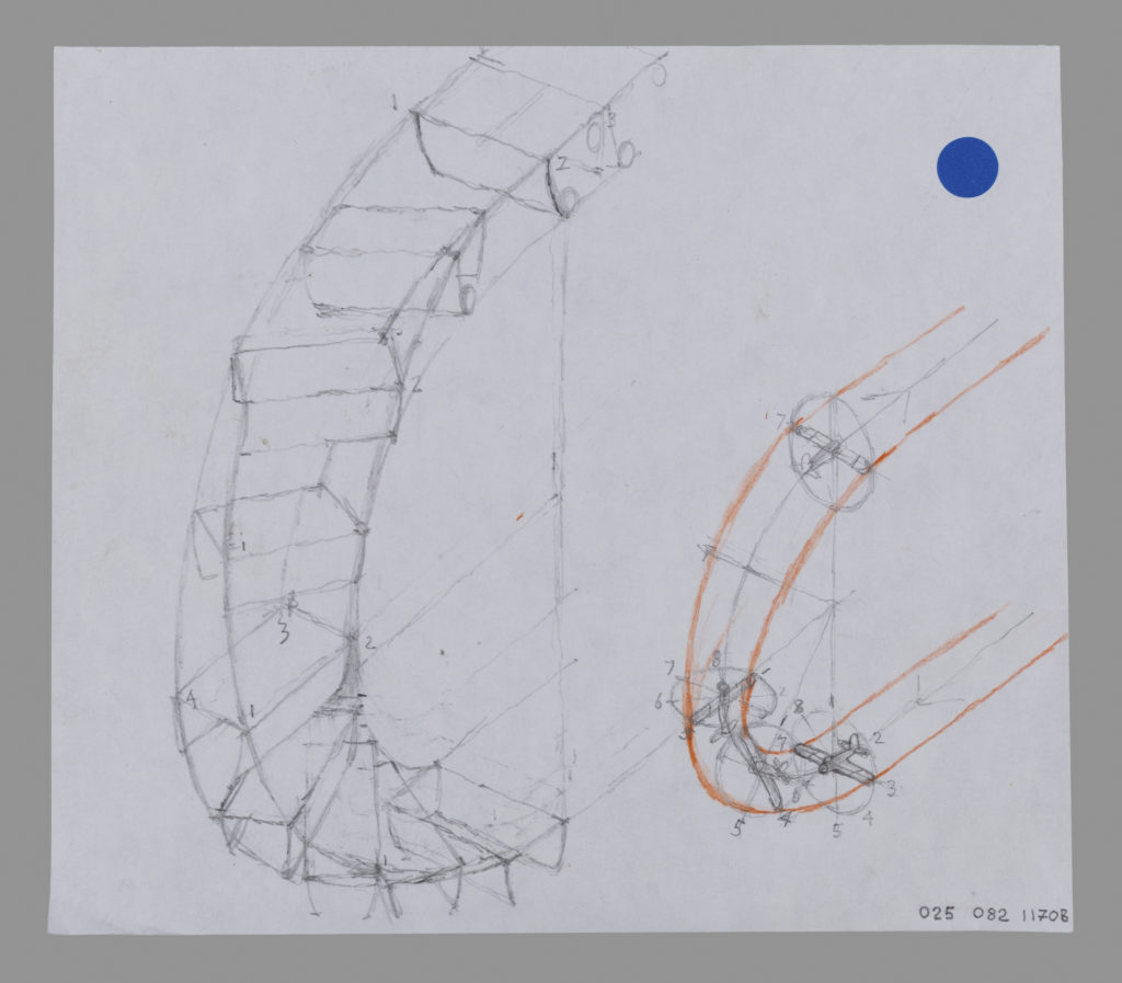
The other pair of studies show the escalator arrangement, in which two devices run parallel to one another, each taking their users on a sinuous fairground-like ride. Webb’s idea here is that the escalator treads become arranged as a fully accessible loop, rather like a horizontally orientated paternoster lift. To do this he has to think of a way of keeping the upper surface of the moving treads to the top after they loop around the terminal curves. As shown in the last drawing, he imagines this through the crossing over of the guide rails at the side, so that the treads turn 180° around a vertical axis. As we see in Webb’s sketch, it’s as if the rails on either side are trails left by the wingtips of an aeroplane that, turning through a vertical arc while climbing upwards, completes a half roll so that the cockpit comes out on top.
Related...
Alternative Histories: Havana architectuur on Michael Webb
Drawing, Movement and Medium: Mark Dorrian in conversation with Michael Webb, Episode 3
– Mark Dorrian and Michael Webb
A Chevrolet Truck
– Stephen Bayley
Category
design methodologies drawing histories drawing techniques & materials commentaries, rants & reflections Drawing Matter archive: research & collecting
Period
c20th
Architect
Michael Webb
Medium
collage drawing print
Tags
elevation student work civic & municipal health & leisure DMC sketch section