Exhibition Design: Charging the Void
Last year at Cornell University, five students in Alessandra Cianchetta’s design studio Global Artscapes worked on designs for a gallery in the valley at Shatwell. For this, they used photographs and videos in default of a site visit. The brief was for an exhibition space to accommodate the display of up to fifty architectural drawings from the Drawing Matter collection. Each student then curated a virtual exhibition for their gallery that was loosely organised around the theme of public space and its representation. Films made by the five students (Basil Harb, Erin Huang, Sarah Tien, Abigail Calva, and Claire Oster) can be viewed here.
In the weeks since term ended, Claire Oster has been developing and adapting her exhibition space around a selection of drawings made for her by Nicholas Olsberg. Titled ‘Charging the Void’, the drawings speculate on the preoccupation of post-war architects with the spaces in between buildings. Below are Claire’s representations of the exhibition accompanied by a reflection on her process.
The process of curating a selection of Drawing Matter drawings for the speculative exhibition ‘Charging the Void’, as well as designating their groupings and placement, began with an in-depth discussion about the concept of the charged void (a concept borrowed from the Smithsons). It then moved towards identifying what we came to see as the three main types of voids, each charged by Emptiness and Contemplation, Geometry and Communication between them, and Action. From there, we selected works that were the strongest examples of the themes and showed the widest range of drawing types and materials.
In the design of the gallery, the flexibility of the movable walls is used to create a specific and strategic orientation that prioritises a non-linear progression through the body of work and free circulation through the exhibition.
This break from a single or orchestrated directional flow moved the focus onto the relationships and conversations between the drawings. It takes inspiration from Herbert Bayer’s exhibition design for Bauhaus: 1919-1928 at MoMA in the late 1930s, a design precedent that also emphasises this approach. The exhibition’s clever use of floor markings to creatively guide movement sparked interest in the ways floor markings can be used to highlight themes and connections between works rather than for navigational purposes.
A series of iterations led to the use of coloured lines. Each coloured line running across the floor indicates one of the three themes and directly calls attention to pre-conceived conversations between the works on the walls. The lines also run across the walls to delineate connections between the works that were presented side by side.
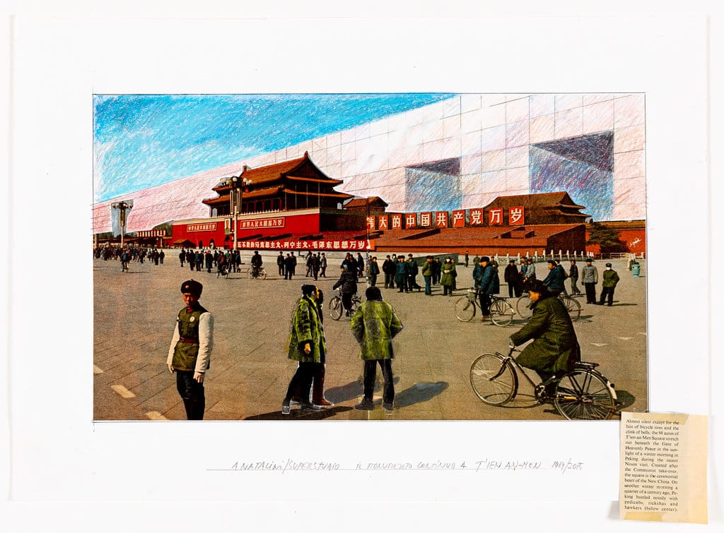
The lines are meant to be read as clear, curated connections that prompt new associations, from modes of representation to politics both within and outside of the identified themes. The work is seemingly arranged in a random, non-identifiable order, but dialogues begin to appear and ask more questions about what ‘the charged void’ is: for example, the placement of Carlos Diniz’s drawings of the U.S. Embassy in Moscow across from those of Stuperstudio’s Continuous Monument at T-ien An-Men Square.
While looking to create a free-flowing organisation removed from pre-determined circulation, however, two of the walls closest to the entrance of the gallery are purposely positioned in a way that creates an entrance vestibule. The wall to the left states the themes and their connection to the lines on the wall and the floor in clear language. On the other side of a doorway on that same wall is OMA’s collage ‘Exodus, or the Voluntary Prisoners of Architecture’, which is identified as a piece whose void was charged by all three themes and therefore stands as a great opener to the show. The other wall on the right lightly encloses the entrance vestibule and faces the entrance. Hanging on it are works from each theme that are prominent examples, engaging and informing visitors before they continue into the gallery.