Hans Hollein’s Immunological City
Hans Hollein’s city structures look awry to someone familiar with his retail work. In the time that these drawings were made, Hollein completed his UC Berkeley degree, travelled across the USA, and did an exhibition with Walter Pichler in Austria. His most influential visit was to the Native American pueblos. It wasn’t long before he made proposals of his own for this sort of a city, with ideas much more radical than alternate city planning proposals coming out of the CIAM (Congrès Internationaux d’Architecture Moderne). Grounded in practicality, the CIAM played within technological limits whilst Hollein broke away from this restriction to reinvent the city – as chunks and assemblages isolated within vast swathes of open fields or deserts. These structures complemented the Transformations series which Hollein worked on simultaneously. Reyner Banham pointed out that his cut out image of the USS Forrestal was an assemblage of an airport, ship, housing, power plant, and a mobile communications centre at once. [1] It was this mixture of function that became implicit within Hollein’s city structures. Whilst the Transformations series remained a testing ground for the idea of machines embedded in open landscape, the matured forms of those structures are seen here in his subterranean city drawings.
The materiality of these structures emerging from the ground, made of the ground, shows the presence of man in shaping the environment; something that Hollein would later show succinctly at the MANtransFORMS exhibition at the Cooper Hewitt Museum, in the form of a tree trunk converted to a timber beam at the top. In contrast to the shiny metals and ionic column resemblance of the Retti facade, his sketch comprises irregular chunks of earthen materials, abandoning this precedent.
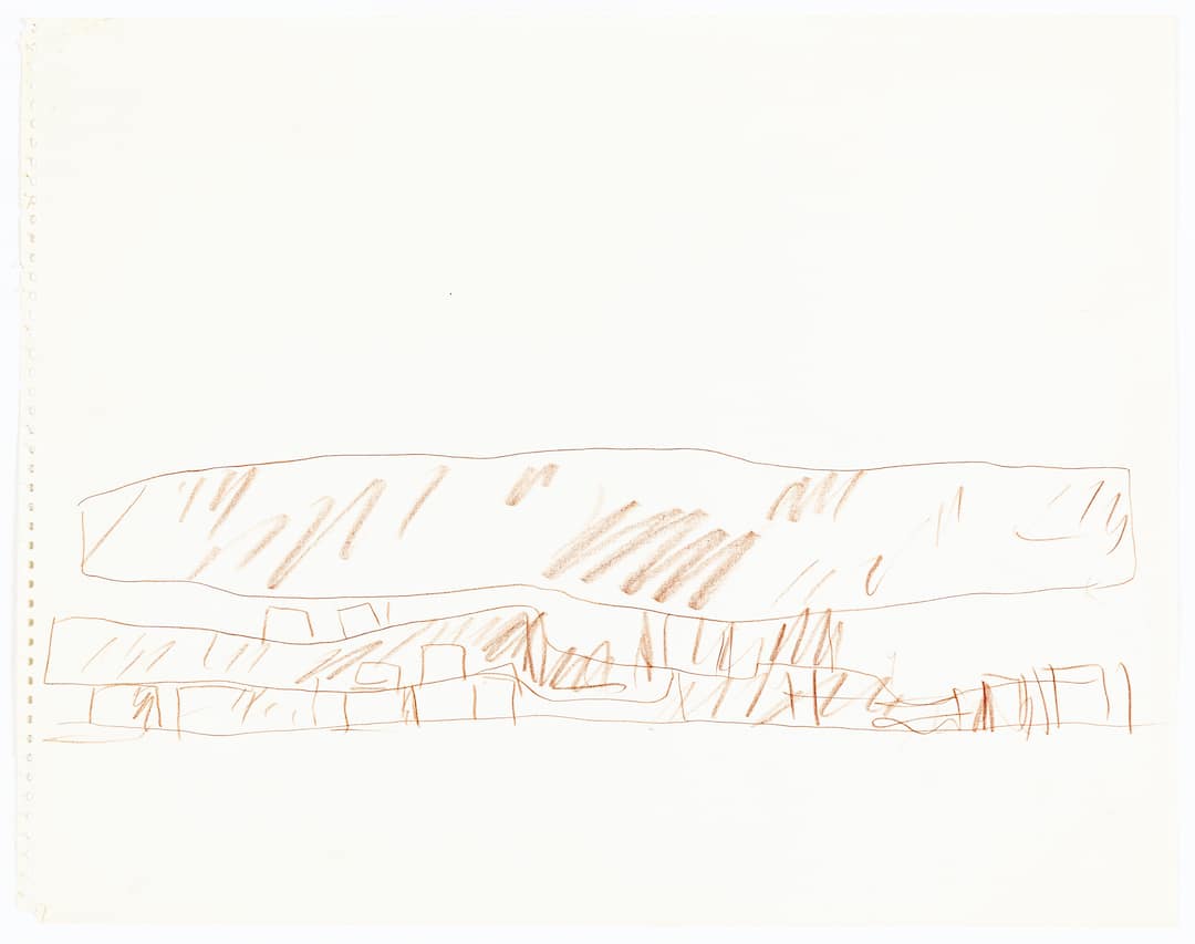
At the liberty of reading this drawing as a proposal for a new city, opposed to a documentation of the Cliff palace, there is clear correspondence with Jeffrey Kipnis’ categorisation of InFormation, ‘…to form a collecting graft, usually by encasing disparate formal and programmatic elements within a neutral modernist monolith.’ The hovering rock is not exclusively meant to emulate nature, neither some postmodern manifesto, but is a cut in between the two; the evocative mass stands above the city, occupying the deep poche of natural formations and the flat roof of modernist sensibility. In Aircraft Carrier City in Landscape (1964), Hollein’s InFormation is apparent: the cantilevering runway roof of the USS Forrestal becomes the modernist slab under which the city looks inward. The implosion of design at Retti and in the Aircraft Carrier is the same as the city structures, with a change in materiality.
Hollein’s call for architecture to be sacral, pure and functionless was not only a call to remove the preconceptions heavily laid on by classicism – and subsequently by modernism’s demands on buildings as smooth functioning machines and economic temples – but also a return to groundedness. Unlike Archigram, Hollein and Pichler buried down into the ground. This return, which Corbusier’s five points had essentially discarded from the practice of the avant-garde, particularly with pilotis, was revived in the most radical manner and came back at the much larger scale of the city.
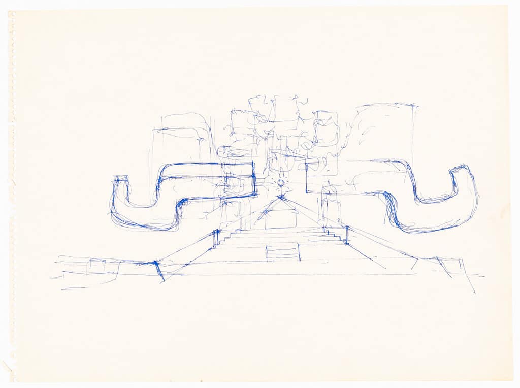
The City Communication Interchange building reflects this idea, with forms that were deliberately provoking with respect to modernism by being unconventional and symmetrical. The going ‘back’ into the ground at this scale would require the most neoteric of technologies. The sketch’s fibreglass dome [below] stands as a point of revelation for this inherent technology required for the construction of this city: an invention that wasn’t available to the modernists, is now to be used on top of the deceptive structure whose materiality evades the advanced global city civilisations in which the dome is conceived. The Communication Interchange building similarly subverts its transmitting and outward function with opacity and not with wired transparent metaphors of progress and permeability. Hidden in Hollein’s structures is a critique of the burst of globalisation itself. The globalising tendency came at the cost of the city. ‘The contemporary city is less walls and towers than a monstrous communication machine…’ reads differently in light of such an interpretation. The hollow wire structures or the radiating globalisation of the glass buildings is muted in favour of these opaque forms.
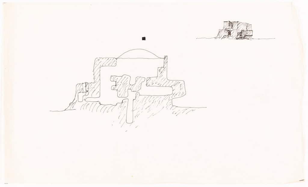
Not only is going inside the ground an atavistic gesture, but it also serves an immunisation function birthing the identity of the new city. In many ways this is one of the most traditional designs by Hollein. ‘Architecture is control of bodily heat – protective shelter’: this primary function which the Viennese suggested was only one dimension of the field, nevertheless remains a historically critical one, also seen in other proposals such as the mobile office. Here, the space is an isolated environment where the architectural skin becomes the placental companion supplying the immunity. This idea was further abstracted in the Non-Physical Environment (1967) where a red and blue capsule is stuck onto a page reading the title.
The theme of enclosure inside the pneumatic self-sustaining structure and underneath the mass of rock is what Peter Sloterdijk calls the ‘interpersonal endosphere’. A contradictory political stance seems to dawn on the drawing here. The formation of the roof and the thick poche, is the precise moment when the globalising instinct is questioned by the architect. This point would stand in ironic opposition with the contemporary scenario were it not for the Communication Interchange buildings. Those structures are the tension points between the exploded macrosphere of the West and the potent immunised endospheres of the Native American people. The subterranean urge here creates a politically charged poche where the outward force of global communication and of open market economic macrosphere was countered and filtered by the immovable structures with characteristic heaviness. This seeming paradox between the three drawings is in fact a state of equilibrium for Sloterdijk: ‘One could define cities as compromises between the surrealism of free-floating self-reference [Noah’s ark] and the pragmatism of groundedness. Cities and states developed their triumphant improbability from the merging of these mutually counteractive motifs; they gained their history-making power by combining the two to form a morphological machinery’. [2]
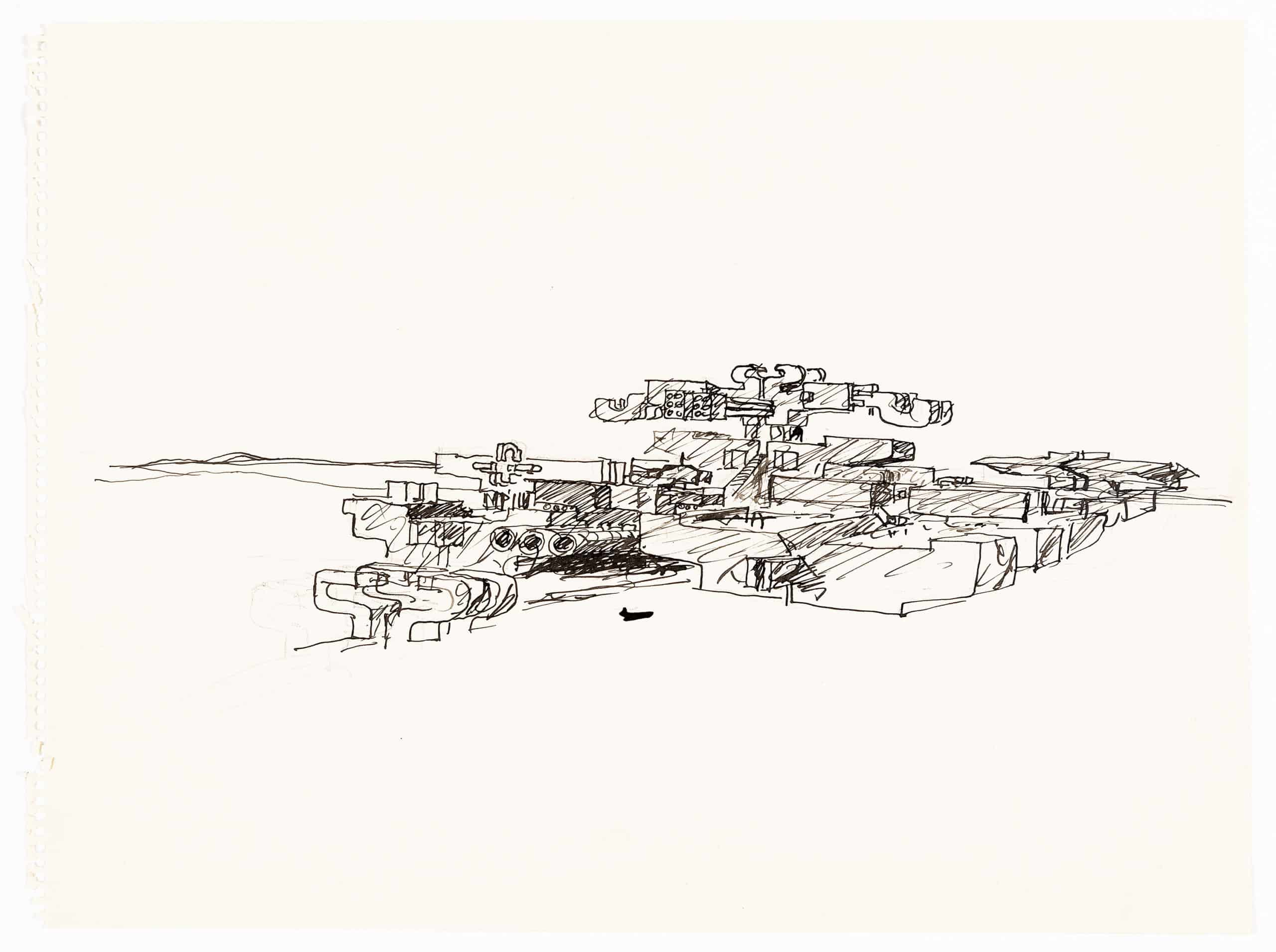
The space between the roof and the houses below becomes the space of utmost historical criticality. The detaching of the traditional roof form from the house and animating the spherical immunological function of the city in a hovering mass is an ideation in literality that postmodernism strove to achieve. Pichler’s TV-helmet (1967) is of note here, because of the rawest form of architecture it produces. The cocooned inside becomes an echo chamber of the projection of architectural activity. The pneumatic structure of the mobile office, the non-physical environment and the imagined subterranean cities become this reversion to enclosure that modernity wanted to eliminate. Perhaps that is why the conditioned environment in the subterranean structure with a fibreglass dome does not have windows.
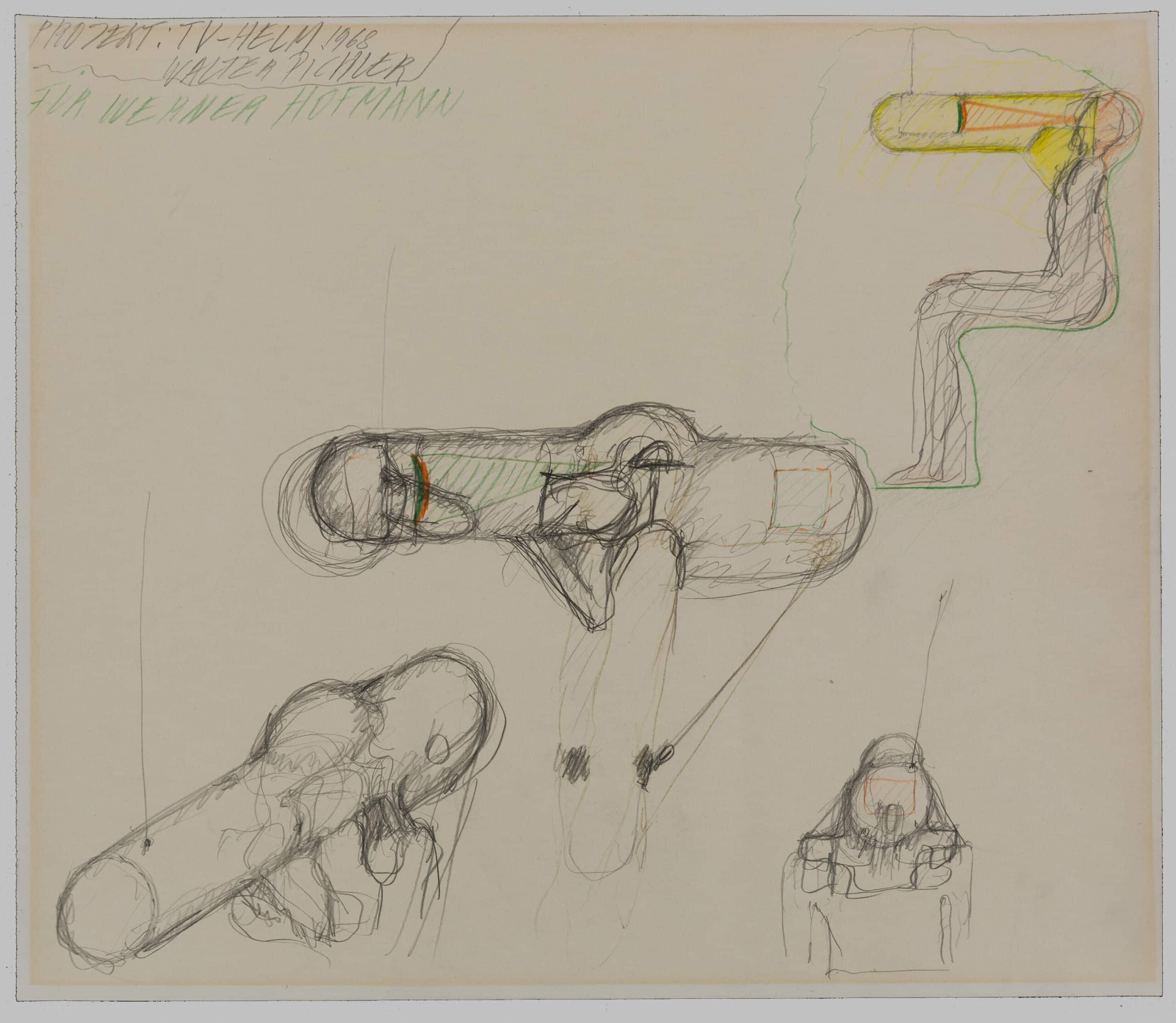
Hollein writes ‘The enormous technical constructions necessary to make these cities function, themselves contain a latent monumentality, and it is the task of architects to discover it and bring it forth’. Here the monumental third space, between the inside and outside, is not revealed with exposed materials, polished pipes, or the high tech aesthetic, but rather through the drawing itself. The ancient technologically devoid poche of the pueblos is being emulated. The third space has to be brought forth in the mind of the eccentric viewer (architect) by the sheer irony of such a heavy construction, coated in earthen material in the age of high spanning bridges, tensile structures, efficiency of Fuller’s domes and the pneumatics of later Hollein himself.
Thus the élan of Alles Ist Architektur was not so much to absorb the domain of the outside into architecture or to expand the technical and ontological categories of architecture, rather it was a strategic homogenisation of the city world into architecture, into one Architecture. As Mark Wigley writes, echoing Sloterdijk ‘All architecture becomes interior design.’ [3]
Notes
- Craig Buckley, Graphic Assembly: Montage, Media, and Experimental Architecture in the 1960s ( Minneapolis, 2019).
- Peter Sloterdijk, Spheres Volume II: Macrospherology, Globes (Cambridge: MA, 2014).
- Mark Wigley, ‘Whatever Happened to Total Design?’, Harvard Design Magazine, Issue No. 5: Design Arts and Architecture, 1998.
Dhruv Mehta (mehtadhruv.com) is an architect, furniture designer and an M.Arch II candidate at the Harvard GSD, currently based out of Ahmedabad, India.
This text was entered into the 2020 Drawing Matter Writing Prize. Click here to read the winning texts and more writing that was particularly enjoyed by the prize judges.
