Stirling & Gowan: The Isle of Wight House
– James Gowan, J. M. Richards, Laurent Stalder, James Stirling and Ellis Woodman
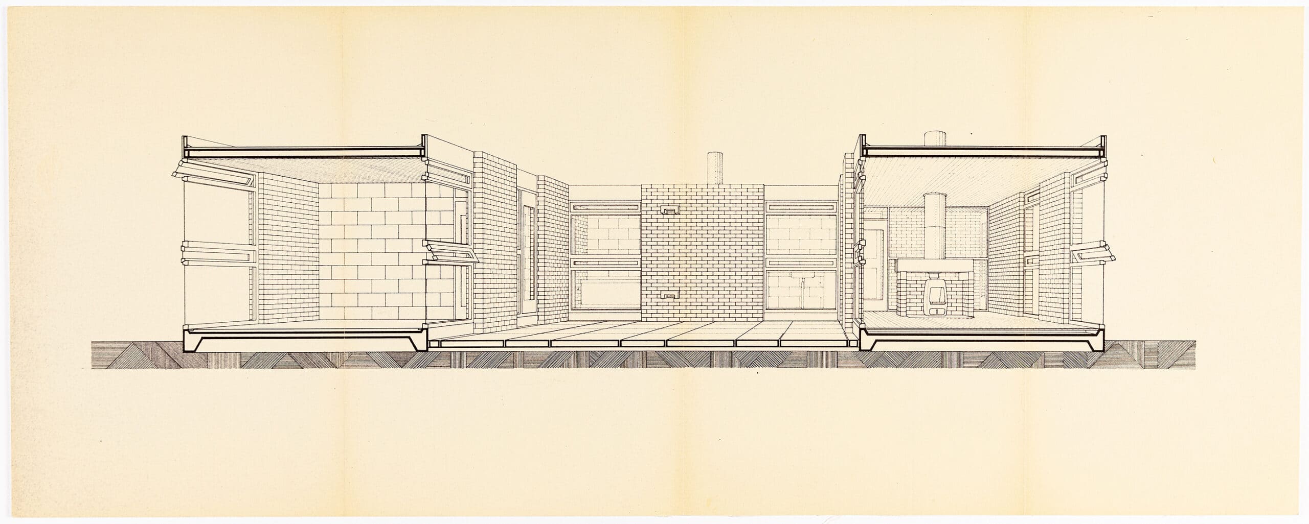
This first impetus for this article was provided by Laurent Stalder’s discussion of the sectional perspective drawing for the Isle of Wight house, reproduced here, which led us to J. M. Richards’ seminal essay, and then onward through the literature. In addition, we asked the Deutsches Architekturmuseum and the Canadian Centre for Architecture for copies of any material they held relating to the project, and are grateful for their collaboration; it turned out that Stirling and Gowan had each retained in their personal archives the same rather limited documentation of it.
Taken together, the article contains much of the documentation – including the architects’ own extensive photography – for an important early project by Gowan (although sometimes attributed instead to Stirling or to the pair together), and begun before the partnership turned its attention to the Ham Common flats, for which it offers many clues in terms of the approach to drawing, the design process and the built language itself.

J.M. Richards, The Architects’ Journal, 24 July 1958
This is the first time I have discussed a house in this series of articles, and it is a little surprising that it should be on this occasion that I find myself confronted by a design strictly based on the principles of modular planning. The design reflects what some people may feel is a doctrinaire insistence that every element in the plan must conform to a mathematically consistent grid. I say it surprising, because a house is the one type of building in which every space – that is, every room – serves a different purpose and demands a different size and shape. Therefore one would expect it to lend itself far less well to modular planning than a type of building requiring frequent repetition of the same unit. On the other hand I suppose it could be argued that buildings with rooms of assorted sizes are the very ones that need the overall discipline which reference to a single module imposes, in order to give the plan coherence.
You can take your choice; and I should now say that I am not objecting to this highly schematic approach to planning. One must judge by results and I find this a very charming little house. What I would like to be sure of is whether its charms are due to the architects’ interest in modular design endowing it with some inevitability of form and proportion, or whether they have been achieved in spite of this. But before going into the question any further I must try briefly to define what the schematic basis of the design consists of.
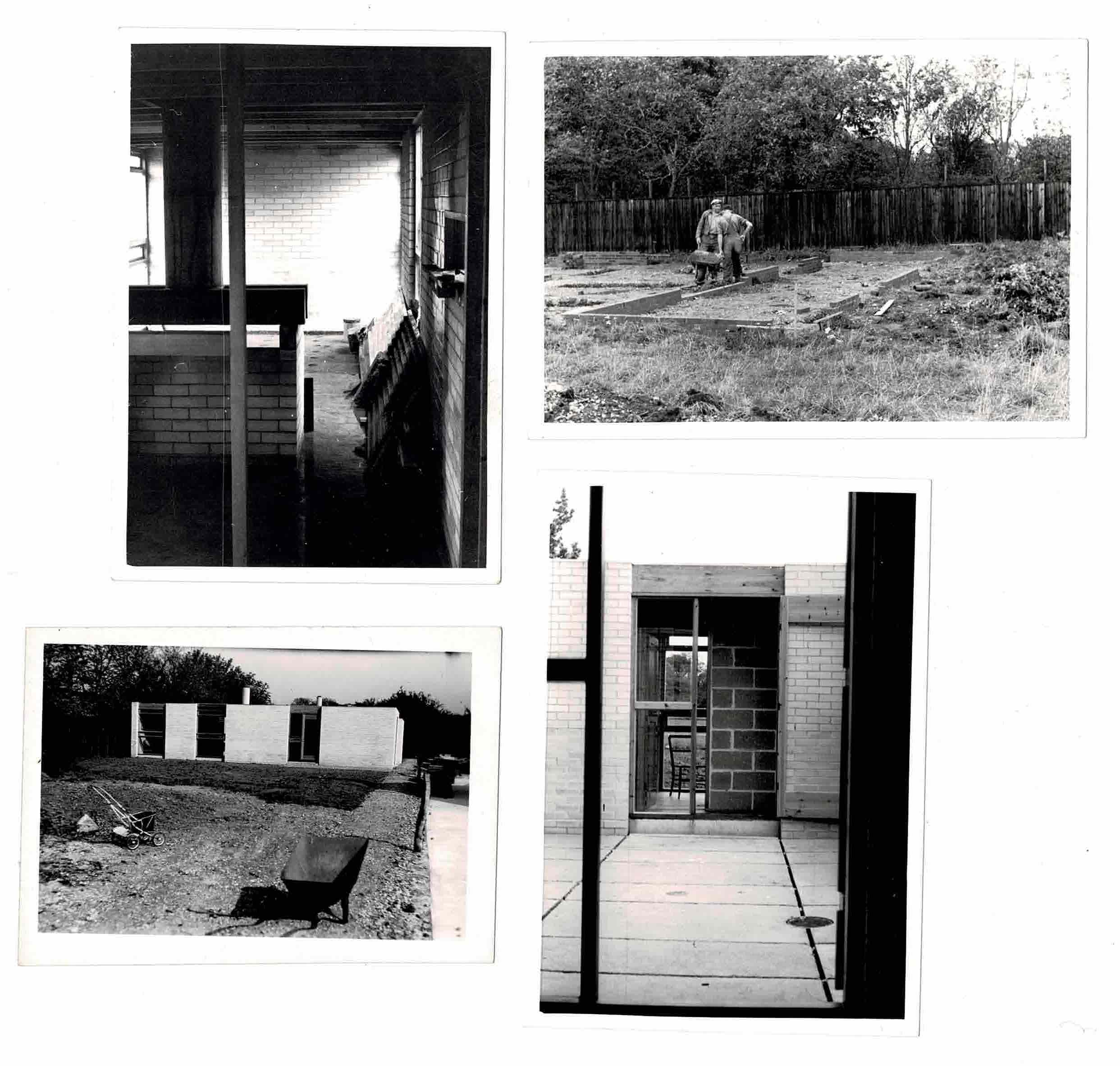
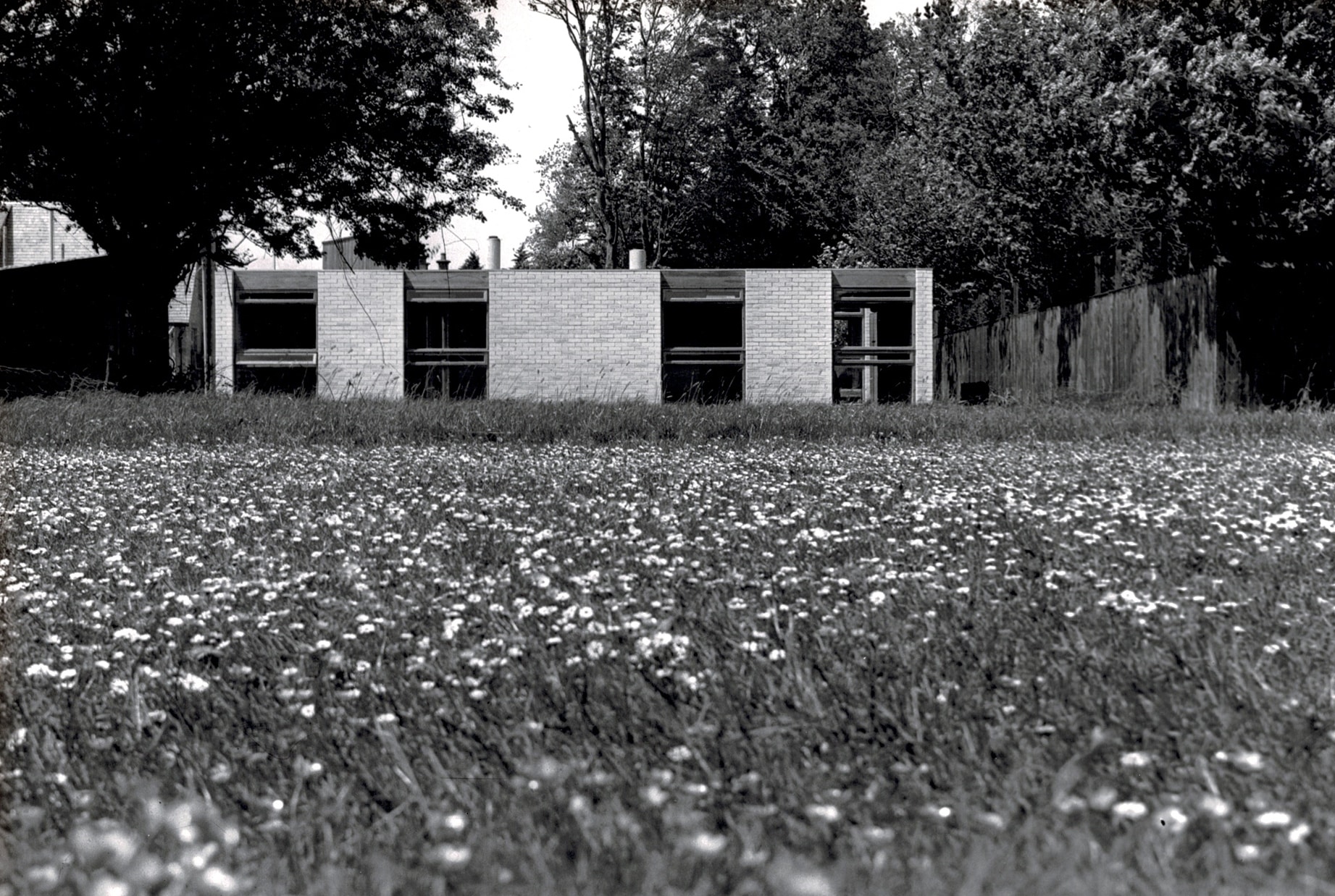
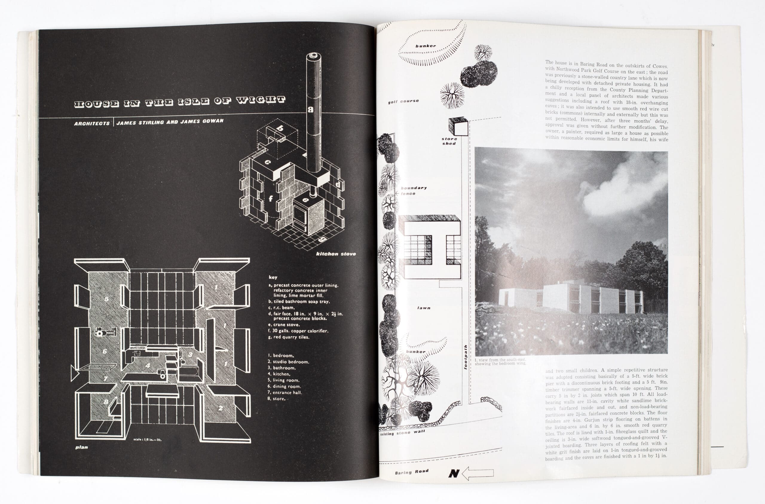
The house is of one storey only, laid out on a 10-ft. grid. Its plan is the shape of a capital H, with the living-room, the entrance-hall and a store-room occupying one long wing, the bedrooms and a small studio occupying another wing parallel to it, and with these two wings connected by a shorter one containing kitchen, bathroom and a corridor. This short wing divides the space between the two long wings into two paved courtyards, one twice the width of the other.

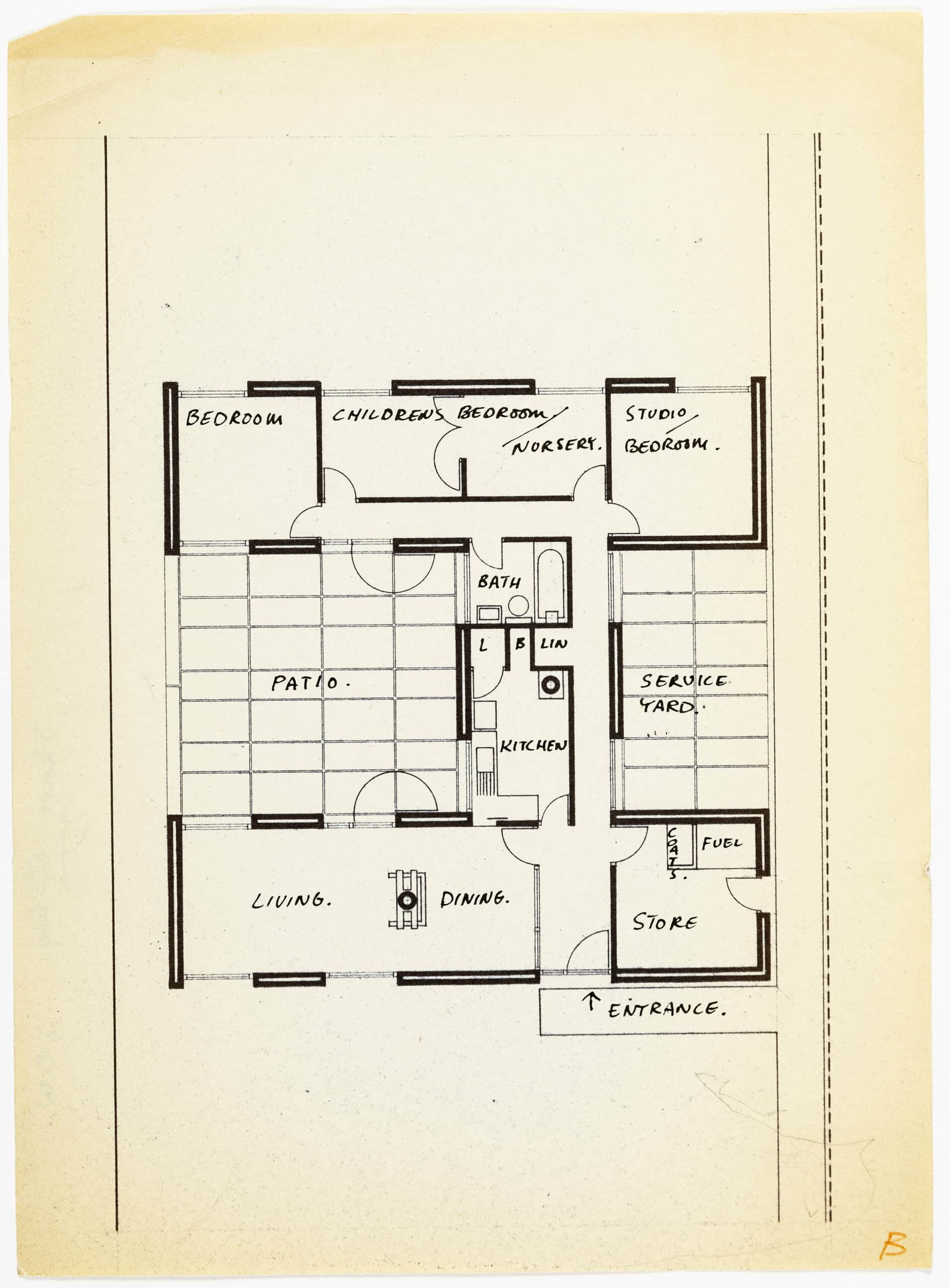
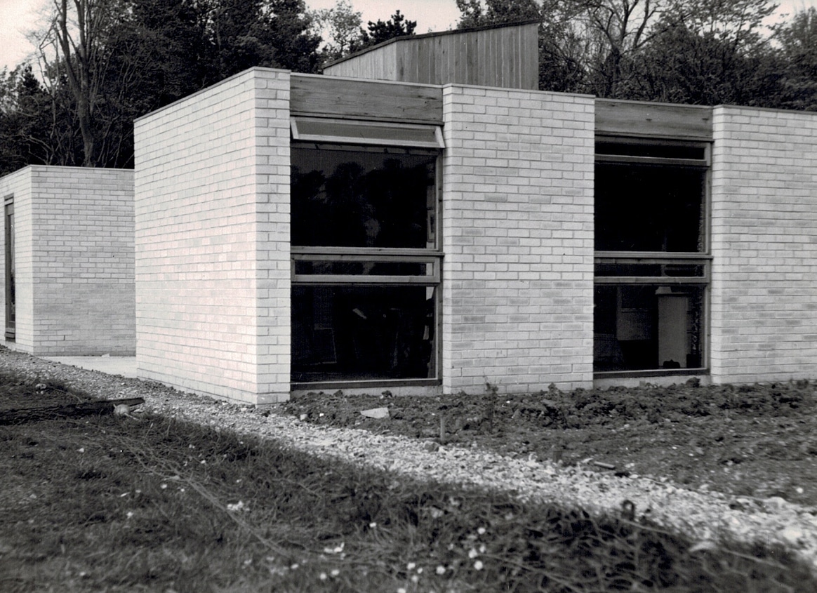
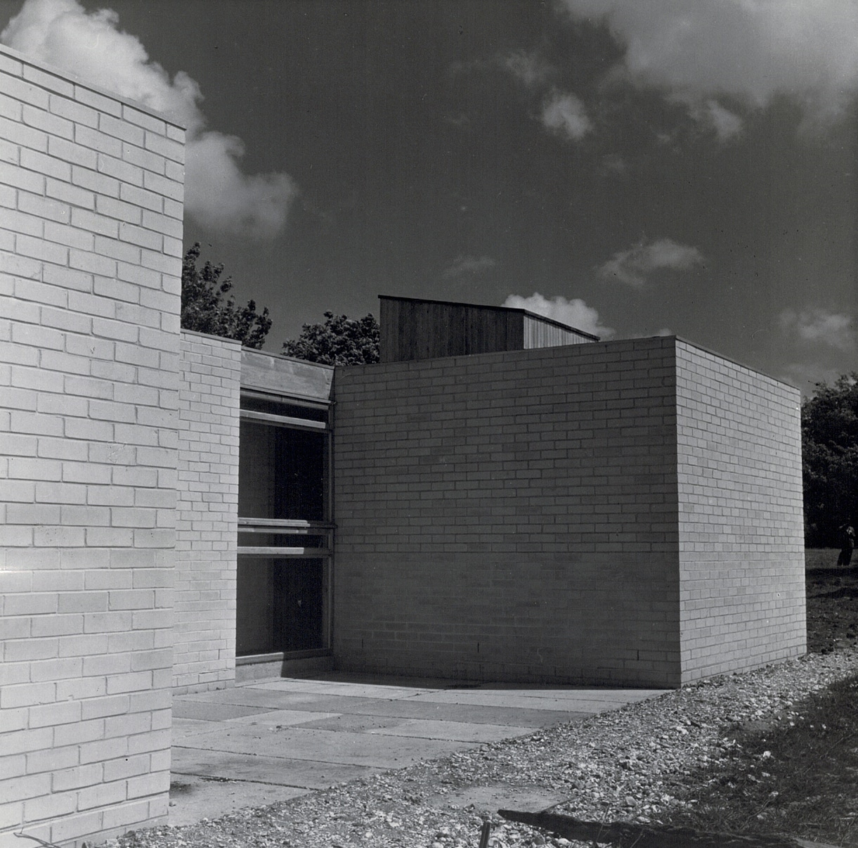
Each wing is 10 ft. wide; the courtyards between them are 20 ft.; the other dimensions of the courtyards, either side of the 10-ft. cross-wing, are 20 ft. and 10 ft. Internally this 10-ft. grid is subdivided into 5-ft. units, every window or door opening throughout the house being 5ft. wide, and the wall areas between windows being either 5 ft. or 10 ft. All other subdivisions of the plan – such as the partitions separating the entrance-hall from the living-room, the bathroom from the kitchen and the bedrooms from each other – conform to this grid, and the corridors are 2 ft. 6 in. wide – half the 5-ft. unit. All finished dimensions are not, of course, exact multiples or subdivisions of 5ft. because the thickness of the wall (11-in. cavity throughout) has to be allowed for, but the principle of modular planning is never departed from. Leaving aside for the moment whatever aesthetic or intellectual satisfactions are obtained from the application of this principle, it can be seen that it has definite practical advantages. The house had to be built very cheaply*, and this must have been greatly helped by the reduction of the structural elements to so few. All windows, throughout the house, are identical (they are of softwood, clear-varnished, with fixed glazing in the large panes and horizontal opening lights across the centre and at the top), and the doors in external walls (front door, side door, and the doors opening from each wing into the larger courtyard) are a slight variation of the same pattern. All external walls are composed of standard lengths of cavity brickwork (on discontinuous footings) of identical height, and there is no spanning over openings by brickwork or concrete lintels. Each window or door opening is spanned by a timber trimmer of standard size. Finally, the whole roof structure consists of 5-in. by 2-in. joists, all spanning 10 ft., covered with boarding and roofing-felt and insulated with glass-fibre quilting.
This is, in fact, in spite of the unorthodox appearance of the house, a brick and timber structure of the most straightforward kind, which is usually the type of structure a small local builder does best; and it is always worth remembering that whether or not it is economical as regards actual cost, an orthodox structure is nearly always economical as regards the builder’s willingness to submit a reasonable tender. How often have ingenious, but novel, money-saving ideas had their purpose defeated by a builder being frightened by their very novelty into putting up his tender in order to be on the safe side.

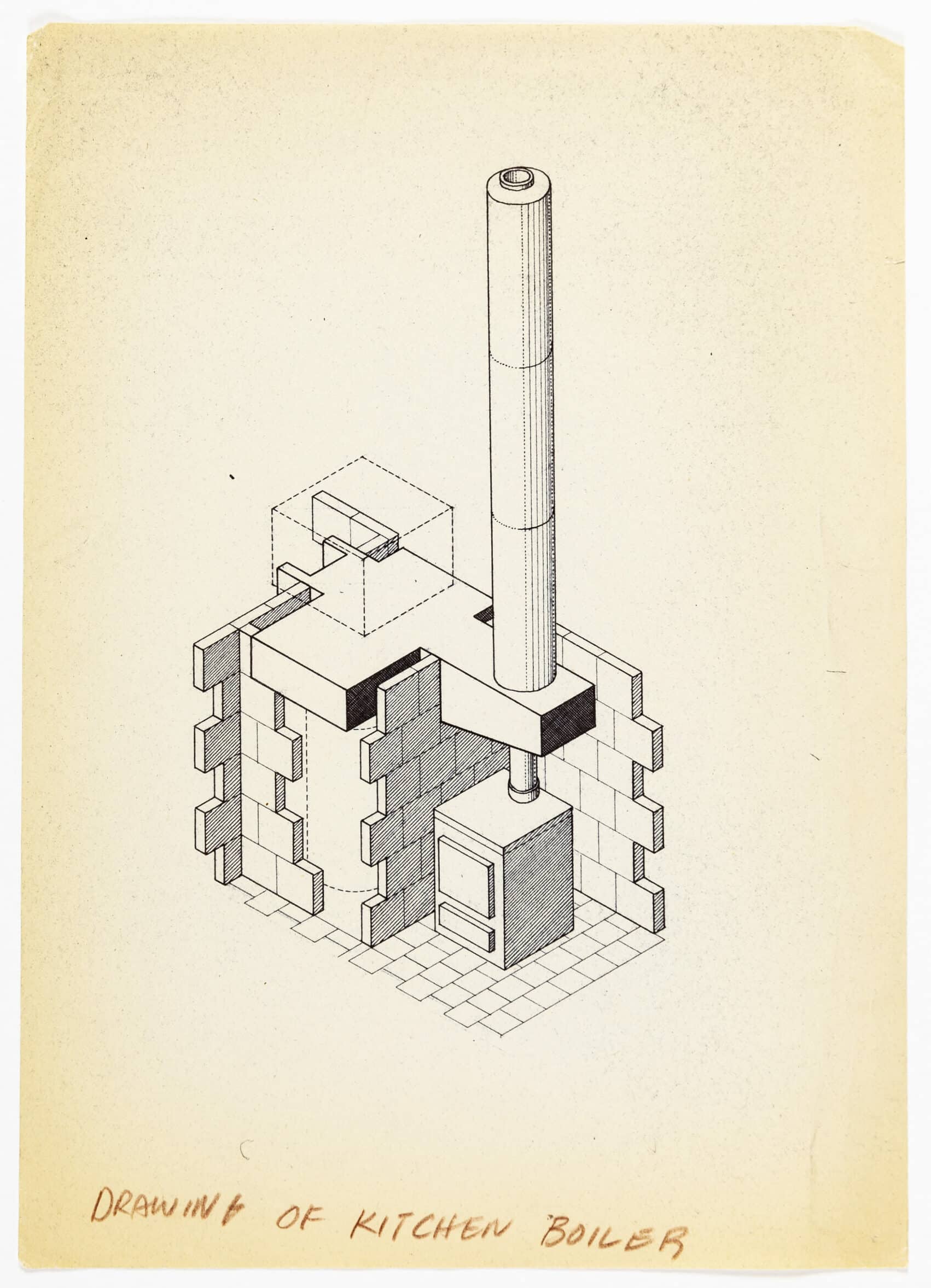
The only unorthodox bits of construction in this house are the fireplaces and flues in the living-room and kitchen, and they are very simple. Both flues are made of precast concrete cylinders. In the sitting-room the flue rests on a concrete beam supported on a brick fireplace surround; in the kitchen it rests on a concrete beam cantilevered from the wall to leave the stove it serves freely accessible. The only other non-standard structural element is a simple timber north-light in the roof of the studio.
There are two interesting things about the expression given to the simple but highly disciplined style of design on which the whole character of the house depends. One is that the elevations are in fact a straightforward projection upwards of the plan; or, to put it another way, the plan is the same at whatever level it is taken: the wall continues upwards as wall and the window as window. Both simply stop when they reach roof-level, with a slim aluminium angle to finish them off. Drawn in elevation the effect of this may seem rather abrupt, but in fact the depth of the window reveal, though only a few inches, gives sufficient modelling to the facade and, when seen in perspective, gives sufficient variety to the roof-line.

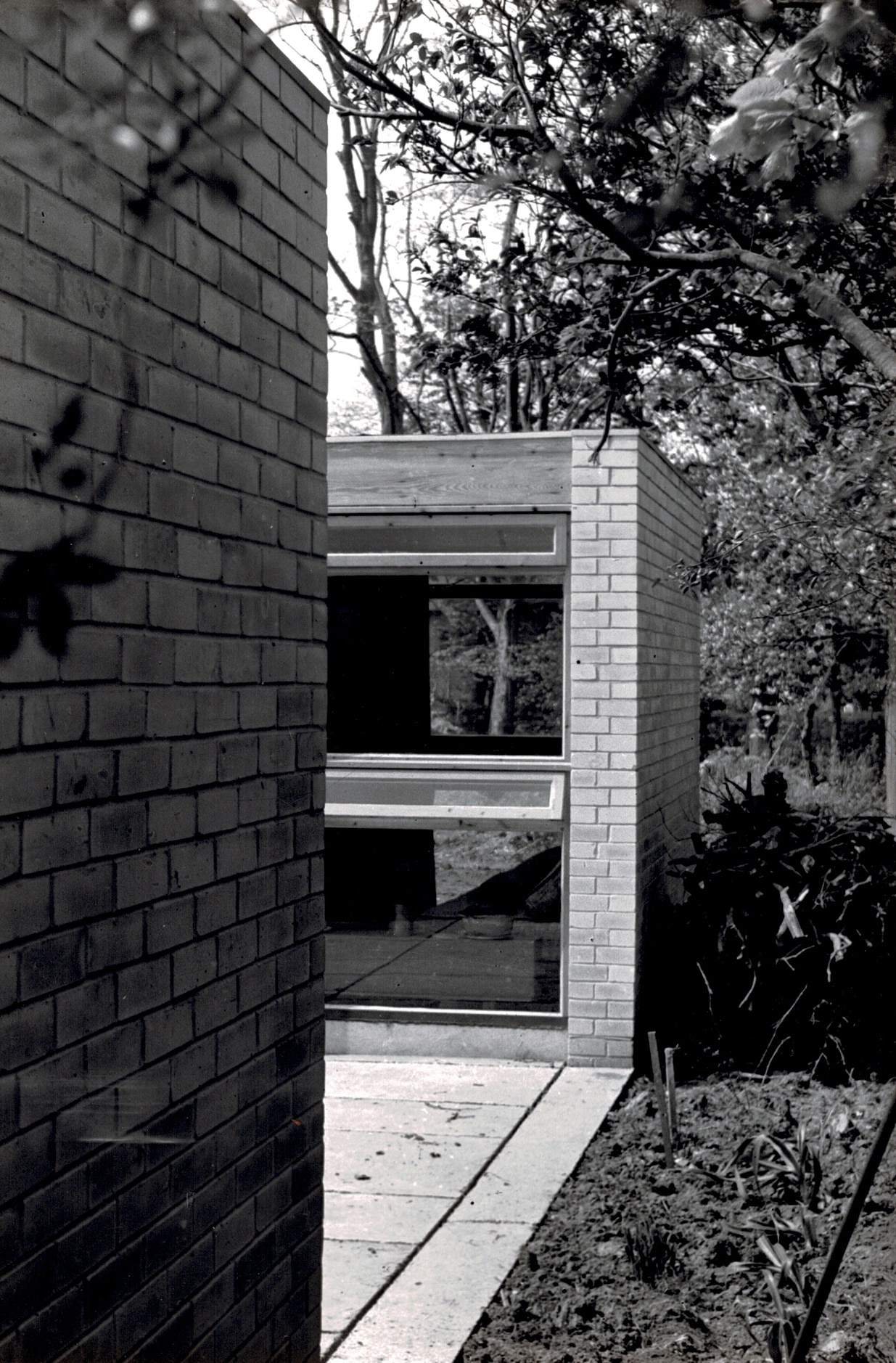
The other interesting point is that the walls are treated identically inside and out. Both brick surfaces are fair-faced; there is no plastering and the windows have the same finishes on both sides. This is not only consistent with the forthrightness of expression that obviously appeals to these architects – the idea of everything being no more and no less than what it seems to be – but it also gives unity to the whole design. When you are in the courtyard you are in a room bounded by walls of white brick interrupted by windows of varnished wood, and only another surface underfoot and the absence of a ceiling differentiates this outdoor room from the indoor rooms surrounding it. There is no distinction between indoor and outdoor finishes. And this is emphasised by the crossviews created everywhere by the schematic nature of the plan. Standing, for example, in one of the bedrooms, you look across the courtyard into the living room through the window that corresponds exactly to your own, and beyond it into the garden through the far window; and standing in the living-room you do the same. There is thus a visual link between front and back gardens.
I should perhaps at this stage say something about the placing of the house on its site. It is on a deep narrow plot, 50 ft. wide, and it fills the whole width all but a passage on either side. It is set some way back from the road behind the building line of the plots next door, which makes it quieter and more secluded and gives a green foreground view to the living-room windows. The bedroom windows have a similar view over a golf-course at the back. The plan-shape of course gives complete seclusion in the main courtyard, and readers looking at the plan may have wondered why this is placed on the north side. South would certainly have been correct, if it had not been for the exigencies of the site. But it happens that the north boundary is well screened by trees; the south is open to the next-door garden. A north-facing courtyard therefore gets much more privacy, and in practice the low roof-line allows plenty of sun to enter it.
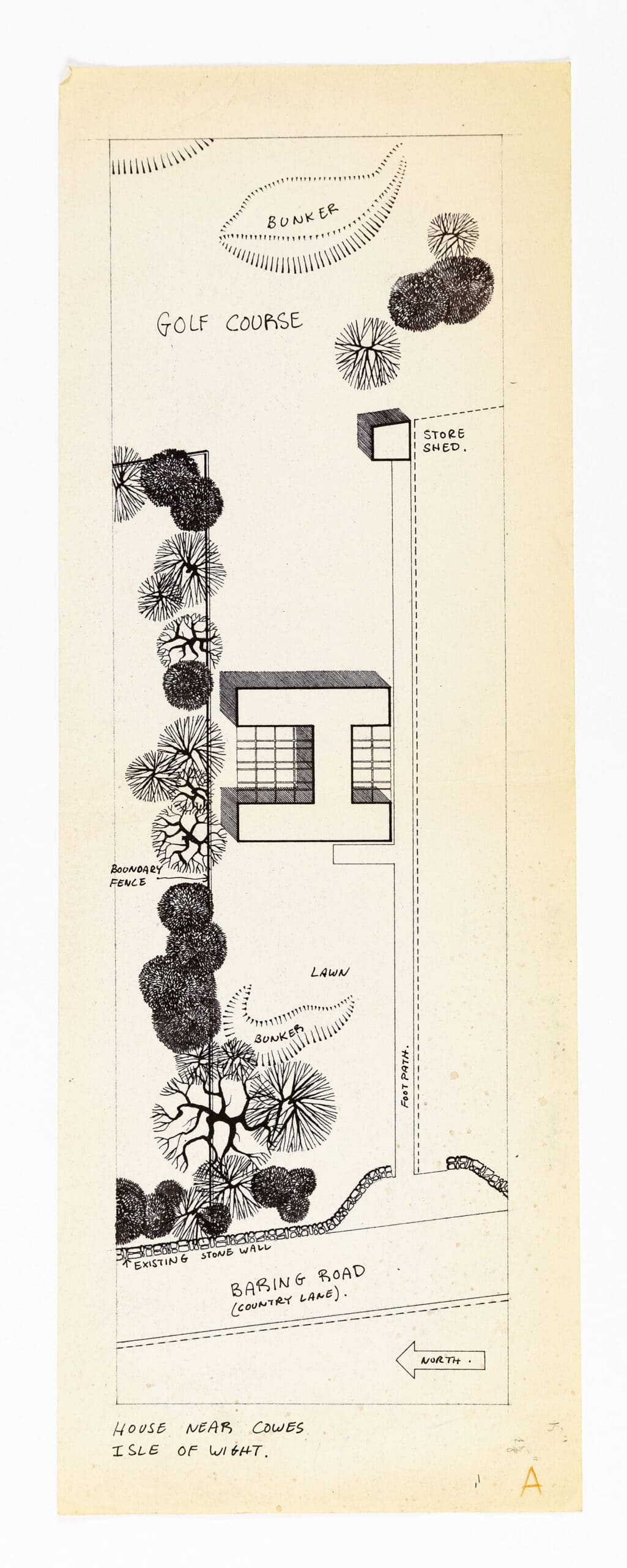
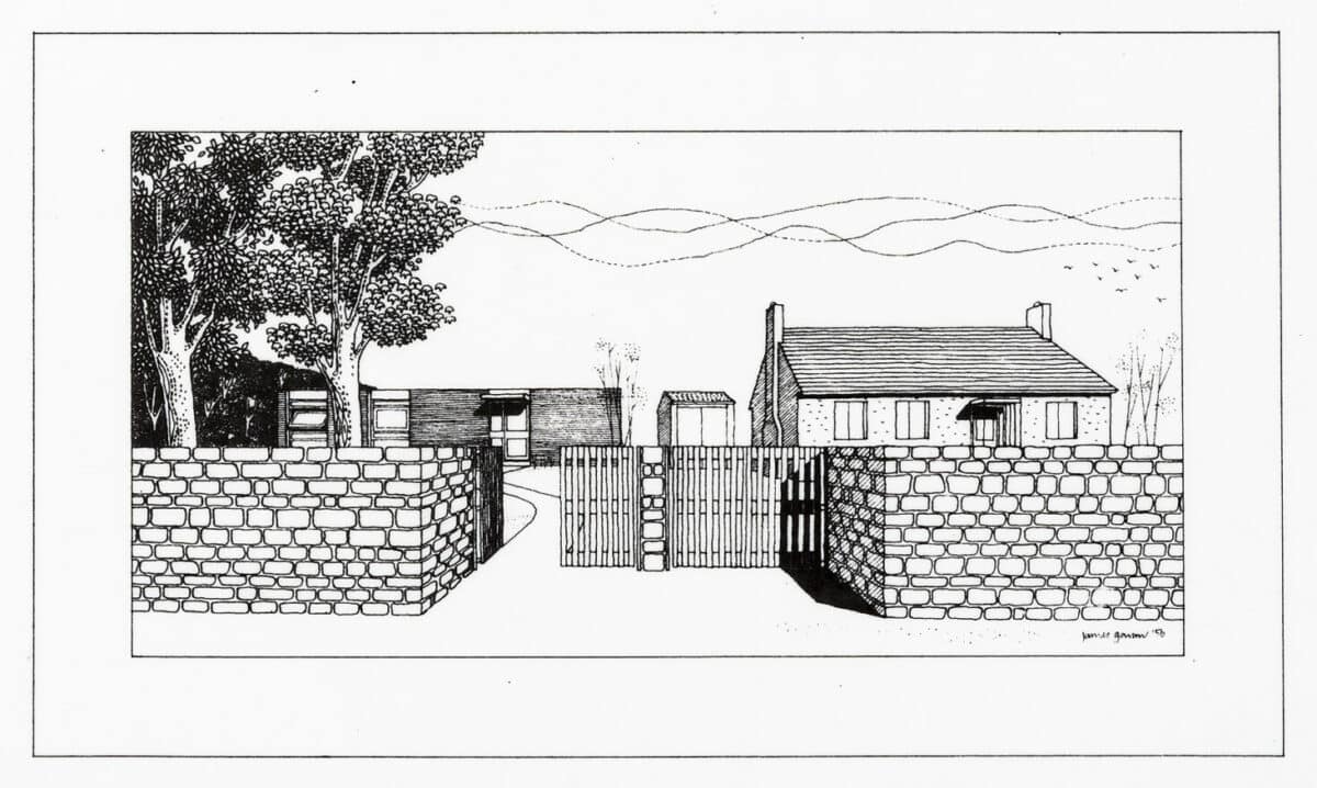
It will have been gathered that this is a suburban area. The road along the short west frontage was until recently a country lane, but it is now being developed in conventional suburban style. The house under discussion, however, perhaps because its outline is so simple, does not stand out too aggressively from among its more orthodox neighbours. Its colouring, moreover – white sand-lime brick and blonde wood – does not draw too much attention to its uncompromising geometry. The architects, I understand, wanted to use a dark red brick but were prevented by the local authority. My personal feeling is that this would have given too much visual emphasis to the vertical subdivision of the facade by insisting on a contrast of tone, and would also have made the interiors rather gloomy. As it is they are fresh and gay, with none of the effect of chilliness the large expanses of glass might have produced, perhaps because of the warm colour of the fairly low boarded ceilings which, running at the same level through the house, serve also to emphasise its geometrical consistency in the horizontal as well as the vertical plane.
I began by questioning the logic of applying modular planning principles, from which this geometrical consistency derives, to a building type so little susceptible to standardisation of room dimensions as a small house, and looking at this plan one has a slight feeling that room shapes may have been forced into the schematic layout – especially the very narrow shape of the living-room. I ought to say, however, that when one is in this room one is not uncomfortably aware of its narrowness, perhaps because of the way the proportions are changed by the use of the fireplace as a partial barrier, dividing it into sitting and dining spaces.
A criticism I am a little more confident in making is that the arrangement of fireplace does not enable it to serve very satisfactorily as the social focus of the room, round which chairs can be grouped. It is not necessary, of course, though it is traditional, that a room’s social focus should be the fireplace; but a sitting-room ought to have something of that sort, and in this room where else can it be? My only other, relatively minor, criticisms of the plan are that the 2 ft. 6 in. corridor is rather cramped and that where it turns the corner by the studio door it is not well lit. Architecture of this kind, where there are no applied surfaces to contribute their own decorative effects, depends for its quality on the fall of light, on proportion and on finishes. The two first are perfectly satisfactory; the last mostly so, a few of the junctions between materials being not perfectly worked out. On the other hand, the architects were wise not to complicate the simplicity of the idea by over subtle detailing. For example it might have been a temptation to give added expression to the nature of the walls as separately articulated vertical slabs, in contrast to the continuous horizontal surfaces of floor and ceiling, by recessing them at top and bottom to encourage the ceiling, as it were, to float with a slight degree of independence. That kind of refinement might be a way to bring out the character of structure more strongly, but to my eye one of the charms of the house is that it gets it effect without adventitious tricks of emphasis.


One need not be too puritanical. I approve of the neat brass ring that finishes the boarded living-room ceiling where the flue of the fireplace passes through it, though logically a plain hole in the boards, feather edges and all, would have been in the spirit in which materials are used elsewhere. On the other hand, I find the fireplace itself, though designed in the same spirit of frankly revealing the elements of structure, a little crude and unwieldy. Perhaps this again is a matter of junctions between materials. One is happy about the abrupt junction between the surrounding brick walls and the floor-boarding because, looking through the windows, one is aware of the way the walls descend to the ground outside and one accepts the logic of the boards butting against them. But the low brick wall surrounding the fireplace appears to rest on, rather than rise through, the boarded floor. This is a subtle – perhaps a pointlessly subtle – distinction, but it is the fascination of this house that leads one on to make such distinctions and to analyse relationships of form and material that are often taken for granted. To say so doesn’t, I’m afraid, answer the question whether this is a purely intellectual fascination: that is, how much or how little one’s appreciation of the intellectual clarity with which the idea of the design has been worked out has to do with the visible qualities of the result.
*As in fact it was. The final cost was £2,800, which is remarkably low for a house of 1,000 sq. ft. enclosed living area, or 1,600 sq. ft. including the courtyards.

The Architects reply… Stirling and Gowan in The Architects’ Journal 31 July 1958
In last week’s Journal J.M. Richards discussed a house near Cowes, on the Isle of Wight, designed by James Stirling and James Gowan. This week we print the architects’ replies to the points made by Mr. Richards.
In reply to J. M. Richards’ critical observations, we would like to say that the design was not based so much on a modular system as he described, but on a very simple structural technique; brick pier, timber trimmer and standard roof joists in conjunction with a series of repetitive window and door elements. Internally, the structural clarity is maintained by using concrete blocks for the non-loadbearing internal partitions.
Of the point ‘one has the slight feeling that room shapes may have been forced into a schematic layout’ and ‘this arrangement of the fireplace does not enable it to serve as the social focus’ the first is true in as much as all the rooms have an integrated order which, however, is flexible enough to permit a reasonable variation of sizes, the plan in fact having five distinct room shapes. The fireplace is located in the centre of the living room, which is the best position for space heating, but its location in a 10 ft. width does limit the number who can sit around it, although it can accommodate this particular family. Of the point ‘the corridor is rather cramped . . . by the studio it is not well lit’ it is fair to say that all the dimensions of non-habitable spaces are an absolute minimum, but we think the corridor is quite well lit by fanlights over the bedroom doors. A formal concept does tend to result in an oversimplification of the problems involved. The requirements of a particular room become secondary to the whole and specialised needs may be subdued to express the ideogram; the achievement of a balance being the architect’s prerogative.
When designing a one-off house for minimum cost (in this case£2,800) in terms of the small builder, any deviation from the most conservative techniques results in a rejection or a higher tender. In effect, one is limited to two materials, brick and timber. The result is a solution essentially based on manual methods, inevitably sub-mechanistic.
Any validity which the house has lies in the relationship of the principal elements and on the issue of the refinement of junctions of materials which J. M. Richards considers we may have been right in disregarding, we now think otherwise. Where timber boarding is laid at right angles to brickwork it appears to run into the walling. Internally, the floor boarding thus appears to support the brickwork and the ceiling to terminate it. This is a visual illusion and occurs in spite of the conclusion being illogical, in fact, the opposite of what usually happens. The remedy may be to curtail the ceiling boarding or to introduce a transitional element so that the brickwork is distinct and primary. In the case of the fireplace, where we agree with J. M. Richards that it appears to float on the floor, we now think that it should have been raised on a concrete hearth. This would also improve the uncertain relationship between the flush hearth tiling and the boarding, which also has the practical disadvantage that washing the tiling removes polish from the flooring.
We are relieved that J. M. Richards found his visit worthwhile even though the occasion was accompanied by a torrential downpour.
James Gowan, March 1978. Published in James Gowan, Style and Configuration (Academy Editions, 1994), 58.
The Isle of Wight house was first published in the Architectural Review of April 1958 and the written description which accompanies it is terse and practical in tone. No mention is made of aesthetic consideration and this is not altogether surprising as a young architect at that time had to couch his offering primarily in economic terms. He was in toe-to-toe competition with the local spec. builder and a proven track record. Budgets were ridiculously low and the client’s requirements limitless.
The Owner, a painter, required as large a house as possible within reasonable economic limits for himself, his wife and two small children. A simple repetitive structure was adopted consisting basically of a 5ft wide brick pier with a discontinuous brick footing and a 5 ft 9in timber trimmer spanning a 5ft wide opening…
William and Gillian Howel are a little more expansive on their Sussex cottage, again presumably for a relative. In Architectural Design June 1955 they say:
The need for extreme economy suggested that the possible materials would inevitably lie within the usual post-war range – bricks, blocks, concrete and unselected softwood. We therefore decided to make a virtue of necessity, and make the house an essay in these materials used in their own right. It seems to us that the bulk of post-war house-building, though engaging this range of materials, has failed to make such use of them, certainly in interiors. In fact every attempt is made to disguise their nature, as something to be ashamed of, with the result that all the surfaces the eye rests on are characterless and might be made of anything (indeed probably are). An attempt is often made to give them an acquired character by means of various decorative devices – wallpaper, ivy, bamboo, etc but this has developed into a stereotype, and is by now as much of a bore as the thing it reacted against.
In the Architect and Building News of December 1959, David Gray extends the conversation further and elaborates on the internal planning arrangements which, in this case, are particularly thoughtful. A sampling of the commentary on his Lowestoft house runs thus:
The first floor is, in effect, a suite for the parents. They have their own large sitting-room which opens on to a south facing balcony, and their bedroom and bathroom. The large landing is fitted with bookshelves and can be used for reading and working. The fireplace has a high hearth so that this area is not dead space, as is usually the case when the fire is not alight, but is useful as a low bench or table all the year round. The plan form has a vertical relationship; by grouping the bedrooms over each other both rooms get morning sunshine and there is no problem of noise.
The farmhouse aesthetic with strong bookish, professional overtones pervades all three interiors, particularly in the kitchens of the Howell and Gray houses where the stoves appear to be set into a conventional fireplace. Our living room fireplace is a free-standing, constructivist version of the Howell model. The Isle of Wight house attaches much importance to proportion and is arranged on an arithmetical sequence with the occasional golden cut whilst the Howell house uses the Corbusian modular for dimensions, though these appear to be centre-line. The dimensional systems expand into the structure with a good deal of display and the clerestory detailing of the Howell and Gray houses could well come from the same office.
If each architect, at the time, thought he was working in isolation, the results suggest otherwise. The three houses have much in common, the wish to topple the blandishments of the spec semi with a more expansive interior arrangement – the large windows do not only pump in light and air but also the life-force. If the cultural values were those of the professional middle class, for a brief time in the 50s, they coalesced into a recognisable style, commonsensical, spartan yet optimistic.


Excerpt from Ellis Woodman’s interviews with James Gowan. Excerpted from Ellis Woodman, Modernity and Reinvention: The Architecture of James Gowan (Black Dog Publishing, 2008).
You start working on Ham Common in 1956. You must also have been working on the house at Cowes on the Isle of Wight at this time.
The previous year I got planning permission for the Isle of Wight House, which was for my wife’s brother. He was an artist and he had bought a site. There was no question of fees; he was doing me a favour. I worked on the details of the house at weekends at home so as not to intrude on office time.
Your concern for proportion comes across strongly in that project. Where did that interest develop from?
The Influential study, then, was Wittkower’s Architectural Principles in the Age of Humanism. That book offered a very convincing backing on proportion. The other influences on this, and on the Schreiber House, are the concrete block houses of Frank Lloyd Wright. Those are set up on a regular grid. There is an illustration in Hitchcock’s book on Wright that you would think was the inside of the Schreiber House.
You mean projects like the Ennis House?
That type of thing but he did plainer ones like the house for a relative in Tulsa [Richard Lloyd Jones Residence, 1929]. Generally, Frank Lloyd Wright didn’t figure in Britain because we were in this poverty stricken period and everyone was looking at low cost solutions. You looked at a lot of his stuff and it was clear that we were not going to be building this sort of thing here.
How does the proportional system work on the Isle of Wight House?
The plan is set up completely ad quadratum. That is the Medieval business, according to Wittkower, where the plan is based on the square. Recently – just to prove to myself that I existed – I’ve done an analysis of the things I have designed throughout my life; most of the buildings are done ad quadratum.
On the Isle of Wight House, the plan is set up on a five by five ft. unit. The section is proportional as well: the floor to ceiling is seven ft. six in.. Each five ft. wide window is divided into two golden sections. Staggering beauty, just with a piece of sheet glass! The slots left over are the little opening vents. Funnily enough, the system appears again in one of the Milan buildings that I did a few years ago. Everything I do seems to be the same, which is a bit awkward really. The Fibonacci system, which Corb made a great fuss about, everyone found just too complex to deal with.

Despite the fact that it is a solo project, Stirling was given a joint credit when the house was published.
We published Ham Common and the Isle of Wight House together, which was to our mutual benefit. Totally unexpectedly J. M. Richards, who was editor of The Architects’ Journal and The Architectural Review, thought the Isle of Wight House was terrific. That was because it was about proportion, simplicity, low cost: all the things that he would use as a model should – in the near future! – he become commissar for the Russian empire in west London.
And what did he make of Ham Common?
Oh, he wasn’t so keen about that but you can’t imagine the amount of publicity we got from Ham Common. Every magazine did it. There were magazines giving us eight pages when it was half built. Of course, there was nothing else happening.


Excerpt from Laurent Stalder, ‘Interior Breakdown’, in Architecture Through Drawing (Lund Humphries, 2020).
… It is difficult to clearly distinguish sectional perspectives from sectional axonometrics. More often than not, they overlap. But by virtue of their cutaway walls and ceilings, or the incorporation of enlarged detailed drawings, sectional axonometrics are most often based on the progression of time. It is no coincidence that a whole series of presentations made between 1940 and 1950 had a ruin-esque dimension similar to the drawings made in the 18th century. By contrast, sectional perspectives depict the interplay between structure and space. Although many record the construction in great detail, this particular aspect is secondary to showing the spatial qualities of the architecture.
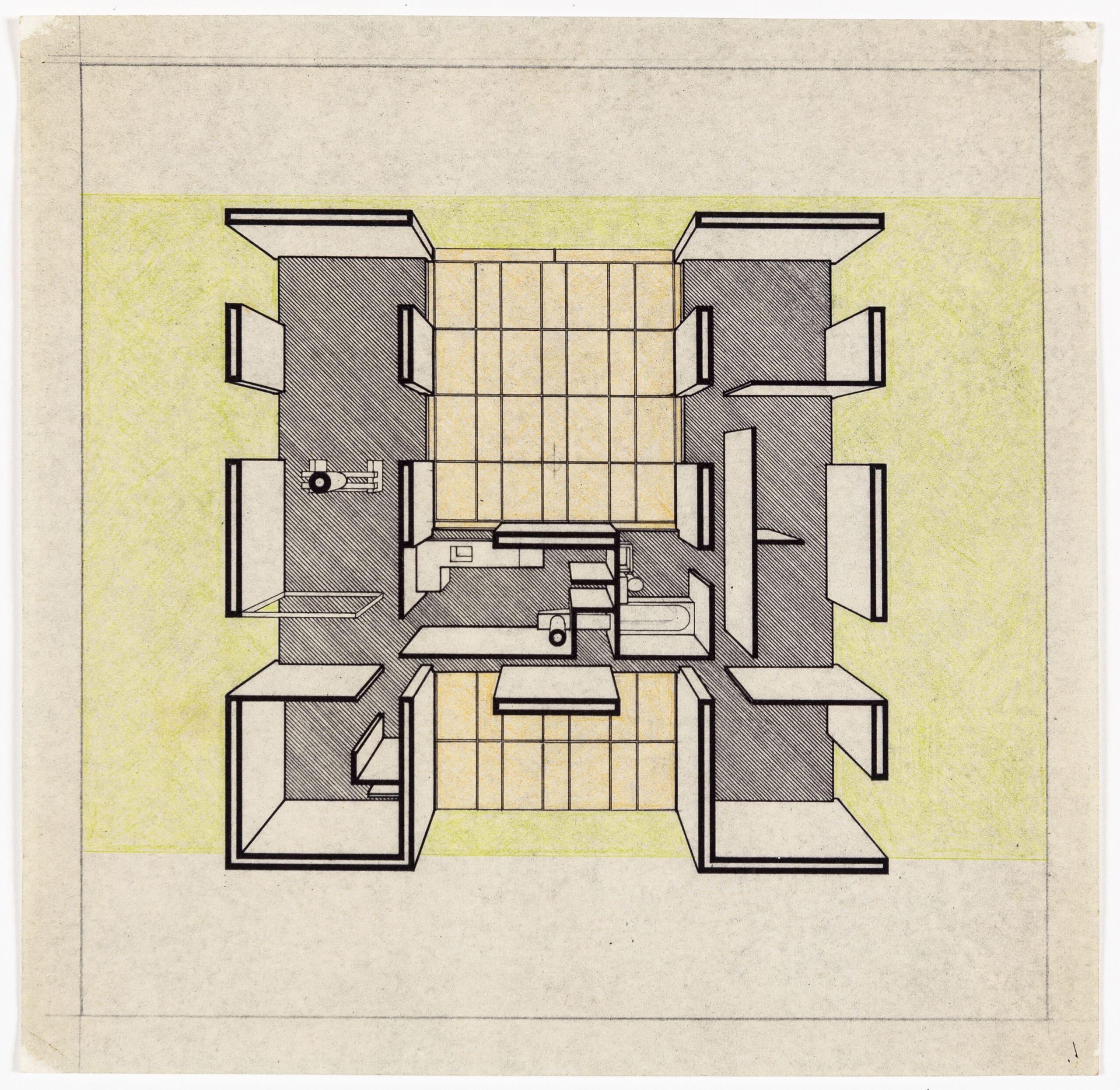
In the case, for example, of the sectional perspectives by Stirling and Gowan – initially for their house on the Isle of Wight (1955–1958) and also for the flats at Ham Common in London – the wall structures are implied but are neither drawn nor described in any detail. The window sections remain schematic, while the vertical sections through the walls completely dispense with any material specification. The goal involved is a different one, as demonstrated by the chosen vanishing point of the perspective. For the Isle of Wight house, this is deliberately slightly off-centre to the middle of the square-shaped picture, allowing all of the walls, formed as spatial slabs, to be seen in full height. ‘The plan,’ as J. M. Richards commented in the Architects’ Journal, ‘is the same at whatever level it is taken’. What is paramount here is the relationship between floor plan, elevation and structure as sketched out in the modular structure of the the slab construction.

– Neil Jackson