John Hejduk’s Bye House: An Object in the Landscape
– Stan Allen and Marina Correia
‘Life has to do with walls; we are continuously going in and out back and forth and through them; a wall is the quickest, the thinnest, the thing we’re always transgressing, and that is why I see it as the present, the most surface condition.’
— John Hejduk[1]
The series of Wall Houses designed by John Hejduk between 1967 and 1974 are widely recognised as a decisive moment in the evolution of late-modernist formal languages in the final third of the twentieth century. The Wall House series is an unprecedented re-imagining of the space, form, and programme, of the single-family house. In these projects, space pivots around the wall, which serves as a threshold between past and future, between movement and stasis, contemplation, and action, and between body and mind.
The images most often reproduced—model photographs or Hejduk’s characteristic 90-degree projections—show the house as an intricate, self-referential object, floating in an expansive spatial field. In an axonometric drawing, there is no horizon to locate the viewer in space. Like the Diamond projects that immediately preceded the Wall Houses, this is an abstract architecture in dialogue with painting—a ‘still-life architecture,’ to use Robert Slutzky’s term. The free-standing wall marks out a virtual picture plane against which the push/pull of sculptural volume and attenuated movement can be understood.
Less often noted is the fact that Wall House Two-The Bye House-emerged out of an extended conversation with Hejduk’s friend and colleague at The Cooper Union, the landscape architect A. E. Bye. The house was designed as a residence for Bye, to be constructed on a plot of rocky ground in Ridgefield, Connecticut.[2] Together, architect and landscape architect choreographed the approach and the gradual revealing of the house in the landscape. They established and re-framed views, and they created a dialogue between built form and the features of the site. The house and landscape seen together make up a whole, and this synthetic whole provokes a new reading of Wall House Two.[3]
While assembling material for a recent lecture in honour of John Hejduk, architect Marina Correia suggested I look again at the relationship between Wall House Two and its proposed site. What follows is a conversation around that question, and the way in which seeing the Wall House in landscape profoundly alters our understanding of this canonical project.
Stan Allen: If the Bye House, as you have written, is about movement, procession, and the crossing back and forth across the threshold defined by the wall, how does this change when we look at the house in the landscape, in this very specific landscape?
Marina Correia: Among the variations we discovered in the landscape insertions, the one that appears to be most definitive for Hejduk (as later published in Mask of Medusa) shows the house centred on a topographic axis. Yet, it keeps the horizontal coordinates continuous from one side of the wall to another, so a horizontal by vertical opposition is maintained. Despite the flatness of the ground, a gap between floor and roof slabs emphasizes a sense of suspension and detachment among the stacked volumes. That separation mimics the threshold during the crossing of the wall. The placement of the house on the lot also masks the inhabited rooms from the moment of arrival to the property. A progressive, mysterious revealing, paired with a predominant sense of isolation is elevated by the presence of the landscape. The interplay between fixed, controlled geometries and moving, sinuous profiles are also heightened. How do you see the house’s engagement with the ground and the horizon?
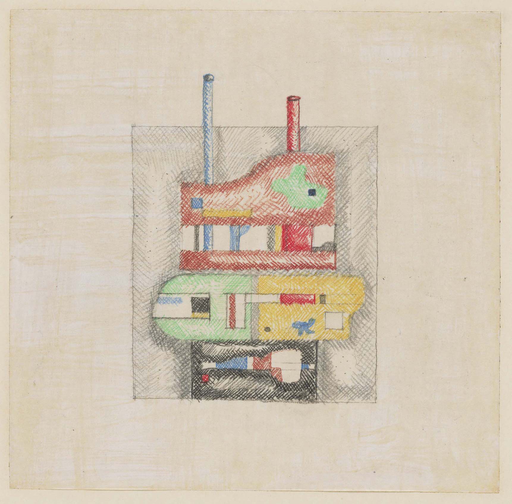
SA: What is strange and interesting to me is the very deliberate way in which Hejduk addresses the ground. It’s just there, always a straight line at the base of the elevation, not unlike a model on a table. Yet the house does not sit heavily on the ground. Nor is it floating above the ground as, for example, in the Farnsworth House or the Villa Savoye, Hejduk’s modernist precursors. I think already there is something animated about the stance of the Bye House—like a dancer planting herself on the floor just before lifting off. The ground is a datum, a plane of reference, but it does not ‘ground’ the house in place. In the Bye House this is accentuated by the diagonal of the entry stair and the bridge formed by the passage from the stair to the wall. Moving toward the house from the road (a narrow dirt road at the time), a visitor will first look under the bridge, to the framed and cropped horizon beyond, which is in turn mirrored by the insistent horizontality of the bridge, before swerving right to find the entry.
The lot is a relatively high piece of ground in the rocky landscape of Western Connecticut. Here, 20,000 years ago, glaciers carved north-south valleys and exposed the rock ledges that mark this site. Even though the site is heavily wooded, there is a sense of vistas beyond. As built, the house would have at once created an intense dialogue with its immediate surroundings—the rock ledges, the understory, the trees, and ground cover—and at the same time with the distant landscape: the sky, the clouds, and the horizon beyond.
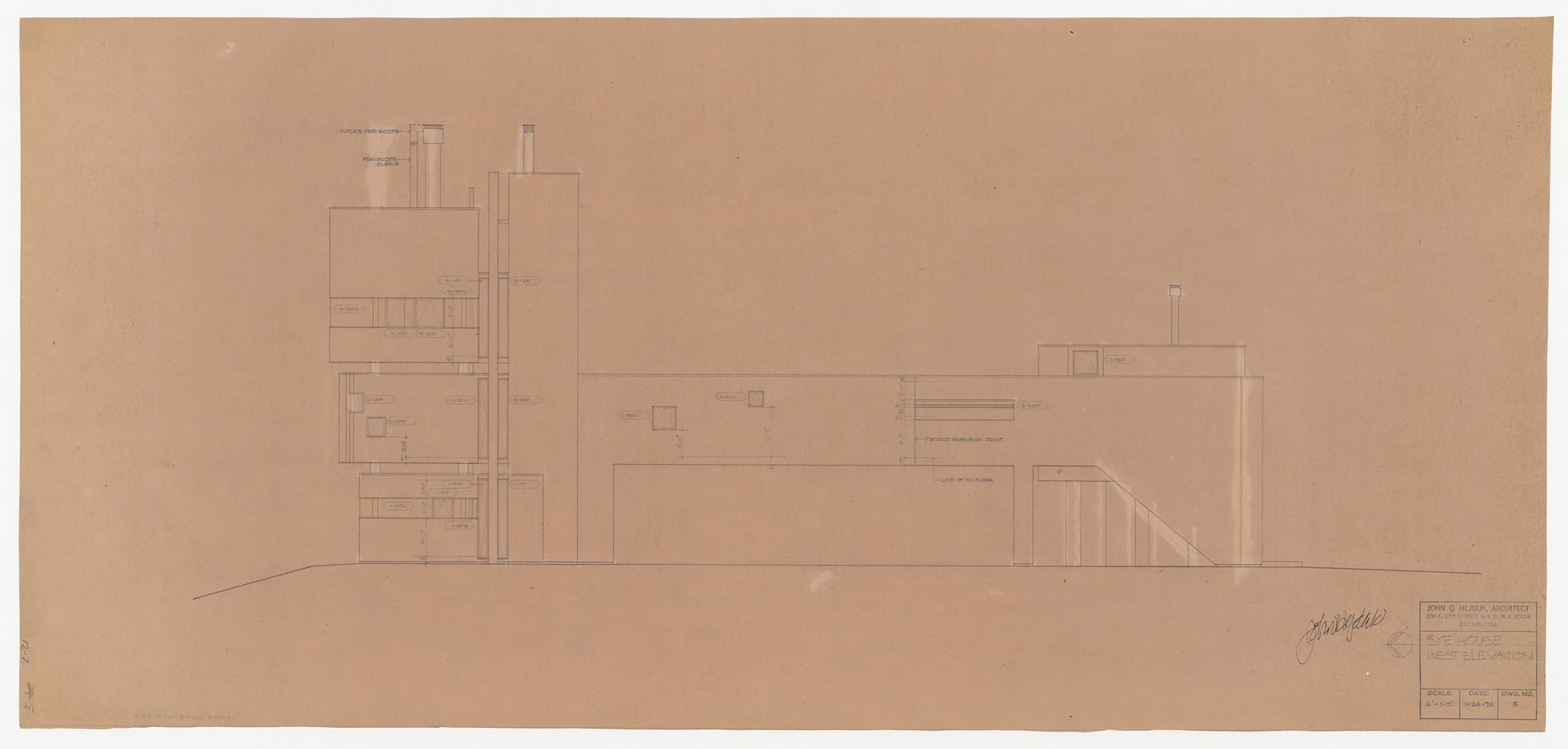
MC: In this sense of a horizon beyond, it’s also interesting to note a few moments in the house’s interior where Hejduk intensifies both seclusion and encounter with nature through the contrasting window geometries. This control is much greater here than in Wall House One, where the volumes are fully transparent. The openings also support this animate character of the house. This is to me the breaking point that points forward to the masques, a movement away from the traditional modern structural ordering.
SA: Absolutely—it’s a proto-masque, suggesting movement and a nomadic life-in-time. Not literal movement, but potential movement. I don’t think this sense of animation is at odds with the specificity of its location on site. The house has a presence that implies and suggests the possibility of movement without moving. And as I am sure Bye would remind us, landscape is a living thing, never fixed and static. Bye was a landscape architect highly attuned to change in the landscape—the changing light over the course of the day, changes in weather, clouds in motion or branches moving in the wind, and spatial transformations from season to season.[4]
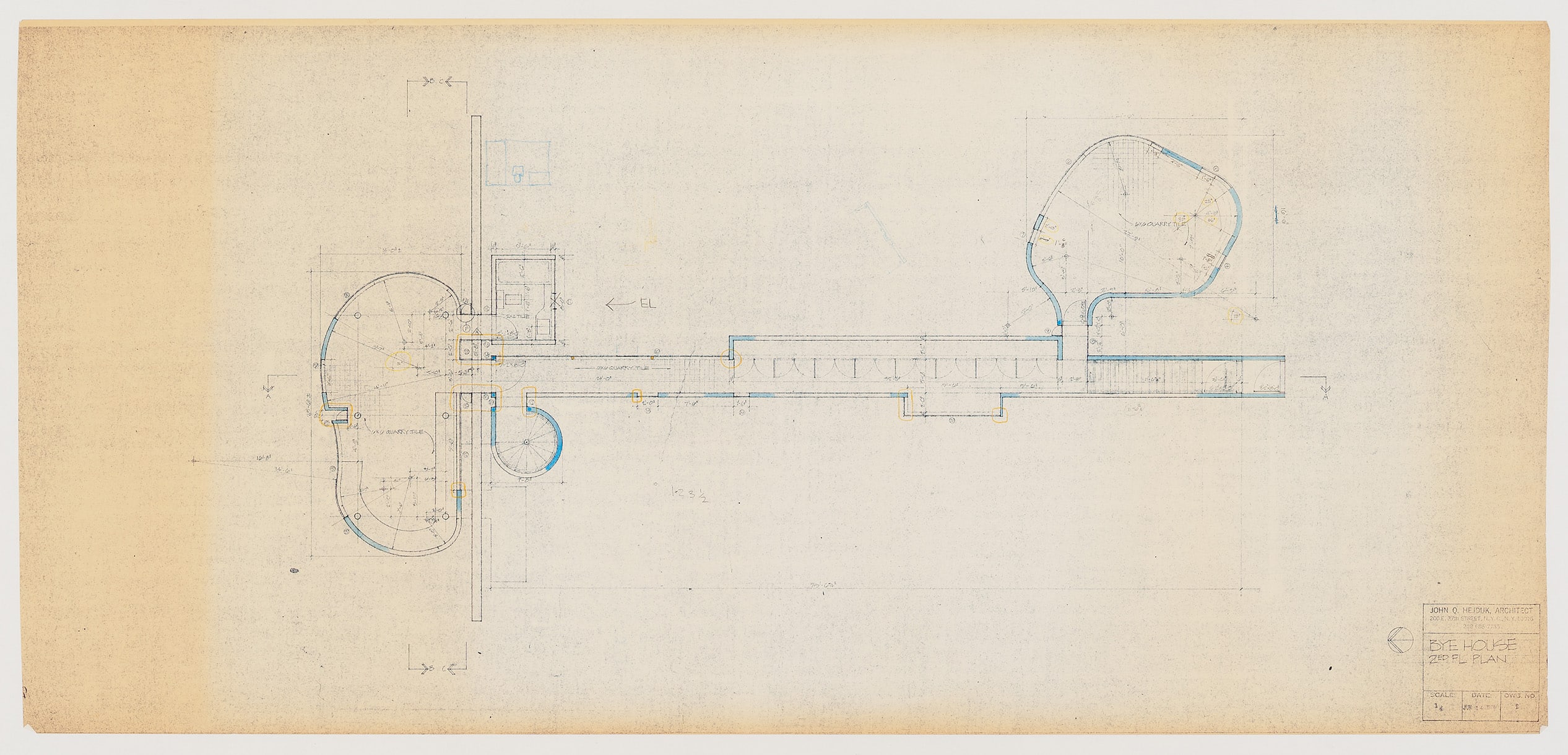
MC: In the drawing of the study room a geometric centre is located outside the building, maybe a direct verdict of the interaction with the exterior. In the main volumes this creaturely expression overtakes geometric purity. It seems that the Wall House ‘system’ comes to life with extreme potency in this context. The drawing of the study room portrays that precedence in plan.
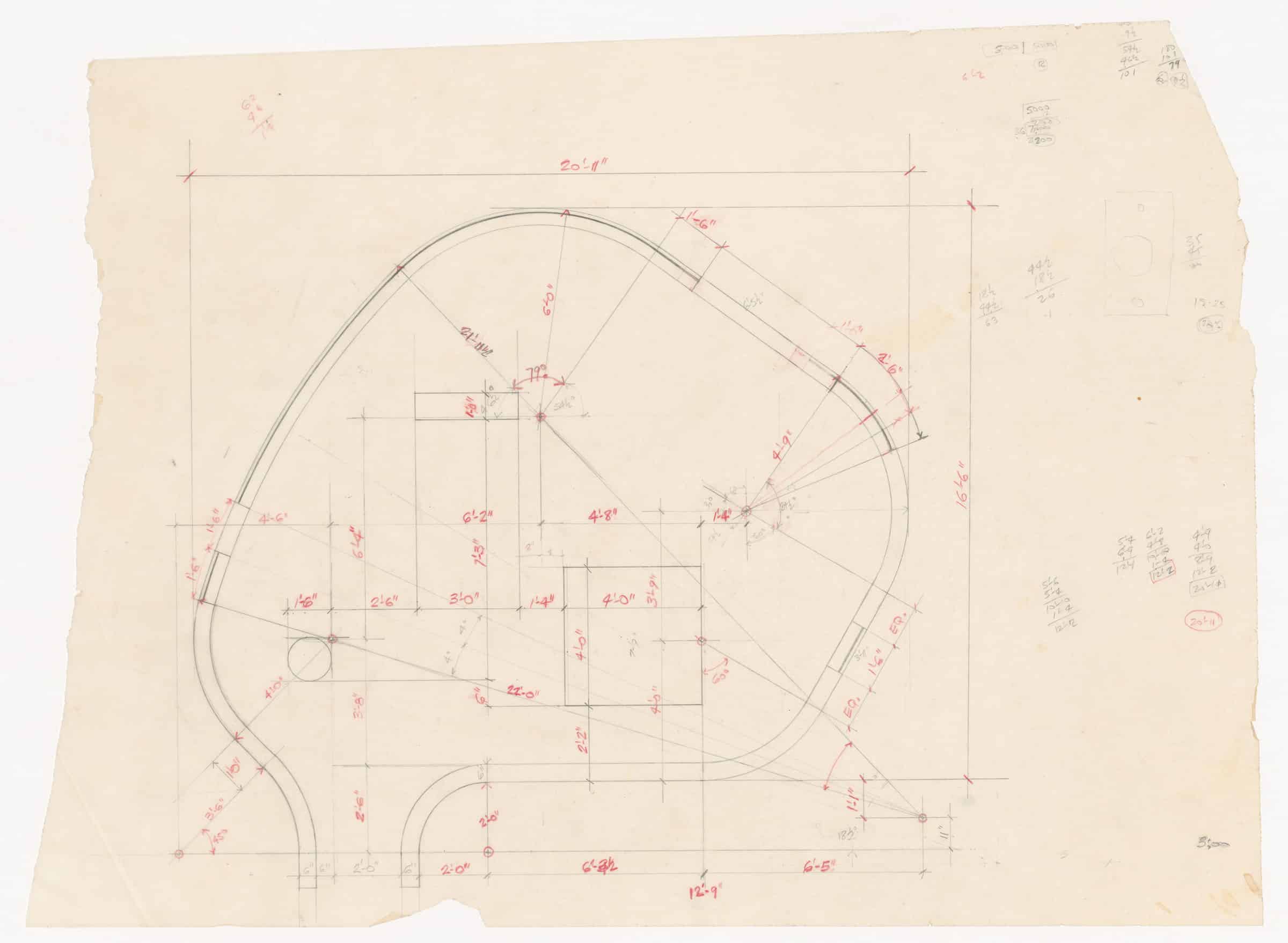
SA: True; it’s a remarkable drawing. Here, the geometry of the room is simultaneously self-contained, a place for study and contemplation, and at the same time in dialogue with the site. You see it in the architecture itself, independent of the drawn landscape; there is a sense that an awareness of landscape has inflected the form. Even knowing, for example, that the study room has prospects to the north, east, and south changes our understanding of this intricate geometry (in this drawing, as in the working drawings, north is to the left).
MC: You mention the elements of nature in this specific Ridgefield location, almost as found characters that will interact with the house. How do you see that in this sketch? How about the garage?
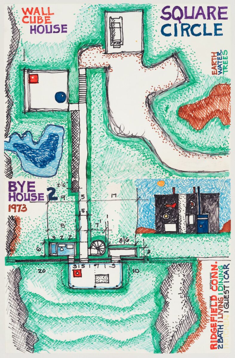
SA: Yes, it’s interesting that this simple box-like garage keeps popping up in the drawings—even in the models. This sketch is dated 1973, relatively early in the process, but it is already quite specific in its response to the site. Hejduk calls out the elemental conditions of landscape: Earth/Water/Trees. The primary orientation of the house on site is south/east to north/west, and the living spaces are to the north of the wall. Hejduk pays close attention to the programme elements of the house. He draws the driveway with a turnaround and a car in the garage; in other words, all the mundane necessities of everyday life are accounted for and located in the world. Architecture’s elemental geometries—wall, cube, square and circle—confront the elemental conditions of landscape.
MC: I think the simple box-like garage in this specific drawing creates a sense of ‘ensemble,’ as if the house, the driveway, and the garage became one organism. What you highlight in terms of the elements allows us to understand Hejduk’s logic towards landscape. He seems to address it less as an ‘entity’ and more as a plural field of natural forces, which converges with Bye’s approach to landscape design as an inheritance, or revealing, of existing conditions and ‘moods.’
SA: Correct. Ted Ceraldi, who worked with both Bye and Hejduk, described Bye’s approach as one of editing—more subtractive than additive.[5] And when we think about all the forces at work on site—water, soils, vegetation, I am reminded of another fascinating drawing you sent me: the engineer’s plan for the ‘Basic Site Plan/Sub-surface Sewage Disposal System.’ The septic plan for the Wall House! I’m still trying to wrap my head around that idea.
Beyond the fact that it underscores the idea that this was a real project for a real site, and that Bye had every intention of building it, what strikes me about this drawing is the confrontation between the house and the rock ledge on site. The ‘mineral’ plane of the exposed concrete wall sets up a dialogue between the curvilinear volumes of the house and the rough rock ledge, across a gap of merely ten feet. We also know that the exact location of the house was continually shifting throughout the design process. How do you see that tension between an autonomous object, a term in a series, and the specificity of this house in this landscape? What other resonances between the house and site are visible in this drawing?
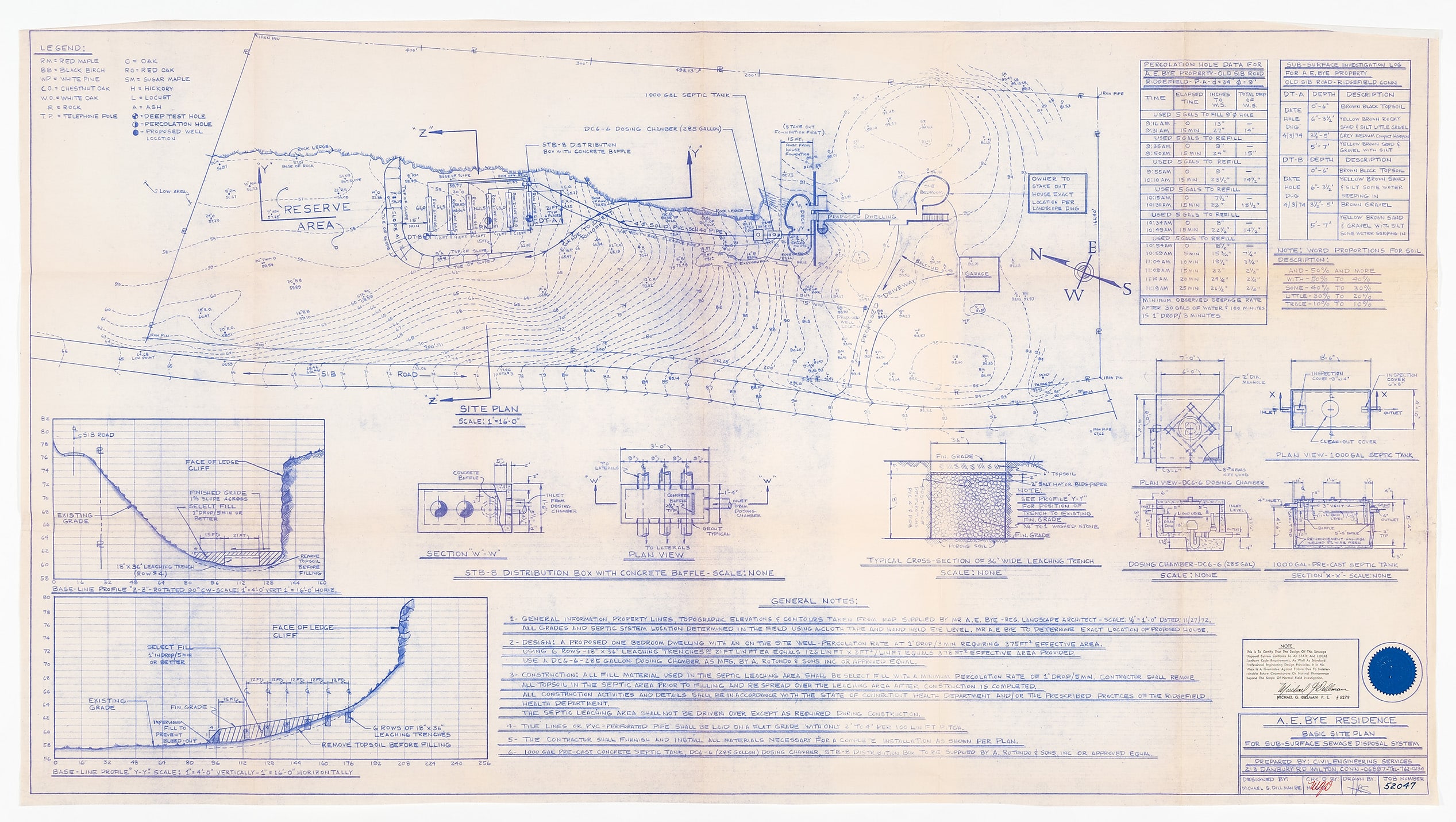
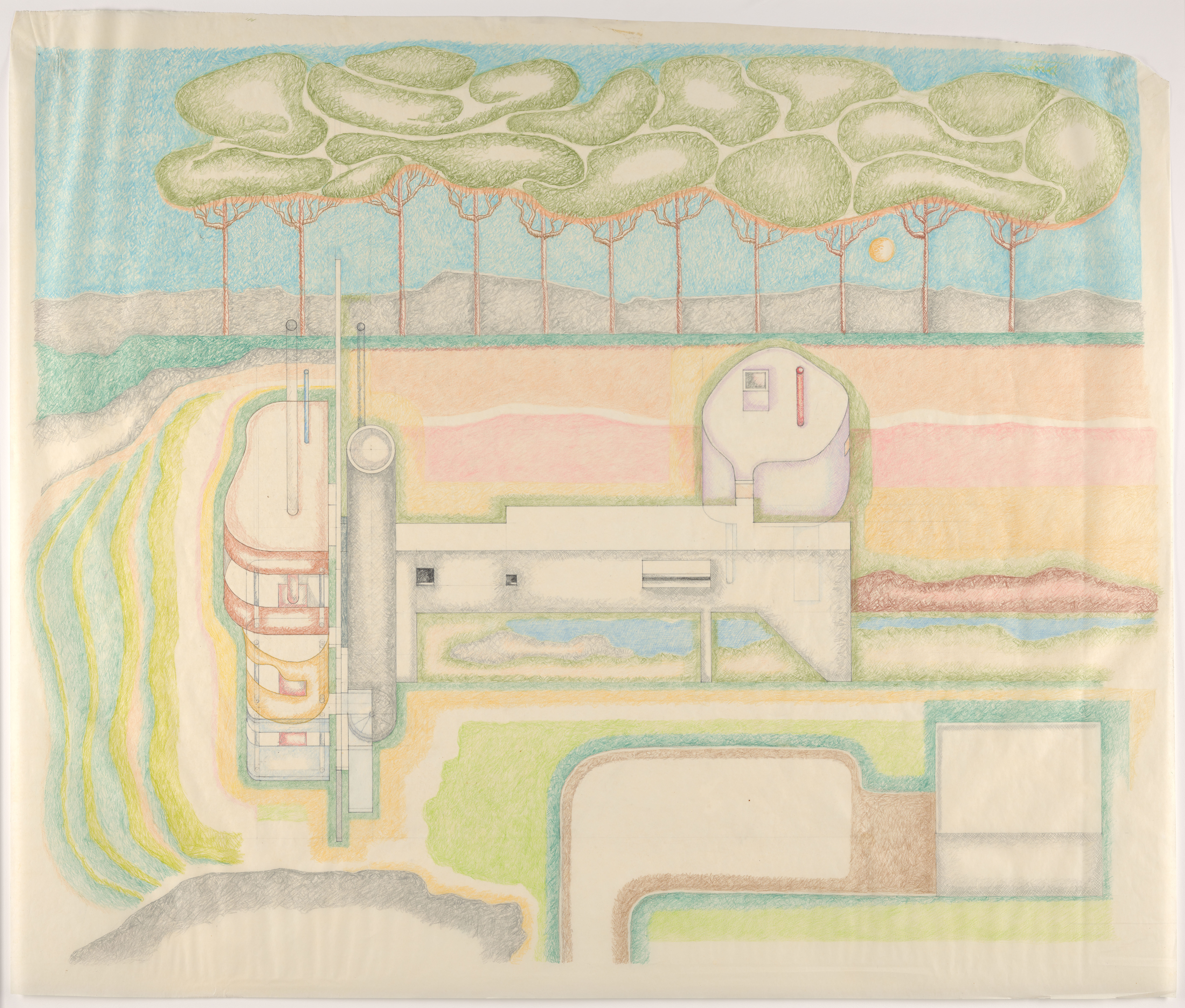
MC: What caught my attention in this drawing is the simple representation of topography. Omitting the trees lets us perceive the geometry of the house in relation to the movement of the ground. Despite Hejduk’s emphasis on flatness in many representations of the project, I believe that there is an order of nature manifest in the curvilinear geometry that was amplified. Meaning, the ‘anywhere-object’ which Wall House One could be, becomes grounded here. The universal elements—ground, trees, clouds, sun—that Hejduk includes in the drawing ‘Grading Perspective’ allude to a sense of cosmology, or pantheism as Jim Williamson noted in our conversation. This world-making position doesn’t conflict with adhering to these specific site elements you point out, such as that massive rock ledge that hugs the house. In this drawing we see a note that says, ‘owner to stake out house exact location per landscape dwg.’ Owner, not architect. This may lead us to think that Bye could have wished to keep some margin of adjustment, as he was so fond of making decisions on site, through site.
SA: My understanding is that Bye was a very hands-on landscape architect, working with what already existed on site to reveal the character of the landscape, and re-working the ground after construction. This suggests that each of these drawings is, in a way, provisional. Only by staking out the house on site, and developing the landscape over time would the real character of house and landscape become evident.
MC: Yes, this provisional character of the drawings, underscored by the traditional ‘work in progress’ stamps, reveal a pact between Bye and Hejduk.[6] We could interpret it as a form of liberation, a less controlling stance in favour of a more adaptive and responsive approach to the building process.
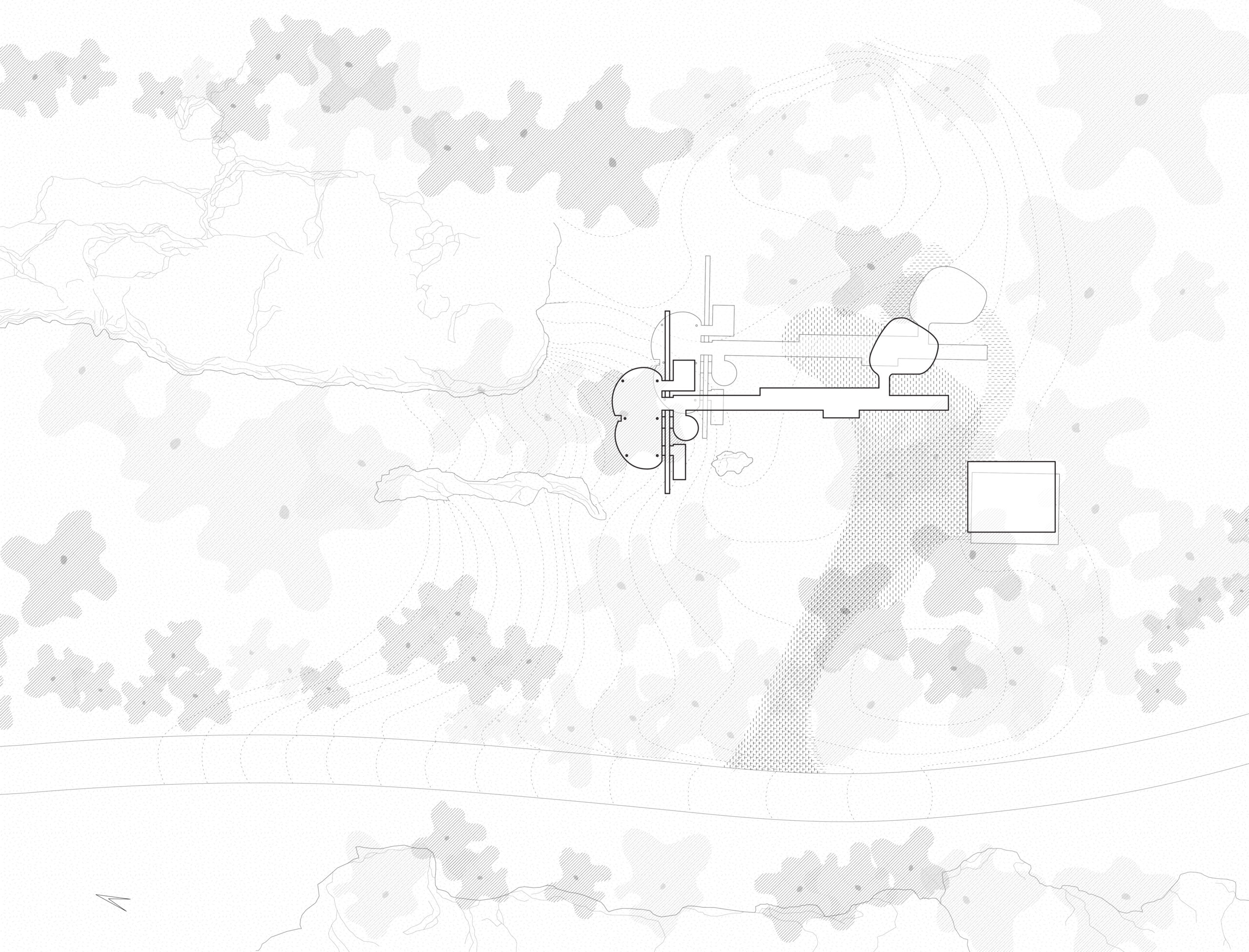
SA: That idea, I think, gives a special significance to another drawing of the house in the landscape, reproduced as Figure 01 (and, to my eye, by Hejduk’s own hand). In this drawing, the ‘Grading Perspective,’ Hejduk describes a flat podium for the house, establishing a ground plane in dialogue with the constructed, vertical plane of the wall. The wall marks a boundary in the landscape just as it does in the house, visually terminating the gap at the top end of the shallow ravine that the house confronts. Hejduk has sketched in the rock ledges that edge the ravine and delineated the gentle slope of the ground beyond the wall. Once past the wall, the inhabitants are restricted to the stacked volumes of the house—the sloping ground plane and reck ledges are not meant to be inhabited. These curvilinear volumes, read against the flat plane of the wall, are the primary protagonists in the dialogue with the site—the ravine, the trees, the ground, and the rock ledges.
It also forces me to revise what I said earlier—Hejduk has drawn an axonometric with a horizon. It is as if the viewing plane of the drawing is itself folded, and Hejduk positions an imaginary horizon, available to the viewer entering the site—an idealised horizon line and a timeless yellow sun seen through the trunks of the tall umbrella pines. The trees are softly rendered, in shallow relief, in dialogue with the sculptural forms of the house.
This site, as shown in this drawing is, to me, less a representation of a particular landscape and more a cipher for an idea of landscape. Hejduk understands perfectly that the real condition of the site will only ever be realised through Bye’s work, as both landscape architect and inhabitant, after construction, working in direct contact with the land itself, in all its difficult and irreducible ‘presentness.’ The landscape is not in the drawing; it exists in some future moment and will grow and change over time.
MC: Hejduk’s response to this specific site helps to layer our understanding of his architecture as real. When we look closer at Wall House Two, the reality of the drawing stands out. ‘A drawing on a piece of paper is an architectural reality.’[7] In the history of Hejduk’s thinking, the question of architecture’s reality is central. What makes architecture real, or what is the reality of an architectural drawing? The most suspicious critic inquires: is the ghost of the unrealised building enough? Does that build a school of thought in our discipline? A common critique of his radical imagination is its lack of reality, or an abstraction more familiar to other forms of art than architecture per se. The most common adjective is ‘theatrical’. In the case of Wall House Two, the critique breaks down, as we see the arguments of Wall House One strengthened through a dialogue with site. Manipulated by the landscape architect, who was to inhabit the house, and complemented by structural and mechanical engineers, the Wall House ‘system’—if we strip down all variations into an assemblage of an elongated arriving (past), a compressed, fleeting threshold (present) and an open suspended space (future)—becomes real. The intensity of the architectural elements dissolve into a reversed frame of three elevation marks: the ground, the trees, and the clouds. The clarity of the architectural elements, their legible simplicity, turns them into measuring devices, a kind of silent geometric frame that flips the ‘self-reflective’ into a form of dialogue.
Notes:
Kevin Chow helped research this piece and drafted the diagram shown as Figure 07. The authors wish to thank Steven Hillyer, Kim Shkapich, and Ines Zalduendo for their invaluable assistance. Thaïsa Way and Ron Henderson generously shared insights and research material; Way is the author of the forthcoming Landscape Architect A.E. Bye: Sculpting the Earth. Paul Amatuzzo, Richard Cordts, Ted Ceraldi and Ed Aviles, all Cooper Union graduates, shared recollections of time spent working with John Hejduk and A. E. Bye. Finally, conversation with Jim Williamson helped shape the ideas presented here.
- John Hejduk, Mask of Medusa (New York, Rizzoli, 1985), p.67.
- Wall House Two—the Bye House—has been frequently published and written about extensively. In 2001, shortly after Hejduk’s death, a version of the house was constructed by Thomas Muller/van Raimann Architekten & Otonomo Architecten in Groningen, The Netherlands. All this has served to reinforce the idea of the house as an autonomous object, unrelated to a specific site condition. Unlike Wall House One and Three, Hejduk was careful to always identify Wall House Two as the Bye House whenever he had control of its publication. It has, therefore, a double identity—as an element in the series of Wall Houses, and as a concrete proposal, intended for realisation on an actual site. It should also be noted that in 1972, Hejduk had recently completed the renovation of the Cooper Union Foundation Building, and that a full set of working drawings and structural design documents were completed for both the Bye House and the slightly earlier Bernstein House (Mamaroneck, New York). Documentation of the house in its landscape context was published in Hejduk’s Mask of Medusa (1985) and in an issue of Progressive Architecture from June, 1974. (pp. 98 – 103) A detail of the drawing reproduced here as Figure 9 appeared on the cover of that issue, and the article on the Bye House announces that the second of Hejduk’s wall house studies, ‘will soon be built on a hillside in rural Connecticut.’
- Thaïsa Way and Ron Henderson first proposed the rethinking of the Bye House from the landscape perspective in an exhibition at Penn State in 2015.
- See: A. E. Bye, Moods in the Landscape (Cambridge, MA: Spacemaker Press, 1999). This volume, illustrated with his own photographs, underscore’s Bye’s sensitivity to the evocative, even emotional, character of different landscape, the counterpart to Hejduk’s poetics of architecture.
- In conversation, February, 2023. Ceraldi is an architect who studied with Hejduk and later worked with Bye, completing one of the versions of the site drawings.
- During this period of time, Hejduk maintained a professional office, located at 200 East 37th Street in New York City. (An obscure location, distinguished primarily by its proximity to the Mid-Town Tunnel). We were able to track down and speak to three architects—all Cooper Union graduates—who worked with Hejduk on the Wall Houses: Paul Amatuzzo, Richard Cordts and Ed Aviles. Aviles said he worked mostly on mechanical drawings and details, and confirmed in an interview that Hejduk and Bye spoke frequently, almost daily, about the project. Their communication, according to Aviles, was always of a warm tone of mutual respect. There was no disagreement and a constant exchange of ideas in conversations and drawings sent back and forth. Aviles, age 91 at the time we spoke, remembers that when Bye received an estimate of USD $150,000 to build the house, he was discouraged by a student of his, who said it was ‘too expensive.’ Richard Cordts worked on a model and drawings of the Bye House while a collaborator at Hejduk’s office. He explained in an email to the authors that ‘One Monday morning—it was always a Monday morning (I think John worked most and best at home on the weekends),’ Hejduk handed him ‘one of his colour drawings—like those in Fabrications’ and he was instructed to make a model and do the drawings. He affirms that afterwards the project was not changed from that first iteration, by Hejduk nor Bye.
- John Hejduk, Mask of Medusa (New York, Rizzoli, 1985), p.69.
Stan Allen is an architect and George Dutton ’27 Professor of Architecture at Princeton University. He has taught at Harvard, Columbia, and Princeton, and served as Dean of the School of Architecture at Princeton from 2002 – 2012. His practice SAA/Stan Allen Architect has realised buildings and urban projects in the United States, South America, and Asia. His work has been recognised with numerous P/A and AIA Awards, as well as the John Q. Hejduk Award from the Cooper Union, and an Academy Award in Architecture from the American Academy of Arts and Letters. His most recent book is situated objects, published by Park Books in 2020.
Marina Correia obtained her architecture degree from The City University of New York, she holds a Master in Architecture from Harvard University Graduate School of Design and a Ph.D. in History of Architecture and Urbanism from the University of Sao Paulo. Her doctoral thesis Miniature Volume: John Hejduk and Venice explores through the work of the American architect John Hejduk the critical dimension of architecture in the late 20th century, presenting the close relationship between poetic language and the socio-political agenda of this period. In 2013 she founded Atelier Architecture and Urban Design, an international design practice that supports actions for the democratization of culture and education, currently based in Rio de Janeiro and Los Angeles.
