Watercolour is not the traditional medium one associates with architectural plans, particularly those that are realised in built form. I believe this is what caught my eye while searching for a drawing by Walter Pichler and instead discovered a portfolio of drawings by Paul Robbrecht. Aue Paviljoenen project B depicts an idea for a temporary pavilion to display works of art for the once-every-five-years exhibition known as Documenta.
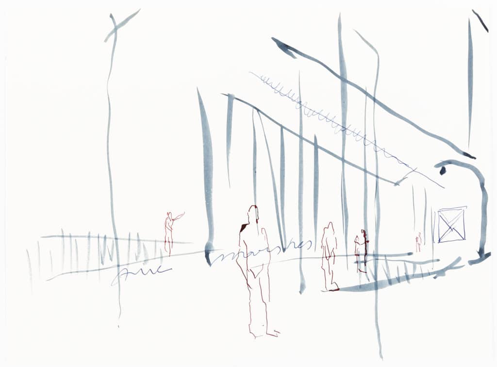
It seems these parallel streaks in blue – some steady, some fading – were rapidly put to page so that we might make sense of the faceless figures standing apart in postures of contemplation. What are they looking at? Or perhaps they are only an afterthought? Inserted to give meaning to the architecture which here, even in watercolour, powerfully frames the pictorial space.
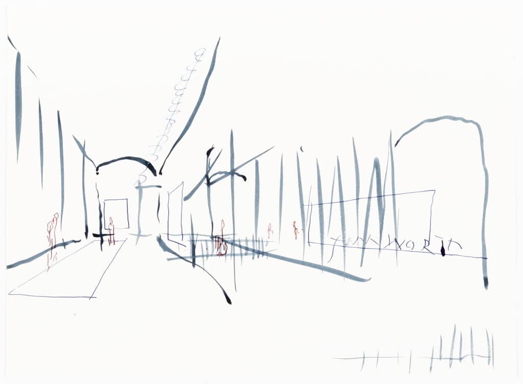
There is something about the lines, the placement and even the palette that remind me of Anthony Gormley’s Another Place (1997). His idea was ‘to test time and tide, stillness and movement…’ through the gradual corrosion of several solid cast iron body-forms installed along Crosby Beach, outside of Liverpool, UK. Like Gormley’s work, Robbrecht’s points to ‘another place’, an idea where time and tide, stillness and movement coexist in an architecture for experiencing art.
Paul Robbrecht
– Rosemary Willink
Watercolour is not the traditional medium one associates with architectural plans, particularly those that are realised in built form. I believe this is what caught my eye while searching for a drawing by Walter Pichler and instead discovered a portfolio of drawings by Paul Robbrecht. Aue Paviljoenen project B depicts an idea for a temporary pavilion to display works of art for the once-every-five-years exhibition known as Documenta.
It seems these parallel streaks in blue – some steady, some fading – were rapidly put to page so that we might make sense of the faceless figures standing apart in postures of contemplation. What are they looking at? Or perhaps they are only an afterthought? Inserted to give meaning to the architecture which here, even in watercolour, powerfully frames the pictorial space.
There is something about the lines, the placement and even the palette that remind me of Anthony Gormley’s Another Place (1997). His idea was ‘to test time and tide, stillness and movement…’ through the gradual corrosion of several solid cast iron body-forms installed along Crosby Beach, outside of Liverpool, UK. Like Gormley’s work, Robbrecht’s points to ‘another place’, an idea where time and tide, stillness and movement coexist in an architecture for experiencing art.
Related...
Alternative Histories: Dow Jones Architects on Robbrecht en Daem
Alternative Histories: Stephen Taylor Architects on Robbrecht and Daem
Paul Robbrecht: Drawn Closer
– Paul Robbrecht
Category
drawing histories project & building histories drawing techniques & materials commentaries, rants & reflections Drawing Matter archive: research & collecting
Period
c20th
Architect
Paul Robbrecht Robbrecht en Daem
Medium
drawing
Tags
exhibition DMC sketch exhibition design