Paul Robbrecht: Drawn Closer
Initiatief 86 was important because (as Robbrecht en Daem) it was more or less our first real work for art. It was also an important moment for the Belgian art scene. That summer Jan Hoet curated Chambres d’Amis, exhibiting the work of 50 artists in homes across Ghent. At the same time and also in Ghent, Jean Hubert-Martin, Goose Oosterhof and Kasper König co-curated Initiatief 86 at Sint Peter’s Abbey. Kasper, who had recently made three important exhibitions in Germany, knew the Belgian scene quite well and invited us to design a space to exhibit the work of René Heyvaert. He is now well-known in the Flemish architectural world but at the time, Heyvaert was a kind of cult figure. During the 1950s and 60s he worked as an architect, designing only houses. But he had problems with his lungs, which made it difficult for him to continue, so he became an artist, making very light and fragile objects from cuttings and paper. He died two years before Initiatief 86 and was by then nearly forgotten.
Kasper wanted a space to show Heyvaert’s extremely fragile work. For some reason we landed on the question of how to design a house for an artist who is no longer living. It became our guiding principle. This sensibility, and maybe also San Marco in Florence – where in the dormitorio are the small interventions by Fra Angelico – were hanging somewhere in my head.
At the same time, Chambres des Amis had taken over, and artists were moving into houses all over Ghent. Our children were little, and the Swiss artist Niele Toroni had taken up residence in our babysitter’s small room. He placed a bottle of whiskey and a glass on a cabinet and then painted one side of the window with his famous square dots. In half an hour the work was ready. The photographer Attilio Maranzano made a beautiful photograph. So this was the context. The artists were in domestic spaces all over Ghent – Toroni in ours, and then Heyveart in the cloisters of the abbey. But it was exciting to think about ways of showing art outside of a gallery or museum, and these experiences reassured me that designing at the scale of a domestic space could work.
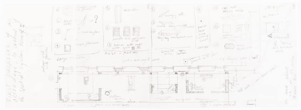
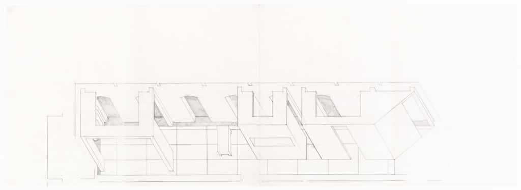
At Sint Peters we were working in the corridor that formed part of the abbey cloister. The long perspective of the space is heightened by the wall of windows that runs along one side, and the wooden floor continues like a tapestry all the way through. We thought this long perspective would help us connect the separate spaces we wanted to make – a large room, a small room and between a room for resting where we would install a bed. We then determined the amount of artworks we thought the space could hold and assigned a number to each piece before locating them in the plan. The proposal was an exercise for us to see what the space could take – to see whether the galleries could really hold everything. It consists of two sheets of A3 tracing paper glued together, drawn with a mix of freehand and lines made with some of the beautiful cherry-wood set squares I still use.
All of the elements of this drawing do a lot of talking. Drawing has always been my language. I use it to discuss ideas with myself, and I start speaking it from six every morning. I’ve never really worked with models because a drawing is still much more immediate. I also work over computer drawings. On Friday evenings I get my homework – a stack of printouts to draw over. It’s quiet. I live next to the office and work at a big table in my house. I turn on music, pour a whiskey.
Anyway, even now 36 years later, this drawing doesn’t seem chaotic. There is a sense of order, and I see myself working through things. First, there is a clear direction – you read the sheet from left to right. You walk through the plan from the entrance. You then take note of the individual pieces, above, and then you see them in a certain spatial sequence. You also have perspectives, because at times the plan was not enough. When I draw a plan I have to take the sheet off the surface of the table and hold it up in order to imagine being in the space itself (this was maybe the only valuable thing I learned to do at architecture school).In this drawing are little perspectives that try to make sense of certain views and better understand the scale of the artwork in the space – how these pieces, like satellites, could find their place in this rhythm of cells.
The elements here come together like a movie script, in that you can still walk through the exhibition. But at the time our script was constantly changing, and when Kasper finally came into the space, this proposal went out the window. Everything was moved again and reinstalled in a different way. The bed we had designed for René Heyvaert was relocated to a room of Raoul De Keyser’s work and used as a bench. Over the years Raoul became a friend, and we designed many benches for him. It’s funny that an idea that is now so much a part of viewing his work, started with seating meant for René Heyvaert!
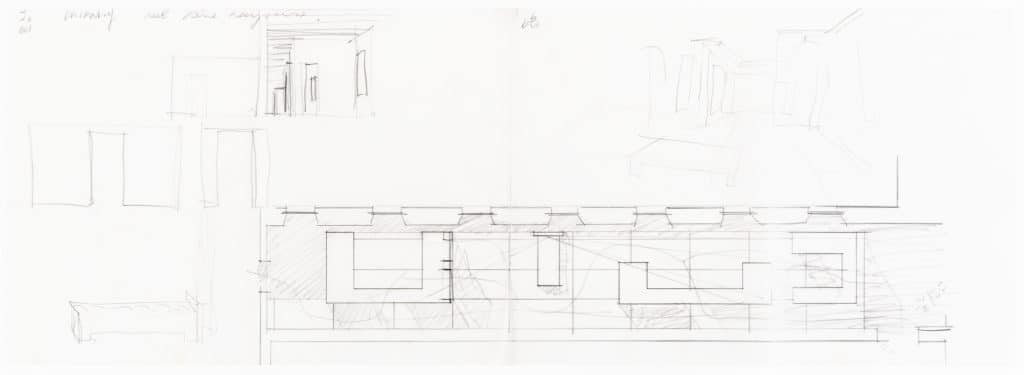
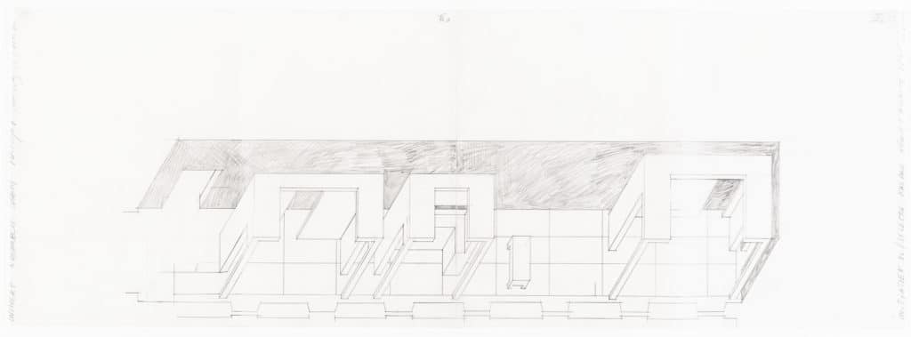
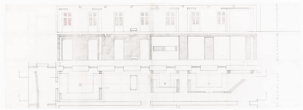
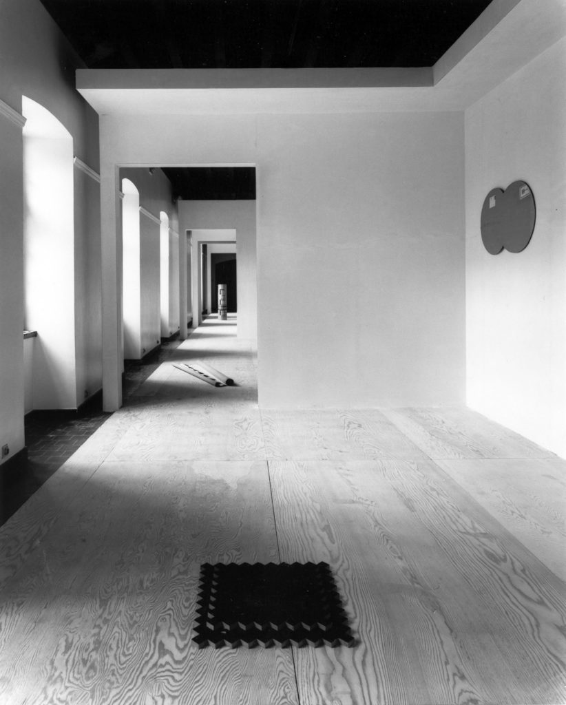
Still, the project was successful. People said they had never seen art shown in such a way, and I think it was the reason why Jan Hoet invited us to work with him on Documenta IX. He phoned me the day after he was elected as artistic director – luckily, I was the only architect he knew. He asked me to come immediately to Kassel, and so I did.
Jan had a simple but powerful idea and that was to bring painting back to its origin – the landscape. The Aue Pavilions were sited in the extensive baroque park of Friedrichs Aue, which lies below the nearby Friedrichsplatz. You could look down on the pavilions from above and across to the hills of East Saxony on the horizon. At the time we started design in 1989, Saxony was still part of East Germany.
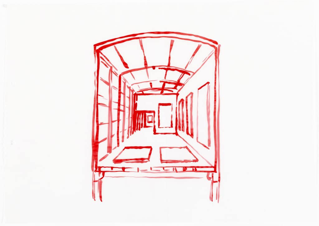
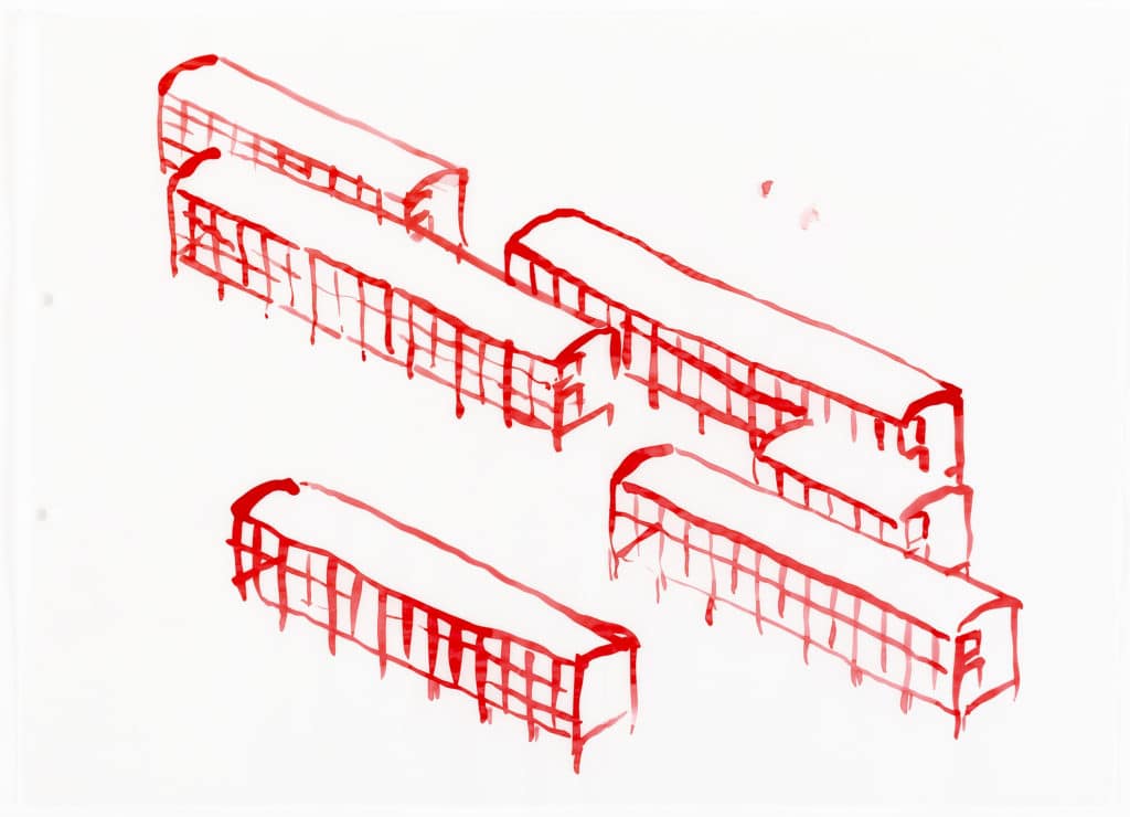
If you look at footage today, thirty years after the fall of the Berlin Wall, you see that people were travelling on trains all the time. And I have always been fascinated by what happens when you look out the window of a train and watch other people in other trains gliding past. You see yourself, the other people, and the trees. All of the separate scenes merge into a single moving image. I’m not sure if I was totally conscious of this, but these masses of people in transit played a role in how we thought about the buildings, designed as a collection of low-budget, temporary container-structures. I also had a romantic notion that art pieces are always searching for their final place. So the image of art, which is travelling all over the world and doesn’t have a specific home, was the idea behind the containers. Initiatief 86 is certainly related to the pavilions. The long corridor we were working with at Sint Peters became a series of corridors inside these structures set in the Saxon landscape. Similar to the long window that connected the spaces of the Rene Heyvaert exhibition, the east side of each structure comprised a continuous glazed wall.
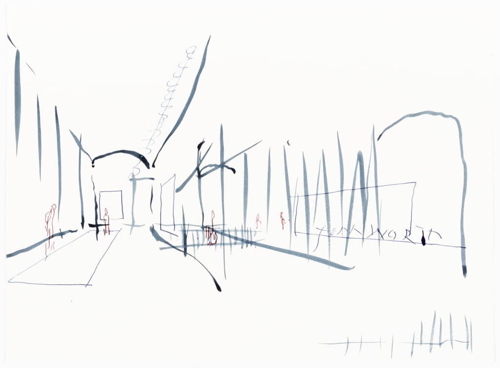
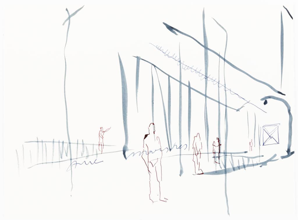
In 1990 Jan asked me to present my maquette to a group of five artists – Mario Merz, Gerhard Richter, Thomas Schütte, Cabrita Reis, and Per Kirkeby. They were all enthusiastic, and the minister of culture said, ‘I will help you to find the money’ – she really did. We were travelling around with a model just to raise money for that thing. Without her the project wouldn’t have happened. Jan Hoet had no idea. He got to the site when the building was finished and said, ‘Oh, you did it! Let’s put some art inside.’
The building had to accommodate 28 different artists. They were supportive when they saw our drawings and the model, but most could only react when the spaces were built. Dan Graham was enthusiastic. He said it reminded him of the rock song of the ‘Under the Boardwalk’ – maybe he was referencing the pedestrian bridges that zig-zagged between the containers. We worked with him to construct a parallelogram-shaped portal at an intersection between two pavilions. Two of my friends that I made in this period were Gerhard Richter and his second wife, and Isa Genzken, who I originally met during Chambres d’Amis. They were very helpful to me because they said, ‘We want to be in your building.’ Isa chose a glass corner for her window-sculpture made of transparent artificial resin.
Gerhard Richter asked me what I saw when I looked at his paintings. I recognised a sort of vegetal, iris-like morphology that came through in his strip-like brushstrokes. The effect reminded me of marshes, bamboo, wood. I told him I had recently visited Weimar to see Goethe’s mineral cabinets and proposed doing something with walnut panelling. He went back to his studio and a few weeks later called to say he had built the whole cabinet. Of course it looked completely different in his white-walled studio, than in the pavilion. When we were installing the panelling he said, ‘If I don’t like it, I can paint it at the last minute.’ But he didn’t.
At the end of Documenta the steel structure was transported to the Netherlands and reconstructed in Almere and once again serves as an art pavilion. It now travels between Almere and Amersfoort – so in a way it became a train.
This interview was done in collaboration with Asli Çiçek. Drawn Closer is a year-long collaboration between Domus and Drawing Matter, edited by Sarah Handelman. Each issue of the magazine features one architect discussing a drawing which they recognise as a transformative moment in their work. This text appears in the July/August issue. Domus 2020 is guest-edited by David Chipperfield.
