Peter Wilson and Mark Dorrian in Conversation – Part 2
– Mark Dorrian and Peter Wilson
This is the second part of an edited transcript of a conversion held in Thurloe Sq, London, on 25 July 2020. Peter Wilson’s exhibition ‘Indian Summer and Thereafter’ had opened at Betts Project the previous evening.
Mark Dorrian: Moving on to the Villa Auto and Clandeboye projects, both were sited in the context of landed estates in Ireland with Neo-Palladian houses.
Peter Wilson: Yes, Powerscourt was the first Villa Auto project, where the car drives through the centre. I think that’s a little bit about me trying to make a link to my Australian past—the suburbia, where everyone drives, meets the classical garden. I believe Raimund Abraham also proposed some drive-through suburban house when he arrived in America.
MD: I understand that the connection with Clandeboye came from a link between the AA and the Marchioness of Dufferin and Ava, but how did you come to Powerscourt?
PW: My student, Phillip Malcolmson was Irish, his family lived in County Wicklow, just around the corner from Powerscourt. He and I worked closely together. I was once staying with him in Wicklow and we went round to Powerscourt—he knew the daughter of the Slazengers, who owned the estate. It was after the fire, so they were living in one of the side pavilions. The father had a bad back and when we walked in, he was hanging in the staircase in a neck brace to straighten his spine.
MD: What led to the project then? Did you run it as a student project?
PW: No … it was the absent centre, Hans Sedlmayr’s Verlust der Mitte. Eisenman was talking about the loss of centre at the time and to come across this house with a burned-out centre and two occupied side pavilions … I was taken by the relationship of these two very pure boxes. There was also the ha-ha on one side and the formal garden on the other.
MD: It has a special resonance in Ireland as well, where the image of the grand house is so closely associated with the history of the ascendancy. The case of Powerscourt is a little different, but there are many voided aristocratic mansions in Ireland.
PW: In the case of Clandeboye, the connection to Alvin was actually through the AA president John Prizeman, a friend of Lord and Lady Dufferin.
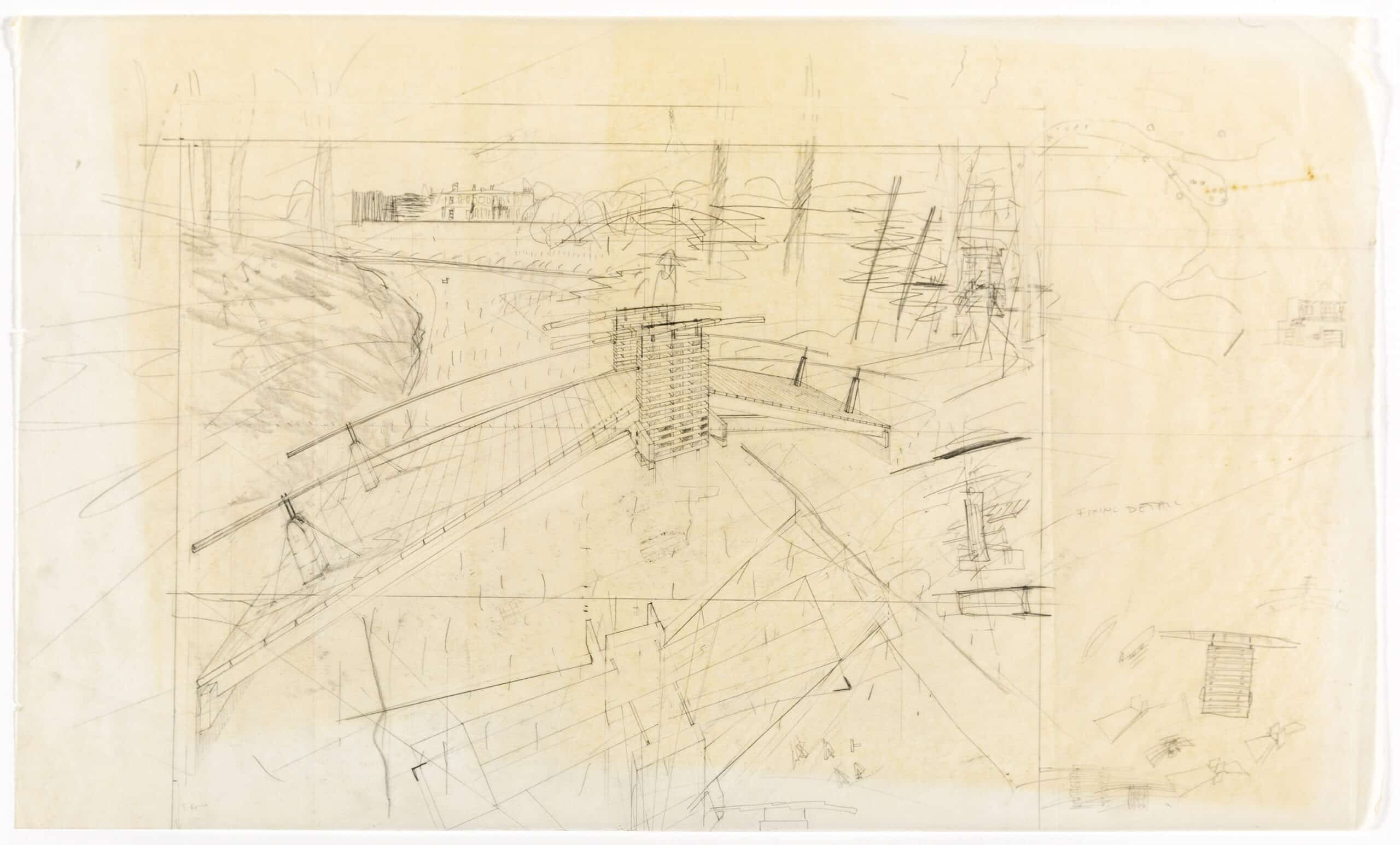
MD: There’s a different mode of drawing in the Clandeboye projects, with a new sense of lightness. Although Powerscourt and Clandeboye have a contextual similarity, the Villa Auto drawings feel to me to belong very much to the world of the Water House or the Bird House, whereas the Clandeboye drawings imply a more fragile condition.
PW: Yes … the first Clandeboye drawing was the bridge, and because I was drawing an actual bridge that was there and had steel joists underneath, I wanted to emphasize the tectonics of it. And of course, I did set Clandeboye for my diploma students as well. It was the time one was interested in the making of things.
MD: There’s a heightened distinction in those drawings between the intense tectonic detail of the structures and the lightness and ambiguity of the landscape, which feels almost Japanese (Fig. 11). What motivated that?
PW: I think it was expedience. It was the quickest way to refer to a landscape. At Powerscourt what really interested me was the terrace—getting all the shading of the ground, the trees and the ha-ha, while the buildings were much smaller and incidental. The plans of the building at Powerscourt were really weird, Baroque interiors with little passages winding around rooms. At Clandeboye one was hoping that Lady Dufferin might build one or two of them, so they were drawn constructible. In my then unit at the AA, our subject was the ‘figurative and the tectonic’, so one was obliged to show how things were put together.
MD: As the work moves through into the Clandeboye project, there is a sense of the ground being increasingly dissolved. This gives an impression of these structures always being lifted, even in the case of the gatehouse structure (Fig. 12).
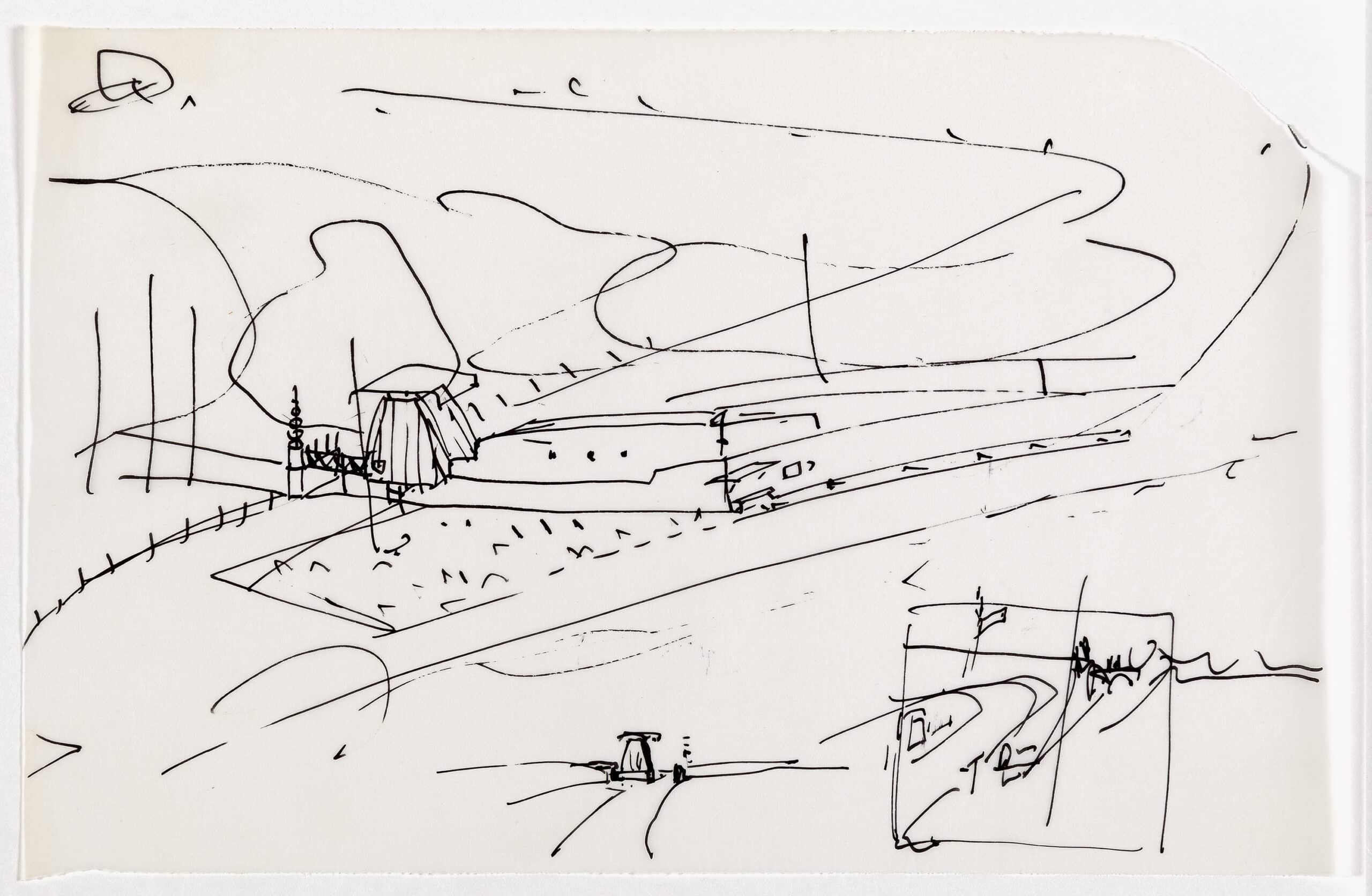
PW: There are two things there. One is seeing the drawing as a representation of a physical object, and the other is the relationship to the paper. Even in the Water House, the smoke coming out is simply the naked paper—one drew dense atmosphere and then faded it out to become smoke. I was always very intrigued by Japanese woodblock prints, ‘cloud and smoke technique’ or ‘blown-off-roof projection’, particularly where the skies get darker to the top. Clandeboye does that quite literally, with the black at the top of the page. And the trees in Clandeboye were a black [gestures making a stroke]. One just took a lot of graphite and put it on a smudger and did that and you had a tree.
MD: In the Clandeboye drawings (Fig. 13) you are quite often working with flattened isometric projections …
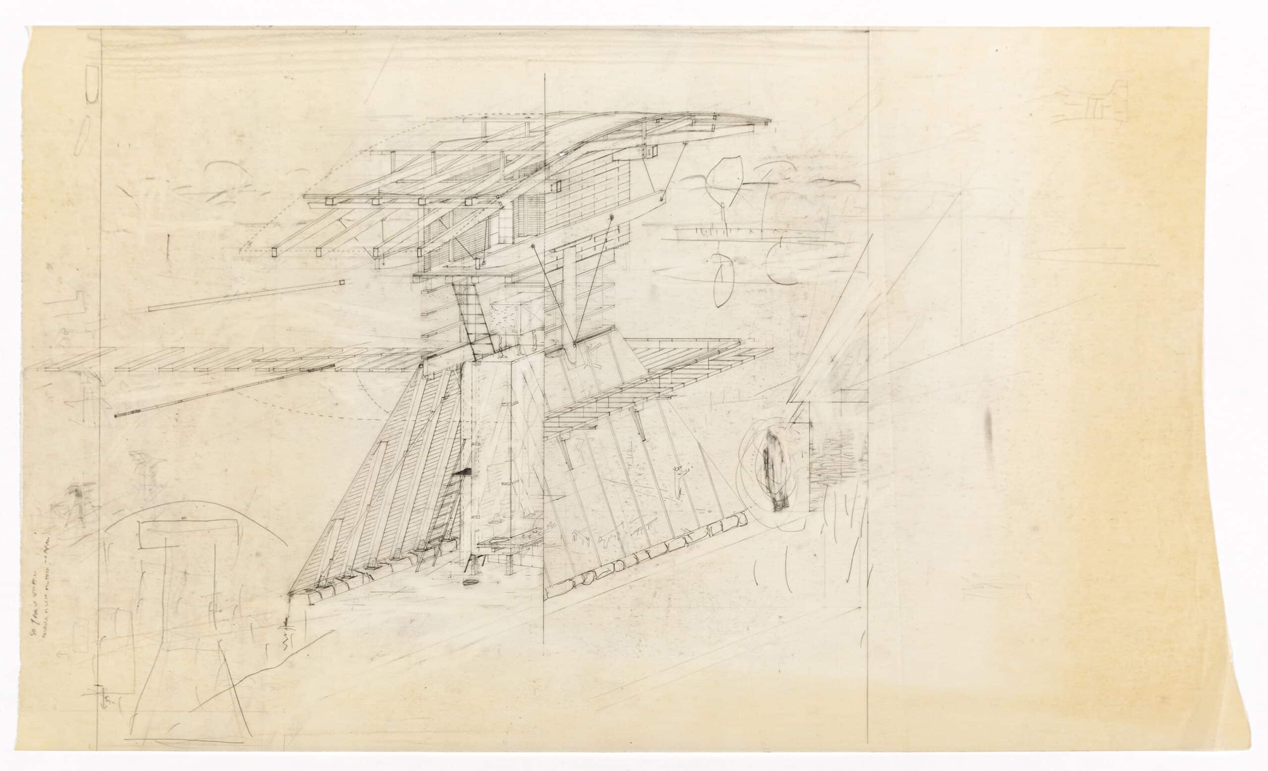
PW: I’m very fond of the isometric because you always get that distorted rectangle as the first thing on your page. Then you can go back or forward from it—up or down.
MD: They feel very different from drawings like the 45-degree axonometric, which give the sense of looking more from above—instead there’s an impression of a lateral stretching-across.
PW: Yes, axonometric, military perspective. There’s always the question with the isometric of the diagonal lines—does one halve the dimension to make them feel more real or does one just leave it measurable, which stretches the object?
MD: That’s interesting—so if you halve the dimension, you develop an impression of perspectival recession but without any convergence of the lines. Can you remember which drawings do that?
PW: I think the Water House is probably halved … but then what I quite liked was that when you project a cubic building with accurate dimensions it looks almost like a shipshape. One of my students drew such an extremely distorted cube that Cedric Price, the juror, took it for a ship.
MD: Moving on now toward the Japanese projects and the work gathered in Western Objects Eastern Fields … reading through your descriptions of the projects during this period, there is a continued insistence on the architectural construction as an ‘object’—I’m thinking here about the AA Themes book Informing the Object – but also your reflections on the condition of the Japanese city, its ephemerality and electronic mediation. But at the same time there is a new sense that this architectural object should form a point of stability, orientation, and navigation within the broader, fluctuating, urban condition.
PW: The confrontation with Japan was a real shock, because I had believed in the geometrically ordered city, and to encounter a city hung together on a whole different set of rules really knocked me sideways. But I think it was a great relief as well. My position in Japan was enormously privileged – we met Shinohara and went with him to his Yokohama private house. And Akira Suzuki was very close to Koji Taki, the philosopher and theoretician who wrote about us in El Croquis, 67. So, one was schooled by good Japanese people. The whole Japanese experience was quite strange because Nigel was there first, a fashion person imported by a developer to design various fashion venues. Cool Japanese kids pestered him for his autograph. Japan was the place of origin for his Italianate and NATØ style. Whereas I was much more undoing my past baggage—the knots one had got into.
MD: The projects feel increasingly interiorised in that context—I’m not sure that’s entirely true to say—but there is this understanding that they are refuges (Fig. 14).
PW: Yes, they are refuges. Absolutely. With things like the comfortable house, I used the term ‘deep interiority’. I think I was discovering from actual experience more and more that I was comfortable with that sort of introversion … intuitively feeling one’s way into a sort of enveloping spatial construct. The Suzuki House—the house for Akira—is so small that you’re always touching concrete wherever you are.
MD: Let’s turn to the Münster Library, Peter.
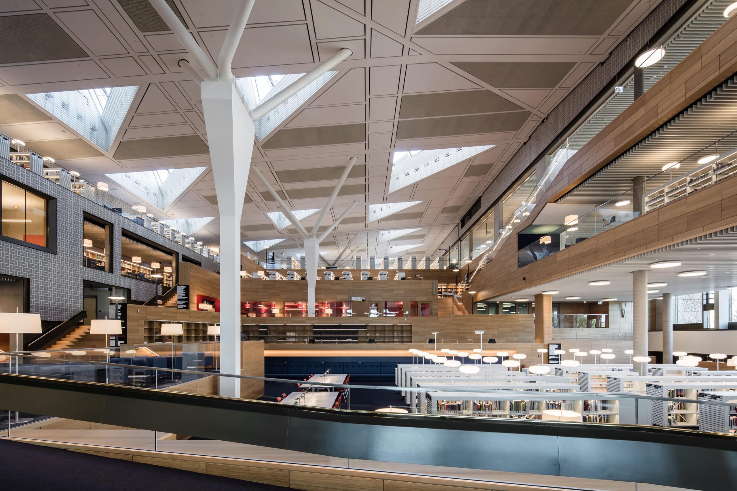
PW: The library was an absolute revelation for us because we’d spent so many years in an academic cloud, held aloft by concept and speculation. It was a revelation when the library materialised and we saw a building actually occupied by people. The building had this other life, which is not intellectual but to do with how the spaces are understood and appropriated by the users. What we built in Münster was a result of our years working in London on small domestic interiors, designing spaces that we ourselves felt comfortable in. In the library there are lots of niches where you can retreat, handrails to caress, etc. Our deep interiority was validated in the Münster City Library. It’s also full of weird angles, mannerist and quirky doglegs in the structure. The frame and adjacency idea was still alive then and we were able to attach lots of little detail subplots to the abstract frame. In contrast the Luxor Theatre is about the grand narrative, the one gesture, a wrapping façade.
MD: Thinking urbanistically, in terms of what they do as objects within an urban field … the Münster site seems tighter, more contextually defined in a way. Is that fair?
PW: The Luxor had nothing impinging on it—at least, not then. But I think a lot of it has to do with an intuitive reading of sites. I always go to the site myself before starting to design—it’s best to go at night, because then you feel the massing of surrounding buildings. We did that at Münster and the reason for the central axis is that the Lamberti Church is lit at night. Suddenly the whole city disappeared and one realised there’s a very strong latent axis to hang a library on. We did this one night when staying with Julia’s mother, and that was the origin of the divided site parti.
MD: I’m always struck by the quality of detailing and material in the Münster library.
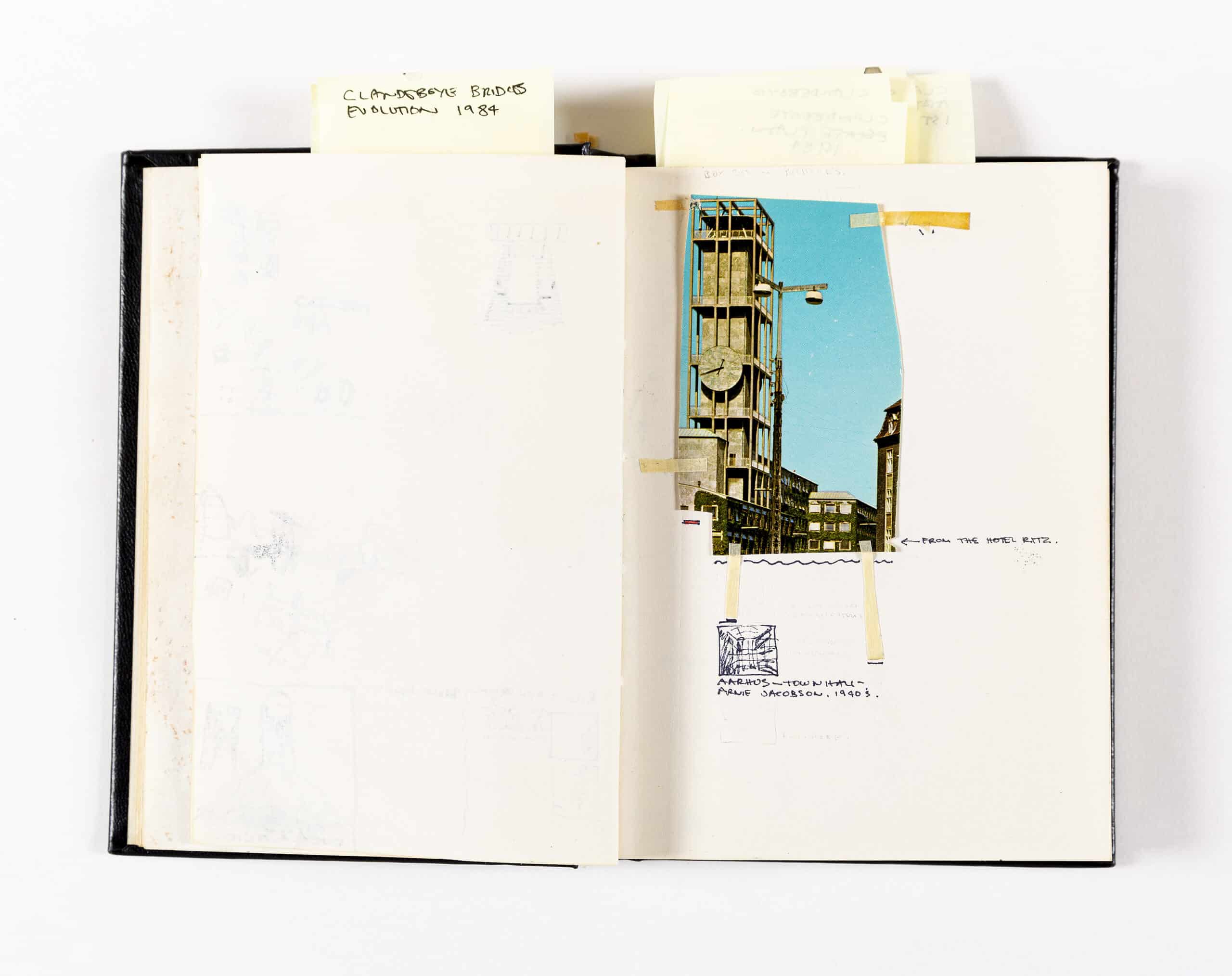
PW: We thought every building was like that and didn’t realise that we were going totally over the top with detailing. Our clients, the city, when they saw that they had young architects who had not yet built a public building, gave us three years’ planning time—three years to sit there developing details. We invented almost every detail. The reference was my favourite building at that time—and it still is—Arne Jacobsen’s city hall in Aarhus, built during the war and prolonged on site so the workers would not be drafted. Beautiful in every detail … a crafted building (Fig. 15). And Scharoun as well—in his Berlin library we also discovered a modernism based on careful details, interior landscapes.
MD: How was the project understood by the commissioners?
PW: They were nervous that they had put public money into a somewhat unconventional building. There was a lot of negative comment from the older generation, those who had been involved in the postwar reconstruction, because they had reinstated what they thought was a historic city and then we came along and inserted something unfamiliar that they thought disrupted it. But younger people, younger users, took to it just as it was. From the start it was always very well visited—there were and are three or four thousand visitors per day. And in terms of ranking—the Germans do a ranking of public libraries—it was for fifteen years first or second nationwide in users’ assessments. For us that was really important, even more important than any sort of architectural acclaim or theoretical interpretation—the fact that it actually did present people with a space they were happy to be in.
MD: How was the office organised at the time you were doing the library? How did it emerge out of this situation?
PW: We knew that Julia and I didn’t have the experience to manage and specify a project on this scale. So, somebody Julia had studied with joined us, and we were called Bolles-Wilson and Partner for a while, but he left right after the library. We had, I think, four people working on the team. There was one who had worked on the competition and another, Katrin Lahusen, who had been my student the AA at the time of Clandeboye. She came and started working on the library but didn’t like Münster and didn’t like practice and returned to London to teach in the AA first year.
MD: I know there was the Blackburn house before, but Münster was the first major building. Did you have prototypes made of different elements? Something that I think is really beautiful is the way in which the structural members are articulated with metal connections—you know, the leaning elements.
PW: Most of that is making it up as you go along—dealing with things that suddenly appear. The laminated timber beams had always been there, and then halfway through the design process the structural engineer said, ‘I think we have a problem here—the knee is not strong enough’. So we reinforced it with steel band-aids. It’s all a matter of negotiating limitations and thinking on your feet. The underlying philosophy is ‘every change leads to an enrichment’.
MD: How has the building transformed? It’s interesting that you’ve been working in the same city and I suppose you must pass it all the time.
PW: We try to go there once a week for lunch. The head librarian and her assistant were about our age when it was built—it was also the start of their careers. They were the number one fans of the building, looking after it really well and not making any changes without asking us. They’ve just now retired and the new director ran a workshop asking library users how it should evolve. We went along—it was bit awkward as we were there as policemen. She asked us if she should get in a troupe of young designers to rethink the interior? We said, ‘no way, you can’t do that’. I think it’s a building that just has to be taken as it is. Thirty is the danger age for a building, when it either slips into the popular imagination or gets forgotten and abused. We’re trying to get it classed as a historic monument, but for this it has to be there for at least one generation. But as it’s almost 30 years old now, that’s one generation.
MD: How has the building weathered?
PW: The copper didn’t go green as we had hoped.
MD: Because of pollution?
PW: Yes, air pollution. A few corners are green where workmen or dogs pissed on it.
MD: I’m often struck by the very strong graphic sensibility that is there in both the drawings and the buildings. The frame and adjacency idea is part and parcel of that. There’s a kind of precision of contour and of the legibility of figure, produced by its positioning in relation to a colour field or against a screen. And that has a relation with the detailing and the use of materials—like the blue brick prows that extend out in Münster. The choice of materials often appears to be about conserving that precision of contour, which seems a different attitude to that in the work of some of your contemporaries where there’s an interest in the breaking down of materials—I’m thinking about Peter Salter and Chris Macdonald’s Osaka Folly, for example.
PW: I always felt myself to be a somewhat pedestrian designer with my Osaka Folly around the corner from theirs. Chris and Peter’s was so overwhelmingly poetic in its conception, but unachievable as well. The layered earth and ash were abandoned…
MD: In the case of the Luxor Theatre in Rotterdam, the basic formal gesture of the building is about the servicing of the stage area and the movement of trucks to it.
PW: Yes. With the plan a sort of 360° wrapping gesture was the first move. The stage had to be a 40 m high voided box, a very simple object of focus. They wanted a conventional auditorium because the actors don’t know which way to face if it’s asymmetrical. And then the issue was to deliver at stage level. They don’t have an in-house company, only travelling shows, and so two or three changes per week. This means you have to get the 18 m long trucks right next to the stage and because of lack of space the stage had to be at first floor level. It’s a functional diagram in the end and the trucks drive up through the foyer [gestures] and out there. The auditorium curves were based on the turning circle of trucks. A couple of years ago we saw Nutcracker on Ice in the Luxor and the whole stage was frozen. It was the last night, we went backstage, and it was fantastic. The curtain came down and big guys with sledgehammers smashed up the ice, carried it out and threw it into the harbour [laughs].
MD: And you see the trucks coming up from the exterior …
PW: Yes, behind an orange zigzag truss. And then on this side [gestures], the restaurant is below the loading bay, and the foyer is on top. It is essentially a sandwich of representational space and functional space.
MD: As we were saying earlier, the library has a more defined contextual condition—in relation to the church …
PW: … urbanistically, yes …
MD: … and the way the form develops is responsive to that, whereas in Rotterdam the form is generated much more out of the internal conditions of the building.
PW: We knew from our own urban masterplan that the Luxor would have to have this autonomous and continuous outside skin, a sort of blob—which the Dutch pronounce ‘bloop’.
MD: Is this a part of the city that people are passing through each day?
PW: A lot of people commute across the bridge to the city. The south side of the river Maas was the working-class area, the docklands. The Luxor theatre has always prioritised vaudeville and musicals for a wide public—it’s not high culture. Occasionally they do concerts or operatic things.
MD: Coming to the recent Luxembourg library (Fig. 16)—rather different from Münster in that it is a national library, isn’t it?
PW: Yes, but it’s such a small country.
MD: How do you think of the development between the libraries?
PW: When we started the Münster Library everybody was nervous, thinking that with digitisation the library might disappear. The curious thing is that libraries have gone through a renaissance in the meantime. We always refer to the Münster library as the public living room of the city. In Luxembourg, it’s even more the case. It’s almost the only venue where you can go and hang out for a whole day and use for free a working space where you can plug in your laptop. The library is still a really important cultural programme. Luxembourg was open before COVID-19 and was super successful, super full. We had a few emergency meetings how to squeeze in ten more tables—it was so tightly planned we could hardly fit them—because they were having more visitors than they could cope with. You can see it’s been taken up by people who aren’t usually library users, like school kids going there to do their homework. Again, it’s gratifying that it works so well.
MD: I presume that as a national library there are major archival functions to deal with?
PW: There’s a huge archive—the whole thing is built around a five-level bombproof box which has to stay at 18 degrees. It’s the memory of their country …
MD: How do you communicate ideas in the context of the office? Is it primarily through drawings (Fig. 17)?
PW: I do little sketches—atmospheric scenarios that also act as navigational maps. But also most designs originate with my precise 4H plans and sections. I’m very fast with these—Julia says too fast because my responses are intuitive and not rationalised and gridded as our German context requires. When I began working with Julia, her German rationalist background disciplined my wilful poetics but also upped my drawing precision. She is essential to the office, and in fact I wouldn’t exist as an architect without her. Julia is now often a juror for major competitions like the European Court of Human Rights. She daily compensates for my irrationality.
MD: I wanted to ask about the reappearance of red in the Luxembourg library. It’s something that continually punctuates your work.
PW: The easy way out of that is to say that it’s the Australian desert. But I think it’s more an Italian sienna colour.
MD: It’s a very particular red, isn’t it? I was looking at the documentation of the Living With Rust exhibition in Ron Arad’s One Off showroom that you did in 1985 with Guy Comely and Neil Porter—at that point you were talking about the relationship to the Australian landscape.
PW: Yes … but I think that was really grafted-on theory.
MD: I had always read it as an industrial reference—red-lead paint and ironworks.
PW: It gives a sort of warmth as well … comfort, like the red room in the studio next door or that wonderful Red Studio painting by Matisse.
MD: There’s a nice little drawing in one of your sketchbooks in the Drawing Matter archive of a project on the remaining red footings of the first Blackfriars railway bridge that emerge out of the Thames (Fig. 18).
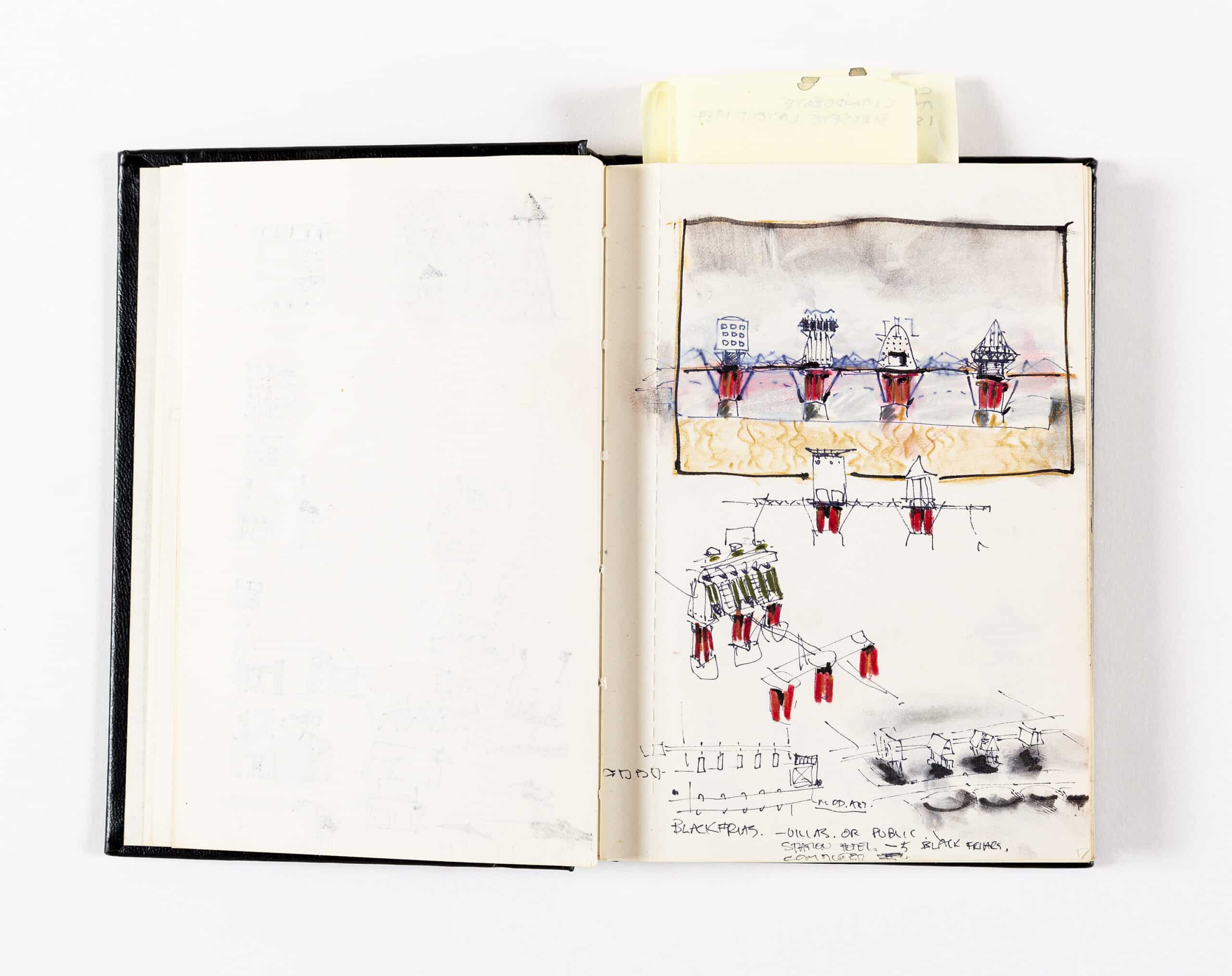
PW: Yes, I set that for my students …
MD: I remember that one of the things Tschumi said in his review of the Bridgebuildings book was that for Peter Wilson, the bridge is never a singular bridge but always multiple. Going on from that, because of the articulation of the different elements, you often get these liminal or in-between spaces. Things aren’t simply continued, there’s another element which holds ‘this’ or which is positioned between two other pieces—or in the Accademia Bridge, for example, where you have the shipshape truss that holds up the lower bridge or at least relieves the force on it. It seems to me that one gets the sense of a series of events or procedures or a fictional history that is stimulated by the additive quality of these complex constructions. It folds the sense of a complex historical accretion into the compressed time of the project …
PW: Yes … I guess there are two different themes there. One is multiplicity and the other is the experiential. And the user who crosses the bridge experiences one after the other and ties them together into their own narrative.
MD: You’ve done much work recently in Albania. How did this connection develop?
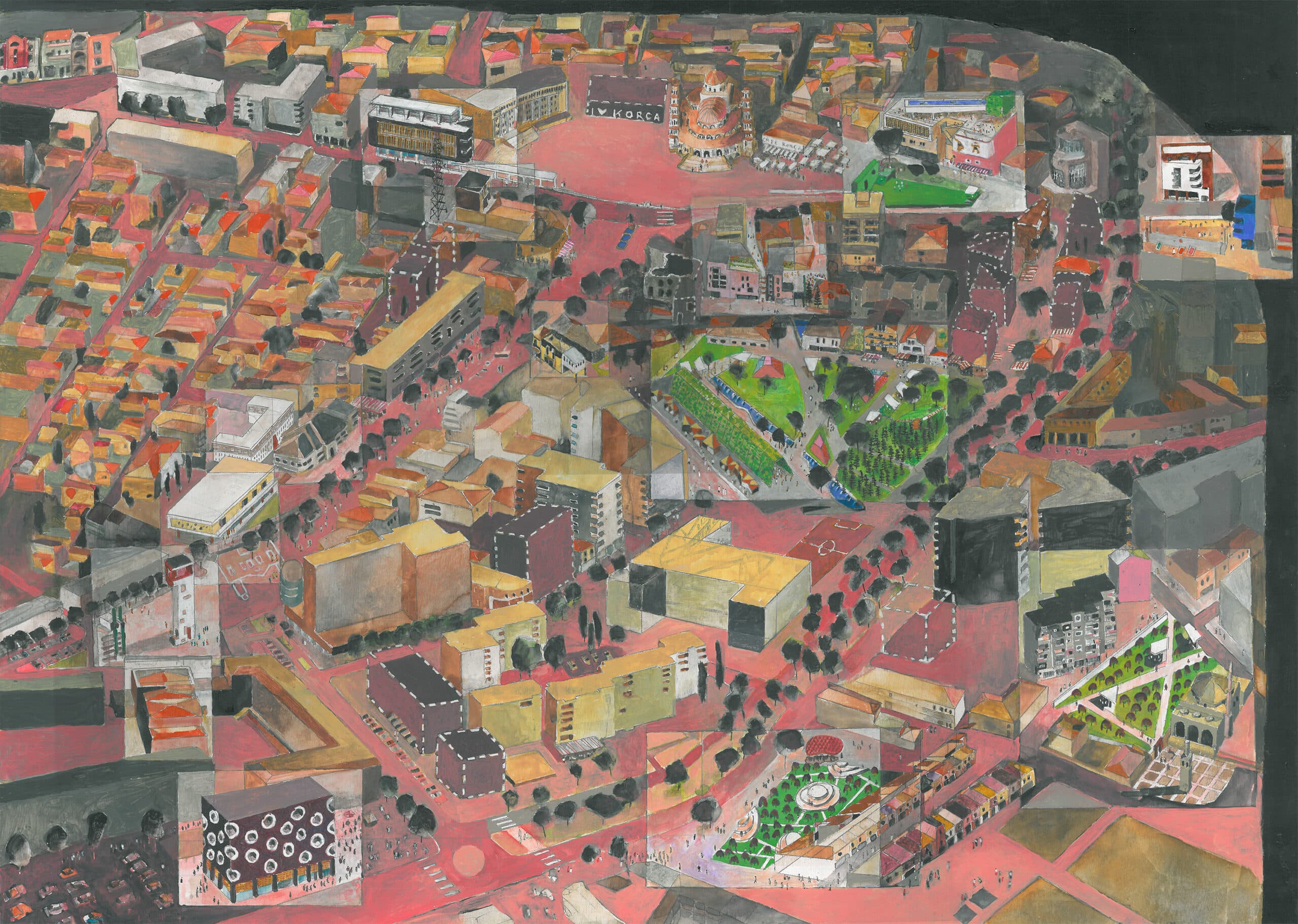
PW: It started maybe fifteen years ago, with the competition for the main axis of the city of Tirana. Luckily, we were not successful, but that gave us a contact to Edi Rama, who was then the mayor. He called us back to design various facades and we then built one whole building in Tirana called the Rationalist Apartments. Edi would send us Albanian architects or developers whose buildings fell short of his expectations and we sort of acted as tutors, a very weird situation—one was a bit embarrassed about standing on their toes and ‘correcting’ their projects. Luckily, that phase came to an end when we won the international masterplan competition for Korça (Fig. 19). We were invited there because of our relationship to Edi and his socialist party. Korça is a little town up in the mountains near the Greek border, and the competition was to marshal new development for the historic city centre. We’ve now been working there for ten years. I describe it as my playground—it’s a bit like having a city as your sketchbook. We’ve been inserting little additions, I suppose the adjacencies are now individual buildings in the town centre of Korça. Because Albania is a developing country and very poor, everything is done with aid money. They can’t afford to pay normal German fees, and so we can’t give them a full architectural service. So I told them that for their fee they get a hand sketch, and they said, ‘Oh, fine, we can have someone here interpret it’. I insisted in being in dialogue with the interpreter, so they put us in contact with some young architects who are really up to speed—keen, with office and building experience. Now our Albanian way of working is that I do hand drawings—plans, elevations, perspectives—and then they digitally translate them, sending back renderings for me to correct with a red felt tip. It’s an iterative process and it also works that way during construction—they send site photos and I tell them what colour on this wall or what detail or material there, etc., rather like a nineteenth-century architect. What we’ve discovered is that in a developing country they can’t afford high-tech products or materials, but they can afford labour. Processes which would be very expensive here—sanding something down or careful brick laying—they can do because they can afford to pay people to work months on a building. In consequence we’ve tried to develop a vocabulary of material details, which interpret traditional construction like stone walling or forms of steel work.
MD: I suppose it happens quickly … does it?
PW: No, it’s slow. It takes years. After two years, when you thought the project had gone to sleep, a photo of a building site arrives.
MD: The Icon Museum is in Korça?
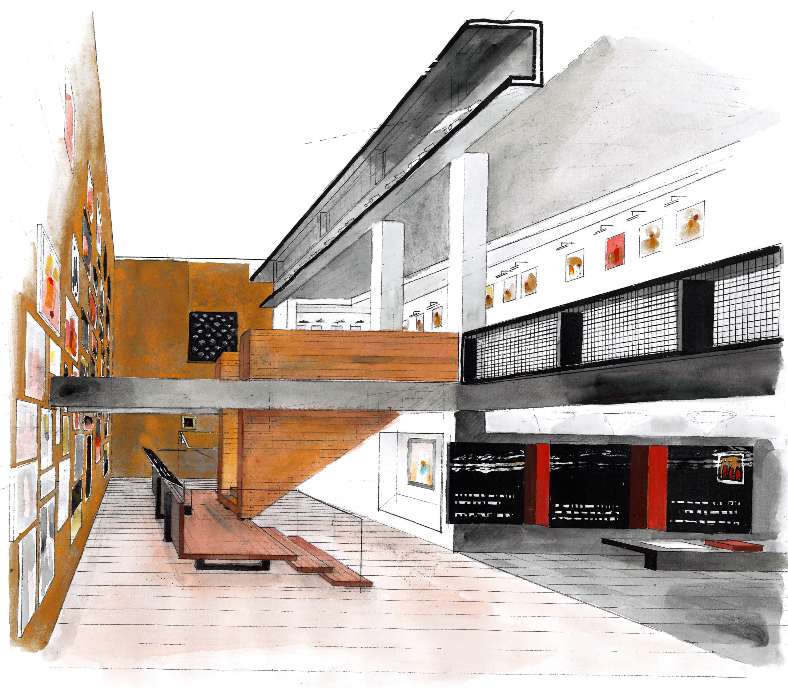
PW: We were in partnership with some commercial Albanian architects there. They had the job and we were asked to do the interior. But Edi Rama, now Prime Minister, saw it and didn’t like the facade. The Albanians wanted a mediaeval building for icons, but Edi said it looked like a prison and asked me to pimp the façade. I said, ‘I can’t do that, Edi—it’s someone else’s building’. But he said, ‘Do it, Peter’, and if the Prime Minister says do it, you do it. We plastered their stone facade in black, leaving big cut-outs for the abstract scattering of windows. It all came out quite well, I’m quite happy with it, but then that’s sort of making it up as you go along. We worked principally on the choreographing of the interior, which holds the largest icon collection in Europe (Fig. 20).
MD: Do you feel that you’re in the position of a kind of state architect?
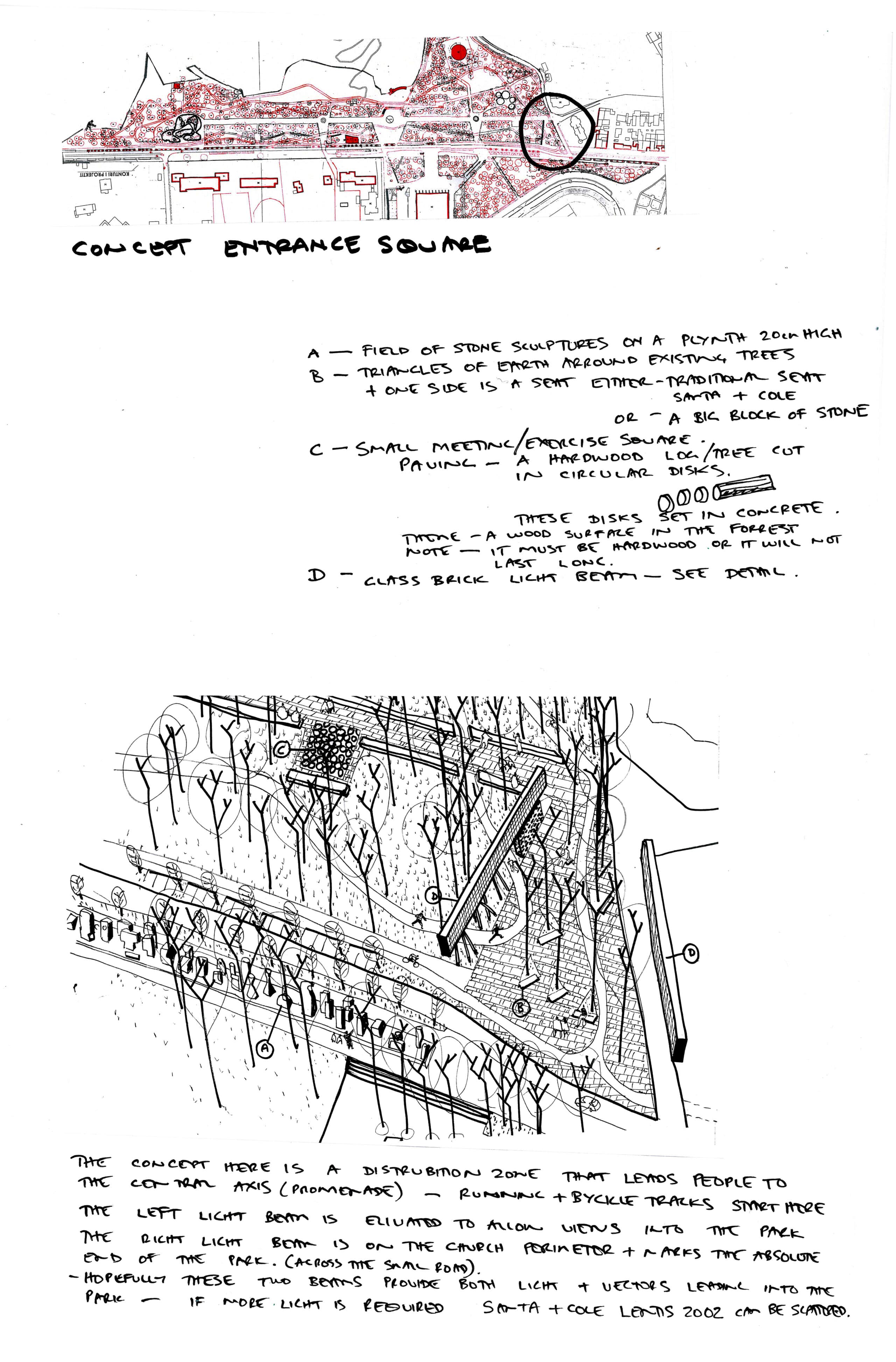
PW: They called me city architect for a while, legally necessary because they’re not allowed to commission foreigners. One has a sort of responsibility—but basically what we’re doing is marshalling new development that would otherwise damage the historic scale. We’re also making public spaces—four squares to date. We have built them a new public library, which is just about finished. The old communist library we converted to municipal offices. And now there’s a bus station on the perimeter of the city, and also a sports park. What’s really gratifying is that one actually sees these things working and giving something back to the public. One of the first things we did in Korça was an upgrading and rescripting of a communist-era park. That was the first time that I said for your fee you only get a hand drawing—the layout was drawn in red felt tip on a tree survey plan, weaving bicycle paths through mature trees. They built exactly what I sketched, and we invented a lot of wacky details—for instance, they can’t afford street lighting so we made these beams of glass brick with internal lighting (Fig. 21). I noticed they were very good with Christmas lighting so we put LED chains inside a double glass-brick wall, and now these great self-illuminating architectonic beams lie around the park. Basically, one makes up details which are achievable for them. One of the best experiences of my whole career was to walk with the mayor through that park when it was finished. With its Mediterranean climate it’s warm on summer nights, and as we walked down the central axis there were something like three thousand people promenading. People rushed up to shake the mayor’s hand, saying ‘thank you, thank you for this wonderful new park’. Really nice to see—spontaneous public appreciation.
MD: Yes, I can see it must be very interesting and rewarding, but I imagine disconcerting as well. It’s an unusual situation …
PW: Yes, it’s a very strange situation …
MD: …and politicians come and go and power shifts.
PW: If the socialist party goes out, that’s the end of Albania for us. Things there are totally polarised. The so-called democrats are actually the ex-communists. When communism collapsed they just changed their name, communist to democrat. The socialists, our clients, are actually social democrats, but they can’t use the word ‘democrat’ in their name.
MD: Is there a strong architectural culture or press?
PW: It’s like Poland. When a country suddenly comes out from a shadow, then the whole world is there like a supermarket and young architects shop online on ArchDaily with no idea of direction, tradition, or conceptual ordering principles.
MD: To finish, Peter, I’d like to talk about the current paintings—or maybe constructions is a better word—which you’re doing at the moment. I’m struck by the degree to which they seem like negotiations of experiences and relations—ways of sifting through things, and articulating relations with figures who are particular points of reference, like Malevich or Caspar David Friedrich.
PW: Yes, they are discursive in that sense. But I think in the first instance, they are objects—hand-held objects. They compensate for my growing mistrust of paper. I now have folders full of sketches but don’t quite know what to do with them anymore. The miniatures are painted on MDF.
MD: Yes, they feel very intimate, very personal—but maybe also totemic because of the physicality (Fig. 22).
PW: Yes.
MD: They have a tactile materiality—one thinks of miniatures, but also icons. I think of the famous photograph of the 0,10 Last Futurist exhibition, with Malevich’s black square sitting high in the corner of the room, where an icon would have been traditionally placed.
PW: Do you know the photographs of his funeral—the car with Black Square hung on its radiator? I was thinking of painting that. What really impressed me working on the Korça Icon Museum was the physicality of the icons themselves. They are so super haptic—on wood, this thick [gestures], full of wormholes, and battered on the corners, and they have a surface bursting with golden religiosity. From the back they’re also fantastic, with nails that have held them together for hundreds of years.
MD: I think the hanging in the icon museum is very powerful, with the densely-hung room and then the white room with only two pictures. I noticed last night that you used hinges to hang your paintings?
PW: Those were for an earlier exhibition at the AA, so students couldn’t run off with them. But they took the hinges as playthings and fingered the very delicate water-based surfaces.
MD: I knew some of the paintings from the Some Reasons for Travelling to Italy book, but it was interesting last night seeing their scale and material qualities, and the additional elements like the sushi on the edge of the Malevich. I want to ask you in connection with the paintings about the naming of things, and the way in which that naming is important to you. This is something that runs through the work—the shipshape, bridgebuilding, etc. At one point, going through one of the sketchbooks, I came across the ‘dogsbody’ …
PW: [laughs] … that wasn’t followed up.
MD: It strikes me as being quite important to your work, the way the name and the image act upon one another (Fig. 23).
PW: It’s dealing with character in a way, a sort of christening, or giving an interpretive orientation … As I get older, I read more, and write more, and words and images play with each other. It’s all a consequence of the long nights in Münster.
MD: I see something of that in the titles of the paintings. I mean, the titles are important.
PW: Yes, they’re really important, an essential component of the work.
MD: There’s a wit, humour—sometimes irony.
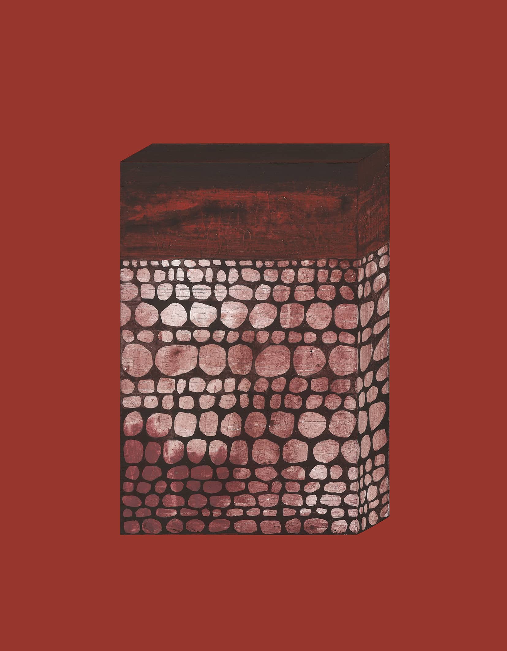
PW: I think there’s a lot of poking fun at over-intellectualising … like my favourite—A Pantheistic Resonance of Picasso’s Late Work was One Irrefutable Consequence of Global Warming (Fig. 24).
MD: Which means you probably don’t want to say any more about them [laughs].
PW: I prefer to be a naïve Australian.
MD: Perhaps that’s a good point to finish.
Mark Dorrian is Editor-in-Chief of Drawing Matter Journal, holds the Forbes Chair in Architecture at the University of Edinburgh, and is Co-Director of the practice Metis. His work spans topics in architecture and urbanism, art history and theory, and media studies. Dorrian’s books include Writing On The Image: Architecture, the City and the Politics of Representation (2015), and the co-edited volume Seeing From Above: The Aerial View in Visual Culture (2013).
Peter Wilson is a founding partner in Architekturebüro BOLLES+WILSON. Peter is the author of Some Reasons for Traveling to Italy (2016), Some Reasons for Traveling to Albania (2019) and Bedtime Stories for Architects (2023). His drawings are held in the collections of Drawing Matter, V+A, CCA, DAM Frankfurt. BOLLES+WILSON are the subject of three El Croquis Monographs and the publication, A Handful of Productive Paradigms (2009).
This article first appeared in The Journal of Architecture, 26:5, Architectural Lineaments: Adventures Through the Work of Peter Wilson, ed. Mark Dorrian (2021): 599–638.
Find more drawings of Peter Wilson’s Clandeboye Bridge at Drawing Matter Collections.

– Peter Wilson