Soane: Energy and Frustration

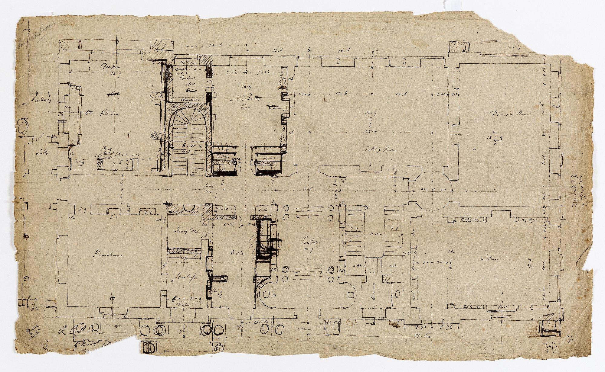
This seemingly benign-looking plan is in fact a thrilling drawing. It shows Sir John Soane’s cerebral struggles in attempting to resolve a number of key competing design elements in the planning of a country house. The drawing exudes energy and frustration.
The challenge of designing buildings symmetrically is hard work indeed. It takes multiple design attempts, and is all the more challenging when parts of the building already exist or have been predetermined. Soane’s plan is dimensioned, so one might assume that this is either a survey of something that already exists, or a part-developed design. Scope for change appears to be limited. For ease of description, we will assume that north is at the top of the plan – although it may well not be.
The internal planning strikes one first. The south side shows a rather beautiful and characteristic entrance vestibule. It is centred on a seven bay façade, with small apsidal recesses on either side, steps up and framing columns flank the ascent. It is very ‘Soanean’, and his works at Bentley Priory and other places immediately come to mind. It was a design formula that was known to delight.
This vestibule leads to an axial spine passageway extending from a library and drawing room to the east, and towards the kitchen and housekeeper’s room to the west. Here is the first design challenge posed by this drawing. One side is ‘polite’, the other is ‘service’. Soane will want to manage the transition invisibly, at least from the ‘polite’ side.
Moving eastwards from the vestibule down the corridor is the main staircase, before a circular lobby serving the three principle rooms is reached. This clever and efficient planning device is typically ‘Soaneian’ and it determines the length of the axial passageway on the eastern side. No changes are made here as this part of the plan already works well.
The corridor westwards towards the kitchen was the real challenge. But Soane will want the new corridor extending west from the vestibule to be symmetrical in length with that from the east, as from that key moment of arrival at the top of the vestibule steps, all must be architecturally resolved in either direction. A dishing of the wall on either side of the ‘eating room’ doorway already hints at a ceiling dome (or tribune) to mark this important moment.
Soane achieves his symmetry to the west by placing a new secondary stair in a position that exactly reflects the location of the circular lobby to the east. A door whose reveals have been lightly marked on the plan would have blocked sight down the continuing passageway at this point. For Soane it would have been a given that no one would want to look down towards the kitchens and staff areas.
Soane’s new secondary stair is apsidal, like the stairs of his houses on Lincoln’s Inn Fields, with a small alcove formed in the plain wall opposite to manage the view from the stairs themselves. In the hands of others, the new staircase may have created a muddle of smaller spaces opposite and adjacent to it, but this is where, with a lot of chiselled black pen strokes, Soane’s genius design is carefully worked into place. A new bed chamber is formed for the owner along the north front, between the new stair and the eating room, with a ‘powdering’ room (with wardrobe) neatly provided in the small area behind the stair.
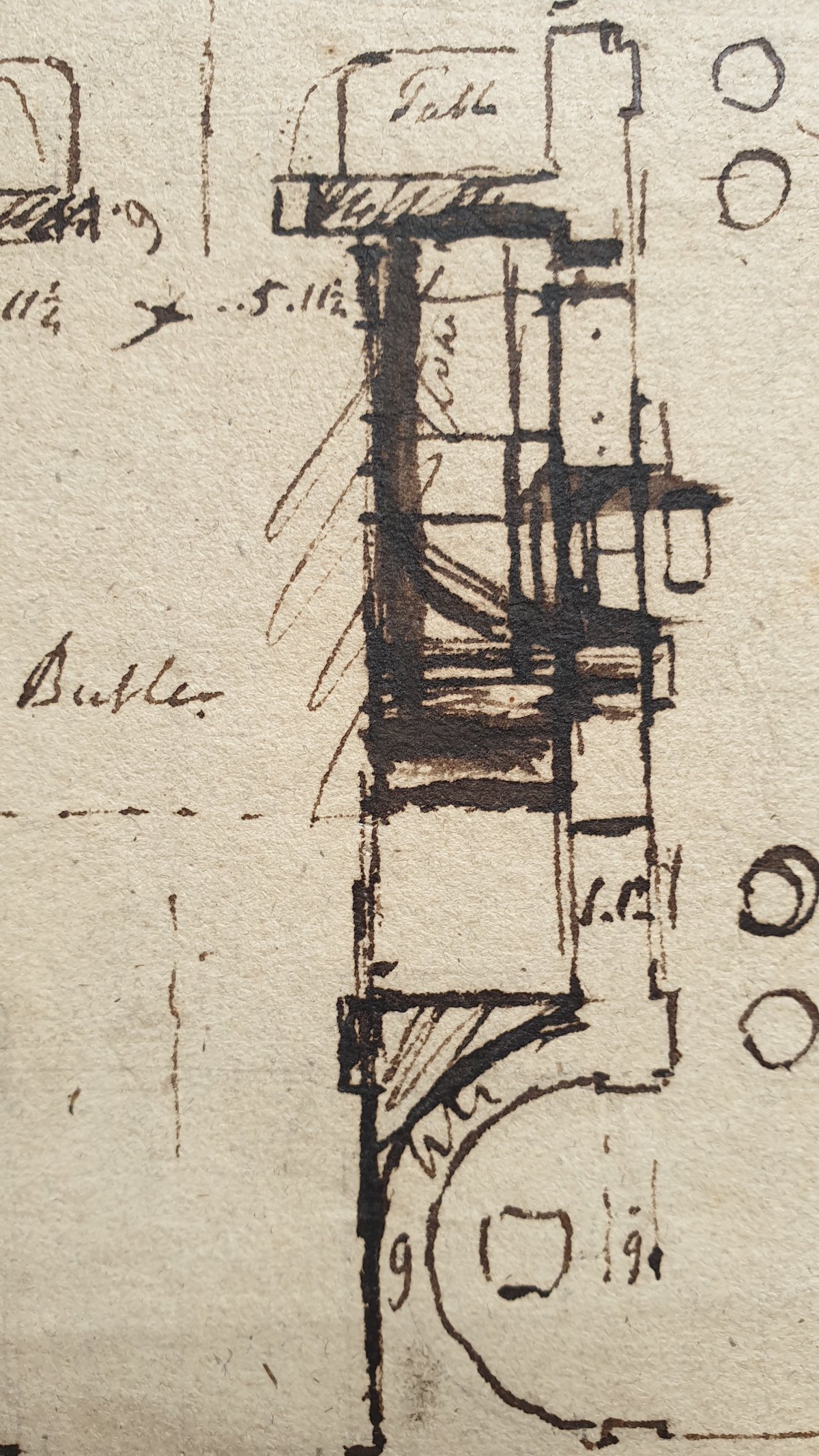
South of the passageway, a butler’s room and strong closet are formed. But the butler’s room does not need to be as large as it is, and there are opportunities to make a recess, and perhaps a fireplace to the vestibule on the shared wall between the two rooms. Symmetry within the butler’s room would nevertheless matter, and even here there is a screen wall to emphasise the north-south door-window axis, while the door to the strong room on the west wall is to be matched by a blind recess. So far as compositional symmetry and Soane were concerned, even the butler deserved careful design.

While progress with the internal planning now appears close to resolution, outside, a second major design challenge to the external elevations appears far from happy. To the north the existing seven bay elevation was being respected and emphasised by additional projections to the windows at either end. To the south, something else was happening which we cannot determine from this plan alone. It is hinted at by lines on the extreme left hand side of the page. At the base of the drawing, a new grand entrance is being formed, but seemingly not to the elegant new vestibule and hall, but instead to a small secondary scullery entrance off the housekeeper’s room, two bays west of the main entrance. If symmetry is to be achieved, this implies that this would need to become the centrepiece to a new eleven bay extended frontage, or perhaps something else was in mind. Can this be true? At this stage we don’t know what was up Soane’s sleeve. One almost feels Soane tiring of the challenge, putting down his pen and moving onto something less taxing.

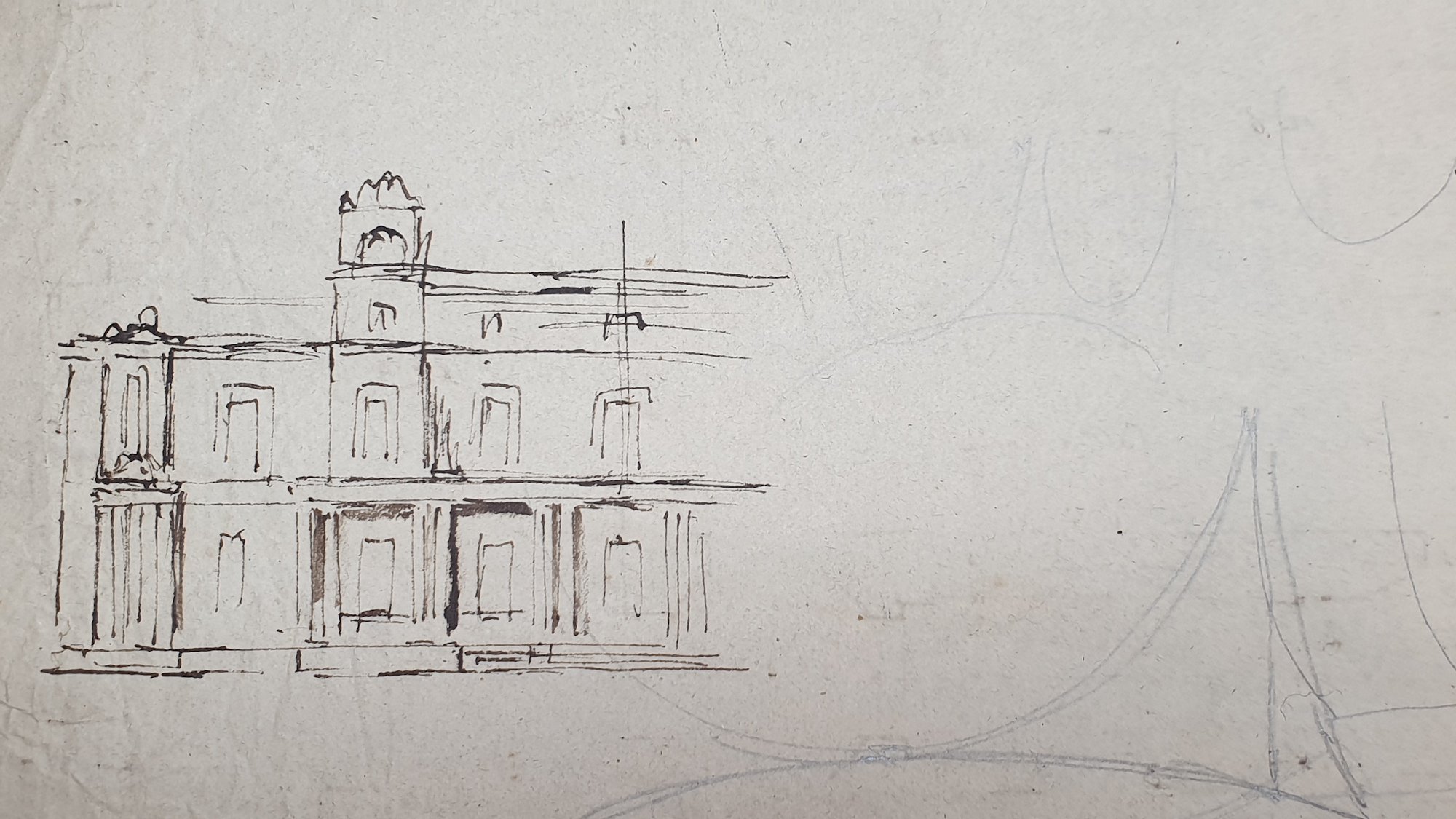
However, this was not so. All is explained on the back of the drawing where the proposed elevation is sketched out much more freely. It is as if his accumulated ideas have suddenly been released in a great out-pouring of flowing black pen lines; drawn in haste before as if he could forget them. The new entrance will in fact be centered under a five bay loggia, with double recessed windows at first floor and low attic windows at second floor level. Soane’s favoured finial motifs from the Bank of England and from the gateway at Pitshanger re-emerge to mark flanking tower structures. The all-important central axis line is marked on, so we know that he would not have needed to draw the rest of it. He knew where it was going.
The drawing is again put down, but it is tempting to imagine a final flurry perhaps, and Soane reaching for a pencil, taking the drawing upside down, and leaping off in further flights of fancy about the future entrance tribune. Arches and a pendentive dome perhaps. It seems odd that having built so many of these domes by this time, he still struggles to draw them in perspective.
The design represented here is in transition. This drawing, with its thick and multiple line strokes expresses his gritty determination as freshly as the day it was made.
– PD, by email to the Drawing Matter editors, 10/06/2020: I have really very much enjoyed looking at this absorbing drawing, and thank you for sending it to me. You have said that the project is for Gittisham in Devon, the drawing reveals the name of the owner is Mr Putt. As you asked, I did not look this up until after I had written the below – but it’s relatively late for a Soane country house – 1811. ‘Poor Reymundo burst a blood vessel and never spoke again’ it says in my book, killing the job. It is a wonder looking at these blackened lines that Soane himself did not burst a blood vessel!
