The Cornice: The Edge of Architecture
The following essay was first published as the introduction to ‘The Cornice’, GTA Papers 6 (2021). It is one of the outcomes of the work done in preparation for the exhibition The Hidden Horizontal: The Cornice in Architecture and Art, which was on show at the Graphische Sammlung of ETH Zurich (25 August – 14 November 2021), and curated by Maarten Delbeke and Linda Schädler, assisted by David Bühler, Anneke Abhelakh, and Emma Letizia Jones.
In response to Maarten Delbeke’s text, the Drawing Matter editors have gathered an informal group of cornice drawings from the collection, some of which were included in the exhibition at the Graphische Sammlung. Click here to see the selection.
The Cornice: The Edge of Architecture
Everything should be measured, bonded, and composed by lines and angles, connected, linked, and combined … ; so that one’s gaze might flow freely and gently along the cornices, through the recessions, and over the entire interior and exterior face of the work, its every delight heightened by both similarity and contrast; and so that anyone who saw it would imagine that he could never be satiated by the view, but looking at it again and again in admiration, would glance back once more as he departed; and so that however much he searched, he would not find anything in the entire work inconsistent or incongruous or not contributing its every number and dimension to the splendor and grace.
– Leon Battista Alberti, De re Aedificatoria, Bk. IX, 9) [1]
Cornices are everywhere. At the same time, it is in their nature to be viewed obliquely or observed inadvertently. Once they become the focus of attention, their omnipresence is almost irritating. The skyline of any city street is a ragtag procession of cornices of various types and materials, in various states of maintenance. And they are not limited to architecture. Windows, doors, ceilings, mirrors, wall panelling from across the centuries sport more or less elaborate frames. It does not stop there. Cars and clothes, furniture and household objects feature their own cornice-like elements. Strips, bands, lines of paint act like cornices by profiling, hemming, or crowning almost any kind of artefact. In their ubiquity, the cornice invites ambiguous feelings: it can appear to be the residue of an old order applied by force of habit or even out of lassitude. At the same time, the persistence of the motif suggests that, even if the form seems outmoded, it is by no means exhausted.
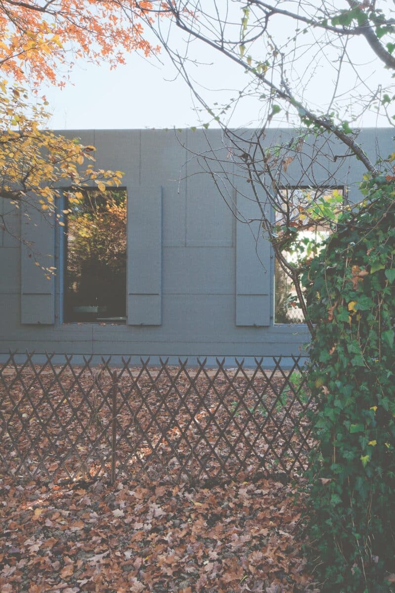
When approached solely as a matter of architecture, the ambivalence around the cornice persists. As part and parcel of the architectural repertory, the cornice seems to be one of the essential elements of design and composition, along with column, wall, and beam. But it has also been discredited. At times the ambition of a design can be measured by the effort spent on eliminating the cornice. The Garden Pavilion by Christ and Gantenbein in Basel (2012) forfeits any hint of a cornice so as to appear wrapped in tar-paper roof-cladding, discretely immersed in its villa garden. In contrast to such radical solutions, the cornice is often not quite architecture: too decorative, artificial, and always on the verge of escaping the realm of building proper to attach itself to any artefact, interior, or facade in need of a flourish. Even in classicist architecture the cornice is not an element in its own right but only the upper part of the entablature.
These ambiguities lend the cornice a particular status. Thanks to its marginality it can act as a repoussoir, a figure in the foreground adding depth to a scene, drawing the viewer in and inviting exploration. But surprisingly often the cornice leaves the margins and crosses into the headlights of architectural practice, theory, and criticism. In these moments the marginal figure often ends up accused of responsibility for an order, a grammar, an attitude, or an ideology. Precisely because of its seemingly nonchalant ubiquity, the cornice is always there when things get complicated; sometimes unwittingly, but more often as a suspected accomplice or even as the elusive mastermind. And because of its ambiguous agency, its lack of obvious utility, its involvement can extend from matters of design to taste, technology, construction, behaviour, and even to morals. At the same time, no single party ever owns the cornice entirely. Often of uncertain functionality, fabrication, authorship, and even age – because of the endurance of its forms – the cornice cannot be claimed by architects with the same ease as, for instance, the column. As a matter of habit it belongs to the collective, and any profession of its value, or lack thereof, resounds with implications. When the cornice takes centre stage, it carries a lot of baggage.
By sequencing moments when the cornice is emphasised in Western architectural theory and practice, this introduction sketches the contours of some of the questions it raises. Celebrated, censured, and outright condemned, the cornice emerges as a crown witness to fundamental debates about architecture both as a design problem and a cultural practice. It owes this role to a moment of rupture: modernism defined itself by rejecting the cornice. Because it is so preposterous (how can an artistic position depend on a thing like a cornice?), this prohibition has ironically gained the cornice some privileges. Once a discreet yet persistent presence in the spectacle of architecture, it now testifies to our own reluctance to discuss questions of aesthetics and taste, perception and appropriation, comfort and habit. This shift – from supporting actor to critical attester – makes the cornice not just a prime observer but also a troubling agent in architectural history.
Modernist Oblivion
When The Architectural Forum dedicated a special issue to the work of Frank Lloyd Wright in January 1938, the architect designed a special fold-out insert for it.
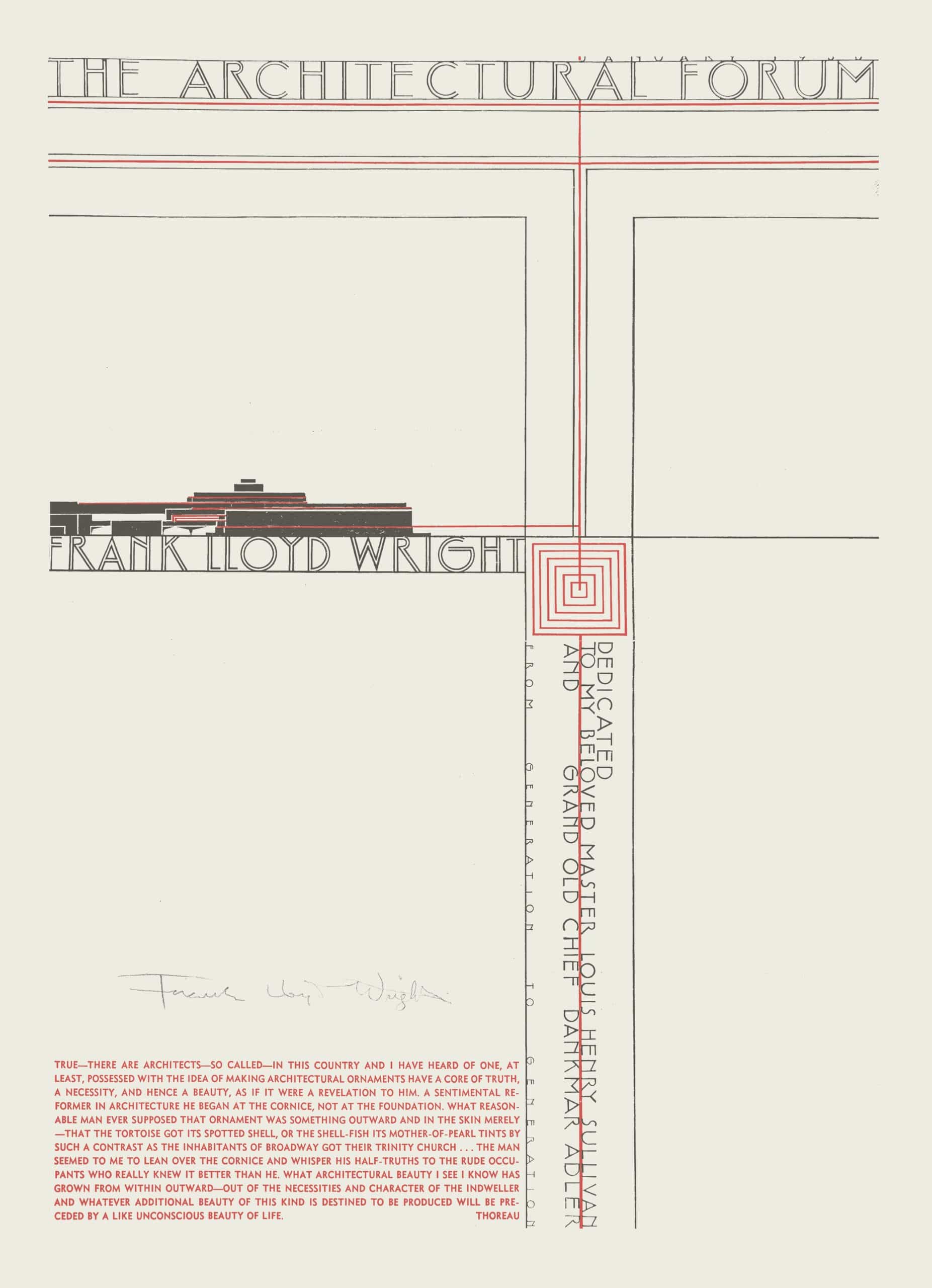
Fold-out insert for a special issue of The Architectural Forum [68, no. 1 (January 1938)] dedicated to the work of Frank Lloyd Wright; lithograph printed in red and black; 426 × 301 mm; signed in pencil.
Framed in a simple orthogonal pattern of black and red lines, the recto of the insert sports the name of the architect and an abstract rendering of a Wright building, a dedication to Louis Sullivan and Dankmar Adler, and a short text set in bright red lettering. The short text is the element in the composition that is perhaps now most surprising – and most telling.
True – there are architects – so called – in this country and I have heard of one, at least, possessed with the idea of making architectural ornaments have a core of truth, a necessity, and hence a beauty, as if it were a revelation to him. A sentimental reformer in architecture he began at the cornice, not at the foundation. What reasonable man ever supposed that ornament was something outward and in the skin merely – that the tortoise got its spotted shell, or the shell-fish its mother-of-pearl tints by such a contrast as the inhabitants of Broadway got their Trinity church … The man seemed to me to lean over the cornice and whisper his half-truths to the rude occupants who really knew it better than he. What architectural beauty I see now has grown from within outward – out of the necessities and the character of the indweller and whatever additional beauty of this kind is destined to be produced will be preceded by a like unconscious beauty of life. [2]
Henry David Thoreau is given as the author, the text taken from the first chapter of Walden, the primitivist paean published in 1854. Part of Thoreau’s account of the construction of his cabin, the fragment criticises ‘so called’ architects who seek to find truth in ornament. With Thoreau’s words, Wright criticises those who believe that ornament is ‘in the skin’ and should not grow organically ‘from within outward.’ Symptomatic of this misunderstanding is the so-called architect’s starting point for his quest: ‘at the cornice, not at the foundation … The man seemed to me to lean over the cornice and [timidly] whisper his half-truths to the rude occupants who really knew it better than he.’ The passage lifted from Walden forms part of Thoreau’s longer dismissal of architectural ornament as insubstantial and of the art of architecture as disconnected from the ‘necessity and character of the indweller.’ Thoreau asks, ‘What if an equal ado were made about the ornaments of style in literature, and the architects of our bibles spent as much time about their cornices as the architects of our churches do?” The answer is clear: the decadence and futility of ‘the belles-lettres and the beaux-arts.’ [3]
The passage selected for the insert alights on one of Wright’s particular obsessions. The cornice that bears the brunt of Thoreau’s polemic is the very architectural element that Wright, in a lecture delivered in 1930 at Princeton University, singled out as the symptom of all that was wrong with architecture. Dedicated to ‘The Passing of the Cornice,’ the lecture spun its tale from an episode when, as a youth, Wright witnessed a trapped workman menaced by the broken iron cornice of the collapsed new west wing of the Wisconsin State Capitol. [4] Drawing inspiration from Victor Hugo’s ‘Ceci tuera cela,’ Wright casts the cornice as the culmination of a dead classical tradition, both means and ends for the perpetuation of sterile values. The Renaissance, for Wright, signified not the revival but the demise of architecture, when the emergence of the first mechanical techniques of reproduction spelled the end of the free crafts. Since then, architecture had withered away under the endless repetition of forms borrowed from the Greeks and Romans, a situation exacerbated by industrialisation, with the mass production of those same redundant forms in new materials. Thoreau’s nativist ideas resonated well with Wright’s thinking in general; however, Wright finds the cornice particularly despicable because of its capacity to become attached to all kinds of buildings, from warehouses to skyscrapers, to lend them a veneer of dignity. The falseness of the cornice, in Wright’s view, is a vehicle for false values rooted in the oppressive social order of the European past. Modern, democratic America needed new forms, indigenous elements dictated by freedom. The cornice was not one of them.
Wright was not the only modernist to denounce the cornice. Three years before Wright’s lecture, Le Corbusier published a short comment on the current state of architecture in L’architecture vivante. [5] Titled ‘Où on est l’architecture,’ it consisted of an early version of his five points of architecture, plus one more. Next to the admonishment to use pilotis, the fenêtre en longueur, the free plan and facade, and the roof terrace, as his sixth point the architect also issued one prohibition: ‘la suppression de la corniche’ (the suppression of the cornice). [6] Each point received a short explanation derived from an earlier text, and for the cornice the author incorporated a slightly reworked fragment of a lecture held at the Sorbonne in 1924 titled ‘L’esprit nouveau en architecture.’ [7] What is striking is how radical Le Corbusier believes his indictment to be: ‘Suppressing the cornice is to inflict a serious twist to acquired habits … but from an aesthetic point of view, to admit that the cornice should be suppressed is to bring a capital element to the writing of a new code of architecture.’ [8] He concludes,
Suppressing the cornice now, is to arrive at a considerable and truly revolutionary aesthetic consequence. The very fact of suppressing the cornice and being able to explain this suppression logically, of constructing well, of not making a construction which is inconvenient and suffers damage, represents one of the most characteristic accomplishments of today’s architecture. [9]
And finally, in an observation included only in the earlier version, ‘We arrive at a conclusion of an aesthetic order, which is the simple appearance.’ [10]

The Myth of Construction
Wright’s and Le Corbusier’s manifestos situate the cornice at the core of some prominent modernist myths. They see the cornice as an automatism symptomatic of a culture defined by amnesia about the true origin and meaning of things. The true original value of the cornice is determined by construction. Both modernists accept the Vitruvian account of the origins of the Doric entablature, explained in Book IV, part 2, of the Ten Books of Architecture, which roots the aspect of architrave, frieze, and cornice in the joints of wooden roof construction. [11] In ‘The Passing of the Cornice’ Wright recalls how seeing the Parthenon in situ allowed him to imagine it as a polychrome wooden building. [12] Wright’s vision stands at the end of a long tradition initiated by Andrea Palladio and further developed by Jacques-François Blondel, Charles Perrault, Marc-Antoine Laugier, and Giambattista Piranesi, among many others, which expanded Vitruvius’s hints specific to the Doric entablature into a full-fledged theory of the tectonic origins of all architectural forms. [13] This development was driven by the conundrum that underlies any theory of architectural design: to legitimate their practice, architects need to persuasively promise that, through the quality of their design, their projects will gain acceptance in their future cultural and social contexts. Since architects exert no control whatsoever over the reception of their creations, they claim to encode the societal importance of the building in its very fabric. Rooting architectural form in materiality and fabrication bestows it with an apparent necessity (‘recherche de technique pure,’ as Le Corbusier would have it). In the absence of such necessity, our modernists and their precursors argue, elements such as the cornice are superfluous.
The most ambitious claim tied up with this argument is that necessity bestows beauty. If it does, then aesthetic pleasure will confirm the rightfulness of the architectural design. Here the cornice assumes a literally liminal position. In 1899 the German critic Karl Scheffler had already warned that the design of cornices was out of joint with the spirit of his day, and he turned to rococo to find forms where material and profile merged. [14] In his Die Konstruktion und die Kunstformen der Architektur (1902) Constantin Uhde focused on the cornice to explain how rational construction according to the properties of materials could generate pleasing buildings. [15]
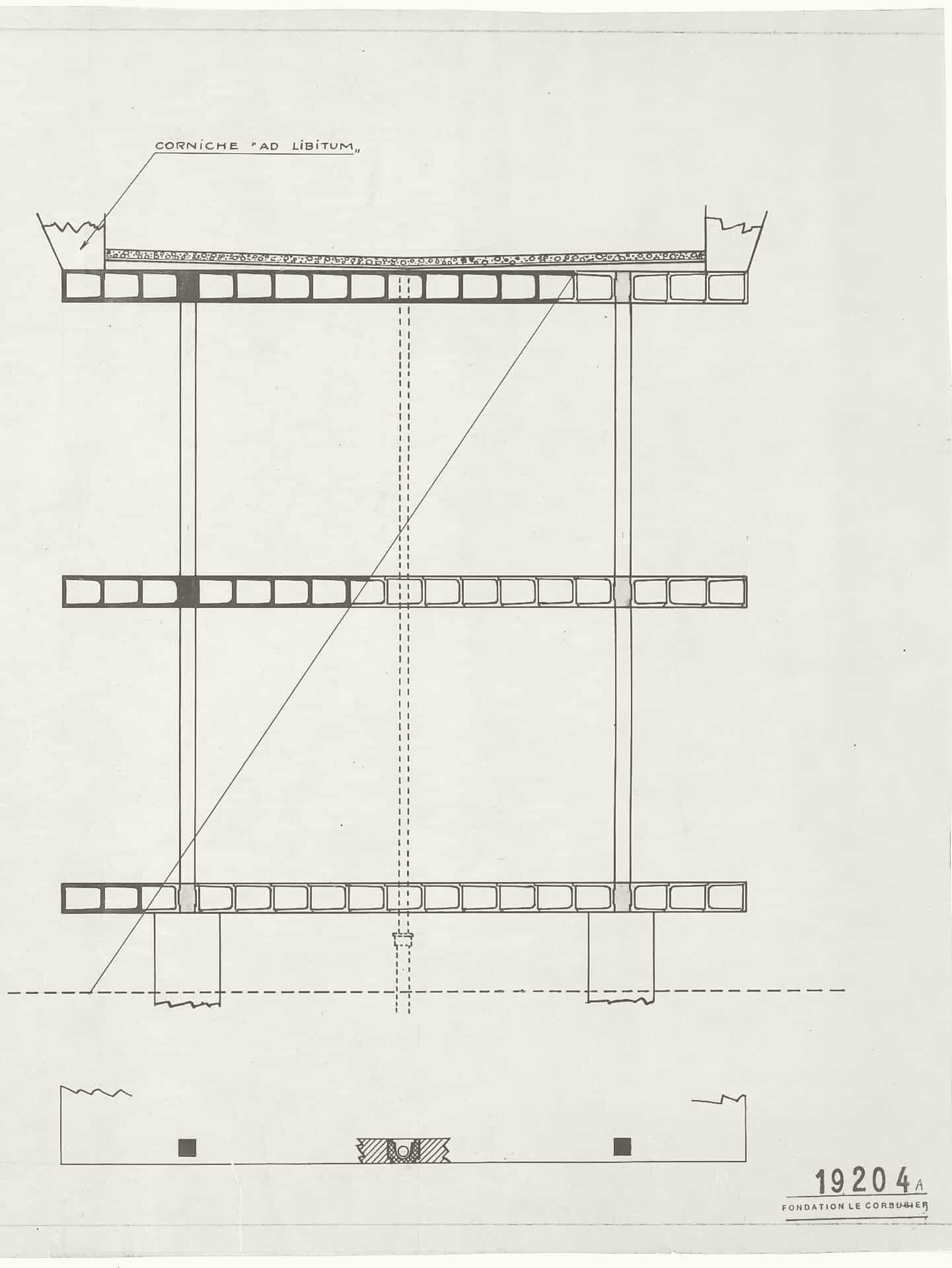
Some twenty years later such redemption was no longer possible. As Le Corbusier wrote, suppressing the cornice is ‘a considerable and truly revolutionary aesthetic consequence.’ [16] The cornice is the reactionary element that has engrained itself in habits of perception, that persists in spite of changing social mores and ways of building. Its suppression is a prerequisite for new architecture. Still, Le Corbusier himself seemed to prevaricate in the face of this challenge. An early section of the Dom-Ino system is annotated with ‘corniche ad libitum,’ and the manipulated photographs of American grain elevators published in Vers une architecture erase the pediments but not the cornice. The same book also celebrates the profile or modé-nature as the distinguishing feature of architecture both as ‘les traits de visage’ (the facial lines) of a building as a form of art and the signature of the architect. [17] In the case of Wright, the fold-out insert of Architectural Forum on which he quoted Thoreau’s condemnation of the cornice was also dedicated to Sullivan and Adler, architects noted for their monumental cornices – cornices that would rally preservationists when the architects’ creations were threatened with demolition.
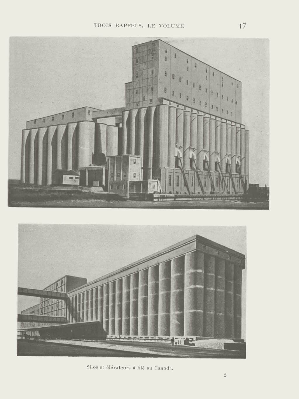
An Aesthetic Object
The hesitation in abandoning the cornice, despite vociferous condemnation, points to some of the ambiguities of the element: while the cornice can be explained as a function of construction or a technical solution, fabrication never fully accounts for its form. Vitruvius pointed out that the first builders ‘decorated the cornices … with fine carpentry for a more attractive appearance.’ [18] Moreover, the cornice may be part of construction, but not of tectonics, and thus appears as an addition to the rudimentary elements of walls, columns, and beams. What the cornice performs within this constellation is less a function of how architecture is built than how it is perceived. The cornice, as Le Corbusier fully recognised, is an aesthetic object. It was discussed as such in the Allgemeine Theorie der Schönen Künste, the first German-language lexicon covering the then young field of aesthetics, published in four volumes from 1771 to 1774 by the Swiss theologian and philosopher Johann Georg Sulzer. Primarily concerned with the question of how the fine arts can achieve beauty, Sulzer roots his theory in a poetics of genre, which identifies the proper artistic means according to subject matter and intended effect. In this context, the Lexicon treats the cornice extensively. After a short factual definition of the cornice as ‘an enclosure consisting of multiple elements at the top, sometimes also at the bottom, of a wall or opening,’ Sulzer proceeds to describe its various applications before arriving at a more critical consideration: ‘The cornice serves to delimit and perfect the elements, which are framed by the cornice so that they appear as a single whole. […] It is therefore an important ornamentation for entire buildings.’ [19]
Crucially, Sulzer links his entry on the cornice to his lemma on profiles or Glieder. The author defines Glieder as ‘the smaller elements, which combined constitute the main elements belonging to the ornamentation of buildings, in particular their cornices’ Their apparent modest nature belies their importance and versatility:
The profiles are to the cornices almost what letters are to words: and just as from a few letters an innumerable number of words can be composed, so from the different combinations of the profiles arises a great variety of cornices, pedestals, and garlands, by which both the different orders differ from one another and buildings in general acquire their character of richness or simplicity. [20]
Sulzer’s reflections on the cornice and the profile thus amount to a short design theory of this architectural element: the cornice is a composite of profiles and offers occasion for almost endless invention. Precisely this freedom calls for expertise and good judgment on the part of the designer, all the more since the cornice helps to determine the appearance of a building – not only by establishing a degree of ornamentation but also because it allows buildings and their parts to appear as a whole.
Sulzer’s ideas summarise a couple of centuries worth of ideas on profiles and cornices. [21] The comparison of profiles to a limited letterset is derived from Charles d’Aviler’s Cours d’architecture (1691), and it had received prominence in Germain Boffrand’s Livre d’architecture (1745). [22] There, the rococo architect declared the line to be the foremost expressive element of architecture and the profile its materialisation. As the means by which character could be imprinted onto the building, profile and cornice became the hallmark of the professional architect. After all, the architect’s remit was to translate the personality of the patron into a design that obeyed good taste, understood as the generally accepted principles of the art. Sulzer, too, would state that ‘you can easily determine the good or bad taste of a builder from the various cornices that are affixed to the inside and outside of their buildings.’ [23]
Line, Signature, and Caprice
This celebration of the cornice could not be more distant from Wright’s and Le Corbusier’s criticism. Rather than casting the cornice as a parasitic element on the verge of erasure, it forms the core of architectural design. Yet the contrast runs far deeper. The modernist vituperation against the cornice is not merely a reevaluation within but the disavowal of a complete system. More than merely refusing a historicist motif, our modernists call into question what this motif was asked to perform. This performance can be characterised as a set of negotiations: between perception and materialisation, between norm and invention, and between design and society. A closer look at these helps to understand why it could become so important to annihilate the cornice.
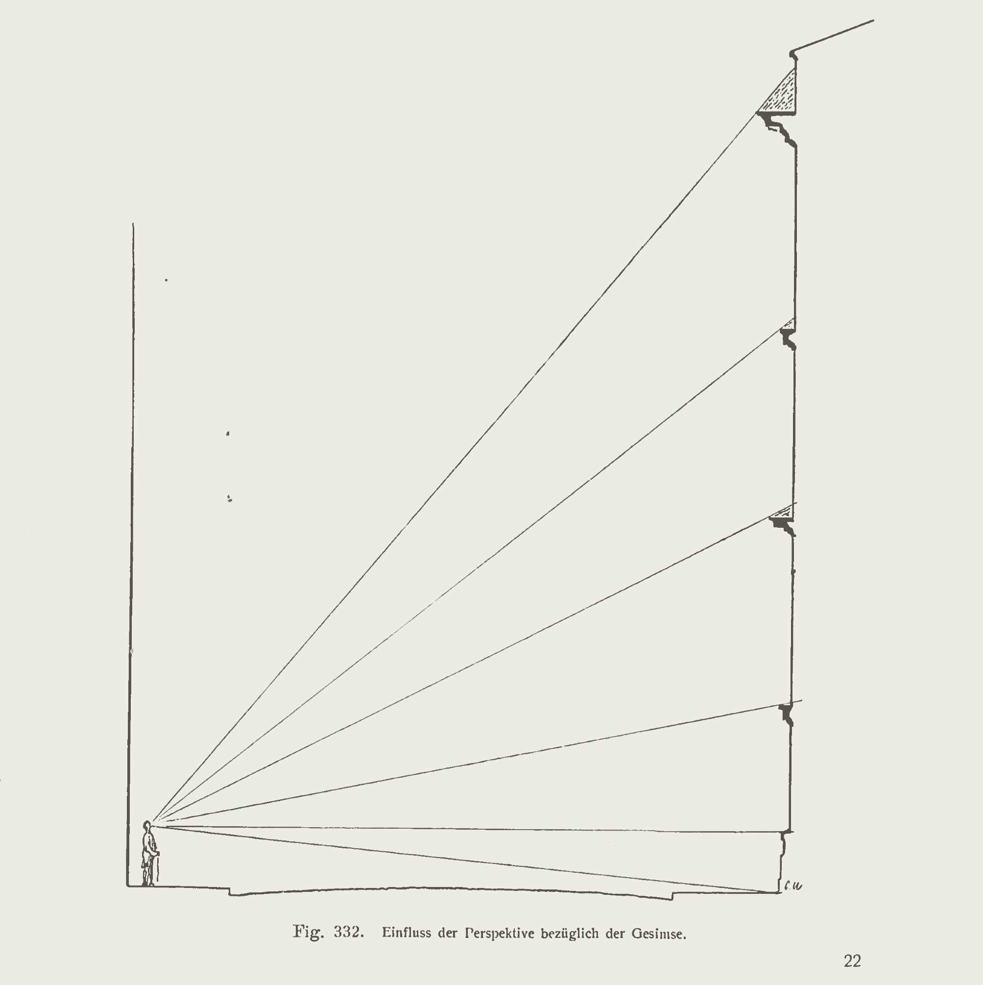
The cornice points to the ambiguous relationship between the percept and its materialisation. If the graphic representation of the cornice amounts to a composition of lines, its visual effect depends on its three-dimensionality and materialisation. As a material body, the cornice generates the play of light and shadow that would fascinate architects from Sir John Soane to Le Corbusier and Luigi Moretti. [24] Exactly this property makes the cornice difficult to draw, since the sculptural qualities generating this play are difficult to seize in conventional orthogonal projections, and rendering the effect of the cornice fails to register its actual form.
This elusiveness gestures toward a second negotiation. Boffrand attempted to codify the proper use of profiles in order to address anxieties about artistic invention. Rehearsing points already formulated by Roland Fréart de Chambray in the middle of the seventeenth century, Boffrand censured those who took too many liberties in architectural design. [25] Condemning in equal measure artisans unschooled in the principles of art and architects who privilege their originality above established taste, Boffrand sought to normalise the use of profiles by placing them at the centre of the architectural project. Boffrand’s stress on the limited repertory of profiles (flat, concave, and convex) and the importance of their proper application implicitly recognised the cornice as a site where architectural conventions had been challenged, not just by multiplying forms and components into ever more complex shapes but also by using the cornice as the driver of the architectural project. In projects such as Francesco Borromini’s facade of the Propaganda Fide in Rome or an early eighteenth-century wall-pillar church, the cornice is less the crown of the entablature than the primary determinant of architectural space. This primacy of secondary elements in baroque Roman architecture was condemned by the conservative Roman critic Giovanni Pietro Bellori. [26] One century later the cornice would receive ample attention in Antonio Visentini’s treatise on the ‘errors of architects,’ as an element bending, breaking, or changing shape in denial of its original subservient purpose. [27]
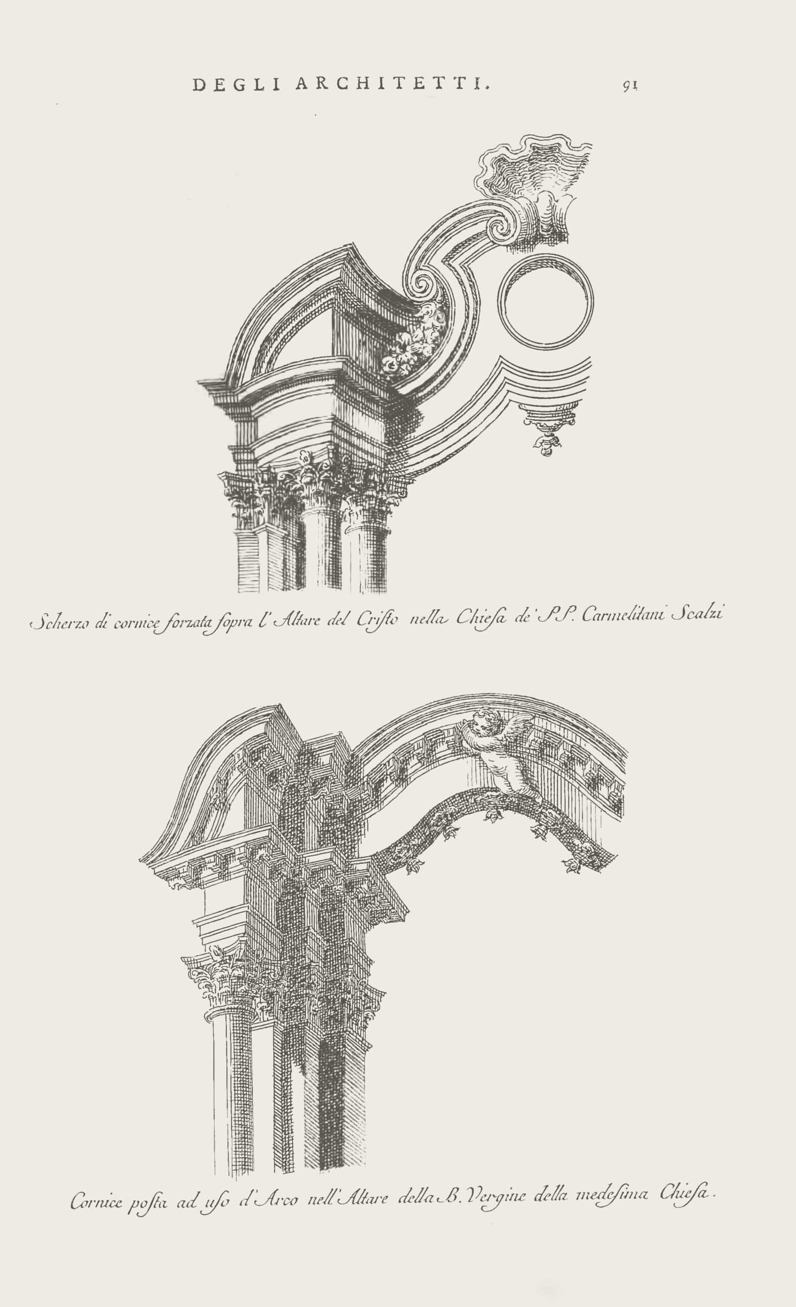
In his nearly contemporary Dissertation historique et critique sur les ordres de l’architecture (1769) Amédée-François Frézier wrote, ‘However beautiful cornices are, one should not use them indifferently everywhere, without judgment, nor take away from them their natural simplicity with breaks or forced contours.’ The culprits, he claimed, are not only bad architects but sculptors and carpenters:
Bad architects like to break the simplicity of the lines of cornices, and to change and vary the direction, imagining that a cornice is beautiful only thanks to the multiplication of its horizontal projections, and by repeating the profiles several times, and by the variegated contours of several parts, often detached, then arched, then plied into volutes, or profiled in rolls. The designs of sculptors and carpenters can often be recognised because of this error. [28]
As a battlefield between the well-trained architect and their allegedly illegitimate competitors, the cornice points to a third area of negotiation: between a building and its cultural context. Critics like Frézier warn of the confusion that unbridled invention of cornices might cause: visual, yes, but also cultural. The alphabet of profiles at the disposal of the architect serves to indicate the purpose of a building and the status of its owner. As such, the cornice is as essential to decorum or suitability as the system of the orders.
But if the orders are quite strictly codified by means of their ornaments and proportion, the cornice escapes easy categorisation. Its sole defining feature, as Frézier and Sulzer remind us, is that it crowns a building. As such, it is not just a particular site of visual expression but an element responsible for the appearance of a building as a whole. As the line demarcating the facade, the cornice is an arbiter of representation. This particular function of the cornice received its most famous treatment in Blondel’s Cours d’Architecture (1771). According to Blondel, the cornice can help ‘to explain the various characters of the different products of architecture, by tracing to the eyes of the viewer, up to the smallest detail, the motif that instigated the erection of the building.’ [29] Blondel roots this capacity of the cornice in an old comparison. Early Renaissance interpreters of Vitruvius, such as Franscesco di Giorgio Martini, had discovered analogies between the profile of the human face and the cornice. [30] In his Medidas del Romano (1526), Diego de Sagredo wrote,
The ancients centered and erected the moldings of their cornices upon the face of man. They placed five frames in five places on the said face. The first upon the forehead, the second upon the eyes, the third upon the nose, the fourth upon the mouth, the fifth upon the beard … . Over the forehead, a cyma; over the nose, a corona; over the mouth, a torus; … over the beard, a … talon. [31]
The passage is illustrated with a woodcut where a satyr- like face is mirrored against a cornice. Blondel generalizes this analogy to the effect of the cornice on the appearance of a building as a whole. By adopting the profiles of different human faces, the cornice embodies various characters and lends them to the building. This will not be to the liking of ‘connoisseurs,’ Blondel warns, as designing cornices like faces will lead to proportions they deem incorrect. But it will please spectators, who will discover ‘quelque chose d’intéressant’ and experience the same pleasure as when seeing a beautiful face. [32]
Rather than framing the cornice in a proportional scheme based on the human body, the facial analogy draws architecture into the sphere of social interaction.
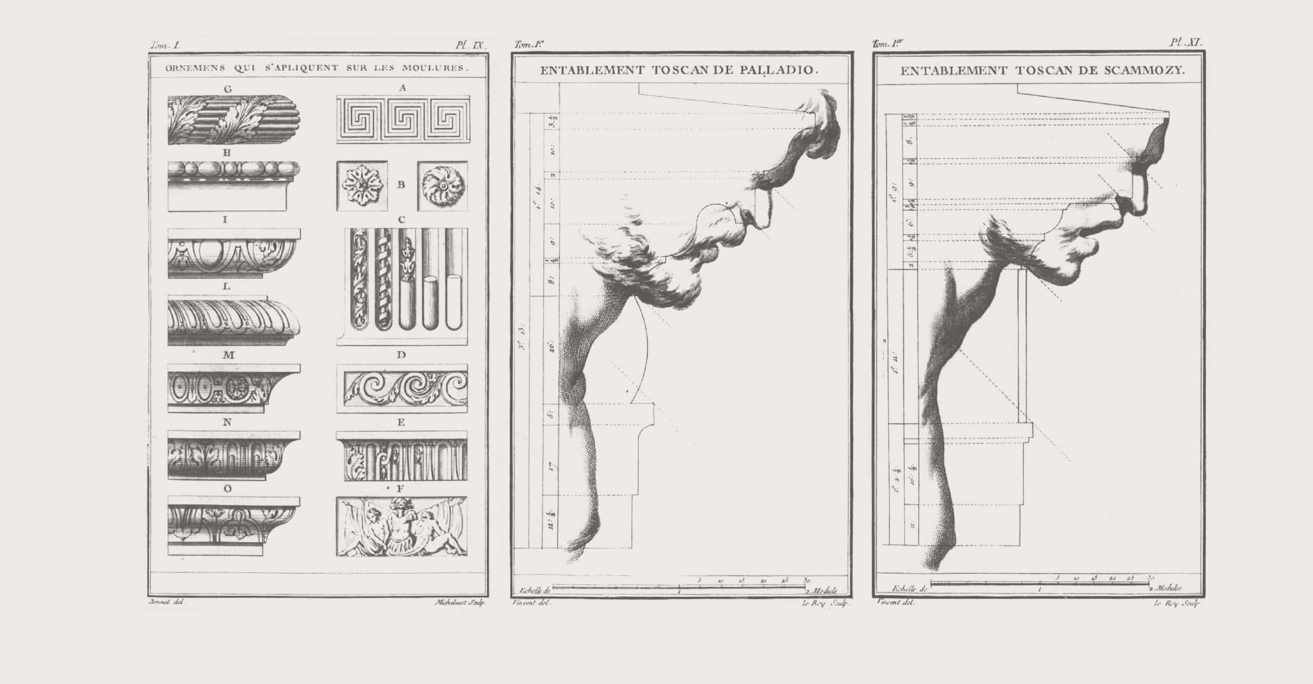
Jacques-François Blondel, Cours d’architecture, ou Traité de la décoration, distribution & construction des bâtiments, vol. 1 (Paris: Desaint, 1771): the Tuscan entablature according to Palladio, Vignola, and Scamozzi, Plates IX–XI
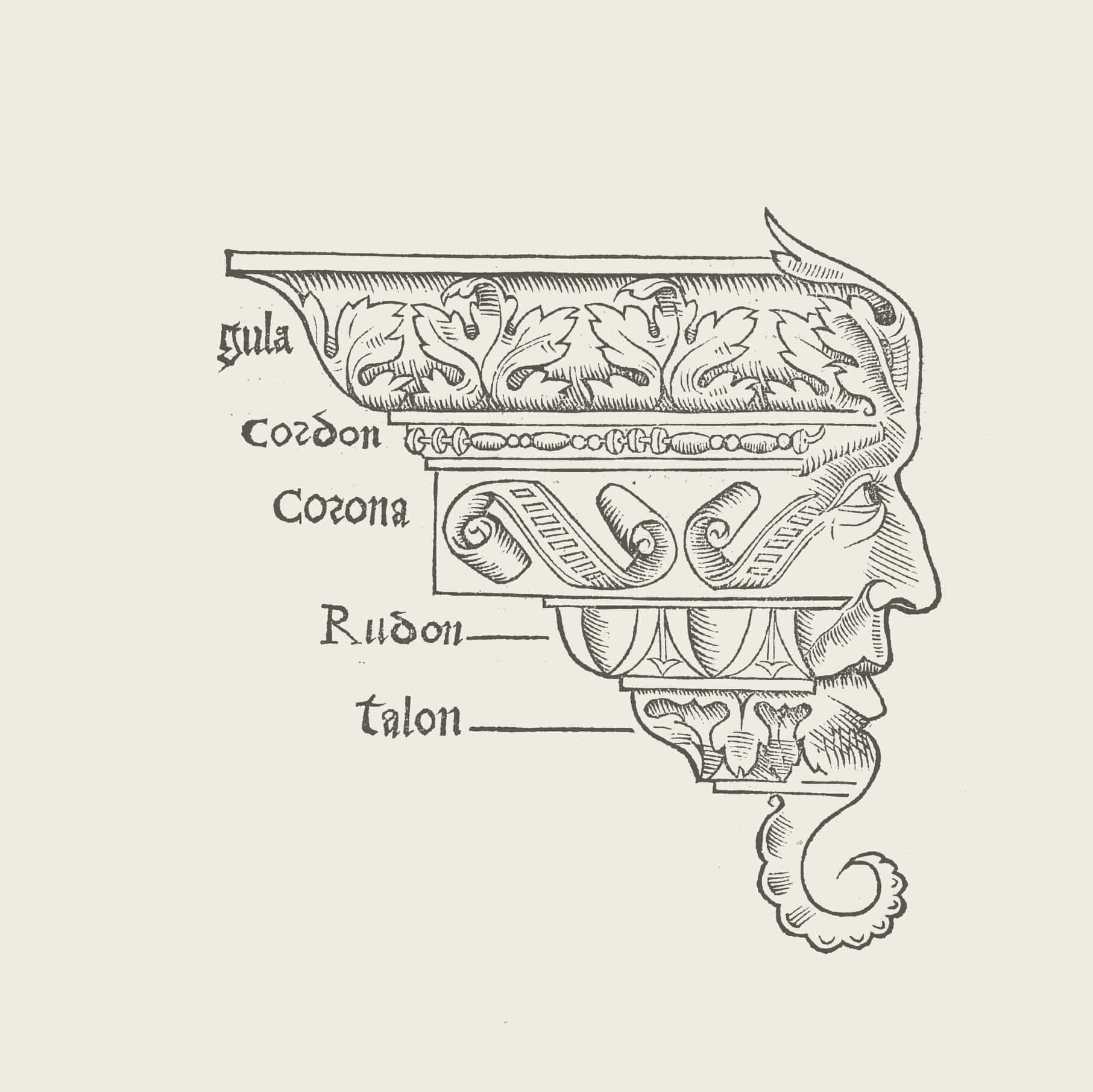
& autres anciens architecteurs (Paris: par Benoist Prévost, 1555), 16.
Reproduction and Multiplication
The capability of the cornice to perform these negotiations grants it, in Sulzer’s words above, the status of ‘an important ornamentation.’ Without reference to function or construction, Sulzer’s moniker attributes the performance of the cornice to a double nature. Identified with a desire to perceive buildings as complete, to give free rein to the architect’s professionalism, and to grant buildings an appearance suitable to their station in society, the cornice is as much an architectural feature as a figure of thought. [33] Blondel’s visual analysis of the cornice confirms this duality. As in an anatomical investigation into the workings of an organ, his sections reveal the anthropomorphism that remains unsuspected when the element is faced in situ but that accounts for its performance. The extruded face of the cornice is where architecture comes into its own, both as a design practice and an agent in society; it is an ‘essential ornament,’ an extension that grafts the building onto its physical, cultural, and social environment: an indispensable prosthesis.
A modernist considers an essential ornament’ a contradiction in terms. Essential is what derives from requirements of construction, materials, or function, to which ornament can only be a superfluous addition. What is essential is no longer ornament. The rejection of the cornice amounts to a dismissal of interfaces between architecture and its surroundings writ large. It is now incumbent on the ‘essence’ of architecture, its natural body, to perform that task. The prosthetic nature of the cornice – which can be called upon to hide errors, consists of uncertain materiality, and can be extruded at will – is deemed emblematic for the duplicity of an old order. This harsh judgment registers developments during the century and a half separating our modernists from Sulzer. The cornice became a victim of its own success. The industrialised production of ornaments, combined with the distribution of manuals and catalogues that allowed unskilled workers to apply them, and the bourgeois desire to see their interiors framed with at least a simple profile, secured the cornice its unprecedented ubiquity.
easily between scales and materials, interior and exterior, the printed and the built, the cornice lends a sheen of class and familiarity to modest interiors or binds together a batch of otherwise unremarkable houses into an ensemble with urban aspirations. [35]
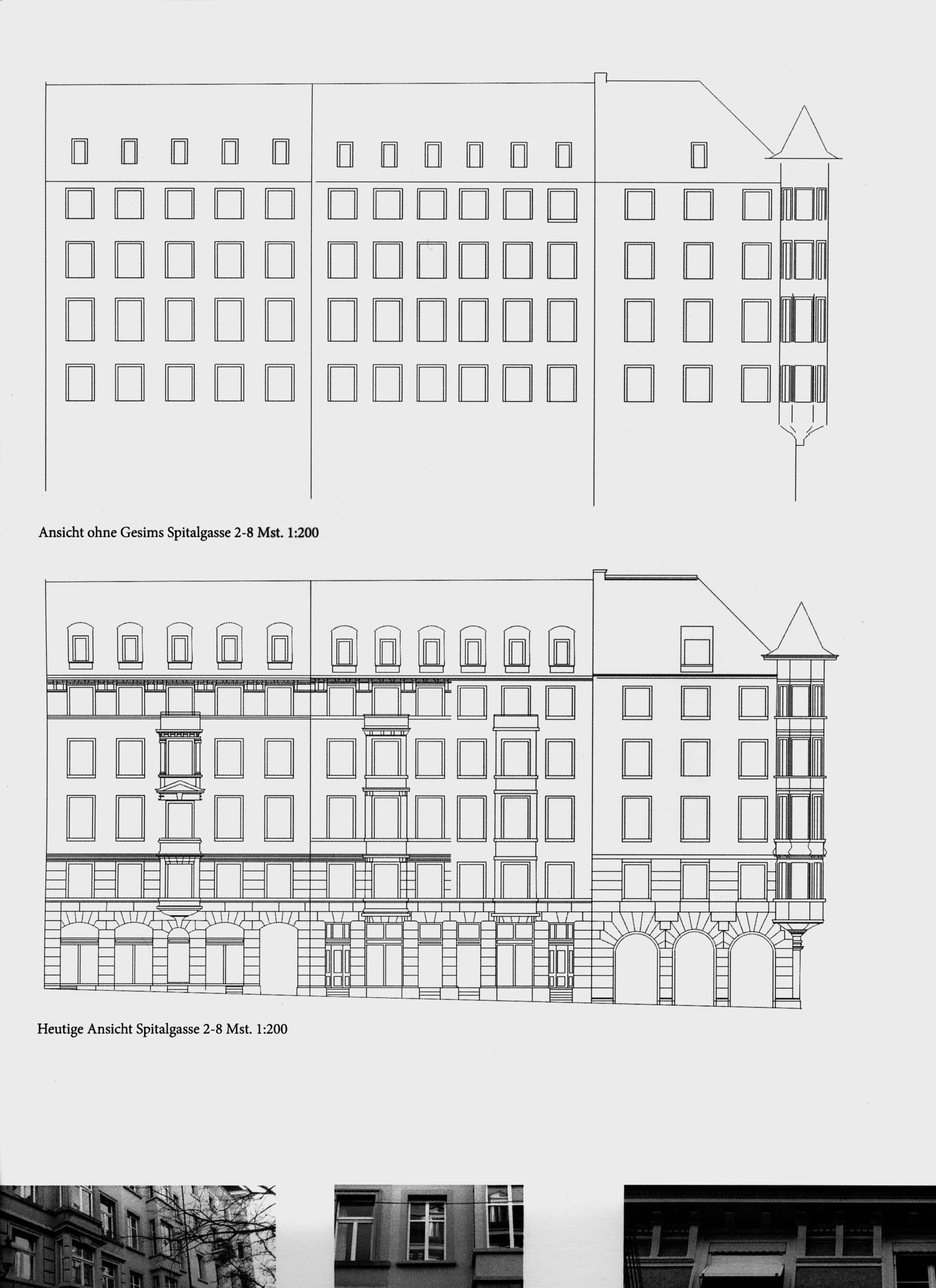
The depth of modernist unease hints at the persistent appeal of such gestures. The proliferation of the cornice at an ever increasing distance from highbrow architecture preserves some of its original agency in derivative practices. Still today, mass-produced cornices help interior designers to meet the requirements imposed by cabling, light armatures, and window shading. As the visual upper limit of buildings, the cornice serves to define building volumes and streetscapes in legislation. Since the emergence of the modern city, the cornice has cunningly concealed the height, density, or banality of real estate developments. The simple removal of cornices from nineteenth-century urban housing in Zurich was part of a student exercise at the ETH. This exercise revealed the extent to which the cornice helps to rescale, dignify, and differentiate building blocks designed with no other purpose than maximising land yield. In spite of their rejection by architecture, cornices continue to register legal ordinances and economic forcefields. They are always there, consigned to the sidelines but not going away, and they bear witness to – literally look down upon – our inability to finally obliterate them.
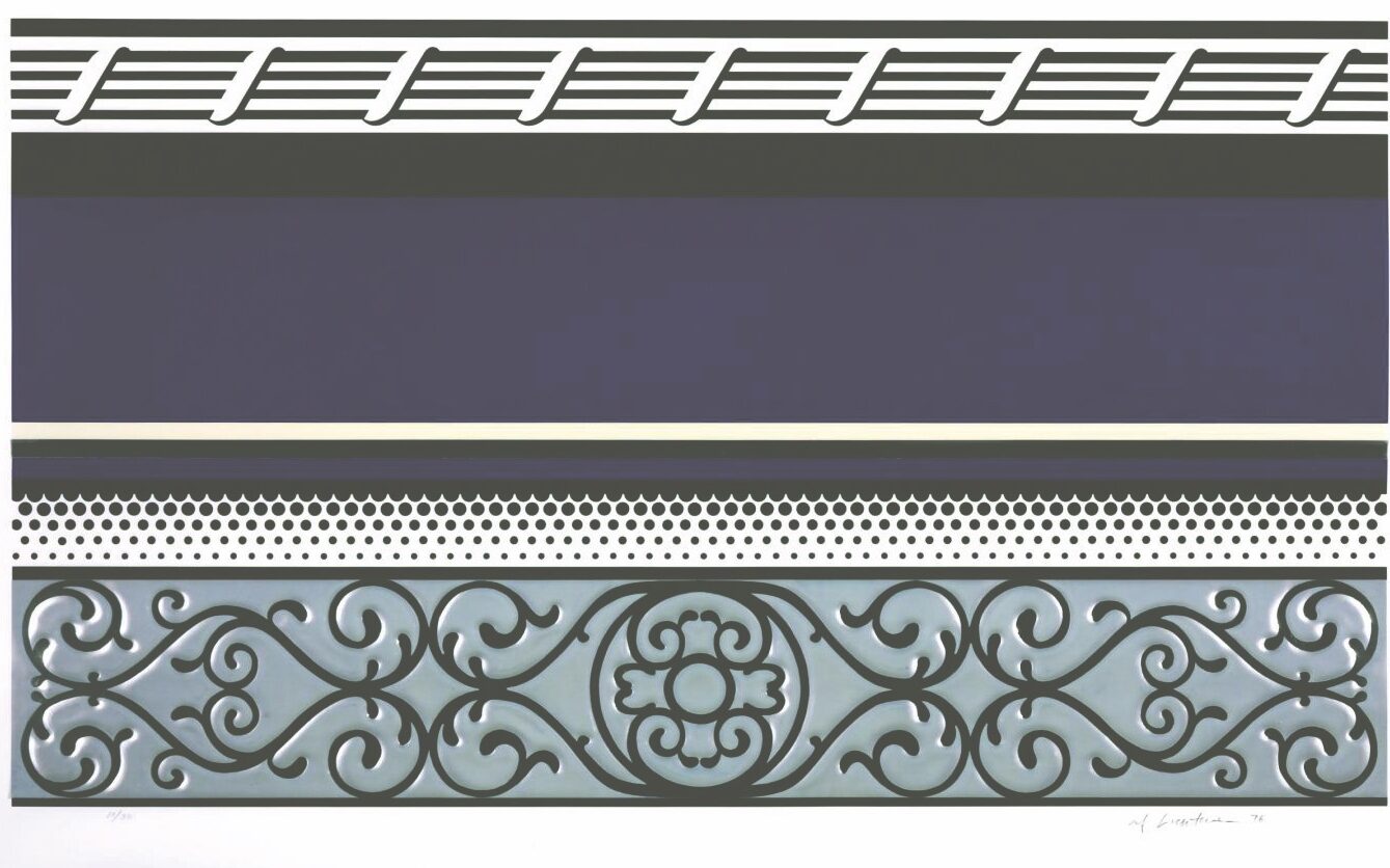
550 × 960 mm, 1976. Courtesy the Estate of Roy Lichtenstein.
No wonder then that the cornice became a motif in the critique of modernism, perhaps most poignantly in the visual arts. From 1971 to 1976, Roy Lichtenstein produced a series of Entablature paintings and prints. Based on photographs of entablatures of Manhattan buildings taken at noon for maximum contrast, the series brings out the graphic quality of these crowning elements while reproducing their seriality. If reminiscent of older ruminations on how shadows and lines shape the perception of architecture, Lichtenstein’s Entablatures forfeit the status of cornices as signature pieces or human profiles in favour of their easily multiplied graphic appearance. Lichtenstein’s work draws attention to their ubiquity and their almost imperceptible contribution to the visual appearance of public space. In 1982 the artist Ludger Gerdes redrew Blondel’s profiles as part of his Paralipomena series to explore how architectural elements could convey particular characteristics and emotions. Gerdes reached back to eighteenth-century theory to uncover aspects of architecture that he deemed lost or neglected in modernism, the ‘character’ so dear to Blondel chief among them. [36] This endeavour is amplified ironically in Charles Holland’s Coastline Cornices. With their profiles based on the coastlines of English counties, his pieces lay bare the conflict between the aspects of the classical cornice: the literal representation of a place of origin does not yield a legible expression of character any more than an element suitable to crowning a building.
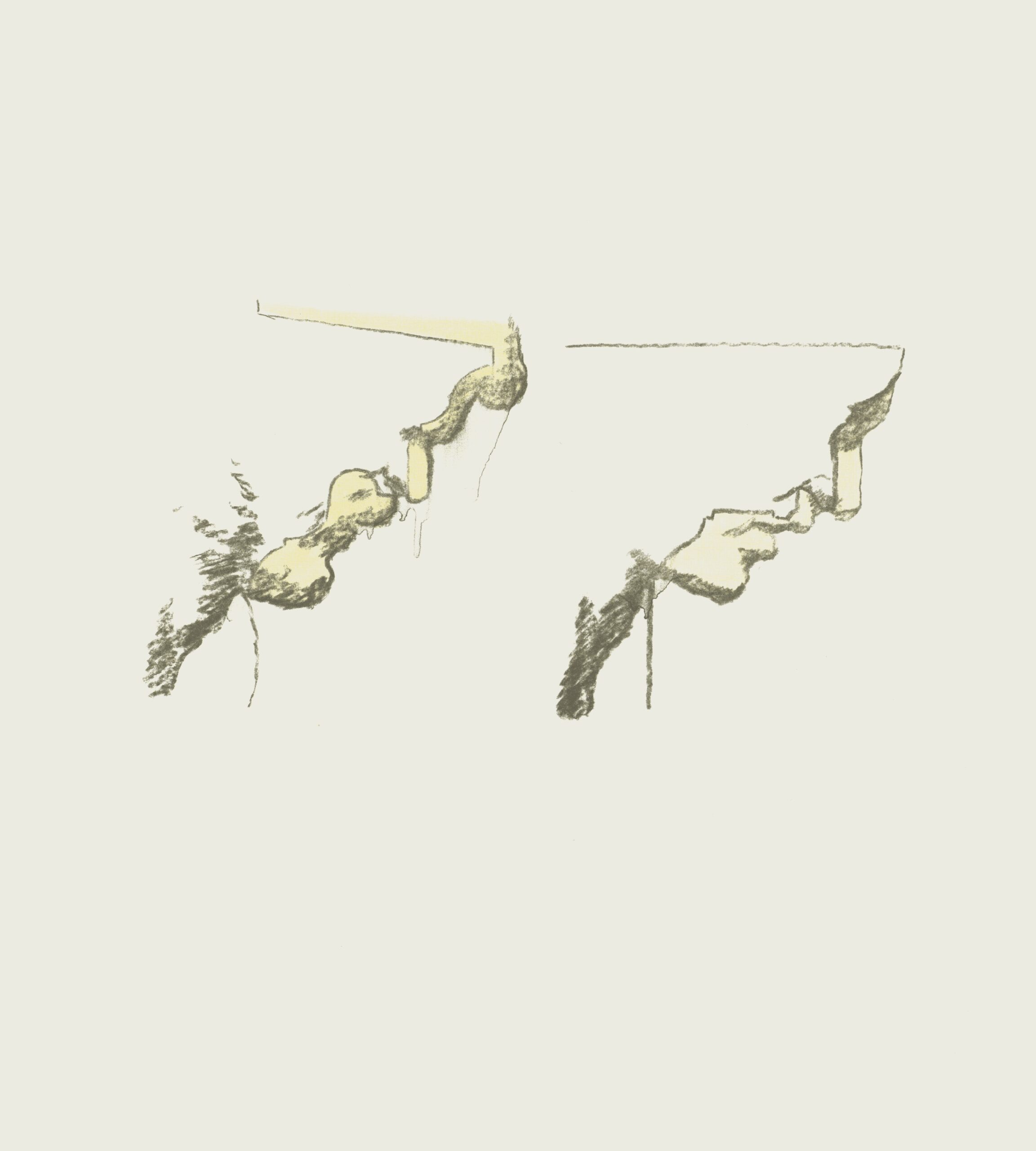
Ludger Gerdes, ‘Profilvergleich
nach Blondel.’ in Paralipomena
by Thomas Schütte, Julian Heynen, 701 E.V. Düsseldorf, (Cologne: Walther König, 2010), 20.
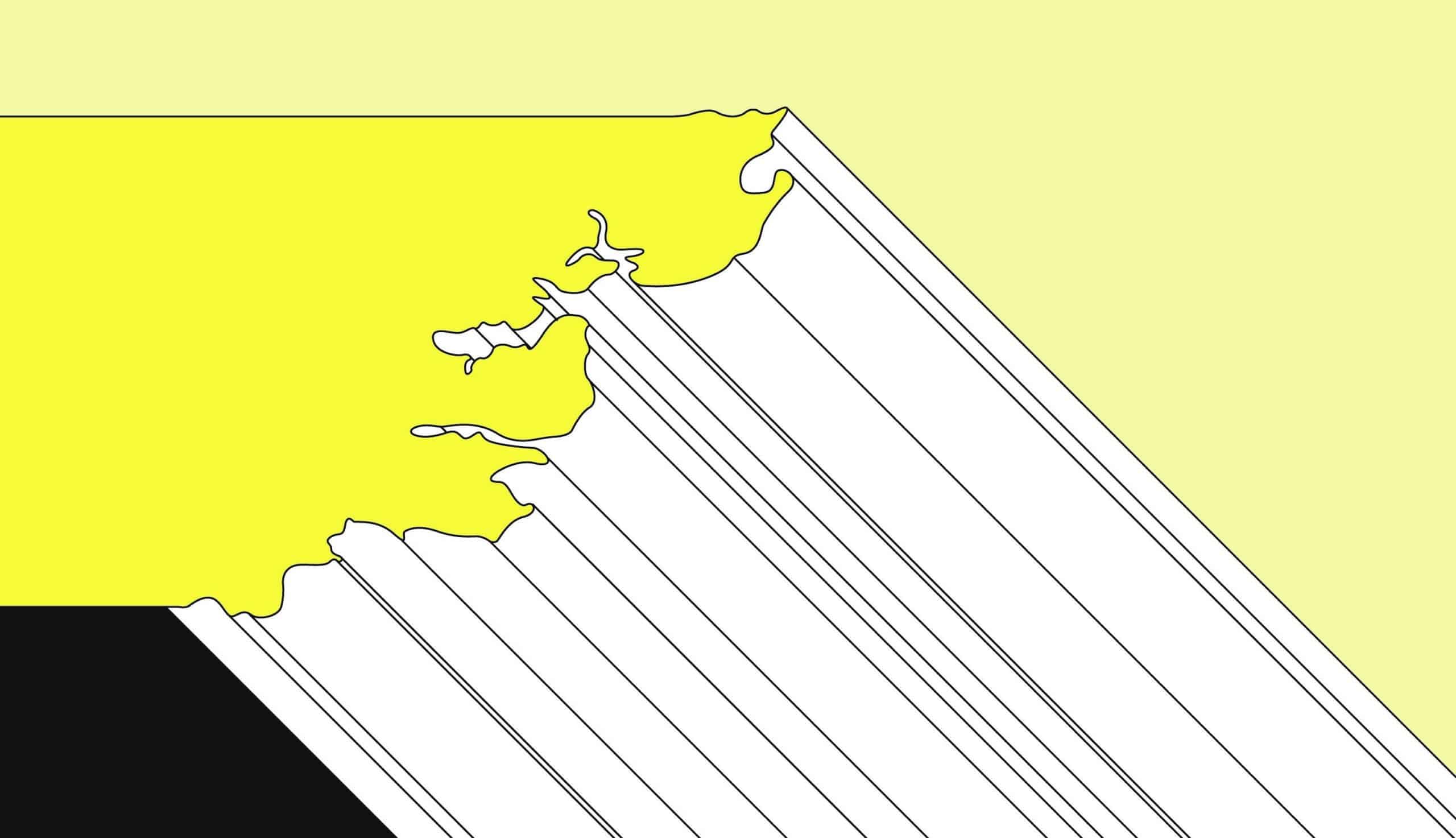
These works provide a critical reading of the architectural role of the cornice. They accept its obsolescence but simultaneously call on it to bear witness to habits and expectations architecture cannot escape. In a design practice and building industry often bent on minimising the joint and the profile, introducing a cornice is a statement, be it about context, composition, historicism, expression, or even beauty. But even those buildings that seemingly forfeit the cornice – or where considerable design effort is spent to make it disappear – have to confront the questions raised by Sulzer: how to delineate the building, have it appeal to its viewers, and make it somehow fitting for a given cultural context. In that sense, talking about cornices is a deliberate provocation to begin a conversation about architecture, one that takes form, design, and construction seriously as aspects of architecture that link buildings to the various forces, agencies, and actors that shape them. This would be a conversation that looks closely at a particular building element as a fragment with lives, pedigrees, and histories that are deeply entangled not just with architectural design but also with issues ranging from materials and manufacturing, to composition and urban design, to matters of perception, representation, and even legislation. Inviting this witness centre stage opens up questions that are eminently architectural while decentring the building and its designer as the sole or primary focus of attention. The cornice is architecture but also something else: as Le Corbusier, Wright, and many others have intuited, talking about cornices is talking about architecture, but with an edge.
Notes
- Leon Battista Alberti, On the Art of Building in Ten Books, trans. Joseph Rykwert et al. (Cambridge, MA: MIT Press, 1991), 314.
- Wright omits ‘timidly.’ Henry David Thoreau, Walden; or, Life in the Woods (Boston: Ticknor and Fields, 1854), 44–45. The quotation (from the chapter titled ‘Economy’) is adapted as the insert text of
The Architectural Forum 68, no. 1 (January 1938): fold-out insert. - Thoreau, Walden, 44–45.
- Frank Lloyd Wright, ‘The Passing of the Cornice,’ Modern Architecture: Being the Kahn Lectures for 1930 (Princeton, NJ: University Press, 1931), 47–62.
- Le Corbusier, ‘Où en est l’architecture?’ L’Architecture Vivante (fall/winter 1927), 7–26.
- Ibid., 25–26.
- Le Corbusier, ‘L’esprit nouveau en archi- tecture,’ in Almanach d’architecture moderne (Turin: Bottega d’Erasmo, 1925), 17–54. Le Corbusier originally delivered the lecture at the Sorbonne in 1924.
- Le Corbusier, ‘Où en est l’architecture?’ 25.
- Ibid., 26.
- Le Corbusier, ‘L’esprit nouveau en architecture,’ 39.
- Vitruvius, ‘Architec- tural Ornament,’ in Ten Books of Architecture, trans. and ed. Ingrid Rowland and Thomas Noble Howe (New York: Cambridge University Press, 1999), IV.2.2:56.
- Wright, ‘The Passing of the Cornice,’ 60.
- Maarten Delbeke, ‘Building Authority: Claude Perrault’s Abrégé des dix livres d’architecture de Vitruve,’ in Traités et autres écrits d’architec- ture (Liege: Mardaga, 2021), 271–84, here 278–80. See also Linda Bleijenberg and Maarten Delbeke,
‘The Afterlife of Vitruvian Origin
Myths in 18th-Century Conjectural Histories of Architecture,’ Arethusa 49 (2016): 199–213. - Karl Scheffler, ‘Das Gesims,’ Dekorative Kunst 3 (1899): 188–90.
- Constantin Uhde, Die Konstruktion und die Kunstformen der Architektur, ihre Entstehung und Geschichtliche Entwickelung bei den Verschiedenen Völkern, vol. 1 (Berlin: E. Wasmuth, 1902).
- Le Corbusier, ‘Où on est l’architecture,’ 38–39.
- Le Corbusier, Vers une architecture (Paris: Les Éditions G. Crès et Cie, 1925), 178–81, here 178.
- Vitruvius, ‘Architectural Ornament,’ 56.
- Johann Georg Sulzer, ‘Gesims,’ in Allgemeine Theorie der Schönen Künste, vol. 1 (1771; Hildesheim: Georg Olms, 1994), 472–73, https://www.deutschestextarchiv.de/book/show/sulzer_theorie01_1771 (accessed June 14, 2021). ‘Eine aus mehreren Gliedern bestehende Einfassung an dem obersten, bisweilen auch an dem untersten Ende einer Mauerwand oder einer Öffnung … Das Gesims dient zur Begrenzung und Vollendung der Teile, die davon ihre Einfassung bekommen, damit sie als etwas Ganzes erscheinen … mithin ist es eine wesentliche Verzierung ganzer Gebäude.’
- Johann Georg Sulzer, ‘Glieder,’ in Allgemeine Theorie der Schönen Künste, 488–89. ‘Die kleineren Teile, aus deren Zusammensetzung die zur Verzierung der Gebäude und der wesentlichen Teile derselben gehörigen Hauptteile, besonders die Gesimse, entstehen … Die Glieder sind für die Gesimse beinahe, was die Buchstaben für die Wörter sind: und wie aus wenig Buchstaben eine unzählbare Menge von Wörtern kann zusammengesetzt werden, so entsteht aus der verschiedenen Zusammensetzung der Glieder eine große Mannigfaltigkeit der Gesimse, Füße und Kränze, wodurch sowohl die verschiedenen Ordnungen sich von einander unter- scheiden als auch die Gebäude überhaupt ihren Charakter des Reichtums oder der Einfalt bekommen.’
- Essential on this topic is Michael Hill and Peter Kohane, ‘The Signature of Architecture: Compositional Ideas in the Theory of Profiles,’ Architectural Histories 3, no. 1 (2015): 1–21, http:/dx.doi.org/10.5334/ (accessed August 3, 2021).
- Charles d’Aviler, Cours d’architecture qui comprend les orders de Vignole (Paris: chez Nicolas Langlois, 1691). 1:i: ‘Des moulures,et de la maniere de les bien profiler’: ‘Les moulures sont à l’Architecture, ce que les lettres sont à l’Ecriture.’ This is the opening statement of the main body of the Cours. Germain Boffrand, Livre d’architecture: Contenant les principes generaux de cet art, et les plans, elevations et profils de quelques-uns des batimens faits en France & dans les pays etrangers (Paris: chez Guillaume Cavelier pere, 1745), 22–23.
- Sulzer, ‘Gesims’, 1:472: ‘[man] kann aber aus den verschiedenen Gesimsen, die aus- wendig und inwendig an den Gebäuden angebracht sind, gar bald den guten oder schlechten Geschmack eines Baumeisters erkennen.’
- For Soane, see John Archer, ‘Character in English Architectural Design,’ Eighteenth-Century Studies 12, no. 3 (1979): 339–71, here 366. See also the classic text by Luigi Moretti, ‘Valori della modanatura,’ Studio di ‘Spazio’ 6 (1951–1952): 5–12, available in English translation as ‘The Value of Profiles,’ trans. Thomas Stevens, Oppositions 4 (October 1974), 118. Recently translated into German as ‘Wert und Wirkung plastischer Profile,’ trans. Daniel Kurz, werk, bauen + wohnen, 108, no. 9 (September 2021), 32–38.
- Boffrand, Livre d’architecture, 22–23; Roland Fréart de Chambray, Parallele de l’architecture antique et de la moderne (Paris: Edme Martin, 1650), 1–3.
- Giovan Pietro Bellori, The Lives of the Modern Painters, Sculptors, and Architects: A New Translation and Critical Edition, trans. A. Sedgwick Wohl (Cambridge: Cambridge University Press, 2005), 62.
- Antonio Visentini, Osservazioni … che servono di conti- nuazione al Trattato di Teofilo Gallaccini sopra gli errori degli architetti (Venice: Per Giambatista Pasquali, 1771).
- Amédée-François Frézier, Dissertation historique et critique sur les ordres de l’architecture (Paris: Charles-Antoine Jombert, 1769), 55–56.
- Jacques-François Blondel, Cours d’architecture, ou Traité de la décoration, distribution, & construction des bâtiments, vol. 1 (Paris: Desaint, 1771), 259.
- Hill and Kohane, ‘The Signature of Architecture,’ 18.
- Diego de Sagredo, Medidas del Romano (Toledo: en casa de Jua[n] de Ayala, 1526).
- Boffrand, Livre d’architecture, 22–23.
- Seventeenth-century theoreticians of figurative language would point to the cornice and the entablature as key sites for architectural metaphors. See Claude-François Ménestrier, La philosophie des images énigmatiques où il est traité des enigmes, hieroglyphes, pracles, propheties, sorts, divinations; Loteries, talismans, songes, centuries de Nostradamus, de la Baguette (Lyon: Hilaire Baritel, 1694), 169: ‘l’architecture a ses figures énigmatiques de Termes, de Caryatides, de Mascarons, de Metopes, de Trigliphes, de frises, &c.’ This passage is indebted to Emanuele Tesauro, Il cannocchiale aristotelico (Turin: Bartolomeo Zauatta, 1670), 86–7. These ideas would be linked to D’Aviler’s and Boffrand’s comparison of profiles to the alphabet by the French critic Jean-Louis Viel de Saint-Maux, who argued that all architectural elements are symbolic in origin. See Jean-Louis Viel de Saint-Maux, ‘Quatrième lettre sur l’architecture,’ in Lettres sur l’architecture des anciens, et modernes: Dans lesquelles se trouve développé le génie symbolique qui présida aux monumens de l’antiquité (Paris: n.p., 1787), 18–9: ‘Quelques Architectes ont dit néanmoins que ce qu’on appelle moulure, soit des bases, soit des autres parties qui constituent l’ordre d’Architecture, pouvoit dériver des lettres de l’alphabet.
Ils approchoient de la vérité, mais enveloppée de nuages. Les lettres étoient hiéroglyphiques: dans leur principe, elles peignoient, par leurs divers contours, les objets de la nature, & leur rapports symboliques.’ - See fig. 13, page 76.
- Daniel Maudlin, ‘Cyma Recta: Palladianism and the Everyday,’ in Palladian Design: The Good, the Bad and the Unexpected, ed. Marie Bak Mortenson (London: Royal Institute of British Architects, 2015), 30–43.
- See Stefaan Vervoort, ‘Models beyond Sculpture: Architectural Objects in the Visual Arts in New York and Düsseldorf 1966–1984’ (PhD diss., Ghent University, 2020), 1:241–44, 267–70.
