Lantau Commune
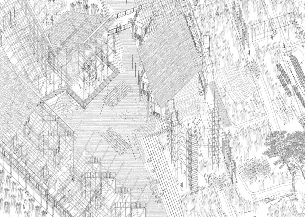
This collection of drawings is about process, both literal and methodological. It is about how the appreciation of the process of making and dwelling leads to an architectural proposition, as well as how that appreciation translates into a drawing method.
Certainly we appreciate architecture as a spatial presence, but there is beauty also in the construction process: the formwork and falsework, the tie bolts and scaffoldings, the sweat, tediousness and exhaustion under the sun. Construction is meant to be a ritual. It reveals knowledge, dignifies labour, gathers people – and it’s great fun. Working at the intersection of ecology, place-making, rite of passage and tectonics, I proposed the Lantau Ecology Education Centre as a participative construction site, at the periphery of a protected landscape reserve. Providing easy-to-assemble construction materials means everyone may design, communicate, build and dwell on their own. The end result is not a fixed building but a cluster that evolves over time: its birth, growth, decay and death resembles that found in nature: the impermanence of being.
The final drawing is twofold: it attempts to illustrate the above proposition, while also putting the tediousness into drawing practice. Derived from earlier studio projects, I narrated construction processes in the most straightforward way possible. The clarity of line axonometric with arrows and reference guides explicates how one should build the proposed commune, almost like an extreme IKEA manual. These how-to-build details gradually accumulate and become one homogeneous drawing, illustrating the proposal in its half-built condition, as if time is frozen.
Today, with 3D modelling software, it is easy to produce flashy and complex renderings. Nonetheless the deliberate choice of line vectors for the final drawing means an extra process of manual editing is required. This tedious, almost primitive editing requires one to thoroughly examine what the computer software automatically generated, to discover flaws and errors in the original 3D model that are often exaggerated by computer software in 2D, and to reflect and rethink every part of the proposition – as one would do in a hand drawing. This complicated process allowed me to re-examine what is often pre-assumed, just like the necessity for architects to investigate the primitive, the rustic, and the destitute, in order to understand how one might build and dwell.
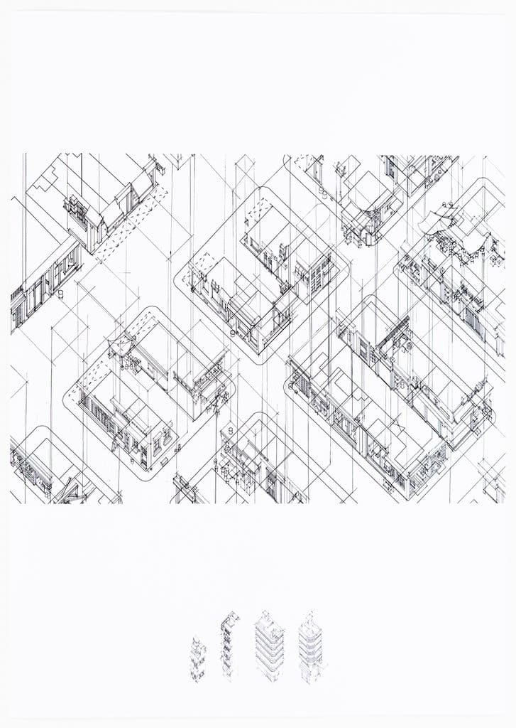
Years ago I drew the facades of tenement blocks in full, from ground floor to roof floor. My tutor questioned the drawing purpose. If it is to demonstrate the vibrancy of typical Asian street markets, I should not draw the facades in full, but only the ground shops, and the daily activities that take place.
I am introverted. I drew no human beings, but only quotidian objects that suggest past human activities – as if time was stolen.
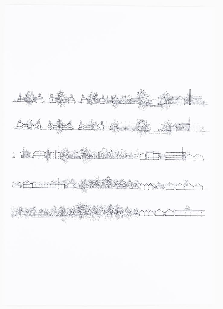
These sectional drawings were meant to be an emotional, early analysis of the neighbourhood around Repton Mill, a derelict factory campus near River Soar in Leicester, occupied by wind, wild grass and bees.
Once again I drew everything in full. Coincidentally, but not surprisingly, I received the same comments I received four years ago, that I should draw the particulars of the site – the cloth hangers, satellite pods, illegal alterations – but not the generic house forms and repeated trees.
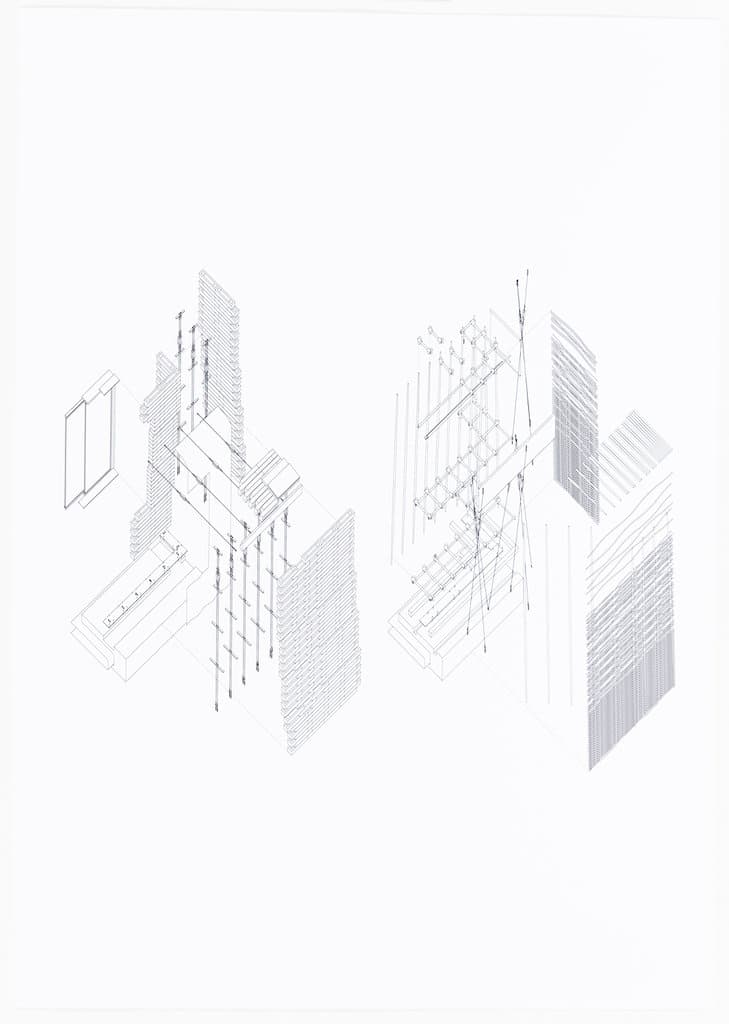
In architectural practice, constructing detailed 3D models by computer is more of a representative gesture. This is because details of this kind could be effectively communicated with contractors and builders in 2D, while 3D models are unnecessarily complicated.
A 2D drawing explains the construction joints and installation sequences in a clear and minimal manner. A 3D exploded axonometric drawing expresses the complexity of architectural construction joints.
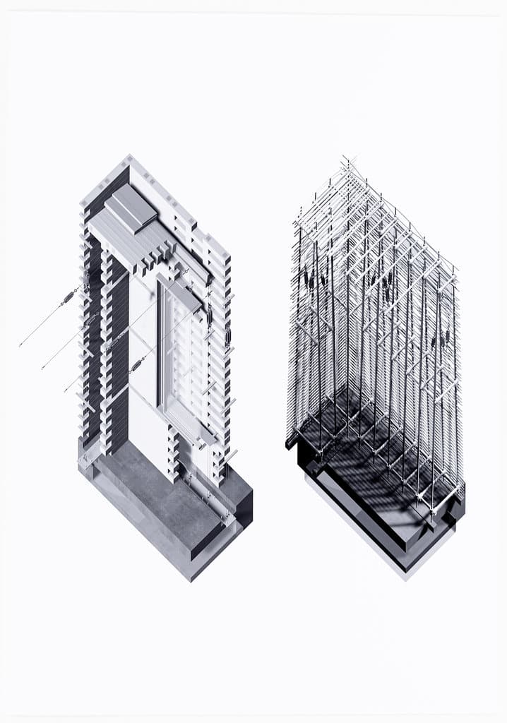
I used a software called Rhinoceros. Upon constructing a virtual 3D model you may either ‘Make2D’ or ‘Render’. The latter gives you a shaded image in pixels, often with shadow, within an estimable time. The former gives you an editable vector line drawing which may take a very long time. Vector line drawings need to be edited because the internal flaws of a 3D model will tend to be exaggerated in 2D. Either remodelling 3D components or manual 2D editing is required. Both are time-consuming.
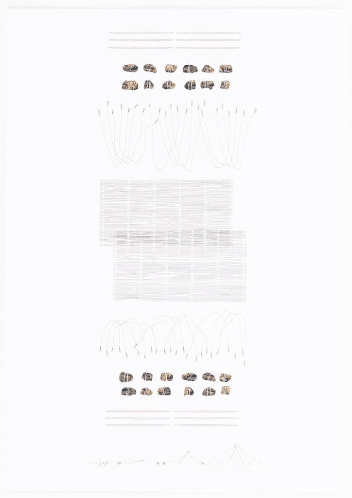
A three-month installation proposal we did at the beginning of our fifth year: my tutors were exceptionally impressed by the diagrams at the bottom, where the construction sequence of tilted posts by strings and stones were drawn explicitly. It demonstrates architecture not as a final product but an evolving process.
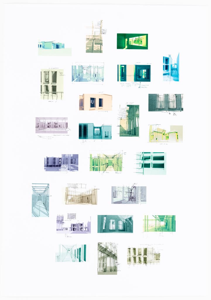
The final building design project began with hand-sketches followed by digital modelling, then hand-sketching on screenshots of the digital model. It was a back-and-forth process. Looking on a computer screen is always different from looking on paper, different from looking into physical models, and different from visiting a real building. Multiple media ensures our imagined space is as close as possible to that constructed.
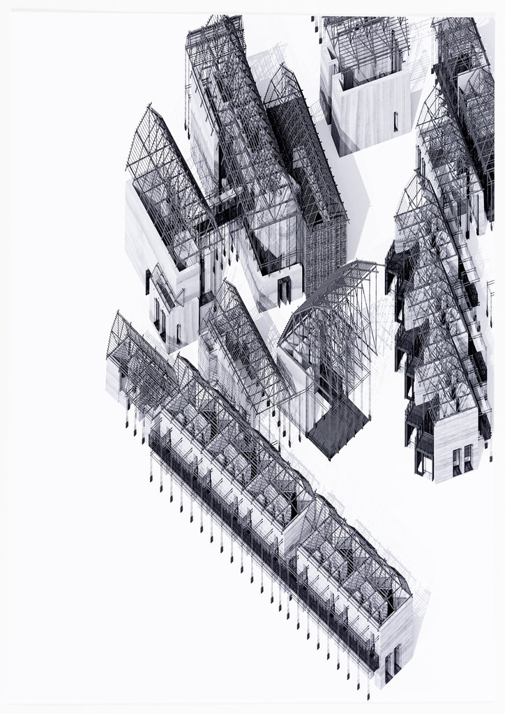
An example of a rendered version of the digital model. During second-term pin-up review, critics appreciated the intricate roof structure and the shadows it could generate, which should be pushed forward. Nonetheless critics were unsure of the use of rendered shades and shadows as representational technique.
Such comment immediately generated two questions.
First, is it the intricate drawing of lines that we appreciate? Or the potential architectural language of skeletal frames that we should investigate? Or both?
Second, if we appreciate the design being represented without a roof, should the actual building be constructed without a roof? Is it possible to freeze a building in its construction stage, so we could appreciate its complexity, like a drawing?
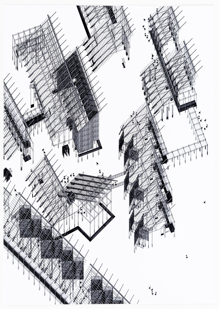
An even more radical rendering done by removing the walls in addition to the cancelled roof. The shadow-receiving ground plane in the digital model was removed, to give more clarity to the proposal.
It was at this stage of the design process that participative construction was confirmed. The proposed commune shall be constructed and re-constructed by the community on a cycle, such that the beauty of what was drawn would be visible in reality.
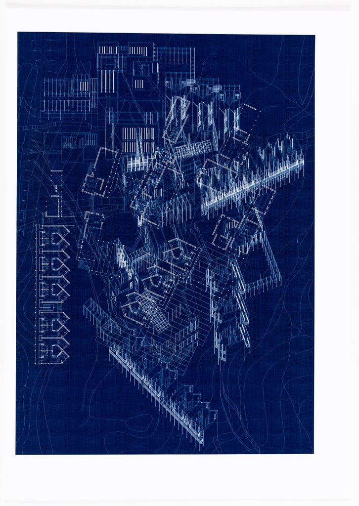
To further explore the beauty of juxtaposed lines and horizontal textures, I overlaid the plan, elevation and site plans together. The result was unsatisfactory.
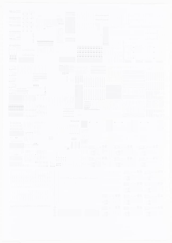
Shown above: an array of all building components required to construct the proposed commune. Extracted from the Digital Model.
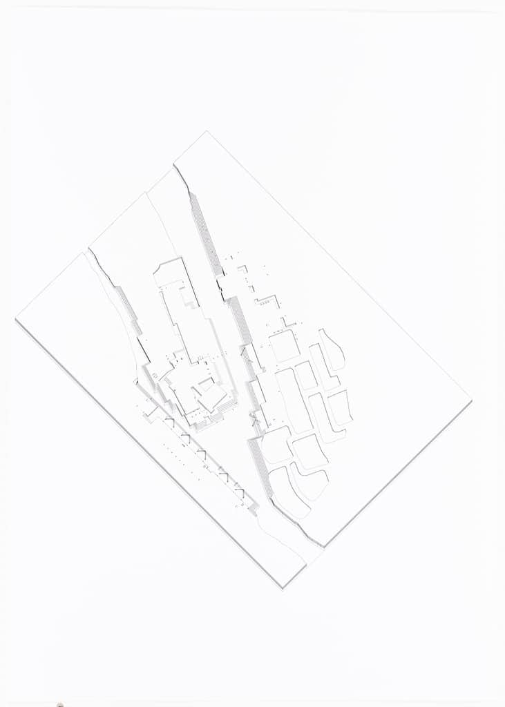
Converting a 3D model into a 2D drawing by computer is not always a smooth process. To control the time required for 2D exports the model was divided into layers for separate exports. In this way the ability to edit 2D outputs was enhanced.
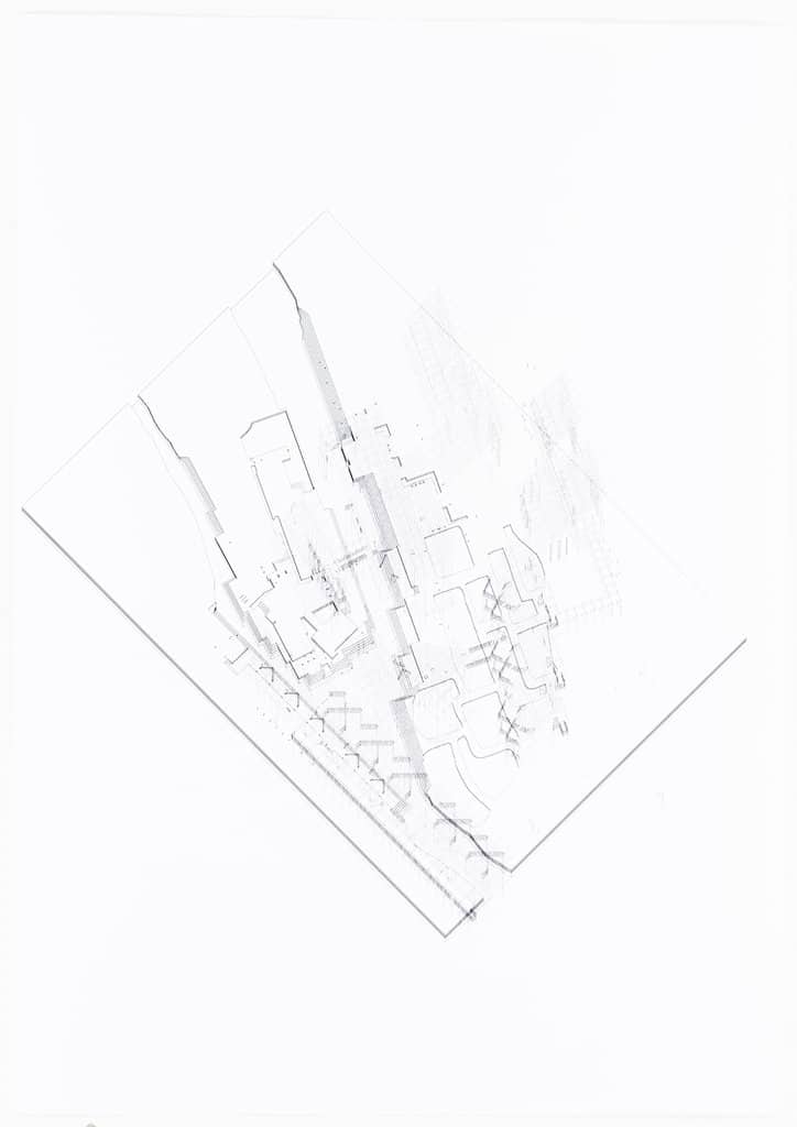
All exports were to be overlaid on the same drawing space before manual 2D editing began. This kind of drawing technique is both easier and harder than direct 3D exports. It is easier because editing becomes intuitive, time of drawing is to be controlled by a human, not by machine. It is harder because one has to manually edit out repeated flaws in which some could have been eliminated within the 3D model.
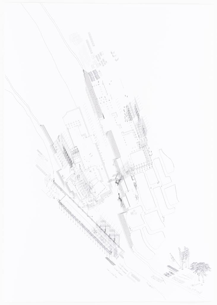
The drawing was to demonstrate the construction process: from tree felling to material transportation to actual construction. It was a design response to the fact that the drawing was more beautiful when the depicted building was only partially drawn. Tools of construction and ways of utilising them were added, like a construction manual. Again no human figures were added.
I was unhappy with the overall composition, particularly the awkward trees on the lower-right corner. These trees cannot be deleted for they are part of the construction sequence narrative.
Tutors suggested to add context to the drawing, to frame the protagonist.
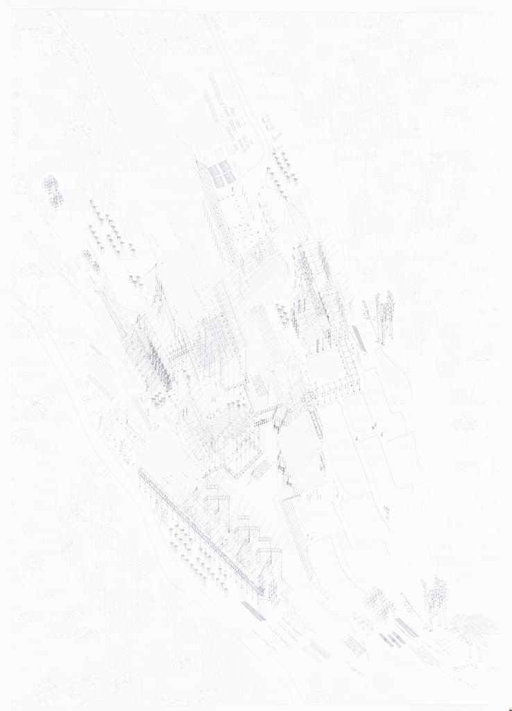
This version of the final drawing was the one originally submitted for external examination at the Bartlett, printed as A0. A vector drawing means it could be reproduced at any size without being pixelated.
The drawing looked well when the A0 was placed on a table in a small room, a typical examination setting that examiners were forced to perceive the huge drawing in details, without being able to look at the overall.
Nonetheless for exhibition purposes it was necessary to reduce the drawing. The repeated trees around the construction site were deemed to be unnecessary to reinforce the main concepts. Cropping and re-editing was required.
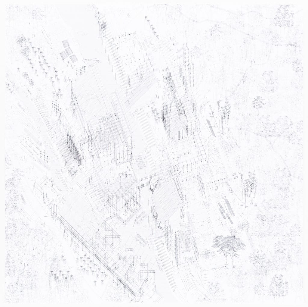
Final drawing submitted for Royal Academy of Arts Summer Exhibition 2017. The drawing was cropped, the construction sequences reshuffled for better layout, and more details added.
Lok-kan Chau is joint winner of the Royal Academy’s Hugh Casson Drawing Prize at the 2017 Summer Exhibition.
