John Hejduk’s Axonometric Degree Zero
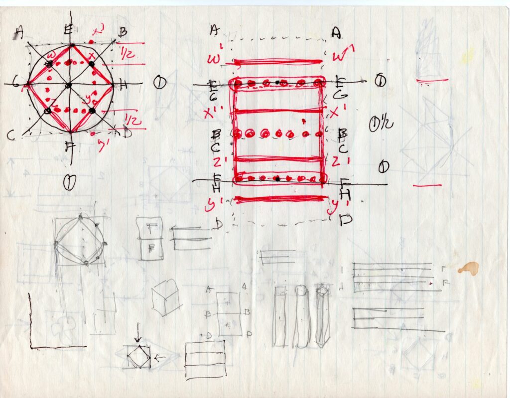
Sometime in 1981, while I was working on my final thesis project at the Cooper Union, John Hejduk set me a drawing exercise. We had been discussing the spatial implications of the 90-degree axonometric. [1] Hejduk had a very particular understanding of this drawing type, which involved folding or hinging more than projection, and a simultaneous presentation of plan and elevation.
It seems that Hejduk arrived at this characteristic form of representation almost by chance. It first appears in the Diamond Series, which he began in 1962. In 1967, Hejduk presented the three diamond projects (Diamond House A, Diamond House B, and Diamond Museum C) in an exhibition held at the Architectural League of New York, alongside paintings by Robert Slutzky. Hejduk and Slutzky shared a fascination with the paintings of Mondrian, and the Diamond Series transposed the painterly problem of the edge of the canvas to the architectural question of the envelope. Rotating a square plan 45-degrees (while maintaining the internal right-angled plan geometries) implies an infinite spatial field that is cut at the edge of the plan drawing. This has two formal consequences: it distributes the compositional energy evenly, rather than a cubist tension between centre and periphery; and it activates the edge, where the two geometries intersect. The architectural effect recalls the angled brise-soleil on the front elevation of Le Corbusier’s Mill Owners Building in Ahmedabad (1954), as does the overall cubic form and frontal address. [2]
The Diamond Series is nothing if not a plan-based operation. Hejduk, at this point in his career, faithfully follows Le Corbusier’s dictum that ‘the plan is the generator’. But considered as a plan drawing, it risks being little more than a graphic reiteration of the painterly precedent. The astonishing originality of the diamond proposition only becomes apparent in the axonometrics, which approximate the effect of the realised buildings but also stand on their own as a complete thought. For Hejduk, the 90-degree projection followed logically from the diamond plan. A text in the original catalogue lays out his thought process. [3] There are many forms of axonometric, but the simplest to construct is a vertical projection from a rotated plan. This means that the plan geometries are preserved, while the elevations are skewed. The usual procedure is to rotate the plan out of square to 45 (or 60) degrees, but in the case of the diamond, the 45-degree rotation brings the bounding box back to the right angle. If the power of the axonometric is to combine in one drawing the measurability of orthographic projection with the pictorial, descriptive character of perspective, the 90-degree axonometric complicates and challenges the descriptive character of the axonometric. It produces an oddly flattened figure on the page. It resonates not so much with cubist painting, but with Fernand Léger and the purist paintings of Amédée Ozenfant and Le Corbusier – think of the stack of plates, the milk bottle and the guitar in Le Corbusier’s 1920 Still Life in the collection of the Museum of Modern Art. But part of the attraction is the slightly awkward, even naive quality of these drawings, something almost childlike, or coming from somewhere other than the Western canon of visual representation.
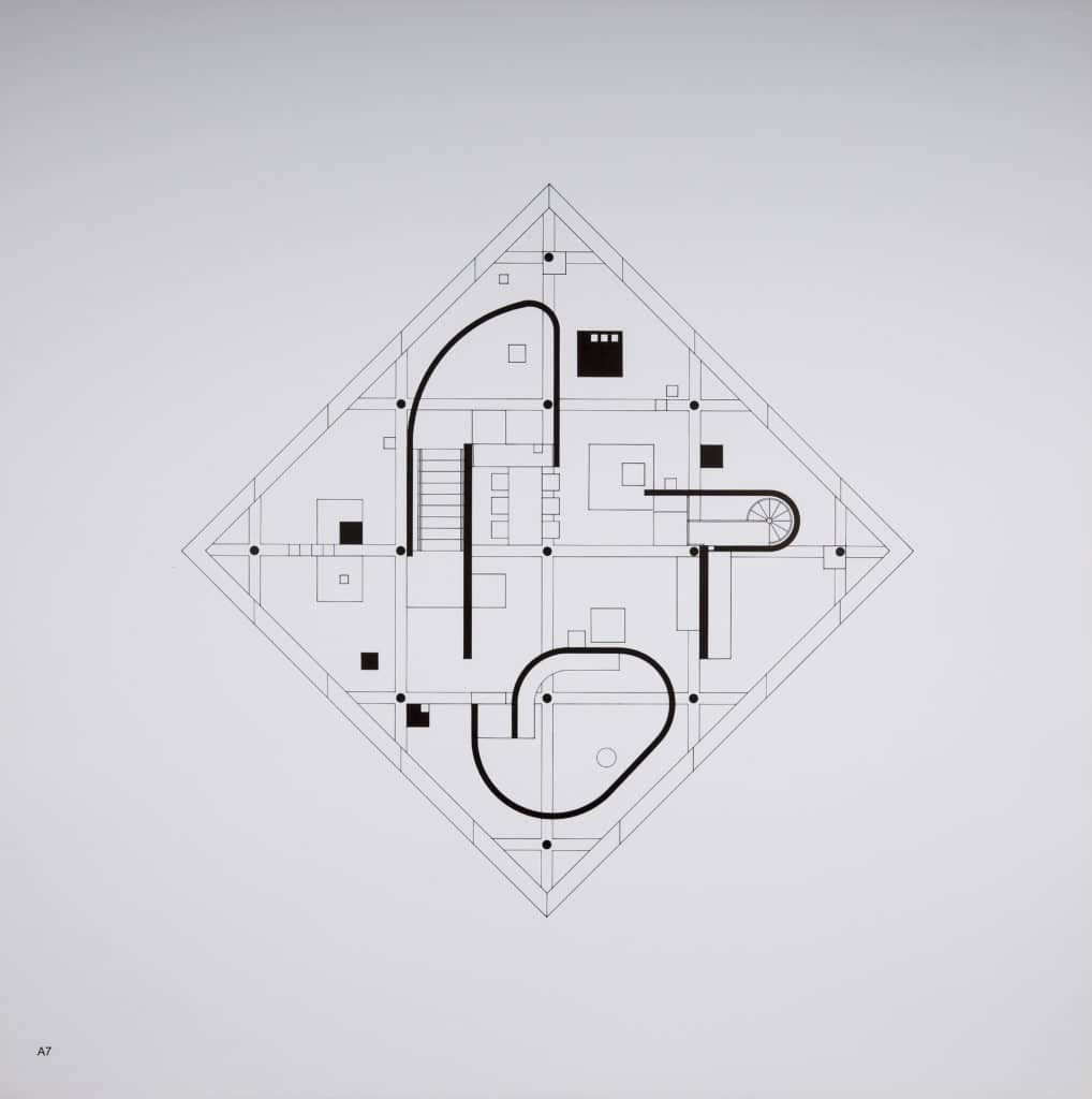
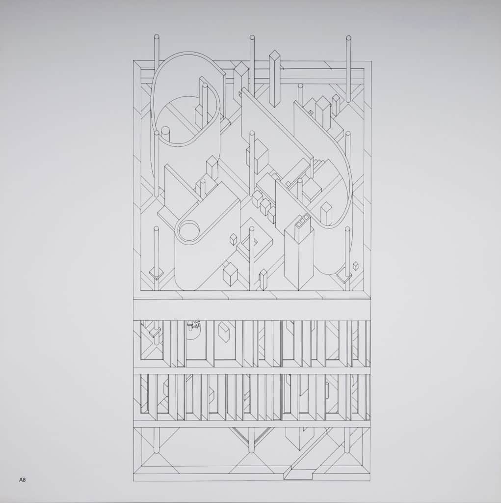
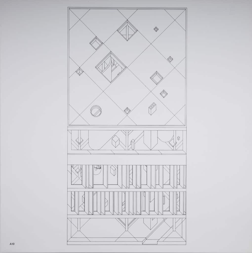
In the 90-degree axonometric, both plan and front elevation are undistorted, and the sides have collapsed to nothing. Only one elevation is visible at a time, which emphasises the frontality. But in the axonometrics of the diamond houses, the internal geometries, which have been rotated into the conventional 45-degree orientation, are clearly described. It is this tension – between flattened two-dimensional bounding box and three-dimensional forms within – that animates the drawings. The implied spatial complexity of the diamond paintings has been fully realised. Hejduk works systematically, drawing each level, and emphasising the stacking up of floor on top of floor. He takes advantage of the capacities of the free-plan to introduce radically different compositions on each floor (the curvilinear forms that abruptly appear, for example on the upper levels). The move from two to three dimensions is primarily through plan extrusion, and sectional complexity comes from stacking and juxtaposition rather than sculptural elaboration. The composition closes with the roof rendered as an elevation, which returns the focus to the frontal plane. Hejduk’s earlier houses worked with a nine-square grid, which, following classical practice, leaves the centre open as the privileged space of inhabitation. In the Diamond Series, consistent with the expansive, all-over energy of the composition, there is a column at the exact centre of the plan, and it can never be occupied.
It is worth noting that what in retrospect seems like an inevitable conclusion – that a projection of a diamond plan would result in a 90-degree axonometric – is by no means certain. Another architect might have made an adjustment, used a 60-degree projection or otherwise avoided the strange (and difficult to read), figure that emerged. Sometimes a logical pathway leads to an unexpected place. For Hejduk, that spatial ambiguity was precisely what he was after, and it must have felt like a genuine discovery at the time. It completed a kind of circuit for him: ‘The isometric projections of the diamond are cubist projections in architecture, therefore completing the formal relationships between cubist projection in painting and cubist projection in architecture.’ The forms, he says, appear two-dimensional and ‘tip forward’ toward the picture plane, as in a cubist canvas. But the characteristic push-pull of cubist space in painting could not be realised without the tension that exists in the diamond houses between rectilinear envelope and diagonal internal spatial organisation. It underscores a fundamental difference between painting and architecture. Architecture’s objects are never framed; they exist in an open spatial field, and can be approached from any side. The painter’s problem of the rectilinear canvas, always approached frontally, is not an issue. The brilliance of the diamond proposition is to synthesise in one architectural object a fixed frame and an active internal composition, now in a highly animated relationship to one another.
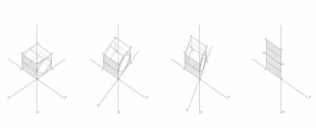
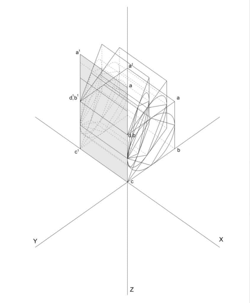
I don’t recall what triggered my discussion at the desk with Hejduk, but he started drawing and explaining, mapping out his understanding of the space of the 90-degree axonometric. He drew some enigmatic diagrams, and talked about a cube that stretched and folded, as if it were elastic. He was preoccupied by the invisible rear faces that collapsed onto the visible front faces. He mapped all the points onto the diagram, demonstrating the simultaneity of front and back – which for him implied a kind of deep space present in the compressed surface of the drawing. He wanted to visualise it from the side, which would make the hinging and folding explicit, and activate the diagonal.
One of the difficulties of constructing a 90-degree axonometric is that since everything is on one plane, it involves measuring as much as projection. This is why I would argue that this form of drawing has less to do with projection, and more to do with hinging and folding. In a conventional axonometric, for example, three faces are normally visible: top and two sides. In a 90-degree axonometric, only one face and the top are visible, both true, and hinged where they join. The sides have collapsed to zero. This restores the frontal address associated with painting, but also suggests a different reading of transparency – not so much of layered space activated by a moving spectator and unfolding in time (as described by Slutzky and Colin Rowe), but of flatness and depth simultaneously present. Time is compressed more than dilated.
Working from Hejduk’s sketches, I produced a series of drawings, which were later published in The Education of the Architect. I tried to transcribe faithfully Hejduk’s way of thinking about this drawing form, and tease out some of its mathematical and spatial implications – including inscribing a cylinder in the cube, which when projected produced a completely inexplicable measurement. I even consulted with a mathematician, who was puzzled by our interest in what he saw as a rather obscure and unscientific question.
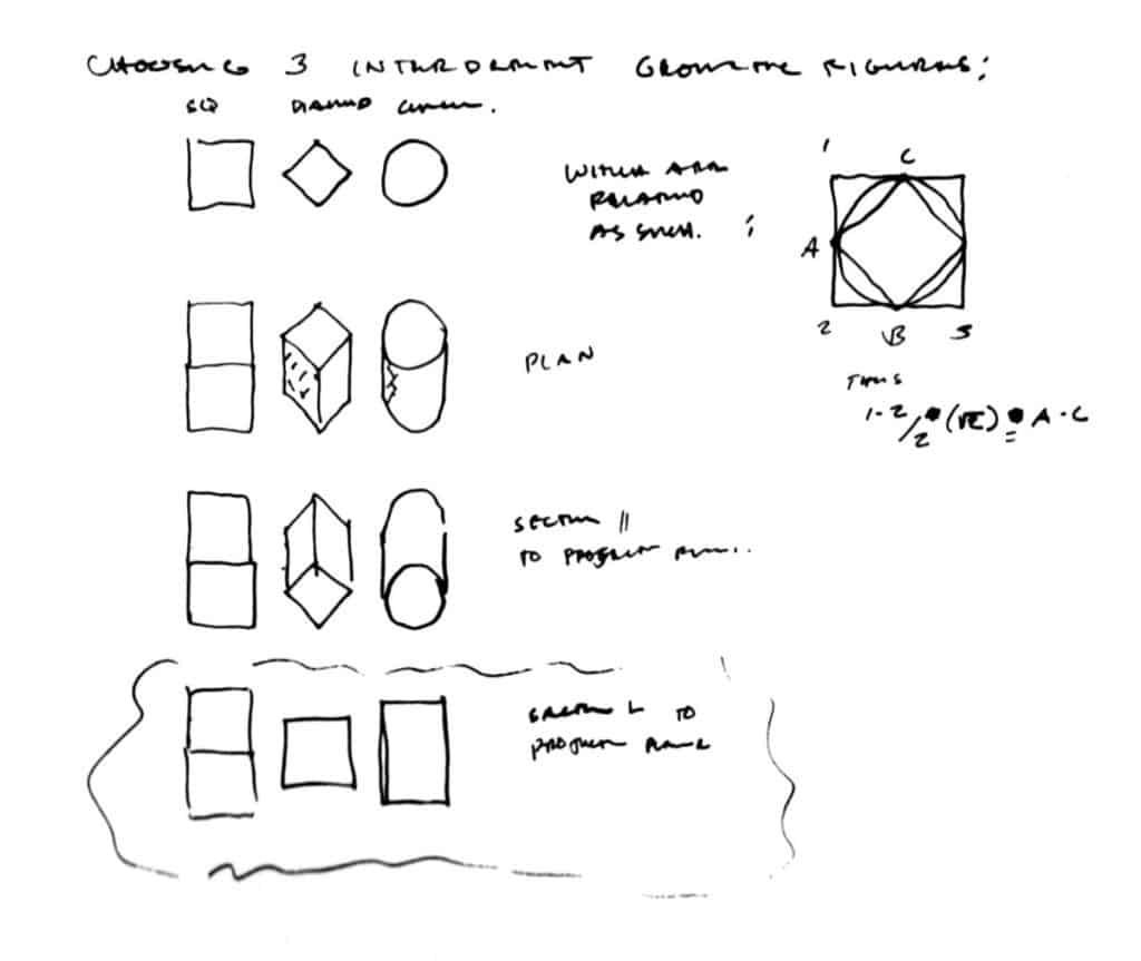
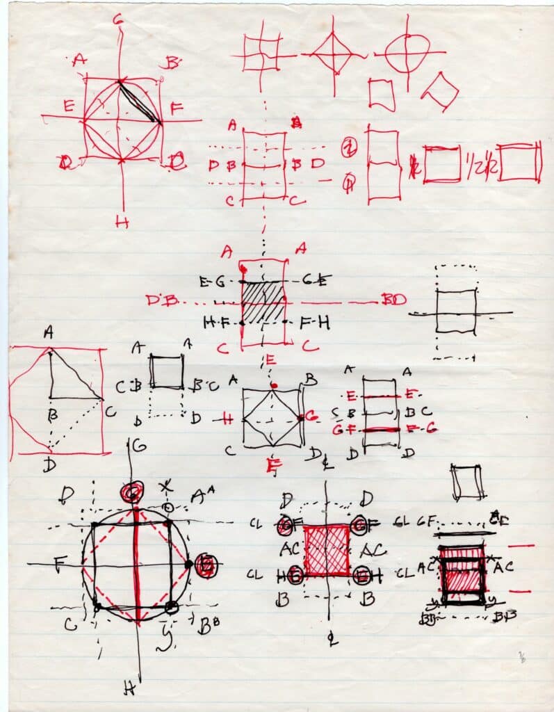

The diagram gives insight into Hejduk’s thinking and underscores his highly individual understanding of this drawing form. But at this point, Hejduk’s architecture exists solely in drawings, and it’s the close fit between the projection system and the architectural ideas that matters. It is tempting to think that without the 90-degree axonometric (discovered in the course of the Diamond Series), there would be no wall houses.
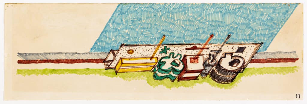
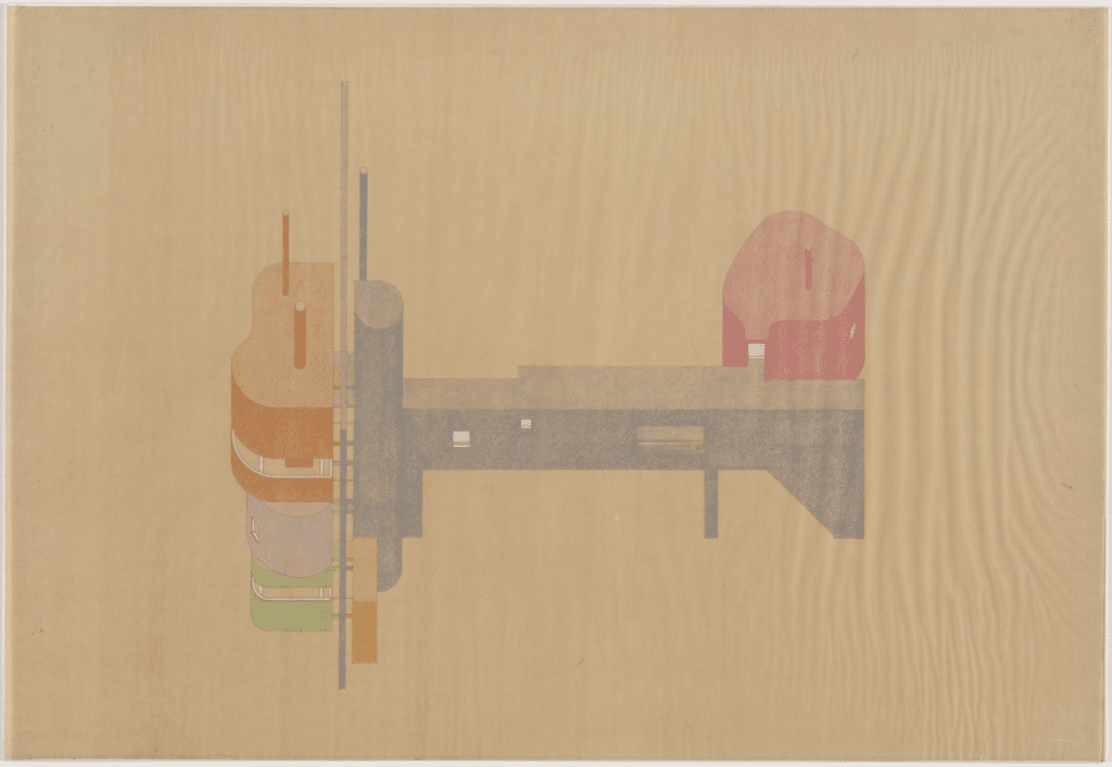
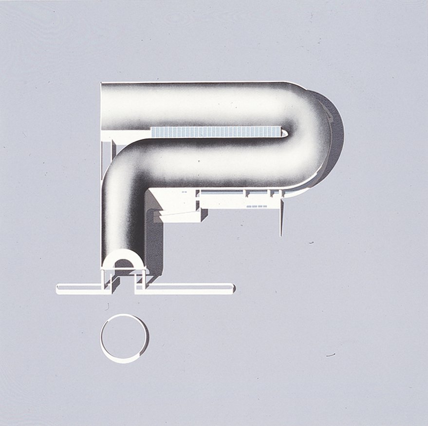
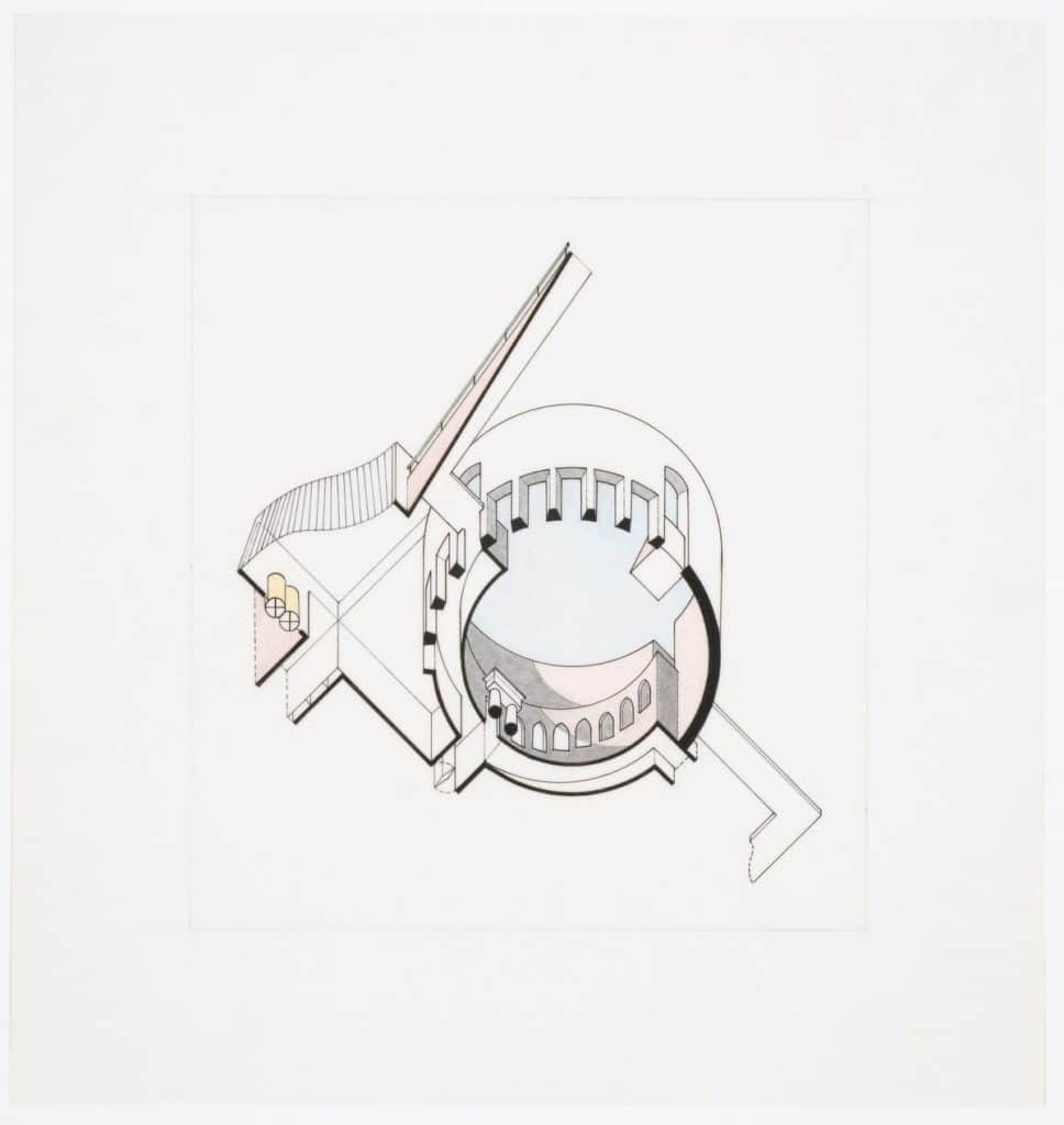
If the Diamond Series remains something of a novelty, marked by the literal translation of a painterly problem, the wall houses are something entirely new. They are more fully three-dimensional and less plan-based. The 90-degree axonometric enables the idea of a ‘still-life architecture’ that underlies these projects. [4] The freestanding wall stands in for the painter’s canvas, but also functions architecturally, as a threshold that is constantly crossed in the course of the occupation of the house. The axonometric here plays a double role: in the frontal views, as in the diamond houses, it reiterates the tension between the stable, two-dimensional frame and active, three-dimensional volumes. But in the side views it functions to explain the relationship of parts. From here on, the 90-degree projection becomes almost a default for Hejduk, utilised for example in the ‘Cemetery for the Ashes of Thought,’ or the masques, where there is less of an explicit formal interplay between the object and its form of representation.
As a student, I avoided the 90-degree axonometric – in part because it was so closely associated with a charismatic teacher. It belonged to a very specific formal and spatial language, and to a set of issues that looked back to an earlier period in the history of the Cooper Union. But with time and distance, Hejduk’s work has become more important for me, and I have returned to the 90-degree axonometric as a preferred form of representation for small-scale projects. For me, it is an indirect form of representation, less transparent to the artefact represented, calling attention the drawing as artifice. In more general terms, the axonometric is experiencing something of a revival, but under different terms today. A younger generation has reacted to the proliferation of renderings, (which, typically done for clients and marketing purposes, have a strong commercial connotation) and turned to a drawing form more closely associated with the discipline. The axonometric is, preeminently, an architect’s drawing: technical and precise. But unlike the earlier axonometrics of Alberto Sartoris or those of Hejduk’s close friend Peter Eisenman, these new drawings do not depict abstract objects floating in space. The drawings made, for example, by Atelier Bow Wow to illustrate the informal urban episodes of Made in Tokyo (2001), or the more recent drawings of buildings and urban complexes by MOS, are populated with a full cast of people, trees, cars and objects, which occupy a carefully delineated ground plane, the whole thing rendered as a scene. [5] The balance has shifted, and the pictorial capacity of the axonometric comes to the foreground, now in a carefully poised interplay with the abstract, measurable character historically associated with the axonometric. If these drawings resonate with anything, it is with the graphic work of an artist like Chris Ware. Here the function of axonometric projection is to shift the image into a schematic register that communicates immediacy. These images are not meant to be deciphered and unpacked; instead, they are immediately available to the viewer, scanned one after the other in sequence, with the intention of telling a story.
These new axonometrics are made on the computer, which raises another series of questions. It would be too simple to link these new representations to the capacities of Illustrator, a vector-based software that is simultaneously measurable and pictorial, and easily integrates images and color. In the case of the axonometric, it is more a question of the way in which the drawing has to be constructed in the computer. The computer automates operations once done by hand. In most cases, these new axonometrics are not projected from plans; instead, they are oblique orthographic views of a three-dimensional computer model (not in fact, so different from the perspectival view of a computer model, which underlies rendering practice). Strictly speaking then, although they look like axonometrics, most of these are not true axonometrics. Because the angled edges are foreshortened differently, the dimensional consistency is not preserved. There is a simple work-around that yields a proper axonometric. It involves a ‘make 2D’ top view of a 3D model that has been rotated and sheared at 45-degrees – which, ironically, replicates in the computer the analog operations of Eisenman’s axonometric model of House X (1978). But it is also worth emphasising that, for me at least, this yields a fairly crude underlay, which has to be extensively reworked in 2D, utilising all of the techniques of projection and geometric construction once done by hand, now faster and more precise in the computer.
The drawings that resonate most directly with Hejduk’s today are the San Rocco covers drawn by Michele Marchetti. [6] The actual source for these is unimportant – by the mid-1970s the 90-degree axonometric had become an available technique, no longer necessarily tied to Hejduk’s formal language or its associations with purist painting. Stanley Tigerman (who had himself made diamond paintings in the early 1960’s) used the form extensively, playing with its child-like, cartoonish quality. In drawings for the Staatsgalerie Stuttgart and later, the Clore Gallery at the Tate Britain, James Stirling combined worm’s eye views with 90-degree projections. Toyo Ito and Arata Isosaki both used the 90-degree axonometric to different ends. Hejduk may have originated the form, but it now belongs to the shared culture of the discipline. It is this collectively understood architectural knowledge that Marchetti draws upon for the San Rocco cover drawings.
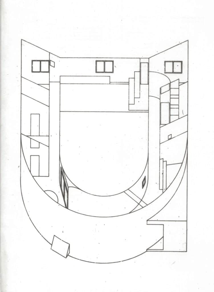
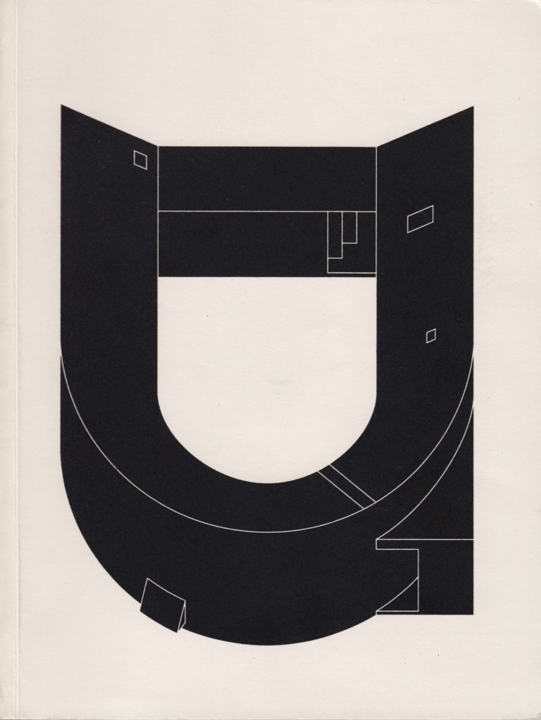
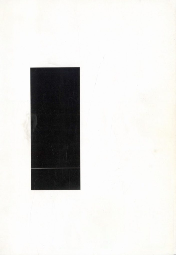
The San Rocco covers convey immediacy and recognisibility, often converting well-known buildings into icons. They operate by reduction, not multiplication. These drawings are made with a full awareness of the image-driven culture that architects by necessity operate in today. They function to create an identity for the magazine, but are not done cynically. San Rocco’s commitment is to the shared knowledge of the discipline, and they make use of the all the tools available to communicate to an informed audience. They are playful and somewhat indifferent to content; it is possible to sense a deep admiration and respect in the drawings made of Toyo Ito’s White U, or Libera’s house for Malaparte in Capri, but something else is at work in the extruded form of Cesar Pelli’s Pacific Design Centre for issue #14. Or, for example, the cover of San Rocco 9 (Spring 2014, ‘Monks and Monkeys,’ on minimalism), which shows a black rectangle, off centre, subdivided by a single white line near the bottom. The drawing presents the bare minimum information necessary to read it as a 90-degree projection of a black monolith, but it also enacts a subtle commentary on the reductive character of minimalism.
These drawings are emblematic of the new understanding of axonometric today: committed to a disciplinary discourse, and in conversation with history, but at the same time not over-burdened by that history. They wear their erudition lightly and are open to a wide range of references – from media, other art practices and popular culture. There is a certain slightly perverse pleasure in the virtuosity that says that anything – from Devil’s Tower to Bramante – can be filtered through this method. They work from a shared base of disciplinary knowledge that includes history as well as technical expertise. Hejduk’s metaphysical speculations about collapsing space are far from their way of thinking. Twentieth-century painting is no longer a preferred point of reference – photography, software and contemporary image culture are more important today.
Hejduk looked inward, and engaged the discipline through a highly personal search; San Rocco and their contemporaries look outward, to architecture as a body of collective knowledge, and to the world beyond. They remind us that technical expertise and a deep knowledge of history are not in conflict with architecture’s political mandate. The knowledge specific to our discipline remains an extraordinarily powerful instrument with which to meaningfully engage the public realm, even in a world where the immense powers of contemporary digital methods and image production seem to all but obviate the need for any discipline whatsoever.
Notes
- Awkward as it is, ‘90-degree axonometric’ is the most accurate term I can find. There is no accepted name for this form of projection, sometimes simply referred to as a ‘flat axonometric.’ When an axonometric is constructed as a projection from plan, any angle may be employed. 15, 30, 45 and 60 degrees are the most common angles. I think something of the attraction of the form for Hejduk was its sense of inevitability. Rather than arbitrarily choose an angle of projection he works with the ‘Degree Zero’ of axonometric; in fact, from the point of view of the drawing, 90 and Zero degrees are the same, so these drawings could accurately be described as a ‘Degree Zero’ axonometrics.
- Slutzky has described the spatial field of this façade as being perceived more like a painting, apprehended centre to edge, and scanned evenly across its surface, rather than being approached hierarchically, from base to cornice. See: Robert Slutzky, ‘Aqueous Humor’ Oppositions 19-20, Winter/Spring 1980, pp 28–51.Although written and published later it is safe to assume that these ideas about the relationship between architecture and painting reflect the ongoing conversations between Slutzky and Hejduk during their time together in Texas and New York.
- ‘Introduction to the Diamond Catalogue’, originally published by the Architectural League of New York in 1967; reprinted in: John Hejduk, Mask of Medusa: Works 1947–1983, Kim Shkapich, ed. (New York: Rizzoli International), 1985, pp 48–49.Hejduk, it should be noted (incorrectly) refers to the projections as ‘isometrics’ – they are in fact axonometric projections from plans, not true isometrics, which involve a projection of a solid rotated 45-degrees in plan and section relative to the picture plane.
- Slutzky observes a ‘still-life vision of space’ at work in Le Corbusier’s work as early as his travels sketches from 1911–12: ‘The lifting of the eye level to the centre makes the ground plane read as tipped forward or ramped, ie, as ‘elevational’, anticipating the tipping up of plan to elevation in the 90-degree axonometric. See Slutzky, ‘Aqueous Humor’ p 32.
- See: Dora Epstein Jones, ‘Little People Everywhere: The Populated Plan’ LOG 45, Winter/Spring 2019.Massimo Scolari’s recently published history of the oblique drawing, on the other hand, emphasises its projective, measurable character: Massimo Scolari, Oblique Drawing: A History of Anti-Perspective (MIT Press), 2015.
- Helen Thomas, ‘San Rocco Front Covers’, 20 June 2017.
