Outside In
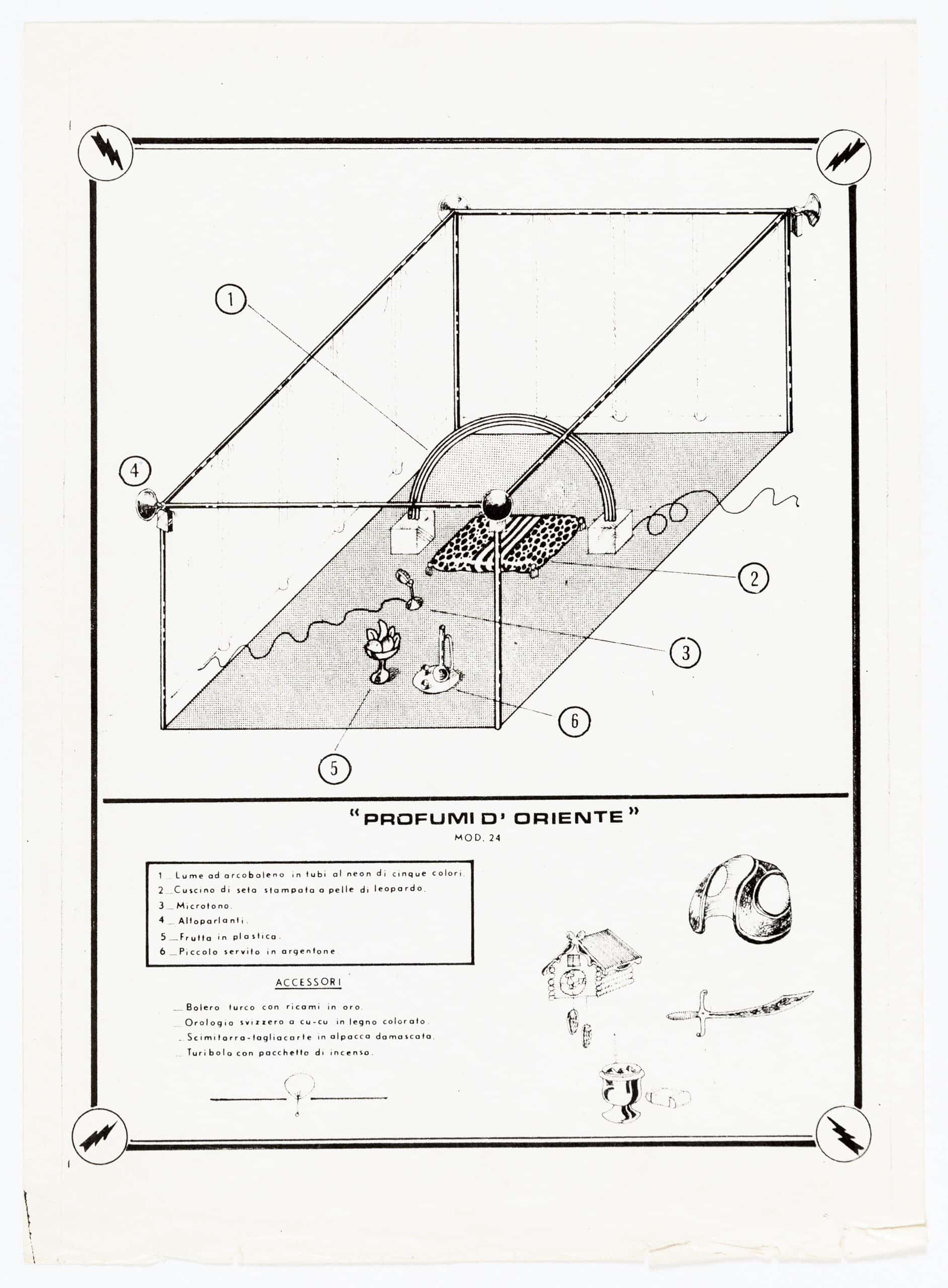
Music plays from behind a curtain. Lights come on and you see that the curtain runs along two sides of a carpet whose centre hosts a leopard skin cushion. There is a chair at one side of the carpet and at the opposite end, a single column. Not before long a brightly coloured rainbow forms over the cushion. In front you notice a selection of ripened fruit sitting in a necked bowl. Feeling peckish, you pick up a banana and bite into it. Immediately after you choke. You throw the banana to the floor. It’s plastic. You realise the leopard skin cushion, as it reflects the rainbow’s light, is also fake. The rainbow then starts to flicker. You follow the arch to its end and find a cable. Bitterly disappointed, you look back and can no longer see the chair. Retracing your footsteps, you realise it is only an image of a chair and the once-proud column is a prop made of foam, weighed down on one side by a floor bracket. Upon seeing everything you realise it’s all staged.
The Gazebo series were a set of drawings created between 1966–74 by Archizoom for the first issue of Pianeto Fresco (Fresh Planet) magazine: a self-published publication by Ettore Sottsass Jr. and Fernanda Pivano. Contributors included artists, architects, and workers who were considered a ‘counter community’ and ‘were fighting creatively for ‘nonviolence’. [1] The series was made shortly after Archizoom’s formation and during the time of Radical Design. A design shift that proposed radically different ways of living, in an effort to counteract the strict formality that defined post-war Italy. The drawings were a ‘meditation on the rational construction of architecture’ and provided a hypothetical space in which the authors could critique bourgeoisie consumerist society. [2]
Much like a shopping catalogue, the drawings were each given a name and model number such as Profumi D’Oriente; Mod.24 and Archizoom were introduced under the pseudonym company name Gazebo’s Inc. So that in their formatting alone, the series seems to welcome a parting with reality. A departure fully enabled through the act of drawing. Yet however surreal, the series had to remain legible to the masses. In order to question everyday living, Archizoom’s drawings had to resonate with the bourgeois consumer. This symbiotic need to create ‘an impossible but significant hypothesis’ whilst remaining coherent seems to have resulted in a project that is at once legible and precise yet uncanny. [3]
Discerning the Interior
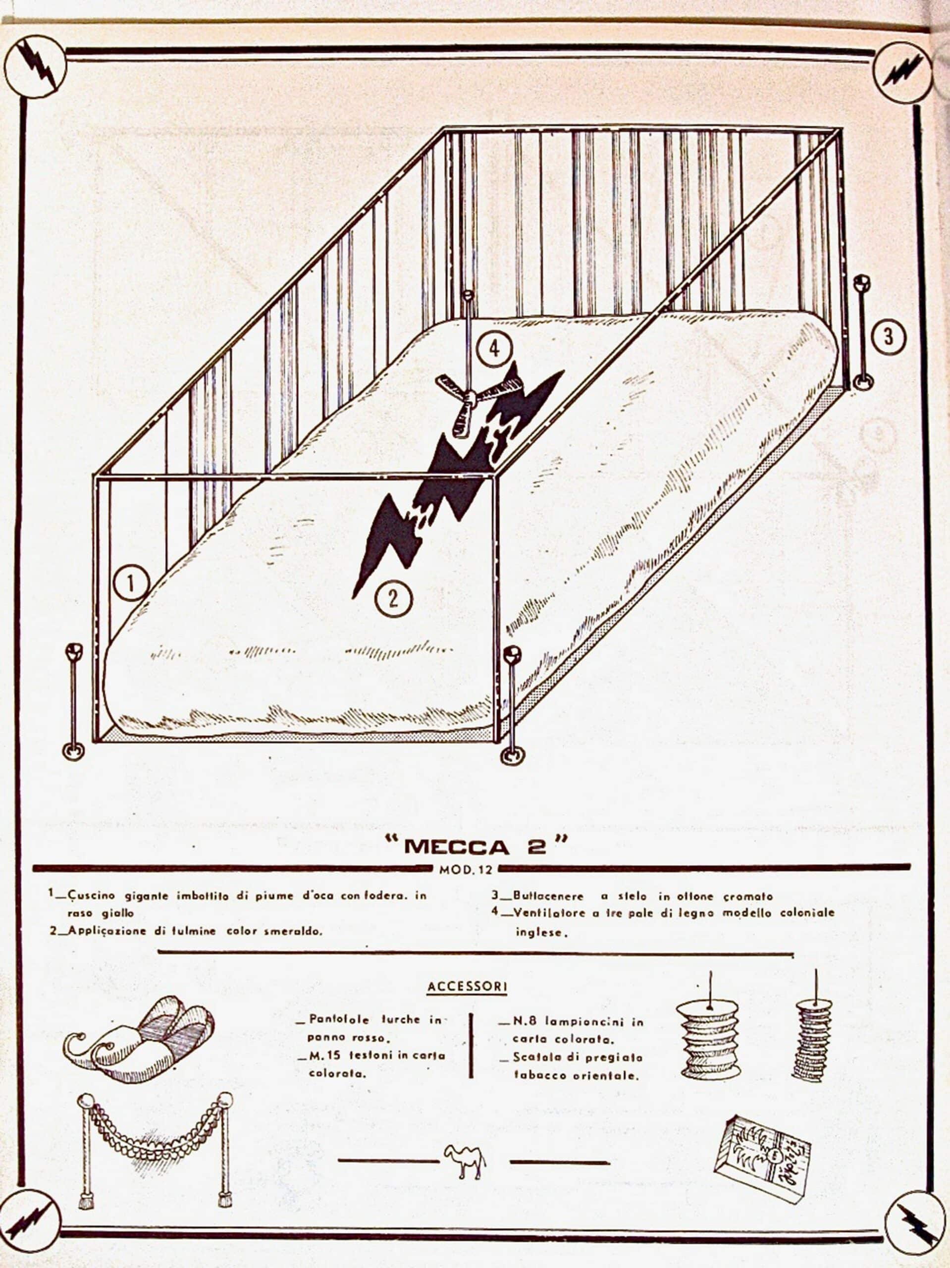
It is as if we have zoomed in from the early pages of No-Stop City, far inside an abstract network towards a series of rooms. That being said, interiors require envelopes and throughout the series some envelopes are less discernible than others. Profumi D’Oriente shows a tubular frame that is part-open and part-lined with fabric. Whilst Mecca 2 has a similar tubular frame, however the frames outer corners are marked by stemmed ashtrays. This suggests there is space beyond what we are being shown. Comparatively, in Teatro Segreto in Ambiente Domestico, the frame is further enclosed by the solid line of what looks like two walls and a door to one side; the latter of which even breaks the bounds of the drawing frame. Rather uncomfortably, these details leave us unsure of whether we are inside or outside and what lies beyond.
Archizoom appropriated the gazebo to ‘estrange(s) users from their own habits’. [4] In light of this one might ask: why a gazebo? As we know it, the gazebo frame encompasses a pre-existing ambiguous aesthetic: it is skeletal, utilitarian and autonomous. Consequently, the objects enclosed by the gazebo are removed from their everyday surrounds to an unorthodox setting. This may lead us to repeatedly question where these objects are. However, the abstract space we call the ‘gazebo’ and the few lines required to make it legible on the page, allows this question to remain unanswered without hindering the drawing.
Deceptive Objects
Throughout the series, cables wriggle out of sight, perfectly trimmed topiary mark corners and we see plastic fruit, mock tiger and fake flowers. Collectively, these fraudulent details make clear these settings are staged. Meanwhile, theatre lights, speakers and megaphones (not to mention the accessories; a stick-on beard, glasses and hat) suggest a lexicon of performance and artifice. Hence, this series has been previously likened to Bertolt Brecht’s theatrical device, the Verfremdungseffekt (alienation effect) first published in 1936. In constant view of ‘blank backgrounds, empty stages, limited objects, exposed lights, projections and half-curtains’, the Brechtian observer must remain aware of the line that lies before them between reality and fiction. [5]
In the Gazebo series such constructs are not read through drawing alone. The similarities they share with the alienation effect seem to mark the limits of visual representation and the subsequent alliance of image and text. For instance, we only know the fruit in Profumi D’Oriente is plastic because of the annotation 5 Frutta in plastica. The text provides the specificity that the drawings, perhaps due to their scale, print or format could not achieve. Through text the colour, size and context of objects become clear. Details such as ‘100W bulb’; ‘rainbow lamp in neon tubes of five colours’; ‘chromed brass tube’ are immediately confirmed. Going beyond what is visually apparent in order to be told (in writing) that the fruit is plastic, urges us to reconsider the authenticity of the room just as much as the fruit. We question what is being shown and what that means to us.
Interestingly, Archizoom leaned on text in another project, No-Stop City (1969). Where they used a typewriter and lettering to code abstract plans for their imagined sprawling metropolis. In No-Stop City text was used as a graphic, wherein text becomes image. Comparatively, in the Gazebo series we are given annotations; text that is meant to be read. Despite the use of text being different in each project, the reason behind its use remains the same: text is binary and precise.
In the postface of the No-Stop City monograph, Archizoom member Andrea Branzi retrospectively wrote that Archizoom were working towards ‘an architecture which was no longer an architecture, and objects which were no longer objects (but concepts)’. [6] The precision given to the annotations in the Gazebo series support Branzi’s claim. They depict objects with iconographic status. In this sense, the series presents us with a collection of symbols, whose details or truths must not be mistaken.
The Spectated Drawing
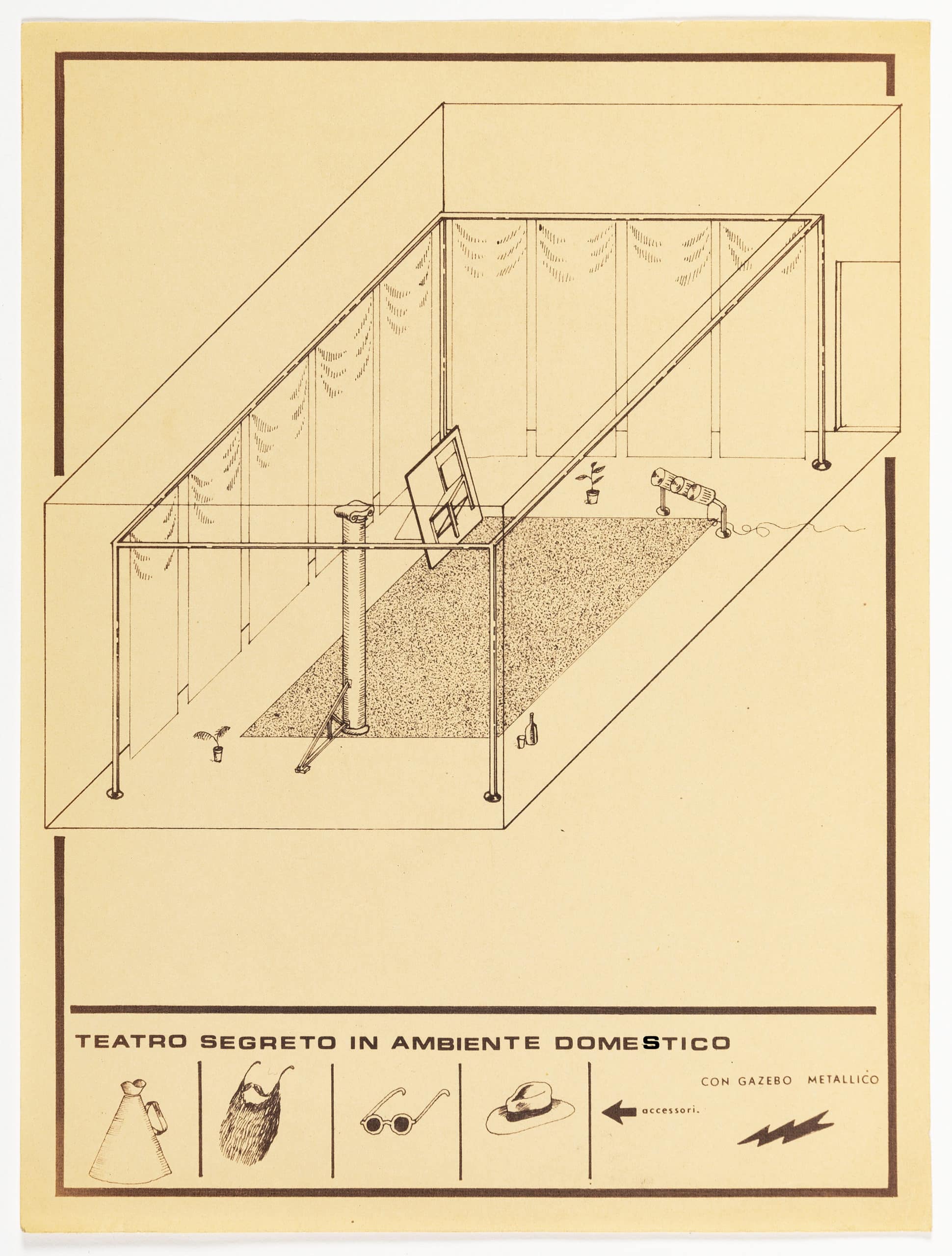
In theatre, one would ordinarily hide scaffolds and cables. For Archizoom, it seems such details were not to be overlooked. The image of a chair and the ballasted column shown in Teatro Segreto in Ambiente Domestico for instance, seem to be configured to benefit a singular viewpoint: where their artifice and forgery would not be visible. However, perhaps in reference to Brecht, Archizoom purposefully constructed this drawing from a point that reveals the deceit of both objects.
By using parallel projection Archizoom expose us to each entire space, but in so doing, we are ultimately removed from what we see. Parallel projection was historically used to represent military ground, so that one is able ‘to see the thing whole, distinct, clear’, as written by Massimo Scolari when comparing oblique drawing with perspectival views. [7] Parallel projection thereby provides an objective overall view, whilst a perspective benefits a singular personal experience. Furthermore, oblique drawings tend to be occupied with ‘the actual space of an object rather than an object in space’. [8] As such in oblique drawing, the assemblage of particular objects and their legibility tends to deliver the drawings intention rather than their qualitative space.
If Archizoom had chosen to draw in perspective, we would have been limited to the confines of each enclosure. The view may have led us to perceive the chair as an actual chair or to admire the fruit. By drawing obliquely, we are denied such experiences. We must consider the fruit bowl entirely and in relation to the neon rainbow. We must question the authenticity of the propped-up column. We must engage with each gazebo, one after the other, as predetermined packages chosen for us by the authors. We must observe the inside and outside of each setting all at once.
Emily Priest is a practicing architectural designer, educator and writer based in London.
This text was entered into the 2020 Drawing Matter Writing Prize. Click here to read the winning texts and more writing that was particularly enjoyed by the prize judges.
Notes
- Breatriz Colomina, Clip Stamp, Fold – The Radical Architecture of Little Magazines (Actar Publishers; English ed. Edition, 2010), 102.
- Ibid.
- Archizoom, Teatro Impossible, Pianeto Fresco 2-3, March 16, 1968.
- Francesco Marullo, “The Jungle: Freeland Labor, Living Knowledge, and Generic Architecture” (unpublished manuscript, April 24, 2017), typescript. See also, Francesco Marullo (2019) Climatic Universal System, Journal of Architectural Education, 73:2, 168-177, DOI: 10.1080/10464883.2019.1633197.
- Francesco Marullo, “The Jungle” in Work, Body, Leisure, ed. Marina Otero Verzier (Rotterdam: Het Nieuwe Instituut, 2018), 261.
- Andrea Branzi, “Post-Face” in No-Stop City, 155.
- Massimo Scolari, Oblique Drawing: A History of Anti-perspective (Massachusetts: The MIT Press, 2012), 1.
- Scolari, Oblique Drawing: A History of Anti-perspective, 9.

– Maria S. Giudici, Joseph Mercer, Florian Scheucher, Keranie Theodosiou, Livia Wang, Sophie Williams and Feifei Zhou