The Politics of the Image
– Maria S. Giudici, Joseph Mercer, Florian Scheucher, Keranie Theodosiou, Livia Wang, Sophie Williams and Feifei Zhou
My course, The Politics of the Image at the Royal College of Art, drew on the Drawing Matter Collection amongst others to explore the construction of images since the Renaissance. This construction has allowed a crafty lie to evolve, be challenged and ultimately influence reality – albeit not always in straightforward ways. The architectural drawing is not supposed to literally represent reality – be it a contemporary or future reality – but rather to produce that reality. The actual product of the architectural drawing is not a building but a way of seeing, or to be more precise, a subject.
Western architecture’s emergence as a form of knowledge separated from the practice of building is conventionally placed at the dawn of the Italian Renaissance, when Leon Battista Alberti put forward a new figure of the architect-intellectual. The drawing was a fundamental instrument of this figure for two reasons: first, as a way to communicate with a construction site the architect would no longer necessarily supervise directly, and secondly, as a device to allow the design to emerge as a consistent project. Clearly, design and project do not mean the same thing: while design is, literally, the conception of the physical form of a space, project is the entire cultural, social, and political agenda the design – consciously or unconsciously – brings with it. This agenda would have been impossible to develop with a hands-on method such as those employed by master builders; it needed a more literate medium to translate thought into something communicable, workable, and durable. Enter the drawing, always accompanied by a text (and perhaps this relationship remains to be explored).
It could be said, then, that from the beginning the drawing serves not the design but the project. This is the same as saying that the drawing produces not (only) space but subjects. While the drawing’s instrumentality as a design tool has probably ended, as theorists such as Mario Carpo have argued, its instrumentality as a tool for the project seems more important than ever. From this point of view, the need to understand what drawings or images are, how they work, how they are built, what they really mean, and ultimately what kind of subject or way of seeing they want to propose, is still extremely relevant.
Looking at the construction of the image over the last five centuries, this course examined ways in which representation was not the only raison d’etre of the drawing, but only one of the many aspects of its instrumentality. Such subjects as the architect, citizen, interior, machine, and programme, were considered alongside issues such as the drawing and abstraction, drawing for a purpose, and the projected image.
Extracts from student projects:
Livia Wang: Fantasies So Varied and So Bizarre – the grotesque in three drawings attributed to William Kent
Troubling in their improbable physics, the depiction of space and architecture was clearly contentious in the dialogue surrounding grotesques, ‘For columns, reeds are substituted; for pediments, the stalks, leaves and tendrils of plants; candelabra are made to support the representations of small buildings… similar forms never did, do, nor can exist in nature.’ [1] Yet these qualities were also the style’s greatest practical advantages; not only were the self-contained vignettes and independent motifs easy to change and adapt in comparison to other conventions within Roman mural painting, its nature as a cumulative style allowed for the incorporation of both iconography and whimsy.
The drawings appear to be studies for the interior of a wall featuring two arched windows. Each sheet tests variations in the painted grotesque decoration, plasterwork and window tracery. Some shading articulates an otherwise flat projection. A curious flattening of the left jamb in the right-hand window reveals the decorated inner surface of the opening. Clearly appealing to a Horror Vacuui, Kent exercises recurring motifs across the drawings: a vocabulary of fountains and urns, canopies and cornucopias writhe amongst bells, putti, peacocks and swans, within a structure of foliage and arabesques.
Feifei Zhou: Hybrid Architecture: a monster or avant-garde? Perpetual Savings and Loan Bank / SITE
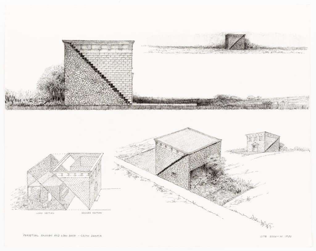
In 1980, the president of the Perpetual Savings and Loan Bank came to New York and commissioned a prototype design for the company’s banks in South Dakota from the architecture and environmental art studio, SITE. The project was designed around the themes of ‘savings’ and ‘loan’ and the drawing explicitly illustrates this design concept and ambition: a cube-shaped building is diagonally split into two halves by a harsh, bold zigzag line. Two distinctly styled counter halves have been formed: one side with a generic bank façade in brick and the other with a blank stone front opening its bottom half to the context. The context, vividly rendered in busy ink strokes, reveals a site located within a flat stretch of rural land. The sleek brick pavement on one side differs vastly from the lush garden of plants on the other. The artificial landscape has seemingly marked out the site boundary and ‘split identity’ of the bank within this unknown territory – a hybrid building with two halves. One half is the ‘secure’ part, based on the classical Greek revival style as the most prevalent form for banks in America, and the other is the ‘creative’ part, based on the traditional stone barn reflecting the vast American landscape. The building constructed an argument ‘with an undercurrent of architectural humour intended to infuse every exterior/interior detail of each structure with some form of commentary on generic bank buildings’ (Wines, 2017).
Keranie Theodosiou: Orthogonal Abstraction – the significance of the plan in the work of Erik Gunnar Asplund
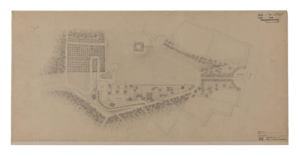
Apslund and Lewerentz prioritised the site’s natural environment and let the existing undulations in the landscape dictate the route and design. While there are elements of the landscape in the Crematorium plan that were sculpted and conceived in tandem with the architecture, the building appears to navigate gently around the foliage rather than insinuate the placement of the plantings and fauna between the gaps it created. Instead of prioritising the new architecture over the existing landscape of the site, the drawing shows a decisive attitude towards emphasising a conscientious synthesis between natural and built environments. The Woodland Crematorium plan represents the pinnacle in Asplund’s development of the plan’s narrative potential. Asplund’s buildings both embed themselves yet simultaneously operate as autonomous entities within their broader surroundings. The drawing operates as part of the larger project narrative yet stands alone as an independent artefact.
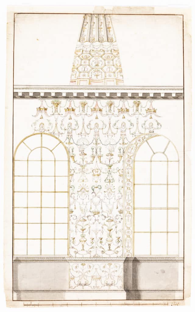
Joseph Mercer: François-Joseph Bélanger’s Fragmented Interior
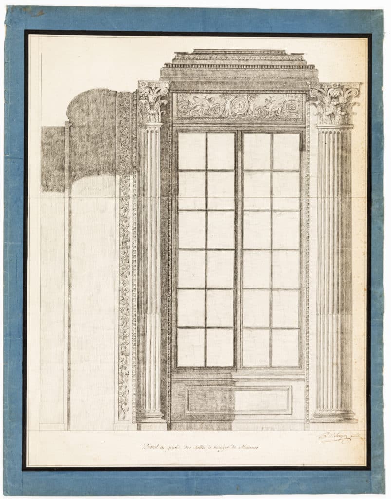
This drawing illustrates one of Belanger’s early projects, an interior refurbishment of the Château de Maisons at Yvelines, completed in 1778, the building having originally been designed by François Mansart and built in 1649. Dating from around 1777–1778, the piece is an interior elevation drawn in graphite pencil to create an extremely high level of detail in the architectural gestures and designs. These are often outlined in ink, though this is predominantly used in the less complex and detailed areas of the drawing.
Graphite is also used to shade the drawing, giving it a depth that is characteristic at the time in architectural sections. This enables the viewer to observe the drawing less as a symbolic presentation used to indicate a layout, and more as a representational depiction able to indicate the atmosphere and quality of the projected space. Belanger’s ability to communicate his designs through drawing would have been essential, as it is today, to creating a relationship of mutual understanding and progress between himself and his colleagues, clients, builders and the architectural establishment.
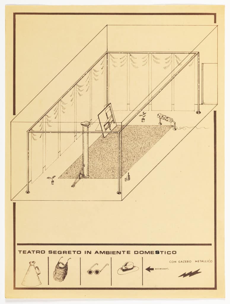
Florian Scheucher: Superstudio – Oriente (Modena Monument) or The Perpetuation of the Fray
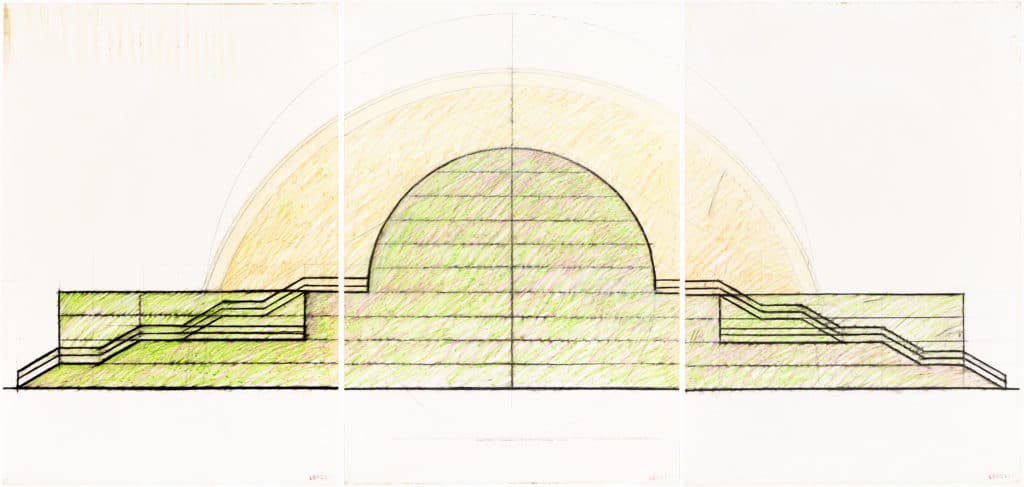
Created in 1971 by Adolfo Natalini, ‘Oriente (Modena Monument) consists of three large panels of pastel drawing, each 70 × 100 cm. The drawing is based on a conceptual project from 1970, a competition entry for an ‘Urban Park in Modena’, and was exhibited at the XV Triennale in Milan in 1973. The exhibition reflected some of the ideas manifest in the original project. Dubbed as ‘grande progetto per un monumento all’Oriente’ (‘great project for a monument to the east’), Cristiano Toraldo di Francia describes it as a design ‘bringing to its limit the rethorique of the theme declaration, with an architecture result of a collage of quotations from architects historically involved in revolutionary ideals. But at the same time it had inside the irony of a healthy self criticism: in fact the design was that of a lamp to light your solitary meals.’
The Monument is explicitly designed as a space to facilitate demonstrations and protests, yet it remains an ideal, an imagined possibility of prolific recalibration. The large elongated square in front of the monument is laid out to be a drive-in cinema, the project being not only a testament to the revolution, but likewise a symbol of mass consumption. Gatherings are not only possible for activists, but also for consumers in their cars. And yet the whole structure speaks of a different scale, one that can also be used as a lamp for dinner tables.
Sophie Williams: Nature versus Architecture
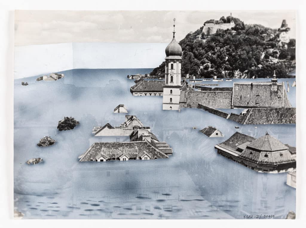
In 1969, Superstudio responded to an open call by the Künstlerhaus, Graz, for projects to be shown in an exhibition entitled Architektur und Freiheit. It was here that the studio would debut the Continuous Monument. The exhibition’s director, Wilfried Skreiner, subsequently invited Superstudio to exhibit again two years later in Trigon ’71. For this exhibition, Superstudio would prepare a ‘series of manipulated postcards’ depicting an urban intervention in Graz which would simultaneously be a ‘discourse around the city and on designing’. Superstudio’s intervention in the city would be ‘a cube of water for Graz’. ‘The Wall of the Mur’, representing ‘the strength of architecture’, would wrap the historic centre of Graz forming a 50-metre-high square dam stretching 850 m in either direction. The water of the Mur fills the tank until the buildings of Graz’s historic centre are entirely submerged; only the city’s natural monument, the Schlossberg hill, is safe from total immersion – a reference to the great flood in Florence in 1966.
Notes
- Vitruvius, as quoted in Alessandra Zamperini, Ornament and the Grotesque: Fantastical Decoration from Antiquity to Art Nouveau (London: Thames and Hudson: 2008), 16.

– Christina Gray