Peter Wilson: Ponte dell’Accademia
In the years prior to the commencement of his major built works, Bridgebuilding No.4 Ponte dell’Accademia holds a critical position within the formative projects of the architect Peter Wilson. The design was prepared in response to an open international architecture competition that was launched under Aldo Rossi’s directorship of the Third International Architecture Exhibition of the Venice Biennale, held in 1985. The competition called for ideas to replace Eugenio Miozzi’s timber-arched bridge over the Grand Canal, which formed a link between the Campiello S. Vidal and Galleria dell’Accademia and—by extension—the sestieri of San Marco and Dorsoduro. Miozzi’s bridge had been built as a replacement to Alfred Neville’s unpopular, heavily latticed and corroded horizontal steel structure of 1854. The timber bridge had been conceived as a temporary solution that anticipated a more permanent stone structure.
The Accademia Bridge was just one of a series of locations for Rossi’s competition, which called for innovative projects for ‘the upgrading of specific areas of Venice and its hinterland’. [1] The resultant projects formed a key element of the overall International Architecture Exhibition that Rossi entitled ‘Progetto Venezia’ and reflected his curatorial theme of public space in the complex and unique condition of the lagoon city of Venice. Around 1500 architects from around the world submitted entries but, as Wilson states: ‘In the end, many of the most original and provocative entries were edited from the monothematic exhibition in favour of a mass of lame and formulaic re-enactments of the 1970′s Rationalism […] this scheme is then from the salon des refusés’. [2]
The critique of the Rationalist doctrinal approach to the city is, indeed, evident in the full title Wilson attributes to his project. The prefix ‘Bridgebuilding No. 4’ not only signals an association with the oldest crossing of the Grand Canal, the famous inhabited bridge-building at the Rialto, but also declares itself as the fourth in a series of projects grouped under a new typology. In Wilson’s work of this period, the ‘bridgebuilding’ and, indeed, its companion the ‘shipshape’, were a sort of irreverent take on the po-faced European typology discourse. Together, they furthered an engagement between architecture and the city without recourse to purely historical forms. Earlier bridgebuilding investigations included: a design for the Pont des Arts in Paris, where building elements are added to fragments of an existing bridge to form ‘a complex collaboration of screen, tower and bridge’; [3] a prize-winning proposition for a city square and housing in Domplatz, Hamburg, in which the ‘bridge’ is used as a metaphor for the contextual status of the ‘building’; [4] and a family of small ‘landscape pavilions that are both bridge and building’ [5] for the Clandeboye Estate in County Down, Northern Ireland.
Wilson did, however, respect Rossi’s motivation for the competition. Upon its publication the following year, he acknowledged that:
‘The choice of the bridge as the subject for the 1985 Venice Biennale competitions implied the rescue of this from the specialist discipline of production and its reconnection to wider discourses. Reinvestigation of the bridge as a multivalent construction in a complex urban situation is a very different exercise from the modernist refinement of a single, unambiguous structural system.’ [6]
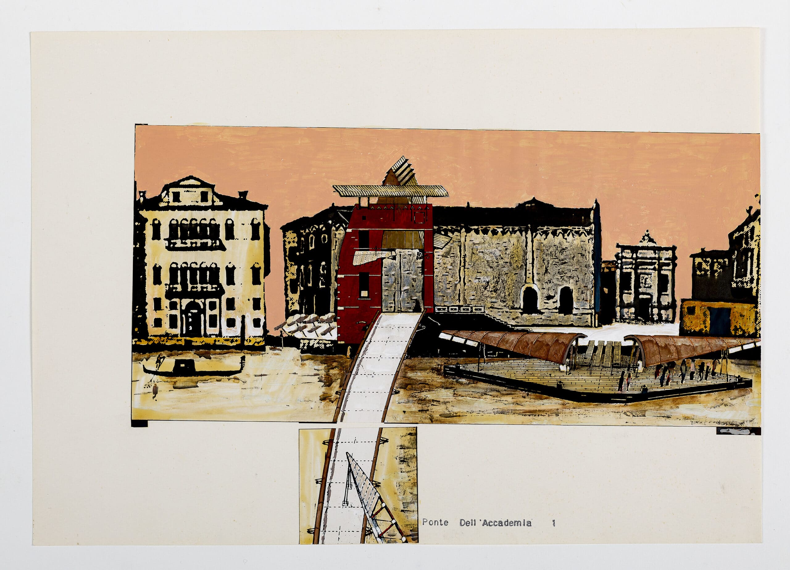
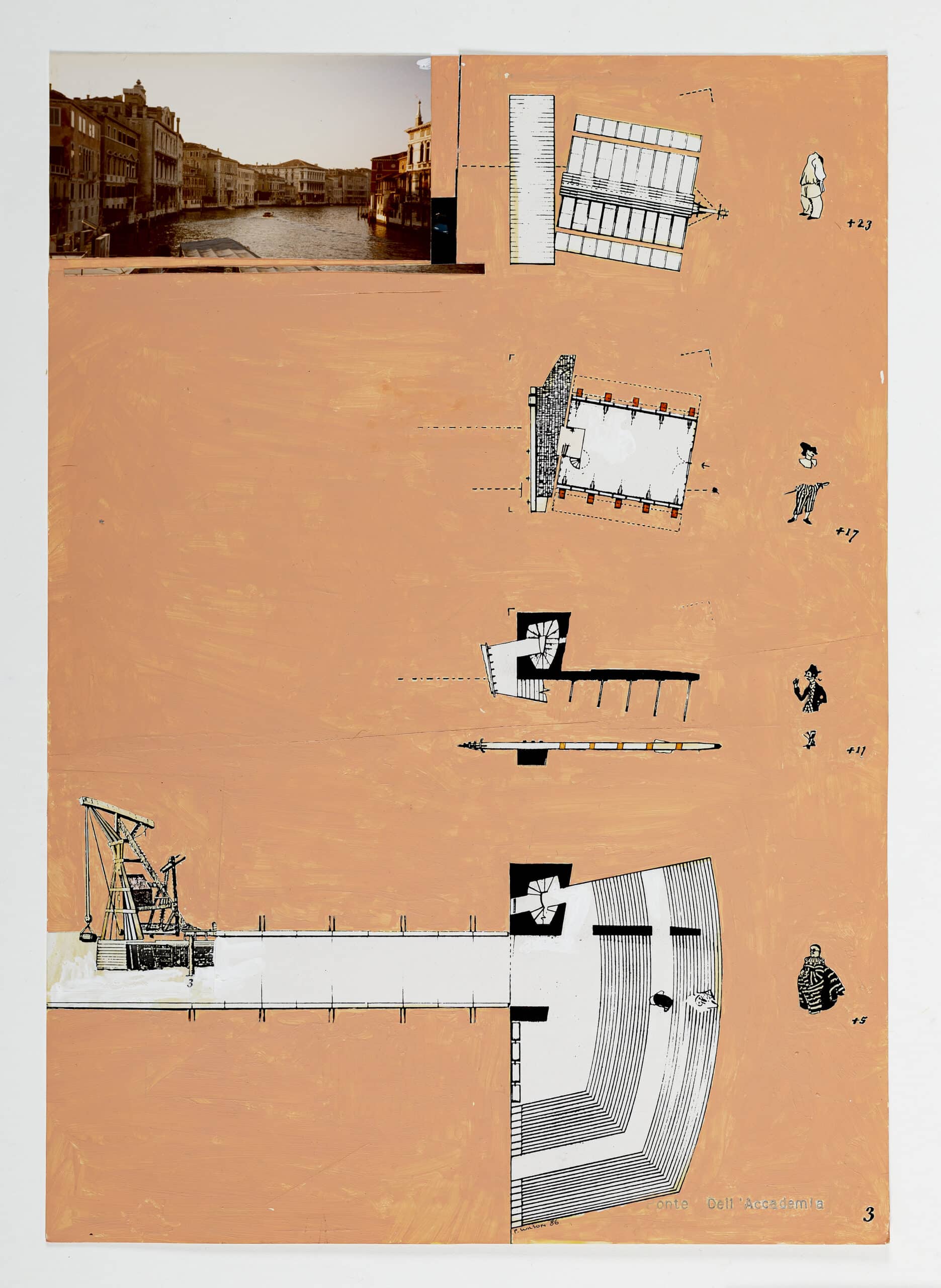
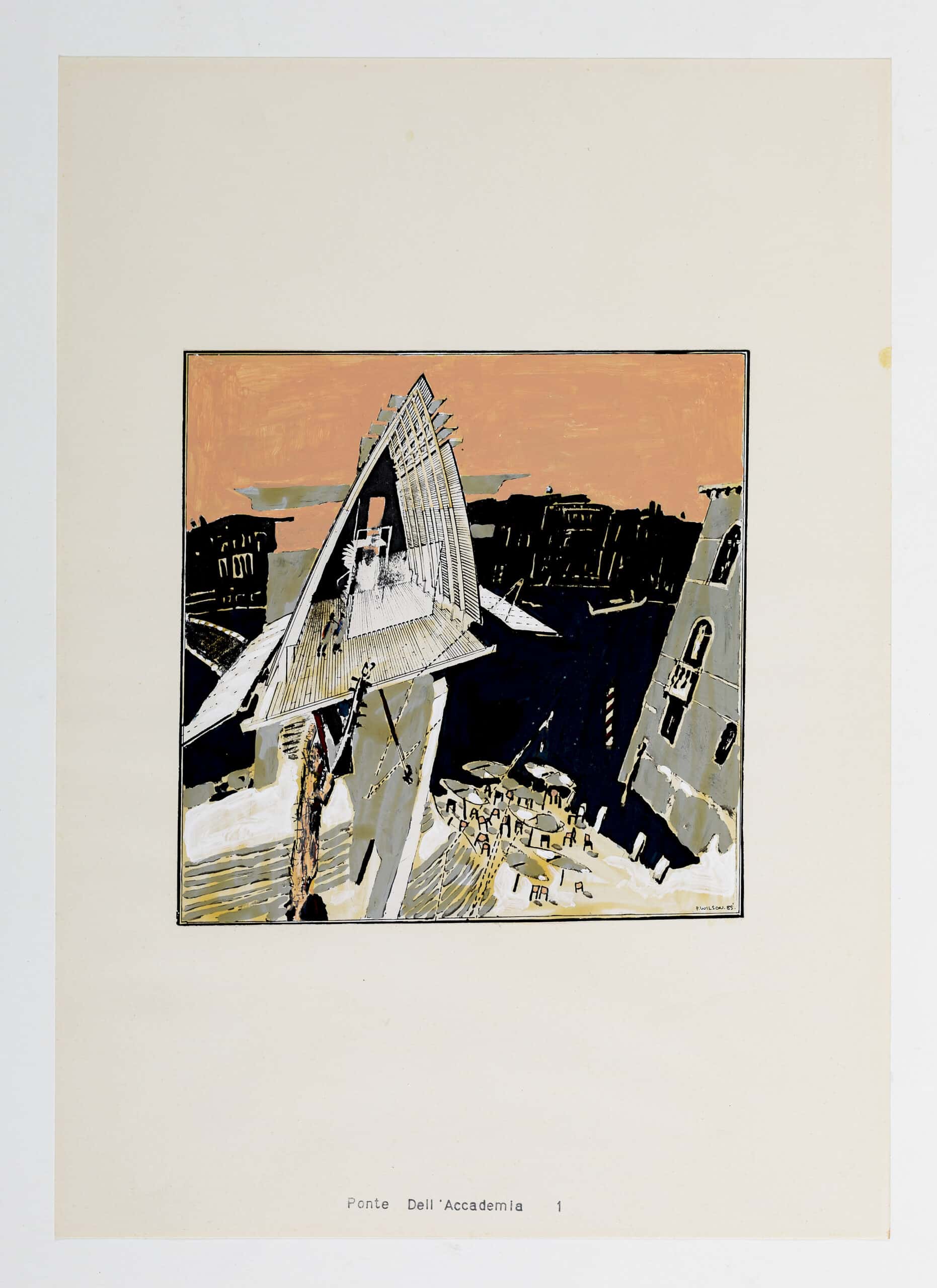
The complexity of the context was both physical and cultural. The bridge needed to negotiate not only the crossing of the Grand Canal but also the route around the mass of the Accademia towards its entrance, all the time maintaining clearance for vaporetti whilst respecting and engaging with the rituals and history of this extraordinary city. To negotiate these complexities, Wilson proposed a linear sequence, an assemblage of pieces, each responding to a localised condition—a market wall; a flying truss; a public palazzo; a raised copper-clad Biennale chamber supported on the sculptural figure of a ‘guardian’; [7] a new performance space of Accademia steps; and a ship-shaped vaporetto stop berthed in relation to the axis of Rio de S. Vidal (Fig.1). These are examples of what Wilson at the time referred to as ‘adjacencies’, highly articulate figurative elements, each speaking their own language and engaging with a localised condition both functionally and poetically. These ‘adjacencies’ are the cargo of the non-rhetorical ‘frame’, which holds them together. In this case, the ‘frame’ is the bridge itself.
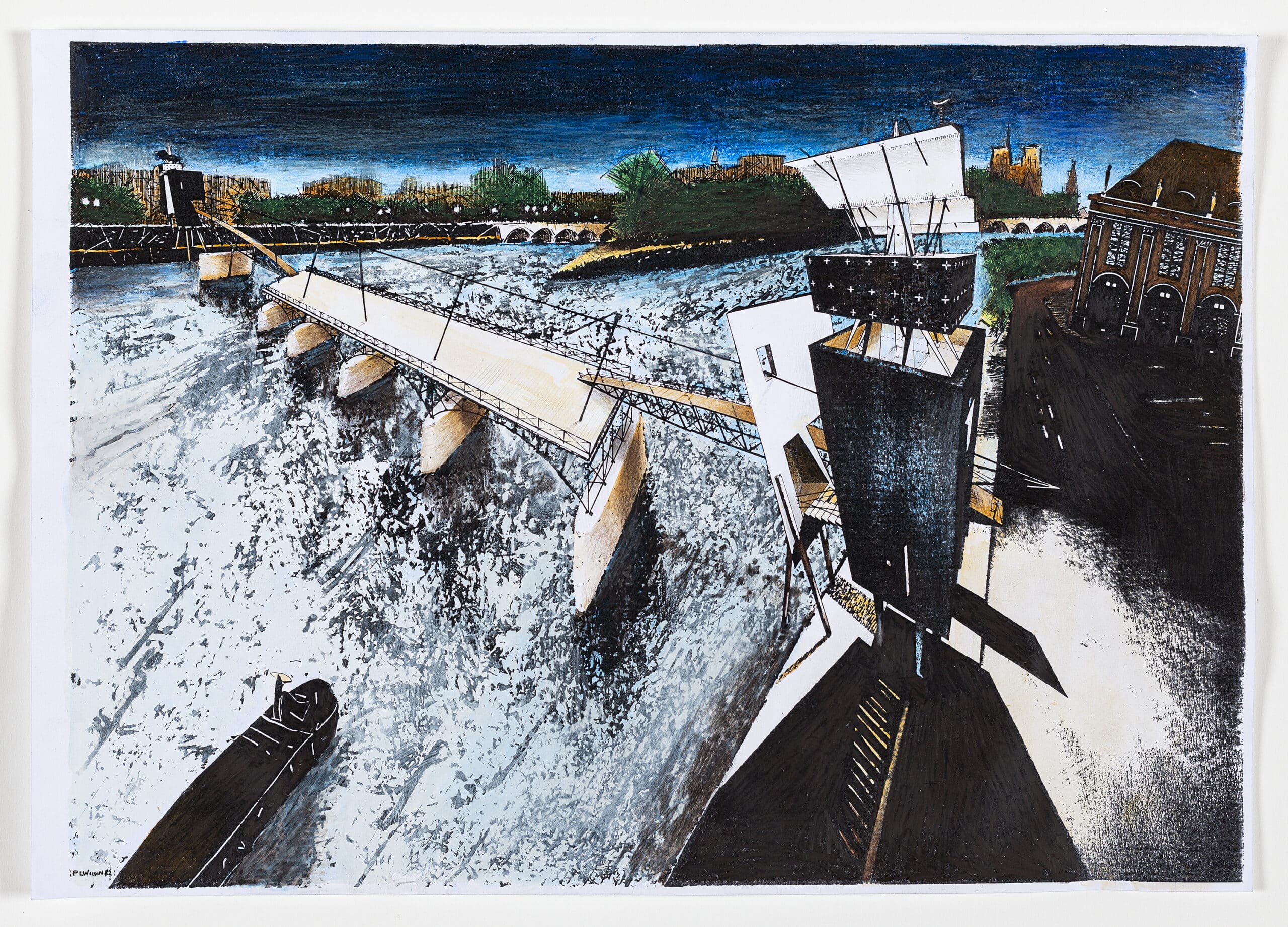
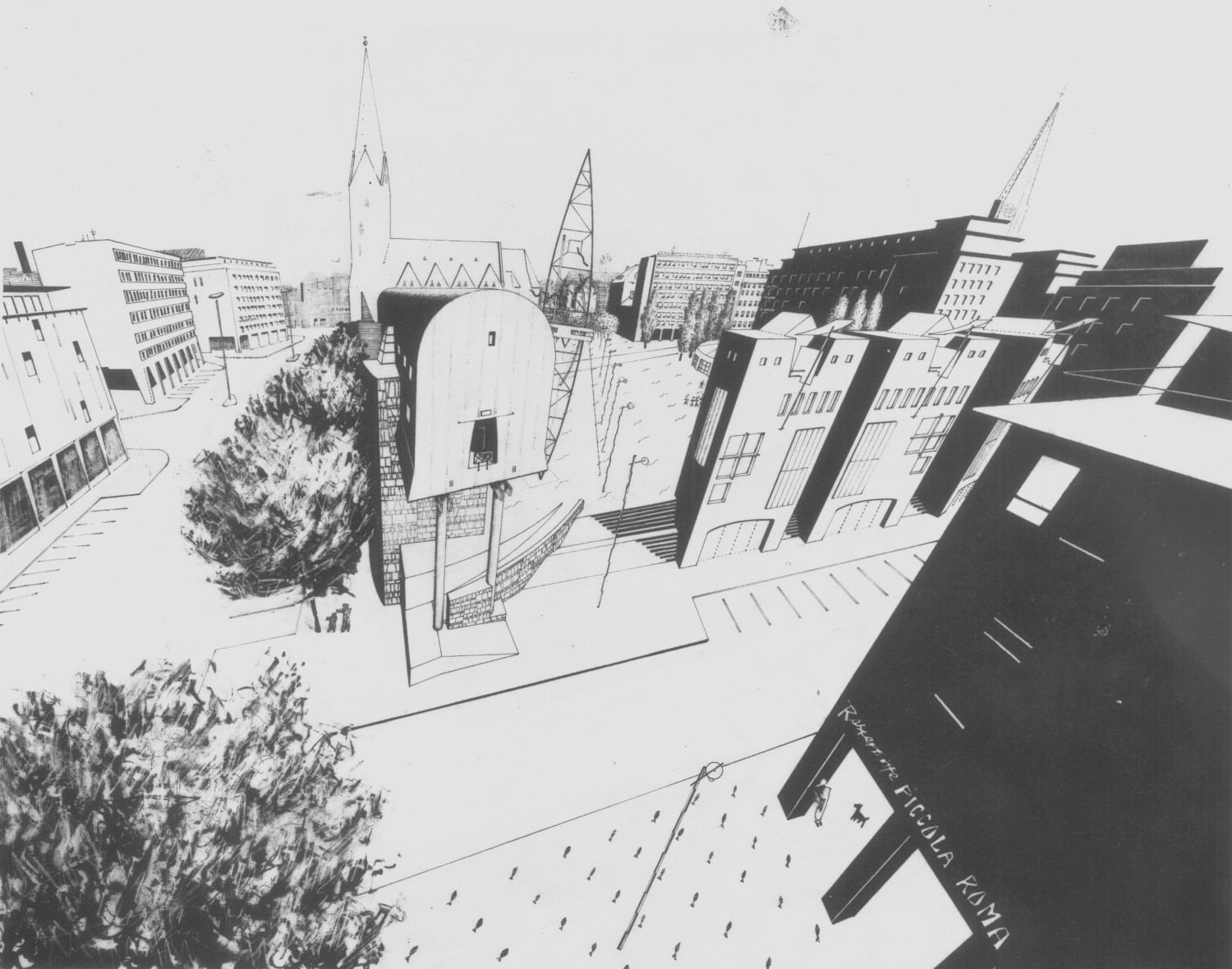
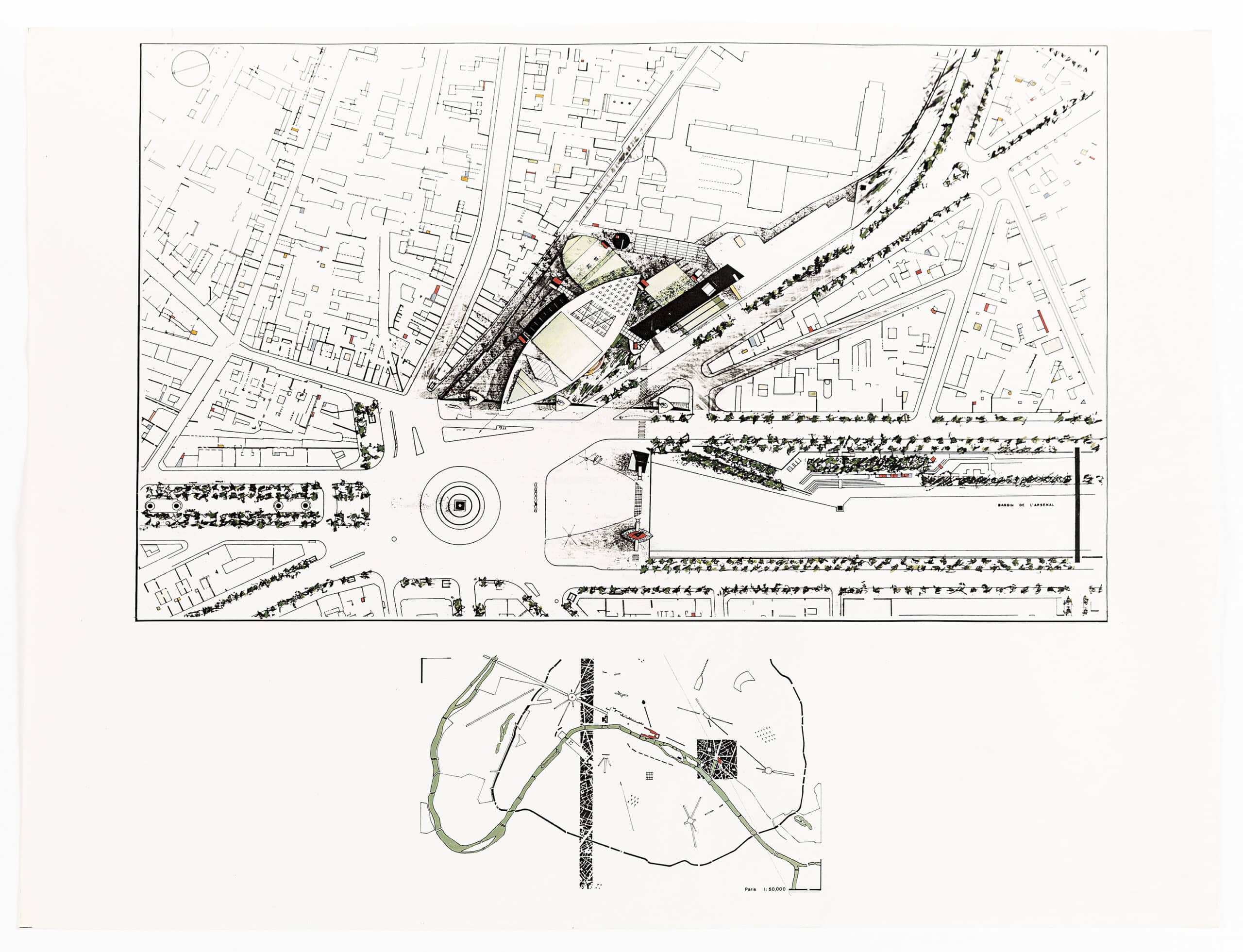
The Pont des Arts project of 1983 introduced what Wilson referred to as the ‘frame and adjacency theory’. [8] The existing fragments of the ruined bridge act as the frame around which various secondary narrative elements operate (Fig.2). For the Domplatz project, a raised ‘land bridge’ [9] of housing forms an edge and frame to a square in which a series of smaller public programmes are set, activating events within the new common space (Fig.3). Later that year, the abstract, contextless form of a massive stone shipshape—tethered by a ‘flotilla of local incidents’ [10] to the particularities of its place in the urban sea of Paris—became the frame for a competition entry for the Opéra de la Bastille (Fig.4). For Wilson, this approach provided a way out of the dominance of singular narrative gestures of the kind associated with figurative architecture. It allowed for both an abstract and figurative reading of architecture, a way of negotiating programme and context, the functional and the poetic.
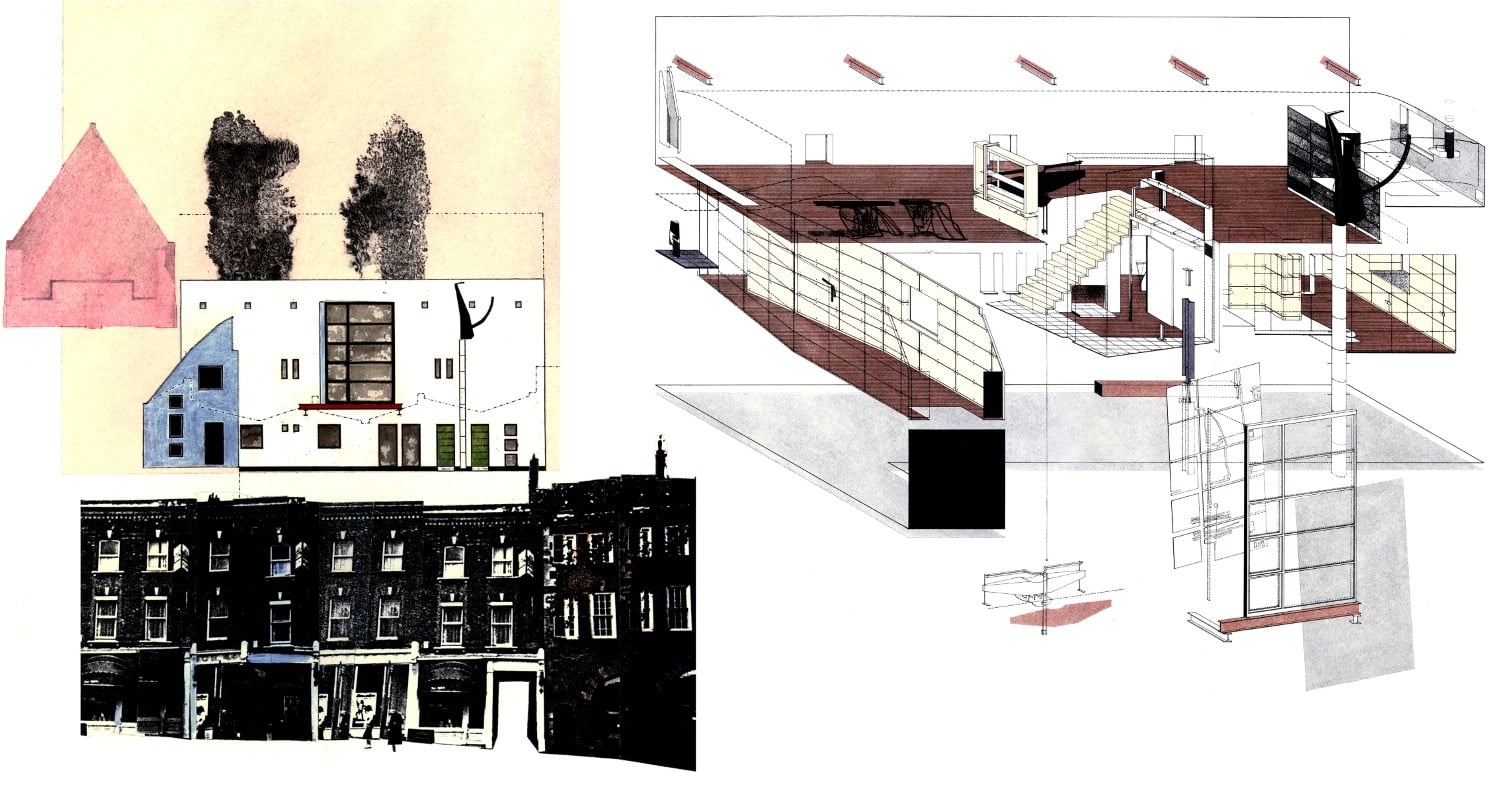
The concept of frame and adjacency also provided a strategy for thinking about the realisation of architectural ideas. Around this time, Wilson was beginning to receive opportunities to build. A small house and private gallery for a furniture collector, the Blackburn House (1987–1988, developed with Julia Bolles as the Wilson Partnership in collaboration with Chassay Wright), acted as a prelude to the first major urban building, the Münster Library (1987–1993, Architekturbüro Bolles Wilson). [11] In both cases, the frame defines the overall envelope and mass of the buildings—mute husks protecting a rich inner collection of furniture or books. Like the project for the Opéra de la Bastille, this geometric form is conceived of as a vessel, an ark adrift within the city. Rendered white and minimally detailed, it provides a context around and within which an array of highly articulated and finely detailed micro-architectures operate. In the case of the Blackburn House, the frame is the simple rectilinear envelope of an existing mews, whereas in Münster it is a fractured shipshape, ‘a slice of the perfect drum of Asplund’s library’, [12] moored against a thick wall that engages with the historic grain of the city, providing anchorage.
The adjacencies act as guides, hosts, and guardians of the collections. They enact simple programmatic roles that help choreograph a transition from the city through to an inner chamber of the domestic study or the private reading station. In the Blackburn House, the sequence begins with a shadowy totemic figure on the white rendered surface of the building (Fig.5). It is a guardian of water that guides fresh water into the house, and rain and dirty water away, its characteristics repeated elsewhere on the facade as a Roman-nosed gargoyle and a minute, masked overflow pipe. The large window that cantilevers out from the house on a rust-red beam describes the vertical movement within, where the red steel reappears as the first step in the ascent to the private apartment. Thereafter, these architectural hosts ritualise a transformative sequence of passage into the domestic interior by offering housings in the form of shelves or stations for umbrellas, keys, electric illumination, and—eventually—a station that holds devices for playing music. Each of these moments are touched by the same red introduced at the threshold, a colour that surely recalls the Australian soil of Wilson’s youth, thus leaving a trail of markings that denotes the passage of the inhabitant. A seat in the form of a red barge holds a central position around which the movement takes place—a ship within a ship.
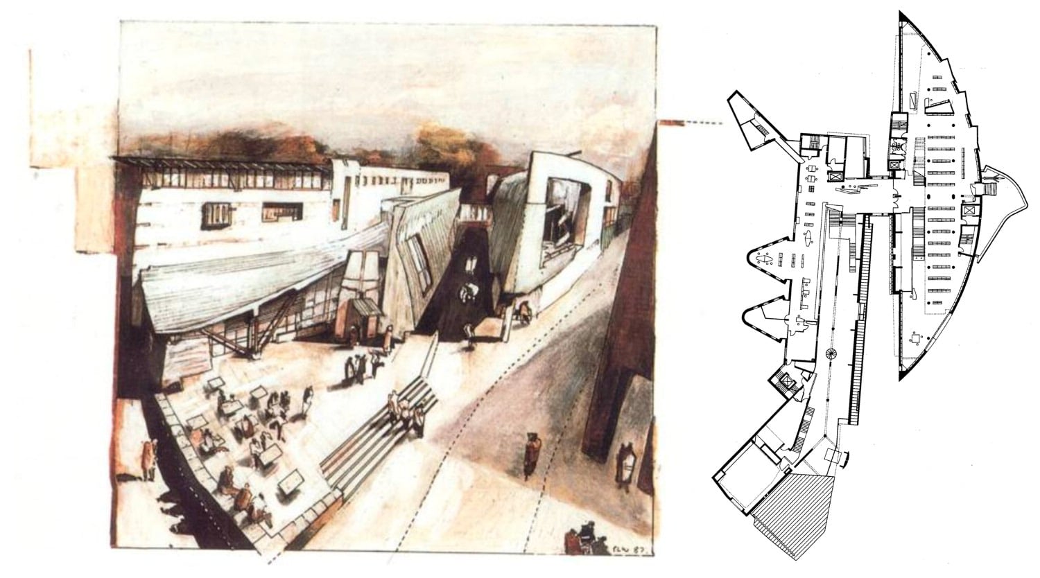
The Münster Library provides a similar choreography of architectural assistants, miniature buildings that orientate, provide information and assistance, and register visceral moments where visitors physically engage with the building (Fig.6). The check-in desk mirrors in miniature the half-shipshape of the permanent collection and performs a similar navigational pivot to the barge seat of the Blackburn House, the librarian’s spiral stair pinning it in place. The ferrous red is there again, leading one through on the balcony edge details above and again in the depths of the interior, but another earth hue guides external movement in the form of unpatinated copper. The library plan is famously cloven, an urban passage, ‘the leitmotif of the scheme’, [13] separating the permanent collection of physical books from the ephemeral collection of electronic information, newspapers, and journals. The public passage creates a spatial engagement with the building without the requirement to enter; ‘it takes passers-by through the exposed centre—an advertisement, an appetizer’. [14] The copper folds back from the movement of citizens like the wake of a passing vessel.
In both projects, these adjacencies provide moments of intense architectural detail, usually through a pairing of timber and steel where one is structurally dependent on the other. This material interplay seems to have evolved from the Divided Bridge of the Clandeboye work (1984), where a seemingly rustic timber bridge is supported by five existing steel beams, remnants of an earlier structure (Fig.7). On either side of an almost centrally placed portal screen, canopy, and a pair of cantilevered seats, materials operate in contrasting ways. On one side, a thick-set, unelaborate and static handrail sits on the exposed steel whilst, on the other, a more expressive handrail of steel and tension wires lean from the point of division with the steel structure now lined in timber. The composition creates a visual fragility, emphasising the precarious poise of the seats.
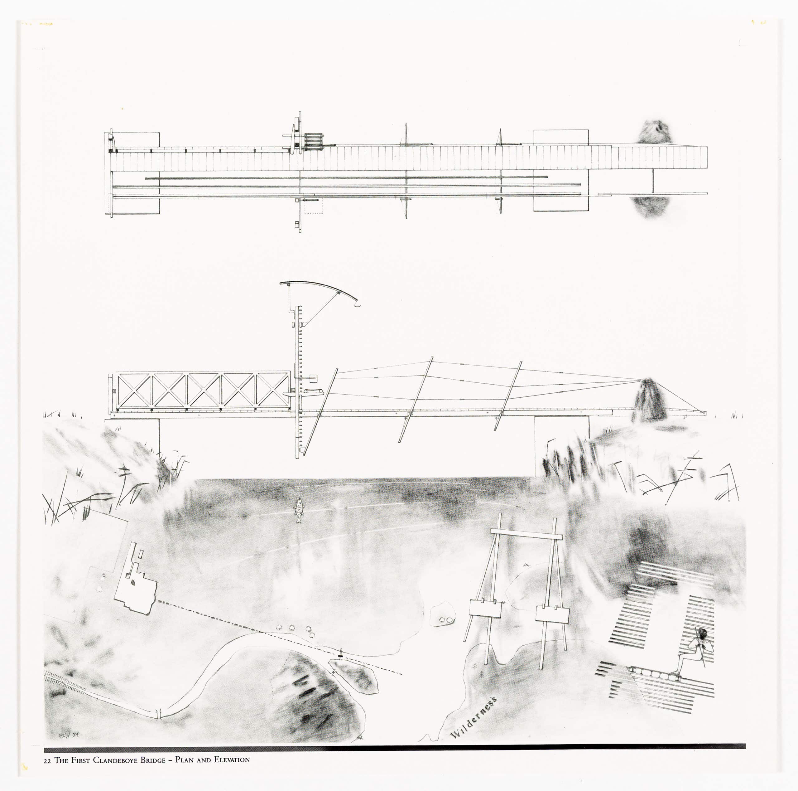
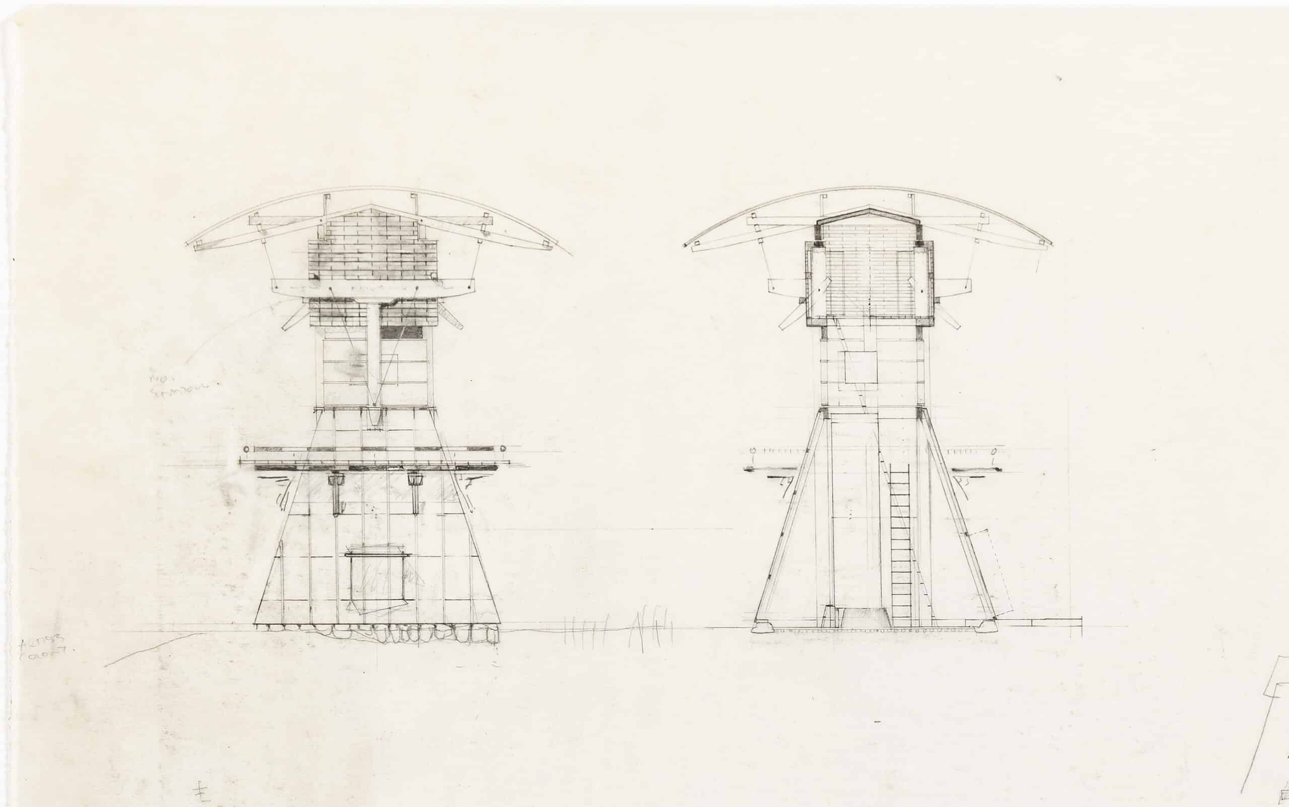
The Clandeboye drawings seem to anticipate the move into construction with their refined graphic concern for tectonic detail. The tectonic has become the subject. ‘The Endless Bridge’, a proposal for an artist’s retreat, is particularly elaborate in detail, ‘drawn with fine 6H pencil, documenting and locating a complex layering of wooden slats and beams’. [15] The drawings describe the proposal in forensic detail—stone footings, steel shoes, a timber structure wrapped in a tent-like skin, a slatted sleeping loft below a taut and outstretched canopy (Fig.8). These projects are experiments in the possibilities of material, structure, and detail to imply narrative and foretell a ‘soon-to follow transition from architectural speculation to actual construction of similarly enigmatic objects (Suzuki House, Bridge Watchers’ House, Münster Library)’. [16] They are figures within a landscape and, as such, they convey postures and actions—they lean, they straddle, they observe, they guard.
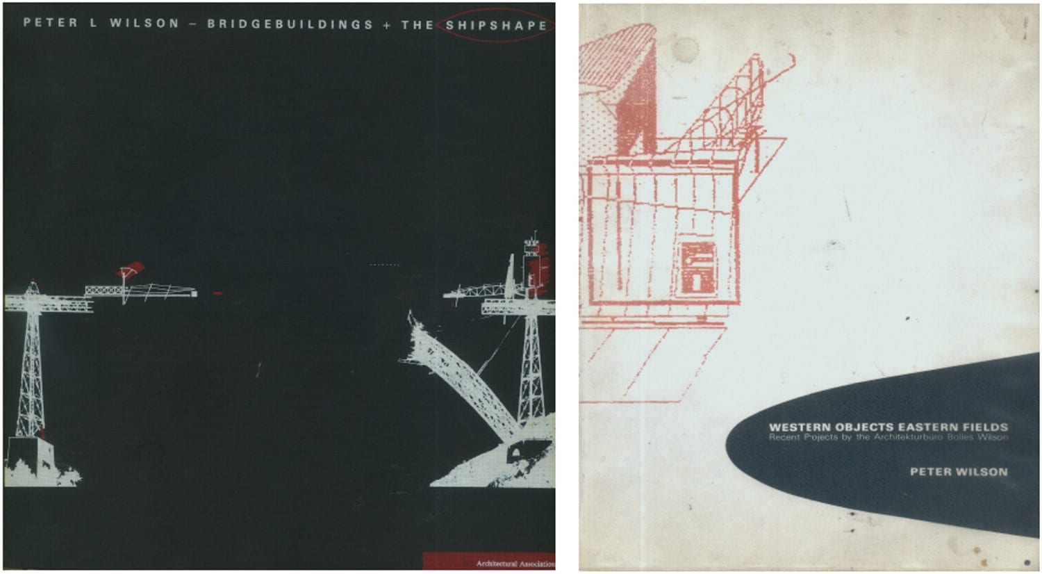
The Clandeboye drawings—originally produced in pencil on 350 × 350 mm tracing paper sheets—were reproduced as the final six plates in Wilson’s first major monograph, the Architectural Association’s folio Peter L Wilson — Bridgebuildings + the Shipshape in late 1984, and they marked the close of the purely theoretical, non-constructed, work. Five years later, a second monograph was published, also by the AA, in the form of Mega XII, Western Objects Eastern Fields: Recent Projects by the Architekturbüro Bolles Wilson (Fig.9), where the transformation was marked. The first publication presents the graphic operations of a lone practitioner as a ‘folio’, where the representations—in the form of a set of printed ‘plates’—are themselves the final product. Each drawing is crafted with a painterly sensibility—they are heavily rendered, the architecture emerging from an obscure context of mist and steam. In the second publication, the work is framed as a collaboration with Wilson’s partner, Julia Bolles—with whom he had won the competition for the Münster Library, which was under construction by then. The drawings are now crisp and sharp, the painterly hand replaced by a new tectonic, poetic sensibility. There is an immediacy, an urgency, that understands a drawing not just to be in and of itself, but also a prelude to construction. Whereas the earlier body of work was of the ground and its articulation through mass, the new work was concerned with transparency, the air, and the ephemeral.
The Accademia Bridge project is unique in that it is the only substantial piece of work by Wilson of this period that falls between these publications. As the Clandeboye Project, developed in the year preceding the Venice bridge, closes Bridgebuildings + The Shipshape, the Münster Library, won two years later, opens Western Objects Eastern Fields. The Accademia Bridge sits in this point of transition; it is a hinge between an internal, personal, set of graphic meditations and a new ‘external’ engagement with the contemporary city and the technologically transformed cultural context of the late twentieth century. A close reading of this work, therefore, offers an insight into the nature of this transition.
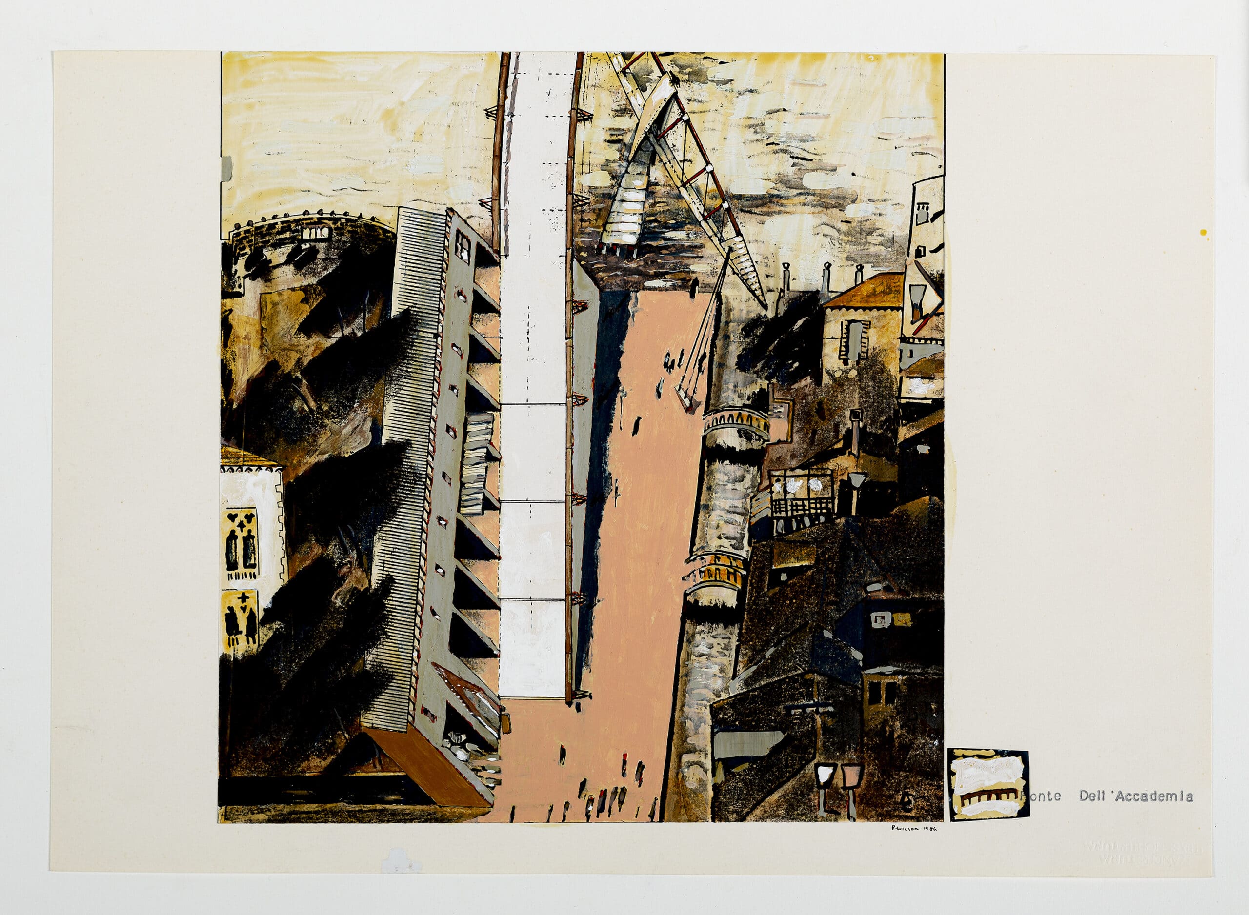
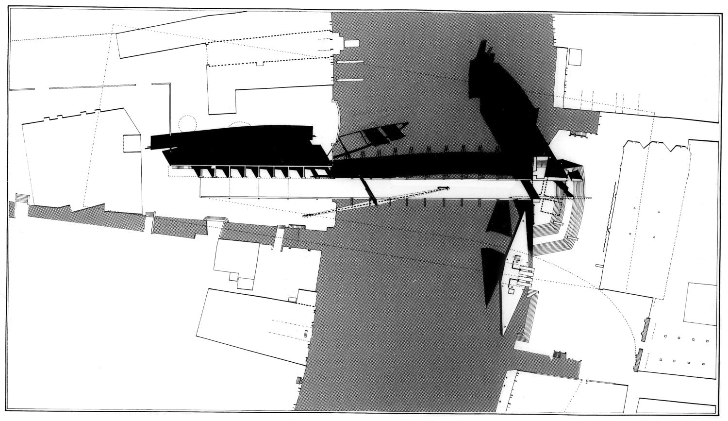
Unlike the earlier bridge buildings of the Pont des Arts, Domplatz or, indeed, the Clandeboye landscape interventions which were drawn situated in a graphic context of narrative and atmosphere, the proposal for Bridgebuilding No. 4 Ponte dell’Accademia, is described with urban precision in both fine-line plan and painted aerial view (Fig.10). It reveals how the composition engages with the geometry of both the exterior public space of the campiello and canal and the internal grain of the framing palazzi of Cavalli-Franchetti and Civran Badoer Barozzi on the sestieri of San Marco, and the Galleria dell’Accademia and its extension into Santa Maria del Carità on the Dorsoduro. Frayed edges of neighbouring palazzi extend further to define the edges of the Grand Canal and reinforce the rhythm of their ornate facades. A dashed, curved line identifies the problem of the bridge—how to form a connection to the Accademia entrance around the hulk of its appropriated church. The line connects the centre of Campiello S. Vidal, the point from which the proposed bridge springs, to the entrance of the Accademia at the far end of Campo della Carità, touching the corner of Santa Maria del Carità on its way. It defines both the objective of the bridge and its limits. The outer reaches of the supporting truss to the north, and the proposed steps of the ‘public palazzo’ [17] to the south, touch—but do not transcend—this line, ensuring a visual connection between the start of the route and the historic entrance facade of its destination.
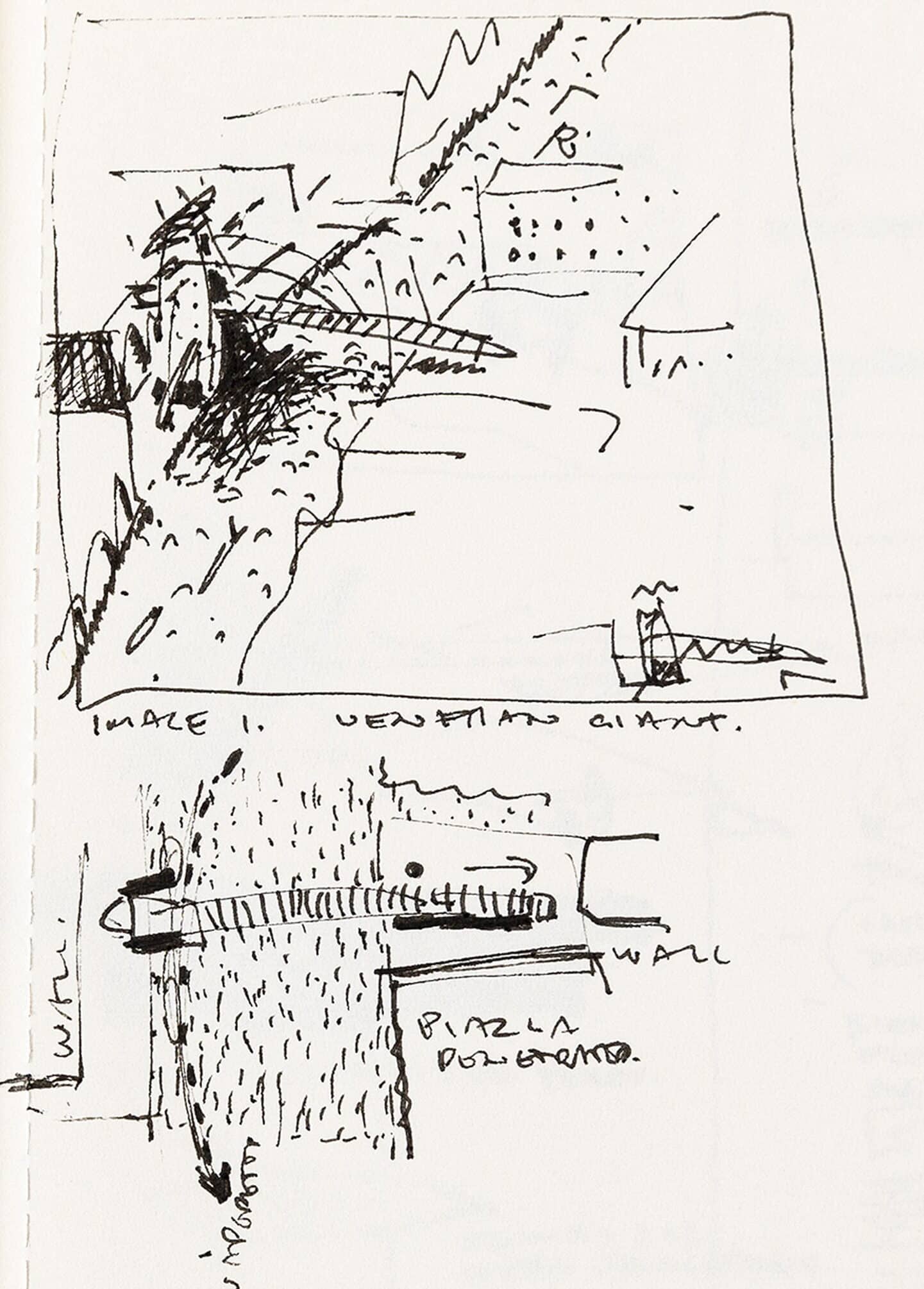
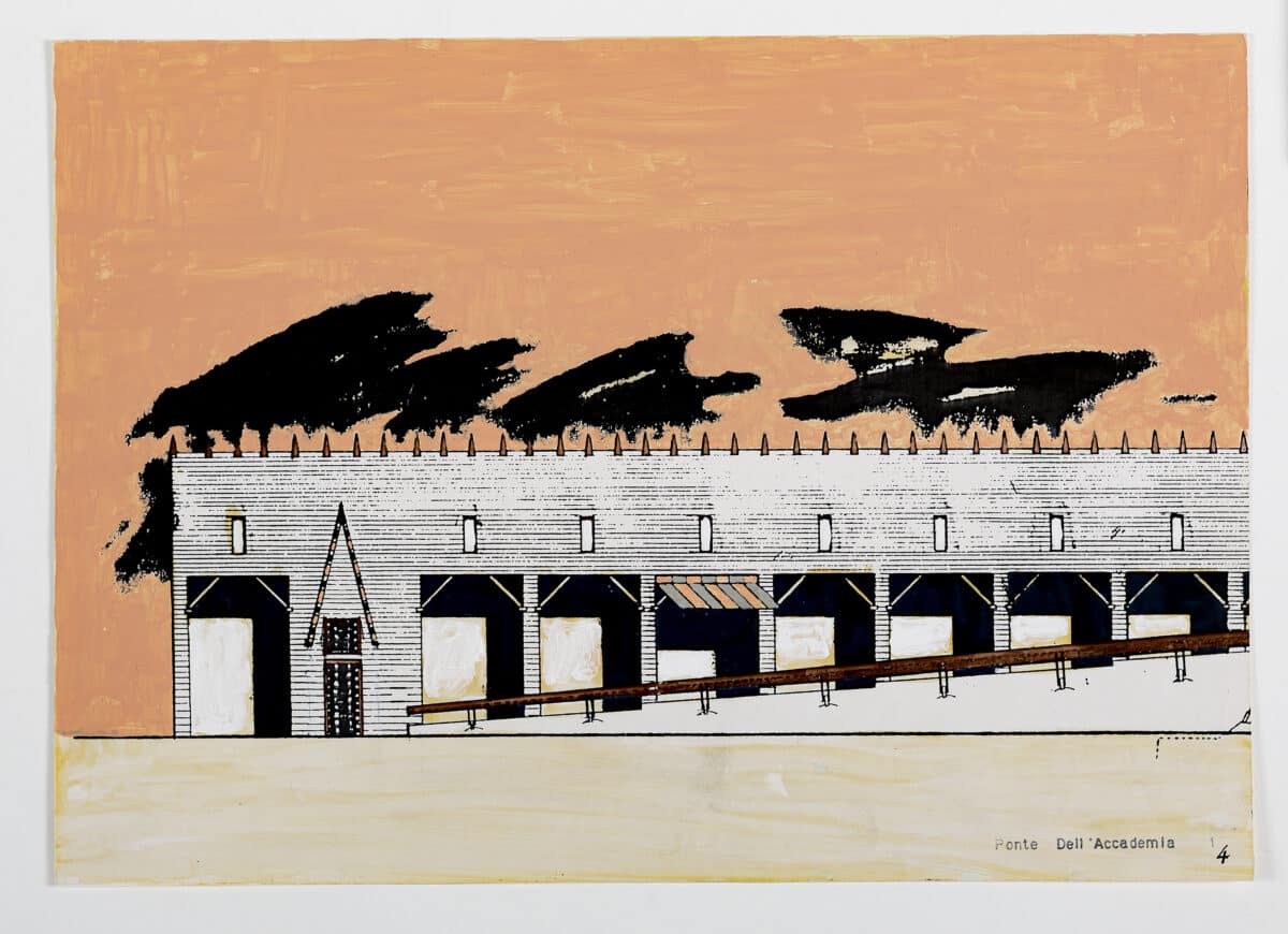
Wilson’s sketchbook from this period identifies the site of the bridge as one that spans between two wall conditions. On the San Marco side, it is the one that separates the Campo S. Vidal from the ornate gardens of Palazzo Cavalli-Franchetti, a wall that runs parallel to the intended passage of the bridge; and on the Dorsoduro edge, it is the facing wall of Santa Maria del Carità itself, a construction whose massiveness Wilson exaggerates in his painted aerial view, rendering it blank, devoid of all but two windows (a reading reinforced in the plan drawing which suggests a fabric veil drawn across its surface). The sketch proposes a screening of these harsh walls—a new thicker wall in the case of the palazzo garden and a large object building, a ‘Venetian Giant’, [18] to stand in front of the church and act as a sort of gatehouse (Fig.11). In the competition drawings, the garden screen evolves into an inhabited wall-building, ‘repeating, at a large scale, the role of the existing garden wall’. [19] It is programmed as a ‘linear market. Like the Rialto, it takes commercial advantage of the concentration of traversers’. [20]
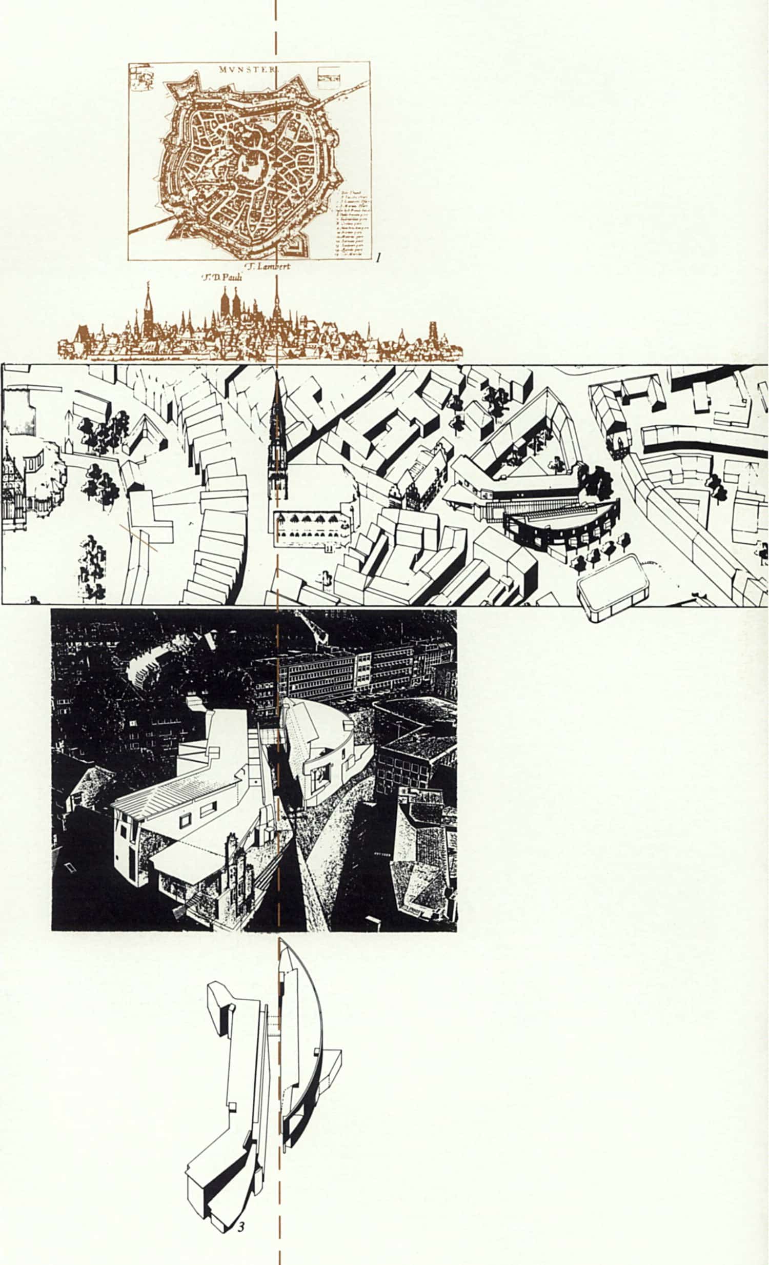
These moves have a degree of familiarity—the wall-building thickening the edge of public space is reminiscent of the road-spanning bridge of the Domplatz Housing competition entry, while the figurative ‘giant’ recalls the towers of the Pont des Arts. Similarly, the carefully choreographed view of a distant, historical object present in the positioning of the rustic seats of Clandeboye’s Divided Bridge, which placed their occupants on the axis of the Neoclassical facade of the grand house rehearses the contextual concerns of the Venice bridge. Taken together, they anticipate the urban strategy for Münster, where the open edge of the existing block is lined by the thick wall of the information building, the object of the giant half-shipshape acts as a pivot in the grain of the city, and the passageway is orientated to frame the apse and steeple of the Lamberti Church, ‘releasing a latent and powerful vertical axis’ (Fig.12). [21]
The length of Campiello S. Vidal permits a ramped route on to the bridge, the market stalls becoming vertically compressed in the process. The height gained establishes the mass from which the bridge eccentrically springs. It does not so much span from one bank to the other, but instead reaches, finger-like, across the Grand Canal to barely touch the Dorsoduro. The early sketch suggests an initial inversion of this was contemplated, with the ‘Venetian Giant’ reaching out to the northern side and hovering over the Campiello S. Vidal, casting its shadow below. For Wilson, the interest in the bridge was the way in which it could measure difference, negotiate a connection between differing worlds and, in doing so, express that negotiation through the structural strategy employed.
The Pont des Arts competition inevitably broke the assumption of a single, symmetrical structural system, as it engaged the cast iron fragments of an earlier bridge and therefore required a fragmentary set of localised solutions. The Divided Bridge of Clandeboye similarly worked with the remains of an earlier structure and employed different systems either side of a moment determined by the axis of the house rather than the central point of structural efficiency. The structural characteristics of Wilson’s ‘adjacencies’ were beginning to convey individual narrative and figurative characteristics, as much as materiality, programme, or form. The miniature architectures that dance around the Opéra de la Bastille and, indeed, Domplatz, are poised—they lean, they reach, they balance. Later, in the Blackburn House and then the Münster Library, a hybrid materiality engages with the interplay between compressive and tensile members to convey anthropomorphic traits. One element invariably holds, assists, restrains, leans against, or reaches out to another. The structural concerns of the Accademia Bridge anticipate the eloquent potential of narrative conveyed through construction.
Two drawings, in particular, illustrate how the Accademia Bridge engages structural detail in a manner surpassing that of the earlier Pont des Arts. One is a section and exploded isometric of the bridge’s material build-up (Fig.13), the other a ‘Gondolier’s View’ [22] of the consequence of these details (Fig. 14). Three tightly packed pre-stressed concrete beams, moulded for structural efficiency, form the outreached ‘finger’ of the bridge from which delicate cantilevered steel flanges reach out to support the wooden pedestrian deck panels and, by extension, the thick copper handrail that seems to float above. From above, these details are mainly obscured—the bridge is a quiet abstract ‘frame’ around which the ‘adjacencies’ operate. From below, the bridge is like the stretched skeleton of a boat, a gondola of keel and ribs. The sketchbook once again shows the lineage of this thinking—an ‘arc (sic.)’ or ‘oversized ferry’, [23] with stepped access to the prow and stern, is depicted elevated and spanning the Grand Canal on trestle-like structures. The figure of the ark, familiar from the Opéra de la Bastille and central to the logic of the Blackburn House, is here stretched to gondola proportions, a simple house-form at its centre. An accompanying note states: ‘animals 2 × 2, when Venice floods’. [24]
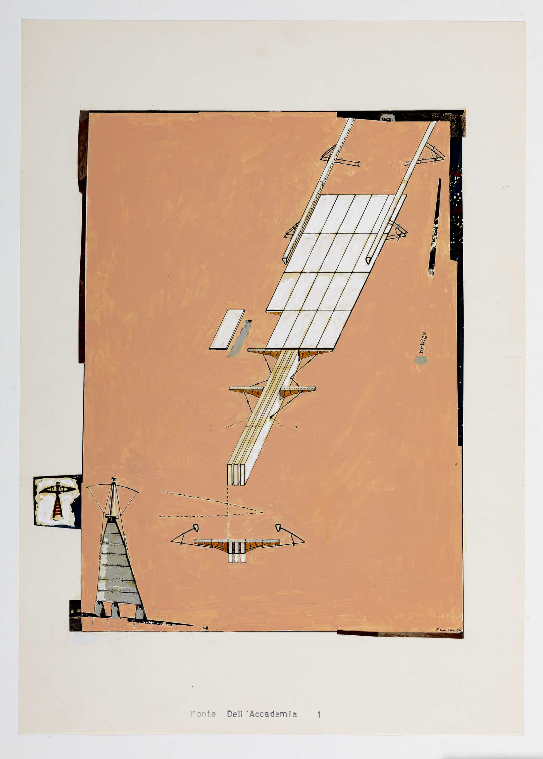
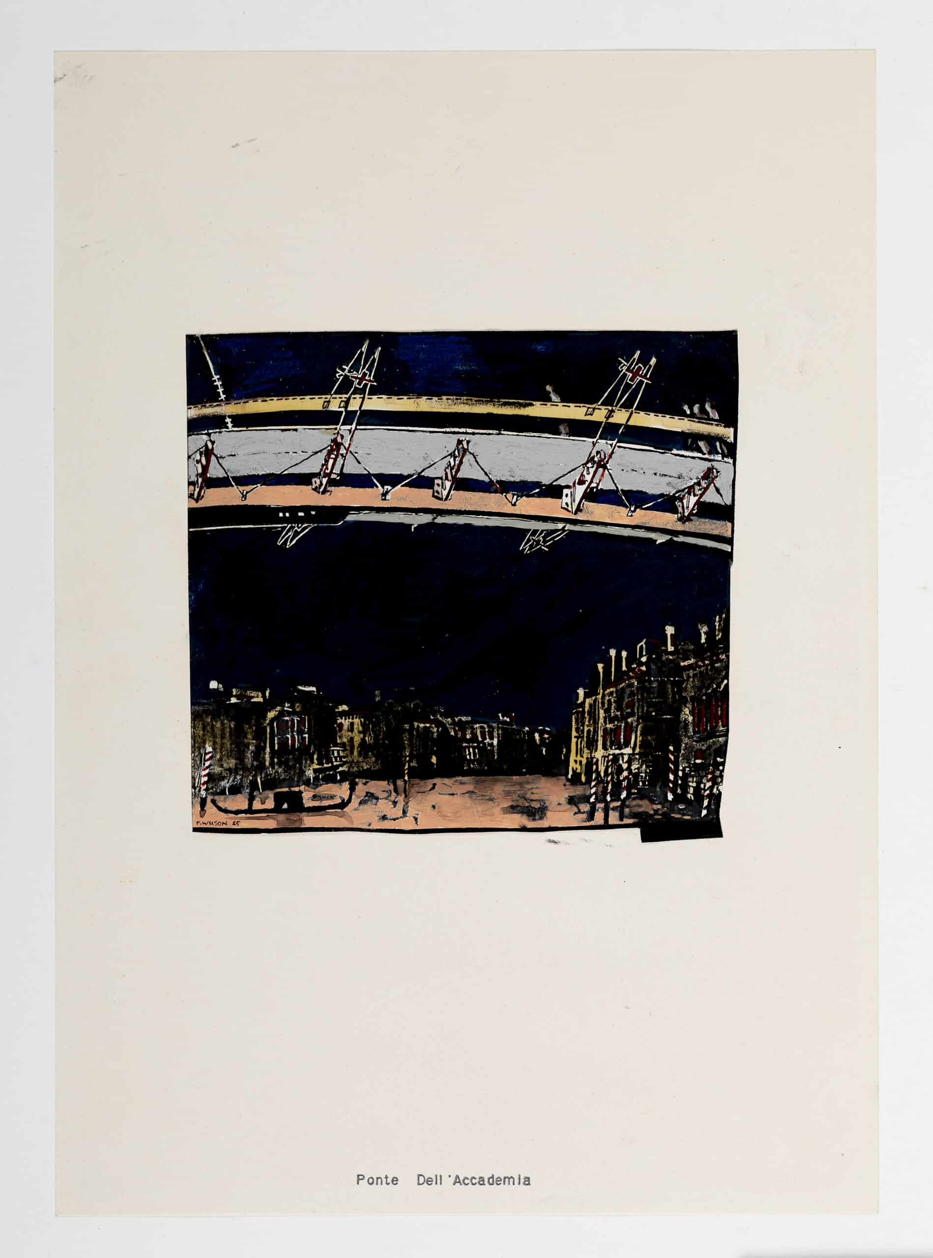
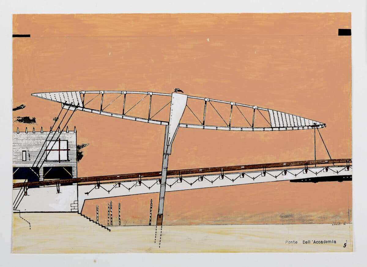
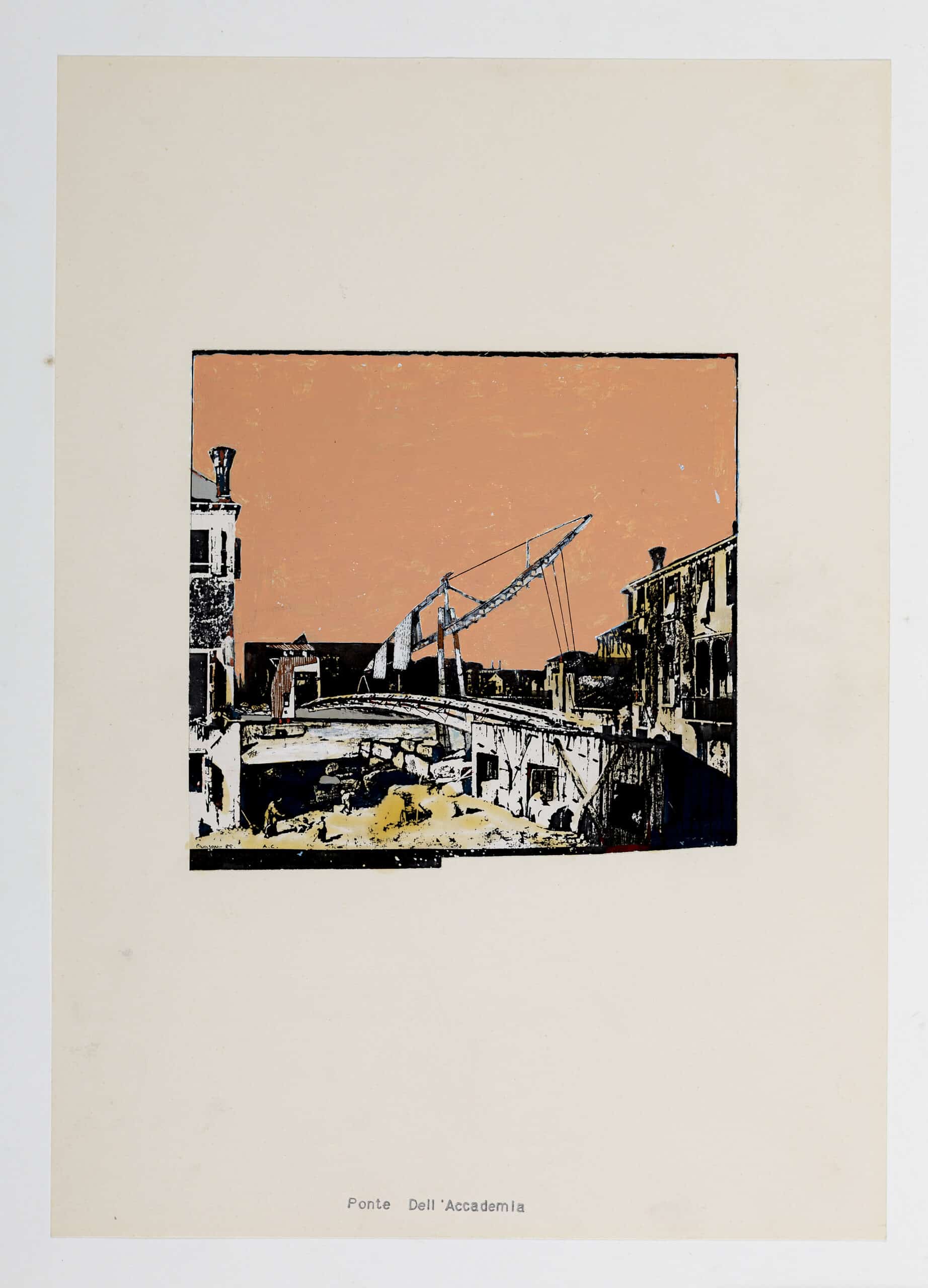
Wilson describes the bridge structure as: ‘A finger-like vertebrae reaching from one side of the Grand Canal and, with the help of a rather dubious flying truss, just touching the Accademia bank’ (Fig.15). [25] The figure of the ship-shaped truss permeates the body of work contained in the 1984 AA Box Folio. It replaces the lost cast iron arches of the Pont des Arts, inhabits the paintings associated with the Bastille Opera and occupies the Hamburg Domplatz as an upright, tilted water clock, tethered into position through taut steel cables. For the Accademia, the ‘flying truss’, which Wilson refers to as ‘unadorned structural exhibitionism’, [26] is supported by two legs that stand in the Grand Canal and is tied back at one end to Campiello S. Vidal, allowing for an assisted lift from the other to the central point of the ‘vertebrae’. Two Canaletto views of Venice are over-inscribed with the bridge proposal. In the reworking of Stone Mason’s Yard, a view that depicts the actual point from which the bridge reaches out to the Accademia, Canaletto’s temporary wooden workshops predict Wilson’s market wall. Beyond, the flying truss bows submissively towards the portal of the ‘Venetian Giant’, its massive figure reinforcing the fine ‘vertebrae’ below and its reach seemingly elongated by the precision of Canaletto’s perspective (Fig.16). The literal presence of the ship is relegated to that of a secondary, adjacent, figurative role ‘like a giant carnival costume standing in the canal’. [27]
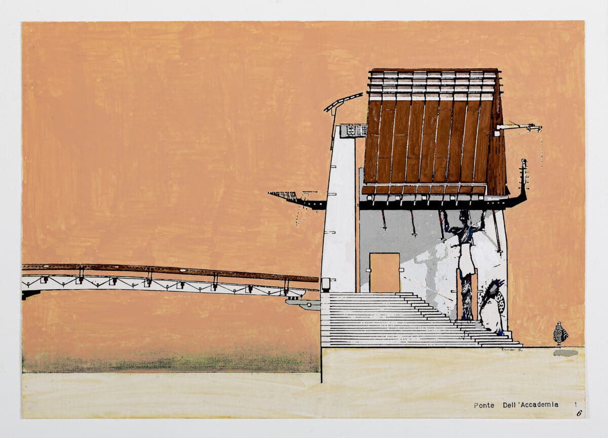
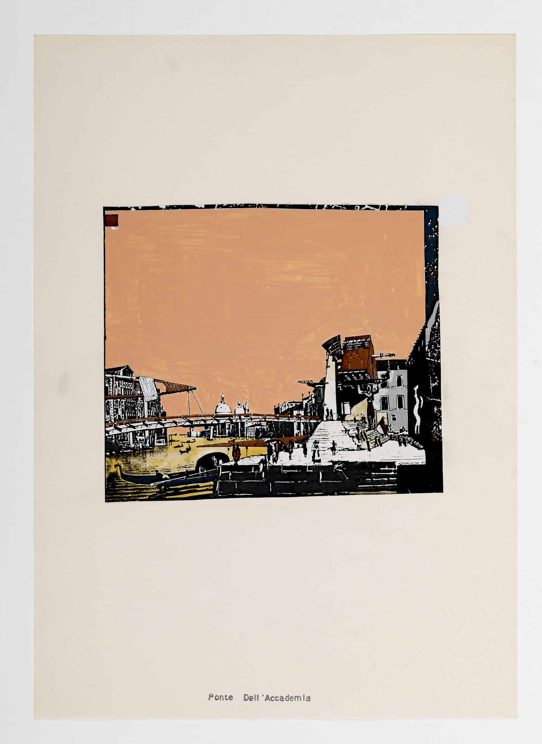
The second Canaletto image adapts a view of Campo della Carità to describe the Accademia bank (Fig.17). It reveals the ‘giant’ to be little more than a mask, a typically Venetian conceit. This was also a familiar Wilson move—the mask as a disarticulated facade had been present since the Villa Auto of 1979, in which two identical pavilions, each behind a mask, one comic and one tragic, address each other across the ruin of the eighteenth-century mansion of Powerscourt in County Wicklow, Ireland. The towers at each end of the Pont des Arts are shielded behind masks with the sectional profile of a knife, while—beyond the Accademia Bridge—the copper walls of the Münster Library are masks of sorts, articulate screens to more silent forms. A sketchbook draft identifies the ‘giant’ as an enclosed ‘room’, [28] a miniature palazzo. What emerges is a thick facade buttressed by a single fin wall that screens access to a carved-out ascent to an archer’s walk (Fig.18). It has become a ruin, a Venetian Powerscourt—a ‘public palazzo’ open to all those that pass through. The Accademia mask conveys weight through a battered profile, edged and striated with what surely must be Istrian marble, and a continuity with the thick mass of steps that descend on to the bank of the Dorsoduro. Where the wading, assistant truss is of the air, ephemeral and articulated, the portal mask is firmly of the ground, singular and weighted.
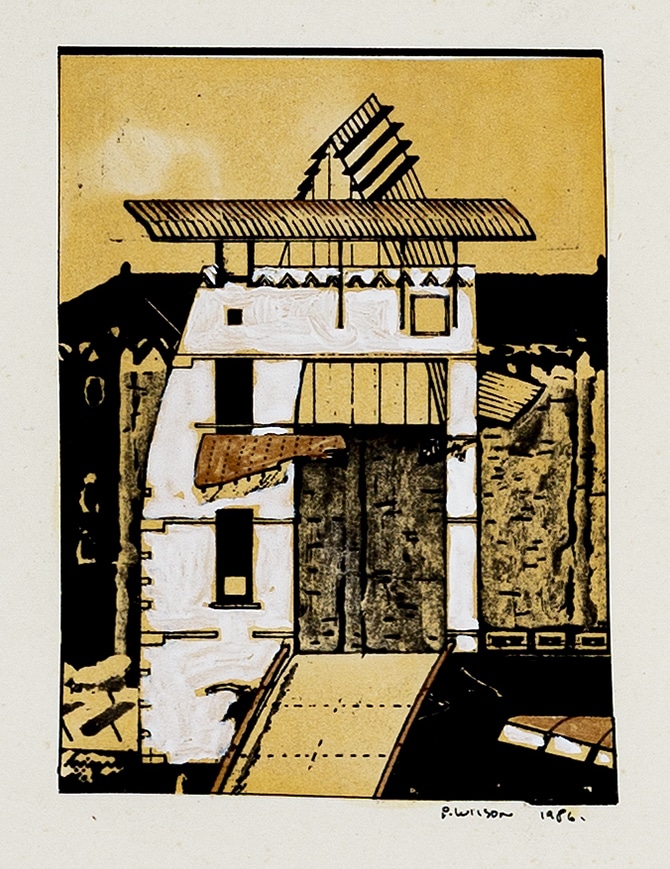
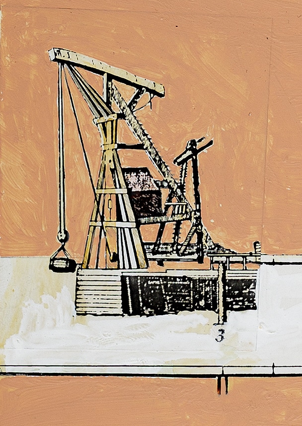
The reworking of Canaletto’s Stone Mason’s Yard is paired with two vignettes, labelled as ‘facade precedents’, [29] that further contextualise the portal. One depicts a type of historic crane, located on the canal edge, reaching across the water yet anchored back to the land (Fig.19). Its figurative poise and structural clarity is clearly a forerunner of the unadorned assistant truss that reaches to support the bridge whilst tethered back to the Campiello S. Vidal. Tellingly, held within its structure is an elevated shelter, the simple shape of a crane-worker’s hut. Reminiscent of the raised forms of Clandeboye’s gatehouse and artist’s retreat, this is a precedent that also seems to inspire the copper chamber that is nestled behind the mask, and held aloft by a gondola beam and a figurative column, a colossus ‘guardian’ to the public space of the steps.
The second vignette gives cultural weight to the thinness of the mask facade. It is a fragment of a Giacomo Franco engraving from 1597 that depicts the arrival of the Bucentaur, the state barge, bearing Morosina Morosini Grimani, wife of Doge Marino Grimani (1595–1605) for her coronation in the Doge’s palace (Fig.20). The barge is welcomed by a flotilla of vessels, each adorned with decoration to represent the different Venetian guilds. A half-bridge reaches out from the Piazzetta and is supported by four gondolas in the recently established tradition of the annual ephemeral pilgrimage bridge of the Festa del Redentore. Having disembarked upon this platform, the Dogaressa would proceed to the palace through the temporary triumphal arch designed by Bernardo Fogari for the guild of butchers.
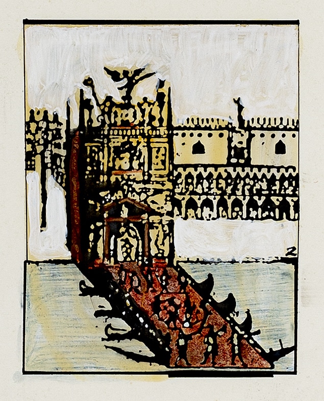
Wilson is evidently attracted by the ritual of this event and how architecture can draw its form and agenda from the theatrical and the spectacular. The bridgebuilding, both as an overarching typology and as a set of tectonic manoeuvres and sensibilities, is clearly at home in the historical and cultural context of Venice. Wilson’s proposal, and the manner in which it is represented, is steeped in a knowing set of references and associations. Like the barges of Franco’s engraving, the skeletal form of the shipshape truss awaits its adornment, its signification, and the announcement of festivities. In a similar spirit, the portal of the ‘Venetian Giant’ elevates the crossing of the Grand Canal to an act of ritual, a celebration of the passage of each citizen.
The celebration of the singular, the individual, is further epitomised in the final piece of the composition, the literally elevated hut-like form of a copper-clad room. Denoted as the ‘Biennale Chamber’—‘an external adjunct to the Galleria dell’Accademia (the temple of art projected into the public realm), this raised salon is for exhibiting special works or a single celebrated Biennale exhibit (“elevated art”)’. [30] This simple form is by now familiar. We have seen it as the house upon the ‘ark’, the modest cabin in the crane, and the canvas tent-like enclosures of Giacomo Franco’s decorated barges. The idea of the salon runs counter to Modernist singularity of function. The Blackburn House is a salon in that it blurs the domestic and the cultural. It is a house as exhibition space. Similarly, the newspaper reading room of the Münster Library is a cultural space masquerading as a domestic interior, with proportions taken from the neighbouring domestic terrace houses and a thick, hearth-like wall upon entry.
An unpublished painted sectional perspective reveals the copper cladding of the elevated room to be also tent-like, as if it were a stretched skin with an interior lining of timber (Fig.21). The room is a threshold, a hinge to the movement towards the Accademia below, and an anti-room to the archers walk above with its sheltered view back to the sestiere of San Marco. The city is on display alongside the selected artwork as though in reflective dialogue. There is a tectonic fineness first evident in the Clandeboye follies and a material palette and sensibility that predicts the language of the Münster Library with its adjacencies of reading rooms and vaulted seams of timber-lined interiors and copper external skins.
Caught between Bridgebuildings + the Shipshape and Western Objects Eastern Fields, Bridgebuilding No. 4 Ponte dell’Accademia was published in 1986 in two journals: AA Files and The Architectural Review. Notably, both present Wilson’s Accademia Bridge alongside output from his highly respected Diploma Unit 1 at the AA. The first includes extracts from the Unit’s own ‘Clandeboye Report’ and the second features a selection of recent graduate projects within a guest editorial insert. Together, however, they mark a transition from the interests of an academic journal to those of a professionally orientated architectural periodical. As such, they not only reflect the shift in Wilson’s practice towards building, but also an expansion of his architectural audience. Wilson’s work, which had long been respected by educators and students of architecture, was entering the awareness of the mainstream profession. A closer inspection of these two publications gives a sense of the change that was starting to take place in the profession at that time.
The final article in the issue of AA Files was a critical review of Charles Jencks’s 1985 book Symbolic Architecture and a recent exhibition of Jencks’s furniture designs entitled ‘Symbolic Furniture’ by James Gowan. Post-Modernism seemed to be in full flow then. In contrast, just a few months later, the editorial in The Architectural Review opened with the blunt sentence: ‘Post-Modernism is dead’. [31] This was no ordinary issue of The Architectural Review. Published under the title ‘The New Spirit’, it sought to dismiss the excess and pretentions of historically referenced symbolism and decoration and present, in their stead, a more dynamic, gestural, and process-driven architecture. Alongside references to punk graphics and the tectonically agile early built works of Vienna’s Coop Himmelb(l)au. Wilson’s Accademia Bridge seems well-positioned to span these two worlds. [32] The masonry weight of the rational arcade and the stepped and battered portal provided an anchorage for lighter, more tectonically expressive, adjacencies. Gowan had found the Jencks House to be rather enslaved to grand overarching narratives of the cosmos and the seasons. Wilson avoids anything like this by allowing these adjacencies their own fractured narratives, each responding to a localised condition.
Despite the disappointments of Rossi’s competition, the two publications show us that, in the few intervening months, Wilson had still found it necessary to revisit and refine some details of the proposal. These changes are telling, as they further reinforce the sense that the work was moving away from a purely academic context of drawings and representations towards a new reality of construction and experience. Whilst the AA Files illustrates the project purely through drawings, probably taken directly from the competition panels, The Architectural Review article is dominated by a new model of timber, wire, and copper that is far more refined and detailed than any Wilson’s studio had previously produced (Fig.22). It seems as though the additional creative decision-making processes required to determine the fabrication of such a model had afforded an opportunity to question and refine some of the details of the original design. Rather than simplifying for the sake of ease of construction, these new moves often elaborate, further articulate, and add a layer of greater complexity to the language of each of the elements. They often move away from the more easily digested form towards something more incidental and curious.
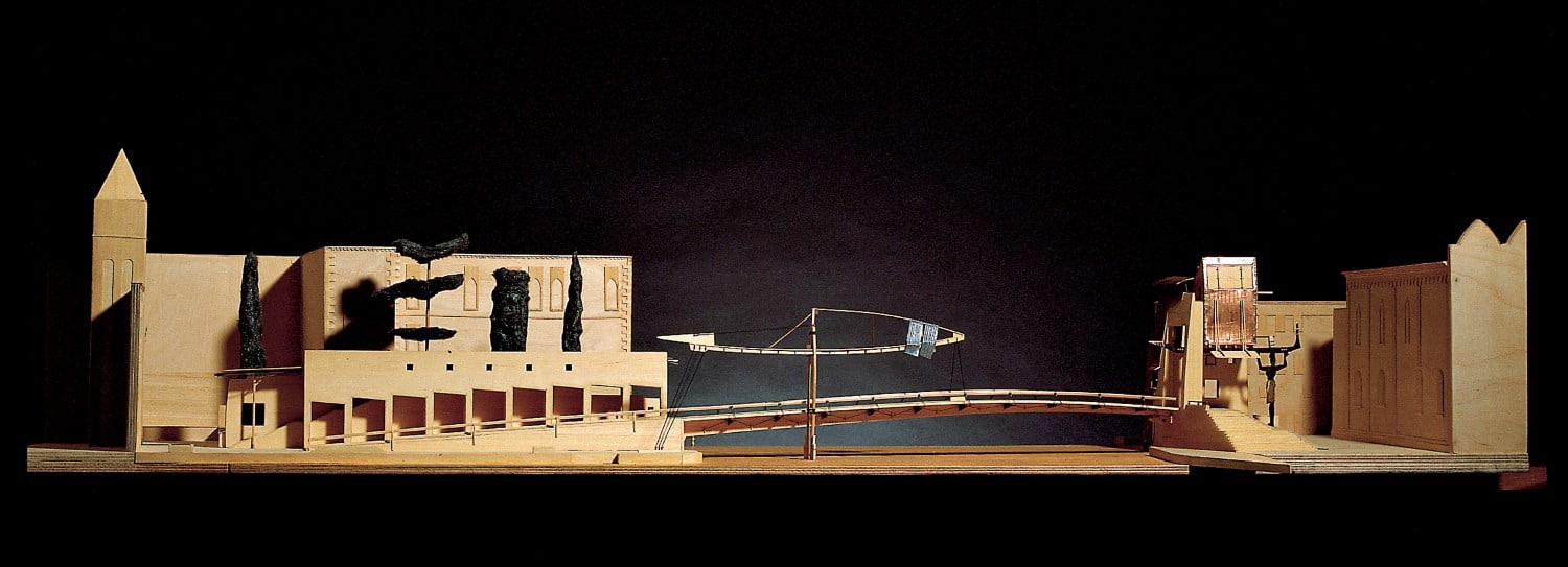
Starting, once again, with the Market Wall on the Campo S. Vidal, we see that it has been stripped of ornamental embellishment and, instead, has developed a greater sensitivity to localised incidents and how it would be experienced if constructed. The market booths have been brought forward, away from the boundary of Palazzo Cavalli-Franchetti. In the space between, a flight of steps has been inserted, the start of which shelters under a new lightweight copper canopy. It is not clear where these steps lead, but they would establish a tree-level view over the palazzo’s ornate gardens. The canopy is supported on its single leg by what now seems a familiar figure, being the first welcoming device utilised in the Münster Library. The bridge form itself remains unchanged, other than for a relaxation in the number of structural flanges, a move that serves to reinforce its lightness.
However, the adjacent truss that assists this structure has evolved. The shipshape has relaxed; it is no longer a singular geometric form. Like the other adjacencies, it too now responds to localised forces and conditions gaining greater complexity. This marks a shift in Wilson’s use of the shipshape—from here on, it rarely appears in the pure form of the Opéra de la Bastille or the ready-made structures of the Pont des Arts or Domplatz. As Münster developed toward a built reality, Wilson reflected that:
‘the first shipbuildings were purposely crude, iconic. The references were refined in the Münster Library, which is made up of a fleet of ships and half-ships, each with its own micro-narrative. It is a private language. I think one shouldn’t discuss it, and certainly never with a client. It’s something to conjure at night when the office is empty, because it is difficult to discuss a metaphor and a working detail at the same time.’ [33]
The ship of Münster is split, its wound cauterised with copper, its hulk is carved and peeled back in response to programmatic and contextual influences. In subsequent built works such as the Frankfurt Kindergarten or the unbuilt proposal for the Kassel Documenta Exhibition Hall, both from 1989, the shipshape form is distorted, compressed, and eroded.
The copper of the Accademia Bridge, introduced through the canopy, continues as oversized handrails that are like miniature canopies in their own right, promising shelter. As with the ferrous red in the Blackburn House, and the copper wake of the future Münster Library, the material seems to denote passage, a record of human engagement, a trail and guide that leads to the secreted ‘Biennale Chamber’ which, itself, offers wing-like canopies to the ‘Public Palazzo’ below. In this new version of the proposal, the chamber has discarded its symmetry. Like the truss, it has moved away from the ‘iconic’ form of a cabin and cranked and raised one side to address the canal edge that leads to the entrance of the Galleria dell’Accademia.
The denotation of passage is most clear in the new iteration of the portal facade. Only a few months ago, in the AA Files, the portal was clearly masonry—solid—and the spiralling stair leading to the salon chamber was depicted in plan as being carved out of its thickest point. Now, in the new model, that section of the portal facade is clad in copper, and the carved stair replaced by a more framed, tectonic structure. In an earlier interview with Alvin Boyarsky, Wilson expressed his interest in Edwin Lutyens’s Castle Drogo and how:
‘for some reason he had built the bathroom outside the building — sort of hung it off the wall of a very solid building. Why? Well that to me is an adjacency. It’s figurative in the way he’s describing the water services which shouldn’t be present in a traditional castle.’ [34]
It is as though the hidden carved stair similarly sat uneasily with Wilson’s sensibilities, as if it was in some way too false, too forced. Instead, the movement within should be expressed and, indeed, celebrated and revealed, given its own narrative voice. In doing so, the wake of copper, the trail of earth red, is completed and forms, once again, a bridge within a bridge.
Wilson’s adjustments to the project are highlighted through a series of marginalia images that are presented alongside the column of descriptive text within The Architectural Review publication. They are corrections, reflections and, indeed, directions to the model maker and the changes have been fed into the accompanying Canaletto views. The act of construction, even in the miniature form of the model, has refined and expanded an established graphic vocabulary. Just as it sits between monographs and spans journals of the academy and the profession, the Accademia Bridge marks an important transition in the architecture of Peter Wilson. It is a transition Wilson clearly relished, and it is evidenced by the feast of details that drives the Blackburn House and Münster Library the following year where ‘as the sketches for Münster get to 1:50 and 1:20, various little sub-plots come into being, such as handrails which might refer to some of our earlier furniture pieces. The closer one gets, the more there is to chew over’. [35] There is a confidence that comes with the collaborative process and difficulties of making. It forms a dialogue with materials and, in so doing, questions and reflects upon purely graphic moves. We can witness this dialogue beginning to form in the transitional project of Bridgebuilding No. 4 Ponte dell’Accademia.
Adrian’s essay was first published in The Journal of Architecture, Volume 26 (2021).
Notes
- See ‘Gli archi di Aldo Rossi’, La Biennale di Venezia [accessed 27 May 2021].
- Peter Wilson, ‘Bridgebuilding No 4 Ponte dell’Accademia Venice’, The Architectural Review, 1074 (August 1986), 40–41 (p.40).
- Peter Wilson, ‘The Pont des Arts, Paris — A Proposal’, AA Files, 5 (January 1984), 84–88 (p.84).
- Peter Wilson, ‘The Typology of Bridgebuildings’, in Bridgebuildings + the Shipshape, by Peter Wilson (London: Architectural Association, 1984), p.5.
- Ibid.
- Peter Wilson, ‘Bridgebuilding No 4 Ponte dell’Accademia’, AA Files, 11 (Spring 1986), 49–53 (p.51).
- Ibid., p.53.
- Alvin Boyarsky and Peter Wilson, ‘Alvin Boyarsky Interviews Peter L. Wilson’, in Bridgebuildings + the Shipshape, pp.7–13 (p.11).
- Ibid., p.12.
- Ibid.
- Like the majority of the projects referred to here, the architecture of the Accademia Bridge and the Münster Library emerged out of open, international competitions (often with a real intention to build)—open to newcomers and those engaged in a parallel teaching practice. Such projects demand an experimentation that engages with the real and their role within the evolution of architecture of this period cannot be overstated.
- Architektbüro Bolles-Wilson, ‘City Library Competition, Münster’, AA Files, 14 (Spring 1987), 36–41 (p.36).
- Ibid.
- Ibid.
- Peter Wilson, ‘The Clandeboye Drawings’, Drawing Matter, 27 October 2017 [accessed 6 July 2020].
- Ibid.
- Wilson, ‘Bridgebuilding No 4 Ponte dell’Accademia’, AA Files, p.51.
- Peter Wilson, Sketchbook 1985, Drawing Matter Archive.
- Wilson, ‘Bridgebuilding No 4 Ponte dell’Accademia’, AA Files, p.52.
- Ibid., p.52.
- Bolles-Wilson, ‘City Library Competition, Münster’, p.36.
- Wilson, ‘Bridgebuilding No 4 Ponte dell’Accademia Venice’, The Architectural Review, p.40.
- Wilson, Sketchbook 1985.
- Ibid.
- Quoted from letter to author in Neil Spiller, ‘Thematic Discord: Peter Wilson and Architekturbüro Bolles-Wilson’, in Lost Architectures (London: Wiley, 2001), pp.22–27 (p.24).
- Wilson, ‘Bridgebuilding No 4 Ponte dell’Accademia’, AA Files, p.52.
- Wilson, ‘Bridgebuilding No 4 Ponte dell’Accademia Venice’, The Architectural Review, p.40.
- Wilson, Sketchbook 1985.
- Wilson, ‘Bridgebuilding No 4 Ponte dell’Accademia’, AA Files, p.51.
- Ibid., p.52.
- Elizabeth Margaret Farrelly, ‘The New Spirit’, The Architectural Review, 1074 (August 1986), pp.7–12 (p.7).
- Beyond Wilson’s immediate circle was an architectural practice still immersed in a conviction that architecture can be ‘read’ through a common syntax. What made the work of Wilson particularly interesting at this time was that he almost engages with this practice but avoids its reductive pitfalls by developing his own, personal, and surprisingly consistent, syntax—the bridge, the ship, the mask, and their figurative poise often suggested through the way they are structured to the site.
- Peter Wilson and Alvin Boyarsky, ‘Far Eastern Conversation’, in Mega XII, Western Objects Eastern Fields: Recent Projects by the Architekturbüro Bolles Wilson (London: Architectural Association, 1989), pp.5–17 (p.5).
- Boyarsky and Wilson, ‘Alvin Boyarsky Interviews Peter L. Wilson’, p.8.
- Wilson and Boyarsky, ‘Far Eastern Conversation’, p.5.
