At first it seemed hugely unfair to invite an audience of some thirty adept critics to review a week’s drawing work by eight students, the more so in the dauntingly Olympian cultural setting of Hauser & Wirth. The review was held in Smiljan Radic’s 2014 Serpentine Pavilion, now commanding the end of a meadow garden designed by the internationally famous landscape architect Piet Oudolf, in the grounds of Hauser & Wirth’s world-class arts centre and gallery, unexpectedly located in the midst of rural Somerset. No-one was more nervous than John Glew, the students’ teacher. The reality of the event, however, was reassuringly prosaic. The wind was chill, the lunch buns tasty, and the critics warmed to their task under the firm direction of Debbie Hillyerd, head of education at the gallery.
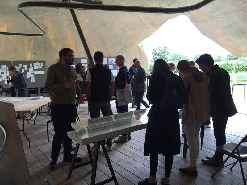
The event, as John Glew said of the intentions behind the summer school, extended the ‘plot’. Which was simple enough: to enjoy drawing, to draw and to think.
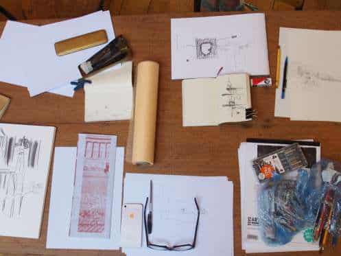
Which in practice was not so simple. Looming over the event, as over Drawing Matter itself, were some big questions. Are architects forgetting how to draw, disabled by the enhanced prostheses of digital technology? Is drawing even important to the production of good architecture, not just these days but ever? In two glass vitrines in the middle of the room were spread a small collection of works from the Drawing Matter collection. The workshop had begun a few days in their scrutiny. What was immediately evident at the review was that the drawings selected for the vitrines shared certain characteristics with the work displayed by the students: we were talking about the sketch, the moment of translation rather than rendering techniques.
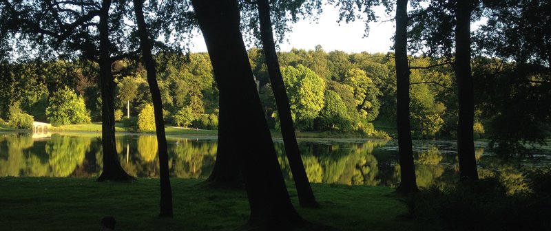
But what to sketch? John Glew pinned down the architect’s paradox by observing his own difficulty in coming up with the programme. Usually, he said, he drew with a design project in mind. In this case there was no architectural trump card, no design project to cleave to. The effect was to concentrate the mind on what the sketch could do, or what the students could do armed with pencil and paper and a few auxiliaries, in different settings. These settings were carefully chosen: an afternoon in the landscape garden at Stourhead, a day retracing Peter Smithson’s Bath walk, and three days in and around the farmyard at Shatwell, which provided a mix of landscape, vernacular and architect-designed buildings. The weather was glorious.
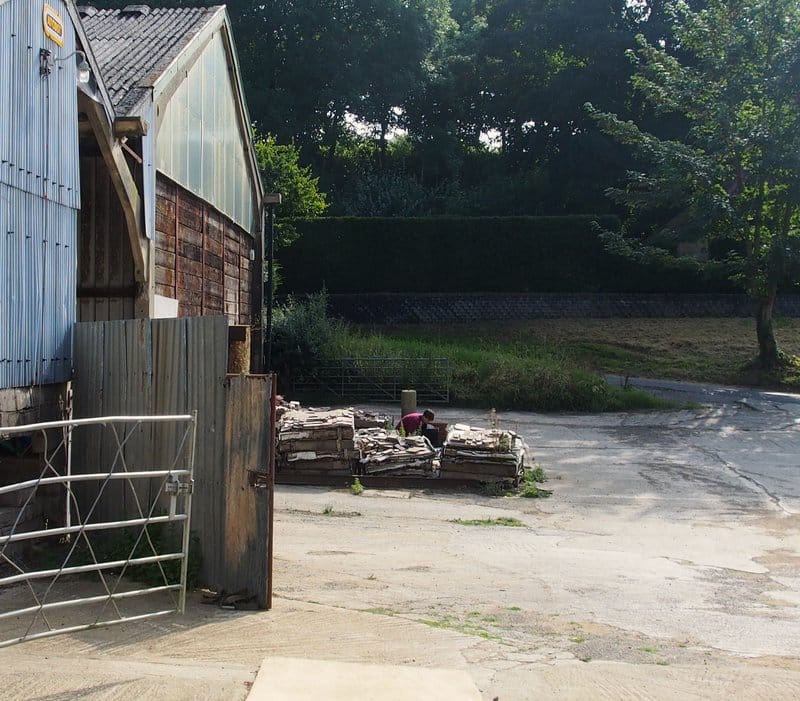
As the review progressed it became clear that the question of what to draw had become subsumed by the question of how to draw. Freed from the demands of the competitive studio environment the students worked hard at shedding the armour of ‘techniquiness’, enjoying instead the opportunity to lose themselves in the task of translation. On show was a sufficient range of work drawn with enough honesty and vigour to chart their journey. The reviewers caught the moment, partly because the students seemed unafraid of their failures and more interested in what they might find out.
Earlier in the week Nicholas Olsberg had shown them a variety of presentation drawings from the collection. These sparked interesting discussions around whether early sketches and final rendered drawings need have any relationship with each other; whether essential ideas were lost in presentation. A careful rendered sketch by Neutra seemed to argue otherwise, prompting reflection on the speed of drawing and the energy and immediacy of the sketch versus the labour of technique. It also raised the question of where the creativity lay when making a drawing of a design that was already determined. Subjected to some initial timed drawing exercises, the students commented that rapid drawing necessitated snap decisions and pushed them to be creative. Looking at sketchbooks by Gowan, Siza and Pichler they could see that serial sketching prompted evolution. The Matta Clark drawing, on the other hand, was quite literally a one off performance piece.
The importance of pace rather than speed galvanised Deanna Petherbridge to rail against architects’ obsession with typologies, which she saw in the very separation of the student’s work into groups and the neat distinction assumed between such entities as the sketch and the presentation drawing. Deanna argued that drawing was a transferable skill – the skill of deciding what mattered. You should simply take what you can from drawing. Joris, the artist among the students, corroborated this view, saying he felt he could just get on with drawing without having to worry, as the architects seemed to, about the ‘architecture’ in view. It seemed the tidy-mindedness of intentionality as well as technique was getting in the way.
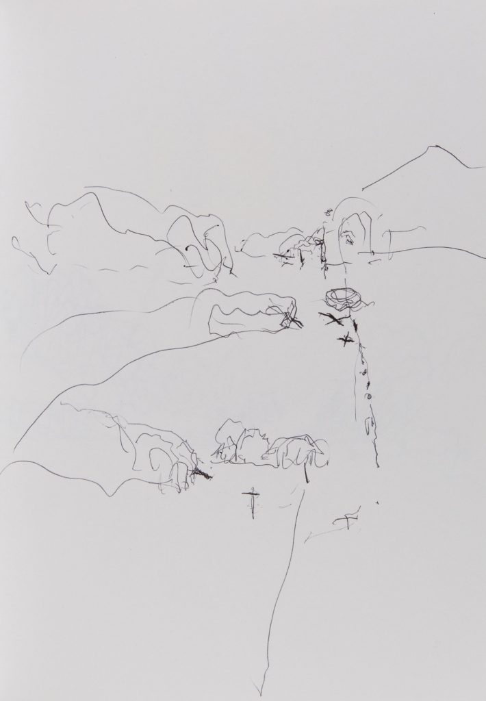
Deanne’s intervention focused the discussion on the student’s drawings and their account of what they meant. Stories emerged and we began to look at different drawings: Bernard’s brightly coloured redrawing of Stourhead captured his memory of the experience; Gustaf’s carefully penciled redrawing of a gap between buildings captured the enclosed landscape. Paul Robbrecht suggested that for him drawing was so directly connected with what was happening in your head it was like a seismograph of thoughts or feelings; nearer to writing or talking. Choreographers and filmmakers, like architects, were able to hold conversations on paper.
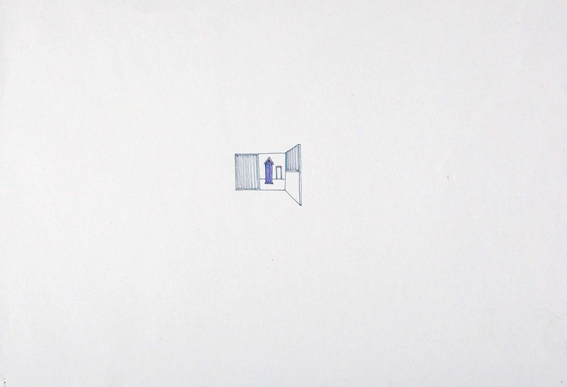
Attention thus switched to a set of tiny but intense drawings by Amandine of a Rossi beach hut found in a barn and the Smithson obelisk parked in a field. Deanne had observed that there was nothing wrong with a laboured drawing: dashing off a quick sketch was not the only approach. Amandine offered that she found drawing more like singing than talking. It was immensely difficult and had to be from the heart. Her struggle was to show how her perception of the Rossi hut changed as she moved through the space.
The discussion wavered round the relation of form to function in a drawing and its usefulness, or not, as a measure of success in judging a good drawing. The discussion had evidently been going on all week. Giacomo pointed out that in any case a drawing had to work in two directions: it might give quite different things to its author and its observer. Deanna neatly tied this notion back to how we look at historical drawings, spotting on the wall sketches like traditional vignettes and landscapes that extended beyond their frame in a more modern idiom. What was most useful was what the drawing gave back. Looking at the tiny Rossi hut, Deanne suggested the drawing offered a ‘strategy of importance’ by situating its subject in the centre of a large sheet of empty paper. Amandine, it seemed, had learned how to draw acoustically: her small song filled the page.
For Hallam the drawings from the workshop were something he could imagine using at a later date. There were many ideas to take away – John had plenty and the students came up with plenty more. Of the discussion one might say it is ‘to be continued…’
The summer school was held over five days in August 2016.
Notes on the 2016 Summer School
– Helen Mallinson
Found in translation
At first it seemed hugely unfair to invite an audience of some thirty adept critics to review a week’s drawing work by eight students, the more so in the dauntingly Olympian cultural setting of Hauser & Wirth. The review was held in Smiljan Radic’s 2014 Serpentine Pavilion, now commanding the end of a meadow garden designed by the internationally famous landscape architect Piet Oudolf, in the grounds of Hauser & Wirth’s world-class arts centre and gallery, unexpectedly located in the midst of rural Somerset. No-one was more nervous than John Glew, the students’ teacher. The reality of the event, however, was reassuringly prosaic. The wind was chill, the lunch buns tasty, and the critics warmed to their task under the firm direction of Debbie Hillyerd, head of education at the gallery.
The event, as John Glew said of the intentions behind the summer school, extended the ‘plot’. Which was simple enough: to enjoy drawing, to draw and to think.
Which in practice was not so simple. Looming over the event, as over Drawing Matter itself, were some big questions. Are architects forgetting how to draw, disabled by the enhanced prostheses of digital technology? Is drawing even important to the production of good architecture, not just these days but ever? In two glass vitrines in the middle of the room were spread a small collection of works from the Drawing Matter collection. The workshop had begun a few days in their scrutiny. What was immediately evident at the review was that the drawings selected for the vitrines shared certain characteristics with the work displayed by the students: we were talking about the sketch, the moment of translation rather than rendering techniques.
But what to sketch? John Glew pinned down the architect’s paradox by observing his own difficulty in coming up with the programme. Usually, he said, he drew with a design project in mind. In this case there was no architectural trump card, no design project to cleave to. The effect was to concentrate the mind on what the sketch could do, or what the students could do armed with pencil and paper and a few auxiliaries, in different settings. These settings were carefully chosen: an afternoon in the landscape garden at Stourhead, a day retracing Peter Smithson’s Bath walk, and three days in and around the farmyard at Shatwell, which provided a mix of landscape, vernacular and architect-designed buildings. The weather was glorious.
As the review progressed it became clear that the question of what to draw had become subsumed by the question of how to draw. Freed from the demands of the competitive studio environment the students worked hard at shedding the armour of ‘techniquiness’, enjoying instead the opportunity to lose themselves in the task of translation. On show was a sufficient range of work drawn with enough honesty and vigour to chart their journey. The reviewers caught the moment, partly because the students seemed unafraid of their failures and more interested in what they might find out.
Earlier in the week Nicholas Olsberg had shown them a variety of presentation drawings from the collection. These sparked interesting discussions around whether early sketches and final rendered drawings need have any relationship with each other; whether essential ideas were lost in presentation. A careful rendered sketch by Neutra seemed to argue otherwise, prompting reflection on the speed of drawing and the energy and immediacy of the sketch versus the labour of technique. It also raised the question of where the creativity lay when making a drawing of a design that was already determined. Subjected to some initial timed drawing exercises, the students commented that rapid drawing necessitated snap decisions and pushed them to be creative. Looking at sketchbooks by Gowan, Siza and Pichler they could see that serial sketching prompted evolution. The Matta Clark drawing, on the other hand, was quite literally a one off performance piece.
The importance of pace rather than speed galvanised Deanna Petherbridge to rail against architects’ obsession with typologies, which she saw in the very separation of the student’s work into groups and the neat distinction assumed between such entities as the sketch and the presentation drawing. Deanna argued that drawing was a transferable skill – the skill of deciding what mattered. You should simply take what you can from drawing. Joris, the artist among the students, corroborated this view, saying he felt he could just get on with drawing without having to worry, as the architects seemed to, about the ‘architecture’ in view. It seemed the tidy-mindedness of intentionality as well as technique was getting in the way.
Deanne’s intervention focused the discussion on the student’s drawings and their account of what they meant. Stories emerged and we began to look at different drawings: Bernard’s brightly coloured redrawing of Stourhead captured his memory of the experience; Gustaf’s carefully penciled redrawing of a gap between buildings captured the enclosed landscape. Paul Robbrecht suggested that for him drawing was so directly connected with what was happening in your head it was like a seismograph of thoughts or feelings; nearer to writing or talking. Choreographers and filmmakers, like architects, were able to hold conversations on paper.
Attention thus switched to a set of tiny but intense drawings by Amandine of a Rossi beach hut found in a barn and the Smithson obelisk parked in a field. Deanne had observed that there was nothing wrong with a laboured drawing: dashing off a quick sketch was not the only approach. Amandine offered that she found drawing more like singing than talking. It was immensely difficult and had to be from the heart. Her struggle was to show how her perception of the Rossi hut changed as she moved through the space.
The discussion wavered round the relation of form to function in a drawing and its usefulness, or not, as a measure of success in judging a good drawing. The discussion had evidently been going on all week. Giacomo pointed out that in any case a drawing had to work in two directions: it might give quite different things to its author and its observer. Deanna neatly tied this notion back to how we look at historical drawings, spotting on the wall sketches like traditional vignettes and landscapes that extended beyond their frame in a more modern idiom. What was most useful was what the drawing gave back. Looking at the tiny Rossi hut, Deanne suggested the drawing offered a ‘strategy of importance’ by situating its subject in the centre of a large sheet of empty paper. Amandine, it seemed, had learned how to draw acoustically: her small song filled the page.
For Hallam the drawings from the workshop were something he could imagine using at a later date. There were many ideas to take away – John had plenty and the students came up with plenty more. Of the discussion one might say it is ‘to be continued…’
The summer school was held over five days in August 2016.
Related...
The Continuous Monument, Shatwell
Peter Smithson: Obelisk
Category
design methodologies drawing techniques & materials commentaries, rants & reflections Drawing Matter archive: research & collecting
Period
c19th c20th
Architect
Gordon Matta-Clark Aldo Rossi Álvaro Siza Peter Smithson James Gowan
Medium
drawing photograph
Tags
sketch architectural drawing summer school DMC