Wagnerschule
EMIL HOPPE, MARCEL KAMMERER AND OTTO SCHÖNTHAL
– Editors
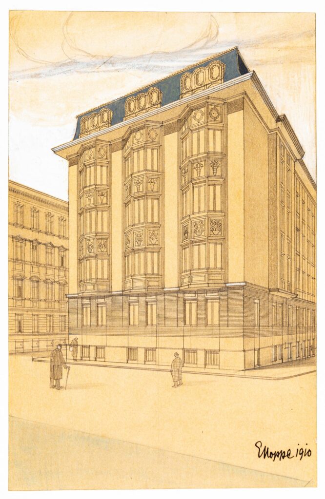
The drawings of Emil Hoppe (1876 – 1957) and Otto Schönthal (1878–1961) attracted particular interest in the Land Marks exhibition, and people were eager for us to share them more widely. They are presented here with little comment and a few additions for context.
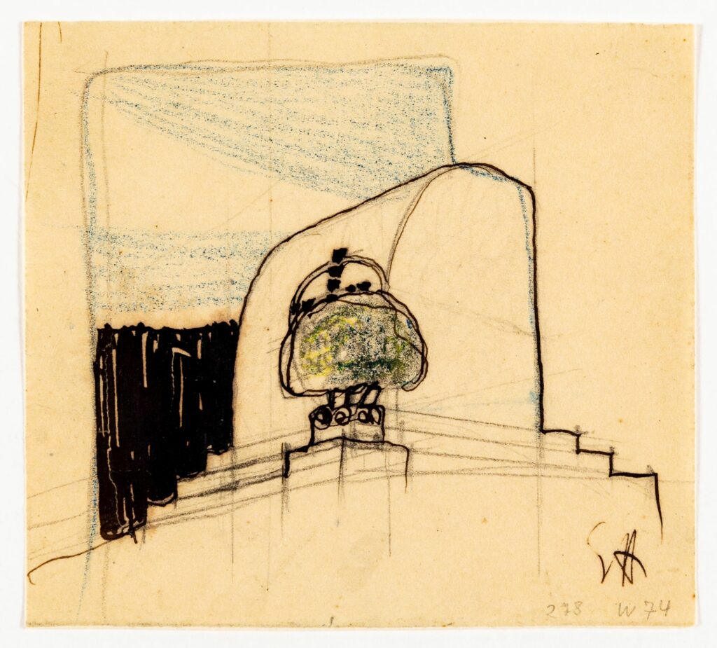
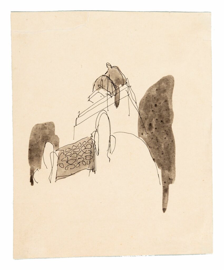
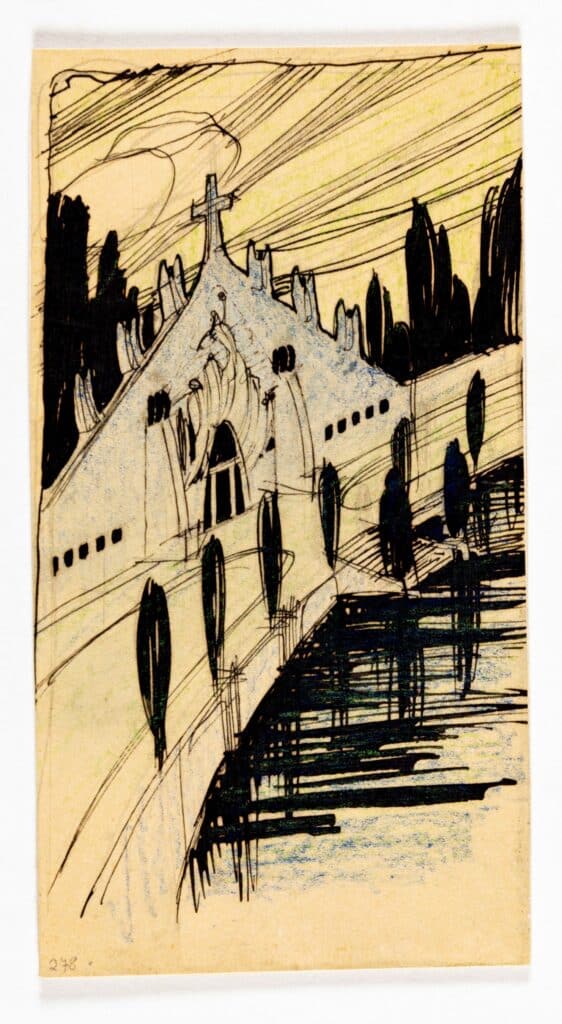
These drawings by Emil Hoppe, Otto Schönthal and Marcel Kammerer – all students under Otto Wagner at the Akademie in Vienna, known as the Wagnerschule – represent something of a revolution in drawing: tiny in size and minimal in scale, they are pregnant with pictorial ideas. The sketches break from the schematic, explicatory measured line-drawing conventions of 1840–1900. These conventions were influenced by the need to reproduce plates in the inexpensive, high-volume, circulating journals of the newsprint era.
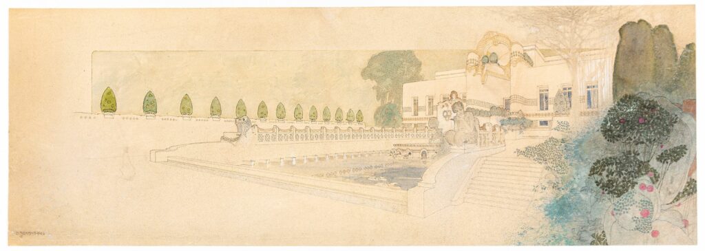
As Schönthal himself describes his own drawing:
The eyes are led along the broad avenue by a line of clipped box hedges. Shrubs beckon across the water, and above all this glistens a luminous point: the house. An open-ended, wedge-like form pushes out of the undecorated flat planes, striving towards the unknown future.
Wagner held that ‘The starting point for all artistic production must be the needs, the skills, the means, and the characteristics of our age.’
The drawings of Schönthal alongside those of Hoppe and Kammerer demonstrate strong contours, contrasts and perspective, making them as much studies of environmental situations – both mental and physical – of the objects, as of the objects themselves. In Schönthal’s drawings, nature and the man made become equal elements in the landscape, whereas in Hoppe’s studies nature and the built environment are more juxtaposed. Orthographic traditions are thrown to the wind in favour of the emotional, pictorial, impressionistic and suggestive, elevating the sketch to a new status. The palettes and the graphic, painterly, even decorative quality reflect the Ver Sacrum aesthetic and were even more revolutionary for representing architecture than for graphics and painting.
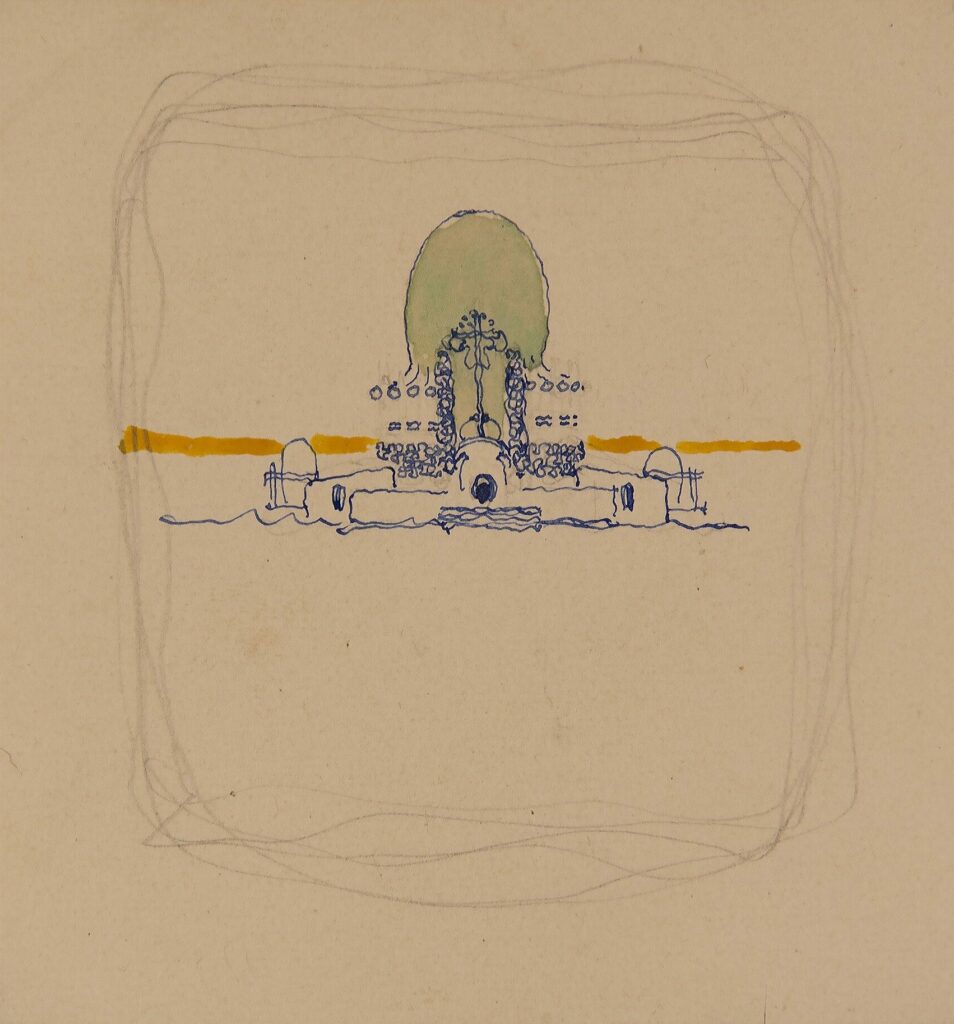
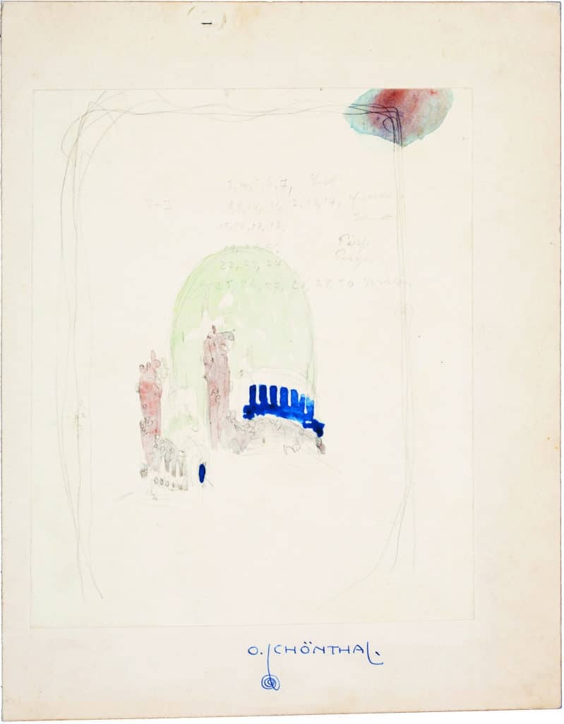
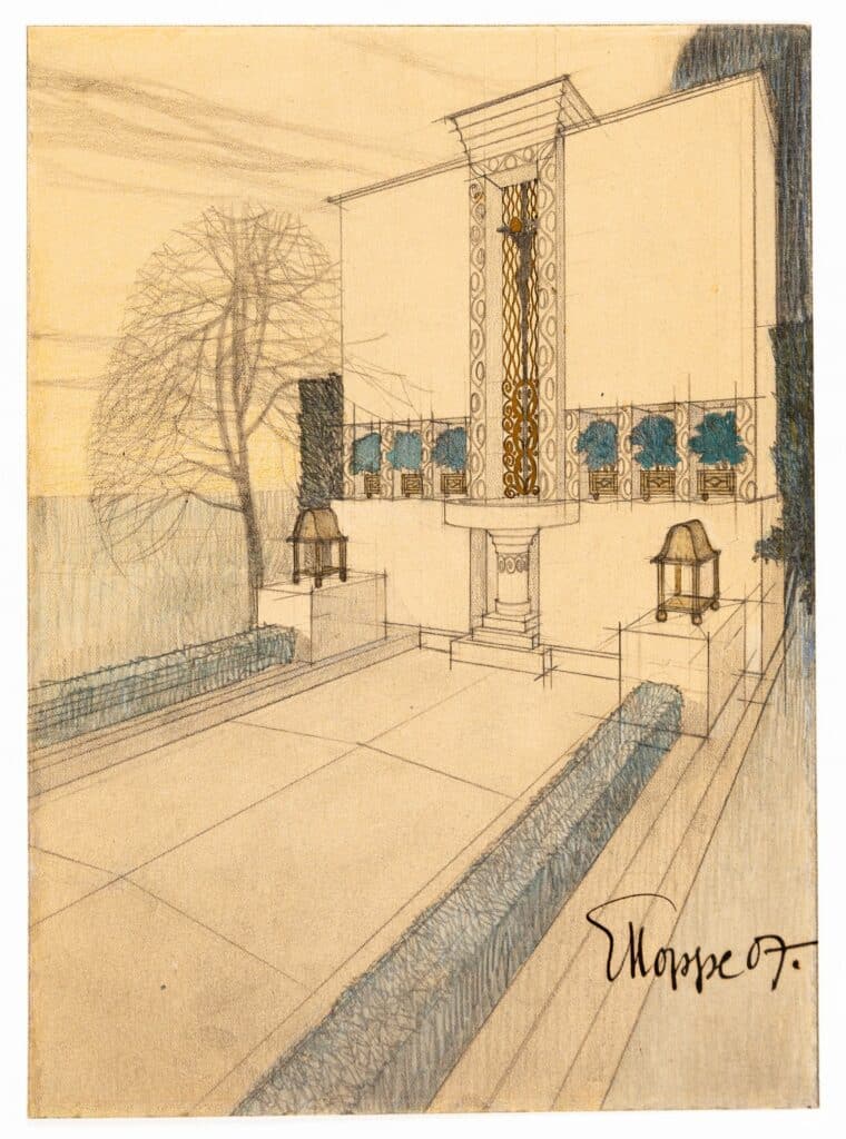
After 1900 the Wagnerschule tradition went from the curvilinear elements of Jugenstil to less decorative though more cubic and volumetric forms, coupled with structural and material innovation. Applied to their forms was a simplicity and a direct relation between function, structure and drawing, be it for the page of a book or the façade of a building. The decoration of each is derived from structural elements: columns, windows, openings, steps, voussoirs.
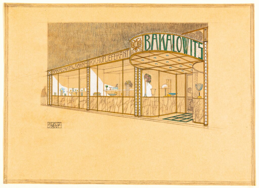
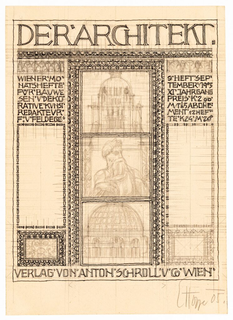
As part of the Wagnerschule Hoppe, Schönthal and Kammerer worked together becoming part of Wagner’s office in 1900 and collaborating on many projects before forming their own office in 1909. In a quality that can hardly be equalled according to Iain Boyd Whyte, drawing became a way through which to work out the visual impact of the architecture.
