Álvaro Siza: The Adoration of the Magi
Our story opens at the close of the Christmas season. It quite literally starts with an Epiphany, both chronologically and figuratively, a glimpse of Three Kings prompted by Niall Hobhouse’s holiday greetings. His somewhat precarious nativity scene, charmingly set upon Álvaro Siza’s yellow columns, reminded me of Sandro Botticelli’s Adoration of the Magi (1478–82).

Right: Sandro Botticelli, The Adoration of the Magi, 1478–82. National Gallery of Art, Washington DC.
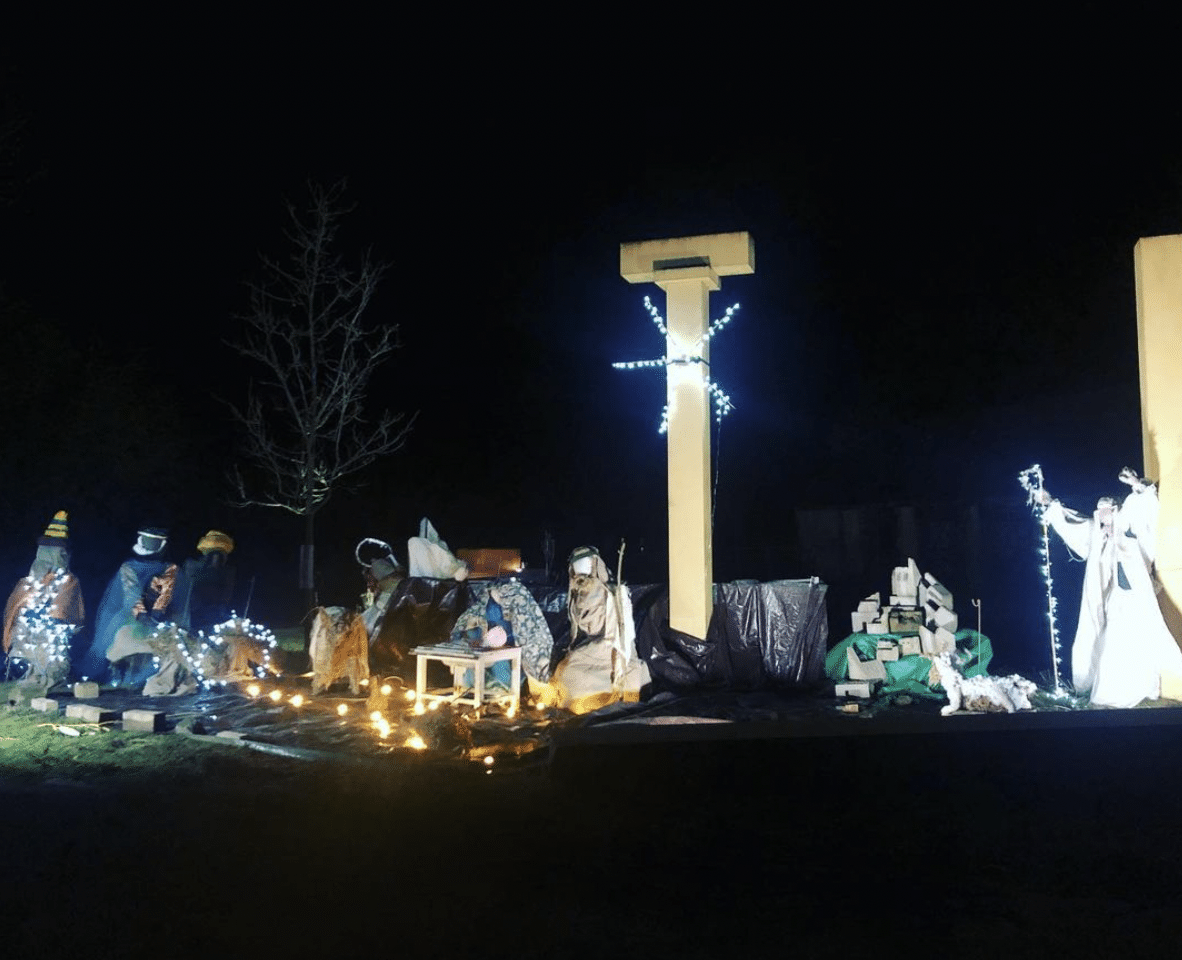
To quote Viola in the Twelfth Night (Act I, scene II): ‘What country, friends, is this?’ A British landscape, a Portuguese monument, an Italian-inspired display of a Jewish scene… Imagery seems universal after all – a mix of history and myth, of psychology and chance – and, like every great drawing, building or book, it welcomes new readings and interpretations.
Although Siza designed the installation for the 2014 exhibition Sensing Spaces, one could argue that its Vitruvian qualities extend far beyond the architecture of the Royal Academy. Instead, it speaks more profoundly to the genesis of Doric entablature and the fall of the Roman Empire. In that sense, it is as true a ruin as his Malagueira aqueduct (1977–97), overcoming the collapse of an old order through the birth of a new one.
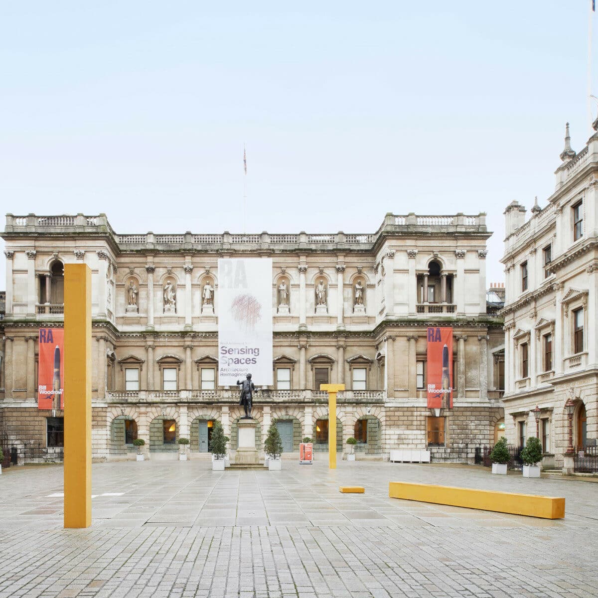
Symbolically, it aligns perfectly with Botticelli’s last Adoration (I say last because he had a series of previous commissions due to the Florentine reverence for the Magi), where he visually emphasised a continuity with Antiquity by suggesting that Christianity grew from its remains. The primordial hut, the origin of civilisation, underwent a kind of petrifaction process to become the classical temple, evoking the passing of time. Centuries later, erosion and fragmentation gave way to Álvaro Siza’s squared-section pillars, reclaimed from Sandro Botticelli’s yellowish columns.
Similarly coloured limestone can be found in Somerset, namely in the Roman thermae of Bath; yet another reason why Shatwell makes for a better home than the Annenberg Courtyard at the Royal Academy, however romantic the tale of the yellow bus or the Freudian nod to the Beatles’ submarine.
In the sunlight, the precast concrete acquires an almost golden tone. Gold, of course, being the symbol of earthly kingship gifted by Melchior. Akin to the Adorations by Gentile da Fabriano (1423) and Masaccio (1428), Siza’s fallen pillar and capital mimic the Wise Men’s prostration before the manger, with Caspar in the middle and Balthasar behind them. Each of the columns develops its own powerful posture and expression: Caspar’s points toward the heavens, as a sign of divinity (frankincense), while Balthasar’s resembles a crux commissa, its architrave reinforcing the T-shape associated with human mortality (myrrh).
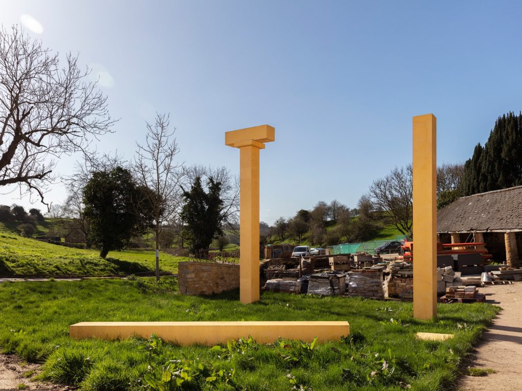
Without stressing the religious aspect, such anthropomorphic depiction is not totally hypothetical given that Siza simultaneously conceived another triptych of menhir-like characters for the 2014 exhibition Personaggi, in Gaeta. He even employed matchsticks, as mini-Giacometti intermediaries, for planning the latest placement of the columns at Shatwell. In a way, the pillars became allegorical visitors, permanently ador(n)ing the archive’s entrance and reconnecting it to the surrounding structures – lying in wait of processional field trips down the valley, in the style of Benozzo Gozzoli’s Magi Chapel (1459) or Fra Angelico’s Adoration of the Magi (1460).
In Egypt, obelisks were urban markers but also a form to honour God (the sun) and represent kings (pharaohs). Siza tends to favour that multi-referential approach, blurring the boundaries between architecture, sculpture and anatomy, while layering them into a different kind of tectonic trinity: space, matter and atmosphere. Therefore, it’s hard to overlook the striking resemblance of his monolith-men to the site plan of the Bouça housing estate (1972–2006), which in turn brings to mind the silhouettes of the Wise Men. Coincidence or archetype?

Centre: Site plan, Bouça housing estate, Porto, 2006.
Right: Girolamo da Santacroce, The Adoration of the Three Kings, 1530. Walters Art Museum, Baltimore, Maryland.
Time will surely untangle this knot more neatly, given appropriate historic distancing, although I would venture that the answer is twofold. On one hand, it sounds like improbable fiction for 1973–74. Amid the loss of his wife, a systemic revolution and the participatory practice with resident associations, there was just too much going on for such eccentric thought methodology. On the other hand, Álvaro Siza is no stranger to transversally sophisticated solutions, especially those that result from a subconscious amalgamation of his own geometric and thematic experiences. Hence, iconographic (self)citation or influence is credible, particularly in regard to projects that spanned over thirty years.
Siza’s boyhood i(magi)nation was surely fed by the account of the Three Kings when the Gospel of Matthew travelled from church into his family home in the shape of little figurines on camelback, which were replaced every January 6th by new ones on their knees. It filled them with childish wonder: ‘Prove true, imagination, O, prove true…’ (Twelfth Night. Act III, scene IV).
That magic – a word derived from the Magi’s prophetic bond with the star(s) being conflated with sorcery in the King James Bible – was emboldened each Christmas by a book from the collection Les Maîtres. The gifts worked as artistic fuel for his adolescent drawings, and he undoubtedly came across several Adorations, from Bosch (1485) to Rubens (1618). Others he would see firsthand during his 1968 trip to Italy: Giotto (1325), Leonardo (1481), Dürer (1504), etc.
For the most part, there’s a remarkable consensus about the compositional profiling of the Wise Men, not unlike imperial offerings in the bas-reliefs at Persepolis (559 BC) or the illustrations of Charlemagne (807). The hierarchy polarises the scene, often by triangulation.
Comparing the obliquity of Girolamo da Santacroce’s version (1530) with the scheme for the Bouça housing estate, one unveils an unbelievably abstract correspondence between elements of the painting and the plan of the estate: the painted steps and the diagonal axis of the railway; the wooden frame of the stable and the street axis; Christ’s extended arm and the ramp of block 1; Melchior’s pious genuflection and the terrace of block 2; Caspar’s crown removal and the laundrette of block 3; Balthazar’s shoulder and the shops of block 4. The ‘heads’ terminating the blocks at Bouça have varied personalities and serve various functions, though they all started equally round.
Putting aside the halo, from my previous deity/frankincense metaphor, one is immediately confronted with the expressionist roots of the Bouça housing estate, thanks to Álvaro Siza’s personal library: Giedion’s Space, Time and Architecture, Goodwin’s Brazil Builds, Zevi’s History of Modern Architecture, and so on.
From Wright’s Guggenheim Museum (1959) to Le Corbusier’s Ronchamp Chapel (1955), or from Niemeyer’s Pampulha Ensemble (1944) to Mendelsohn’s Schocken Department Store (1926), perhaps Oud’s Hoek van Holland and Kiefhoek Housing Developments (1927–30) carried the most significant weight, not merely because they were working class siedlungs but because the units’ modulation was complimented by curvilinear street corners, hovering above communal spaces.

Right: J.J.P. Oud, Kiefhoek housing estate, Rotterdam, 1930. Photo: António Choupina.
The sketches they encouraged span multiple projects, like the unrealised Barbara de Sousa housing scheme (1972), the Bouça housing estate (1972–2006), the São Victor housing estate (1974–79) and the Schlesisches Tor residential complex (1980–84) – colloquially known as ‘Bonjour Tristesse’. Bouça would go as far as to borrow a yellowish hue from Kiefhoek’s window frames and to turn those smooth corner-volumes into the neighbourhood’s public face.
Siza knew that the corner-volumes would be erected in separate phases, hence their physical detachment from the dwellings, which is reminiscent of one of his favourite buildings, the Schaubühne theatre in Berlin (1928), and provides a feeling of fragmentary consolidation rather than unfinished abandonment. Opening them to the street was a means of obtaining external funding, as amenities or ‘equipments’ (in Portuguese) are any civic structures that service local communities and society at large, such as libraries, museums, pools, kindergartens or wash-houses.
Nevertheless, money was solely provided for the houses. António Veiga de Faria, the deputy mayor of Porto who had failed to bring Álvaro Siza’s first downtown urban plan to fruition – Av. D. Afonso Henriques (1968) – commissioned a residential complex as the newly appointed director of the northern FFH (Housing Development Fund). This was Bouça’s first iteration.
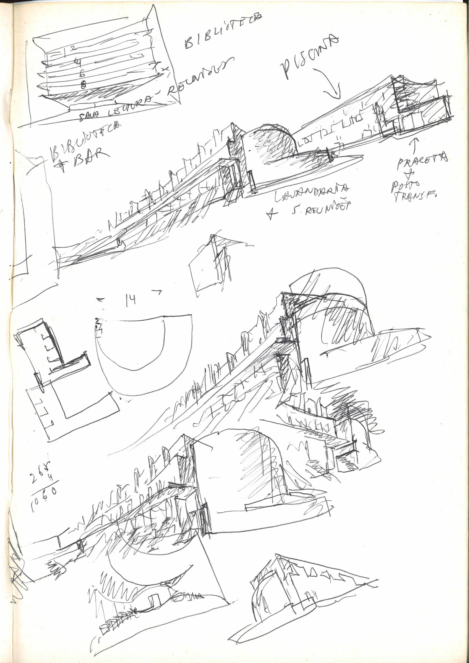
In the preliminary 1972 studies, every housing block had a rounded finishing. By 1973, just the curved tail-ends of the two middle blocks remained, and their refinement process would only resume after the 1974 revolution. Shapes evolved naturally, according to their ever-changing functions. Page 31 of Sketchbook 8 mentions block 3’s semicircle as a collective laundry room, since people could not afford individual washing machines. In addition, it was expected to house association meetings, but has now been converted into a wellness clinic.
Traditional commerce wove these new ‘equipments’ into the pre-existing urban fabric. The classic butcher, grocer or baker was swapped out for a tiled jewellery store (yellow), vintage bookshop (green), and architecture gallery (red). Three uses, three colours, three kings, going back to the imagery of Perugino’s Adoration of the Magi (1498).

Right: Bruno Taut, Rotefront, Hufeisensiedlung, Berlin, 1925–30. Photo: António Choupina.
The narrative of beginnings and endings is always intertwined, may that be birth (healing myrrh) and death (embalming myrrh), dawn (garden city) and twilight (industrial city), or red (socialism) and blue (fascism). From 1926 to 1974, the ‘blue pencil’ was an instrument of censorship and repression in Portugal. Red became a colour of salvation, in the form of scarlet carnations and a nearly bloodless revolution.
Bouça’s choice of paint hence came as no surprise. ‘Red Vienna’ had enabled the construction of the Karl-Marx-Hof (1930), popularised among residential settlements by publications like Rossi’s The Architecture of the City (1966). However, Taut’s Rotefront building has objectively more in common with Bouça: a continuous cherry-tinted surface, punctuated by sequential windows at the top and by protruding white volumes below, ground-floor porches and third-floor balconies symmetrically mirrored on the party walls.
When Siza and I revisited that section of the Hufeisensiedlung (1925–30), the pillars were being painted yet again and the glass extensions had been mostly removed from the balconies. Meanwhile, in Porto, Siza had agreed to the opposite and redesigned Bouça’s spontaneous winter gardens so they could be consistently identical from then onward. That level of respect for the inhabitants’ wishes is one of the reasons why they are so fond of their architect and why touring critics are frequently baffled by blue-collar statements such as: ‘Evidently red is a tribute to Bruno Taut, the most successful residential designer of all time.’
Álvaro Siza’s seminal participation in the 1976 IDZ (International Design Centre) symposium – with Böhm, Gregotti, Ungers and the Smithsons – allowed him a direct experience of Berlin’s modernist housing cooperatives, specifically Taut’s. After Finland (1968), this trip was the foundational cornerstone of the multiverse unleashed in his first fifty sketchbooks (1977–79). On page 2 of Sketchbook 4, he summarises that epiphany perfectly:
Urban renovation has nothing to do with recuperating special archeologic, historic or artistic interest areas. Renovation is a global issue of the city, of urban society […], it’s not isolated: it’s an issue of territory and its use. It does not take place in a single neighbourhood, or in a single city. Not even in a single country. Conservation does not remedy imbalances. Therefore it is not possible without it being owned by the People.
By the people and for the people, to paraphrase Lincoln’s Gettysburg Address, was the spirit on which SAAL (Local Ambulatory Aid Service) was established, bridging the gap – the chasm – in housing for the underprivileged. Until 1974, roughly half of the Portuguese population lived without running water, sewer systems or electricity. In Porto, many of those off-the-grid settlements were known as ‘islands’ (ilhas), not because of their exotic nature but because they were isolated, hiding within city blocks, as if roads were bodies of water.
These ‘islands’ were a by-product of the industrial revolution, which attracted waves of impoverished migrants in the late nineteenth century, as well as financially-savvy landlords who converted their backyards into substandard working-class communities. It was hardly a stable in Bethlehem, but entire families would share 9 to 16 square metres with pigs and chickens, a far cry from the 74 to 80 square metre units at Bouça. Siza’s preliminary study (1972–73) was even more generous than his post-revolutionary first phase (1974–78), with party wall spans going from 6 to 4.5 metres wide and blocks 1 and 4 losing their fifth and sixth floors.
Unfortunately, only 56 homes from blocks 3 and 4 were actually finished, with the remaining 72 being miraculously completed during a much later second phase (1999–2006). Again, like beginnings and endings, unfinished construction and collapsing ruins share a lot in common. Maybe that’s why locals used to compare the erection of Bouça to the demolition of Bairro Vila Maior (1899) in downtown Porto (Fontainhas): both longitudinal rows of repeating doors and walls along a gallery/terrace access.

Right: Álvaro Siza, Court 2, Bouça housing estate, Porto, 1973–2006. Photo: António Choupina.
I would nonetheless pair it with the Finnish Etelä-Kymi Housing Company (EKA) in terms of means, motive and opportunity. Starting with the means, Álvaro Siza’s first-ever undergraduate purchase was the 1950 magazine L’Architecture d’Aujourd’hui (no. 29). It was a monographic issue on Alvar Aalto, presenting the Sunila’s Karhu and Päivölä blocks (1939) as ideal solutions, tools to act upon if or when the opportunity arose.
The Carnation Revolution rendered building socially-conscious workers’ apartments a possibility. Porto, a port-city like Kotka, had the chance to display a distinct model of industrial ‘island’, equally cost-effective yet improving living conditions. Examples of that are the top floors’ full-length terraces in-between the party walls’ strict dimensioning. That rhythmic succession of vertical planes is one of Bouça’s signature features, visually and functionally.
As for motivation, even before Siza interrupted Aalto’s 1968 Easter Sunday, there was an obvious meeting of the minds. As a student, Álvaro Siza recognised himself in the wording of The Trout and the Stream:
I just draw by instinct, not architectural synthesis, but what are sometimes childlike compositions, and in that way, on this abstract basis, the main idea gradually takes shape, a kind of universal substance which helps to bring the innumerable contradictory component problems into harmony. […] Perhaps this why it is to be understood purely and solely through feeling, even though within it and behind it there are often constructive ideas and the whole web of human tragedy.
(Alvar Aalto, 1947)
If Taut was the material Wise Man of this chronicle, then Alvar Aalto was definitely the spiritual one. He died in 1976, the very same year that the SAAL program was dissolved. One can see the emotive crystallisation of his philosophy in the circular lightwells of Bouça’s former laundry room or in the elevation studies’ of blocks 2 and 3. Their transient correlation to Aalto’s posthumous Riola Church (1965–78) verbalises the inherent architectural dichotomy between exterior form and interior space, between body and soul, if you will.

Right: Alvar Aalto, Church of Santa Maria Assunta, Riola, 1965–78. Photo: António Choupina.
After all, that relationship was the theological subject matter to which Alvar Aalto’s church was devoted: The Assumption of Mary. It is the least remote of the Marian dogmas, proclaimed by Pius XII among many of the 1950s post-war reforms, like eliminating the eight-day feast that ran from Three Kings’ Day to January 13th. Mary and the Magi, first drawn together in the Catacombs of Priscilla (2 AD), are two sides of humanity’s divine revelation.
Drawings are always a kind of revelation, not just of tangible portraiture, but of more subtle information comprised within. For instance, Siza’s 1972 perspective of Bouça’s court 2 is an extremely rich universe, contrasting the early realm of design possibilities with the final choices that have been implemented.
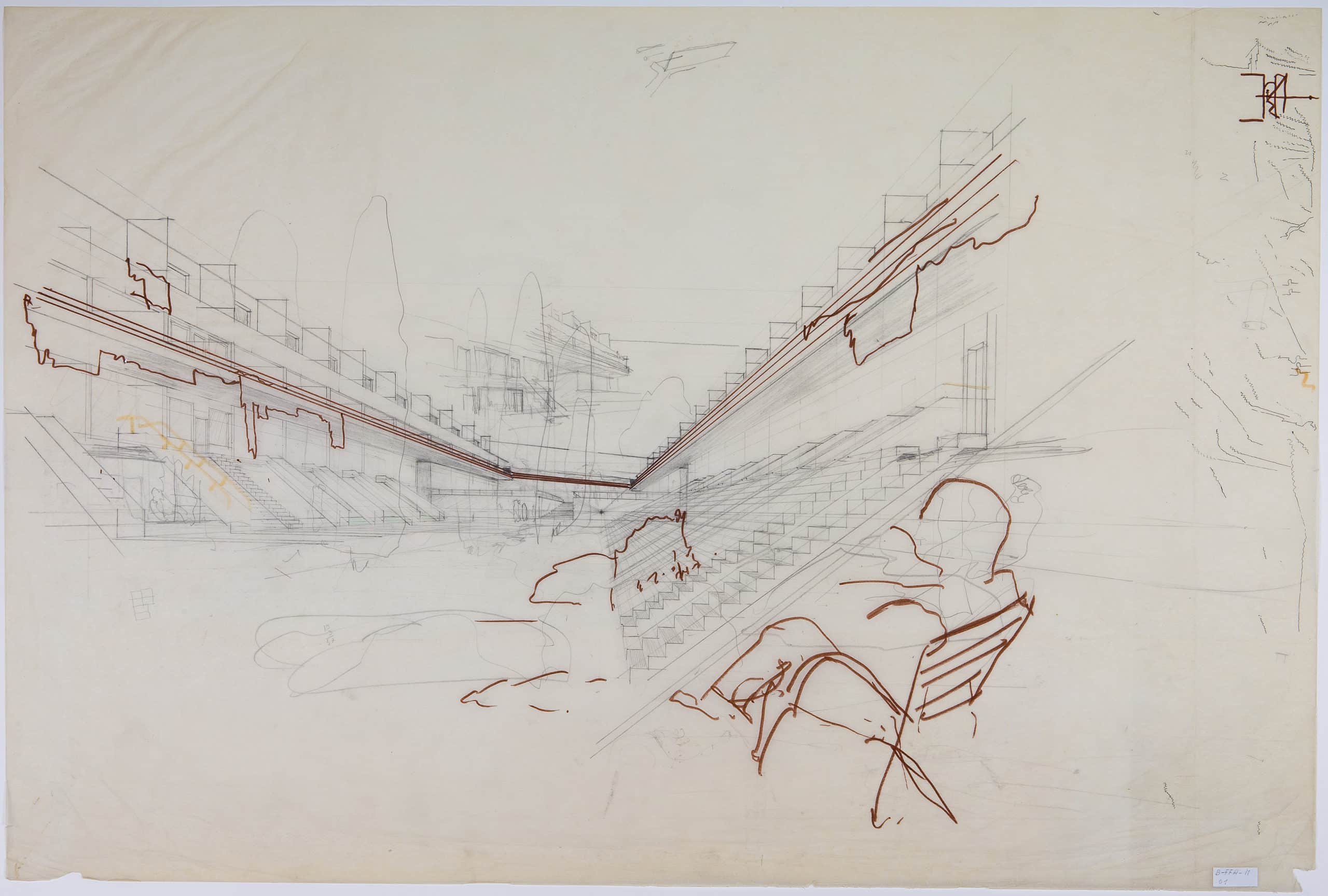
The decision process is self-evident in the party wall modulation, whether in the adjustment of the height of its extruding blades (half walls to full-privacy partitions) or their sharpness (rounded nosing to 90-degree edges). These planes then extend vertically through the third and second floors, playing with the options of modern openness (total transparency) versus traditional enclosure (walled fenestration).
More than just light or structure, each alternative evaluates the benefits and drawbacks of focusing the residents’ social areas on democratic spatial continuity or intimate psychological protection. Smaller studies of the openings elaborate on questions of size, with possibly lower doors than windows, and issues of subdivision, frequently in threes to facilitate the articulation of the windowsills with central knee walls or railings (in yellow).
The red handrails suggest a U-shaped link of the galleries, somewhat cutting the diaphragmatic background wall and strengthening the overall horizontality by means of Babylonian hanging vegetation – or clothes – in the style of Frank Lloyd Wright’s Japanese prints by Ando Hiroshige and Katsushika Hokusai. Anyone familiar with Álvaro Siza’s sketches soon picks up on the fact that all of those red scribbles were in fact done by a collaborator: Francisco Guedes de Carvalho.
One assumes that the man sitting in the bottom right corner represents Siza himself; the hint of a cigarette, the horizon line matching his eye level. It thrusts the whole perspective diagonally, weighting the picture plane off-centre and to the right. The converging palimpsest of stairs was meant to evoke the stands of a stadium, where children could play football, but the face-to-face seating – combined with a raised platform in the distance – is reminiscent of the parliamentary or monastic layouts of a Greek bouleuterion or a Gothic basilical choir.
There’s undeniably a subliminal kinship, like comparing the arrangement of the House of Commons Chamber (1852) with the stalls at Sens Cathedral (1164), which had influenced Canterbury (1180), Bristol (1298) and Carlisle (1322). Those case studies were featured in Álvaro Siza’s copy of Pevsner’s An Outline of European Architecture, however his ‘miracle of the multiplication’ of stairs might have a more pragmatic framework.
Bouça’s block 4 functions as a topographical containment wall so, by inverting the duplexes’ section, people have direct access from above and below. In order for this logic to remain true throughout, stairs were added in blocks 2 and 3. As Siza put it, during our Christmas Eve conversation:
The ground-level houses have a living room above and the gallery-level houses have it below therefore, when there’s a celebration, the gathering areas are the main entrances of the community… I don’t remember if that’s where the stairs came from, although I was aware of da Vinci’s Adoration of the Magi.
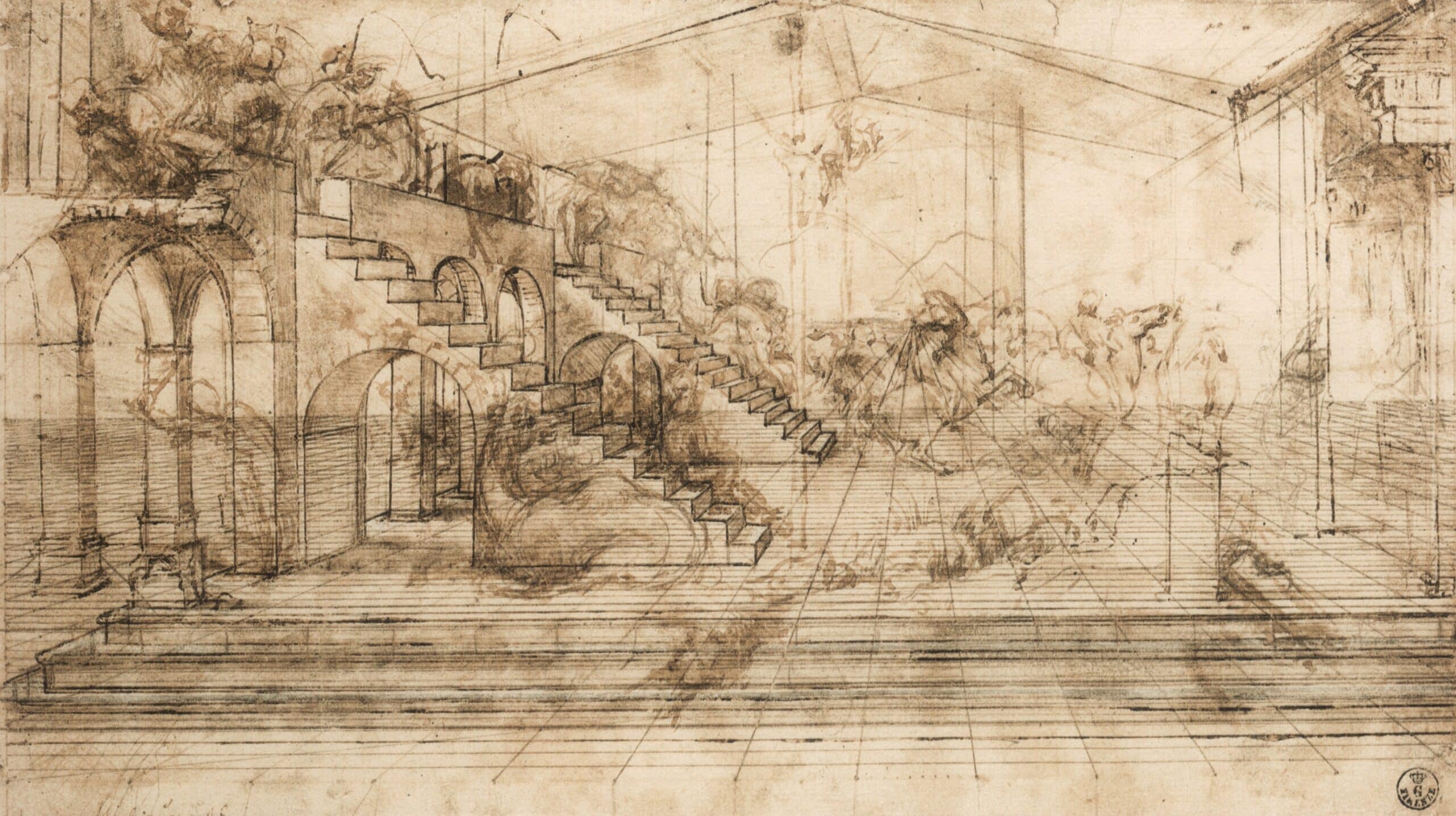
Leonardo da Vinci’s perspective, like Siza’s, both is and is not. They are studies, incredibly detailed studies, but not the total picture or even the final works. That in-between state is precisely what’s attractive about them. The mystery feeds our imagination and grabs our attention by leaving the door open to new conjectures. In Leonardo’s case speculation comes easier, as the author is no longer around to refute it and because the painting was left incomplete, with the Augustinian monks handing over the commission for San Donato in Scopeto (1251) to Filippino Lippi and his 1496 Adoration.
The stairs have been rumoured to belong to the Temple of Solomon (957 BC), the Temple of Divus Claudius (54 AD), the Basilica of Maxentius (312 AD), and the presbytery of San Miniato al Monte (1018). Yet, I would alternatively propose Alberti’s San Sebastiano (1460), since his ‘optimal’ projection techniques – from De Pictura – were generally disseminated while Leonardo was Verrocchio’s apprentice. According to Leonardo’s 1490 manuscript:
Painting is founded upon perspective. Perspective is nothing more than understanding how to properly mimic the function of an eye, which simply consists of capturing within a pyramid all the forms and colours of the objects placed before it.
A meticulous pyramid-shaped grid flows from the core vanishing point of Leonardo and Siza’s perspectives. Oddly enough, each set of stairs delineates the same 36-degree inclination, precisely one-fifth of the hemisphere (180°). That angle is subsequently recalculated to 45 degrees within Bouça’s representation, from right to left, approximating reality. Back then, the current 14-stepped levels had an extra five steps, as indicated in pencil on the foreground: 19×3=57 (steps multiplied by floors).
It’s unlikely that the equation would refer to block 3’s apartment row multiplied by the number of bedrooms, given the 1972 configuration. Nevertheless, court 2’s present-day amount of stairs (23) appears embedded upside-down inside the red bush. Most of the vegetation is sketched more lightly on the ground plane or beyond, like Leonardo, before the manmade (stairs) and nature (trees) were separated into different courtyards.

Centre: Plan of court 2, Bouça, Porto, 2006;
Right: Stairway study, Bouça, Porto, 1977. Sketchbook 4, p. 14, DMC 2506.14.
Louis Kahn similarly removed the garden from the Salk Institute (1965) – at the advice of Luis Barragán – but, where the triumphant tree(s) was lost, Álvaro Siza kept Leonardo’s arches in the form of handrails. The courtyard’s void and perimeter limits craft the illusion of an exterior room, in the vein of Berlage’s traditional street or Porto’s ‘island’ typology. Bouça seems heavily affected by the original floorplan of S. Victor, which Siza sought to preserve in the unrealised 1974 project. Conceptually, there’s a certain beauty to it: the spontaneous curve of the edges, the transversal space under the gallery, the elongated axis of the stairs…
Ironically, the opposite is also correct and the 1979 version of the S. Victor housing estate actually borrows from some of Bouça’s preliminary sketches, namely the roofline that resembles Fritz Höger’s Konsumzentrale (1932). The clever (a)symmetry, literal and figurative, brings us back to the notion of ruin in Leonardo’s Adoration (1481), of (re)construction and disrepair. The municipality was afraid of the latter when it unfortunately demolished S. Victor’s architectural artefacts, yet felt absent for decades while Bouça was left unfinished on the sloping earthwork of the train tracks.
Digging through the substratum of the design process, one becomes aware that many things never came to be in either case. Personally, the most disconcerting is stairway number 2, as per Sketchbook 4 (p. 26), which would articulate court 2 and 3 with the main service gallery and the storage units. It is an unbuilt masterpiece that poses a very interesting conundrum.

Right: Michelangelo Buonarroti, studies for Laurentian Library Stairs, 1525. Casa Buonarroti, 92Ar, Florence.
If Leonardo is the oldest of the symbolic Magi in this analogy, where is Michelangelo? On balance, Álvaro Siza – the sculptor of architecture – has always been fiercely passionate about Michelangelo Buonarroti – the architect of sculpture. When we travelled to Florence, his only request was to see the Laurentian Library (1571). He had visited Brunelleschi’s San Lorenzo (1470) forty-two years before and even enjoyed the Medici Chapel (1555) alone with his wife, but the library was closed, which only added to the mystery. In 2010, Siza finally entered the vestibule and inspected the staircase so scrupulously that one might think Michelangelo was hiding beneath it, as he once did underneath the New Sacristy.
Three flights of stairs turn into one, pouring like lava through the middle. It’s a departure from the initial silhouette: a double flight of stairs composing a bridge-like doorway. Stairway 2 is Bouça’s missing link between the Laurentian Library and the Borges & Irmão Bank, whose 1977 proposed renovation included concentric oval steps (Sketchbook 4, p. 30). An entirely new second phase won the inaugural Mies van der Rohe Award (1988) by tectonically fracturing the stairs in interior and exterior segments, waving down to the waters of Vila do Conde.

Right: Borges & Irmão Bank II. Vila do Conde, 1979 (detail). Sketchbook 41, p.39.
Water has a huge significance during the feast of the Epiphany because, in the West, this day celebrates the arrival of the Magi and, in the East, the baptism of Jesus – both crucial moments of revelation in Christianity. While some churches commemorate the Epiphany and the end of the Christmas season on January 6th of the Gregorian calendar, others still follow the Julian calendar, which converts to January 19th.
The 19th recipient of the IHRU Award (Institute of Housing and Urban Rehabilitation) was the Bouça Housing Estate. Its plaque sits patiently on Álvaro Siza’s monument, a sculptural stairway of unassuming proportions. His complexity often materialises in deceivingly modest ways, like a hypertext of memories, from the grand staircase of the Antiquarian Gallery (1973) to the temporary stairwell of Bouça (1978), from the narrow stairs of S. Victor (1979) to the slanted steps of Porto’s School of Architecture (1995)… changing levels are the most remarkable moment of synthesis and power for any architect or artist on the ‘stairway to heaven’.

Right: Bouça Monument, Porto, 1973–2006. Photo: António Choupina.

– Niall Hobhouse