James Gowan Millbank: Sketches and Comments
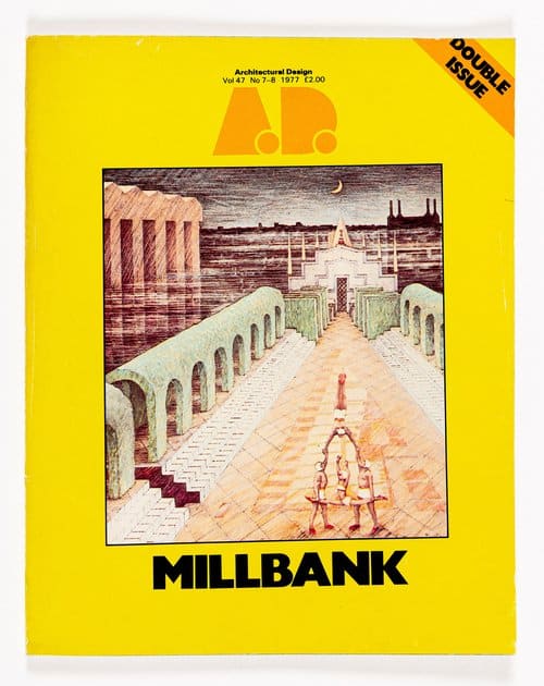
The following text was first published in 1977 in an issue of AD Profiles dedicated to the Millbank Housing Competition. Run by the Crown Estate, the competition to develop a site adjacent to Vauxhall Bridge attracted nearly five hundred entries, including proposals from Alison and Peter Smithson, Richard Rogers and Renzo Piano, Jeremy and Fenella Dixon, Doug Clelland and Eric Parry, Nigel Coates, and Peter Wilson – an avalanche interpreted by the estate commissioners and commentators as representative of both excitement over a challenging riverside site and of the dearth of work available to the architectural profession at the time. The competition was ultimately won by Nicholas Lacey with a scheme which sought to facilitate up- and downstream views through a riverside version of the crescent housing typologies found in Bath, Brighton and Clifton.
Observing that the competition had elicited a body of proposals that served as a cross-section of mid-seventies British architecture, Architectural Design decided to invite the unsuccessful entrants to resubmit their schemes for the site to a panel that consisted of Alvin Boyarksy, Peter Cook, James Gowan and Cedric Price. One hundred of the practices resubmitted and seventy were selected to exhibit their proposals at ART NET for two weeks in July 1977; a smaller number were reproduced in the AD Profile on the competition alongside two short essays by Cedric Price and James Gowan.
Reproduced here is the text of Gowan’s commentary on the Millbank site which he illustrated with his own drawings. Six of these drawings have been identified in sketchbook 7, now in the Drawing Matter collection.
James Gowan: Millbank – Sketches & Comments
It is probably not a simplification to say that the problems posed by the Millbank competition are primarily pictorial, concerned as they are with a strip of the Thames which is seen at its best across a stretch of water. The context is singular and its civic overtones are so insistent that matters of function and access, daylight and aspect, which normally would be considered paramount are here on the first, immediate and indistinctive assessment demoted to attendant roles of an unexpected subservience. It could be argued that this is a classical predicament, that the artistic demand is for a parti of distinction and consequence, and that within the general sweep of such an endeavour the mechanics of site and practicality can be put to one side and absorbed into the schema later with a reserve technique, then, if not well, well enough. If such post-assimilation appears to be clumsy and no better than a graft then it is necessary to point out that precedent in similar London contexts suggests that the proposition has a general acceptance. Painful though it may be to the purist, there is a widespread use of shoe-horn aesthetics and it could be claimed that it is reassuring to know that such a safety net exists and that it is in working order. Some years back, I remember Brian Housden explaining to me that the design method of a very well known London architect was quite at odds with his consciousness and was to select the nearest solution from his memory bank of the Corbusier volumes and convert it to the problem at hand. It is a very speedy and productive technique, not aired too often in discussion, but suggesting that our native abilities of adjustment and improvisation are still abroad. In some part, too, they are the credentials for these sketches.
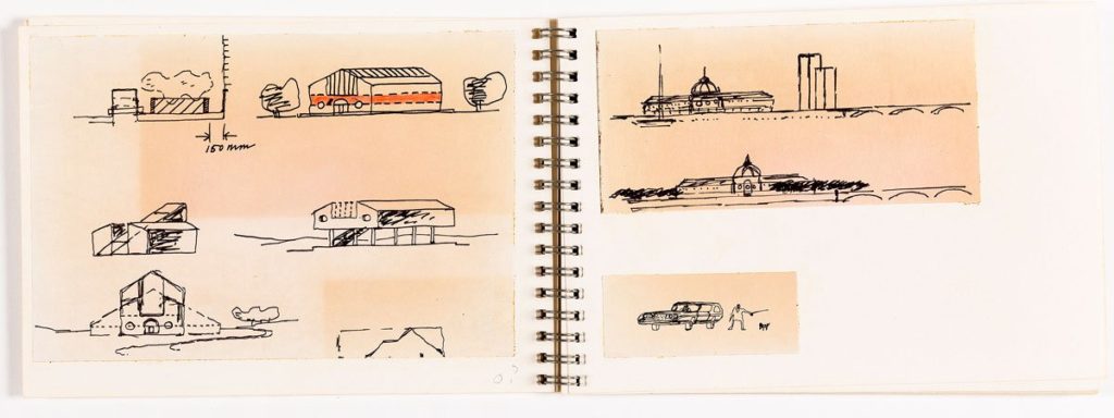
(1) A known building of about the right dimensions is placed on the site to gauge the scale and general effect. The result is inoffensive but the format is reminiscent of County Hall. The existing tower blocks, too, are discomfiting.
(2) The embankment is planted with trees in the straight-line traditional manner and the tower blocks eliminated by demolition. If the consequences are not startling, they are an improvement on the first sketch.
(3) The second proposition is reversed. The tower blocks stand but nothing further is built on the site. It is arranged as a small park, much like the one abutting the House of Commons. It is noted that such an outcome would be quite bearable, if conventional, and there would be a small but worthwhile civic gain.
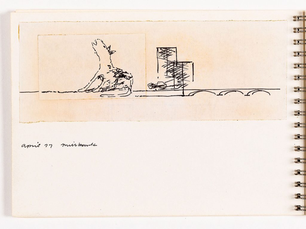
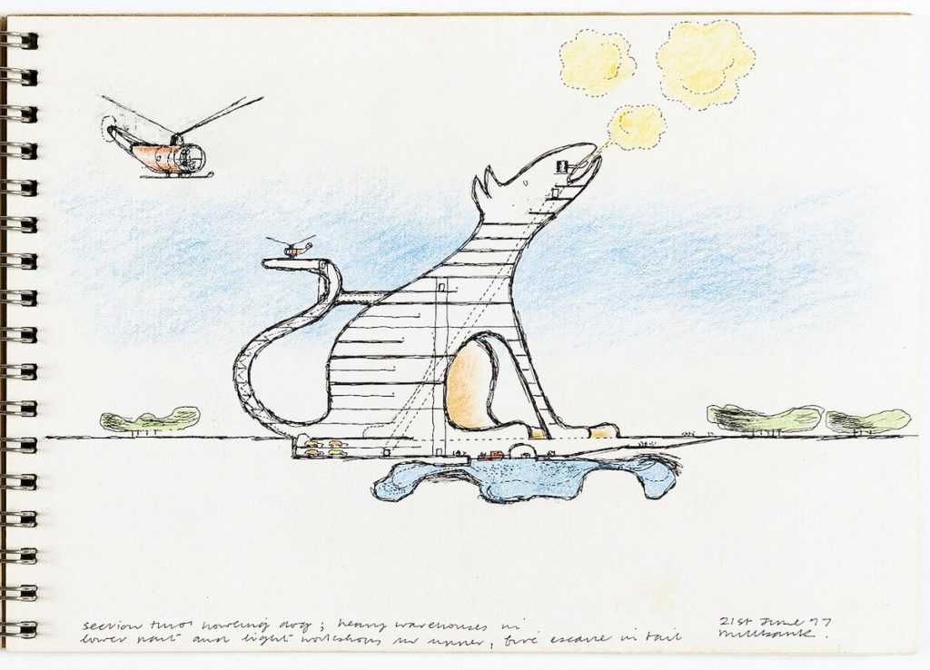
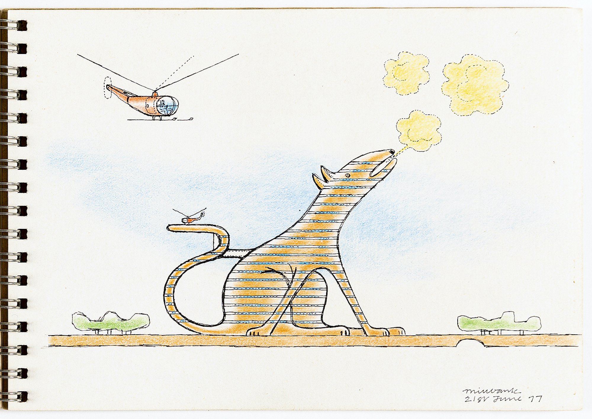
(4) By now the unease about the tower blocks has increased. They present their best face to the city and look tolerable enough when seen from a car passing over Vauxhall Bridge, at speed. From the river, their aspect is ungainly, tentative and abstract. One searches for a resonance between the two, without success. The howling dog, into which all the accommodation in the brief would be crammed, gives expression to this architectural unease and suddenly there is a dialectic. It is not without offence but then it could be said that the tower blocks have initiated this by over development.
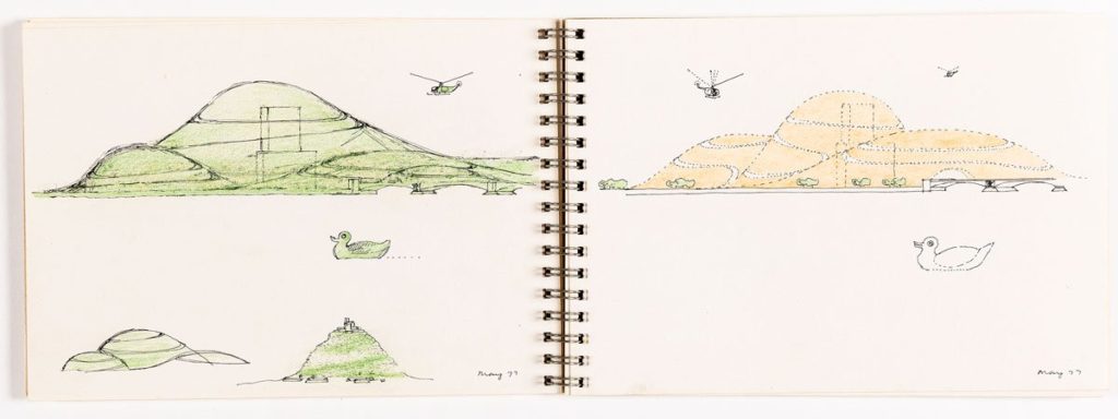
(5) Large undulations of orange-coloured unspecified material, packed with subterranean dwellings and the like, grandly burying the offending blocks in their entirety. This sketch was preceded by a Peter Cook lump but somehow this had too many overtones of landscape and fairy folk for Vauxhall, or to be more precise, what it was historically. The plain mounds seem to conjure up the possibility of a submerged city or, more appropriately, a lost civilisation. If the sketches presume to map out a territory of reality and possibility, one feels that this proposition is on, or more likely over, the limit.
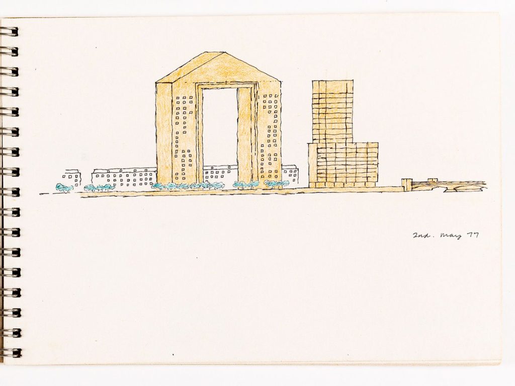
(6) To return to the status quo and the tower blocks, assume that it was sensible town planning to place two large buildings at the internal junction of a bridge and highway and that their size is in sympathy with their location. If that is so, their scale would be acceptable for the competition buildings. In this sketch, the flats are packed into two slender blocks linked with a pediment containing fancy apartments and with the eaves of the new and existing in line. The resulting building is a grand portal for the mandatory view and it is interesting to observe that however simplistic this might be deemed as a notion it has an aesthetic edge on the abstraction of its neighbour.
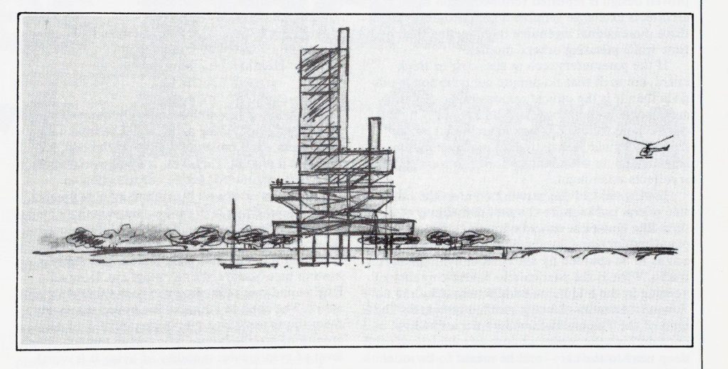
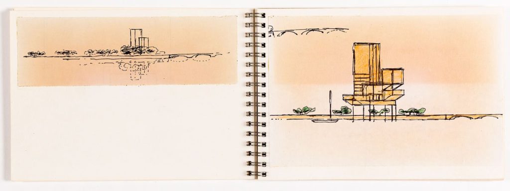
(7) Rivers give most back to a city when they are in use and energised with activity. At Millbank, the Thames is wide and empty. Even South Bank still seems a world away from the other side. The sketch suggests decamping the competition brief into the Thames and approaching it by water. The banks are established as a linear park and this screen of vegetation softens the river’s edge and makes it more hospitable for a greater part of the year.
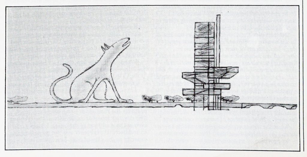
(8) The howling dog is reinstated on the bank and, this time, contains the work buildings. The flats, restaurants and such-like, which are placed in mid-river are strongly reminiscent of an oil-rig and Leicester; an engaging conjunction. The embankment wall is vaulted for the access and storage of boats, a Venetian notion which suggests that, at last, this exercise has made contact with reality; tentatively, perhaps, but two maritime analogies are quite enough to prime the pumps, and set a course, to steam ahead.
