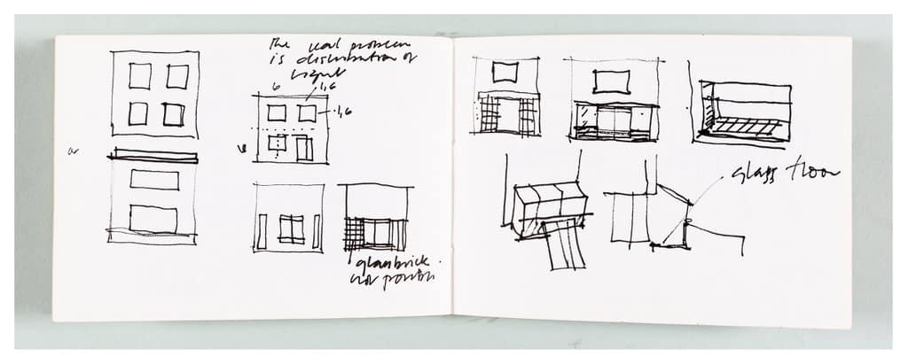
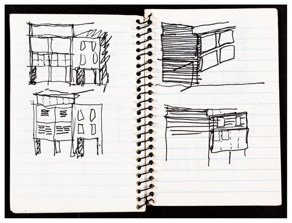
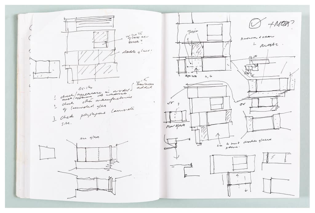
A conversation with Nicholas Logsdail, standing in the farmyard at Shatwell, on the day he came with Freeny Yanni her sons Yanis and Cassius Hammick, to look at Tony Fretton’s sketchbooks for the Lisson Gallery.By way of response, Tony gives us his account of the genesis of the commission.
Nicholas Logsdail: Tony had been a regular visitor to the gallery over the years. Gradually, I got to recognise him and had some fairly cryptic conversations with him from time to time – and then some very good ones about architects and gallery space. I think we were talking about how I had just been to the Sainsbury Centre for the first time, and I was not very impressed by it. I thought it was a waste of money, a waste of space, but not that it wasn’t worth doing, you know.
We started talking about how an exhibition space was often better without architects, very much coming out of the idea of the New York repurposing of loft space, the repurposing of the buildings in Varese by Count Panza, and the repurposing of Soho as arts space, living space, gallery space, etc. And about how, in a way, architects could become very jealous of artists, and aspired to have the gravitas of great artists in the way that, maybe in the past, the great architects of the Renaissance might have had. For different reasons, because it was a different kind of social environment.
What I began to recognise with Tony was that he wasn’t a branding type of architect. He was extremely thoughtful about not just how it looked but about its purpose. You know, even the old Louis Sullivan function before form.
He started coming in with Mark Pimlott, who is his mate, and he was talking to me about doing a performance at the gallery – it never happened. He seemed to understand the art world that interested me, rather than the sort of snobby art world that I have some disdain for still, although we make a lot of money out of it now. But I do have disdain for it, because it is show-off stuff. The best art never came up in that. Although some good art does come out of show-off stuff, so it’s not that simple. You can’t be dogmatic about it.
What was very clear with Tony was that he was very devoted to the idea of doing something. I brought him and Dan Graham together. I think that they were both quite suspicious of each other, and probably still are to this day. I think there is a long recorded interview we have in the archive, which neither of them have published, if I remember rightly.
Niall Hobhouse: You already had Bell Street at that point?
NL: Oh yes. We had bought the derelict building with a view of growing the gallery, one building on Lisson Street and two more on Bell Street round the corner from the original gallery. It was very clear that it was just running out of time and space; it was no longer the sort of late ‘60s, ‘70s conceptual art gallery. We needed more space. It was growing because we were doing well. We had great artists.
The London art world didn’t really know about the Lisson Gallery. But you go to New York, you go to Paris, you go to Düsseldorf or Rome and everybody knew about it.
NH: I do see exactly what you mean.
NL: Or they didn’t know about… who were the other galleries around at that time in London? They didn’t know, hadn’t heard of, the Marlborough Gallery, for example. It was a different world I entered, and I was very protected by being in Bell Street.
I remember Tony became a friend, and when I told him I needed an architect he said, ‘What do you want?’ to which I said, ‘I want space. Space that is not competing with the artist, that is as far as possible lit naturally and feels good to be in.’ I think that a lot of architecture that is created for art is actually quite hostile to the art, and it is so over-insistent, architecturally. It might even be great architecture, but it is not appropriate to compete with the artist.
That goes back to the idea of the architect being jealous of the artist and trying to emulate the celebrity of the artist. As they have, actually, in many instances. Which again is complicated because it is not demeaning to architects who have such ambition, it’s just a point of view. It’s an attitude of mind if you like, and Tony didn’t have that.
NH: Where that conflict becomes explicit is that it is not only demeaning to art, that ‘look at me’ architecture, but it’s always very demeaning to the city. ‘Look at me’ buildings are very aggressive.
NL: Yes. The great artists of my era didn’t set out to be celebrity artists. That happened later with you know who – to remain nameless… That was the advent of a new era.
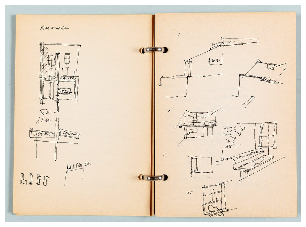
NH: How did Tony have time to fill 43 sketchbooks?
NL: I had no idea he had done so many sketchbooks. I just said: ‘I want a space that artists will aspire to show in, and aspire to make great work to show in that space, because the very process of being in that space, you enter into the space and you don’t know why you are feeling good.’ You don’t attribute it to the architecture. You don’t necessarily attribute it to the art. Once you have actually looked at a show and recognised that there is something really interesting about that artist’s work, then you can attribute it to that. Then you can look at the space and say, ‘Yes. This all works and holds together as a singular experience of the two together.’
NH: One of the things that I remember about it when I went very early on, was how coherent it was in terms of the details. I mean did you decide very early on to allow Tony to really design everything?
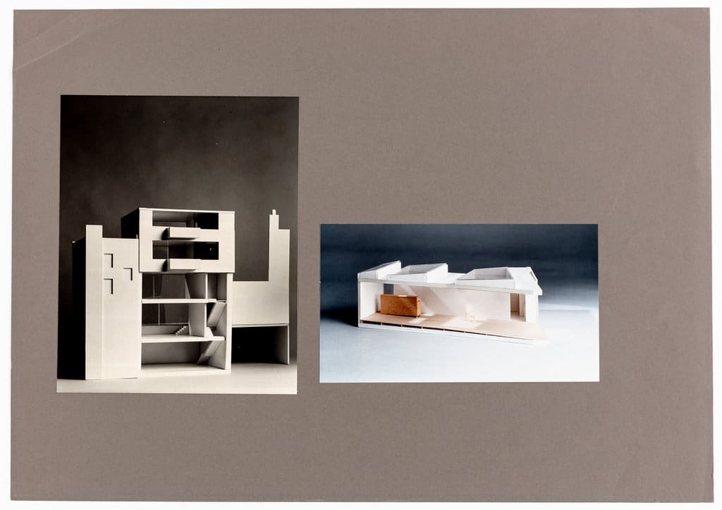
NL: Well, I gave him a brief, which was repetition, repetition, repetition. No trademark design, like little details, ‘Oh, that’s a Tony Fretton detail.’ You know what I mean? It was something we both agreed upon. We did a lot of models. I just wanted to see how it worked, the light and so on.
NH: No lighting engineers?
NL: No.
NH: Because that’s one of the nice things about the sketchbooks, is there are these endless studies.
NL: No lighting consultants. I think we did get the folks from Erco in Dover Street and one of their lighting experts recommended their latest wall washer halogen lights, which is actually what I asked for. I said, I want lights that don’t spotlight, but just give you an even light throughout, and you can, if possible, dim it, either by turning the colour temperature down.
It is all about colour temperature in a way; mixing daylight with artificial light, if you need it, and switching it off if you don’t. And, if possible, it switches off automatically when you have got enough light overhead.
NH: Did you find in the event that the building functioned in the way that you had both imagined it?
NL: Yes and no. It did what we were talking about. It didn’t do it all. But we didn’t expect it to. You know, the idea of perfection is a very false idea, a very false premise in anything, more or less, in a work of art. For an artist to aspire to make a perfect work of art, it’s quite a nice aspiration, and a necessary one, but it doesn’t happen that way. Actually, the perfect work of art usually happens the other way round. It happens somehow by some strange subconscious serendipitous coming together of things.
NH: Which of the spaces did you imagine as the principle space, or did you not think of it that way?
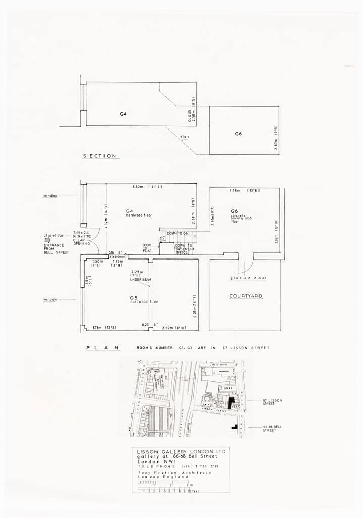
NL: Well, you see, because we were governed by the site and the peculiarities of it, from the medieval to the 17th, 18th, and then the 19th Century. In the 18th Century that whole area started to develop. Before that Bell Street had been there for a very, very long time, houses along that street and a few little side streets. In a way, I think when the early Victorian buildings were built, they were the first brick and mortar buildings. They were very irregular. There was no town planning at that time and it wasn’t an important part of town. Hence, the larger space has no right angles.
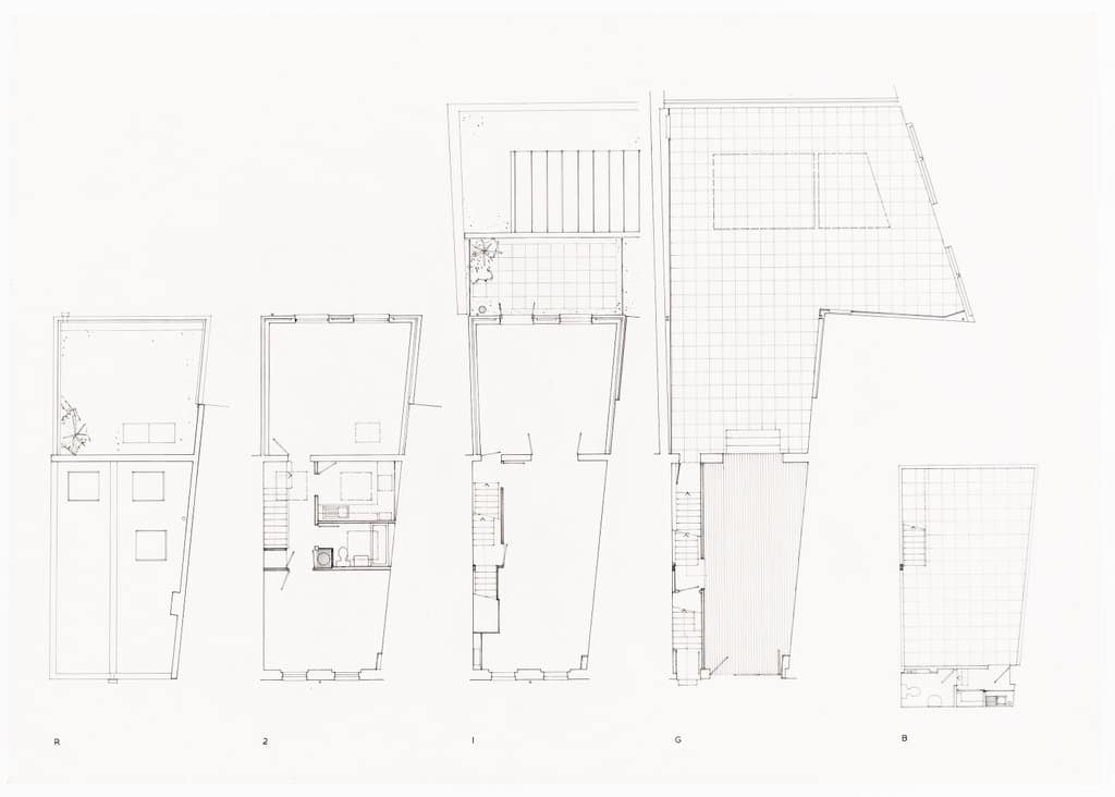
That was very interesting to both of us. We talked about squaring it all up, but we’d lose so much space. We’d have lost 500 square feet by squaring it up.
NH: To what end?
NL: For no purpose. You have just made a boring box instead of this very beautiful, unusual space. Sometimes awkward, but generally not. The challenge with that space for artists was not only to make an interesting show, but that work can look better when you take it out of the orthodoxy of the white cube.
Architect’s Account
Tony Fretton: The critic Michael Newman, who was writing for the Lisson Gallery at the time, and for whom I was designing at the time proposed me to Nicholas for a new gallery. Michael arranged for us to meet at the opening of the Hayward New Contemporaries exhibition in the early 1980’s. Nicholas asked what was the focus of my architecture. I said ‘Light’ and he said that I was the right architect for his project. He asked me to look at a project in a warehouse building in Clerkenwell, which did not proceed. I said that the Lisson Grove seemed to be his natural home and perhaps he might stay there.
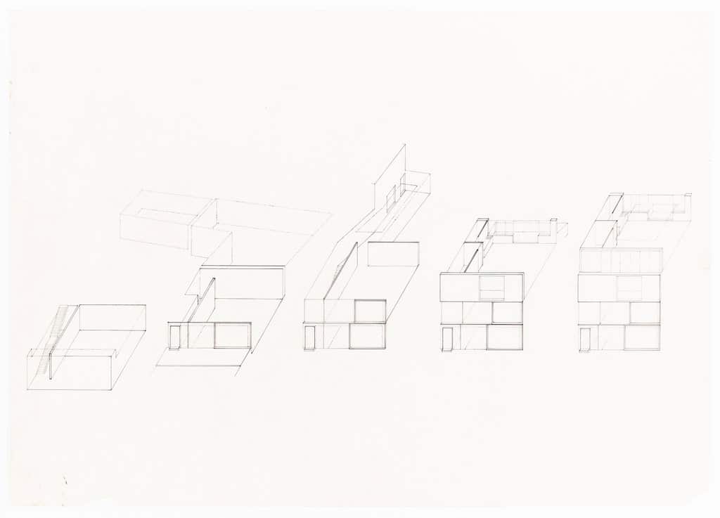
Things went quiet and then some months, or perhaps years later, he called me to look at a property in Lisson Street. It was a former sweet shop and upper with hardly any ground floor space. A young Anish Kapoor was there and looked at it with dismay. I was cautious and suggested he keep looking. He replied that he had already bought the building and I should get on with a scheme. I made a photo collage that he liked of the back yard saying that I wanted to keep some of its rawness. He then proceeded to add more land to the scheme piece by piece, buying from adjoining owners, including the site that later became the second Lisson Gallery. Its ended with the gallery spaces that you can see in the first building.
Nicholas was wonderfully inspiring during the design and behaved towards me as he would to an artist. The design process is described in an article which I included in AEIOU my collected writings.
To give some ideas of the spirit of Nicholas and the Gallery during design I quote:
We were invited to discuss a new building for the Lisson Gallery. Meetings with the Director took place in the single room office below the Gallery that he shared with all of the staff. To reach it you walked into unguarded exhibition rooms directly from the street, down through a storage area into the basement. On the way, some of the most interesting work by artists such as Donald Judd, Sol Lewitt, Tony Cragg and Richard Deacon lay within reach, awaiting shipping or casually displayed on the walls of the office.
The Gallery felt at ease in its peripheral location, a working district away from the London art quarter, and the site for the new building lay nearby in a terrace of partially occupied and wrecked buildings.
Our first schemes were intoxicated by the tactility of the site and the possibility of art being shown in settings made by the quiet action of disorder, but these visions had to be sublimated into the detail-less language of art buildings, so that the Gallery could establish its international status, and they resurfaced in romantic spaces made from the bare facts of location and use.
On Tony Fretton and the Lisson Gallery
– Nicholas Logsdail
A conversation with Nicholas Logsdail, standing in the farmyard at Shatwell, on the day he came with Freeny Yanni her sons Yanis and Cassius Hammick, to look at Tony Fretton’s sketchbooks for the Lisson Gallery. By way of response, Tony gives us his account of the genesis of the commission.
Nicholas Logsdail: Tony had been a regular visitor to the gallery over the years. Gradually, I got to recognise him and had some fairly cryptic conversations with him from time to time – and then some very good ones about architects and gallery space. I think we were talking about how I had just been to the Sainsbury Centre for the first time, and I was not very impressed by it. I thought it was a waste of money, a waste of space, but not that it wasn’t worth doing, you know.
We started talking about how an exhibition space was often better without architects, very much coming out of the idea of the New York repurposing of loft space, the repurposing of the buildings in Varese by Count Panza, and the repurposing of Soho as arts space, living space, gallery space, etc. And about how, in a way, architects could become very jealous of artists, and aspired to have the gravitas of great artists in the way that, maybe in the past, the great architects of the Renaissance might have had. For different reasons, because it was a different kind of social environment.
What I began to recognise with Tony was that he wasn’t a branding type of architect. He was extremely thoughtful about not just how it looked but about its purpose. You know, even the old Louis Sullivan function before form.
He started coming in with Mark Pimlott, who is his mate, and he was talking to me about doing a performance at the gallery – it never happened. He seemed to understand the art world that interested me, rather than the sort of snobby art world that I have some disdain for still, although we make a lot of money out of it now. But I do have disdain for it, because it is show-off stuff. The best art never came up in that. Although some good art does come out of show-off stuff, so it’s not that simple. You can’t be dogmatic about it.
What was very clear with Tony was that he was very devoted to the idea of doing something. I brought him and Dan Graham together. I think that they were both quite suspicious of each other, and probably still are to this day. I think there is a long recorded interview we have in the archive, which neither of them have published, if I remember rightly.
Niall Hobhouse: You already had Bell Street at that point?
NL: Oh yes. We had bought the derelict building with a view of growing the gallery, one building on Lisson Street and two more on Bell Street round the corner from the original gallery. It was very clear that it was just running out of time and space; it was no longer the sort of late ‘60s, ‘70s conceptual art gallery. We needed more space. It was growing because we were doing well. We had great artists.
The London art world didn’t really know about the Lisson Gallery. But you go to New York, you go to Paris, you go to Düsseldorf or Rome and everybody knew about it.
NH: I do see exactly what you mean.
NL: Or they didn’t know about… who were the other galleries around at that time in London? They didn’t know, hadn’t heard of, the Marlborough Gallery, for example. It was a different world I entered, and I was very protected by being in Bell Street.
I remember Tony became a friend, and when I told him I needed an architect he said, ‘What do you want?’ to which I said, ‘I want space. Space that is not competing with the artist, that is as far as possible lit naturally and feels good to be in.’ I think that a lot of architecture that is created for art is actually quite hostile to the art, and it is so over-insistent, architecturally. It might even be great architecture, but it is not appropriate to compete with the artist.
That goes back to the idea of the architect being jealous of the artist and trying to emulate the celebrity of the artist. As they have, actually, in many instances. Which again is complicated because it is not demeaning to architects who have such ambition, it’s just a point of view. It’s an attitude of mind if you like, and Tony didn’t have that.
NH: Where that conflict becomes explicit is that it is not only demeaning to art, that ‘look at me’ architecture, but it’s always very demeaning to the city. ‘Look at me’ buildings are very aggressive.
NL: Yes. The great artists of my era didn’t set out to be celebrity artists. That happened later with you know who – to remain nameless… That was the advent of a new era.
NH: How did Tony have time to fill 43 sketchbooks?
NL: I had no idea he had done so many sketchbooks. I just said: ‘I want a space that artists will aspire to show in, and aspire to make great work to show in that space, because the very process of being in that space, you enter into the space and you don’t know why you are feeling good.’ You don’t attribute it to the architecture. You don’t necessarily attribute it to the art. Once you have actually looked at a show and recognised that there is something really interesting about that artist’s work, then you can attribute it to that. Then you can look at the space and say, ‘Yes. This all works and holds together as a singular experience of the two together.’
NH: One of the things that I remember about it when I went very early on, was how coherent it was in terms of the details. I mean did you decide very early on to allow Tony to really design everything?
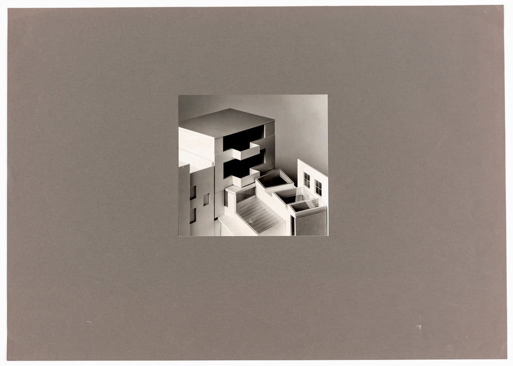
NL: Well, I gave him a brief, which was repetition, repetition, repetition. No trademark design, like little details, ‘Oh, that’s a Tony Fretton detail.’ You know what I mean? It was something we both agreed upon. We did a lot of models. I just wanted to see how it worked, the light and so on.
NH: No lighting engineers?
NL: No.
NH: Because that’s one of the nice things about the sketchbooks, is there are these endless studies.
NL: No lighting consultants. I think we did get the folks from Erco in Dover Street and one of their lighting experts recommended their latest wall washer halogen lights, which is actually what I asked for. I said, I want lights that don’t spotlight, but just give you an even light throughout, and you can, if possible, dim it, either by turning the colour temperature down.
It is all about colour temperature in a way; mixing daylight with artificial light, if you need it, and switching it off if you don’t. And, if possible, it switches off automatically when you have got enough light overhead.
NH: Did you find in the event that the building functioned in the way that you had both imagined it?
NL: Yes and no. It did what we were talking about. It didn’t do it all. But we didn’t expect it to. You know, the idea of perfection is a very false idea, a very false premise in anything, more or less, in a work of art. For an artist to aspire to make a perfect work of art, it’s quite a nice aspiration, and a necessary one, but it doesn’t happen that way. Actually, the perfect work of art usually happens the other way round. It happens somehow by some strange subconscious serendipitous coming together of things.
NH: Which of the spaces did you imagine as the principle space, or did you not think of it that way?
NL: Well, you see, because we were governed by the site and the peculiarities of it, from the medieval to the 17th, 18th, and then the 19th Century. In the 18th Century that whole area started to develop. Before that Bell Street had been there for a very, very long time, houses along that street and a few little side streets. In a way, I think when the early Victorian buildings were built, they were the first brick and mortar buildings. They were very irregular. There was no town planning at that time and it wasn’t an important part of town. Hence, the larger space has no right angles.
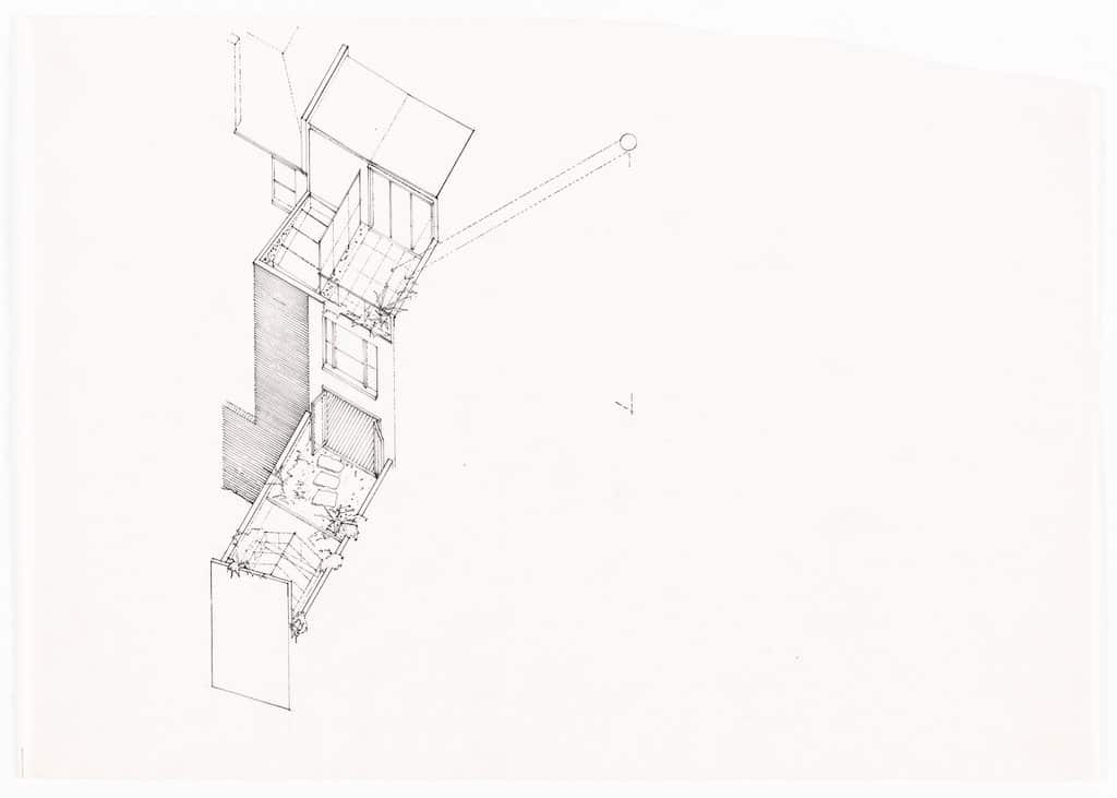
That was very interesting to both of us. We talked about squaring it all up, but we’d lose so much space. We’d have lost 500 square feet by squaring it up.
NH: To what end?
NL: For no purpose. You have just made a boring box instead of this very beautiful, unusual space. Sometimes awkward, but generally not. The challenge with that space for artists was not only to make an interesting show, but that work can look better when you take it out of the orthodoxy of the white cube.
Architect’s Account
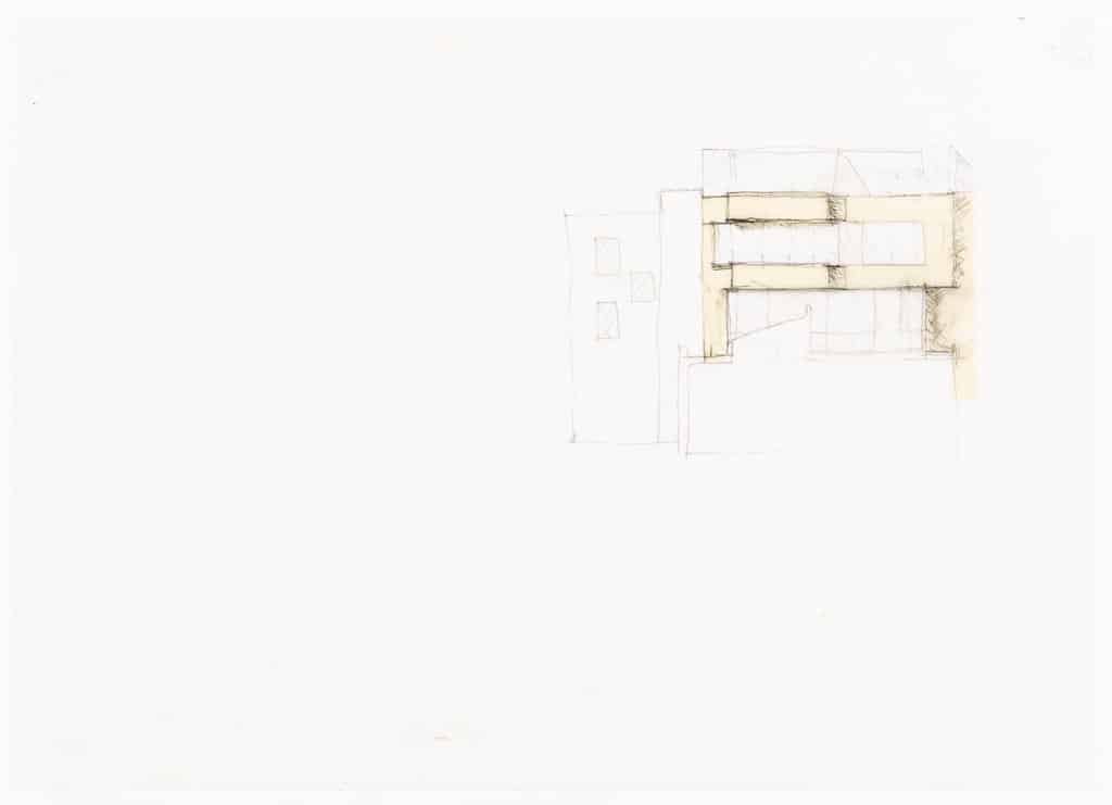
Tony Fretton: The critic Michael Newman, who was writing for the Lisson Gallery at the time, and for whom I was designing at the time proposed me to Nicholas for a new gallery. Michael arranged for us to meet at the opening of the Hayward New Contemporaries exhibition in the early 1980’s. Nicholas asked what was the focus of my architecture. I said ‘Light’ and he said that I was the right architect for his project. He asked me to look at a project in a warehouse building in Clerkenwell, which did not proceed. I said that the Lisson Grove seemed to be his natural home and perhaps he might stay there.
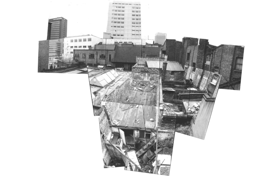
Things went quiet and then some months, or perhaps years later, he called me to look at a property in Lisson Street. It was a former sweet shop and upper with hardly any ground floor space. A young Anish Kapoor was there and looked at it with dismay. I was cautious and suggested he keep looking. He replied that he had already bought the building and I should get on with a scheme. I made a photo collage that he liked of the back yard saying that I wanted to keep some of its rawness. He then proceeded to add more land to the scheme piece by piece, buying from adjoining owners, including the site that later became the second Lisson Gallery. Its ended with the gallery spaces that you can see in the first building.
Nicholas was wonderfully inspiring during the design and behaved towards me as he would to an artist. The design process is described in an article which I included in AEIOU my collected writings.
To give some ideas of the spirit of Nicholas and the Gallery during design I quote:
We were invited to discuss a new building for the Lisson Gallery. Meetings with the Director took place in the single room office below the Gallery that he shared with all of the staff. To reach it you walked into unguarded exhibition rooms directly from the street, down through a storage area into the basement. On the way, some of the most interesting work by artists such as Donald Judd, Sol Lewitt, Tony Cragg and Richard Deacon lay within reach, awaiting shipping or casually displayed on the walls of the office.
The Gallery felt at ease in its peripheral location, a working district away from the London art quarter, and the site for the new building lay nearby in a terrace of partially occupied and wrecked buildings.
Our first schemes were intoxicated by the tactility of the site and the possibility of art being shown in settings made by the quiet action of disorder, but these visions had to be sublimated into the detail-less language of art buildings, so that the Gallery could establish its international status, and they resurfaced in romantic spaces made from the bare facts of location and use.
Related...
Alternative Histories: Tony Fretton Architects on Erik Gunnar Asplund
Tony Fretton: Lisson Gallery 1
– Tony Fretton
Tony Fretton: Drawn Closer
– Tony Fretton and Sarah Handelman
Category
design methodologies drawing histories project & building histories commentaries, rants & reflections Drawing Matter archive: research & collecting
Period
c20th
Architect
Tony Fretton Tony Fretton Architects
Medium
collage drawing
Tags
projection (axonometric isometric) exhibition design art practice exhibition sketch DMC plan