A Public Convenience
Whoops… that sounds like the confessions of George Michael.
There was in choosing this title in 1976 a certain provocation intended, a toying with misdemeanour, not those of the carnal variety, more a voluptus ocularum. This was a time when drawing could be radical, provocative, set conventions on their heads.
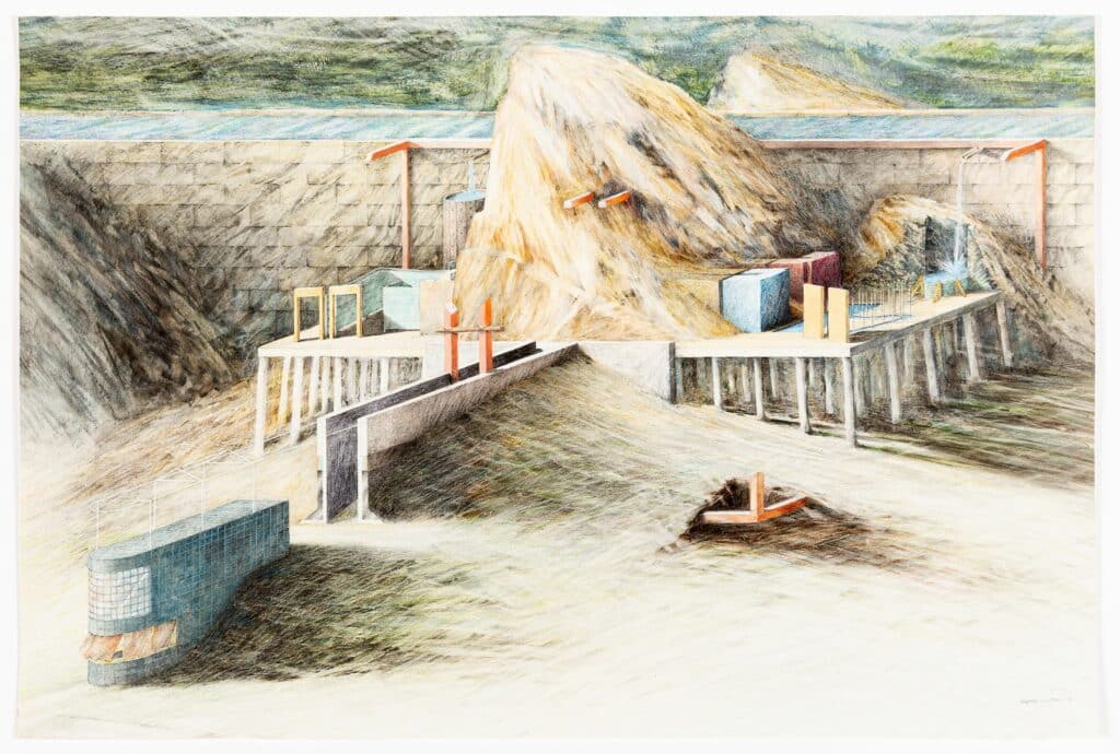
What conventions were here under the spotlight – a Vitruvian comoditas, which at that time was about to exit stage left in the costume of ‘functionalism’. In these drawings an eminently functional typology, the ‘bog’ as we used to call it in Australia, is conjugated – familiar organizational codes of paired entrances, and mirrored boys and girls cubicles (one of the boy cubicles is shorter in plan – the urinal). In this setup mirroring takes on a further iterative trajectory – there are two Public Convenience platforms with the same plan (mirrored). On the left functional expectations and pressing needs are fulfilled, on the right they are denied – doors become closed screens, cubicles solid lumps of sculpted architectonic mass.
Yes, it is didactic in the extreme, almost ploddingly so, a blunt A/B comparison.
In retrospect I would say one was teaching oneself a new language – that of ‘architecture parlante’. The rhetorical had been censured from the tropes of modernism, but by 1976 ‘re-mythologization’ had become a buzzword, at least in art circles.
In what context did such research emerge? The AA of course. At the time the Public Convenience was drawn I was a teaching assistant to my 1974 diploma tutor Elia Zenghelis. Tony Vidler who at that time was researching Boullée and Ledoux, (Enlightenment Parlante – The Writing of the Walls) happened to be on a sabbatical in London and loosely attached to Elia’s Diploma unit. Many inspiring conversations ensued. For the 1975/6 academic year Rem was back from New York (post Delirious) and teaching with Elia. That was the year the Public Convenience was drawn – its atmosphere is emphatically bucolic, not metropolitan as was the official ideology of our unit.
The Public Convenience drawings were for me a follow-up to my much-published Water House project, drawn immediately after graduating from the AA. Half a day’s teaching left much of the week free for drawing and these works took weeks of intensive scrubbing and careful graphite shading – a meditative pastime. The Water House was set in a wild landscape – an architectural device that domesticated a bubbling stream. Transforming the sublime picturesque into the tools of utility – a canal that emerges from the Water House. The Public Convenience is located further along this canal; it also thematicizes water in a practical sense (Thomas Crapper’s invention – left) and as a sensual phenomenological encounter (splash and gurgle – right).
At the time I had imagined pursuing the trajectory (and the series of architectural projections) along the canal into inhabited regions and ultimately to the metropolitan downtown. But my pencil shading style caught on and became too popular at the AA causing me to abandon it for a more expressionist form of scribble in tune with the new painting of the early eighties.
Alvin Boyarsky once described my compositional technique as ‘clearing a stage and placing on it precise objects – like the set for a Bavarian Folk Opera’. I guess he was thinking of the Public Convenience. In the coloured drawing the whole ensemble is bathed in a cold theatrical light, giving rock the bleached ambience of a cold cadaver (Bernard Tschumi on first seeing this drawing asked if the mountain was stone or straw).
The coloured drawing of the Public Convenience gives more clues as to context.
The monumental stonewall of the canal provides a backdrop (behind which lurks a Leonardo-like sfumato landscape). Bottom left a scratchy line indicates the possibility of a road, facing which is a caretakers pavilion, bullet shaped in plan, its kiosk window veiled by a flapping curtain (a breath of life in a slightly morbid tableau). Visitors ducking behind the pavilion pass up a ramp between sandwiching walls. This is architecture fully aware of the freemasonry rituals of approach and initiation scripted by Ledoux for his ideal city of Chaux.
In the foreground the corner of an incomplete red cube is exposed, as if by archaeological excavation. At the time, as a somewhat gestural nod to conceptual strategies I had constructed such red corners from 15 cm dowels – being transportable they were put to work reinforcing the corners of actual rooms, or implying potential rooms in various exhibition contexts.
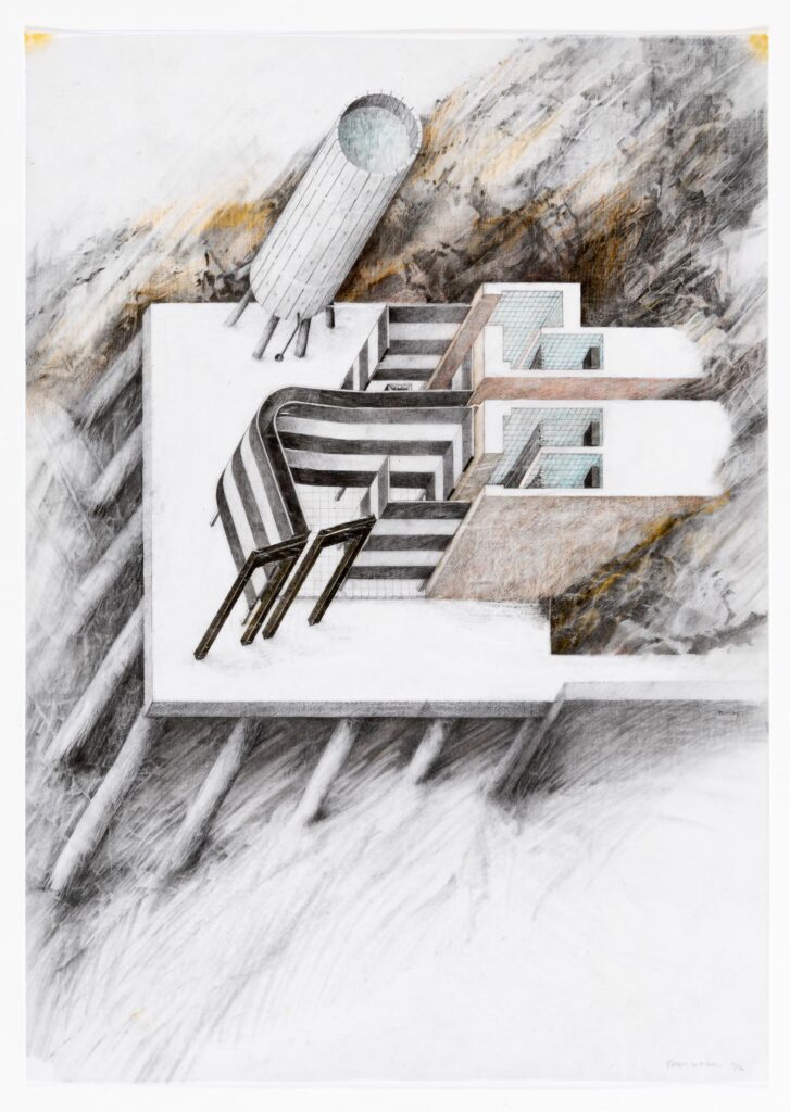
The coloured drawing is projected as diagonal isometric, it insists on the solidity of the architectural components and rejects conceptual overlays or conflicting graphic layers – graphic modes of the time. I can now in retrospect see a link between this early drawn manifesto and a text I wrote some twenty years later in the midst of the digital revolution called ‘Mass in the Age of Media’.
The word ‘ritual’ reoccurs in my works of this time. It is to be understood as implying an intense engagement of user and architecture. A corporal engagement enacted in even the most mundane of situations, like the grasping of a stair handrail thematicized by Walter Benjamin. (All BOLLES+WILSON buildings now have sublimely sturdy and haptic door handles, one designed by Jasper Morrison for FSB). Drawings of architecture conventionally show the object not the user (except, that is, for Archigram’s collages or today’s digital renderings, which come close to the bland world of advertising where everyone is young and cool). On the right-hand platform of the Public Convenience I took the risk of drawing two figures – stand-ins engaged in whatever rituals this function denying architecture might engender. There are also three abandoned shirts – one imagines a Beckettian plot.
There was at the time a further image to this Public Convenience essay – not a drawing but a little square of tapestry by my girlfriend of the time, Abigail Craig. It shows in the ‘low-pixel-resolution’ of the stitch more figures on the roof of the kiosk whose skeletal frame supported a jolly red and white striped curtain. In the background are the Public Convenience platforms – background to daily life as architecture should be.
